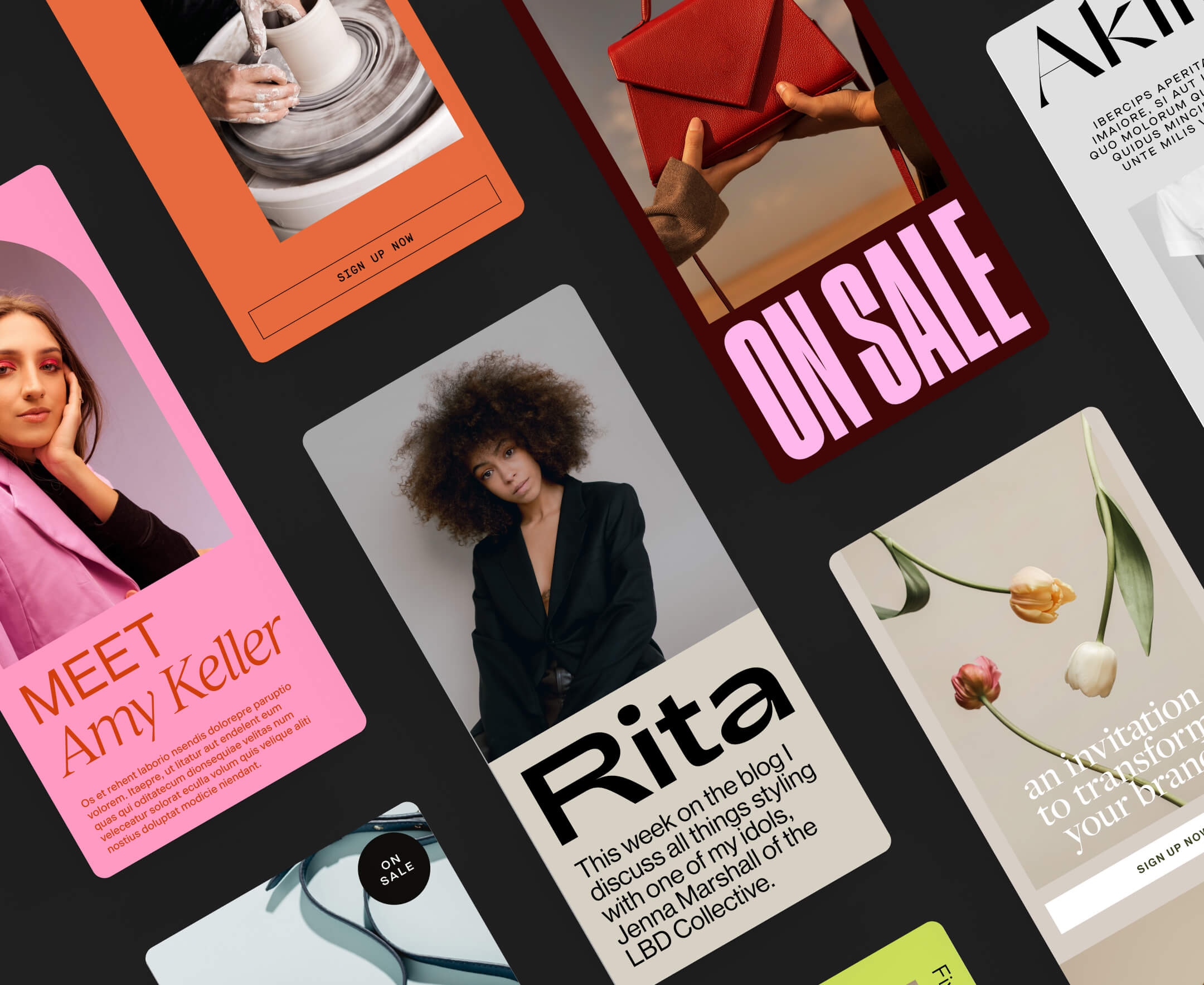
9 standout website pop-up examples in 2024
Table of Contents Jump to:
Jump to:
Table of contents
TL;DR: Explore nine captivating website pop-up examples to inspire you whether you’re growing your email list, offering discounts, or engaging an audience. Say hello to beautiful popups that drive opt-ins and win over your audience.
Love them or hate them, website popups work. But done poorly, they can be the digital equivalent of a persistent salesperson at your favorite store who won’t take “no” for an answer.
While you might find them distracting, there’s no denying that when used effectively, popups can be a game-changer for engaging your subscribers, generating interest in your business, and boosting sales.
But not all popups are created equal. Different types exist to serve various purposes. There are specific popup design and implementation guidelines you should follow to connect with your audience and get the best results.
To better understand how popups work, here are nine fantastic website popup examples and our take on what makes them great.
What is a website popup?
A website popup is an attention-grabbing window that appears on a webpage, overlaying its content. Marketers, creatives, and business owners create popups to deliver specific messages, prompt actions, or collect information from web visitors.
Popups can deliver anything from email opt-in forms and special offers to informative alerts and audience surveys. Because they capture immediate attention, they’re powerful tools for engaging your website visitors and growing your business online.
Types of website popups
Here’s a quick look at some of the different types of website popups:
- Timed: A timed popup appears after a predetermined period, typically measured in seconds or minutes, once a website visitor lands on a page. It’s an automated way to capture attention and encourage engagement.
- Scroll-triggered: Scroll-triggered popups are dynamic elements that appear when a reader scrolls down a web page. It’s activated when the person reaches a specific point on the page, often indicating their interest or engagement with the content.
- Entry: An entry popup appears immediately upon a visitor’s arrival on a webpage. It’s designed to deliver a prominent message or call to action when the person starts interacting with the site. The most common type of entry popup is the “cookie popup,” which asks for consent to the use of cookies.
- Exit-intent. An exit-intent popup is a strategic window that deploys when a reader exhibits behavior that suggests they’re about to leave the website, such as moving their cursor toward the browser’s close button. It aims to retain them by offering a compelling reason to stay, such as a discount code.
- Floating bar. A floating bar, also known as a notification bar, is a thin, unobtrusive banner. It remains visible while the person navigates the site, conveying an important message or facilitating action without interrupting the user experience.
Full-screen welcome mats. A full-screen popup covers the entire webpage upon a visitor’s arrival. It’s often used to deliver a strong initial message, promote special offers, or encourage sign-ups. A reader can dismiss it to access the main website content.
Why do website popups work?
Popup calls to action (CTA) have some of the highest conversion rates out there—particularly when targeting email sign-ups—making them too effective to ignore.
According to a study by Grow and Convert, email opt-in popups exhibit an impressive 1–8% conversion rate. Compare this with sidebar CTAs and generic end-of-post CTAs, which generate conversions within the 0.5–1.5% range.
OptiMonk’s research takes it a step further, pointing to an average popup conversion rate of 11%. Cart abandonment popups outperformed other form types with an impressive 17% conversion rate.
But why are website popups so successful?
The answer lies in their unique blend of visibility, relevance, and ability to prompt engagement. Popups grab immediate attention, ensuring your message isn’t lost amidst the noise or multiple pages of your website.
Plus, they deliver tailored content or offers, addressing readers’ needs and interests at precisely the right moment—driving more conversion.
Design stunning on-brand pop-ups with Flodesk
Elevate your brand with custom emails and forms to deliver personalized messages to your subscribers
9 best website popup examples
Ready to grow your email list, share your offer, or prevent your audience from leaving empty-handed?
These website popup examples provide valuable insights and inspiration you can apply to your marketing strategy.
A newsletter popup is an effective tool to capture email subscribers by prompting visitors to join your mailing list.
The most effective popups offer subscribers something of value in return for their email addresses. It could be discounts, exclusive access, or behind-the-scenes content.
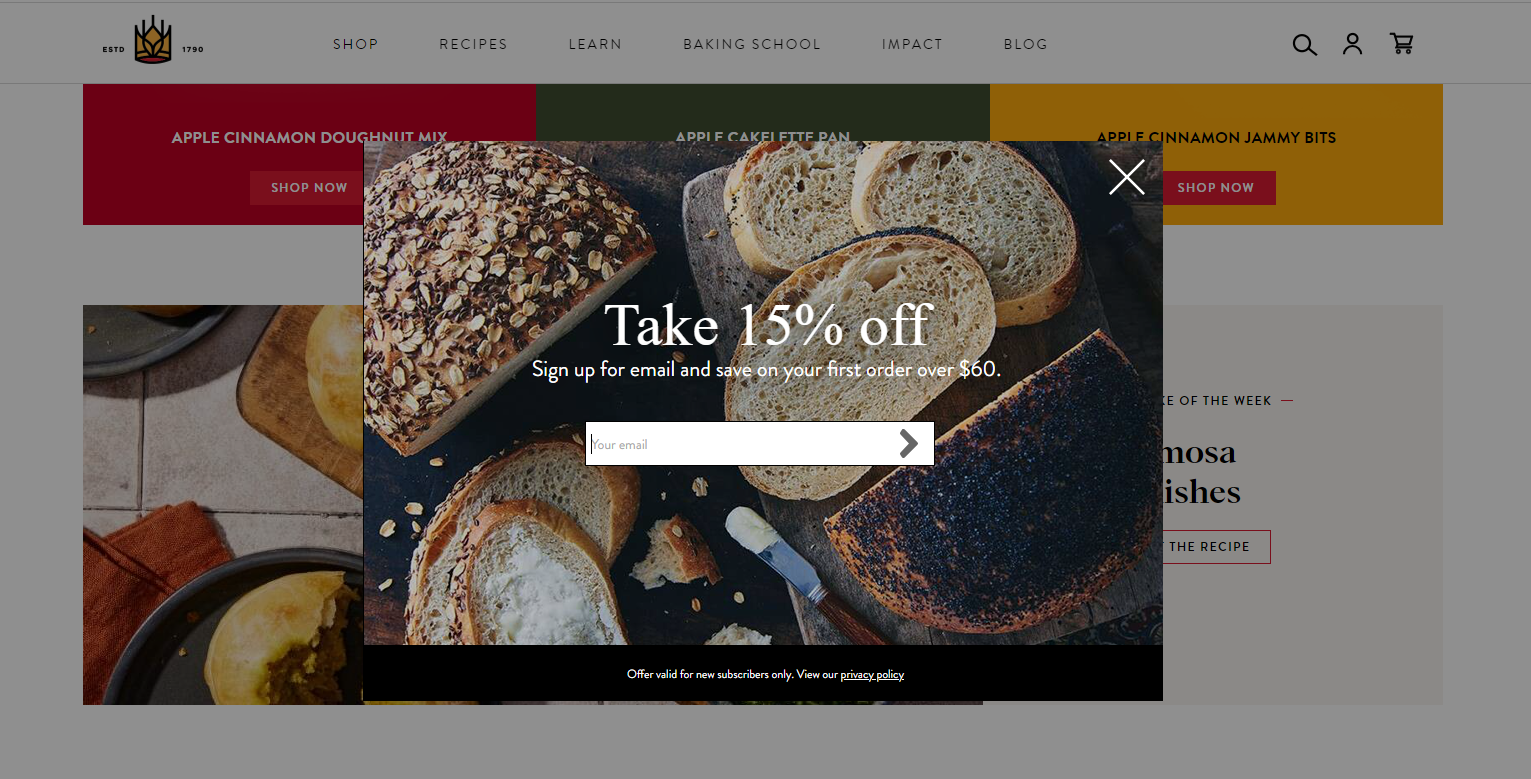
Example #1: Chris Loves Julia
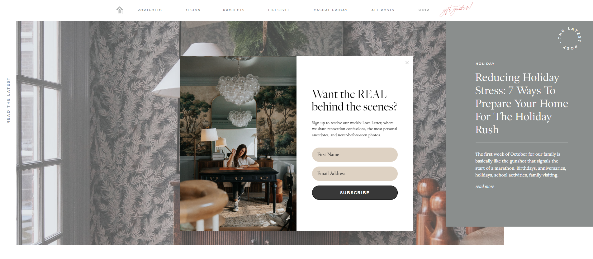
This first popup example by Flodesk member Chris Loves Julia is clean and elegant. It incorporates a high-quality image of a perfectly styled room that matches the look and feel of the website—making it very on-brand and appealing to the target audience.
Because the popup appears in the center of the page, it’s hard to ignore and demands immediate action from the reader.
The newsletter messaging is enticing, too: receive juicy, behind-the-scenes details. The copy provides just enough detail to get readers interested without sharing too much.
Example #2: Alexandra Gater
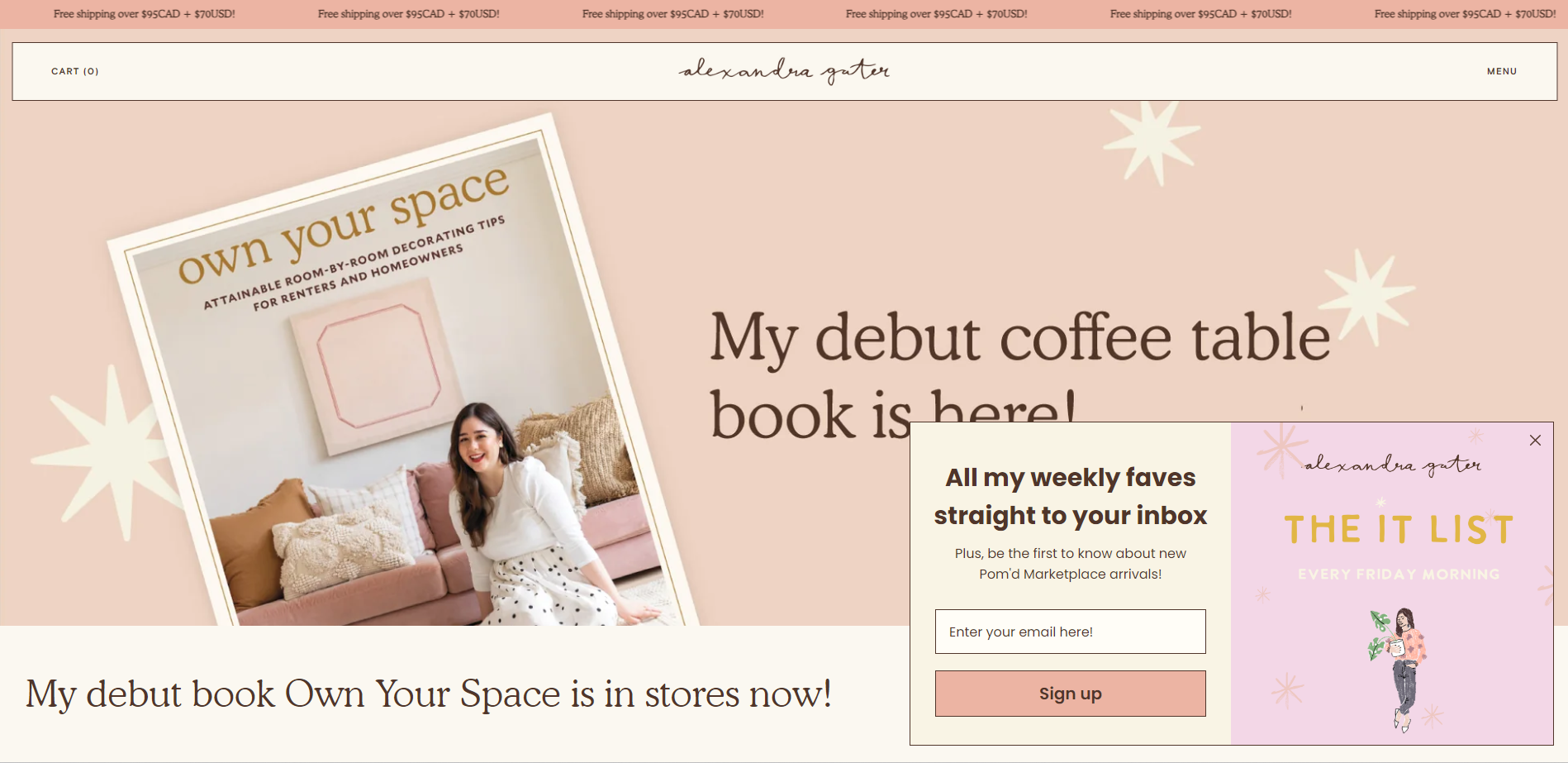
Alexandra Gater’s email popup offers an appealing proposition for website visitors: be the first to know about new arrivals from their favorite home decor expert’s online shop.
The same popup tells subscribers to expect this inner-circle news every Friday morning. This type of lead-generating message is great for influencers or professionals looking to build a community by consistently sharing personal content.
The window image pairs well with the website’s color scheme with a fun graphic. It’s positioned unobtrusively, appearing on the bottom right corner where visitors can choose to ignore it while browsing the site.
Because the email opt-in always remains in view unless a person purposefully closes it, it’s easy to sign up at any point during the browsing journey.
Example #3: Poor Little It Girl
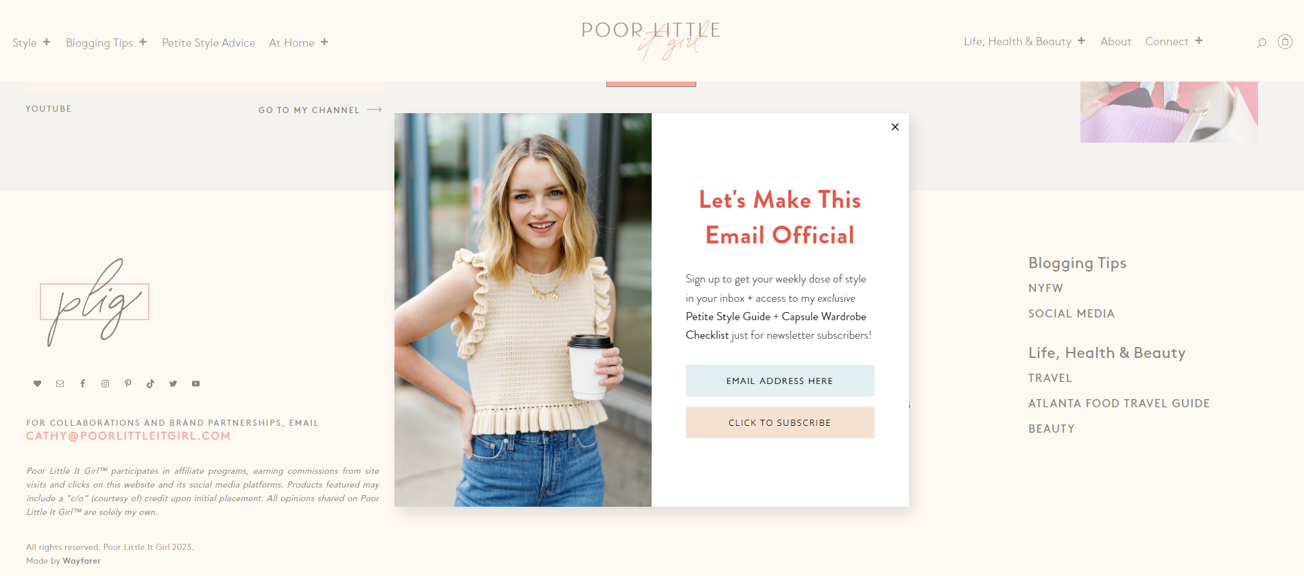
Flodesk member Poor Little It Girl promises an exclusive subscriber-only offer in this front-and-center popup example: her Petite Style Guide + Capsule Wardrobe Checklist. A lead magnet, or freebie (free content in return for an email address), is incredibly effective at gathering subscribers. And the point “just for newsletter subscribers!” gets the message further across.
It’s a great example of how a freebie can offer unique value. Marshal Davis, Managing Partner at Ascendly Marketing, favors this tactic, advising business owners to:
“Offer a content upgrade that is a direct extension of the page the user is on, such as a checklist or template.”
How else can you ensure your popup is a natural extension of your website? Use consistent branding, and always ensure your popup messaging is in your brand voice.
This popup features a photo of the blogger, which adds a nice personal touch. This shows the audience who they can expect to receive an email from—it’s always great to see the face behind the brand.
Discount offer popups
Discount offer popups, like this example of a Flodesk Popup Form, entice visitors with exclusive deals or promotions, motivating them to make a purchase while saving money.
These cleverly timed, visually appealing popups serve as digital magnets. They draw people closer to your products or services and instill a sense of urgency in their purchasing decisions.
Example #4: Elaluz
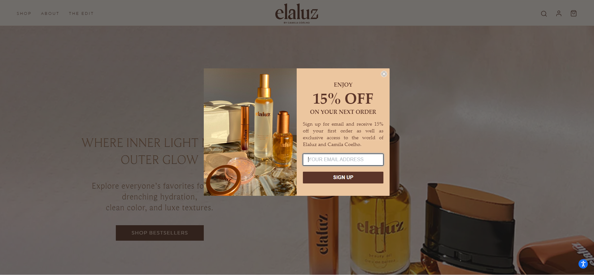
Who doesn’t love a discount voucher? Elaluz’s discount offer is two-fold: it gives subscribers a 15% discount and exclusive access to the website.
The message is clear and to the point, with the “15% discount” in large, bold text to immediately grab attention.
When the popup triggers, the rest of the website fades slightly, drawing even more attention to the already striking popup.
The “sign up” CTA button is also bold, requiring a single email address to access all the benefits.
Example #5: HeyMaeve
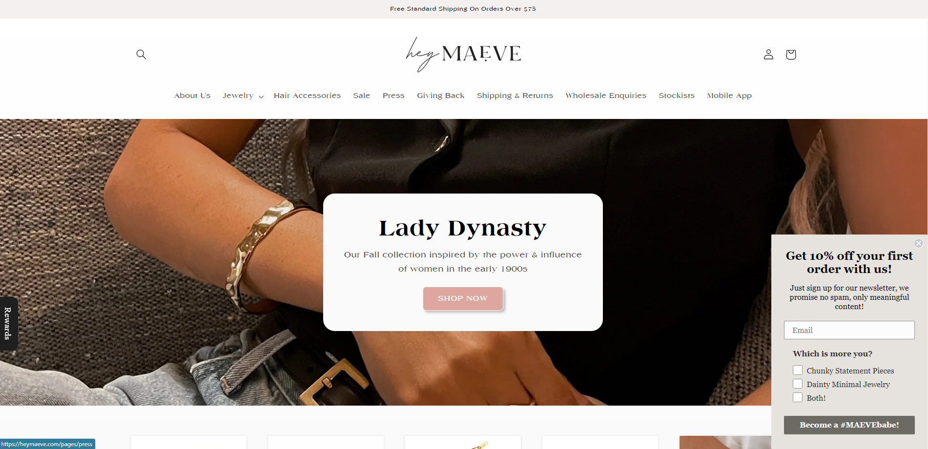
HeyMaeve’s timed website pop-up elegantly slides into the bottom right corner of the brand’s web pages as visitors arrive. The small window doesn’t get in the way while a person scrolls the site, giving it more airtime and increasing the chances of conversion.
This follows the best practice advice of Marshall Davis, too:
“Use a time-delay trigger that only shows the popup after the visitor has spent a minimum amount of time on the site. Use cookie-based tracking to ensure the popup doesn’t appear more than once per session for any visitor. Offer a “snooze” option that allows the visitor to delay the popup until later.”
The neutral color and lack of graphics add to the popup’s discreet appearance. Plus, the offer of 10% off the first order is bold and easy to spot.
Another valuable element you can add to your popup is personalization. HeyMaeve’s popup form allows subscribers to specify their preferences: chunky jewelry, dainty jewelry, or both.
This critical detail helps the brand organize subscribers into more relevant segments, increasing email success rates down the line–—it’s a valuable element to add to different form types as you look to grow your subscriber list.
Lastly, the popup CTA, “Become a #MAEVEbabe!” creates a sense of community, making the audience feel like they’re joining an exclusive club when signing up. Messaging has a significant impact on the success of your popup, so consider how you can frame an experience your readers will love.
Welcome popups
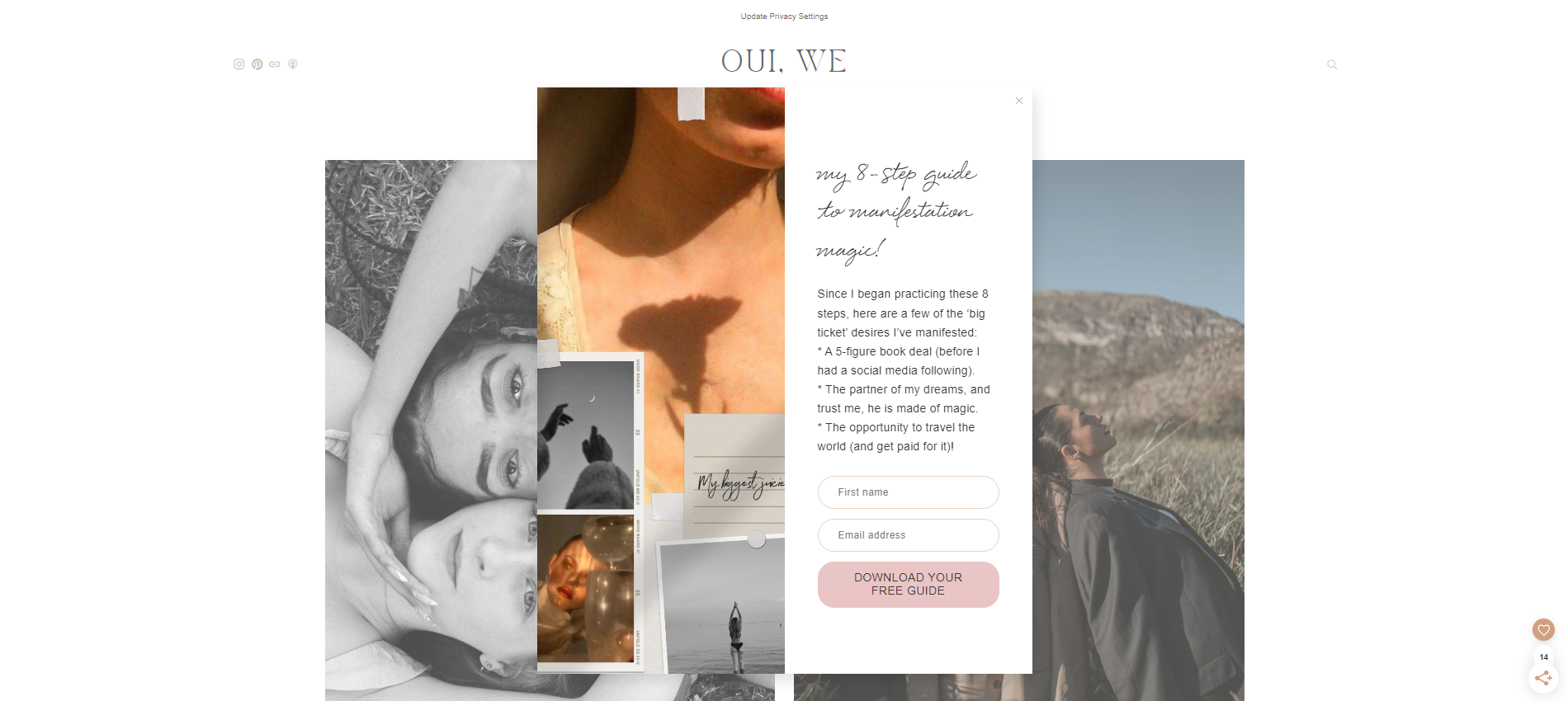
Welcome popups—like this example from Flodesk member Oui, We—are popup boxes that appear when visitors land on a website for the first time. The driving force behind these boxes is to attract attention and convert subscribers.
They typically offer several value propositions at once, like a discount, freebies, and insider news. A good practice is to use them when your visitors need a bit more time to discover your brand before making a purchase.
Example #6: Mimochai
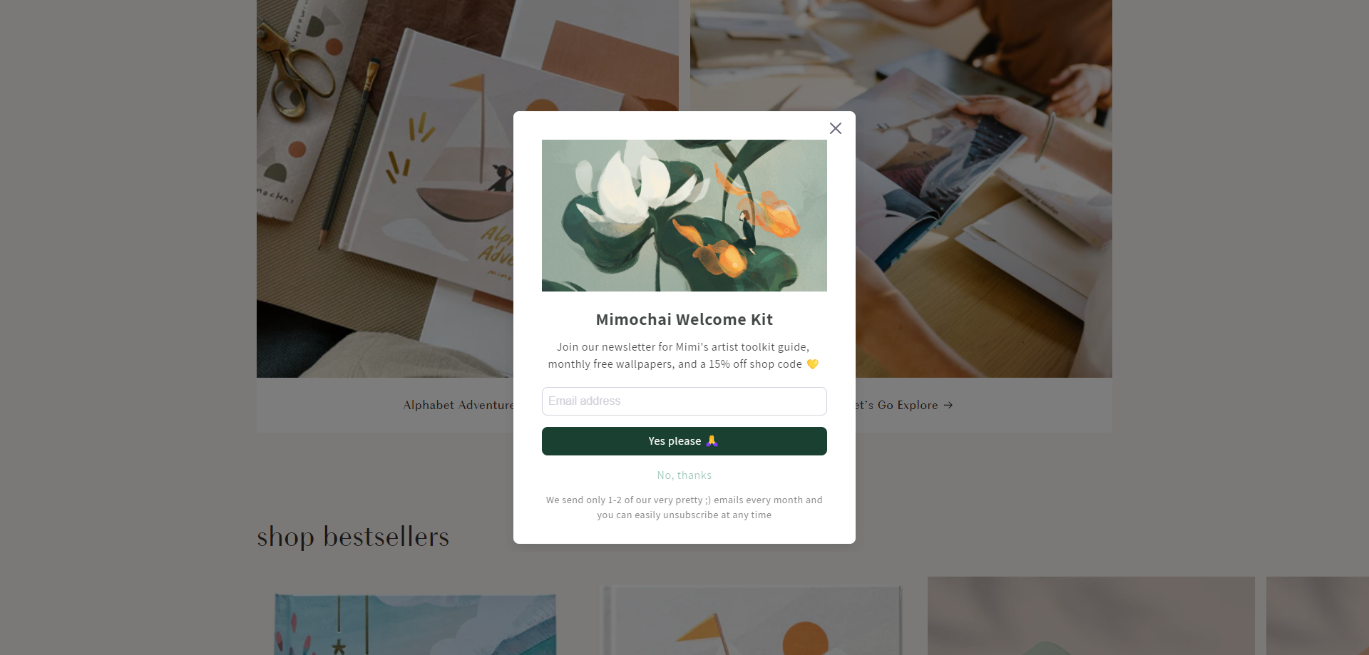
What we love most about Mimochai’s website popup example is its beautifully illustrated graphic. It immediately catches visitor’s attention and shows them what the artist is capable of.
By promising a “Welcome Kit,” the artist welcomes readers into their world. Plus, they offer free monthly wallpapers and a 15% off shop code—it’s quite an appealing offer for art lovers.
The emoji in this popup’s CTA button adds a fun, quirky element, and the dark green color ensures it pops.
Subscribers also know what they’re signing up for with the added note on email frequency and being able to easily unsubscribe. At only one to two emails per month, viewers can feel confident in knowing Mimochai won’t spam them with unnecessary messages.
Beautiful forms made simple
Discover why beginners and experts alike love growing their business with Flodesk
Exit intent popups
Exit intent popups are your digital safety nets, preventing valuable engagement from slipping through the cracks and giving you a second chance to make a memorable impression.
Example #7: CRAFTD London
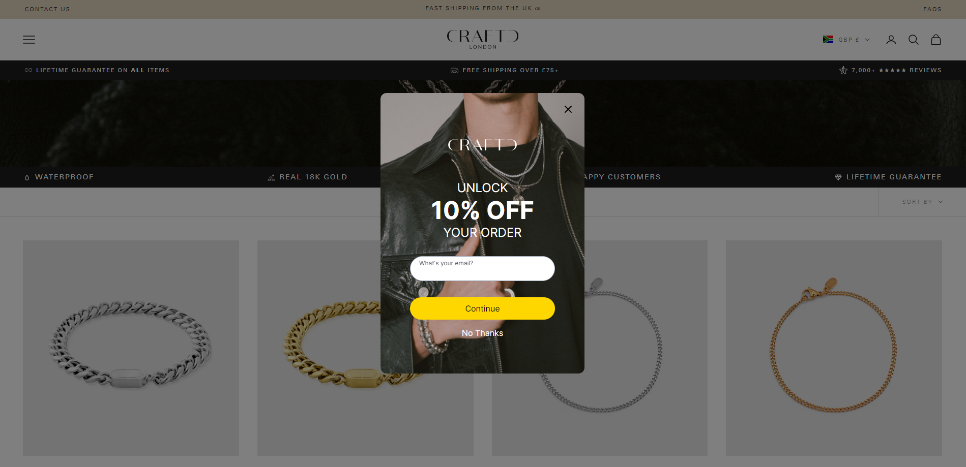
This exit popup example by CRAFTD London encourages customers to stick around on product pages by unlocking an enticing 10% off their order when they sign up.
The “10% off” is bold and eye-catching, while the background image portrays their exact target market: stylish men looking for jewelry. Always make sure to add an image that your audience can relate to.
The CTA button is in bright yellow, prompting customers to “Continue” their journey after entering their email address. While the other option, “No Thanks,” is much less prominent with no background color.
This popup does what it needs to by offering one last attempt to keep visitors interested in the online store.
Example #8: The Sill
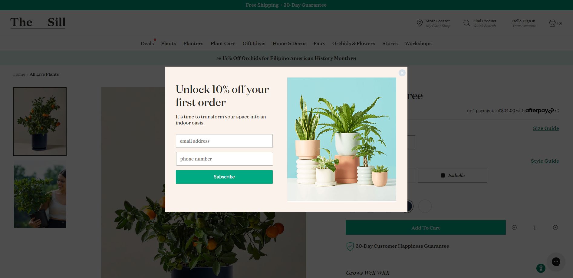
The Sill has designed an impactful exit popup on their product pages. It includes a discount code to lure visitors back into shopping and a message to tap into their emotions.
The message, “It’s time to transform your space into an indoor oasis,” implies these plants are the missing ingredients to creating an inner sanctuary—a sentiment that any plant lover will lap up! This messaging follows Marshal Davis’ guidance:
“Use emotionally charged language that resonates with your target audience to capture attention immediately.”
The messaging is what makes this popup example really shine. You can do this by simply tapping into your target audience’s pain points or emotional pulls.
Graphics-wise, the image uses bright colors with a CTA button aimed to grab attention. The rest of the website also fades slightly as the popup triggers, making it stand out even more.
Floating bar popups
Floating bar popups, often seen as discreet notification banners, offer an unobtrusive way to convey important messages and encourage specific actions as people navigate a website.
Example #9: Jewelscent
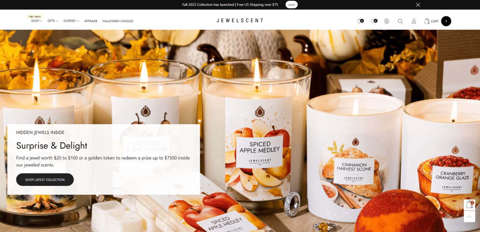
Unlike the other popup examples, Jewelscent’s floating popup doesn’t require readers to subscribe to a newsletter. Instead, it sends them to the brand’s fall 2023 collection to start shopping (and jewel hunting), with the offer of free US shipping for orders over $75.
The message is clear, immediately letting website visitors know about the recently launched collection and free shipping to get them excited about shopping.
Floating bar popups are usually kept simple, which is exactly why this one works: the black background, white text, and clear “shop” CTA button drive traffic to the product page instantly.
Design forms your audience can’t resist
Creating on-brand, beautiful popups is as easy as it gets with Flodesk. Grow without limits
Design popups that engage and convert
Engaging your web visitors can be challenging, especially with so much competition online. But the secret lies in using the right popups strategically to drive conversions and engagement with your audience.
Just as Flodesk’s intuitive email builder simplifies crafting emails that captivate readers, our versatile and truly gorgeous forms empower you to create popups that keep your subscriber list growing. From popups that offer last-chance deals to timely discount offers, your website can be a dynamic stage for boosting conversions.
Choose from a wide variety of Popup Form templates and witness the transformative power popups with Flodesk. Create yours free.

Related Articles