Newsletter popup tips and examples to inspire your own
Table of Contents Jump to:
Jump to:
Table of contents
Considering giving newsletter popups a try? If so, keep reading. We’re sharing why popups are a powerful way to attract new subscribers and how you can use them strategically to boost opt-ins.
Depending on who you ask, the average popup conversion rate ranges anywhere from 3.09% to 11.09%. That’s a big range—and how you design your popups will determine where you rank on the scale.
Explore our top five tips for creating eye-catching popups your readers will love, along with inspirational popup examples that show you how to showcase your offers, build your list, and meet your business goals. Let’s get started.
5 tips for crafting an eye-catching popup
Newsletter popups are a visual pull for your audience, but it’s not just about the popup design—you need to offer high-value content, a unique perspective, or something enticing to get your website visitors eager to sign up.
Offer a lead magnet to incentivize visitors
A lead magnet is where you offer a freebie or service in exchange for data, like contact information. It’s your incentivizer: the trigger that’ll hopefully encourage your website visitors to sign up for your newsletter. Lead magnets could be:
- Free samples or guides
- Newsletters
- A discount code
- A free consultation or trial
A lead magnet is a kind of value exchange. In order for your readers to be willing to share their personal data, it should feel worthwhile to them. For added inspiration, explore these 16 opt-in freebie ideas to grow your email list.
“I think the most important factor is a very clear and exciting offer. People are hesitant to give out their email addresses these days—it’s almost like a currency,”
says Flodesk Chief Brand Officer, Rebecca Shostak.
“Make sure you’re offering something of value, communicated clearly on your form, so subscribers are willing to offer you something they value in return—their email address! Among many things, this could be a discount, freebie, newsletter with juicy content, or exclusive access to a video.”
Lead magnets like these are the first step into your sales funnel. They’re powerful tools across all business types—from wedding planners offering free event planning guides to photographers presenting photo tutorials. (Psst! Check out these photographer lead magnet ideas for more pro tips.)
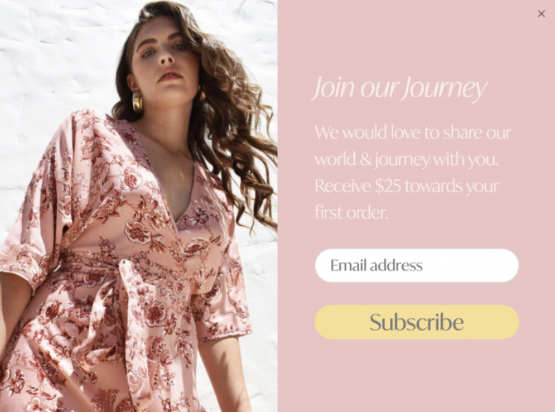
Take a look at this example from House of Lacuna, which offers a $25 discount on customers’ first orders. If they’re already interested in the brand, this discount might get them to make their first purchase.
2. Make your value proposition clear
Value propositions are a way of showing your audience that the product or service you offer is a worthwhile investment. The stronger the value proposition, the more likely your subscribers are to become customers.
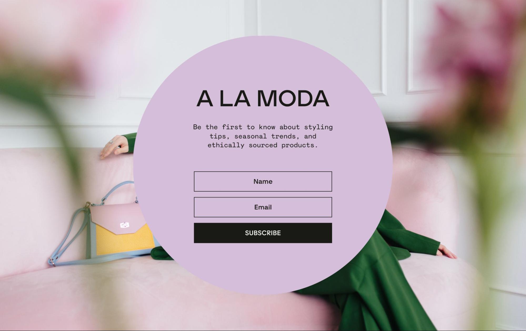
This newsletter popup example has a crystal clear value proposition. It pairs slick design, pops of color, and on-trend items with an ethical stance. The effect is powerful—promising fashion content and products that readers can feel good about while still achieving the look they’re after.
3. Include a striking, relevant image
Visual content stimulates our brains in the best way possible, engaging us and fueling interest. And aside from just looking good, the image you choose can say a lot about your value proposition or brand persona.
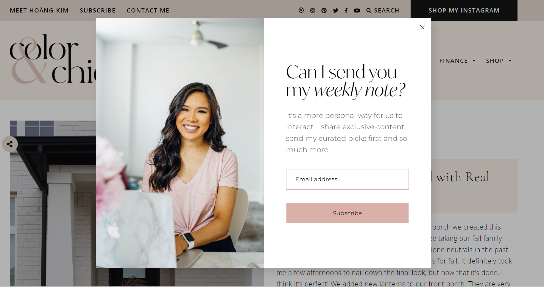
This newsletter popup form from Color & Chic is a simple but effective representation of what’s on offer: a weekly note with exclusive content from its writer, Hoàng-Kim.
The form feels personal, helps to showcase her personality, and lets subscribers know what they can expect from her newsletters. Plus, the image ties into the colors of her popup, creating a consistent look and feel that’s on-brand.
Flodesk Brand Designer, Jordi Bayona, says color can be a powerful driver of an effective popup design.
“As a designer, I believe color is a powerful element of the visual language. Using colors effectively can attract attention in the popup form, like the CTA button. A well-designed popup form that aligns with the website’s branding and color scheme creates a sense of familiarity and trust. Consistency in design reinforces the brand’s identity and fosters a seamless user experience.”
Design emails people love to get
Beautiful emails. As easy as it gets. Discover why beginners and experts alike love growing their business with Flodesk.
4. Include a clear CTA
While aesthetics are essential, don’t get swept up in the design of your newsletter popups and neglect other key elements. You want to ensure you’re achieving your main objective—to increase sign-ups. Include a strong call to action (CTA) to prompt your readers to take a certain action.
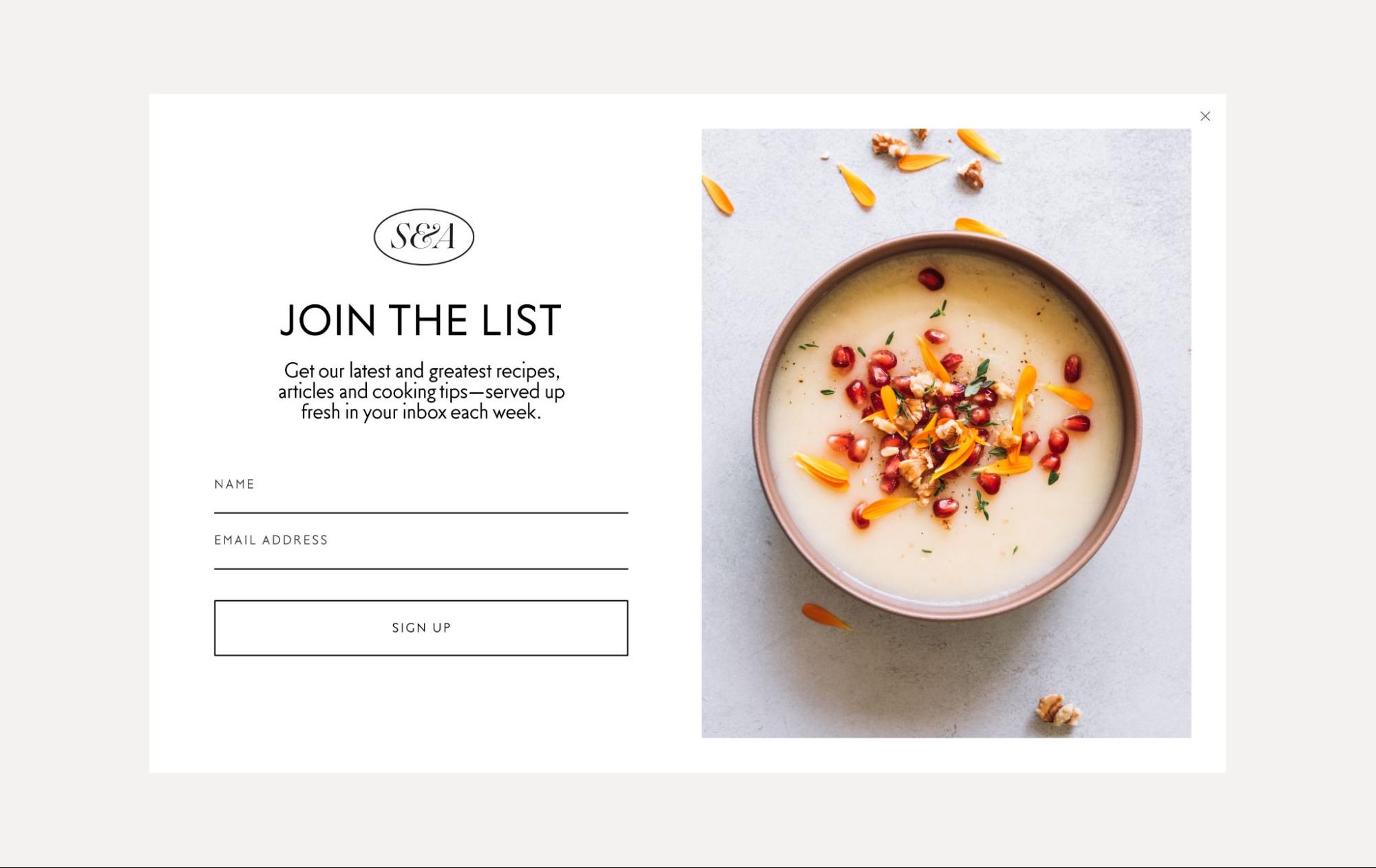
In this case, you want them to enter the information required to sign up for your newsletter—like in this popup example.
This popup promises the audience fresh insider updates: Weekly recipes, collated articles, and cooking tips. The reader’s next steps are made super clear with the CTA, “Sign up.”
5 awesome website popup examples
With striking visuals and compelling value propositions that incentivize opt-ins, here are five awesome newsletter signup examples to inspire your newsletter popups.
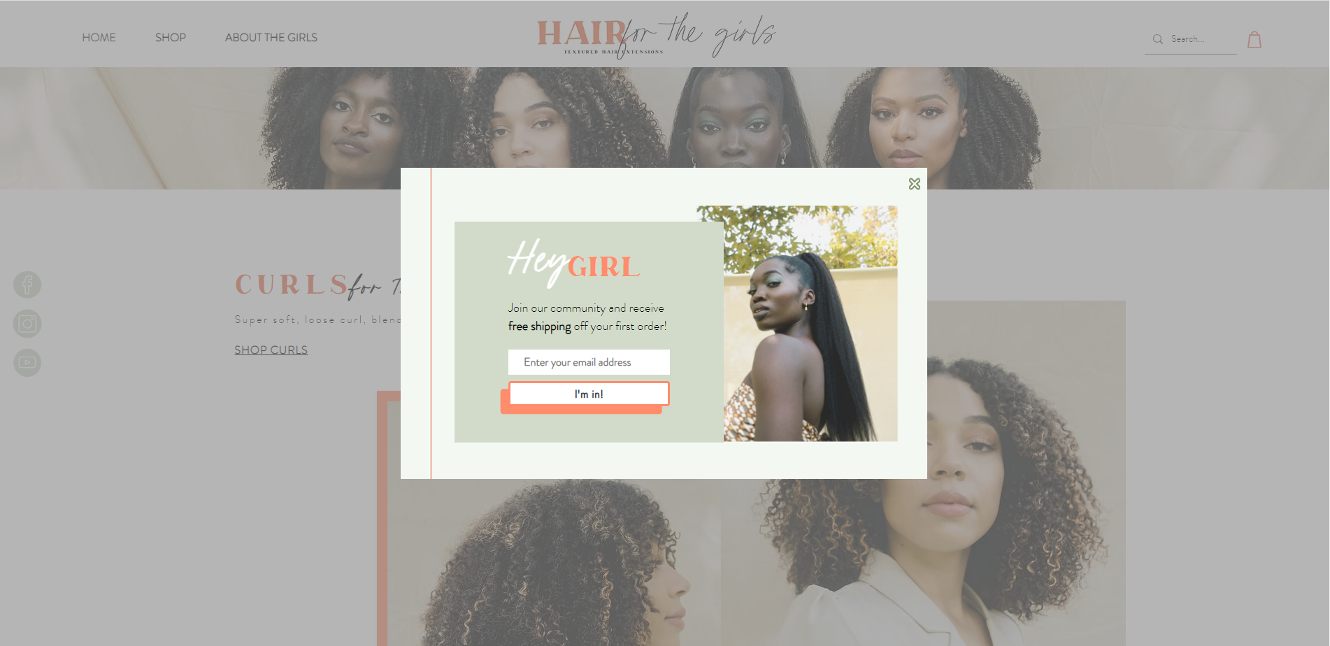
1. Hair for the Girls’ free shipping offer
What’s better than a freebie? Free shipping! Hidden costs and high shipping rates can stop a buyer in their tracks. This offer from Hair for the Girls prevents this by providing free shipping on a customer’s first order.
It’s an impactful popup that benefits both the customer and the brand. By saving money on shipping, the customer is more likely to make a purchase and feel great about the value they’re getting. In addition to making a sale, Hair for the Girls gains a newsletter subscriber—and the opportunity to build a long-term relationship with them.
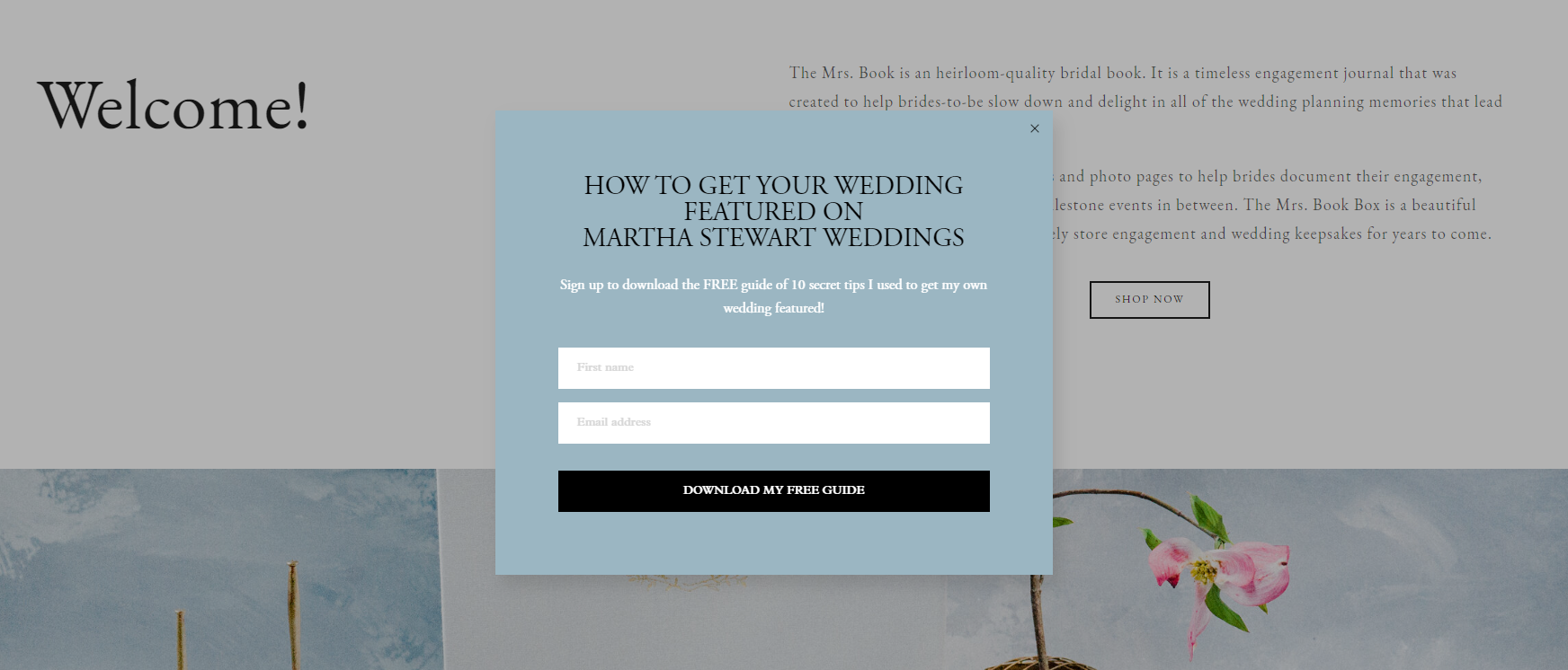
2. The Mrs Book CTA
Your CTA should direct the audience on what next steps to take. Here’s a great example of an effective CTA from Mrs Book—a premium, heirloom-quality bridal book seller. Mrs Book offers clear value: practical insider knowledge that teaches the reader how to get featured in Martha Stewart Weddings. And all they have to do is download the free guide.
By signing up, the reader gets access to ten tips to get their wedding featured in an esteemed wedding publication. It doesn’t give too much away—only noting “secret tips”—making it an even more tempting offer.
This popup makes it clear that signing up has tangible results. Not only will they receive a free guide, but they’re promised extra value if they follow the guidance it contains.
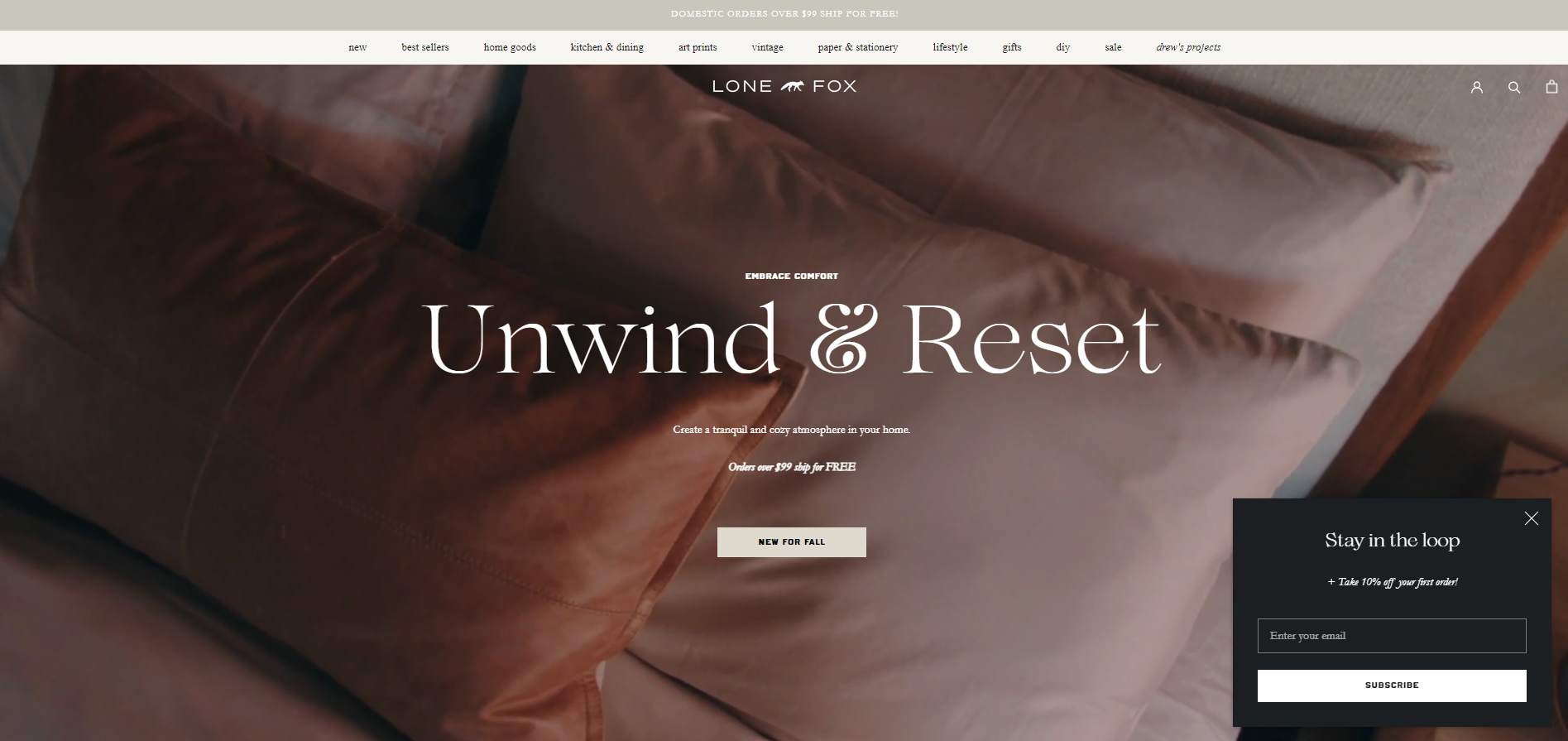
3. Lone Fox’s subtle bottom-of-the-screen box
Popups are only effective if done right. An obtrusive popup screen can sometimes irritate your readers. And if they can’t easily exit the popup or navigate around it, they may decide to simply close the window and move on.
Lone Fox, a popular DIY, design, and home goods brand, shows how popups can be used subtly to get visitors’ attention. This popup is unassuming and easy for readers to navigate around, rather than covering the whole screen.
The popup is also consistent with the design of the website, allowing visitors to continue browsing the site without limitations before locking in a compelling 10% discount offer for signing up.
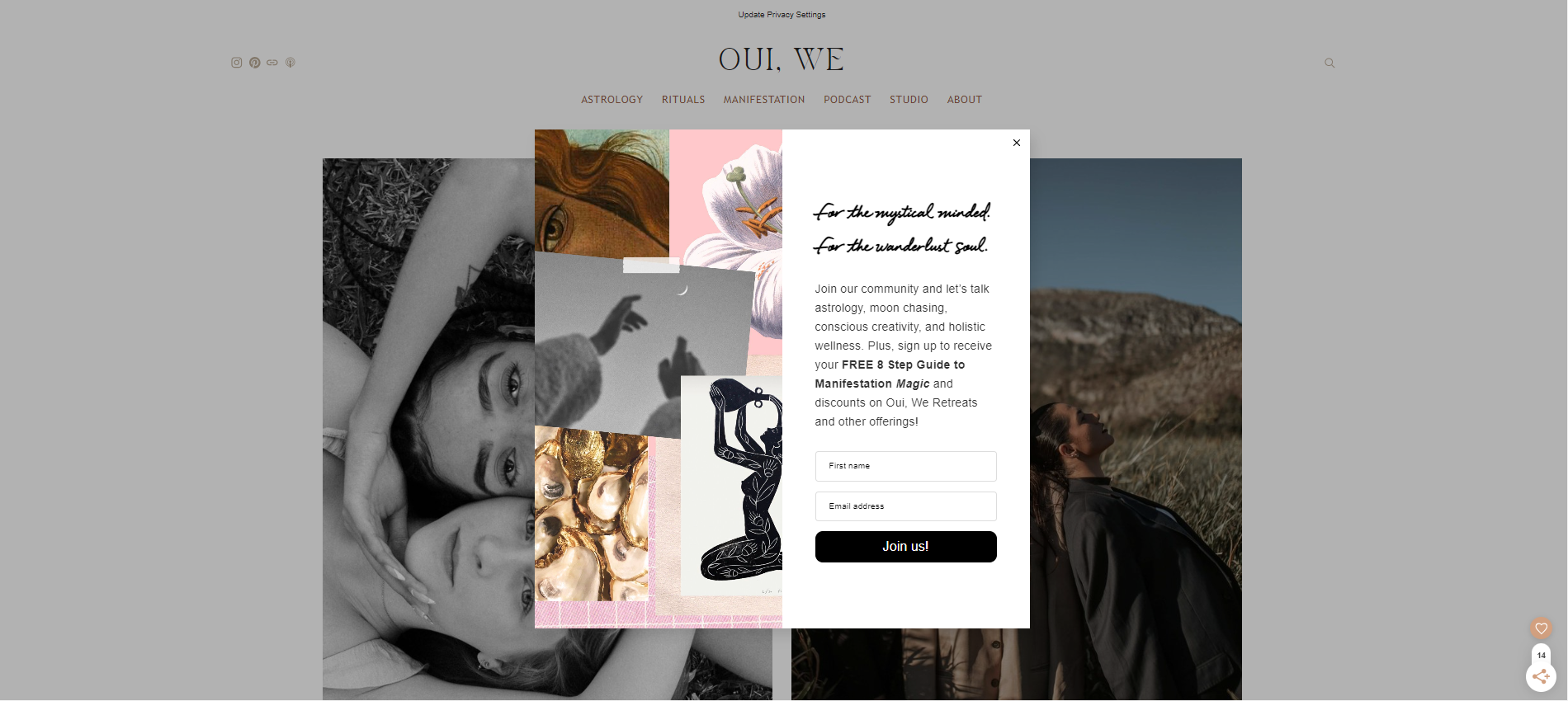
4. Oui, We’s timed popup
Not every person who visits your site wants to be greeted with a popup. One way to create a better on-page experience is by adding time delays to your popups to give your audience time to browse before they’re shown your opt-in offer.
Conscious coaching brand Oui, We shows how popups can add value without overwhelming new visitors by appearing later on in the browsing experience. The design features imagery that ties into the central themes of the brand and offers a valuable freebie, plus access to a community of like-minded individuals.
5. King Arthur Bakery’s clear value proposition
A clear value proposition is a great way to grab individuals’ interest. You exchange signups for a special offer, like a discount or freebie.
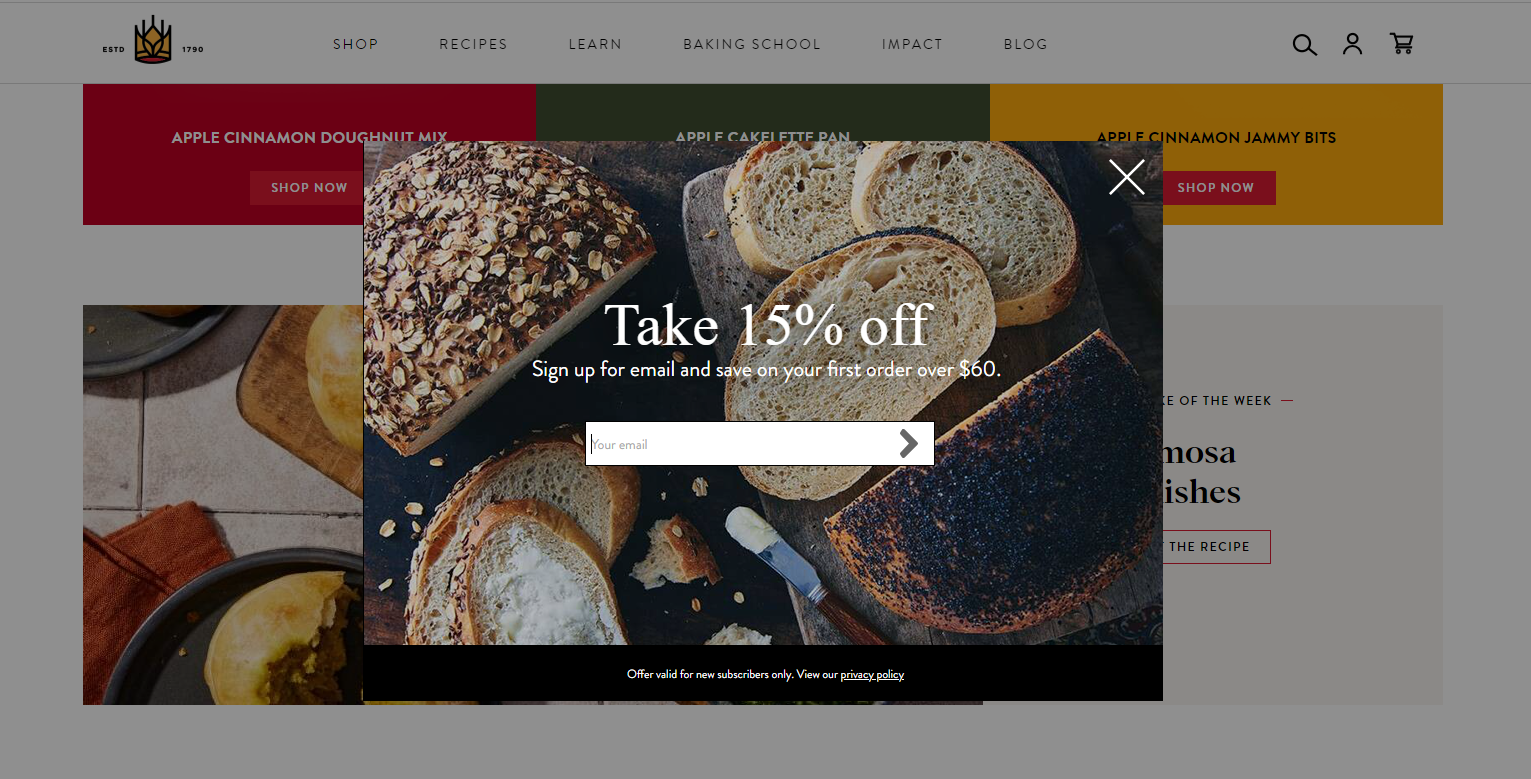
King Arthur Bakery’s example below offers a clear value proposition. When signing up, readers get 15% off their first order over $60. It’s a transparent offer and, while it takes over the screen, it has a large exit button—making it super easy for a customer to continue browsing for baked goods. The popup also features a striking and relevant visual—freshly baked bread.
Looking for more inspo? Check out these amazing website pop up examples
Now, it’s time to craft a popup that’ll get your soon-to-be newsletter readers excited to join your list. Feeling intimidated? Not to worry. Our customizable popup templates make it easy to create gorgeous forms that showcase the best of your business in mere minutes. Get started—completely free.
Here’s how.
Create a new form
Once in your Flodesk account, navigate to the “Forms” tab. Then, click the “+ New form” button to start designing an opt-in form.
Choose from a number of different form types: a Link in bio, Popup Form, Inline Form, or Full Page Form.
Customize your form
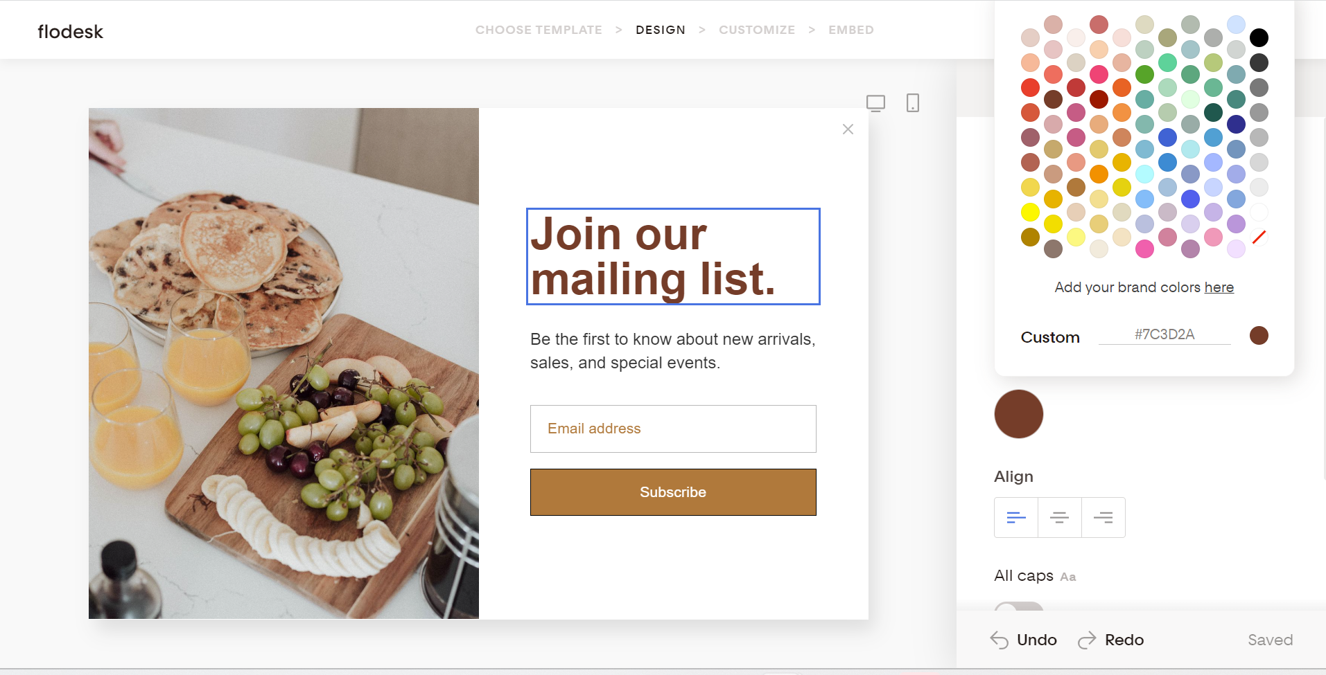
Customize your form to match your brand’s look and feel. Click anywhere on the form to get started. You can add your own artwork, or pull from stock websites like Unsplash—all without leaving Flodesk’s form builder.
Once you’re happy with your design, add your form fields. We recommend capturing simple information about your visitors, such as: first name, last name, and email.
Copy and paste your embed code into your website
To make your new newsletter popup live on your website, simply copy and paste the HTML code from Flodesk into your website’s HTML—and wait for those signups to start rolling in.
Create truly gorgeous popups
Flodesk was built to make small business owners just like you more successful through great design. To get started, choose a template, tailor your popup form, and start growing your newsletter. It’s so easy. Take some inspiration from the popup examples above and give our templates a try. We can’t wait to see what you create. Get started—completely free.
