15 lead generation form examples that convert (and why)
Table of Contents Jump to:
Jump to:
Table of contents
Lead generation forms are like slipping your business card into the pocket of your reader—but better. Unlike a traditional business card, which can get lost or forgotten, these forms give you the chance to create an immediate connection with prospective customers.
Lead generation forms for your small business can come in all shapes and sizes. We’re here to show you some excellent lead generation form examples that were built to drive conversions.
What is a lead generation form?
A lead generation form, often referred to as a lead gen form, is tailored to attract attention and capture contact info from people who are interested in your product or service. Usually, these individuals will sign up for your newsletter, or provide their details in exchange for a valuable freebie, coupon code, or other kind of asset.
This valuable data feeds into your marketing plan, so you can send your new subscribers personalized content, demonstrate the value of your offering, or invite them to become part of your community.
Quick tips for crafting a form that captures leads effectively
How can you create a lead capture form that your audience is actually excited to fill out? Here’s a few quick tips to help you get started.
- Keep it simple: Opt for a simple form with essential fields to make it easier for your audience to fill in your form. Overly lengthy forms can confuse or bore your audience, causing them to disengage before they even have the chance to submit.
- Simplify multi-step forms: If you can’t simplify your form to one or two fields, consider making it a multi-step form. Asking one question at a time makes your form easier to fill out, so your audience can gain access to your special offer, freebie, or gorgeous newsletter content.
- Pay attention to CTAs: A compelling call to action (CTA) guides your audience to complete your form. Make it clear what they’ll get—whether it’s a free tool, a pro bono consultation, or access to exclusive content.
- Address pain points: How does your lead gen form help your reader? Highlight this front and center. For instance, a family photographer might disclose how quickly you can expect a quote, and what the turnaround time is for receiving pictures after a shoot.
- Reduce barriers: Avoid asking for too many personal details. Start with the basics, like name and email address. Avoid asking for information you don’t really need, like a date of birth or zip code, which some people may be uncomfortable including.
- Social proof: People trust their peers more than brands. Incorporate testimonials or endorsements to add credibility and increase interest.
- Nurture your leads: Once you’ve captured interest, begin your sales process to nurture your relationship with your subscribers. With extra information, attractive offers, and a smooth checkout process, they may turn into customers.
- Don’t be intrusive, but don’t be shy either: Make your form easy to spot without overly disrupting the browsing experience. Whether your form is a popup or an embedded inline, ensure it’s prominent on the page.
- Test and refine: Try using two different forms or A/B test variations to see which form performs better. Play around with CTAs, change your copy, and tweak the button color to find out what works best for your audience.
- Highlight incentives: If you’re offering a freebie, a discount, or a consultation, highlight it. These are valuable and act as an added push for people to sign up. And to drive excitement and set expectations, make it crystal clear what the freebie includes or even give a sneak peek.
Create beautiful forms with Flodesk
Grow your list with customizable, stunning templates that you can make your own.
15 fantastic lead generation form examples
A lead generation form is all about exchanging value with your audience. You make it easy for them to opt-in to your newsletter, special offer, or freebie. In return, they offer you their contact details and the opportunity to keep engaging with them down the line. Let’s look at some great examples of lead forms.
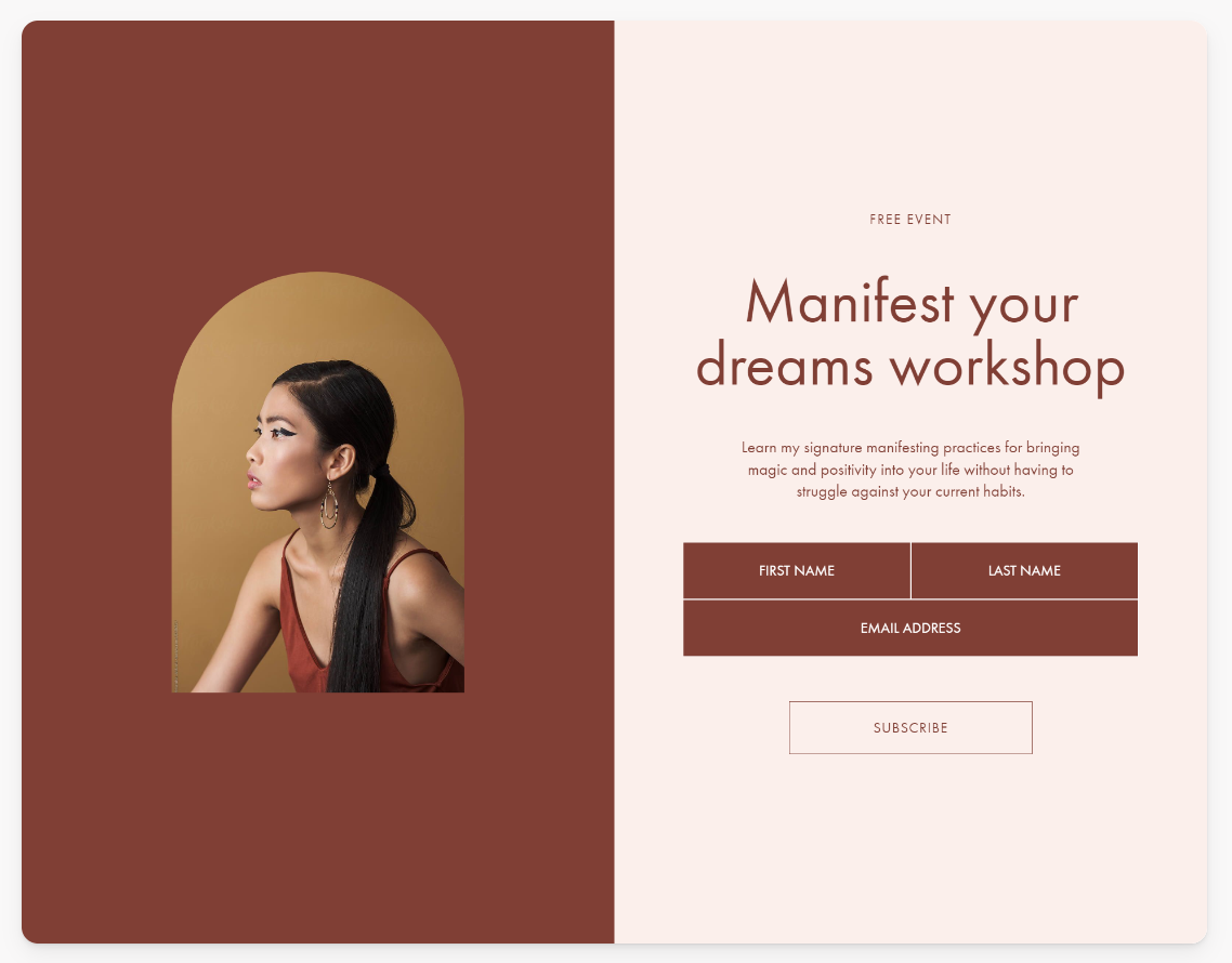
1. Keep it personal like Jess Annison
Readers prefer a personal touch. Leadership and careers coach Jess Annison championed this approach for her lead gen—using the opportunity to turn her form into a more human and personal experience.
And it fits her business perfectly. As a coach, her clients sign up to spend a lot of time with her—face-to-face (or screen-to-screen). Her form sets the tone for this experience, featuring an image of her seated “opposite” the viewer, as if in the middle of a consultation.
It’s a smart and simple move that helps you envision exactly what to expect in a session with her.
What they’re doing right
- Jess only asks for basic information, which increases trust
- The picture makes it feel like you’re interacting with Jess directly, creating a more personal experience
- It’s quick to fill out, which makes it easier for her audience to reach out in the spur of a moment
2. Bootstrap Dreams gives a sneak peek of what you’ll get
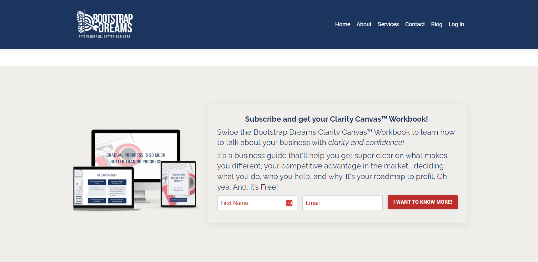
Have you ever seen a lead form that promises you a freebie—like a workbook or e-book—without clarifying what the content will actually cover? Probably not. And if you have, you likely didn’t hand over your contact details.
Bootstrap Dreams shares the perfect amount of freebie info to drive opt-ins. Their form includes three depictions of the workbook and a summary of its key learning outcomes, highlighting how the workbook will benefit readers. This leaves the audience with no room for doubt about what they’re signing up for.
What they’re doing right
- They show and tell so readers are clear about what they’re getting. It’s simple but effective
- They only ask for two things: name and email. Less is more with lead forms
3. Care/of gamifies shopping for vitamins in their lead gen form
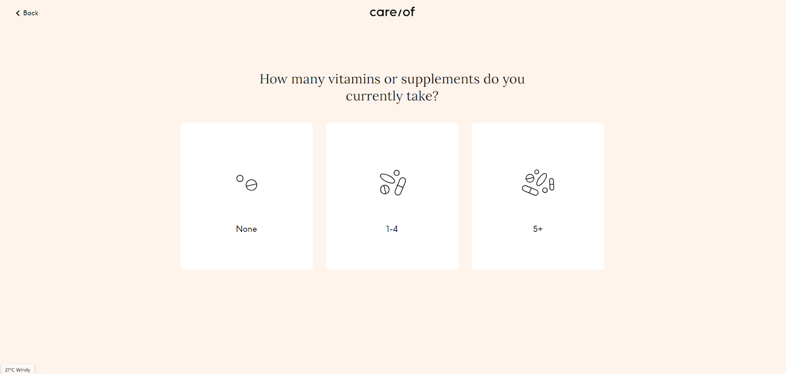
When it comes to taking care of ourselves, it’s easy to get overwhelmed. There’s so much information out there that it’s hard to know where to start. People are looking for clarity and an easy and effective solution.
Care/of understands how daunting it can be to figure out what vitamins to take. So, it offers their audience a streamlined solution with this lead form. Sleek, minimalist, and delivered in quiz form, this lead gen form is quick to complete and easy to understand. Plus, the quiz format adds an element of fun to the process.
What they’re doing right
- They keep it simple, with one question at a time on the screen
- The quiz-like setup makes filling out the form a fun experience
- By communicating expectations from the start, they build trust
4. Lemonade made a difficult process pleasant
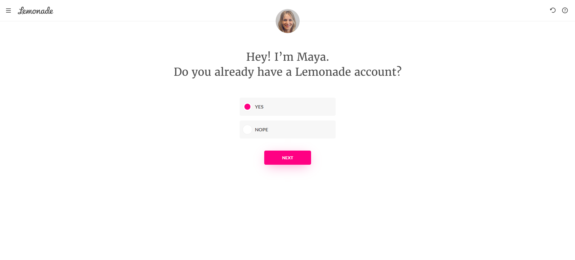
A lead form from an insurance company doesn’t have to be dull and confusing, and lemonade proves that. Lemonade’s form feels like it’s coming straight from a human. Instead of speaking to a faceless business, you’re helped by Maya—who is depicted at the top of the form.
What they’re doing right
- They humanized an otherwise boring process by adding the character of Maya
- Thanks to Maya and slick, modern, design, they make the process feel more approachable and easy to understand
- The form shows only one question at a time—making it super easy to complete
5. Babes & Brews gives value in return for your email address
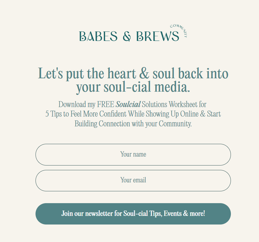
Don’t forget to add personality to your lead gen form! Babes & Brews’s playful writing style captures what it’s like to be a part of this fun, mindful, and meaningful community.
But they don’t just rely on puns to convince their audience to sign up. Apart from access to their newsletter, subscribing gets you a free worksheet. They outline why that’s valuable in their form, so soon-to-be subscribers know exactly what they’re getting out of the deal.
What they’re doing right:
- They maintain their playful tone of voice in all areas, down to the button of their lead gen form, so it all feels like an experience rather than a cold business transaction
- They’re clear about what you’ll receive in return for signing up, detailing what the worksheet freebie covers
- They keep things simple by only asking for a name and email address
6. Create a subtle sense of urgency like Colleen
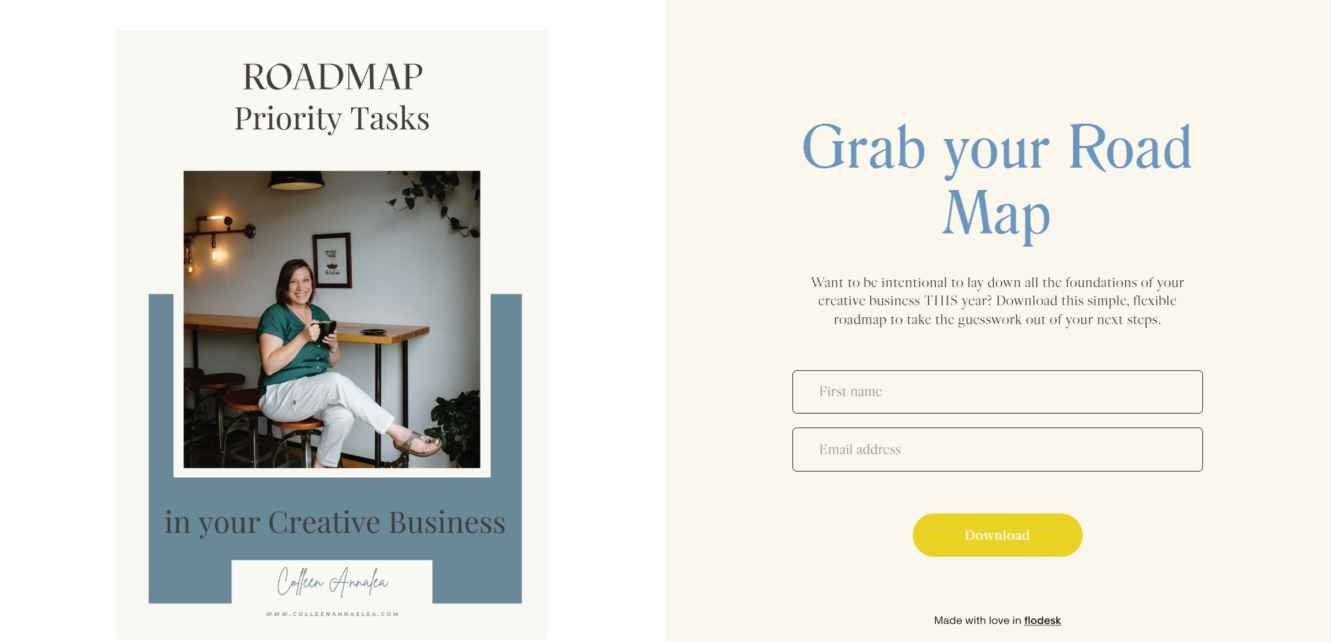
If you open any marketing book, you’ll find the same advice over and over: create a sense of urgency to incentivize people to take action.
Colleen Annelea does this by giving her audience a gentle nudge, mentioning that her freebie will help you drive action “THIS year,” and provide clarity on your “next steps.”
It’s way less alarming than a countdown or limited-time offer but still incorporates an element of timeliness, which makes this an appealing offer for people who are ready to take action.
What they’re doing right:
- Colleen is crystal clear on what happens after hitting the yellow button: you get a downloadable roadmap for building a creative business
- She incorporates a friendly picture of herself in her form, making you feel like you’re getting advice from her personally
7. KT Merry made a form that’s about her visitors, not herself
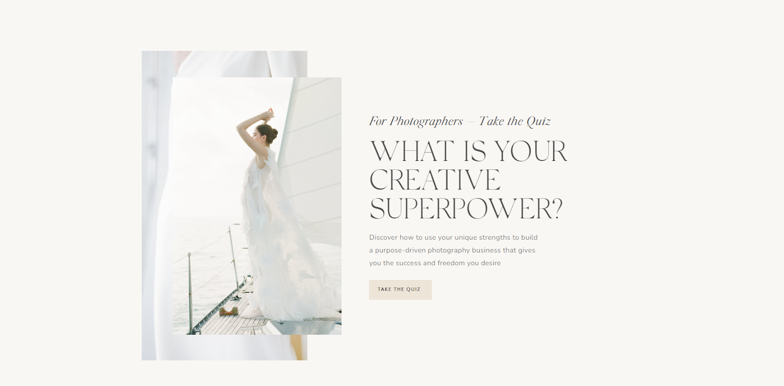
Who wouldn’t want to find out what their creative superpower is? KT Merry, a luxury destination and editorial photographer, made her lead form all about her website visitors. It makes use of a golden rule in marketing: people don’t want to hear about you, they want to know how you can help them.
KT Merry created a quiz that doubles as a lead form. It’s a great way lead generation tactic to gamify that first point of contact with people who may want to work with her. Instead of putting aside the time to provide a free discovery call (which might intimidate some people), she gets their wheels turning with a quiz.
What they’re doing right
- KT Merry maintains a focus on the reader and leads with a thought-provoking question that shows she understands her audience
- The form maintains her brand’s look and feel, and incorporates some of her high-end photography work to demonstrate her expertise, standards, and style
- She makes lead gen interactive and more fun than simply subscribing to a newsletter
Forms just the way you like them
Create on-brand forms that your audience can’t resist with a range of customizable templates
8. Get straight to the point, like Studio-AMA
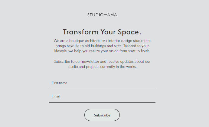
Simplicity is key in lead gen forms and Studio-AMA understands this. Their lead form is classic and timeless—just like their approach to architectural design.
Adding too many bells and whistles can dilute the impact of your call to action. Studio-AMA keeps its message simple and straight to the point, paired with a neutral design that leaves space for the audience member to bring their creative vision to life.
What they’re doing right
- Their form is fully on-brand and matches their designs: it’s simple, clean, and timeless, with space for the client to bring their own creative ideas
- They’ve kept messaging straightforward; what you see is what you get
- They ask for minimal information, making it easy to sign up
9. Put your mission in the spotlight, like Bianca Ariel
Lost for words for your lead generation form? Turn to your mission statement for inspiration. Bianca Ariel outlines both the kind of clients she seeks to work with and the benefits she brings them within her form.
She then lists out precisely what her content covers: guidance on life and career changes. This helps the audience know exactly the kind of career-focused content they’re opting-in for before handing over their details.
What they’re doing right
- Using on-brand messaging that aligns with their mission statement
- They kept it simple by only asking for two pieces of information
- They set expectations by outlining how often you’ll receive content, so you know you won’t get bombarded by emails
10. Use a Link in bio wisely, like Natalie Franke
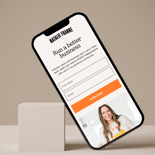
Your lead generation form isn’t just for your website. With a Flodesk Link in bio, you can build your email list right from your social media profile.
When Natalie Franke did this, she saw an uptick in subscribers within 24 hours of using a Link in bio. She says, “I never realized how many potential subscribers I was missing out on by having a more standard link in bio that just keeps directing people onward. A Flodesk Link in bio puts email acquisition above the fold as the priority.”
What they’re doing right
- She gives a clear idea of the value she’ll add: industry news and business tips
- It’s simple, short, and easy to grasp, from the headline to the CTA
- She shows that her community is big (with over 20,000 individuals), which is powerful social proof
11. Ask one relevant question, like Minimal Beauty

We love a good quiz. But sometimes when you’re on the hunt for product recommendations or tailored content, you don’t want to answer a bunch of questions.
Minimal Beauty lives up to their name, and only asks for one relevant detail in their form: skin type. This ensures that their audience will receive relevant content, without having to fill out a lengthy form.
What they’re doing right
- The design is just right and matches the brand’s look and feel. It’s clean, minimalistic, and relaxed: everything you want from a wellness brand
- The audience self-segments by adding in their skin type, ensuring content is personalized, and relevant to them
- The offer is clearly explained: monthly musings and practical tips
Hey there! Looking for an amazing landing page builder? Check out our guide on the top Leadpages alternatives
12. Add a creative CTA, like Erin
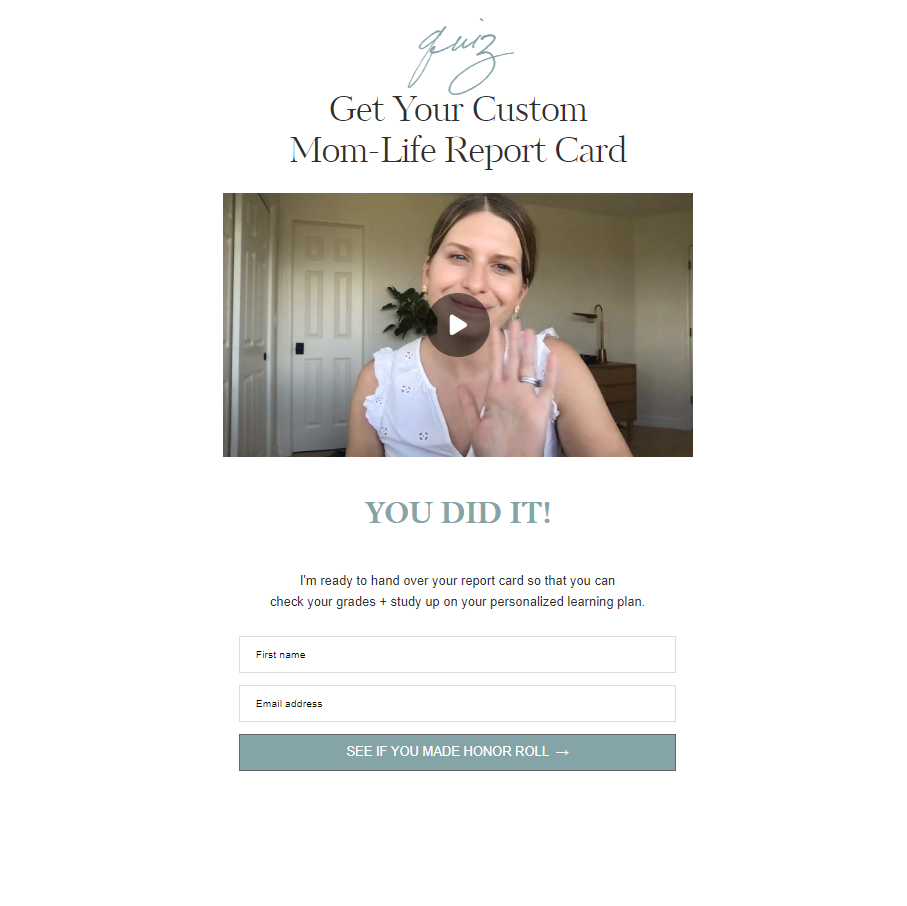
Erin from The Mom Life Handbook uses a Flodesk opt-in form to share a personal video and a prompt to sign up for her newsletter on her quiz results page. This is a unique approach that builds interest and helps her to connect with her subscribers.
Erin sticks to her educational messaging, by prompting readers to “check your grades” and “study up.” And she carries this through with her imaginative CTA: “See if you made honor roll.’’ It’s much more interesting than “Next” or “Subscribe.”
What they’re doing right
- Her clever CTA sparks curiosity and gets people excited to sign up
- She makes lead generation feel personal with a video instead of a generic thank you page. Erin shows her website visitors that she goes the extra mile
13. Snack Paper’s lead form encourages a purchase
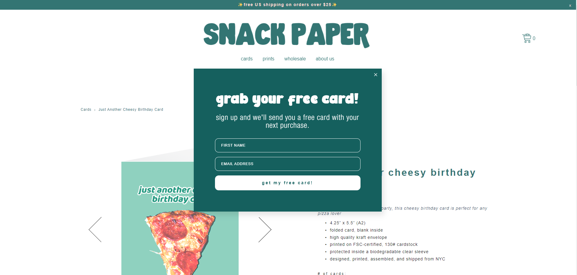
Who says lead forms can’t have an immediate impact on sales? You don’t always have to play the long game with lead gen. Snack Paper shares an immediate offer: a free card with your next purchase if you sign up.
What they’re doing right
- They provide an immediate and tangible benefit to filling out the lead generation form: a free card with your next purchase
- It is consistent with the look and feel of the website, by picking up on the site’s spot color and font
- It’s not too intrusive and you can still see the product you were eyeing
14. AnneMarie Hamant adds luck to lead generation
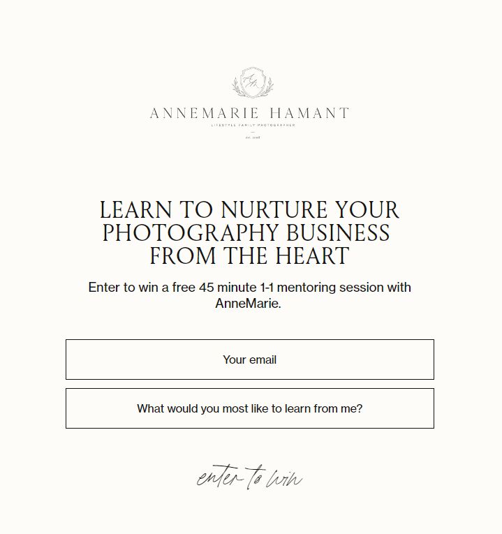
Some knowledge can’t be shared in a freebie or downloadable content. For some professionals, their value is best delivered in personalized, tailored sessions. Sadly, you can’t give everyone a free mentoring session without going out of business.
Instead, AnneMarie turns her lead generation form into a lottery for photographers. By gamifying her lead generation form, she adds an element of excitement to the process, which may increase her sign-ups.
Plus, you know you’re not getting generic advice. She asks what type of knowledge or tips you’re after, so she can deliver more personalized guidance to subscribers.
What they’re doing right:
- This lead generation form is chock-full of value. By including the chance of one-on-one time with AnneMarie, she targets photographers who are serious about growing their business
- AnneMarie gains vital insight into what her audience is after, by asking them what they want to learn. She can use these insights to improve her mentoring sessions and to deliver better content
15. Write a catchy headline, Rachel Rainbolt-style

Rachel from Sage Family cuts right to the chase with this cheeky headline. It’s bold, it’s fun, and it captures the reality of parenting, making for a perfect hook.
Rachel could’ve gone for something safer, like: “Are you a frustrated parent?” But that wouldn’t have had the same effect. Instead, she makes it clear how frustrated parents feel in the kinds of difficult moments they want to learn to manage better. Using clever copywriting, she shows her audience that she can relate to how they feel.
She also outlines exactly what you’re getting out of signing up: 12 proven tactics to help you keep calm.
What they’re doing right
- The headline catches your interest quickly and uses informal language to build a connection with the people she wants to reach
- She’s clear on what you’re going to receive. It’s a good move because a “fun surprise” is probably not what tired parents are after
- Her CTA “get the secrets” is perfectly aligned with the freebie she offers
Create the perfect lead generation forms with Flodesk
Using these top tips and Flodesk’s beautifully designed templates, you’re ready to grow your business with effective, on-brand lead generation forms.
Grow your list and take your small business from good to great by using our fully integrated platform. But first, get started with a Flodesk Link in bio and start converting 40x better than traditional website opt-in forms. Get yours—completely free.

Related Articles