8 Sales page templates and tips: How to create a high-conversion landing page
Table of Contents Jump to:
Jump to:
Table of contents
TL;DR: Ready to boost online sales? We’re sharing top landing page templates designed to sell for every niche—plus tips to build a high-converting sales page in minutes.
Wondering how you can boost online sales year-round? Whether you’re pitching your digital product, promoting an event or workshop, or looking to land more clients, you need an online landing page that can grow your business. A page designed to turn page scrollers into paying customers.
Sale pages can be a transformational point in your sales funnel. With high-converting design principles and tactics, these pages draw visitors in with an irresistible offer and can get them clicking in all the right places. An effective sales page should do an extraordinary job pitching your products, services, and events to help increase sales and achieve business growth—without needing to lift a finger.
Templates take the guesswork out of building a landing page that sells and helps you create beautiful designs. Keep reading for tips and templates to start selling online right now.
What is a sale page?
A sales page is a page, usually on a website, that turns online visitors into customers by persuading them to take action or buy what you’re offering. They’re designed to sell products and services. A great sales page will make visitors feel seen and heard rather than sold to, leaving them with no choice but to act.
They’re informative and persuasive, providing just enough details to entice action.
What is a conversion?
In the digital world, a conversion occurs when a person moves from online visitor to customer in the sales funnel by performing a desirable action. Actions might include:
- Enrolling in a workshop
- Purchasing a digital product
- Downloading a freebie
- Buying a service
The best sales pages convert visitors consistently using engaging copy, strong calls to action (CTAs), and strategic landing page design to drive results.
8 Effective sales page templates to start selling now
Sales page templates make creating high-converting landing pages quick and easy to do. We intuitively design templates to convert, so all you need is copy, visuals, and an irresistible offer to get started.
What makes a great sales page template great? And which template is best for promoting your unique offer? Here’s a roundup of eight powerful sales page templates, what they’re good for selling, and what we love about them.
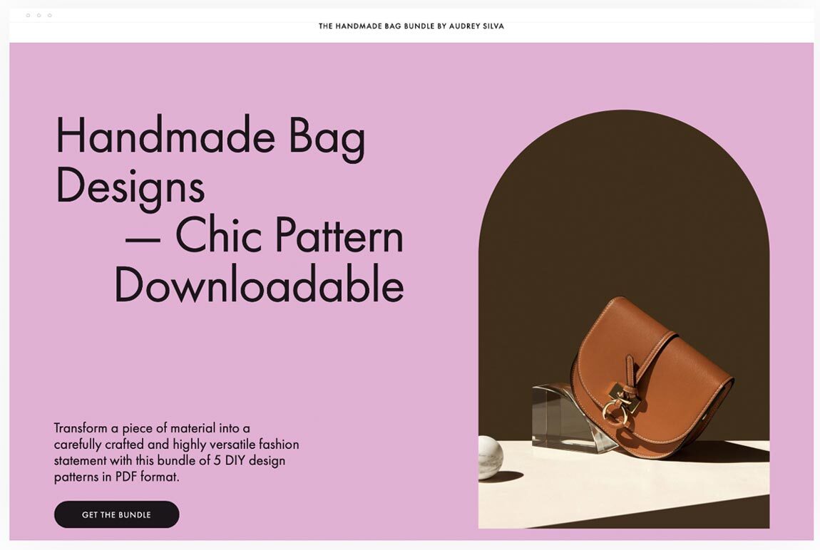
1. Sell a digital product
When you’re selling a digital product, creating a compelling sales page is critical to growing your business. You need a template that showcases the full breadth and benefits of your product while keeping page visitors engaged—from first scroll, through first sale.
This template is ideal for selling digital products. It leads with an attention-grabbing headline and striking product image before providing a simplified explanation of product details and benefits. It establishes brand trust with content blocks that speak candidly to customers’ needs and multiple points of social proof throughout the page.
Page visitors have numerous opportunities to make a purchase, with CTA buttons from top to bottom of the page. Overall, this sale page template is great to use as-is for selling a digital product, or you can customize it further to meet your specific needs.
What we love about this template
- An eye-catching headline and image immediately draw attention to the first page block
- It uses social proof, such as customer testimonials and ratings, to build trust throughout the template and encourage digital product sales
- There are CTA buttons throughout, providing multiple conversion points to turn page visitors into customers
- We designed this template to include a lot of information while maintaining minimalistic design principles. The spaced-out text and images allow visitors’ focus to be narrowed on key page elements
2. Boost online course sales
Whether you’re looking to boost sales for an existing online course or are prepping for a course launch, sales pages can help prospective students go from feeling curious and on the fence to being excited and ready to enroll.
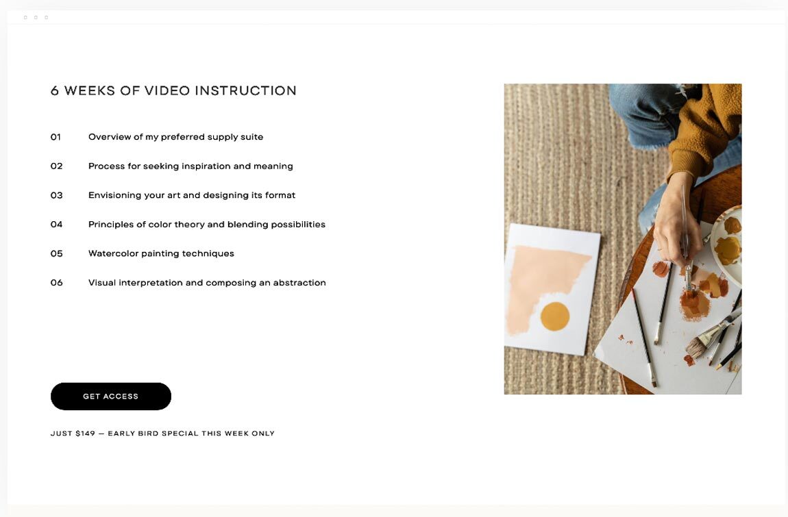
Signing up for an online course takes more than a financial investment—it requires customers to put forth dedicated time and energy, too. It’s critical for prospective students to feel confident in their investment. That’s why you should choose an online course template that provides ample room to instill trust and break down course details, such as topics, timelines, and outcomes—all without creating an overwhelming landing page experience.
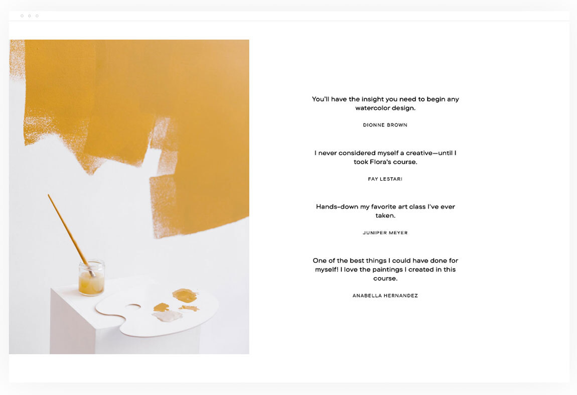
This template does a great job of balancing information with a beautiful, simplistic design. It reinforces trust by leading and ending with multiple testimonials from previous students. The online course has been simplified into an easily digestible, week-by-week view. There’s no questioning what students will walk away from the course with—it lists all outcomes.
What we love about this template
- The clean, beautiful template design creates an enjoyable visitor experience
- A listed course breakdown and timeline provide key course information, without overwhelming the visitor
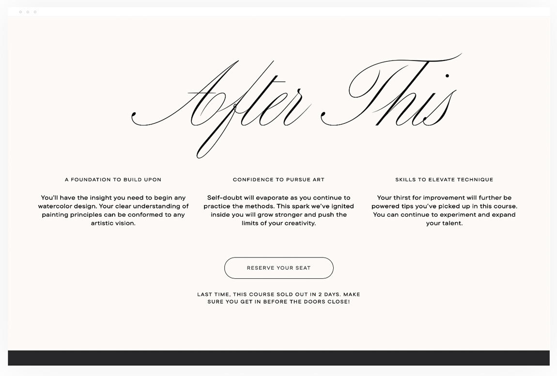
- It highlights course outcomes, allowing prospective students to feel confident in what they’ll gain from enrolling
- Previous student testimonials throughout the page build trust and encourage sales
3. Book more sessions
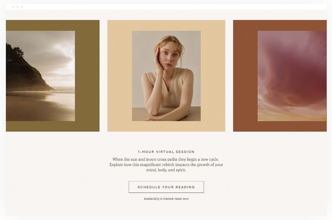
Sell one-on-one sessions with a sales page template designed to give potential clients a highly personal experience with your brand. This expressive, whimsical template leaves plenty of room for striking brand visuals while pulling back the curtain on the value rooted within your offer.
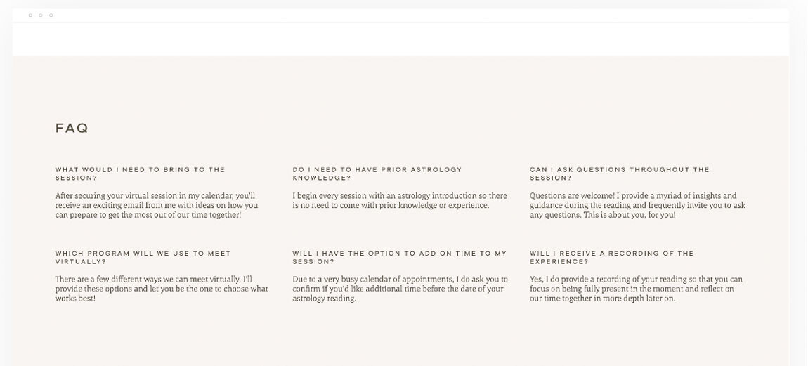
The template features content blocks for enticing upsells, social proof, and a personal introduction. The detailed session breakdown paired with a thoughtfully curated FAQ section eases any customer concerns. If you’re looking to book more sessions, this template is an excellent choice for your brand.
What we love about this template
- It’s designed to forge a deeply personal connection with potential clients, which is vital for selling one-on-one offers
- The strong focus on brand visuals draws eyes toward key sections on the page
- Each block instills a sense of urgency, using strong calls to action and limited-time upsells to drive conversions
- We especially love how this template eases any customer concerns by providing room for detailed explanations, outcomes, and an FAQ section
Read next: 15 lead-nurturing email examples
4. Drive freebie downloads
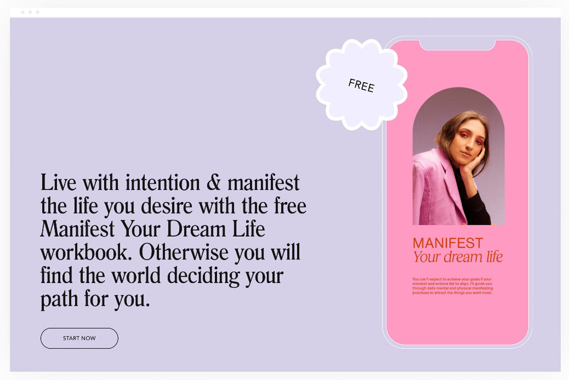
There’s no better way to grow your email list than by creating a juicy freebie offer that people can’t wait to get their hands on. Create a list-boosting lead magnet with a landing page template that drives freebie downloads in no time.
Rather than build long-form sales pages filled with extensive copy and trust signals, you’ll want to choose a short-form template that quickly outlines the key benefits of your offer and can get visitors downloading quickly.
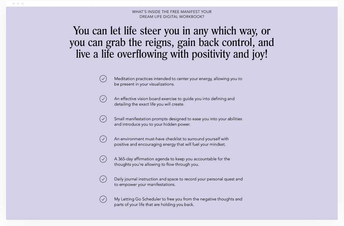
This landing page template does a great job by providing a bulleted list of what’s inside and placing a CTA within each block of the page. It includes a brief personal introduction that adds authority to the offer while maintaining a consistent focus on what visitors should do: download the freebie.
Looking to simultaneously drive sales with your freebie? Add a paid upsell at checkout to increase revenue. Drive traffic to your freebie page and watch your email list grow.
What we love about this template
- This simple, short-form page design is packed with clear calls to action
- It clearly defines freebie details and benefits in a bulleted list format
- The introduction section adds a personalized touch and builds authority
5. Grow E-Guide sales
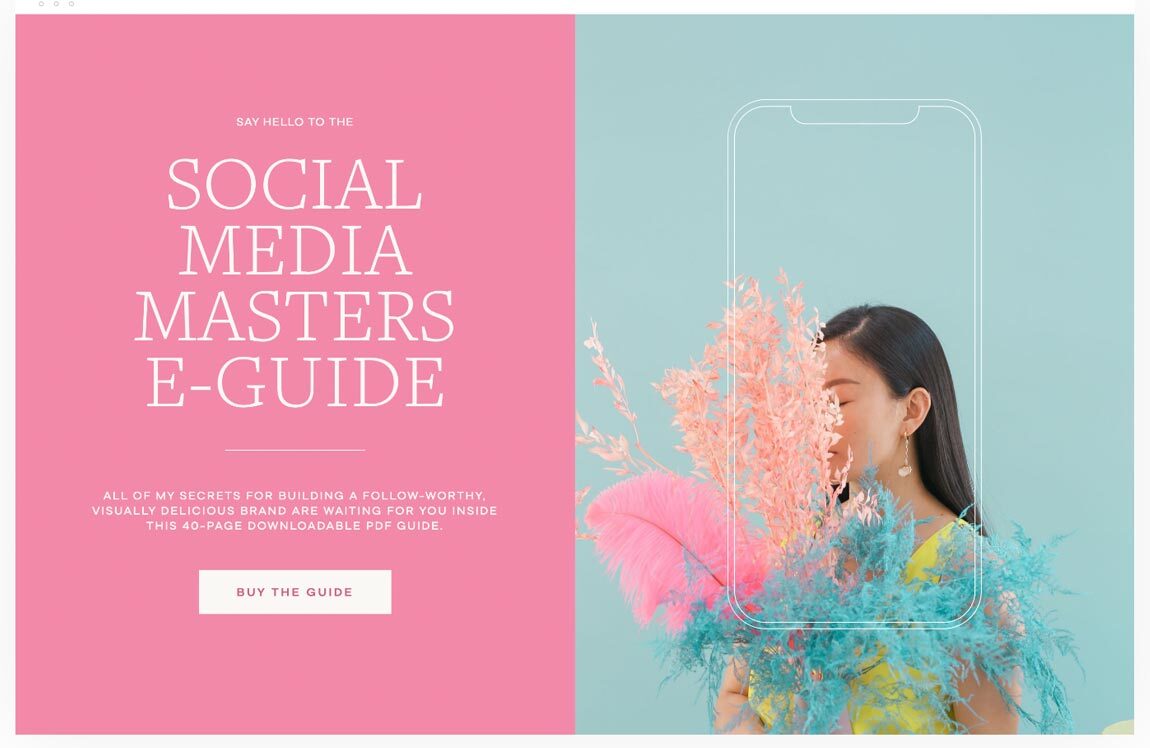
That’s where a sales page template comes in handy. This template is perfect for growing e-guide sales and attracting those who could benefit from your offer. The highly visual design coupled with exciting mockup blocks help showcase the benefits of your e-guide or ebook in a simple, stunning way.
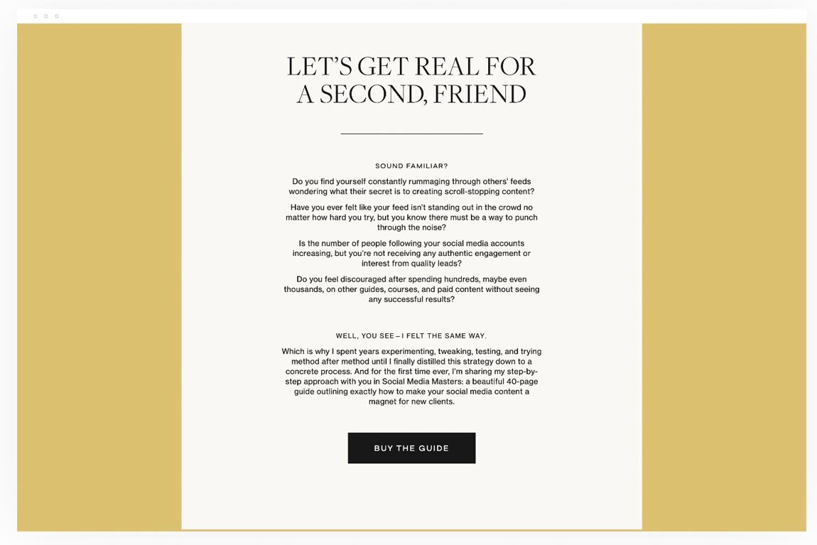
Plus, the long-form text blocks give you the chance to speak candidly to your audience about the challenges you already know they’re facing—hurdles you can help them overcome with your e-guide. Like other templates, it includes high-converting content blocks that outline the details and benefits of your offer, supported by trust signals.
What we love about this template
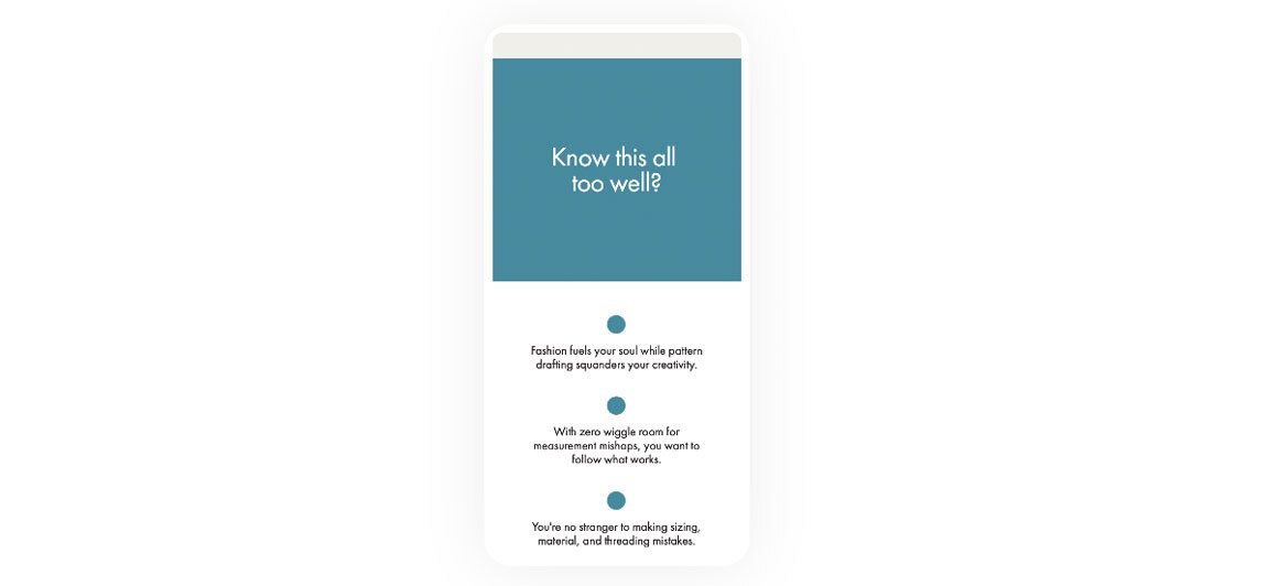
- With a focus on personalized storytelling and addressing consumer pain points, this template makes visitors feel seen and heard
- The page leads with a strong headline and sub-headline, followed swiftly by a CTA
- Mockup blocks seamlessly showcase e-guide benefits and features
- Multiple content blocks instill urgency and create an enticing, limited-time offer with optional free bonuses and discounts
6. Promote registration for a workshop or event
If you’re organizing an event or workshop, there’s a small window of opportunity to promote ticket sales. You need a sales page that single-handedly builds excitement, answers questions, and prompts visitors to register now. We think this template perfectly achieves all three aspects, helping you sell out every seat.
With multiple call-to-actions above the fold, registration is a top priority. The bold, eye-catching typography and visuals beautifully highlight how attendees will benefit from signing up, what to expect, and more.
With a personal introduction, you can immediately establish yourself as an industry expert, with space to showcase relevant awards and recognitions you’ve received. By promoting registration with this template, you can sell out your event or workshop in no time.
What we love about this template
- It highlights the benefits attendees will receive from signing up, what to expect, and more
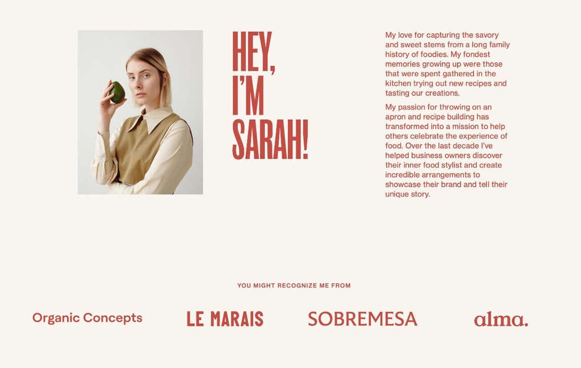
- An introduction block fosters a more personal connection to the event while establishing added authority
- There’s no questioning what attendees can anticipate—it neatly outlines all information in an FAQ-styled list
- Bold visuals and typography create a memorable and highly effective design experience
7. Sell your services
Maintain a fully-booked services calendar with a template designed to consistently convert page visitors into new clients. If you’re a service-based business owner, building trust and authority throughout your landing page is extra important. People want to hear how you’ve helped others and why you’re the expert they need to solve their problems. You need a template that makes working with you a no-brainer.
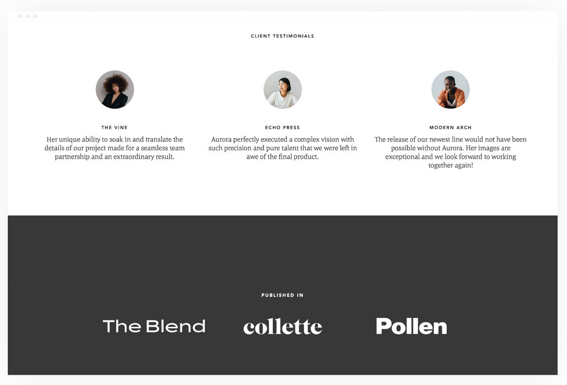
This template is fantastic for selling your services. Its airy, versatile design makes it easily customizable to any service or brand. It offers reassurance throughout every step of the sales flow, using testimonials, data, and recognitions to instill confidence.
Content blocks allow you to provide a detailed explanation of your service offerings and numerous moments to convert. Promote your services while staying on brand with custom brand fonts, colors, and visuals. Pair this template with an irresistible service offer and watch the sales pour in.
What we love about this template
- There’s no limit to what you can create with this sales template—the versatile design is intuitively built to help you convert visitors using a combination of beautiful imagery, text, and multiple CTA buttons to increase bookings
- It prioritizes trust signals, with a variety of confidence-boosting content blocks scattered throughout the sales flow
- It offers clearly defined service details and outcomes in simple columns and lists
- The airy template design maximizes blank space to direct visitors’ focus to key points on the page
8. Enroll more participants in your program
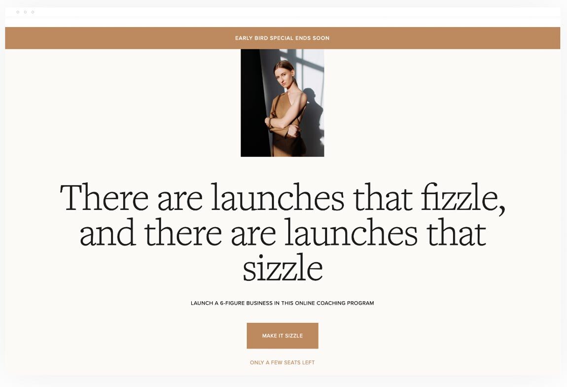
Are you looking to sell coaching packages, virtual training, or templates? Make your offer appear both exciting and professional with this light and brightly designed long-form sales page template. Introduce your offer with an eye-catching headline, followed by an opportunity for visitors to buy. Build excitement for your program with strong social proof from previous participants.
Reinforce why visitors need your program and what they can expect by using this template’s airy design paired with bulleted lists and timelines. The versatile mockup designs allow you to showcase your guides, templates, or program results visually.
This template includes a wide variety of high-conversion sales tactics that are perfectly suited for enrolling more participants in your program. Use the existing template or customize content blocks to meet the unique needs of your program and audience. The choice is yours!
What we love about this template
- With a wide variety of trust signals sprinkled throughout the page, potential customers can feel confident in the program’s quality and outcomes
- Compelling data-driven blocks provide external reinforcement to purchase
- All headings and subheadings prompt action followed by a CTA button to purchase
- Versatile mockup designs provide visual examples of program results
- With a limited-time bonus offer and comparative pricing, there’s added incentive to enroll in the program immediately
Preparing to create a sales page
Before you begin building a sales page, you first want to determine the information you’ll include. You need to get crystal clear about what you’re offering, who you’re selling to, what benefits your offer provides, and why people should buy.
Not sure where to start? Here’s what you’ll want to consider.
What are your goals?
What do you want your sales page to achieve? Do you want visitors to enroll in a course, workshop, or event? Are you selling a digital product or service? Clarify your goals and use these as the North Star for your planning and copy.
What are you selling?
Sales pages are made to drive purchases—so you must have a solid understanding of what you plan on selling. We recommend focusing on one to three offers maximum per landing page (although one offer is ideal). Providing too many offers can overwhelm visitors and lead to low conversion rates.
Know your offering inside and out. Understand your product or service features and the benefits they provide.
Understand your positioning and strengthen your pitch
Creating effective sales pages—or marketing strategy—starts with understanding the market, your audience, and your unique selling points.
How does your offer stack up against competitors?
Research the competitive market and compare your offer’s features and benefits to others in the industry. Uncover what key benefits differentiate your brand and consider how to market those differences to your advantage.
How well do you know your audience?
Now is the time to clarify who your target audience is and what problems they’re facing—problems your brand can solve. Doing so will help you write copy that speaks directly to your customer’s pain points and needs, making your brand the obvious solution and best choice.
Are there facts or figures that can add to your sales pitch?
Stats, facts, and hard data can often lend credibility to a product or service pitch. Explore relevant studies, industry publications, and credible data for persuasive information to add to your page.
Gather credibility factors to instill trust
Boost your credibility by implementing trust signals and social proof on your landing page. Collect testimonials and key success metrics from previous customers. Increase your authority by highlighting relevant awards, recognition, and publication features you’ve received.
What to include on a sales page
Phew—you’ve done the heavy lifting of preparing to create a sales page. Congrats! Now it’s time to build one. Creating an engaging sales page that gets people eagerly clicking all the right buttons is no easy feat—it’s an art. One you can learn with these simple tips!
Ready to get started? Here’s what you should include in a sale page to achieve high-conversion results:
Top elements to include on a sales page
1. An eye-catching headline and sub-headline
Drive sales with a leading headline that’s attention-grabbing, yet simple. Command readers’ attention by focusing on your offer’s solution to customers’ most pressing needs.
2. Images, graphics, and brand elements
Images increase a piece of content’s chances of being read by 80%. Visuals direct attention to key sections of your page at first glance. Place a striking visual above the fold, and use brand photography to showcase your products or services. You can also use graphics and mockups to simplify information and highlight key messages on your sales pages.
Customize your page design to match your brand by placing branded elements throughout the page. With Flodesk Checkout, maintaining brand consistency is easy. Upload logos and visuals; save brand colors and fonts; and easily match the look and feel of your brand—just like you do with Flodesk Email. Sign up for our free trial to try Flodesk Checkout for yourself.
3. Multiple calls to action
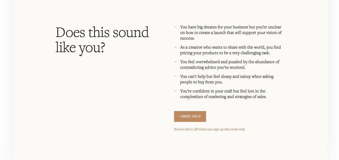
To achieve high-converting results, encourage visitors with calls to action throughout the sales flow. Place your first CTA at the top of the page, right below your sub-headline or introduction.
Include additional CTAs throughout the page, focusing on key opportunities to convert customers (such as the below product or service descriptions). We recommend using colored or outlined buttons to make your calls to action pop and increase click-through rates.
Pro tip: Before you launch your sales page, review each CTA and test buttons to ensure all links are working properly. Nothing throws a wrench in a sales plan like broken links.
4. Customer pain points
Use consumer research to meet your customers where they are. Craft copy that makes your customers feel seen and heard, while candidly addressing the challenges they’re facing and how you can solve them.
5. Explanation and benefits of your offering
Provide a simple explanation of what you’re offering, including key features and pricing. If you’re selling a course or workshop, provide a timeline and brief overview of what you will teach. Similarly, if you’re offering a product or service, clarify what customers can expect.
Share the benefits of your product or service by using bullet points, tables, or graphics to outline added value. Consider implementing an FAQ section to answer visitors’ most pressing questions.
Pro tip: Always frame your benefits to solve customer pain points. Make your brand the obvious solution to their challenges, giving them no other choice but to purchase your offer.
6. Trust signals
Many customers look for trust signals before making an online purchase. They want to feel confident in their purchases and trust that they’re making a good decision—and who can blame them? With an overwhelming amount of options to choose from online and inflated marketing claims to sift through, buying decisions have never been more difficult.
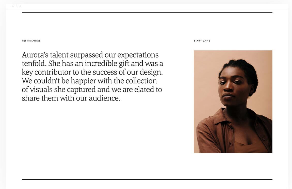
Nothing instills brand trust quite like hearing about other people’s experiences with a product or service. That’s why it’s crucial to add confidence-boosting elements or social proof to your sales pages. Include written or video testimonials, product reviews, and endorsements. Showcase your relevant awards and recognition. Sprinkle these throughout your page, ensuring there are trust signals from beginning to end.
7. Introduce yourself
Putting a face to your brand can be an effective sales-boosting tactic. Consider adding a brief bio or introduction to your landing page. Doing so can make your brand feel more familiar, approachable, and authentic. Instead of supporting a business, customers will feel like they’re supporting a person—and that makes all the difference.
8. Use blank space to your advantage
Headlines and visuals aren’t the only way to draw attention to important elements on your sales pages—blank space can also help direct visitors’ focus. Airy templates can transform visitor experiences on your page from overwhelming to enjoyable.
9. Consider instilling an urgency factor
Do you have short-term sales goals to hit, or a limited offer to sell? Persuade visitors to act now by adding a sense of urgency. Present your offer as a limited-time or limited-supply deal. Consider using language, like “Get started now” or “Only two spots left—buy now,” in your calls to action.
Use templates to create amazing sales pages in minutes
When done right, sales pages can be highly effective in driving online sales. But whether you’re a sales page expert or not, building a landing page that sells requires a lot of time and energy—two things that can feel scarce as a small business owner.
Sales page templates ease the creation process and are intuitively built to convert customers. Save months and create amazing sales pages in minutes with a template builder.
Flodesk Checkout is the easiest way to sell online. You don’t need a complicated mix of tools to sell your offer—in fact, you don’t even need a website! Our templates make it easy to tailor pages to your brand and create a customized sales experience, from page visits through payments. Each template is optimized for conversions as-is, but you can easily edit, add to, or delete page blocks with our drag-and-drop designs.
Don’t waste your precious time fiddling with extra tools and integrations to build sales pages. Create a swoon-worthy page that sells in less time than it takes for you to brew your morning coffee. Try Flodesk for free.
