10 Checkout page examples and best practices to supercharge your sales flow
Table of Contents Jump to:
Jump to:
Table of contents
TL;DR: Curious how you can seamlessly convert more customers online? Learn how to create a stunning checkout page that transforms a tedious customer experience into a terrific one.
Imagine scrolling your phone on the go and you see a promotion for a product you’re interested in purchasing. You click through to the mobile sales page and are sorely disappointed by the clunky, unresponsive design. After trying to maneuver the checkout process on mobile with no success, you decide to pull out your laptop to complete the purchase.
Unfortunately, the desktop checkout experience isn’t user-friendly either. You’re led through a lengthy click-through process; required to create an account and input your details multiple times just to place an order; and notice several surprise add-on charges on final checkout. The cherry on top? Your preferred payment method isn’t supported. Naturally, you do what most online shoppers would do: abandon your shopping cart and never return again.
For many online shoppers, this scenario is all too familiar. The average online shopping cart abandonment rate sits almost at a whopping 70% across industries—signaling that too few brands focus on optimizing their checkout page experience.
Yet, tailoring your audience’s journey through your sales funnel—especially at checkout—can help you reach your business goals and convert more customers. Experts estimate that you can increase checkout page conversions by over 35% with the right checkout optimization strategies in place.
Thinking about creating a checkout page? Look no further. We’re sharing the top features of the best checkout pages and 10 exceptional ones to inspire your own.
Checkout pages: What they are and why you need one
A checkout page marks the final step of a customer’s conversion journey—it’s perhaps the most important point in a sales experience. When customers reach your checkout page, it should seamlessly guide them through a simple process to purchase. Every brand can benefit from a checkout page—no matter if you’re selling products, services, or freebie offers.
Do you dream of making sales while you sleep? With an excellent checkout experience in place, that dream can become a reality. Great checkout pages are intuitively built to convert customers quickly and close more sales.
Common features of a great checkout page
If you’re looking to boost online sales, building an effective sales funnel that nurtures prospective customers through a journey with your brand is crucial. There are countless ways to attract and encourage prospects at the top of your sales funnel with an effective e-commerce marketing strategy in place—but there’s only one way to close sales: a checkout page.
So, how do you create a foolproof checkout experience that sells and leaves customers coming back for more? While each brand has unique needs and audiences to appeal to, there are a handful of common features that every great checkout page experience includes.
Elements of a great checkout page:
- Fast, easy checkout process with as few steps as possible
- Responsive, attractive design across devices
- No distractions on the checkout page itself
- Frequent CTAs that motivate quick purchases
- On-page icons and security badges at payment that reassure a secure purchase process
- Social proof, like testimonials and reviews, to earn trust and share customer reviews
- Brand imagery, photography, colors, and typography that create an iconic and pleasing on-page experience
While the following elements aren’t essential to checkout pages, they can elevate the customer experience and encourage future purchases:
- A progress bar throughout the entire checkout experience
- Guest checkout option so customers can easily make quick purchases without an account
- No surprise charges—all fees, including taxes and shipping costs, are clearly outlined and included in the total price
- Accept multiple payment methods to encourage more purchases and avoid driving prospects away
- Instant delivery that can provide customers with immediate receipts, downloads, and custom messages post-sale
Together these page elements can lead to higher sales, lower abandoned cart rates, and a phenomenal customer experience. But constructing an effective checkout page takes time—a resource that can feel scarce for busy entrepreneurs and business owners.
Save yourself precious time and ease the burden of building a page from scratch with checkout page templates. Checkout templates are ready-made with all the elements of the best checkout pages along with impressive designs that you can customize for your brand.
There’s no easier way to start selling online than with Flodesk Checkout—the drag-and-drop interface and beautiful templates are fully optimized to drive your sales goals forward. Our templates, your brand—customizable, fabulous, and ready to publish in mere minutes.
Build powerful checkout pages with Flodesk Checkout
Use Flodesk’s high-converting and customizable sales and checkout page templates to convert visitors into paying (and repeat) customers.
10 Best checkout page examples to inspire your own
If you’re looking to level up your existing checkout page or create a brand-new one, you’re in the right place. There’s no better way to get inspired than by exploring examples of great checkout pages from other small businesses and entrepreneurs.
We’re sharing ten outstanding examples of checkout pages at work, featuring a range of industries and offers. See what creative approaches others have taken to create memorable experiences that sell and get inspired to build your own!
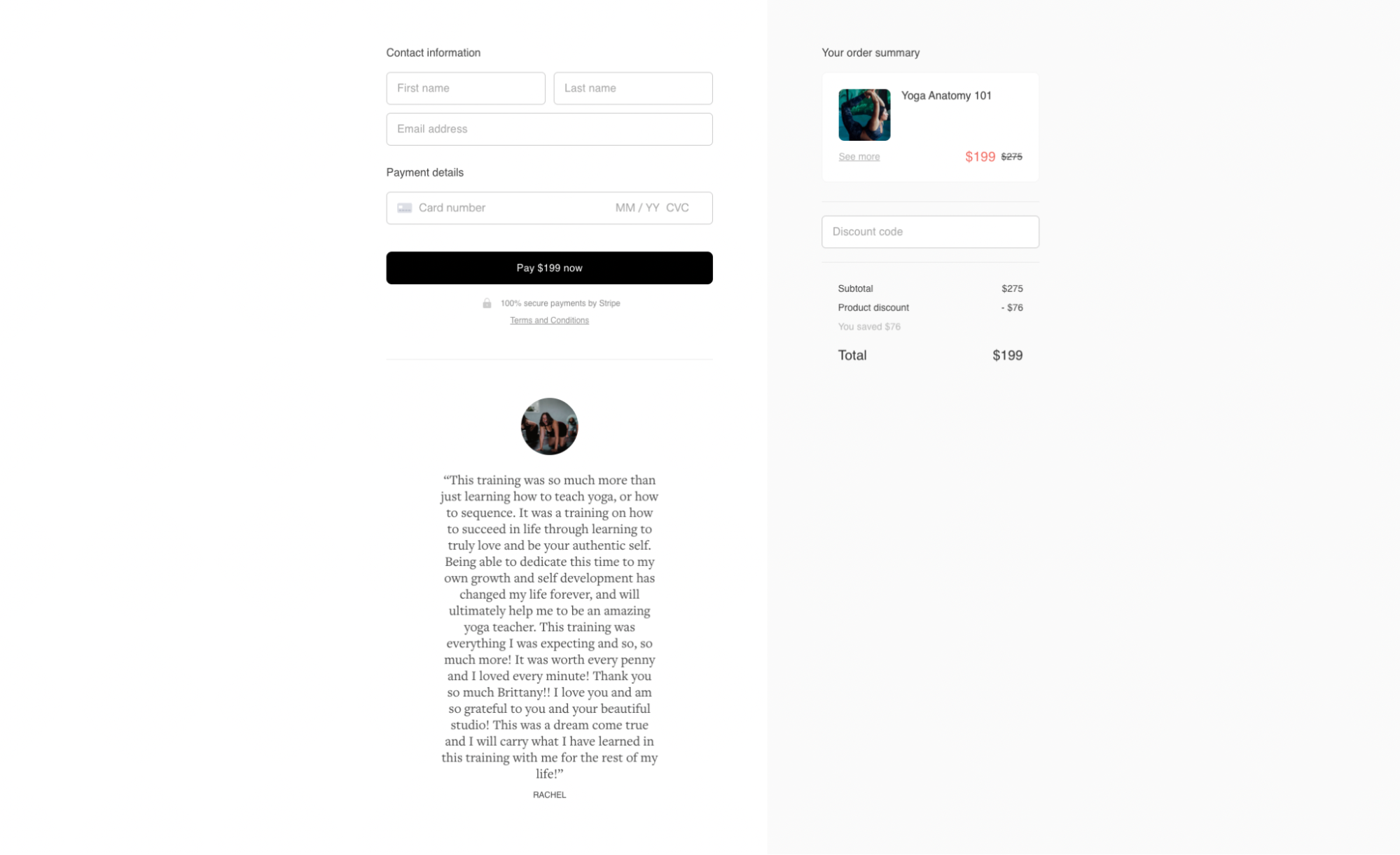
1. Yoga Anatomy 101
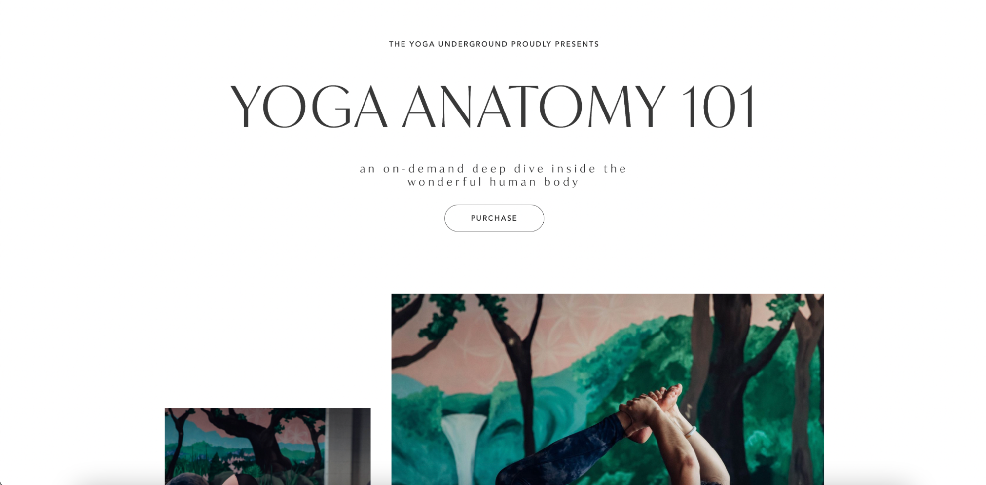
The look and feel of your checkout can influence customers’ experience with your brand—and ultimately, their decision to buy. This checkout page from The Yoga Underground does a beautiful job of balancing imagery with information to sell their yoga anatomy course. It neatly places key information about the course—plus a call to action (CTA) button to purchase—above the fold.
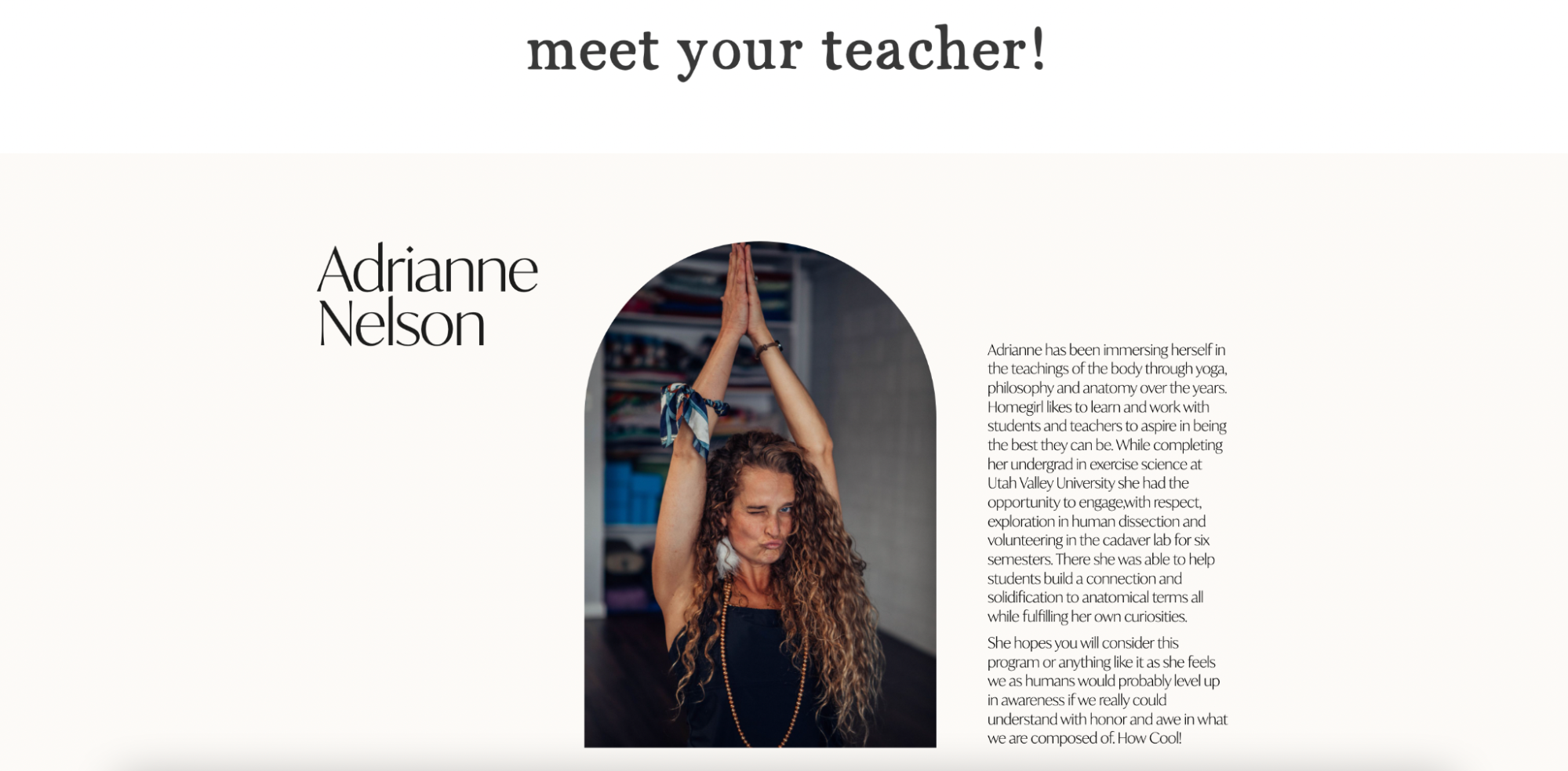
Adrianne Nelson, the course instructor, introduces herself with a short biography and fun headshot—both of which establish authority while showcasing brand personality. This checkout page is a prime example of how the imagery, copy, colors, and design you choose to use online can charm prospects and give them a better idea of who you (and your brand) are.
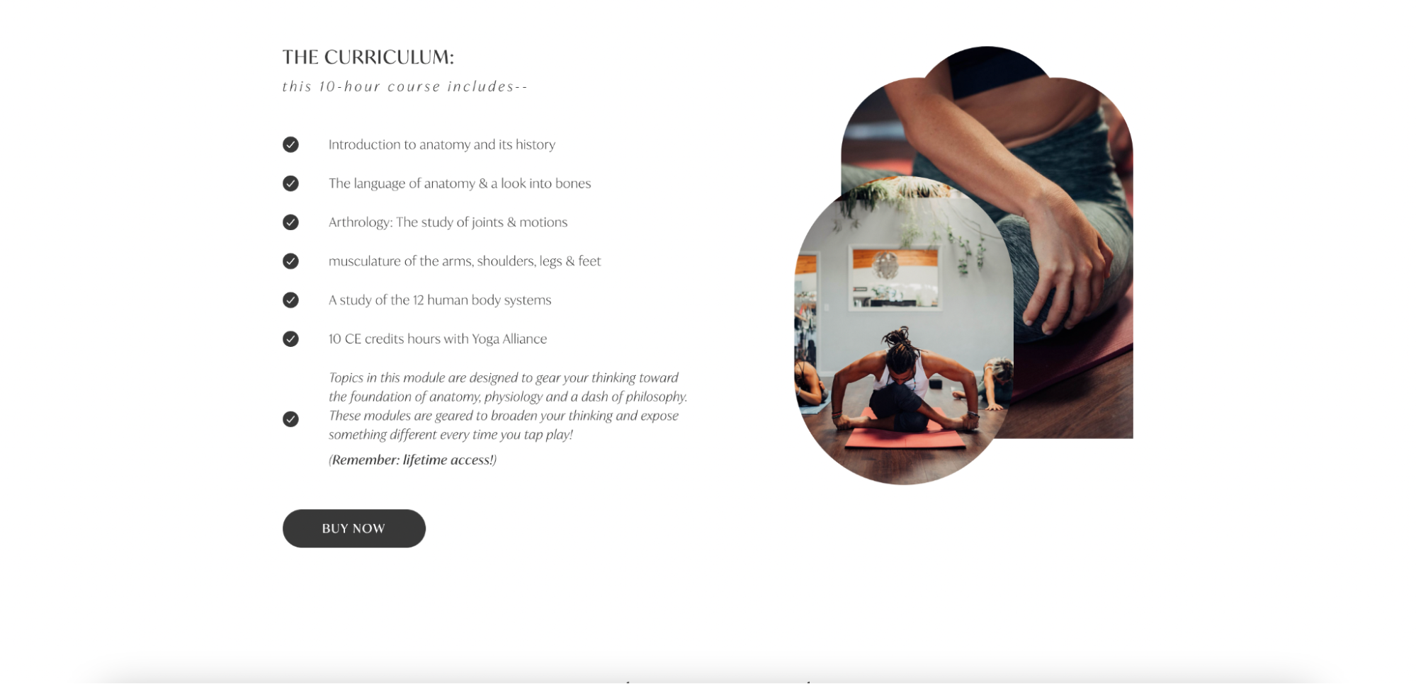
The checkout page breaks information throughout the page into easily-digestible bullet points, plainly outlining timelines, outcomes, and inclusions. Once a page visitor clicks a CTA button and navigates to the payments page, the brand experience continues with a simple payment process—complete with a secure payments badge and reinforcing testimonial—to close the sale. Overall, The Yoga Underground has built a pleasant checkout experience that encourages sales.
What we love about this checkout page
- Eye-catching headlines, minimalist design, and beautiful imagery work together to create a distinctive brand experience
- It provides all key information in clean, bulleted lists and a reassuring FAQ section
- The fast, easy checkout process promptly guides visitors through payment
- On final checkout, a discount is applied—incentivizing quick purchases—plus all costs and discounts are clearly outlined in the total price
2. Healthy You 2023

Checkout pages aren’t just for selling paid products and services—they can be powerful drivers for free offers, too. Enroll more participants in free courses or events, boost digital downloads, or deliver access to exclusive bonuses. No matter your objective, a checkout page can help you achieve new, high-conversion milestones.
For example, this Healthy You 2023 checkout page shares a live, interactive event designed to help participants reach their annual health goals. Although the event is free to sign up for, Victoria—the health coach behind the offer—uses a checkout page to guide participants through her conversion flow.
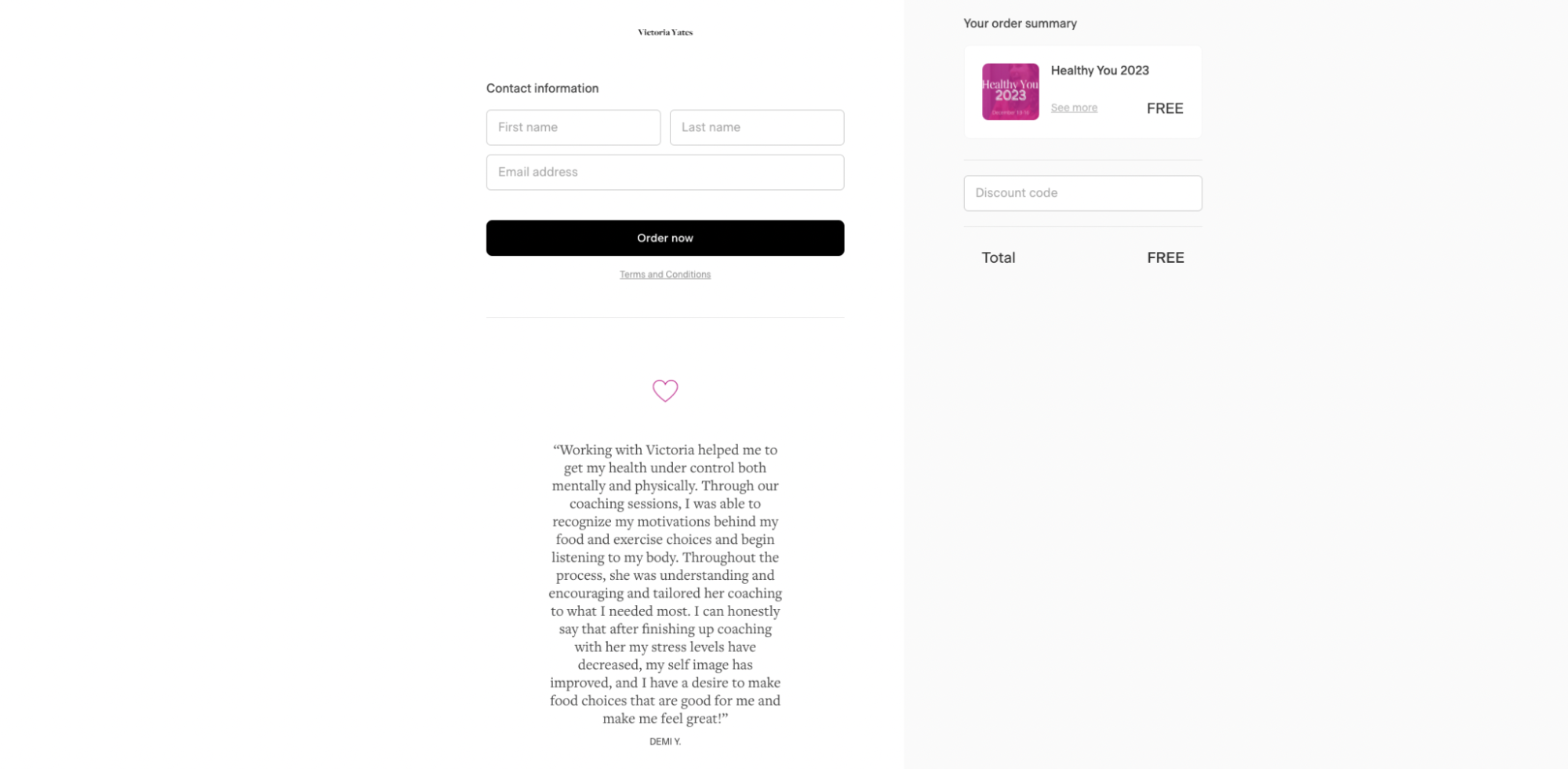
Instead of collecting payment details, she captures participants’ names and email addresses—a clever tactic to help build her email list and further nurture customer relationships beyond the free event. While this checkout page likely won’t boost Victoria’s online earnings just yet, it puts her in a great position to grow in the future.
Now, prospects can have a positive checkout experience with the brand, benefit from the free event, and join Victoria’s email list—making them more likely to buy the brand’s offerings in the future.
The checkout page itself makes a compelling pitch that’s backed by social proof, such as client testimonials and reviews. The bold CTA buttons and colors pop on the page, urging visitors to click through the entire checkout process.
What we love about this checkout page
- Frequent, boldly colored CTA buttons throughout the page provide ample opportunities to grow enrollment
- The short-form, no-fluff checkout page experience drives quick sign-ups
- It neatly lists what participants will gain from the event
- Victoria’s expertise is apparent through her author biography paired with strong testimonials
3. Watercolor Workshop
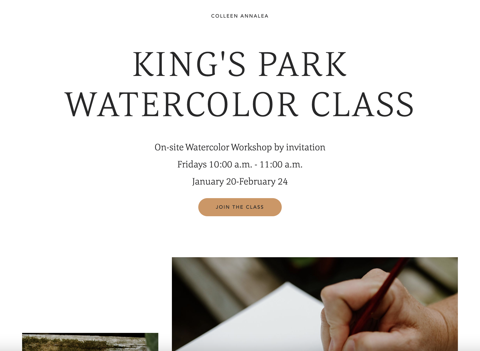
Colleen Annalea is a creative entrepreneur with a passion for teaching others the art of watercoloring. She offers a variety of different creative workshops, including this parkside painting workshop. The minimalist page design of Colleen’s checkout creates a soothing user experience chock-full of important class information, without overwhelming the page with text.
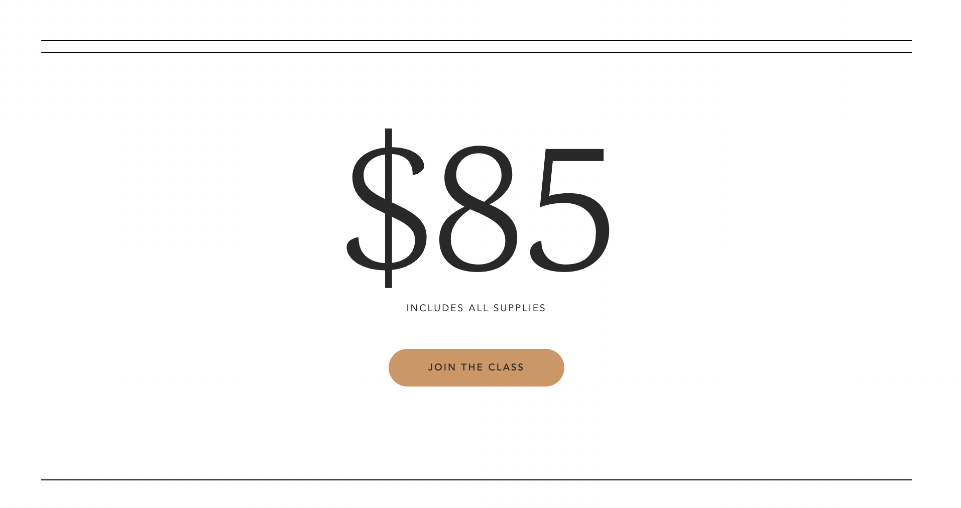
The large bolded price block is attention-grabbing and swiftly drives page visitors to join the class with a CTA button that stands out. Speaking of eye-catching—we can’t go without mentioning the stunning photography Colleen has selected to showcase her offering and echo her brand style. The visuals add to the on-page experience.
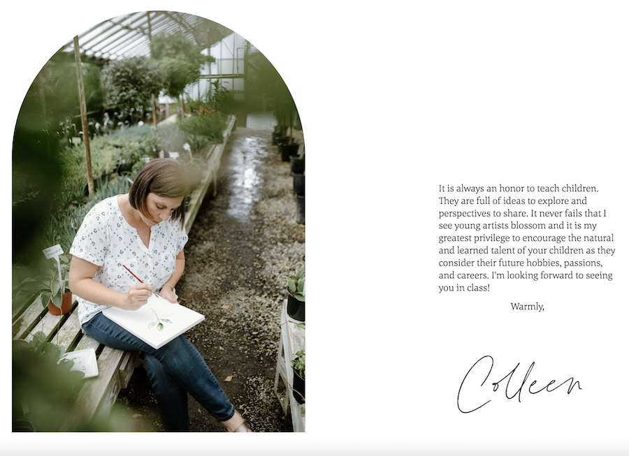
The personal biography blocks give customers a sweet, candid perspective on who Colleen is and why she teaches. When visitors navigate to payment, they’re reminded of important class info within the “order summary” section before entering their details to enroll.
What we love about this checkout page
- Phenomenal brand photography showcases the offering and the brand’s style
- Clean page blocks with colored CTA buttons and minimal text help direct visitors’ focus
- Both of Colleen’s candid biographies showcase her passion and establish her expertise
- Visitors go through a consistent branded experience from start to finish
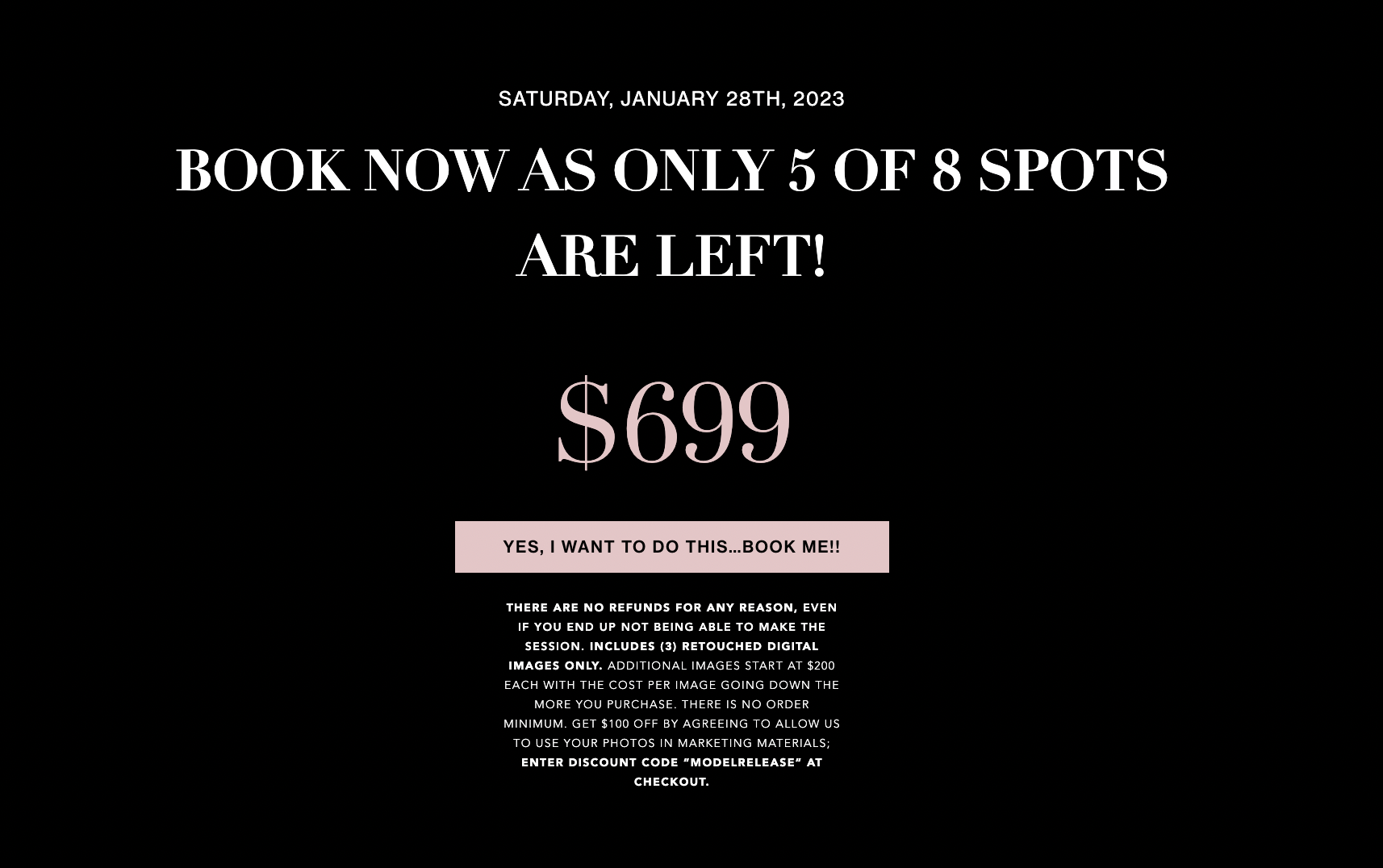
4. Red and Pink Editorial Sessions

There’s no better way to sell a photography experience—or any visually oriented offer—than with a checkout page full of striking imagery. See how Beautiful You Studios uses a suite of images decorated with varying shades of pink to sell their Red and Pink Editorial Sessions offer, which is available by invitation only.
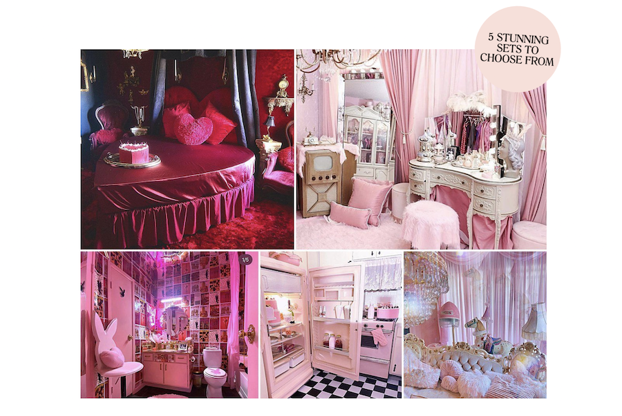
The image-heavy page design is perfectly suited for the offer and portrays what words can’t: the glamorous atmosphere and experience that Beautiful You Studios has willfully created.
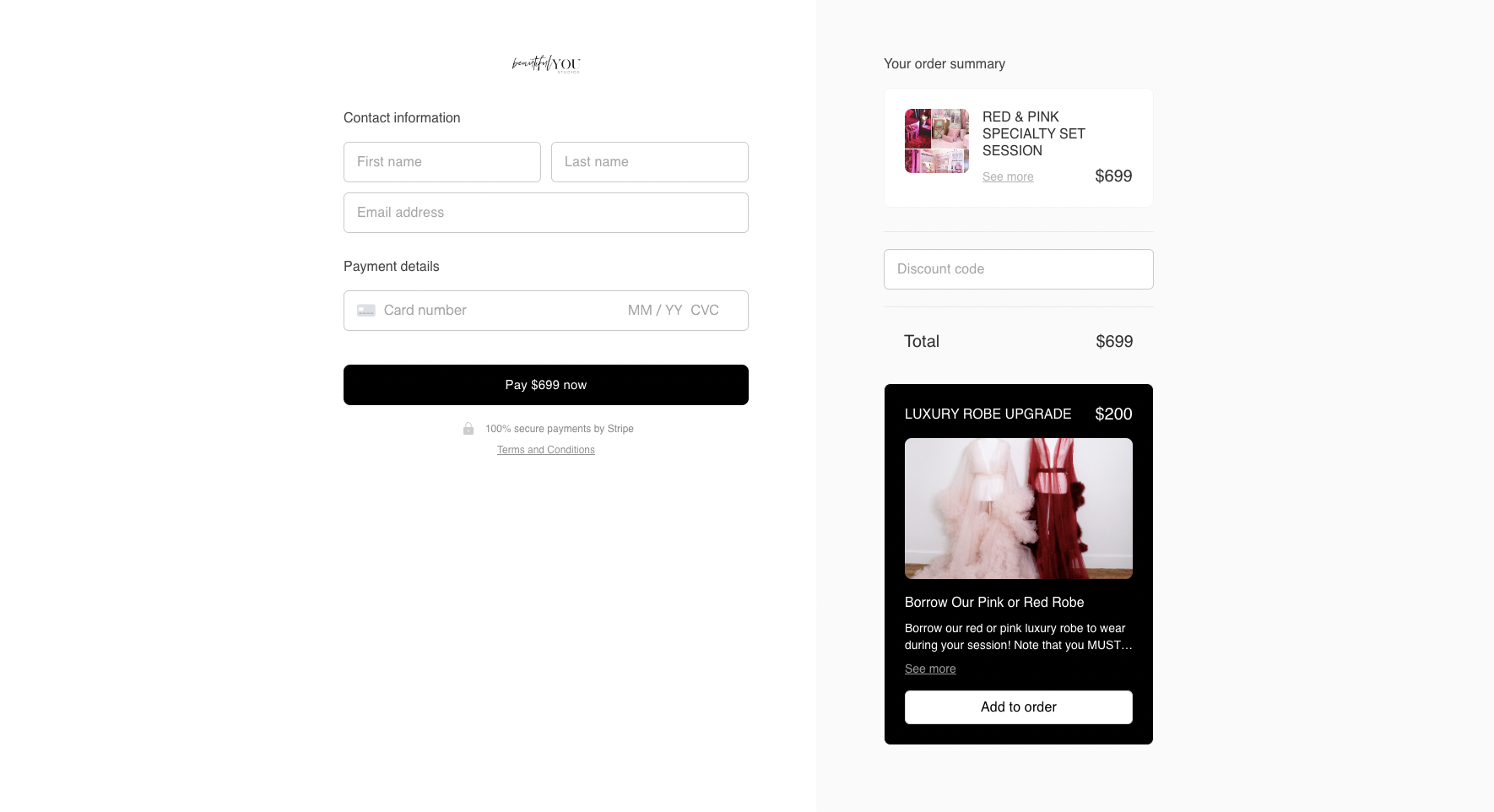
The page presents an optional add-on offer both within the initial checkout page flow and again at the final checkout—providing further opportunities for customers to add to their cart. The page closes with an urgent CTA to purchase, reinforced by limited availability copy.
What we love about this checkout page
- Stunning visual-focused design perfectly suits the offer
- Limited-time offerings and CTA copy instill an urgency factor, motivating quick purchases
- The add-on bonus offer on both the initial checkout page and at final checkout offers extra opportunities to make the upsell
- The entire checkout process is compelling, yet clear and simple
5. Soulful Brand Builder course
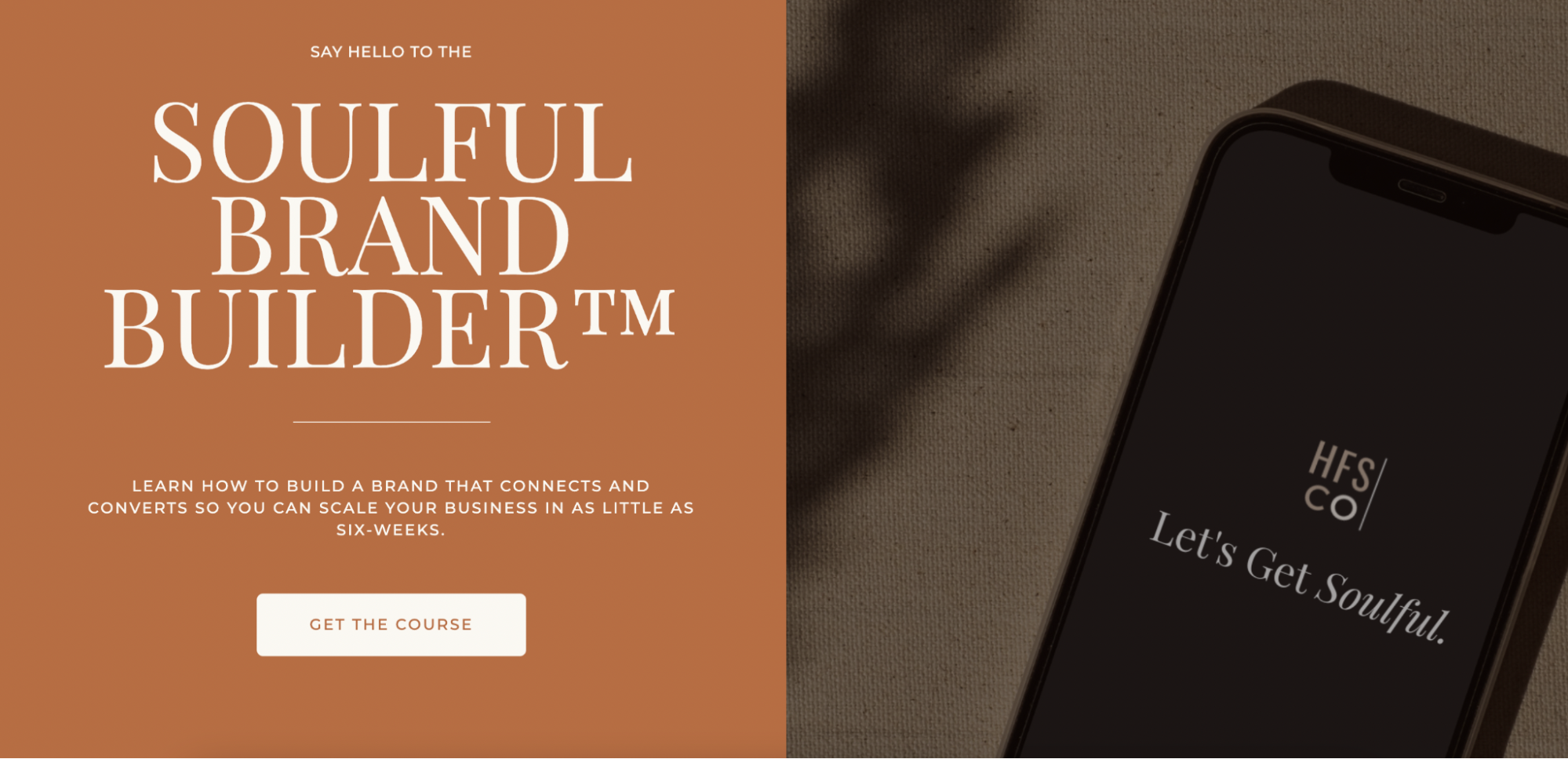
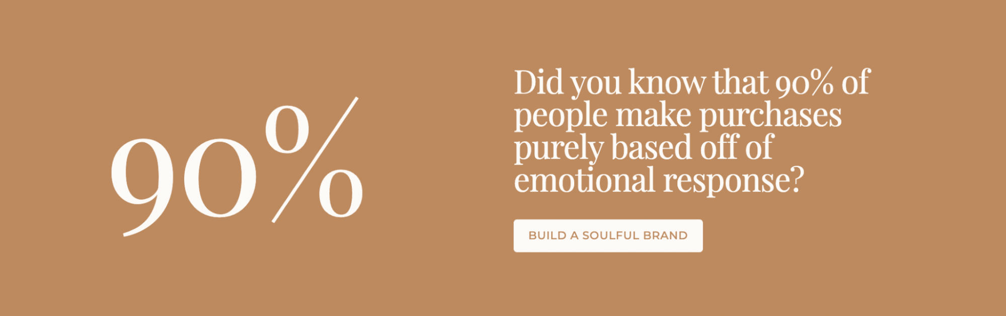
Boost enrollments in your online course with a checkout experience that leaves visitors feeling connected and eager to work with you. Video marketing is a great way to foster an emotional connection with viewers—it even has the power to increase conversions by 130%.
HFS Co.’s page, built to sell the Soulful Brand Builder course, weaves together a perfect mix of emotive content, like a video and founder biography, with data and testimonials that make signing up feel like a no-brainer.
A branded color palette flows throughout the checkout experience—from first scroll through final sale—and uses blank space to draw eyes to key elements of the page. The brand does an excellent job of creating a memorable experience that speaks directly to consumer pain points and repetitively encourages sales.

We love seeing how HFS Co. implements branded photography and complimentary typography to craft a beautiful checkout. The calming aesthetic and decluttered design makes scrolling through the long-form page feel effortless and enjoyable—an achievement for any brand looking to uplevel its customer experience.
What we love about this checkout page
- Video marketing helps create an emotive connection to the offering
- Data and testimonials back up the sales pitch and build trust
- The branded color palette and imagery flow together to create a memorable checkout experience
- Visitors walk through a cohesive, easy process from the first visit through the final sale
6. Cultural cooking experience
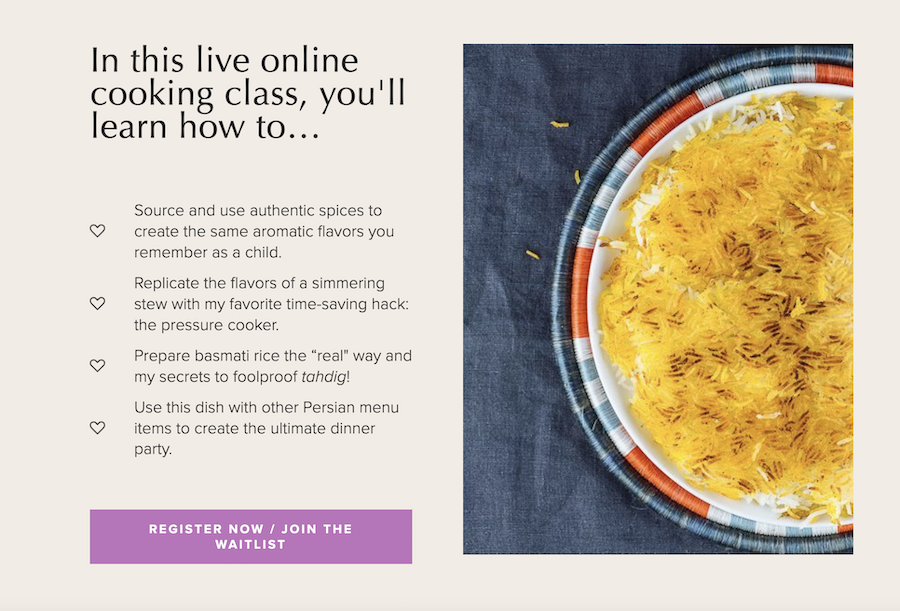
Sell extraordinary experiences with a checkout page that inspires visitors to try something new. This page by Confetti Kitchen uses a playful color scheme plus bright brand photography to captivate visitors’ attention and sell a unique cultural cooking experience.
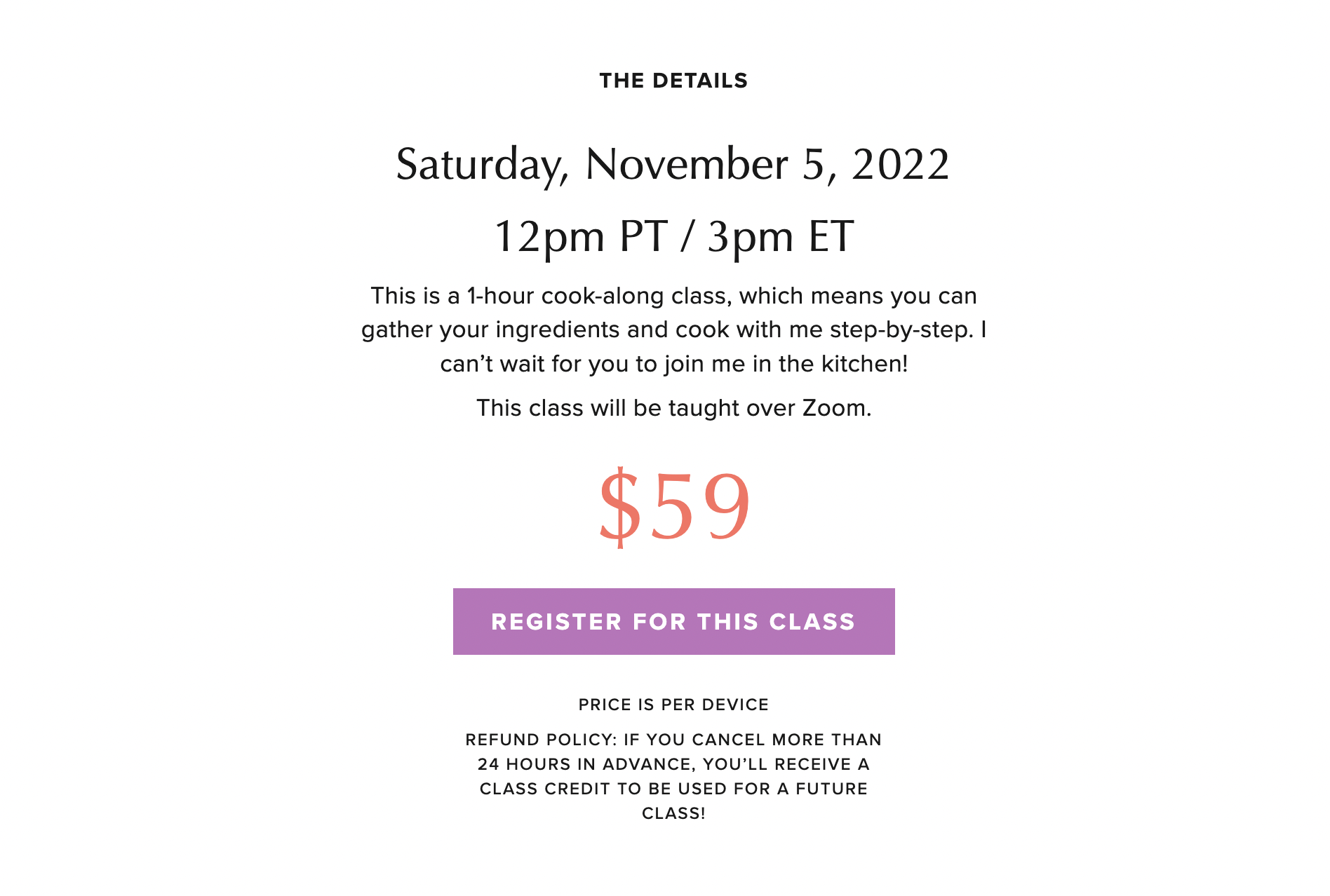
Like all quality checkout pages, it features key information—like class info, dates, and pricing—in an obvious, decluttered page block. It features mouth-watering photos throughout the page to showcase the cultural cuisine that participants can expect to cook in the class.
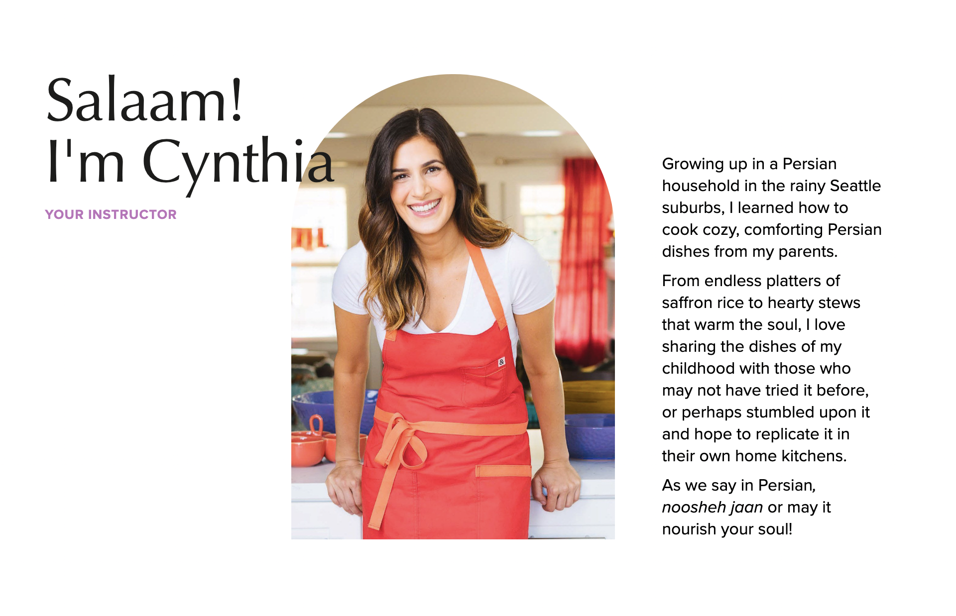
The most impactful point on the page, however, has to be the instructor biography which paints a vivid picture of Cynthia’s childhood and ties to Persian cuisine. After reading it, it’s hard not to want to “nourish your soul” with Cynthia’s cooking class.
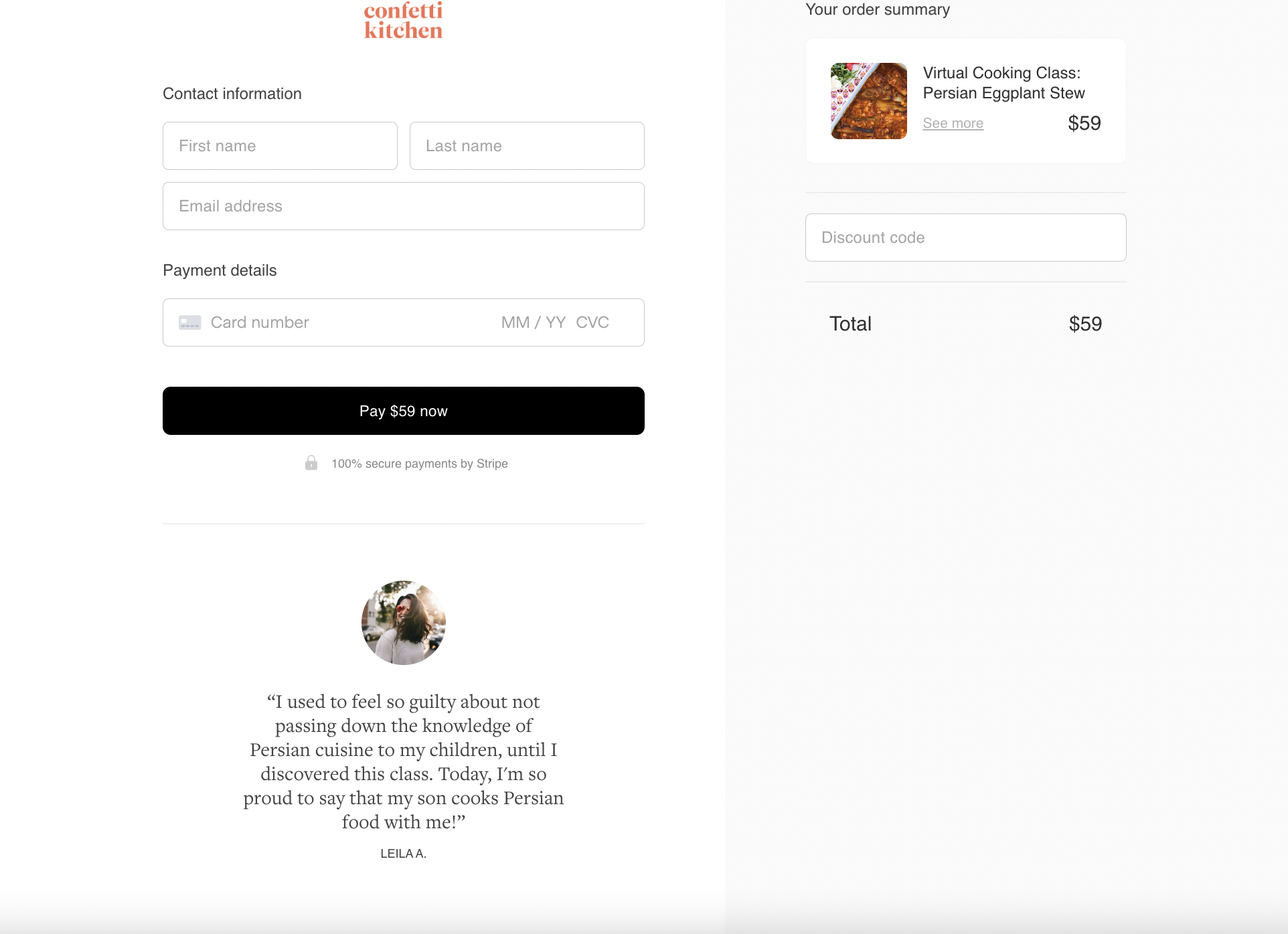
The final few clicks lead visitors to an ultra-simple payment page, complete with a brief testimonial, order summary, and secure checkout process.
What we love about this checkout page
- Vibrant page colors and photos create a distinct, culturally relevant brand experience
- Decluttered information blocks make it easy to explore key information about the offering
- Cynthia’s instructor biography forges a strong connection to the audience and offering, showcasing her cultural ties and passion for cooking
- The final checkout page is simple and secure, prompting customers to make purchases confidently
7. TikTok strategy consultation
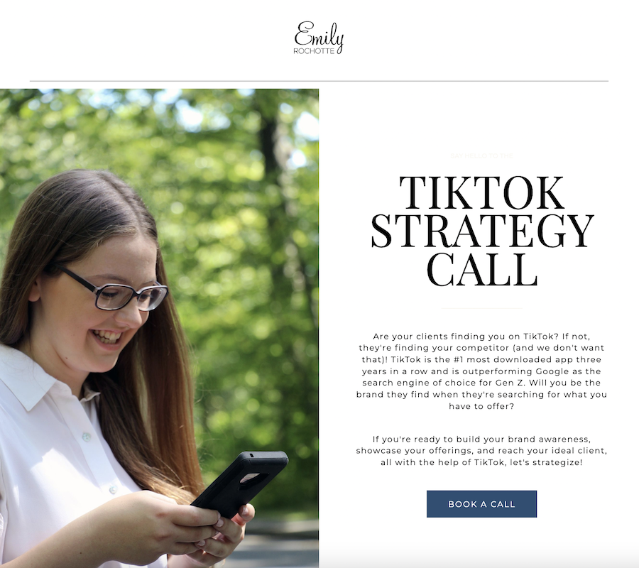
Book more client calls with a checkout page that speaks directly to customers’ pain points while painting your offering as the obvious solution to all their problems. Emily Rochotte perfectly achieves this with her Tiktok Strategy Call page, which immediately opens with a striking headline, compelling pitch, and custom brand photo.
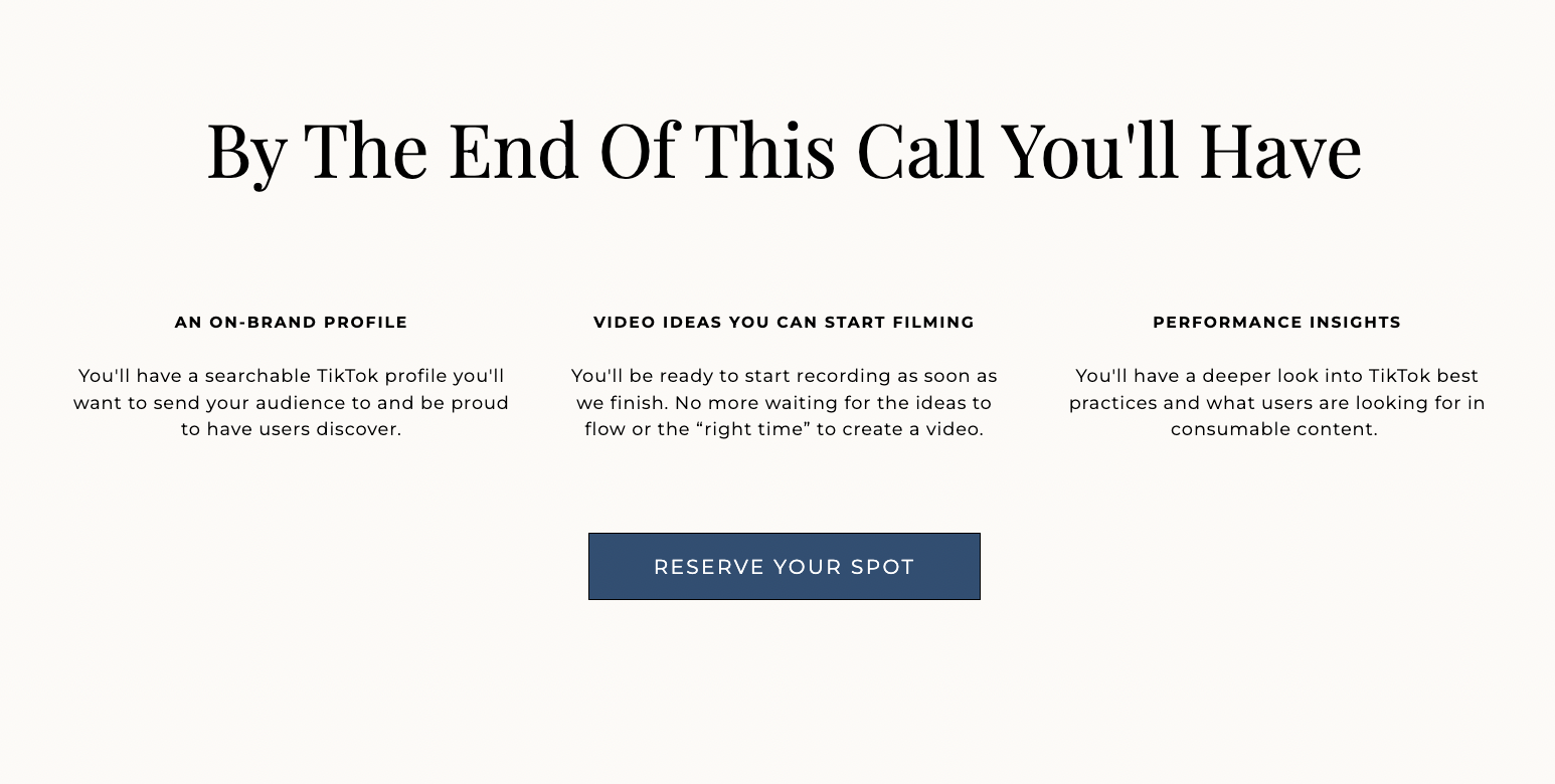
Emily clearly outlines all the call will cover while emphasizing what actionable tools her clients will walk away with. The neutral page background paired with dark typography and contrasting CTA buttons helps put essential on-page content in focus. With multiple CTA buttons scattered throughout the page, Emily will book out her TikTok Strategy calendar in no time.
What we love about this checkout page
- A large headline immediately grabs attention and introduces the offering
- Emily provides a clear breakdown of everything that’s included with an emphasis on the actionable tools her clients will walk away with
- Multiple, darkened CTA buttons pop on the page and encourage sales

With checkout pages, you can easily turn a seasonal offering into an evergreen source of passive income. Take this checkout page from The Graceful Baker. They created it to sell a fall tutorial and workbook on how to decorate different pumpkin cookies. Now, they use it to drive evergreen sales for a recorded version of the tutorial.
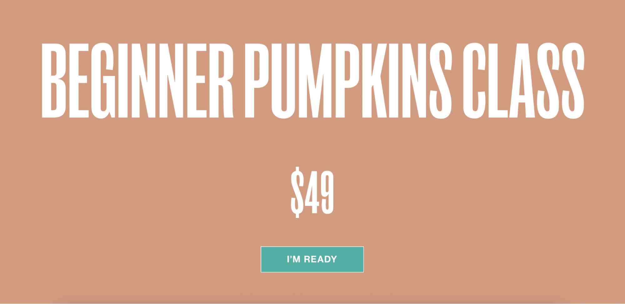
The page maintains vivid shades of blue and orange contrasted by white lettering, which helps text and CTAs stand out throughout the page flow. It provides ample information—key learnings, class requirements, and inclusions—in distinct sections.
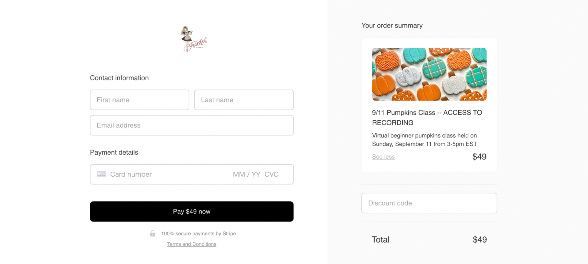
When customers navigate through the payment process, they’re greeted by a simple, secure payment page that provides instant delivery of the offer—a tutorial recording and downloadable workbook. The page has transformed what was once a short-term event into an evergreen offer that seamlessly sells and delivers itself.
What we love about this checkout page
- The page transforms a seasonal event into an evergreen tutorial
- Bold shades of orange and blue contrast with white lettering, making on-page text extra visible
- A simple, secure payment process at final checkout helps drive more customers through the last leg of the conversion funnel
9. Creative portfolio template

Digital downloads won’t sell themselves—they need an irresistible landing page to get visitors clicking through to access your juicy offer. Sell more digital downloads with a page designed with all the best checkout page elements.
See how this page creates a short and snappy on-page experience to drive downloads of their free Notion template. Within one page scroll, visitors experience the full breadth of the checkout page—a bold-faced headline paired with a vibrant download button, followed by a simple mock-up image of the template itself.
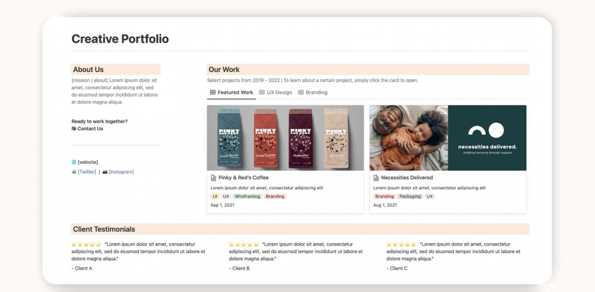
Although this page is super simple, it features the core elements of a great checkout experience: a distraction-free, fast checkout process with as few steps as possible, plus a compelling offer. The visual mock-up example removes the need for text-heavy page blocks—it’s enticing and informative enough to prompt free downloads.
What we love about this checkout page
- The short and to-the-point sales experience is rich with necessary information
- It uses a beautiful mock-up image to showcase the offering instead of a text-heavy page design
- Quick, continuous CTA buttons drive visitors to act now
- This freebie page leads visitors through as few steps as possible to download the template
Build powerful checkout pages with Flodesk Checkout
Use Flodesk’s high-converting and customizable sales and checkout page templates to convert visitors into paying (and repeat) customers.
10. Intuitive eating course
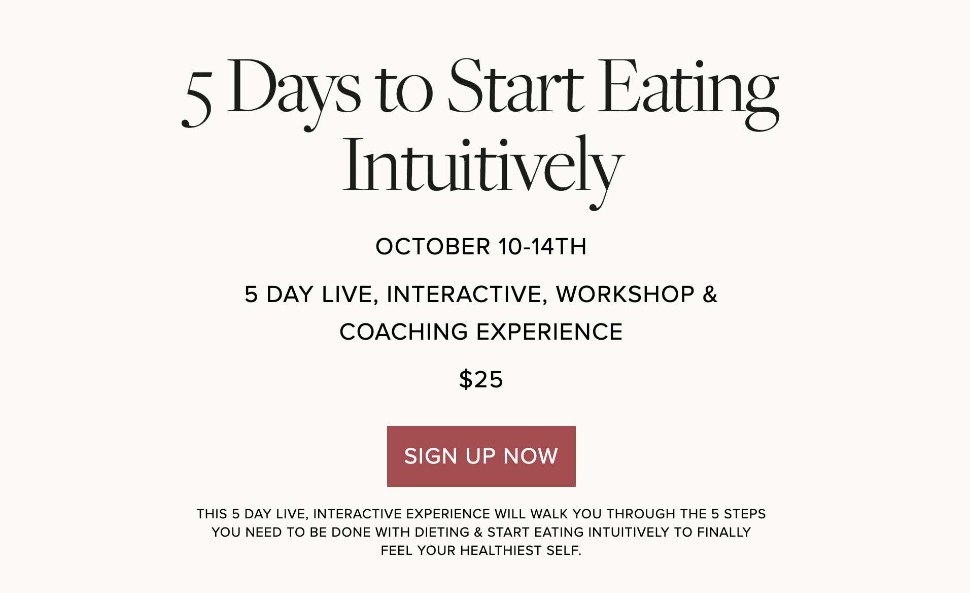
Simplicity sells—and the same can be said for checkout page design. A strong checkout page maintains a consistent focus on one simplified offer. This checkout page for an intuitive eating workshop uses simple selling to make their pitch. All key workshop information plus a boldened CTA button are at the top of the page—there’s no questioning what the offer is, when it occurs, or how much it costs.
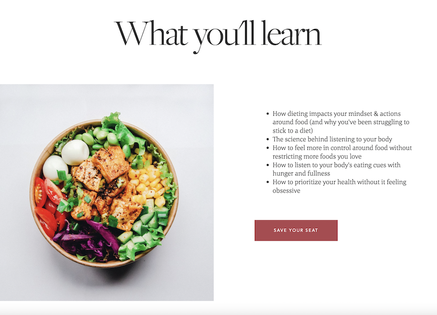
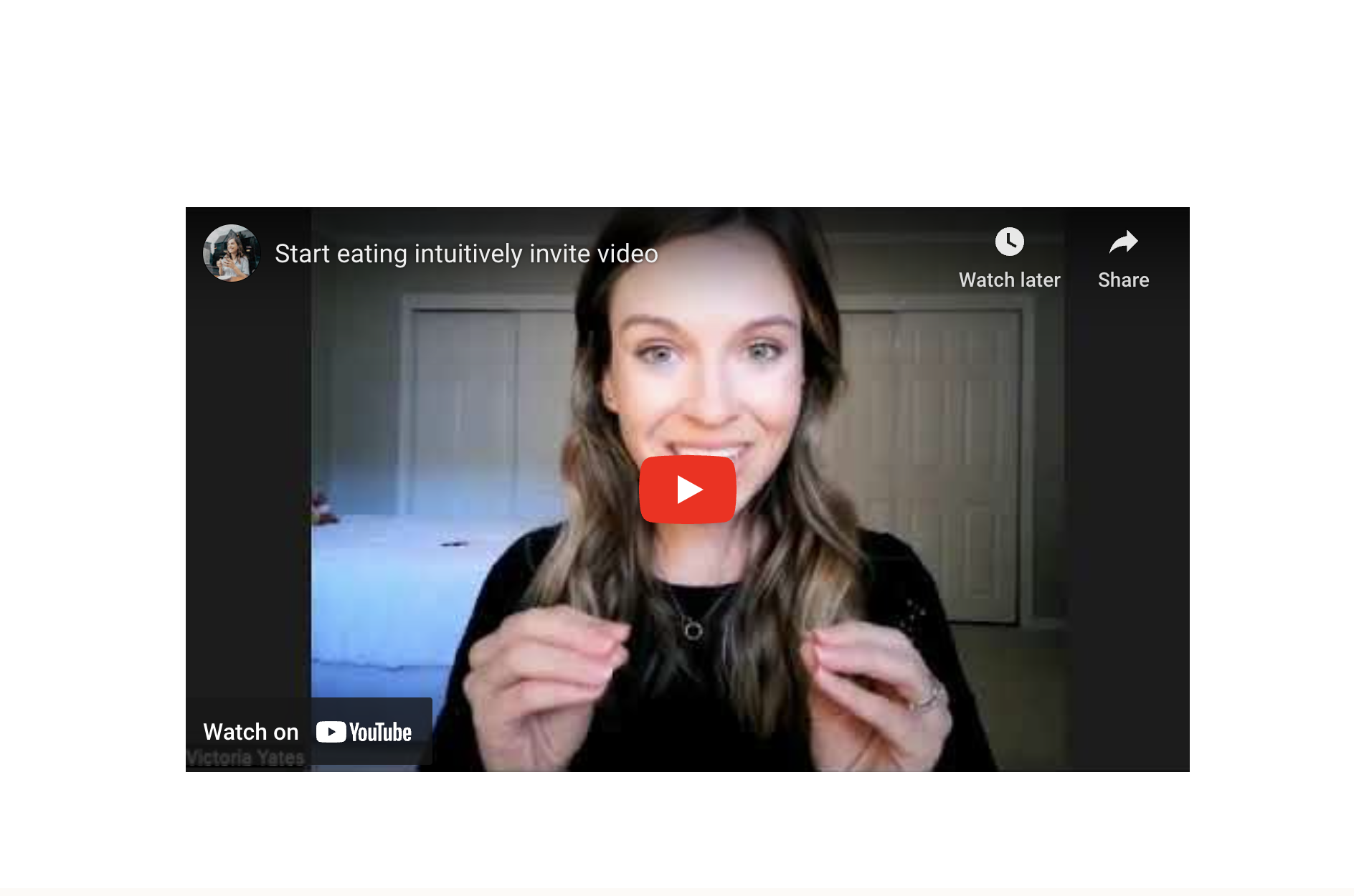
The page uses brand imagery sparsely yet effectively. The striking food photography pairs beautifully with informative page blocks. Rather than relying on copy to sell, this checkout page implements on-page video marketing to provide a detailed, personal invitation to the workshop.
When customers navigate to pay, they’re greeted by a clean page that’s full of social proof—from the logo and secure payments badge to an added client testimonial. It even promotes a bonus offer just below the total price, motivating last-minute add-on purchases.
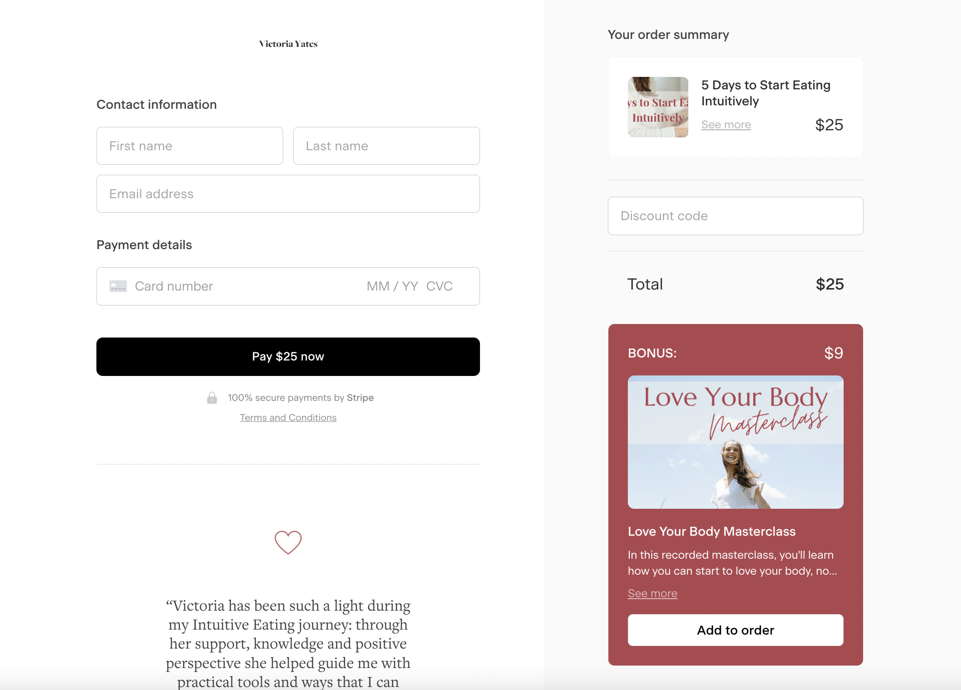
What we love about this checkout page
- Rather than using many visuals and colors, this simplified design sells with text blocks and bold CTA buttons
- Information is formatted to be skimmable, with bulleted lists followed by snappy CTAs to enroll
- It offers a surprise lower-price bonus at final payment, encouraging easy upsell purchases
- Video marketing creates a more personalized connection to the offer while providing more detailed information on the coaching experience
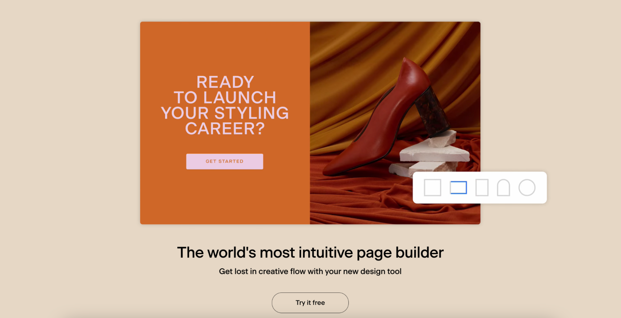
Design awesome checkout pages easily with Flodesk
You might be eager to launch a checkout page but too time-strapped to work with a complicated mix of tools to bring it to life. Don’t worry—we have the perfect solution.
We’ve reimagined tiresome, uninviting checkout experiences in favor of a stunning range of checkout templates optimized to sell. Flodesk Checkout is the world’s most intuitive page builder, ready to be transformed into marvelous, custom online shops for entrepreneurs and small businesses alike.
Flodesk Checkout’s templates don’t just look great—they lead customers through an elevated checkout experience that drives sales, secures payments, and quickly delivers offers and receipts—all while tracking key metrics throughout the process. Best of all, it automatically connects with Flodesk Email from the start so that your email and e-commerce seamlessly work together to achieve your goals.
Tailor page blocks, remove sections, and build a brag-worthy branded experience. Design a checkout page in minutes, click publish, and watch your sales pour in. Ready to give it try? Get started with a free trial and access all of the Flodesk tools for as long as you need—only pay when you’re ready to send or publish.

Related Articles