Ebook landing pages: Best practices and 9 examples we can’t get enough of
Table of Contents Jump to:
Jump to:
Table of contents
TL;DR Ebooks are a powerful marketing tool, but only if you get people to download or purchase them. Let’s explore best practices and find inspiration from businesses doing ebook landing pages right.
Have you poured hours into designing your ebook, crafting the content, and putting the finishing touches on it before giving it a final review pre-launch? Great! You’ve done most of the hard work, but you’ve got one more thing to do—build a compelling ebook landing page that gets every visitor hitting that Download or Buy now button.
But what is an ebook landing page? Let’s find out!
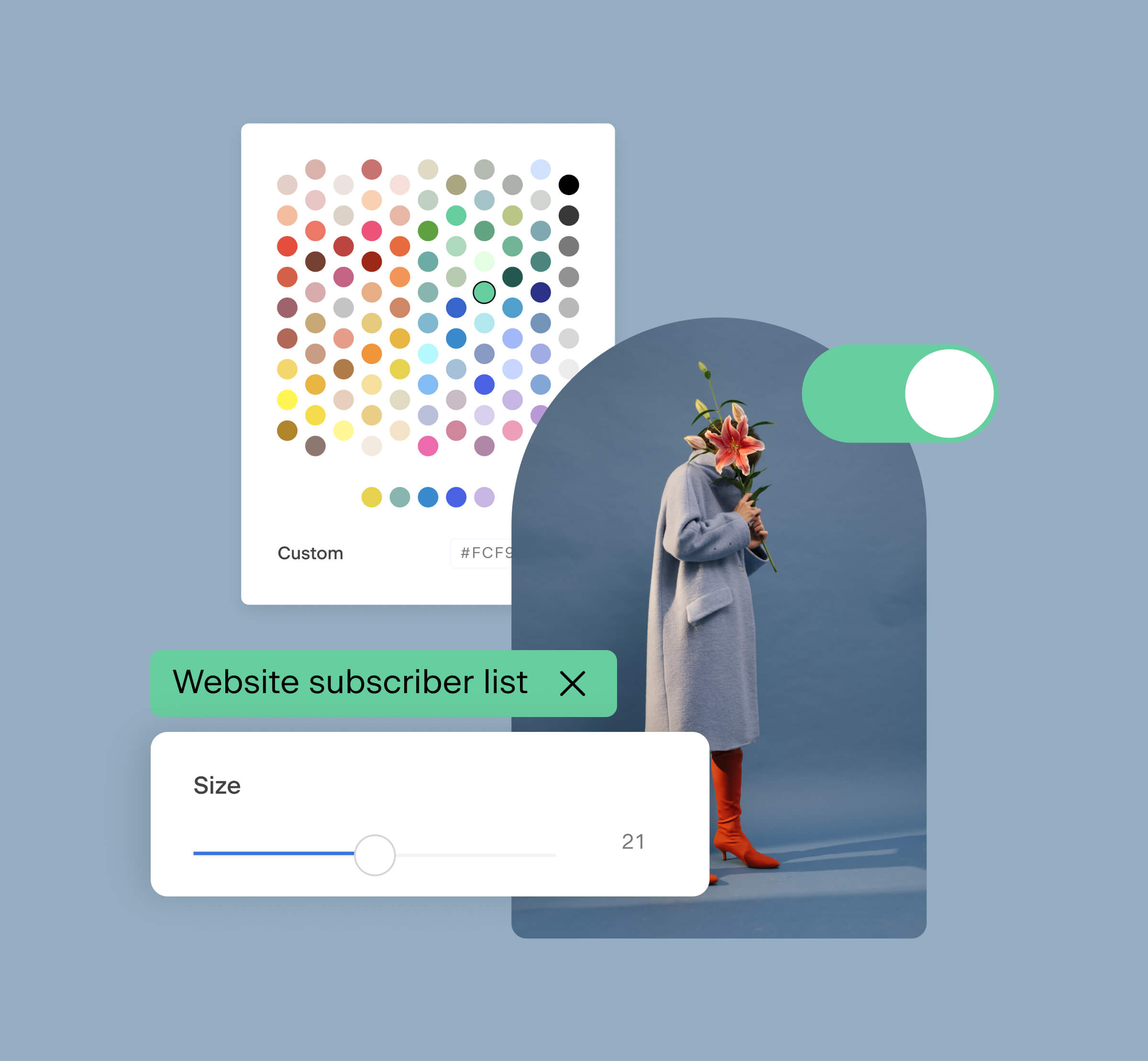
Building landing pages has never been easier
Design beautifully branded landing pages with Flodesk Checkout’s intuitive sales page builder.
What is an ebook landing page?
Whether you’re using your ebook to collect leads or selling it for your ecommerce side hustle, you’ll need a place to host it. This place is your ebook landing page—where you promote your ebook and where visitors go to purchase, download, or access it.
Think of your ebook landing page as your ebook’s home—an inviting, tidy, and beautiful place for people to visit.
Businesses often use ebooks as gated content (a way to collect email addresses). Visitors submit their information—typically their first and last name and email address—in exchange for access to the ebook via a download.
Ebook landing page best practices
Building an ebook landing page can be daunting if you don’t know where to start. But not to worry—we’re breaking down best practices to follow, what to include (and avoid) on your ebook landing page, and how you can quickly design a beautiful landing page to sell digital products online with Flodesk Checkout.
Before you build your ebook’s home, look over our best practices to create a high-converting and beautifully-designed ebook landing page.
Monetize your ebook
Looking to sell your ebook online? Create beautiful and compelling sales, checkout, and delivery pages using Flodesk Checkout’s easy-to-use page builder.
1. Write clear and compelling CTAs
Whether you’re selling your ebook or offering it for free, the end goal remains the same: get the ebook in the hands of your visitors. But if you have too many CTAs or they’re unclear, your visitors may abandon your ebook landing page altogether before ever purchasing or downloading your ebook. Yikes!
But there’s an easy fix—don’t fill your page with secondary links or buttons that don’t lead to the checkout page or an instant download. Use a CTA with a clear purpose, and try to limit how many you use. When you have dozens of links or buttons, you’re forcing visitors to split their attention between all of them, which can lower the chances they’ll click on any of them. Too many choices can lead to no decision at all.
So, if you can’t limit yourself to just one CTA, at the very least, make sure they all lead to a checkout page or an instant download.
The good news? Landing pages with one link—even in multiple places on the page—have an average conversion rate of 13.5%. Just make sure your CTAs are compelling enough to encourage action. Here are a few ways to do just that:
- Make your CTAs stand out. Use a boldly-colored button, but make sure there’s high contrast between the button color and the button text so readers can read it clearly.
- Avoid generic CTAs like Click here and instead opt for a straightforward but enticing CTA like Get your free writing tips ebook.
2. Highlight the benefits, not the features
You worked hard on your ebook, so it’s natural to want to talk about it and how amazing it is, but your readers don’t care. It’s a harsh reality, but the honest truth. Instead of focusing on features or what your ebook’s about (the what), Unbounce suggests highlighting what matters most to your readers (the why): what value they will get from it:
- What will your readers learn?
- How will it improve their lives?
- What are your top benefits?
And to draw even more attention to your benefits, use bullet points. List three to five benefits your readers will get from the ebook.
When I designed my ebook sales page in Flodesk Checkout, I used a template with a benefits layout included to bring home the value my ebook provides. And with some sales under my belt, this advice is a tried and true way to encourage downloads and purchases.
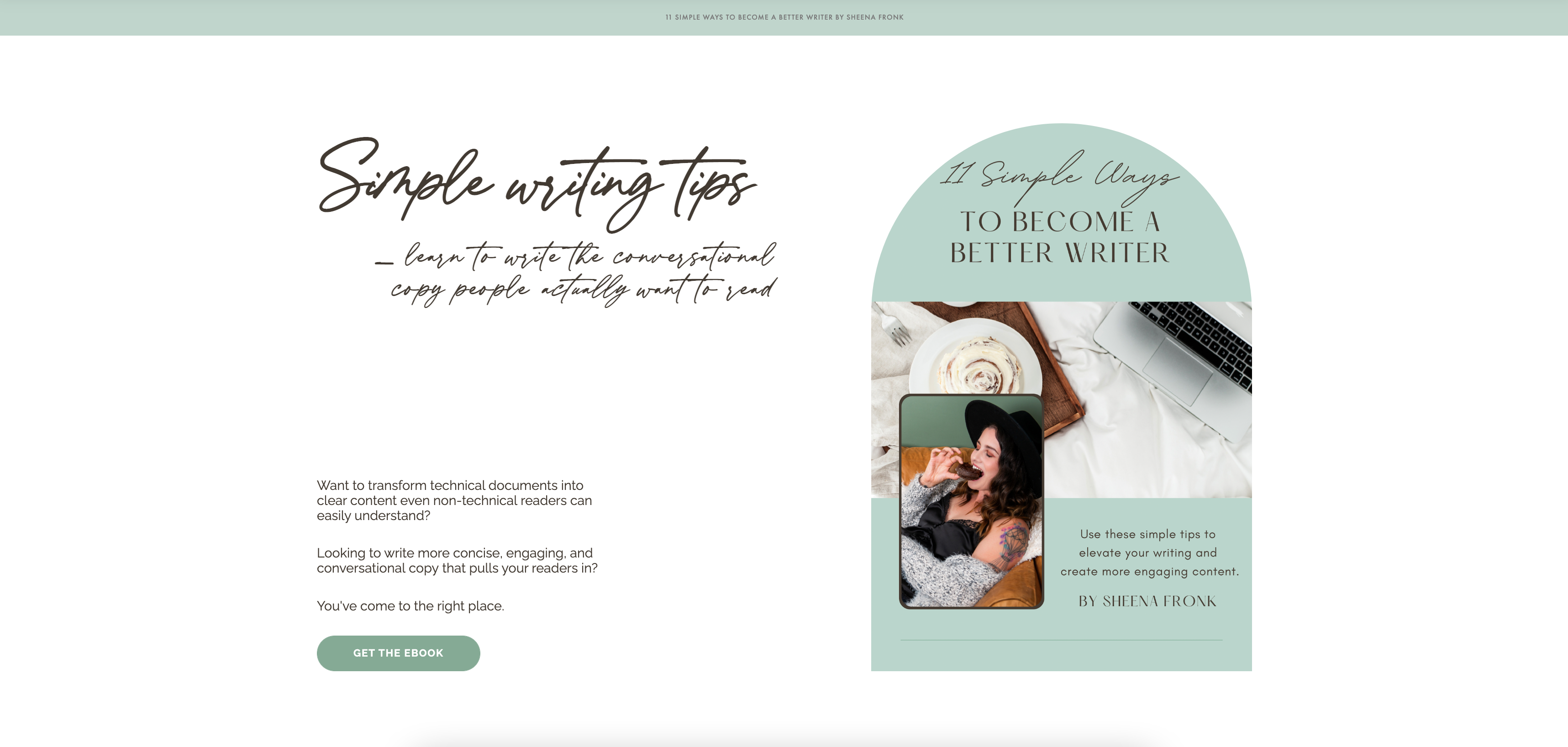
3. Use attention-grabbing headlines
Remember when newspapers were an essential start to the day? You would scan the headlines to stay in the know about what’s going on in the world. And if a headline was captivating enough, you’d read the article. While print newspapers are nearly a thing of the past, the same rule applies: your headlines need to draw readers in and motivate them to keep reading.
You have less than 10 seconds to capture your visitors’ attention, so your headlines need to hook readers almost instantly. While I love a clever headline, you should balance it with clarity. When someone lands on your ebook landing page, they should be able to identify whether your ebook’s relevant to them.
AppSumo suggests:
- Being straightforward. The first half of my headline makes it clear that I offer simple writing tips.
- Showing readers the main benefit. The second half of my headline highlights the value: writing copy people actually want to read.
Pro tip: Headlines are the first thing visitors see. Keep them simple, but show them the main benefit immediately.
4. Use imagery to balance out text

Flodesk member, Dietitian Kristie’s, checkout page
Words are great, but no one wants to read an entire page without images (unless it’s a book or your ebook). Find a balance between images and text to create a landing page that provides the context visitors needs and imagery to bring your ebook to life. Going back to the home analogy—the visuals are the decorations you place throughout your home to add character and interest.
But not just any image will do. Use those that match your brand or feature similar colors. If you have your own photography, great! If not, you can choose from stock photos and GIFs in Flodesk Checkout. Either way, you want intriguing and beautiful images that relate to your ebook.
Not only do images add visual interest to your page, but they can also keep visitors’ attention and reduce your bounce rate. We process images six to 600 times faster than text and respond better to images. And according to Social Media Today, custom visual content yields a 7x higher conversion rate.
Your images can do double duty as a way to break up text and enhance your story. If your ebook gives readers hours back into their day, a visual of someone enjoying free time can bring that point home. Or, if you have compelling stats, create an image to make the stats pop!
5. Show off your testimonials
When you’re trying to find a new restaurant, fun places to travel, or even a new tablet, you probably do a bit of research first. And unusually, that involves scanning review sites, asking friends and family what they think, and looking up product ratings.
If you’re selling your ebook, your potential customers probably are doing the same. While this may not be as common for ebooks businesses use as gated content, a good review never hurts! People want to know that others got value out of your ebook before they decide to commit.
But before you dedicate a section of your ebook landing page to social proof, make sure it’s from real customers. Visitors can spot fake reviews a mile away, and those reviews can seriously backfire, impacting downloads and sales. Ask for honest reviews, or don’t post any at all.
6. Entice visitors by telling a powerful story
Before you begin writing, consider your goal. Yes, you want to let visitors know what your ebook’s about, but more than that, you want them to convert. Don’t make the beginner mistake of only talking about the contents of your ebook.
Instead, try:
- Bulleting out your main benefits to make your page scannable
- Sharing with readers how your ebook will improve their lives, work performance, etc.
- Sprinkling social proof throughout your landing page
- Giving them a sneak peek of what’s inside the ebook (chapter summaries)
- Sharing a little about your background, what inspired you to create the ebook, and why you’re a qualified expert
Visitors need a reason to hit the Download button, and your story is that reason.
7. Consider your visitors when asking them to fill out a form
Filling out forms or surveys in exchange for gift cards or cash can be fun, but, as harsh as it sounds, filling out a long one for an ebook download is exhausting. But this is a crucial part of your landing page. The download or access form is where your visitors input their information in exchange for the ebook, and it can skyrocket downloads (or sales) or eliminate conversions.
If your form is overwhelmingly long, your visitors won’t fill it out. They’re here for the download, which should be almost instant. Make your form as concise as possible:
- Only include necessary fields, like first name and an email address
- Keep the user experience in mind by having a simple design and clear asks
- Make it short and sweet. Don’t make visitors jump through a bunch of hoops
Remember, you can always follow up with leads in another email after they input their information. You can send emails asking for their preferences, to schedule introductory calls, share resources, and more—so why clutter your form with all the information you can ask for in later emails?

Flodesk member, ARRA Studio’s, form
8. Make design a priority
At Flodesk, we’re all about great design. It’s why when we launched Flodesk Checkout, we focused not only on high-converting sales pages but pages that would leave visitors in awe, too. Your ebook should live somewhere beautiful, your forms should be aesthetically pleasing, and they should all align with your brand. Good design makes that possible.
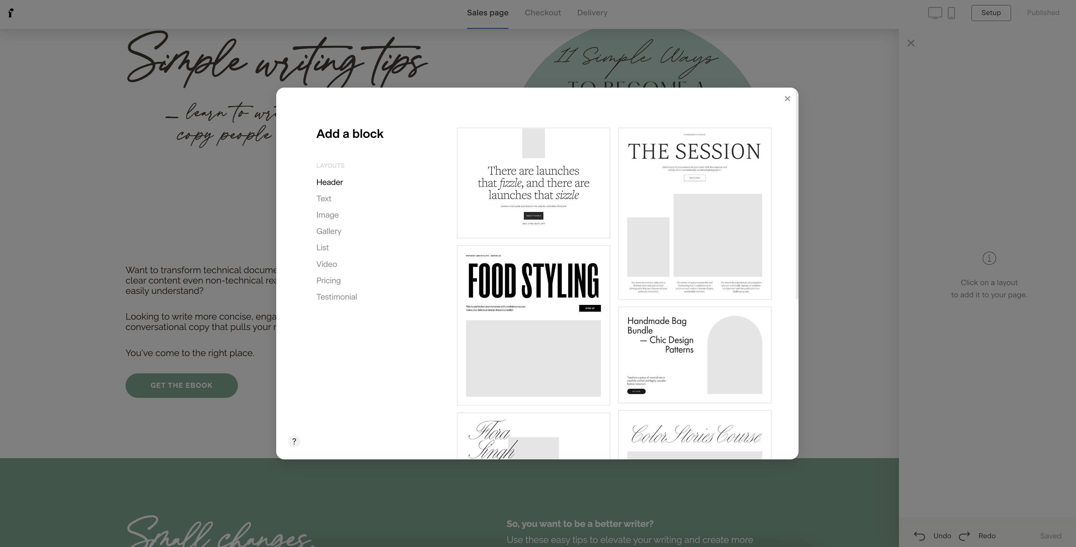
Use Flodesk Checkout to customize your layouts
When building your ebook landing page, ask yourself a few questions first:
- Is it beautifully designed, or does it look outdated?
- Is it appealing enough to draw visitors in and encourage them to scroll?
- Is it clean and organized, or cluttered and hard to navigate?
- Does it match my brand?
Create a simple and effective landing page for your ebook that’s clean and doesn’t overwhelm visitors with too many design elements. But above all else, make sure your visitors recognize that it’s coming from your business. You can do this by using:
- The same or similar fonts
- The same or similar colors
- Your logo
- The same voice and tone
Whatever platform you use, don’t neglect the design. An outdated or busy sales page can turn visitors off and lead to fewer conversions. But a consistent design aesthetic can boost brand recognition, so when you send your ebook launch announcement email, share the form on social, and promote your landing page, viewers instantly recognize it as your business.
Design stunning ebook landing pages
Create beautifully-designed landing pages for your ebook using Flodesk Checkout’s easy-to-use page builder and stunning templates.
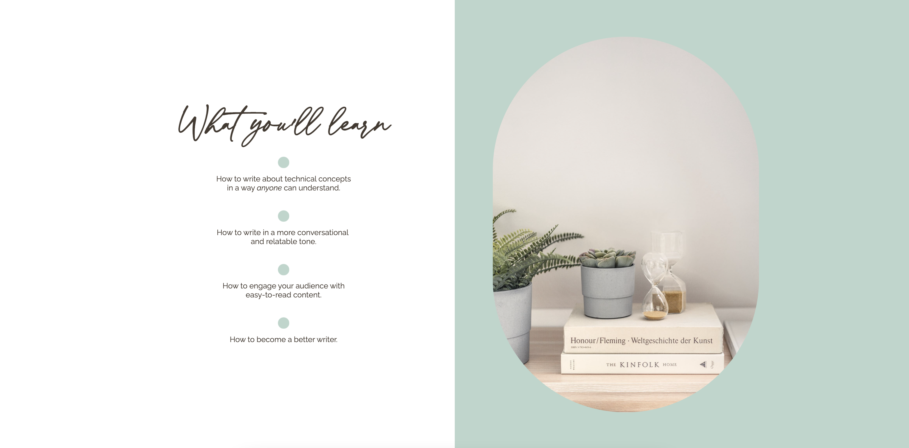
9. Give visitors a peek behind the curtain
A captivating story, beautiful images, and benefits-rich copy are only part of the equation for successful ebook landing pages. Visitors want to know what they’re getting, so give them a look at what to expect. But remember, your entire ebook landing page shouldn’t focus solely on chapter summaries!
Include a brief description of your ebook
It’s tempting to hype your ebook to be the ultimate solution to your audience’s biggest problem, but instead, keep your descriptions free from marketing fluff or overhype. Keep descriptions straightforward. We suggest including:
- The main points in your ebook
- The value your ebook provides
- What problem your ebook helps solve
- A preview of the content, like a chapter summary
Pro tip: Break up your main points into easily digestible chunks or bullet points. Even if they skip over your description or paragraphs, their eyes will be drawn toward the bulleted list. Make it count!
Include a cover photo of your ebook
When was the last time you read through an entire landing page of text? It’s easy to glaze over an ebook landing page when it’s just neverending blocks of text. So, in addition to the other images on your page, include a photo of your ebook.
Get creative with it. You can edit an image of your ebook onto a laptop screen, mobile device, or even a tablet so customers can envision how they’d read it. Or you can simply feature an image of your ebook cover.
9 Examples of ebook landing pages doing it right
You now have all the tips to put into practice to create an outstanding ebook landing page. But a little inspiration never hurt anyone. So, take a look at nine Flodesk members doing it right with their ebook landing pages. Check them out!
Rach For A Day
Rach For A Day’s beautiful ebook landing page is packed with stunning visuals throughout the checkout page.
Why we love it:
- The visuals align with the Rach For A Day brand
- The images are beautiful and compelling
What it does well:
- This landing page sprinkles images throughout to balance chunks of text
- The visuals aid in the storytelling. They’re not random or unrelated
The Bingaman Co

The Bingaman Co’s ebook landing page uses fun but clear call-to-action (CTAs) that encourage action, but aren’t your basic Buy now CTAs.
Why we love it:
- The CTAs are compelling
- The CTAs inspire action and use creative but clear language
What it does well:
- The landing page features high-contrast CTAs, so you can’t miss them
- The CTAs all lead to one place, so visitors aren’t overwhelmed with varying competing offers
Jolie Sleep Consulting

Nothing capture’s a visitor’s attention faster than a bold headline. Jolie Sleep Consulting’s ebook landing page capitalizes on a common problem among its audience: a lack of sleep.
Why we love it:
- The headline focused on a solution to a very relevant problem
- It creates intrigue and a bit of mystery that draws readers in
What it does well:
- This highly-relevant headline does a great job of connecting to pain points immediately
Laporte & Company

Laporte & Company’s ebook landing page focuses on telling a story with empathetic copy and beautiful images. Who can’t relate to wanting to vacation, but life always seems to get in the way?
Why we love it:
- It tells a story that many people can relate to
- This page packs a double punch with great storytelling and images that enhance that story
What it does well:
- The landing page connects with the target audience through effective copy
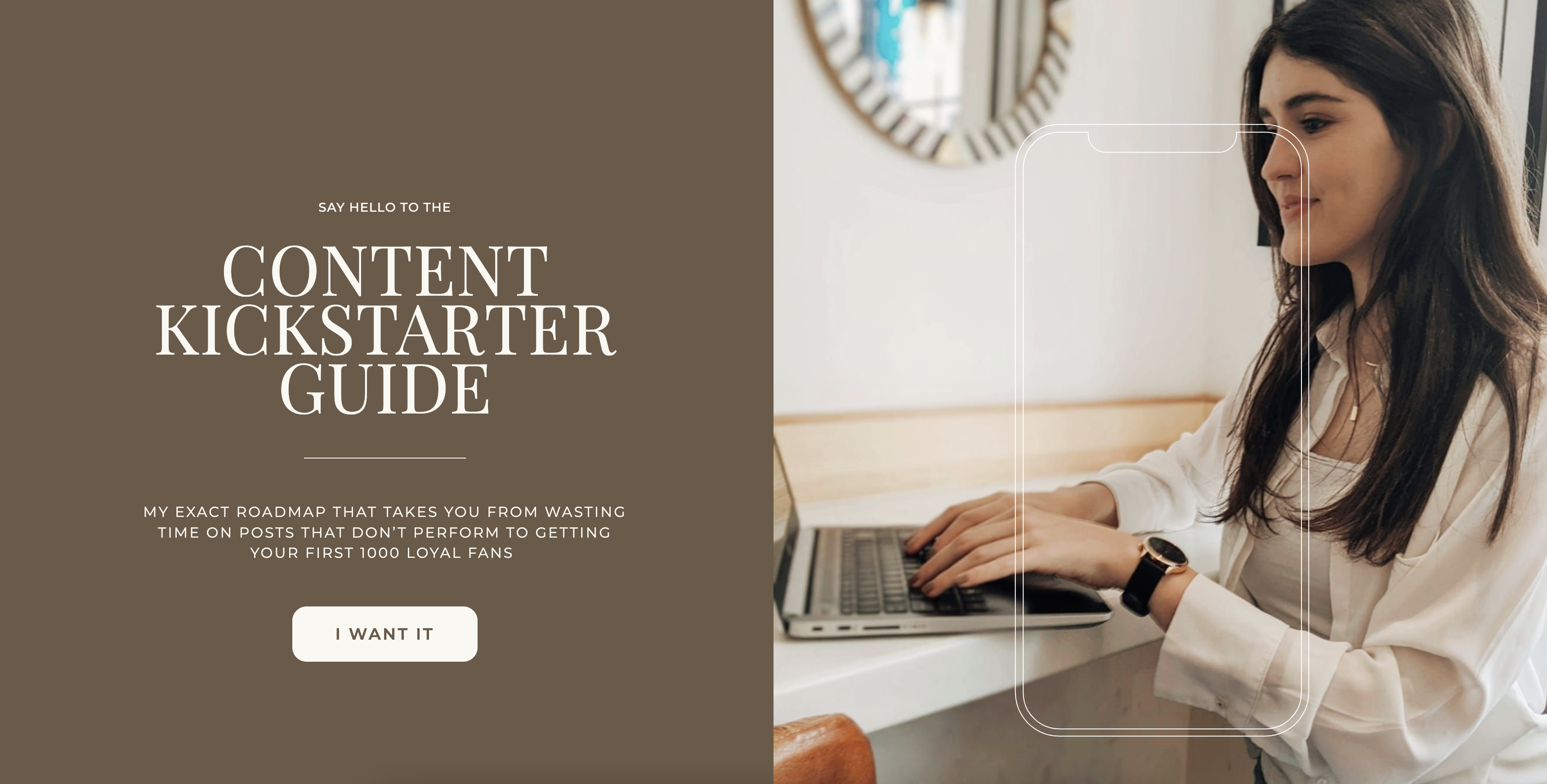
The Inmans Photo & Video
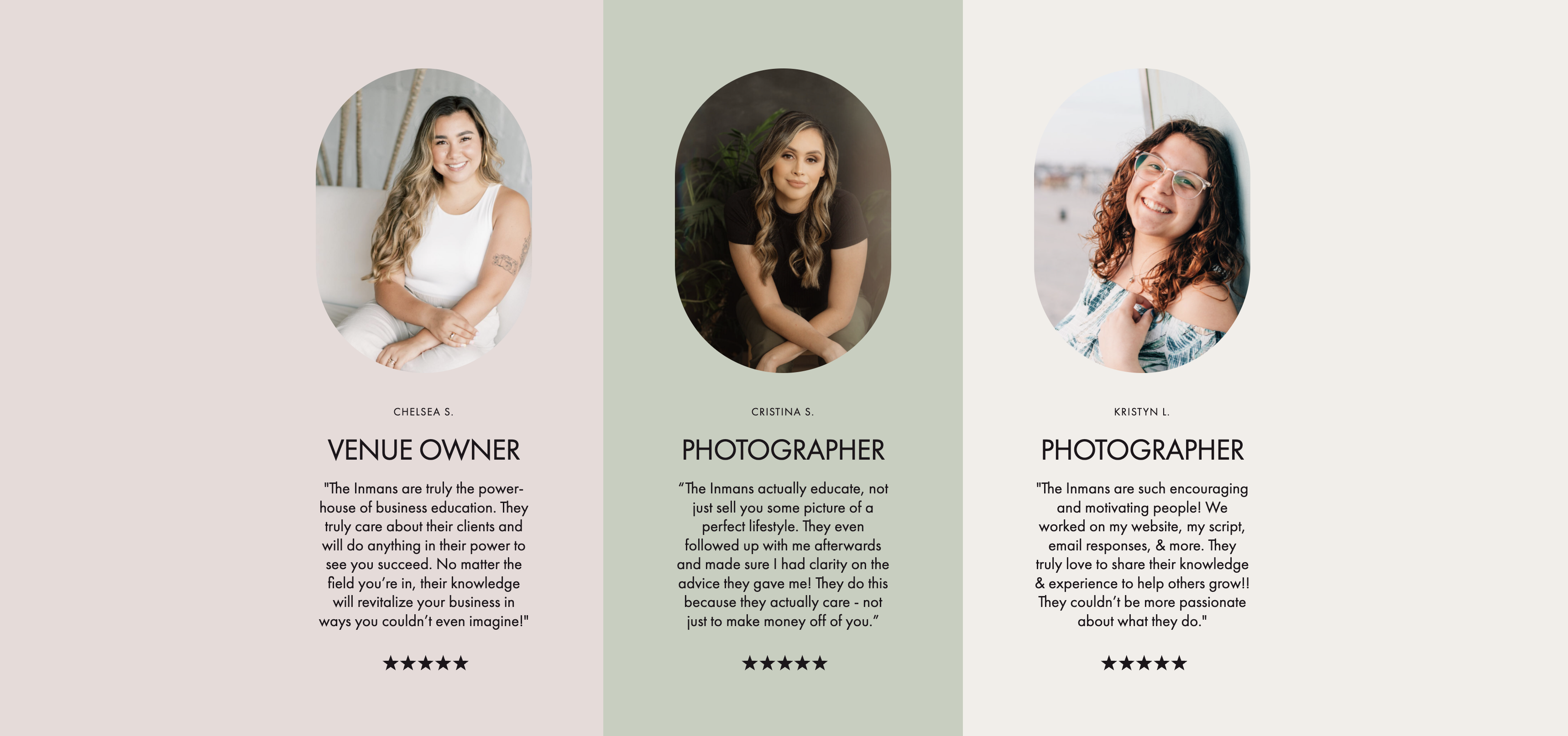
The Inmans Photo & Video’s ebook landing page made their testimonials a focal point visitors can’t miss. We know social proof can be a determining factor in purchasing behavior, so highlighting it is a great way to aid conversions.
Why we love it:
- They’re authentic reviews that put The Inmans Photo & Video in their best light
- The testimonials are front and center, so visitors can quickly see what others have to say
What it does well:
This ebook landing page does an exceptional job of building authority around their expertise, encouraging visitors to purchase. But it also shows that the sellers know their stuff and are credible.
Stephanie Thomas Fitness
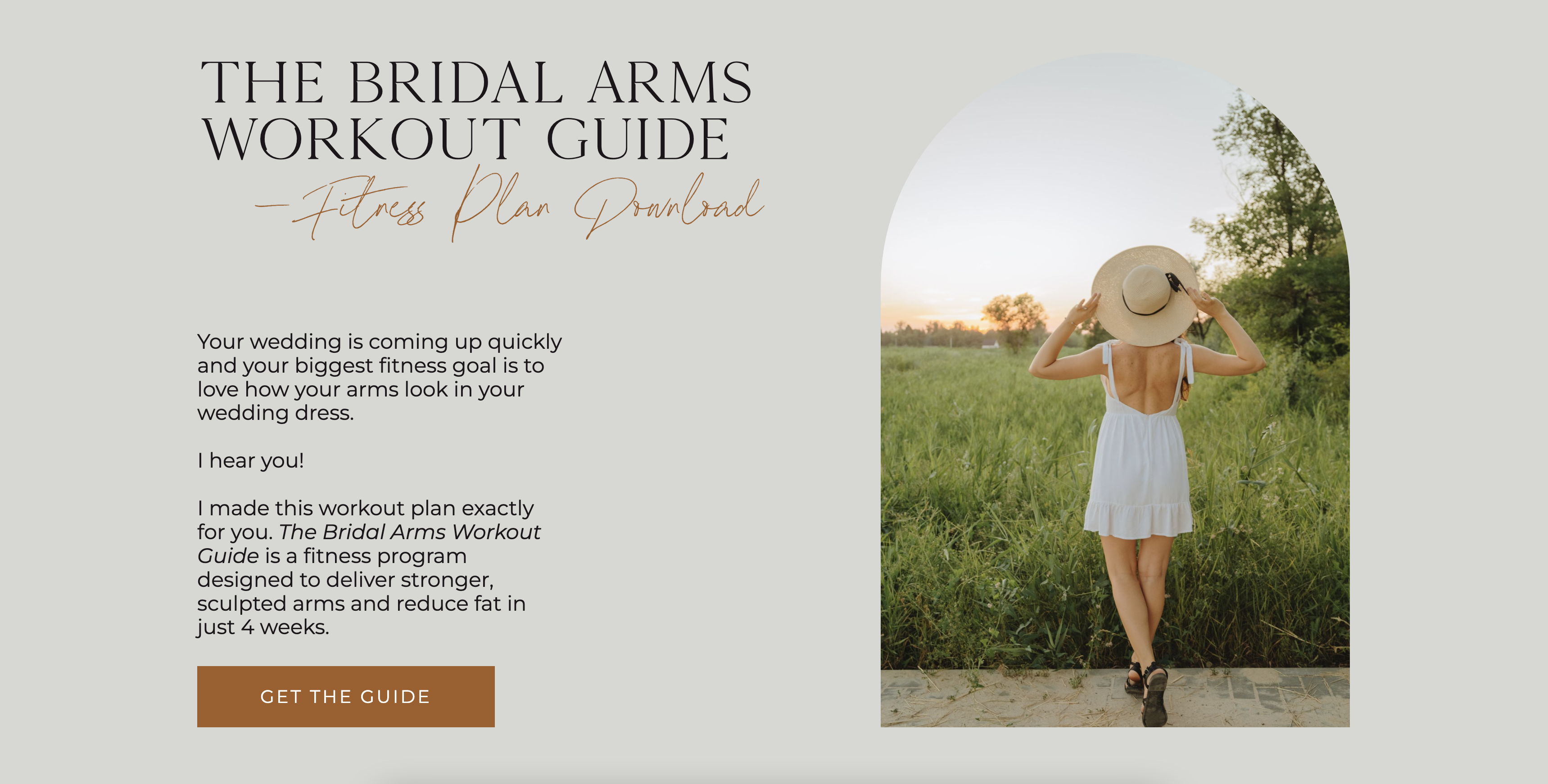
The ebook landing page from Stephanie Thomas Fitness features a gorgeous visual in the header. But they go a step further by using a photo that shows off the results visitors can expect from using the guide: a toned back and arms.
Why we love it:
- The image is visually appealing and can almost tell the story itself
- The main visual does double duty as something pretty, but also an advertisement of the results to expect
What it does well:
Stephanie Thomas Fitness prominently features a stunning image at the top of the page that’s strong enough that they don’t need a bunch of others throughout.
Woo Woo Realm
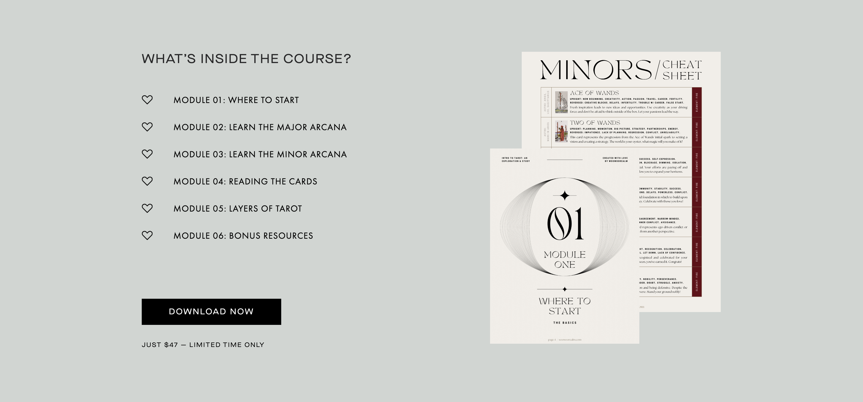
Woo Woo Realm’s tarot ebook landing page not only previews the different modules, but also uses a GIF to flash through the pages, giving visitors a true sneak peek. It also features the ebook cover at the top of the page, so visitors get an idea of what to expect throughout the landing page.
Why we love it:
- The combination of text and the GIF gives visitors an inside look
- The GIF adds context to the modules text on the left
What it does well:
This landing page takes a creative approach to visuals, using a GIF to show the contents of the ebook. Not only that, it pairs text and visuals together to pack a powerful punch. Well done!
Keosha Hinson Mindset Coach
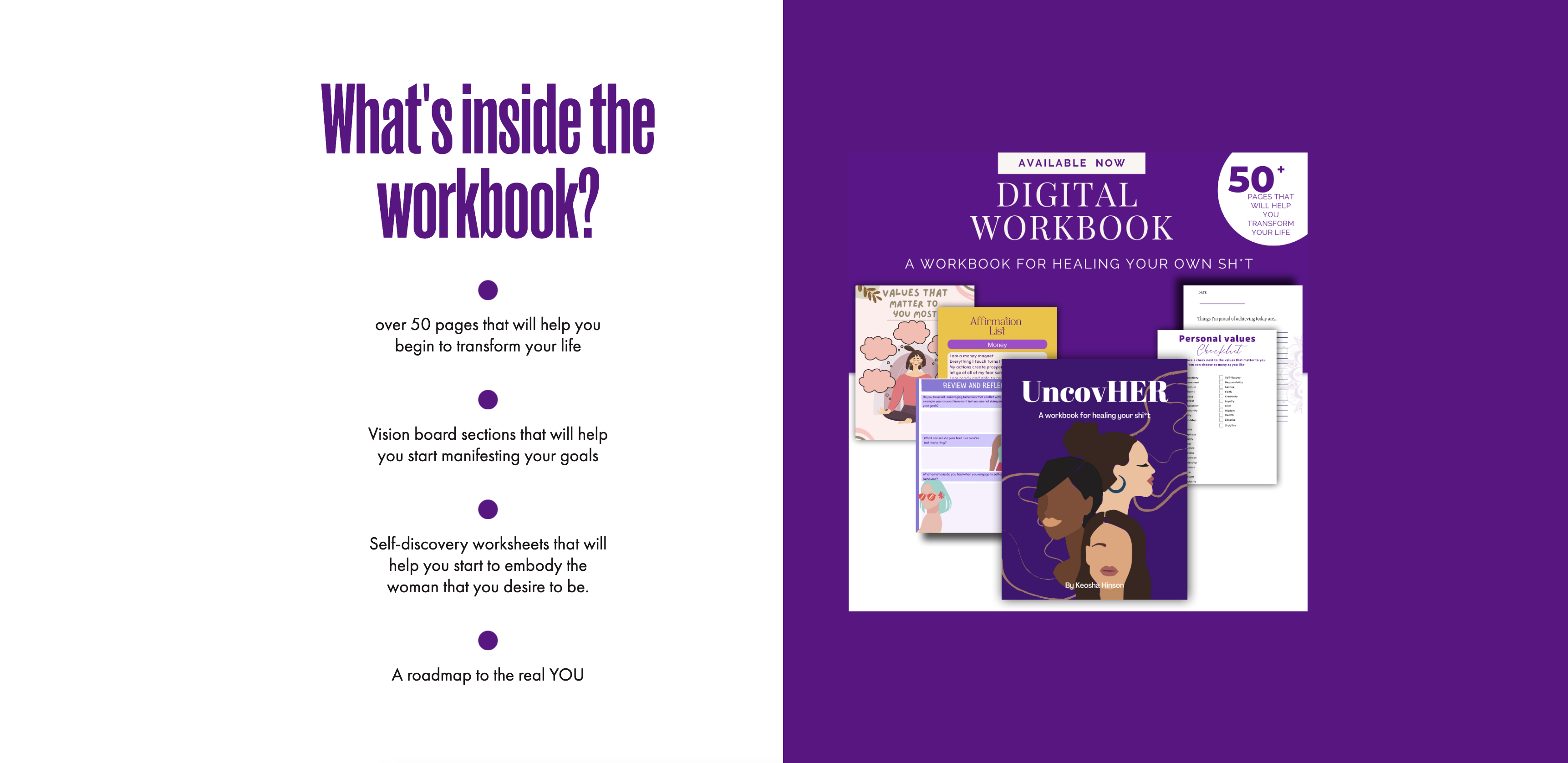
Perhaps the most important aspect of any ebook landing page is letting visitors know how they’ll benefit from your ebook. Keosha Hinson Mindset Coach uses a combination of benefits and a preview of the contents to sell visitors on why they should purchase the ebook.
Why we love it:
- This page does a great job of focusing on benefits and how the ebook delivers those benefits
- It pairs the benefits with a sneak peek of what’s inside, almost proving the value to come
What it does well: Keosha Hinson Mindset Coach’s ebook landing page makes benefits the focal point. From start to finish, it tells visitors why they need to hit that Buy now button.
CWJ Marketing
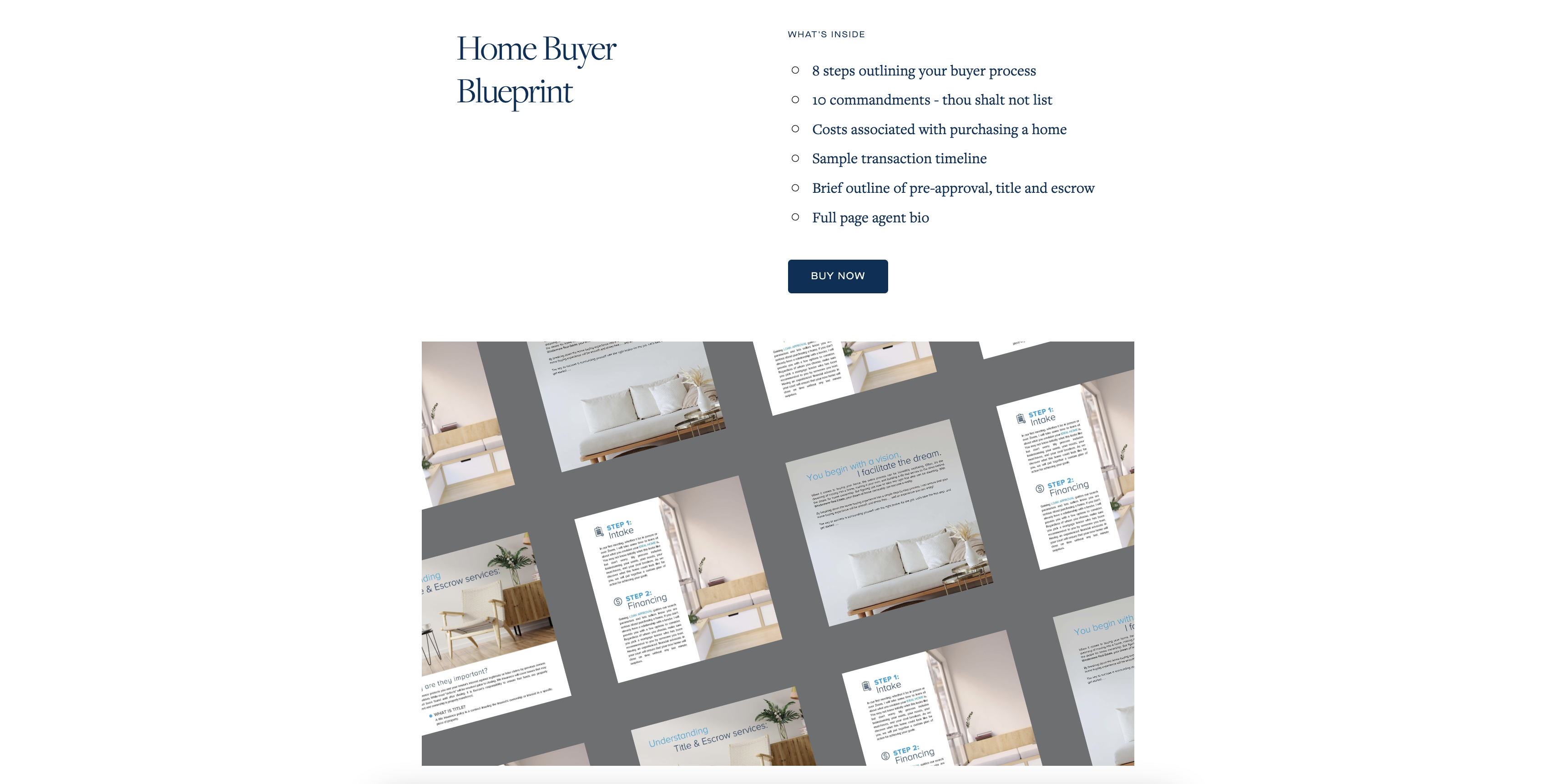
CWJ Marketing’s unique landing page takes previewing to an entirely new level. Yes, it uses text to share what’s in the ebook, but the grid pattern image of the actual pages in the ebook tells the story even better. It’s creative and gives enough to offer context, but it still leaves a bit of mystery.
Why we love it:
- This landing page takes a creative approach to imagery
- It combines text and images to share what to expect without giving too much away
What it does well:
CWJ Marketing delivers creativity and intrigue with its unique way of displaying the blueprint in the ebook.
Create your ebook landing page with Flodesk Checkout
Feeling inspired? After all those gorgeous landing pages, we certainly are! And if you are too, head on over to Flodesk to create a landing page for your ebook or guide.
Much like Flodesk Email, you can play around with layout blocks, fonts (did you know you can upload custom fonts?), colors, and branding to create a truly beautiful, on-brand landing page for your ebook. You can also:
- Use pre-built templates or create your own from scratch
- Edit or delete layout blocks to fully customize the look
- Match your brand with custom fonts, branded colors, your logo, and more
- Add custom images or use our stock photo and GIPHY integrations
- Create a seamless checkout and delivery experience
- Add upsells, bonus offers, discounts, and more
- Use your checkout page as an opt-in form too
It’s never been easier to create beautiful, high-converting landing pages. Try Flodesk Checkout free for 30 days and start designing the perfect home for your ebook. We can’t wait to see what you’ll create!
Design stunning ebook landing pages
Create beautifully-designed landing pages for your ebook using Flodesk Checkout’s easy-to-use page builder and stunning templates.

Related Articles