Products page design: 15 Examples and best practices
Table of Contents Jump to:
Jump to:
Table of contents
TL;DR: Want to learn more about designing effective product pages for your business? We’re breaking down a few examples and what makes each one successful.
You have built a great product or service. You’ve cut through the social media algorithms, the promotions tab of various email inboxes, and even ranked high enough in the Google search results to intrigue a few new customers.
Potential customers are clicking on your link, wanting to buy what you’re selling. You’ve made it this far, but what happens next is where the real-life magic happens.
Once a visitor finds your product page, their experience will go a long way to determining whether they buy from you or keep looking for other options. IRP Commerce data revealed that the average conversion rate for e-commerce website visits was 1.77%. In other words, on average, for every 100 people who visit a website for online shopping, only two will actually buy something.
But don’t stress about statistics like this. Our tips, tricks, and best practices will help boost your online digital product sales and convert at a higher rate than 1.77%. Let’s start with optimizing your product page to create a beautiful, informative, and intuitive experience that your visitors will love.
We’ll explore the elements that create high-conversion product landing pages and go piece by piece through 15 of the best examples we’ve ever seen. Learn how to quickly create your own stunning product page to drive conversion, even if you have no design experience!
7 Best practices for a great product page
Great product page design is built on a handful of foundational principles. No matter the type of business you run or the particular product you’re selling, you should keep these seven practical tips in mind when building your e-commerce store.
1. Make it interesting

The ultimate goal for your product pages is to hold your visitors’ attention long enough for them to stay engaged with your site and complete the purchase process. No one likes to open a boring or irrelevant landing page. You more than likely have experienced this yourself.
Imagine you’ve just seen an intriguing Instagram story ad. You swipe up to visit the link, excited to learn more. But once the landing page loads, you see a disappointing and unexciting product detail page, so you quickly abandon it, returning to viewing photos of your friends’ dinner entrees and pets.
Want to avoid your visitors doing the same thing? Create a great product detail page and grab the attention of your target audience as quickly as possible.
2. Focus on user experience
Customer experience should be at the top of your list of must-haves when building your checkout page. You’ve created your digital product to get an actual person to purchase it—and to achieve that, you need to build your e-commerce site from the ground up with user experience in mind.
The best version of a product page is one that drives customers to make a purchase and gives them an unforgettable experience while doing so. A positive online shopping experience can help you gain repeat customers, and data proves it: a survey from Invoca found that 76% of respondents would stop doing business with a company after just one bad experience. So design your product pages with your potential customers’ experience as a top priority.
3. Track your site visitors’ engagement
You want to give visitors the best possible site experience, but how do you know what’s working and what isn’t? You want to create intriguing, user-focused product pages, but you need to know how well they’re working, too. As the S.M.A.R.T. goal-setting strategy lays out, your goals need to be measurable. The more analytics and insights you can gain into your product pages the better.
Knowing your conversion rate across different landing pages and other metrics, like your customers’ most-used payment options, most searched terms, or how long it takes users to complete the buying process can help identify areas for improvement.
Taking time to understand which parts of your website drive sales and which parts don’t can make all the difference between converting two of every 100 visitors to your product landing page or converting at a higher rate. Measuring customer engagement with your online store should be baked into your product pages.
4. Include customer reviews
The Graceful Baker’s compelling testimonials on their Flodesk Checkout page.
Ratings and reviews are the most important factor for shoppers who land on product pages. Even more important than the price. A survey from Power Reviews found that 92% of shoppers consider the ratings and reviews when browsing a product page vs. 88% who consider the price.
Positive customer feedback plays into the marketing phenomenon known as social proof. Social proof is a term coined by a renowned marketing and psychology professor that, simply put, says that people are more likely to do something if they know that other people are doing it too.
Featuring customer testimonials and positive reviews on your product pages is a great way to build a sense of social proof and help potential customers feel more confident buying from you.
5. Make product descriptions informative
Another important part of creating product pages that convert is providing relevant content in your product descriptions. Focus your product descriptions on creating a better customer experience by offering as much detail as possible.
Have you ever seen an online ad for a great-looking t-shirt only to land on a product page that doesn’t tell you the sizing chart or whether the shirt is in adult sizes or children’s sizes? It’s a frustrating experience. And information lapses like that can be positive (or negative) game-changers when it comes to selling products.
According to Power Reviews, 68% of online shoppers consider written product details when they land on a product page. Product descriptions are third among the most important buying influencers of product pages (behind reviews and price). Make sure your product notes help customers find the information they need quickly and easily.
6. Use clear but captivating images
High-quality images are critical to building a product page layout that drives sales. Product images can take your web page to the next level by showing off what makes your product unique.
Whether using stellar product photography to show off a physical good, finding user-generated content and product photos to create social proof, or using beautiful stock photography to enhance the vibe of your product pages, an e-commerce store in any industry will benefit from using high-quality and compelling images.
7. Match your online store to your brand
Each product page should feel personalized and have a strong (and obvious) connection to your brand.
Your customers are looking for a cohesive online shopping experience across all their touchpoints with your brand. When you’re buying online, if you click on an ad for a business you expect the look and feel of the landing page to be consistent with the ad you’ve just seen. Otherwise, you’re may think you’ve clicked on spam or a bad link. The same principle applies to an online product page vs. an in-store experience.
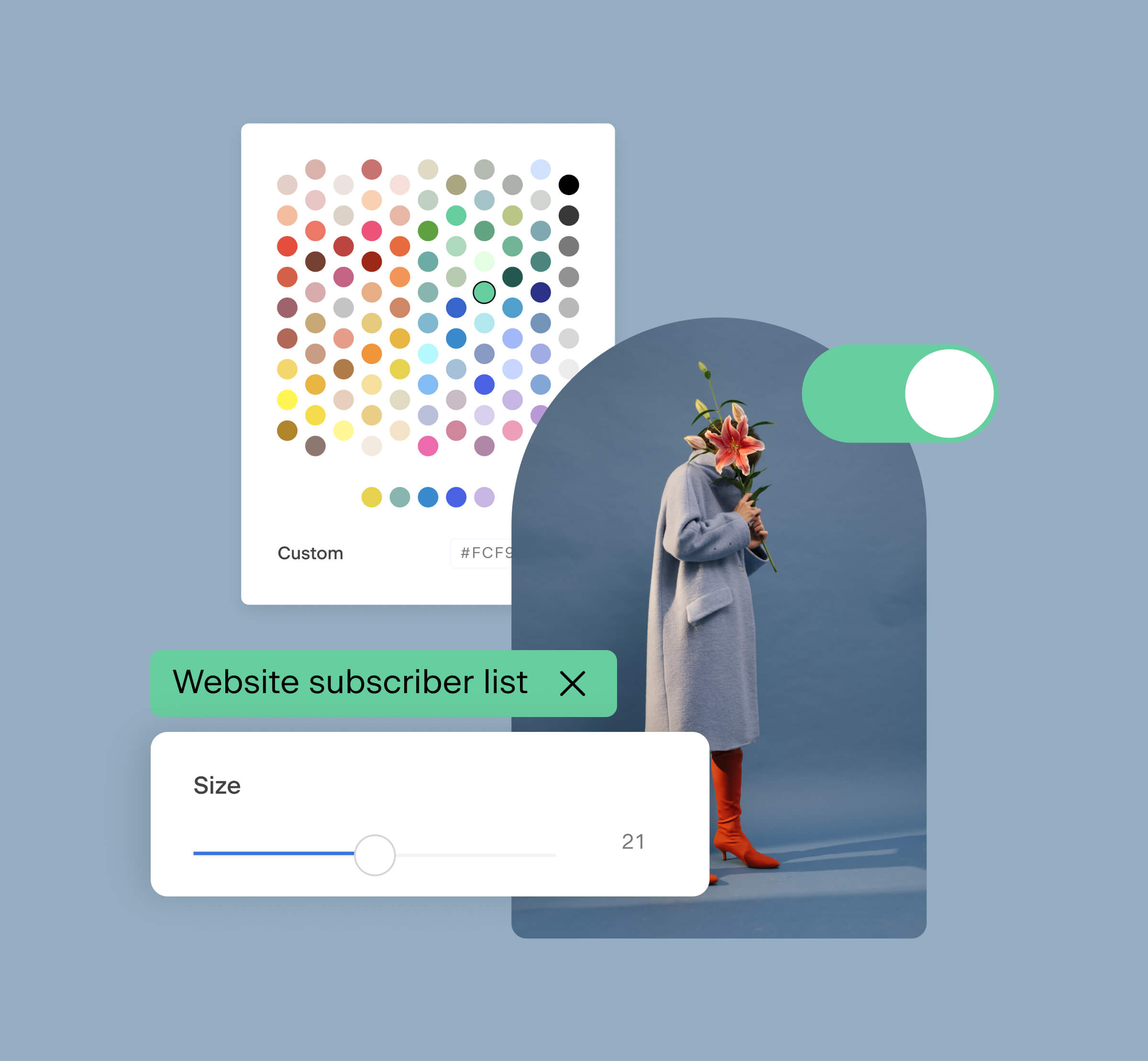
With this in mind, select product images and a checkout page design that your customers will easily recognize as a part of your brand. Tools like Flodesk Email and Flodesk Checkout make it simple to keep everything from your product launch email to your payment confirmation page on-brand with click-and-build templates.
Build engaging product pages that guide customers through an experience they’ll love
Checkout makes it easy to design beautiful sales pages that give customers an unforgettable experience. All with no platform fees.
15 Examples of fantastic product page designs
Now that you know the best practices for creating product pages, let’s take a look at some design examples that will inspire you. We’ll walk through a variety of e-commerce stores, ranging from ebook authors and retail stores to streaming services, to highlight some of the basic design principles we’ve shared above.
No matter what industry they represent, each of the below product pages does a fantastic job of showcasing what a customer needs to know to make a purchase.
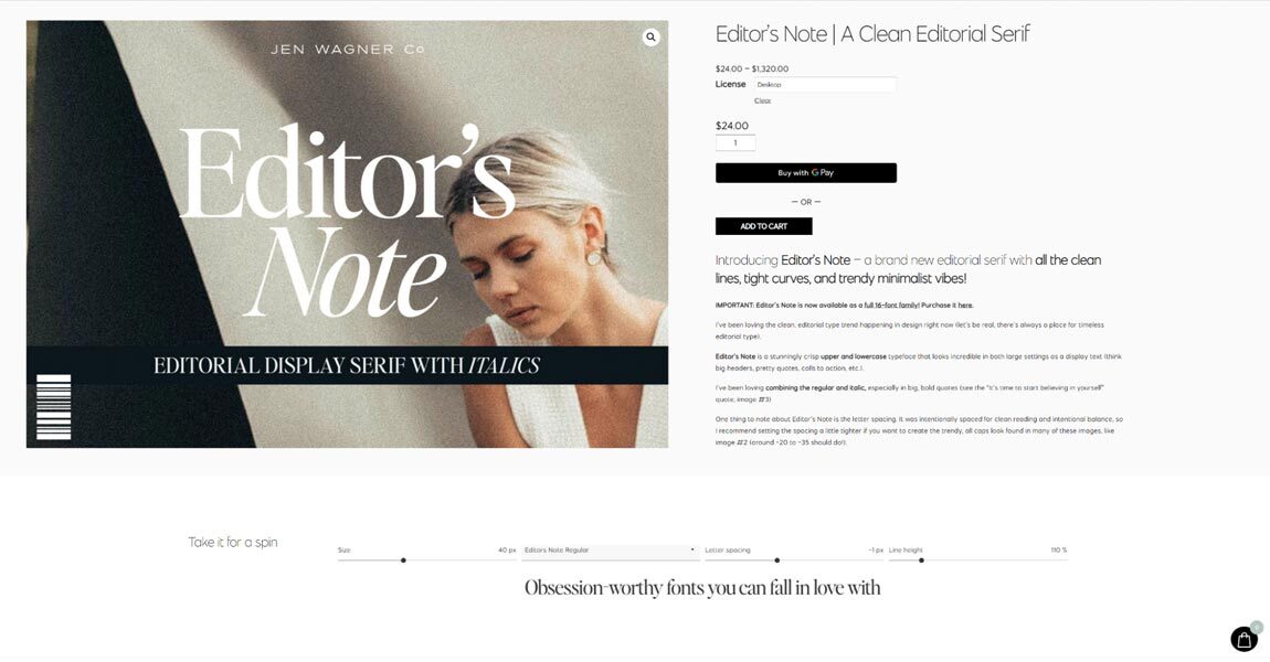
Jen Wagner is a freelance graphic designer and typography artist based in Nashville, TN. Jen offers various design services through her website, Jen Wagner Co., including custom brand font creation, marketing consulting, and custom licensing. Wagner also sells ebooks and online courses detailing the basics of font and typography on her online store.
We’re taking a look at the product detail page for Editor’s Note, one of Jen’s custom fonts. Three standout features of this product page layout include:
- Striking product images that show the font in action and immediately catch your eye
- Product descriptions that are engaging and informative
- An interactive tool beneath the product details invites users to play around with the font using sample text
What we love
- The product images are showstopping and immediately engaging, showing potential customers a wide variety of possibilities for the font
- The product description explains what makes this font different from others and how it’s meant to be used
2. Kith
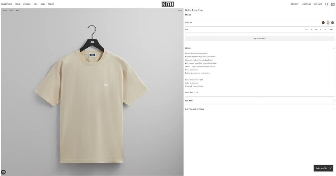
Kith is a New York City-based streetwear brand founded by designer Ronnie Fieg. The brand specializes in minimalist apparel and footwear.
Both Kith’s online store and its brick-and-mortar locations feature well-known major brands like Nike, Adidas, and others alongside their own collection. We’re looking at a featured product called the Kith Lax Tee for this example.
Each of Kith’s product pages shows off stunning, minimalist product photos that are in line with the brand’s overall aesthetic. The product description fits within this minimalist vibe as well, but crucially, it’s still informative for a consumer. It outlines all the important information quickly. Remaining minimalist and on-brand, but also efficient and intriguing.
What we love
- The beautiful product image matches the aesthetic the brand has established on social media and in ads
- The details section of the page further maintains the minimalistic vibes of the website while staying informative
3. Prowly
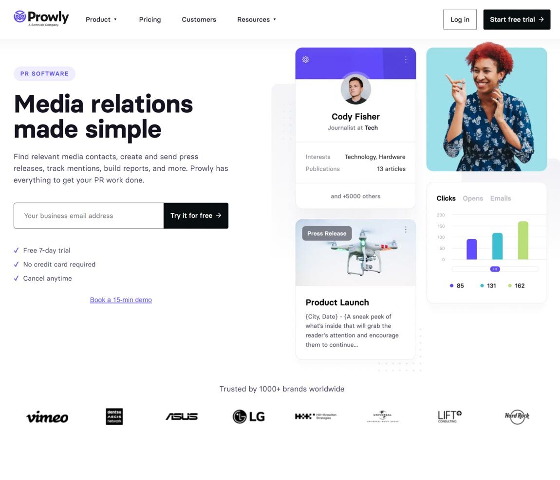
Prowly is a public relations (PR) management software that enables in-house PR teams, agencies, and small businesses alike to manage all of their PR activities in one place. The software empowers users to discover new media opportunities, find relevant media contacts, collaborate as a team, build brand awareness, and analyze content performance.
Prowly’s homepage doubles as a product landing page, showcasing many of the best practices we have discussed. The page has a simple description that their main audience is likely to find intriguing and multiple calls-to-action (CTAs) that make it easy to measure what customers find most interesting on the page. Additionally, Prowly’s site boasts a list of well-known clients and text reading “trusted by 1000+ brands worldwide” as a form of social proof.
What we love
- The product page features a straightforward product description that highlights the utility of the product in a way the target audience will appreciate
- Prowly’s product page features both a free trial sign-up link and a free demo link, making it easy to build a relationship with potential customers who are not quite ready to commit
- Prowly uses its product page to establish social proof by displaying famous brands they’ve worked with previously
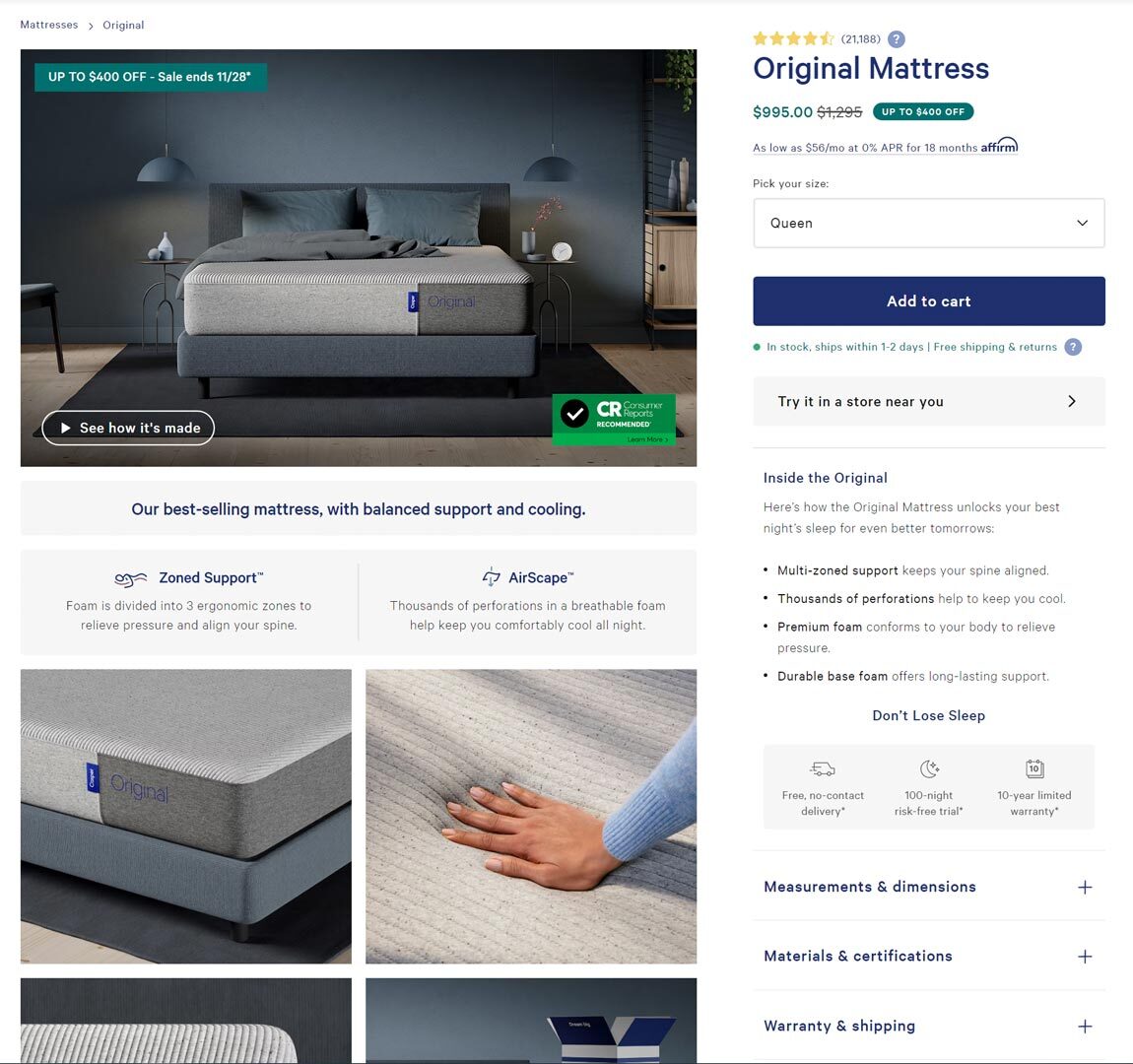
4. Casper
Casper is an innovative mattress company best known for its digital marketing campaigns across podcasts, YouTube, and social media. We are looking at the product page for their Original Mattress as a great example of page design.
In another great example of social proof, Casper features the star rating and the number of reviews (21,000+) for the mattress prominently on the page. Moreover, the product image highlights that the mattress is recommended by Consumer Reports, adding additional authority to the social proof established by the reviews. Finally, Casper goes to great lengths to address common questions about the product, including multiple product videos and detailed descriptions.
What we love
- Establishes that the product is beloved by thousands of consumers. Hello, social proof!
- Features multiple product videos that answer commonly asked questions
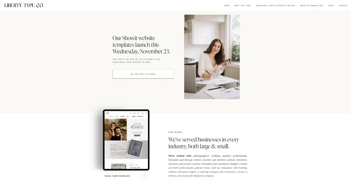
Liberty Type Co. is a female-led marketing and branding consulting agency based in Knoxville, Tennessee, and one of our Flodesk members to watch. Burg and her team at Liberty Type Co. specialize in brand strategy, web design, and marketing services.
You can use this product page as a blueprint for building excitement for an upcoming e-commerce product before you’re ready to start selling it. Liberty Type Co. uses a succinct but interesting description to highlight its forthcoming website templates along with a lovely photo that feels welcoming to the viewer. Its product page also highlights the discounted prices that come along with the product, creating a time-bound incentive for a potential customer to take action.
What we love
- Mentioning discounted prices in the CTA creates a sense of urgency despite the product not being available for purchase yet
- The friendly photo on the product page enhances the connection a website visitor feels to the brand
6. Zappos

Let’s take a look at the famous shoe retailer, Zappos. Its product pages help consumers find detailed information quickly, like this ASICS running shoe page. Every Zappos product page packs an impressive amount of descriptive information into a condensed area without ever feeling crowded.
Zappos has figured out what details their customers typically look for when it comes to a pair of sneakers and distilled it down to the essentials. A Zappos product page showcases clear, simple images of the entire product, details about the original price and sales price, sizes available for purchase, product videos that break down the quality of the product, and more.
What we love
- This product page features multiple helpful tools
- Page design focuses on using all available white space as efficiently as possible to pack in details
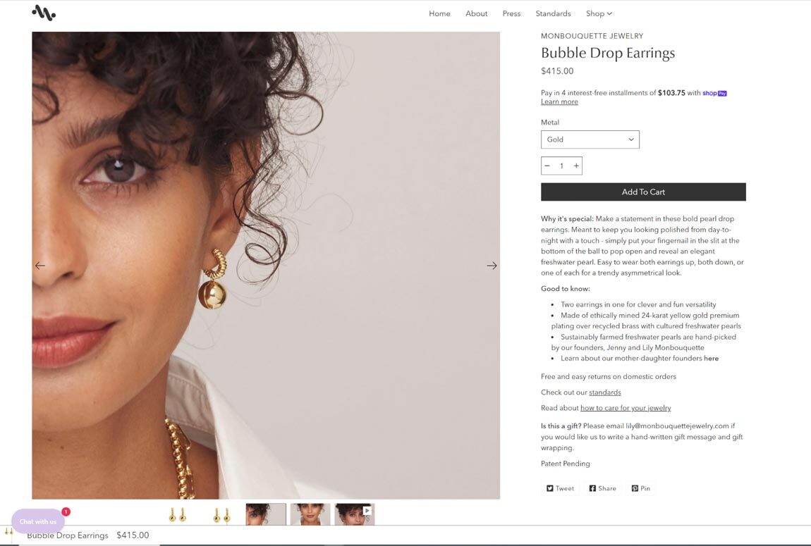
Our next product page is both beautiful and functional enough to inspire your e-commerce product page. It comes from Monbouquette Jewelry. Monbouquette Jewelry is a brand co-founded by mother-daughter duo Jenny and Lily Monbouquette.
The brand focuses on making “clever statement jewelry” that is made in the USA with only sustainable and ethically sourced materials. Our example will focus on the product page for the gorgeous Bubble Drop Earrings from Monbouquette. This unique pair of earrings features a two-in-one style design with its simple gold bubble hiding a pearl inside. The earrings can be worn with the pearl hidden or revealed, and this product page features animated images that display how the earrings can switch between looks. Each of Monbouquette’s product pages emphasize the value proposition of their jewelry with a “why it’s special” section.
What we love
- Animated images on this product page show off unique features in a way that a still image couldn’t
- The detailed earrings description emphasizes their value proposition
8. SparkToro
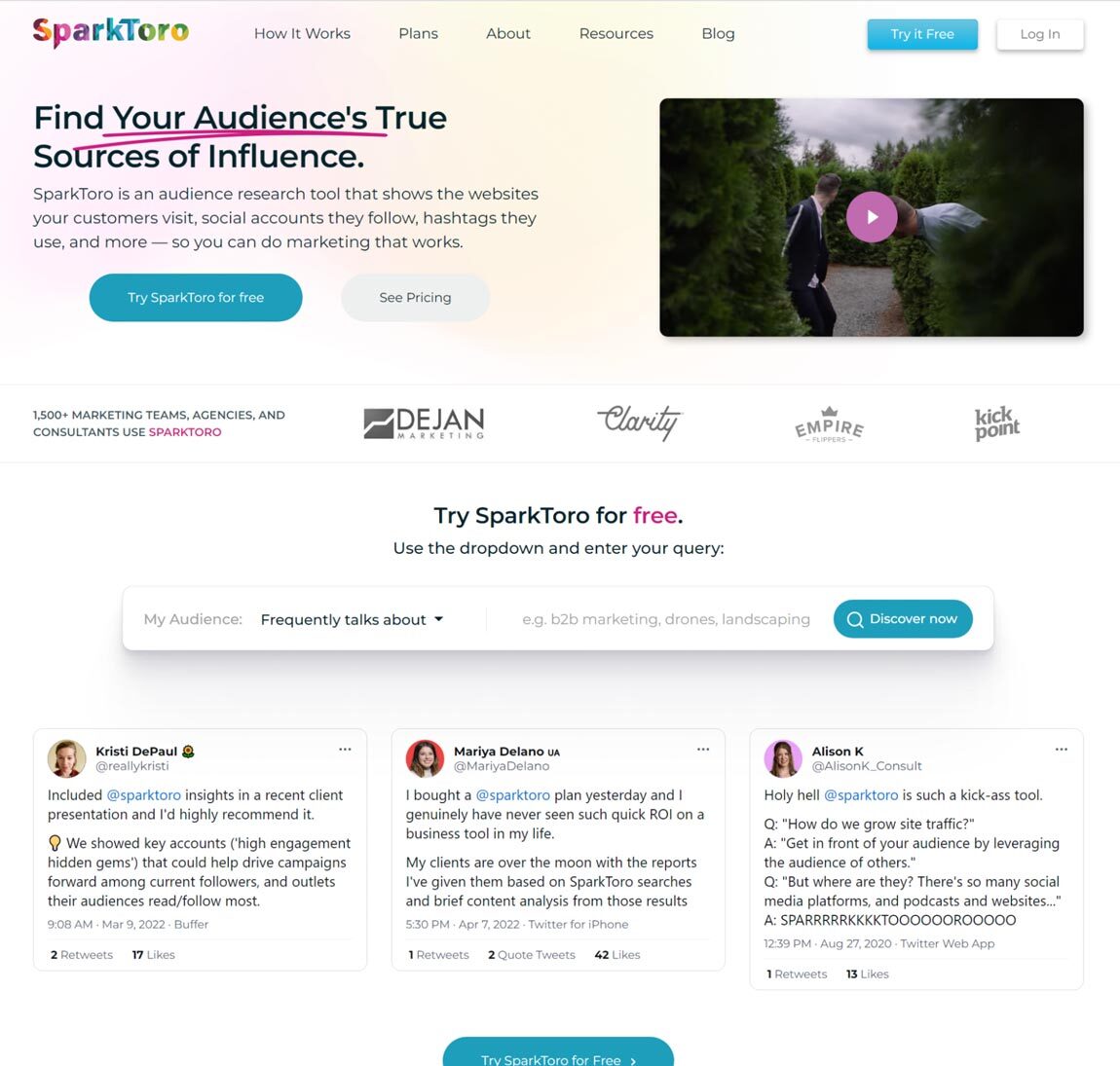
SparkToro is a software tool that helps marketing teams, agencies, and consultants research the audiences that consume their content. The SparkToro platform analyzes data from 12 major social networks including Twitter, LinkedIn, YouTube, and Instagram to put together key information about any online audience and their habits.
These analytics help marketers understand things like the shared interests of their customers, what they like to read or watch, and how they describe themselves online. SparkToro’s homepage doubles as a product page. It features a visually engaging product video that explains the concept behind the tool in detail alongside customer testimonials from tweets from satisfied customers. Finally, SparkToro prominently displays an interactive test of the main feature on its product page for any curious website visitor to use for free.
What we love
- SparkToro uses a product video that draws website visitors in and explains the platform well
- The company showcases genuine feedback from satisfied customers
9. J.Crew
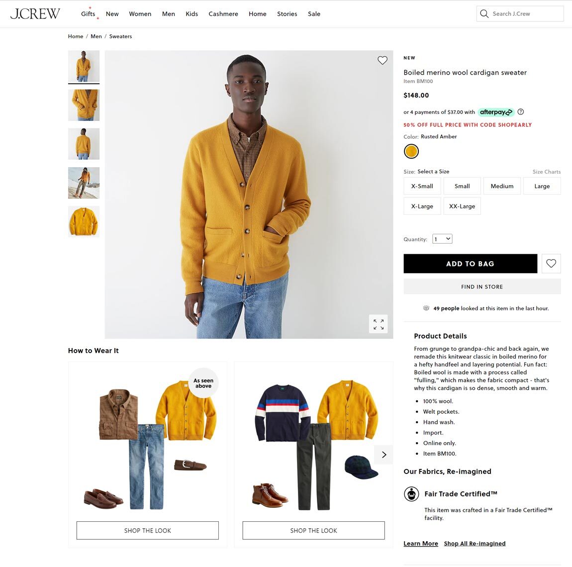
J.Crew is an iconic American clothing retailer that specializes in timeless preppy attire for everyone. Let’s look at the product page for a men’s clothing item called the “Boiled merino wool cardigan sweater”. Like all of J.Crew’s product pages and most others for major clothing brands, this one features product images that show the cardigan being worn by a model plus detailed images of the garment only.
Where this product page separates itself from the pack is where it includes a “How to Wear It” section beneath the product image. This section serves as inspiration for customers unsure of how they might style a bright yellow cardigan.
With its “shop the look” CTA, the “How To Wear It” section also serves the extra purpose of linking to the product pages for other items that interested shoppers might buy along with the cardigan. This technique, known as a cross-sell, is extremely important for e-commerce sites.
Pro tip: Try Flodesk Checkout to integrate cross-sell functionalities into your product pages quickly and easily.
What we love
- Product photography offers inspiration to interested shoppers
- The “How to Wear It” section of the product pages and “Shop the Look” CTAs enable cross-sells
10. Netflix
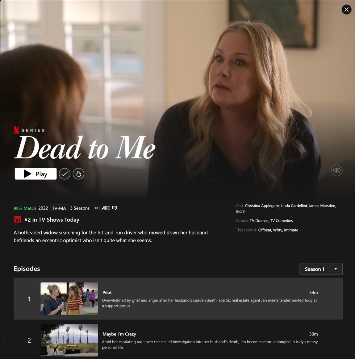
You didn’t think of the Netflix app as an example of a product page, did you? Netflix’s stellar page design is so intuitive and user-friendly that it seamlessly integrates into the larger experience of being a Netflix customer. Every movie or series detail page on Netflix serves the same function as a product page on your website: enticing a potential customer into a conversion.
Netflix primarily relies on its trailers to do the heavy lifting when it comes to getting subscribers to decide to click on a new movie or TV show. Your product page can use the same principle when it comes to your product videos. Show your website visitors just enough in the product video to get them intrigued enough to click the button to go to the next page.
What we love
- A Netflix product page integrates so smoothly into the customer experience as to go largely unnoticed
- Every trailer (aka product video) is fine-tuned to capture attention and convert the audience
11. The Bingaman Co.

The Bingaman Co. is run by Tracy Bingaman, an entrepreneur and virtual coach looking to help busy moms save time and money with her ebook, The Ultimate Budget Bundle, and one-on-one coaching sessions.
Tracy designed her product page using Flodesk Checkout, which gives her the freedom to fully express herself with unique and engaging CTAs—all while maintaining a beautiful landing page that is easy to navigate.
Tracy’s built a beautiful website that makes use of bullet points to quickly explain what buyers can expect if they invest in her ebook. And as a user of Flodesk Checkout, Tracy is also able to accept payments online without any platform fees.
What we love
- The Bingaman Co. utilizes a lovely template from Flodesk Checkout to drive conversions and engagement
- Succinct bullet points drive home the impact of investing in Tracy’s ebook
- CTAs are compelling and drive users to take action
12. Dr. Martens
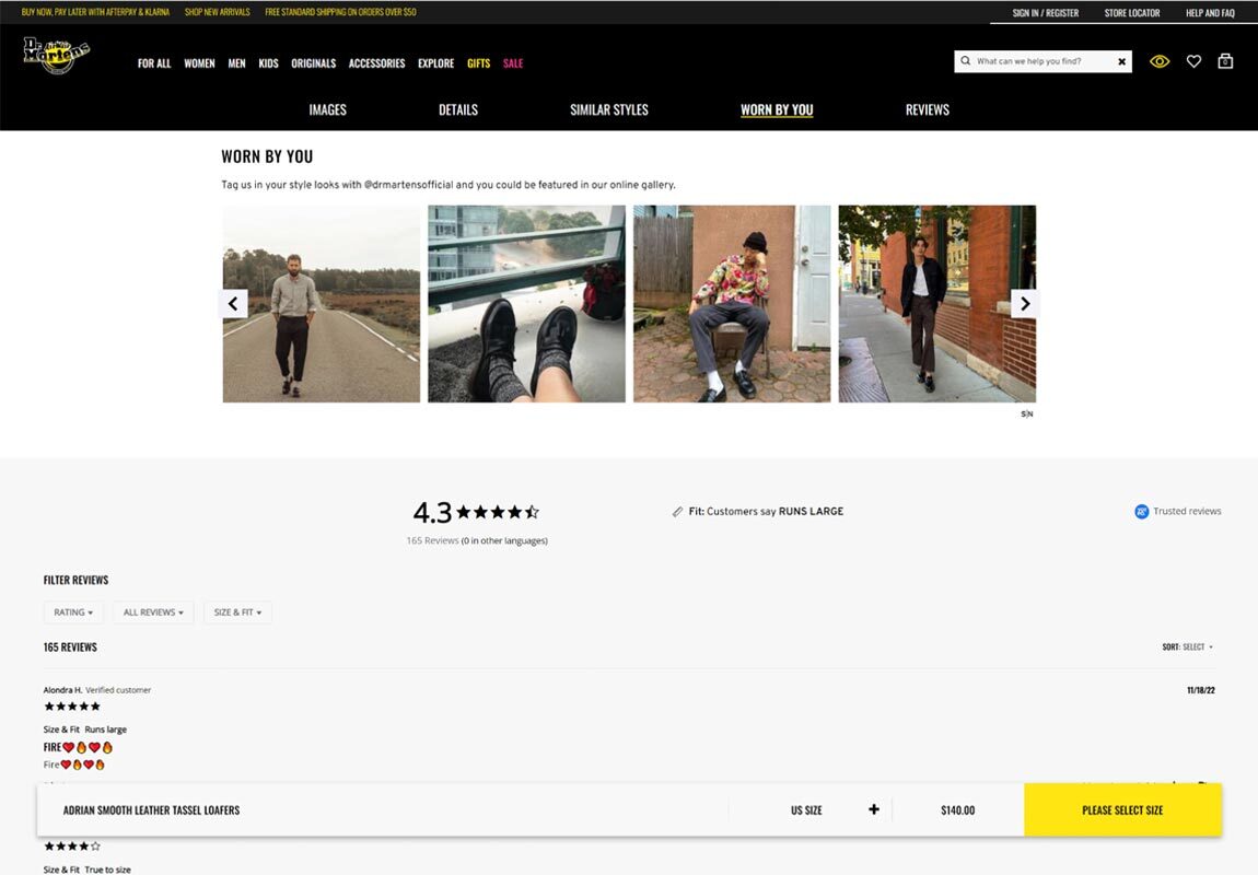
Returning to the world of retail, the next product page we will look at comes from the iconic footwear brand, Dr. Martens. In perhaps the greatest example of the “include customer reviews” best practice we discussed earlier, every Dr. Martens’s product page features a “Worn By You” section showing off user-generated content from Instagram.
Seeing a lot of people do something will typically get others to follow along. Dr. Martens leverages that psychological phenomenon perfectly on their product landing pages. The brand doubles down on the social proof principle on many of its product pages by featuring written reviews in addition to the “Worn By You” section.
By doing so, Dr. Martens allows its customers to feel a part of something much larger than themselves. When you shop for Dr. Martens you become a part of an extremely active community.
What we love
- Dr. Martens’ product pages create a larger sense of community by prominently featuring other people who have bought the same shoes
- The brand and its products are more authentic in the eyes of consumers thanks to their focus on content generated by genuine users of the product
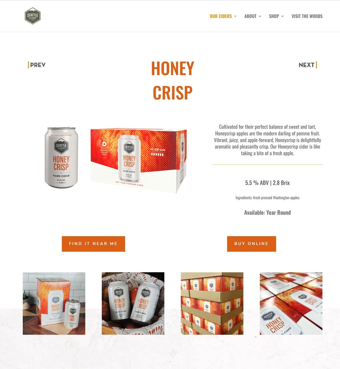
Refreshingly, Seattle Cider Co. is exactly what it sounds like it would be: a Seattle-based company that makes and sells hard cider. The company name’s simplicity and clarity of purpose are both traits carried through to the brand’s product pages as well.
In this case, we’re taking a look at their Honey Crisp variant. Each product page features descriptions of the cider and photos of the packaging that evoke the feeling of relaxing with a crisp, refreshing can of cider in the Pacific Northwest. The descriptions on each page are no longer than one tweet’s worth of characters, but that brevity is an advantage for a product like this. A similarly minimal setup could be the right fit for your product page if you’re in a similar industry.
What we love
- The description of the product is brief, but still takes users on a journey
- The brand remains consistent and simple no matter what landing page a user lands on
14. Moon Pod
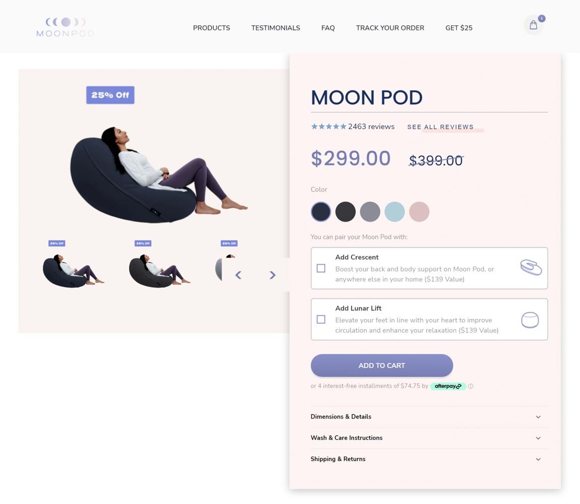
For those unfamiliar, the Moon Pod is a modern reinvention of the bean bag that’s designed to replicate that childhood joy of sitting in a cozy little sack on the floor. The Moon Pod product page nails a few of the best practices we discussed earlier. First, product photography emphasizes the best features of the product as soon as you hit the landing page. These photos make a Moon Pod look like the most comfortable piece of furniture ever.
Additionally, the Moon Pod product page emphasizes customer reviews right above the price, keeping in line with consumer priorities. Beneath that, the product page offers cross-sell CTAs that make it intriguing to bundle a second piece with your Moon Pod purchase. Finally, further down the page, Moon Pod ups the ante with a direct product comparison, pitting itself against the top competitors like Lovesac or a regular bean bag—and beating them on every metric.
What we love
- Emphasizes product reviews at the top of the page
- Features excellent photography that accentuates the value of the product
- Showcases a direct product comparison to set its offering apart from competitors
15. Teddy Baldassare
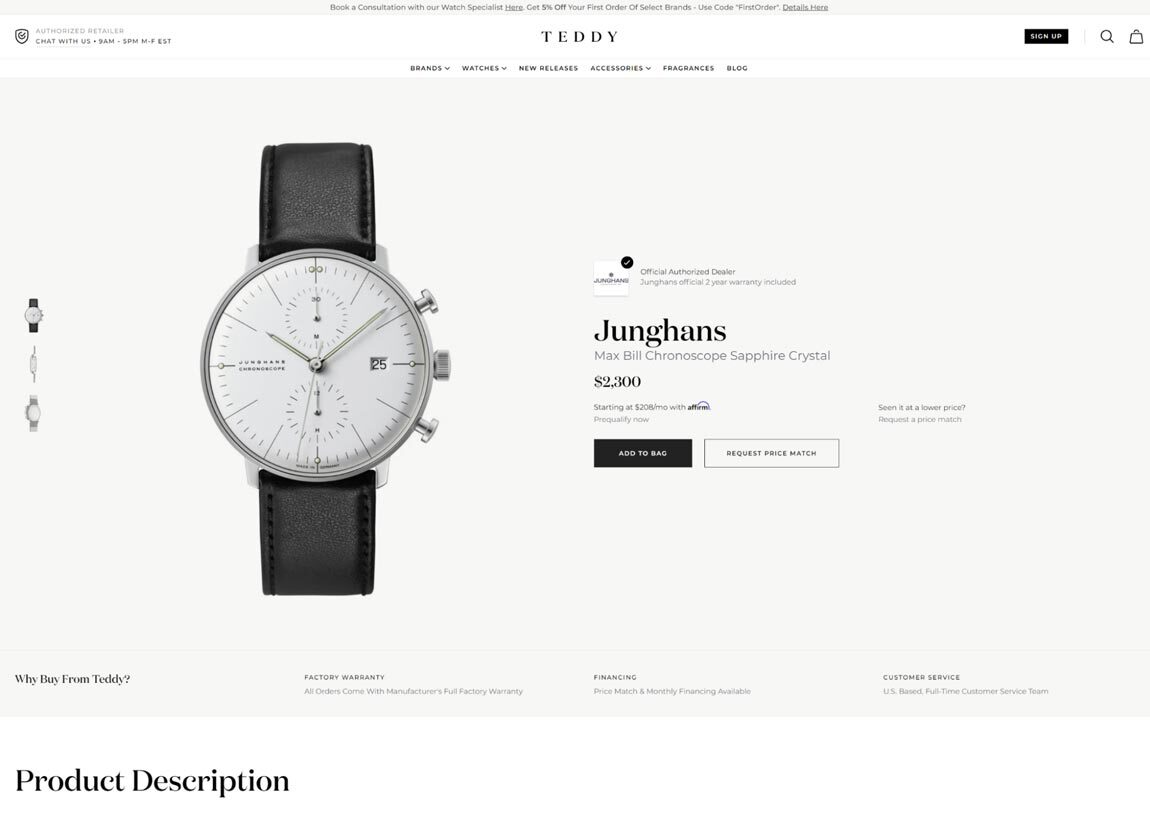
Teddy Baldassare, the man, is a well-known YouTuber and social media influencer who posts popular videos reviewing men’s luxury watches for the modern luxury watch enthusiast.
TeddyBaldassare.com is his online store where he’s an authorized dealer of various popular watch brands, like Tissot, Citizen, Seiko, and many others. What separates its product pages from competitors is that its e-commerce store re-emphasizes many of the traits that have made Teddy a popular YouTuber.
Teddy features in-depth breakdowns of every detail of the watch itself and the brand’s larger history. His enthusiasm for the details is what Baldassare’s dedicated fanbase has come to expect from him, and that experience is carried through on his e-commerce product pages.
What we love
- Every product page functions as an extension of the brand Teddy Baldassare has built for himself on YouTube
- Teddy’s attention to detail and deep appreciation for the history of the brands he sells creates consumer trust
15. Ikea
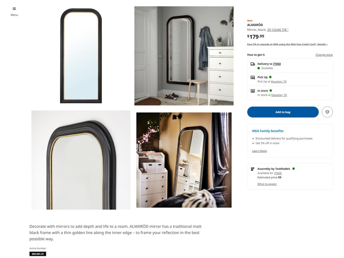
Most people are intimately familiar with Ikea, one of the largest furniture retailers in the world. Despite their giant size, the design of an Ikea product page can be instructive for small business owners looking to improve their e-commerce stores.
Ikea’s main value proposition is that their furniture can better the look of your home without breaking the bank. Every product page on the Ikea website emphasizes that value add. How does Ikea pull that off? Typically, by featuring great product images that feel authentic, beautiful, and inspiring.
In the case of this mirror, Ikea shows the mirror in two different situations that are broadly applicable to anyone who may be interested in purchasing it. Your product page, no matter what it is you sell, should work on the same principle. Work to find beautiful images that your ideal customers are likely to imagine themselves in and add those to your product page.
What we love
- Photographs make clear how interested customers could use the product in their daily lives
- You can quickly find an estimated delivery date for peace of mind
FAQs
What is product page design?
Product page design is the art of creating a landing page that helps customers find and purchase the items you sell online. Customers should be able to use each product page on your website as an important resource for information to help them make a purchase decision, and your design should intentionally reflect that. With Flodesk Checkout, it’s never been easier to build stunning sales pages.
How should you structure product pages?
There is more than one correct way to structure your product pages. As long as your site design sticks to the seven best practices outlined in this article, you will be able to build a product page that converts your website visitors into customers and those customers into repeat customers.
As a reminder, the seven best practices for structuring a product page are:
- Make it interesting
- Focus on user experience
- Track your site visitors’ engagement
- Include customer reviews
- Make product descriptions informative
- Use clear, beautiful images
- Match your online store to your brand
Find the right balance between these seven tips to build a great product page. What that ultimately looks like depends on what industry you’re in, the type of products you’re selling, and your personal preferences. Fortunately, these best practices apply in some form to every industry imaginable.
What’s the goal of a product page?
Ultimately, the goal of every product page is to get your customers one step closer to completing a purchase. This is true regardless of what industry you’re in or what the individual product happens to be. Whether you’re selling ebooks, candles, or coaching sessions, every product page should focus on moving your customers through the final stages of your sales funnel.
Create a stunning product page with Flodesk Checkout
Now that you’ve learned the best practices for designing product pages and have seen inspirational examples from some of the best e-commerce sites, get started building your own high-conversion checkout flow using Flodesk Checkout.
Designing a high-performance product landing page has never been easier. Try Flodesk Checkout free for 30 days and take advantage of the simple templates and easy-to-use design tools.
Build engaging product pages that guide customers through an experience they’ll love
Checkout makes it easy to design beautiful sales pages that give customers an unforgettable experience. All with no platform fees.

Related Articles