Checkout page design examples and best practices to inspire your sales flow
Table of Contents Jump to:
Jump to:
Table of contents
TL;DR: Want to design an irresistible checkout experience that drives sales while you sleep? Explore inspirational checkout page design examples and learn best practices to build your own.
You already have an excellent product or service offer prepped and ready to sell—now all you need is a captivating checkout page experience to start raking in the sales.
A checkout page is perhaps one of the most important pieces of a sales funnel. When a visitor makes it to your checkout, they’re only a few clicks away from becoming a paying customer—you just need to convince them to take that final step and click Buy.
Create a checkout experience that’s too good to resist with great page design and strategic sales tactics. In this article, we’ll share why checkout design matters and offer eight terrific checkout page examples to inspire your own.
Wondering how to DIY your page design? Explore top design principles and best practices for checkout pages to make your first (or five thousandth) sale in no time—with expert advice from Flodesk’s Design Director.
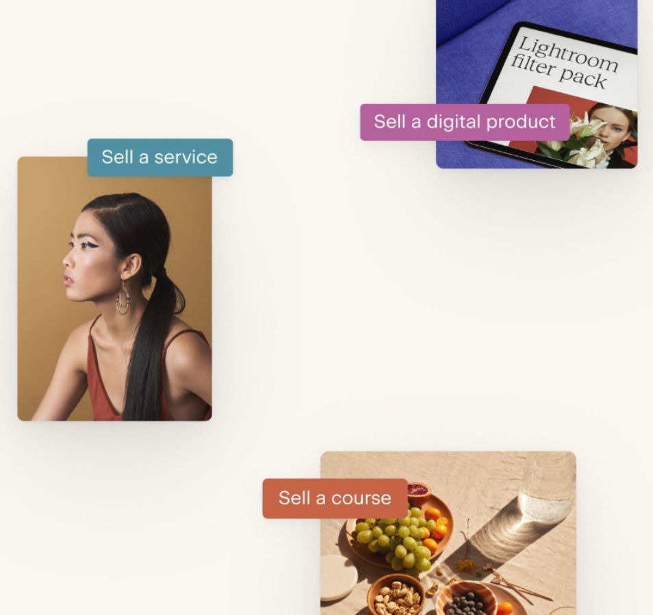
Design a beautiful checkout experience with Flodesk Checkout
Build beautiful sales, checkout, and delivery pages designed to convert using stunning templates from Flodesk.
What is a checkout page?
A checkout page, like a sales page, is designed to lead visitors through the last leg of the sales funnel. Whether you’re delivering freebies, monetizing your content, selling services, or offering paid upsells—a checkout page can help you drive conversions and start selling online.
Some checkout pages feature a sales page flow leading into a checkout process, while others feature checkout only. No matter what approach you choose for your business, you’ll want to ensure that you’ve designed your page to achieve sales goals.
Why checkout page design matters
Checkout pages are a critical component of the sales funnel—they can make or break someone’s decision to purchase and influence a prospect’s journey through the sales flow. If the checkout experience is poor, you risk bringing their journey to a screeching halt.
Once you’ve led prospects to the checkout phase, it’s crucial to have a page design in place that seamlessly drives them to click through and make a purchase (while hopefully encouraging them to make future purchases). Without a great checkout page design, you could be leaving money on the table.
Attract more customers with a strong sales funnel built to nurture from beginning to end—through checkout and beyond. Turn buyers into brand advocates with a purposefully-built experience that leaves customers feeling connected and craving more from your brand.
Wondering what you can achieve with a strong checkout page? Here are five ways you can level up your business with great design:
- Improve usability: Ensure everyone who visits your checkout page has a good brand experience by optimizing page designs for usability, for both desktop and mobile checkout. Keep things simple with clear calls to action (CTAs) and easy-to-use navigation.
- Increase sales: Fuel purchases from shopping cart through payment with strategic design elements and include upsell offers at checkout to supercharge your sales.
- Avoid abandoned cart: Don’t make visitors exit the checkout page altogether. Declutter your page design and ensure it’s optimized for easy purchases.
- Offer a good brand experience: Maintain consistency throughout your sales flow with branded fonts, logos, and copy. Design an experience that’s memorable and encourages brand loyalty. After all, repeat customers can become brand advocates for your business and drive even more sales for you.
- Boost trustworthiness: When it comes to making purchases online, it’s crucial for customers to feel secure before inputting their payment details. Put their worries at ease by showcasing secure payment badges or highlighting the trusted partners you work with to process payments.
8 Stunning examples of checkout page design
There are countless ways to build a unique, high-converting checkout experience that’s tailored to your brand goals and audience needs. With custom brand elements, irresistible copy, and strategic design, you can create beautiful pages that intuitively sell your offer for you.
Here are eight impressive examples of checkout page designs to inspire your own and what we love about them.
1. Embry Flin’s virtual astrology sessions
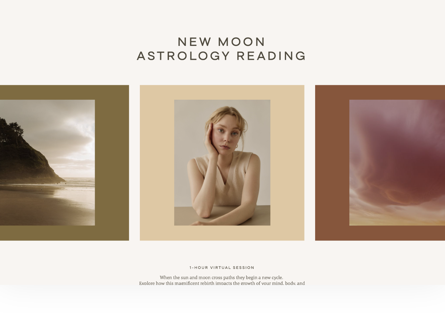
Embry Flin is an astrologer and the founder of the Healing Horoscope—a mentor program designed to support adrift souls as they find their place and purpose. In this whimsical checkout page, Embry does an excellent job of using brand colors and visuals to showcase her offer.
The strong headline stands out and clearly presents the offer before leading into the remainder of the page. It uses earthy tones consistently with simple, small-type fonts that outline the details of her virtual workshop.
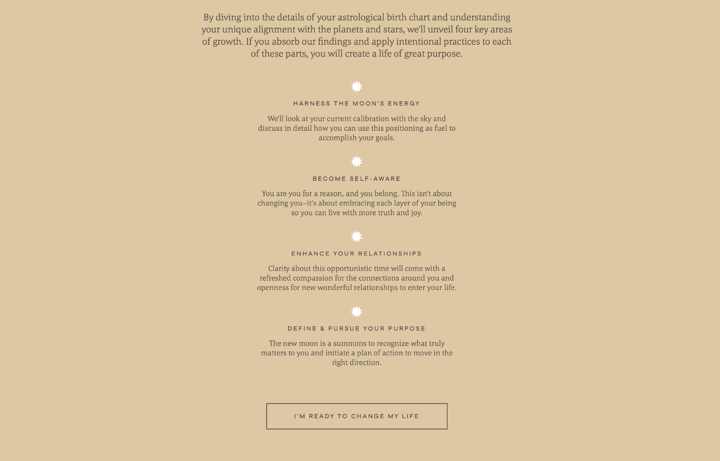
The checkout page outlines key workshop outcomes in a concise, listed format followed by a CTA button to purchase. The airy design of this checkout page provides a beautiful yet informative on-page experience while driving clicks to all the right places.
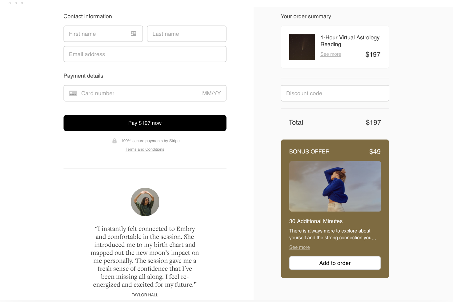
We also love that it uses branded design elements on the final checkout page, which maintains a cohesive on-brand experience from the first page visit through payments. Embry counters last-minute hesitations at checkout by implementing encouraging client testimonials to back up her pitch and instill trust. Plus, she includes an add-on upsell offer—posing an enticing bonus for customers and a sales-boosting opportunity for her.
What we love about this design
- Earthy tones and visuals throughout the entire checkout flow to create a holistic brand experience
- The “less is more” minimalistic style perfectly draws attention to key page elements
- Clear CTA page blocks have been evenly placed from the top to bottom of the checkout page
- Trust signals plus an upsell offer make the final checkout experience ultra enticing
- A secure payment badge adds trust before inputting payment details
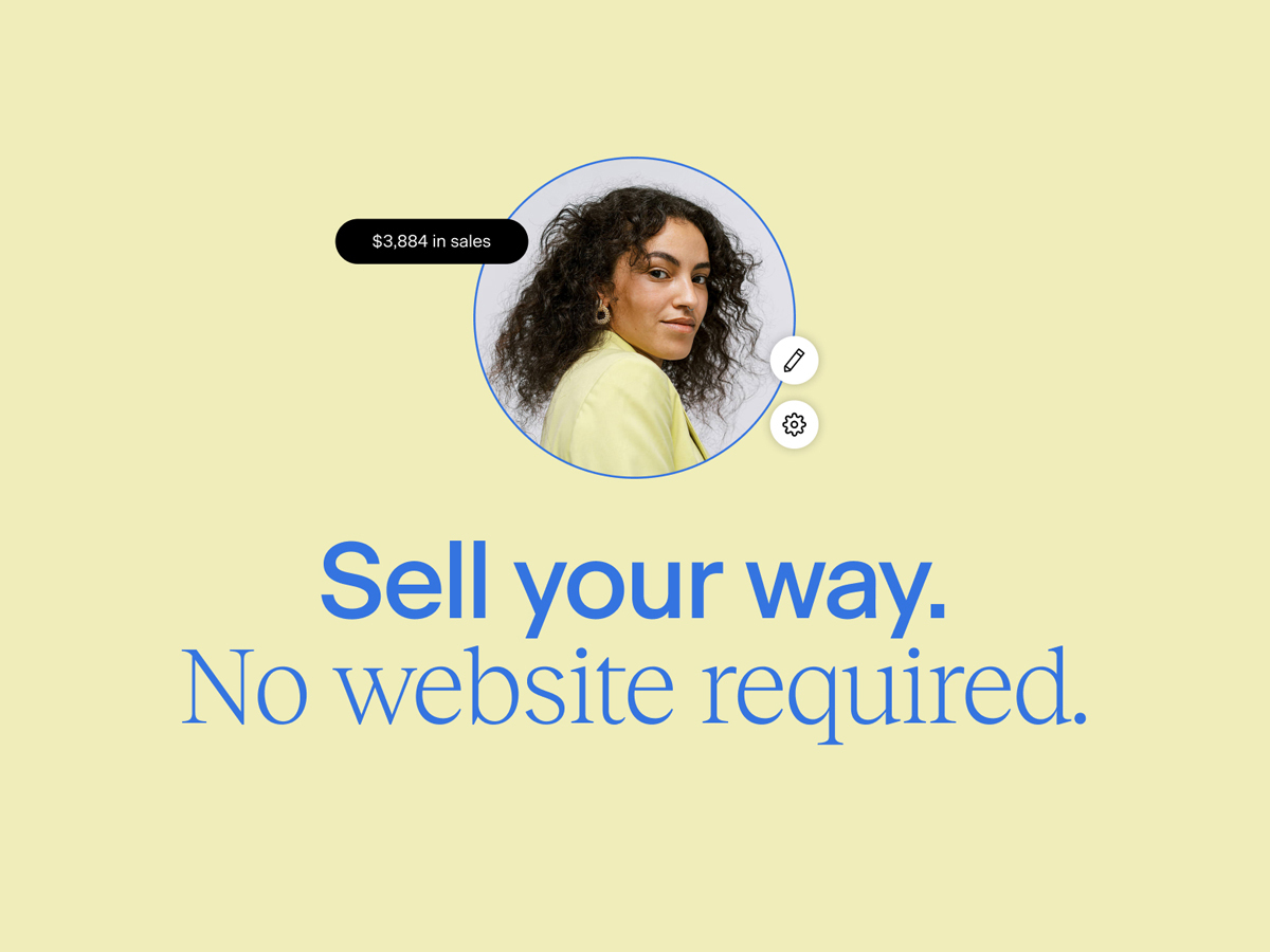
Customize your checkout experience with Flodesk Checkout
Create a beautiful, on brand checkout page that has visitors hitting your CTA over and over—all with no website required.
2. Amber Rae’s journaling workshop
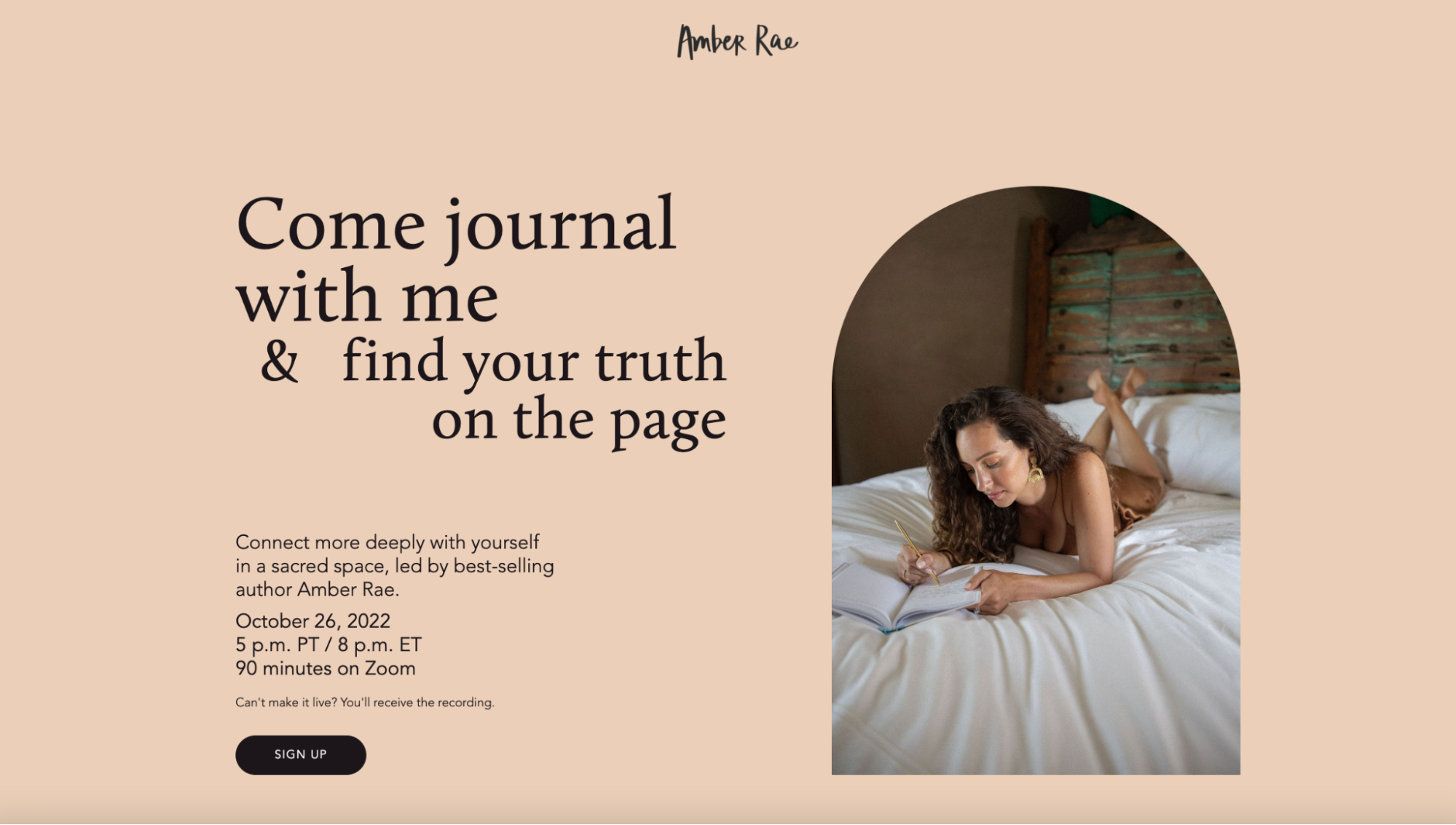
Amber Rae is a best-selling author, illustrator, and fierce advocate of creativity, self-discovery, and emotional wellness. She’s created a journaling workshop to lead others through writing exercises that encourage deeper self-connection.
Amber Rae’s workshop page design immediately draws visitors’ eyes to the heading—which concisely shares what action visitors should take and what outcome they’ll achieve. She puts all key information above the fold, prompting quick sales before a visitor’s first page scroll.
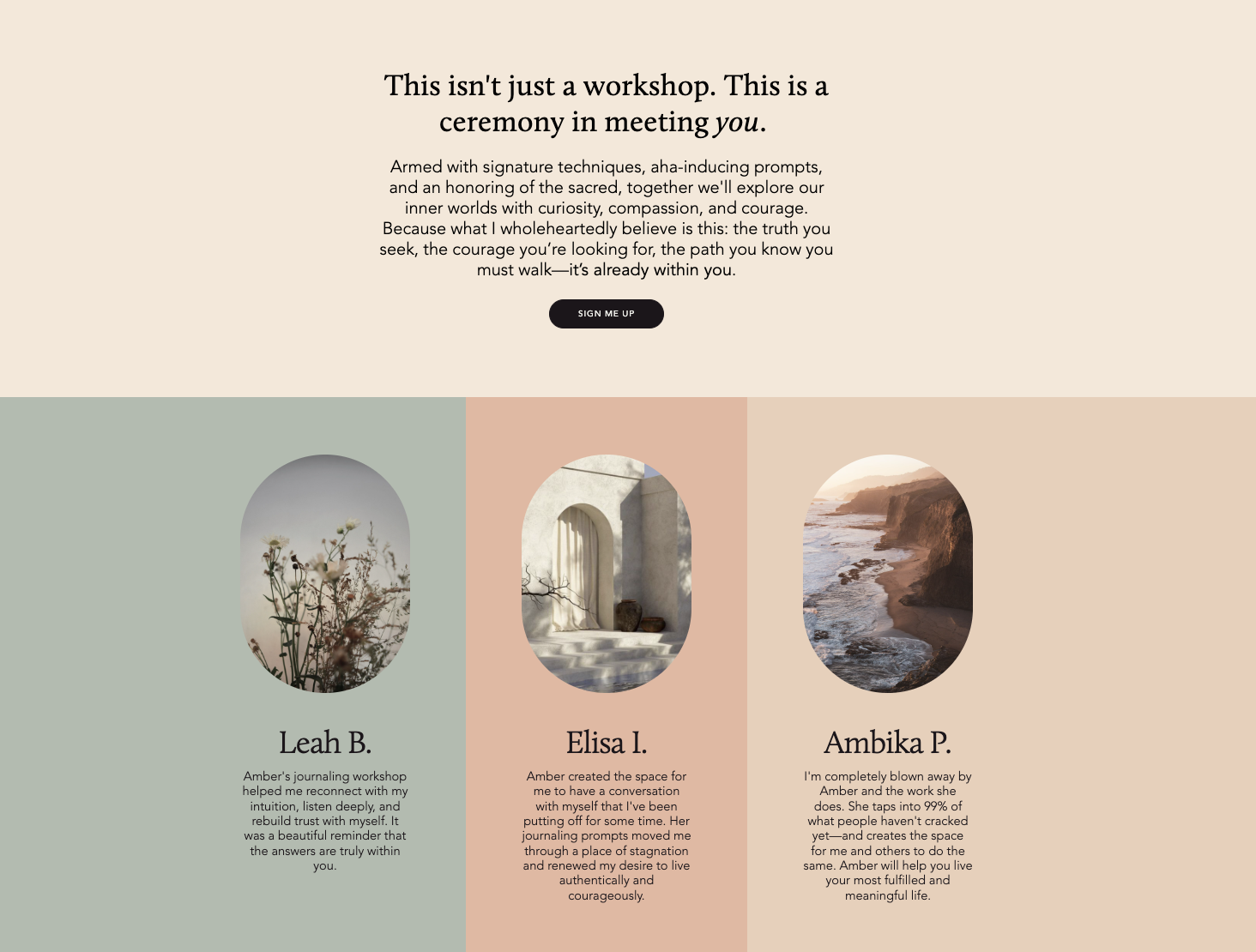
This page uses soft brand colors and imagery throughout the checkout design, creating a cohesive branded style while spurring peaceful emotions. The workshop pitch is supported by testimonials from previous customers plus publications Amber has been featured in, which adds authority to the value of her virtual workshop.
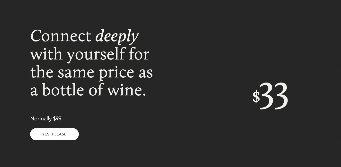
This CTA block uses simple yet relatable copy to drive sales in a compelling way—with comparative pricing placed above the purchase button to encourage immediate sales.
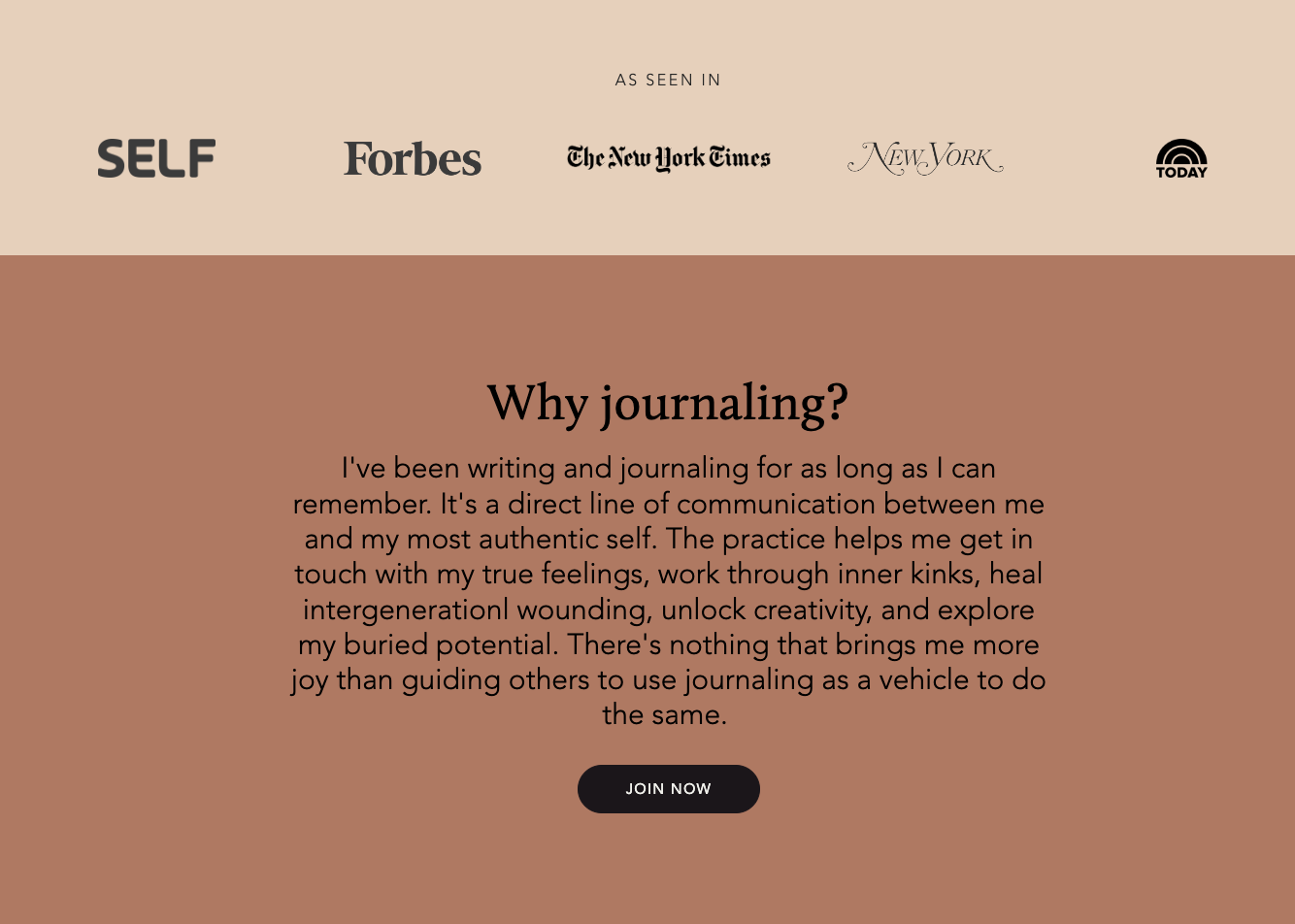
From a design perspective, Amber’s page perfectly balances contrasting page elements—with varied typography, brand colors, and images—plus simple design. She includes enough information to effectively sell her offer without overwhelming the page with copy. Together, these elements create an exceptional checkout experience for her customers.
What we love about this design
- Simple, airy design with pithy page copy
- Contrasting page elements, like varied typography style and size, direct focus to primary points on the page
- The offer, including all workshop details, is placed above the fold
- Testimonials and publication features build trust and establish authority
3. Stephanie Paradiso’s coaching experience
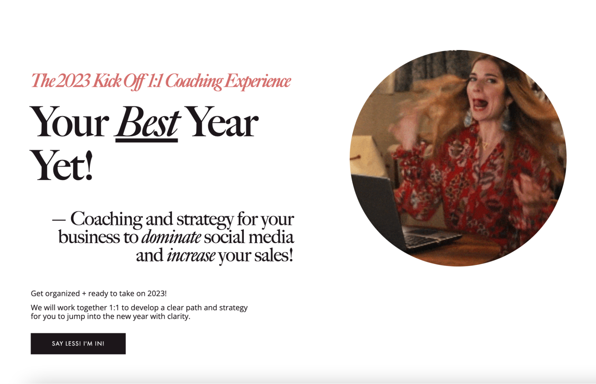
If you’re an online coach or educator, your checkout page is your chance to show off your personality and sell prospective customers on what you have to offer. Stephanie Paradiso does a wonderful job of this by selling her coaching program with a personality-packed design.
Stephanie is a social media strategist and business coach based out of Southwest Florida who founded Inspired Social Co.—a coaching and consulting collective. The introductory page block for her 2023 coaching experience page is highly compelling, using varied typography to highlight her offering plus a fun, eye-catching GIF.
Simple black and white colors make CTA blocks and buttons pop on the page—encouraging visitors with ample opportunities to book the upcoming coaching experience. What we especially love about this page is how it packs in a lot of important information, including answers to frequently asked questions, while maintaining a clean and simple style.
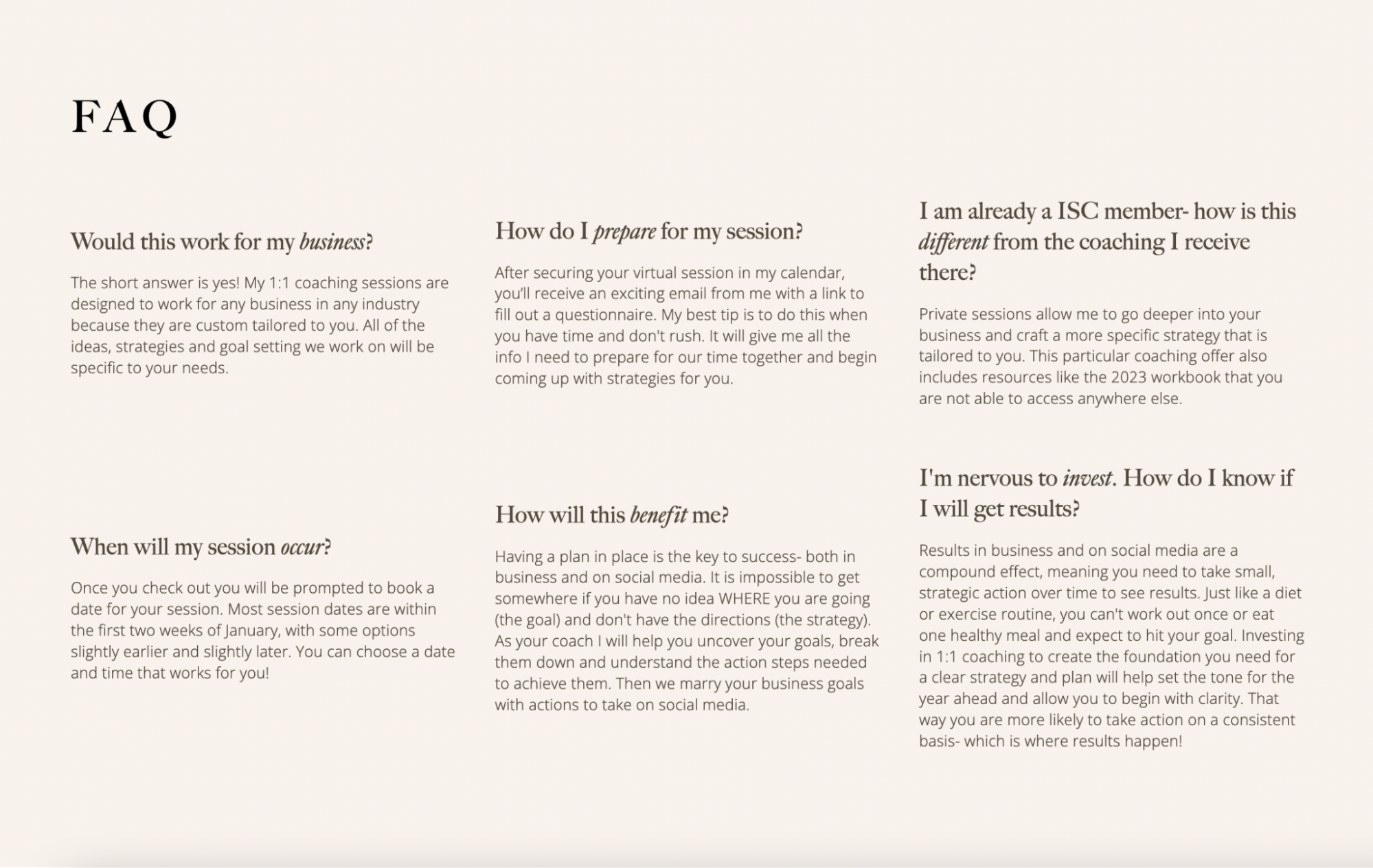
This checkout page pairs numerous page blocks dedicated to driving purchases with discounted pricing incentives and urgency-boosting marketing copy—making Stephanie’s offer increasingly irresistible.
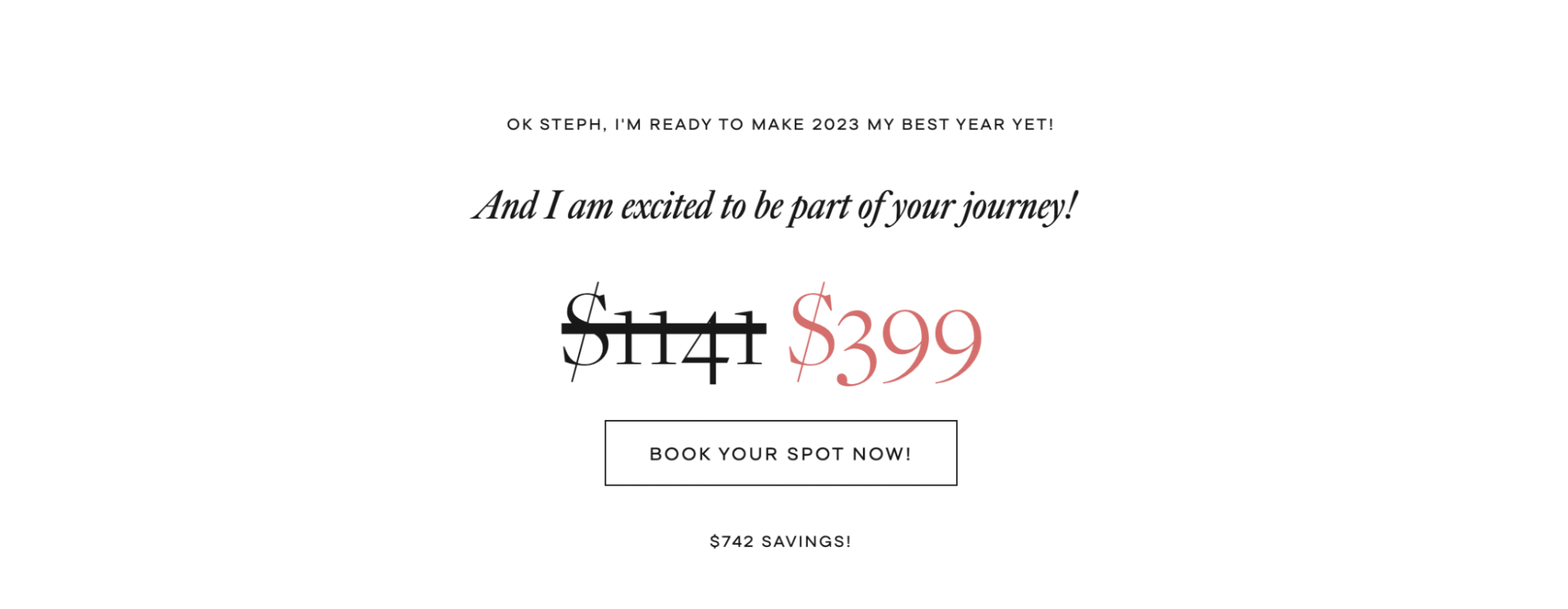
What we love about this design
- Fun, conversational copy and imagery create a checkout experience that’s rich in personality
- The simple, spaced-out style provides key information without an overwhelming user experience
- Discounted promotion pricing plus strong CTAs incentivize visitors to act now
- CTA buttons are pronounced and use clear action-oriented copy
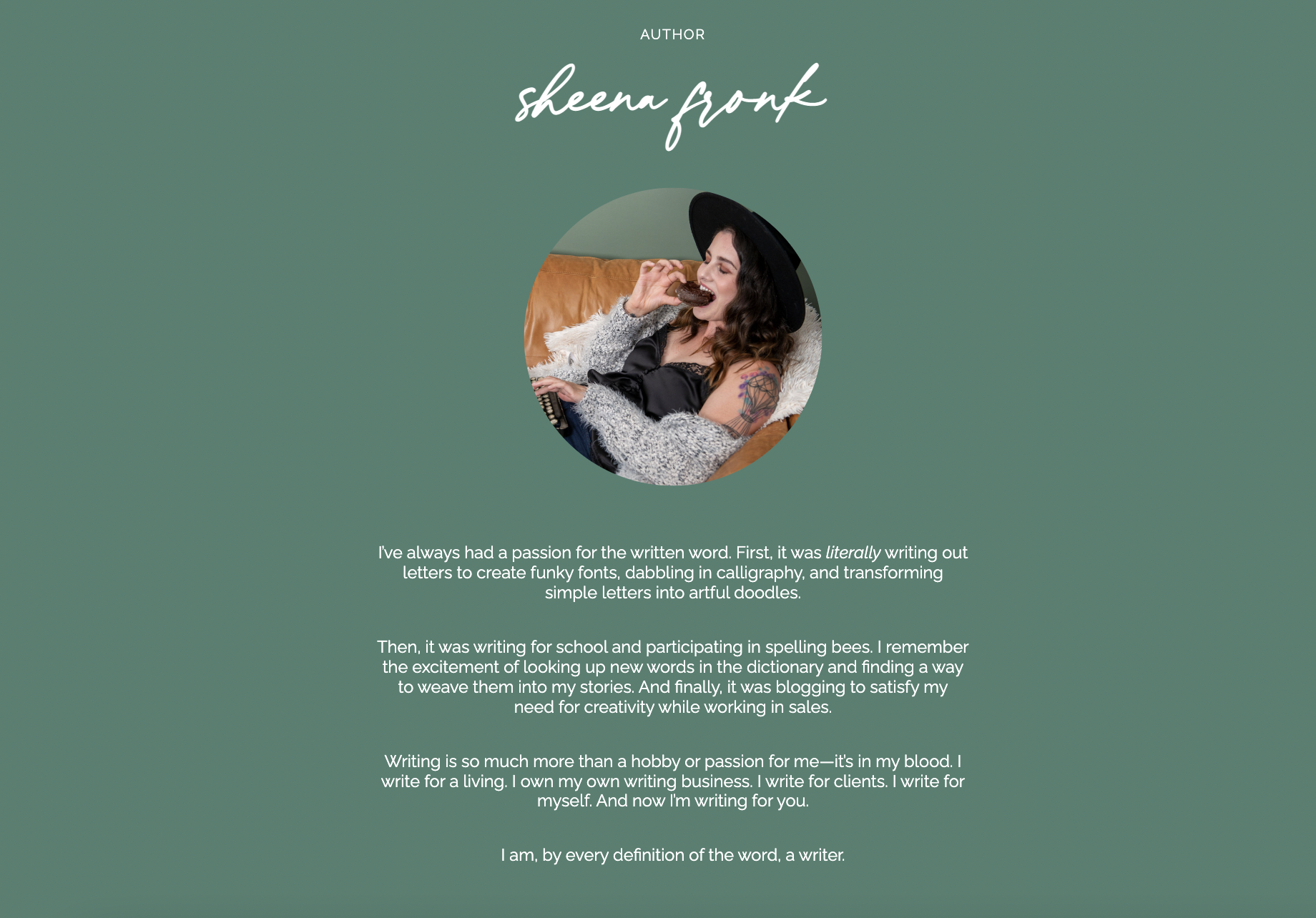
4. Wanderluster Co.’s ebook
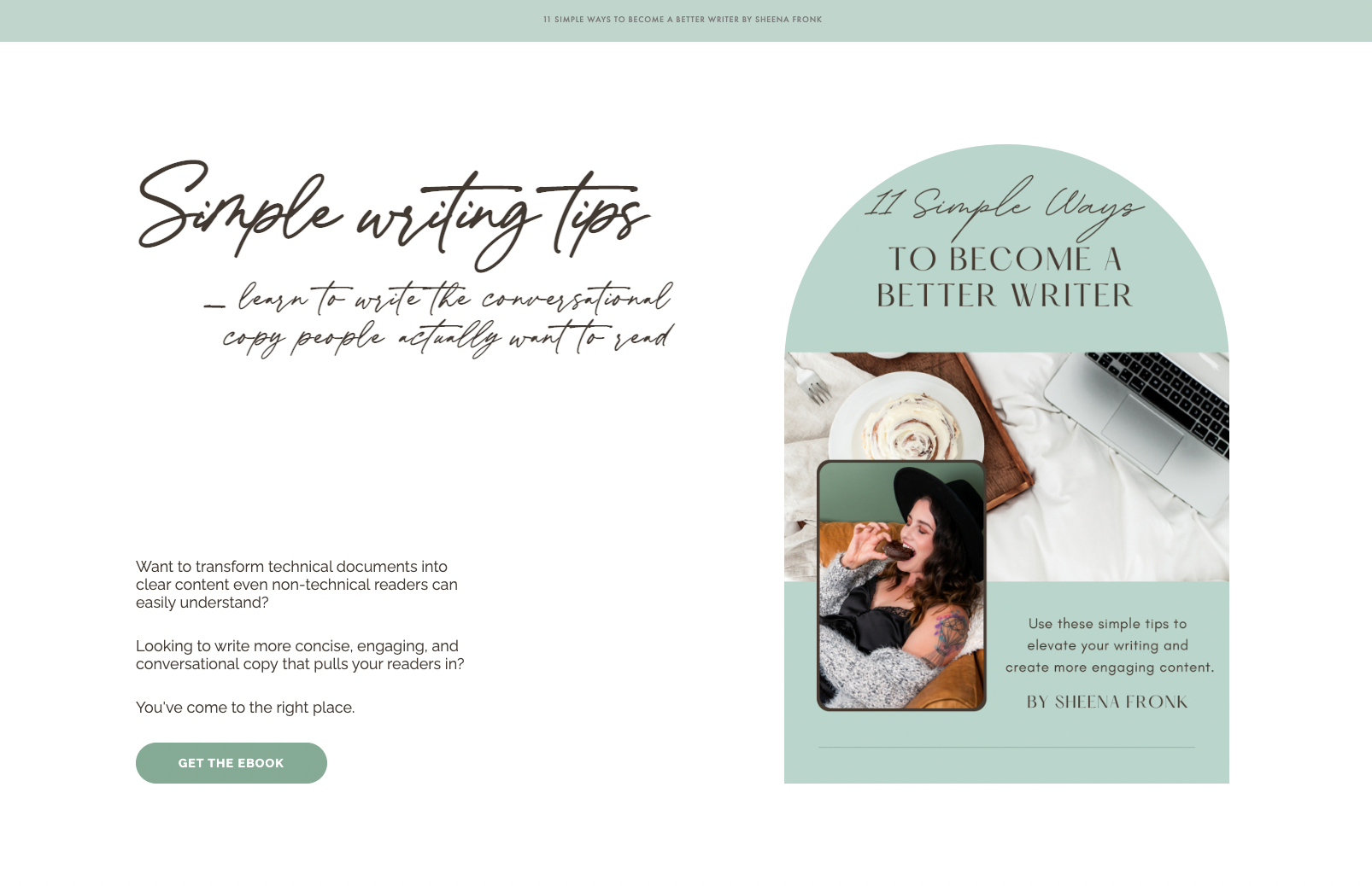
When it comes to building a virtual storefront to sell digital products online, it’s important to relay not only what you’re selling but who you—or your brand—are. A brand’s identity can influence sales, and a checkout page’s design can help illustrate brand identity with visual elements and copy.
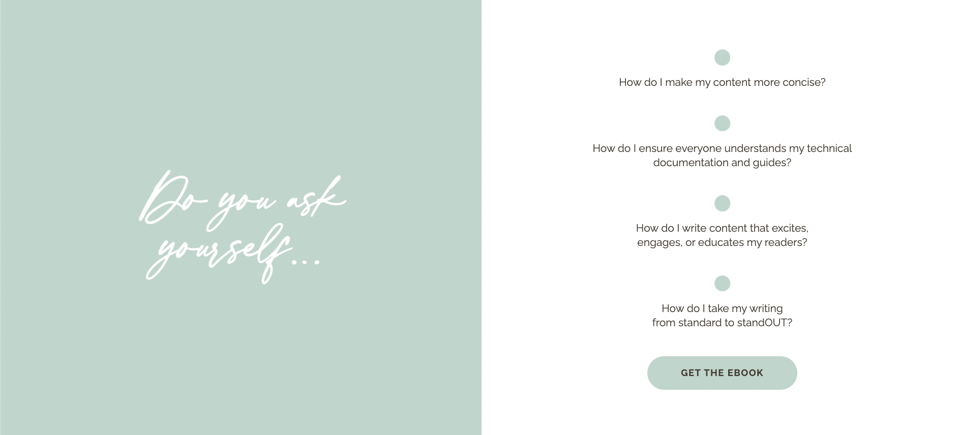
Wanderluster Co.—an “all things writing” brand—offers a digital ebook to help people learn how to become better writers and craft conversational, engaging content. Author, Sheena Fronk, does a wonderful job of selling more than just her digital product—she attracts customers with her distinct brand identity.
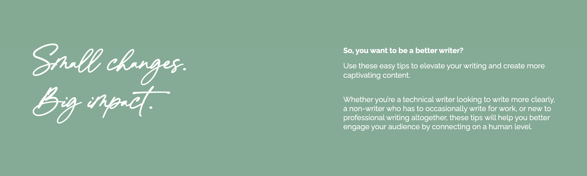
On this checkout page, soothing shades of green contrasted with white and black typography create a comforting brand experience while exploring Sheena’s ebook offering in a clear and intriguing way.
She introduces the digital product above the fold before building added trust through ebook reviews further into the page flow. Bulleted template elements pose questions that speak directly to audience pain points, followed swiftly by a CTA button to purchase.
The biography page block fosters a consumer-to-brand connection that feels personal while showcasing the author’s writing expertise. Page design, photography, and copy work together to convey a witty, approachable persona that’s perfectly suited to help anyone improve their writing.
What we love about this design
- Complimentary colors and type fonts create a consistent brand experience
- Clear CTA buttons are placed from the top to the bottom of the checkout page
- Contrasting colors help text and key information stand out
- The page is full of authority-boosting elements, such as product reviews and a personality-packed author biography
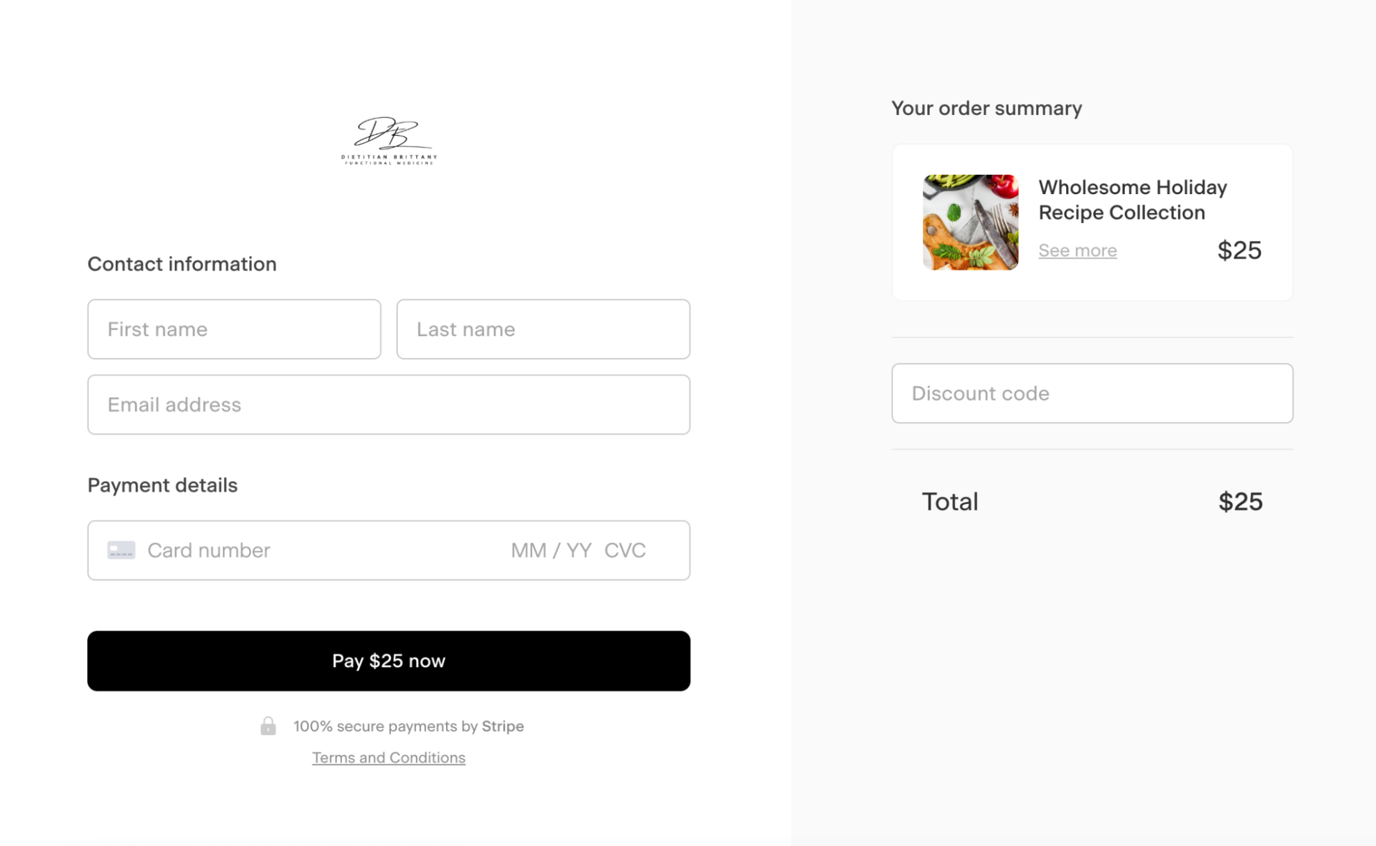
5. Dietician Brittany’s holiday recipes
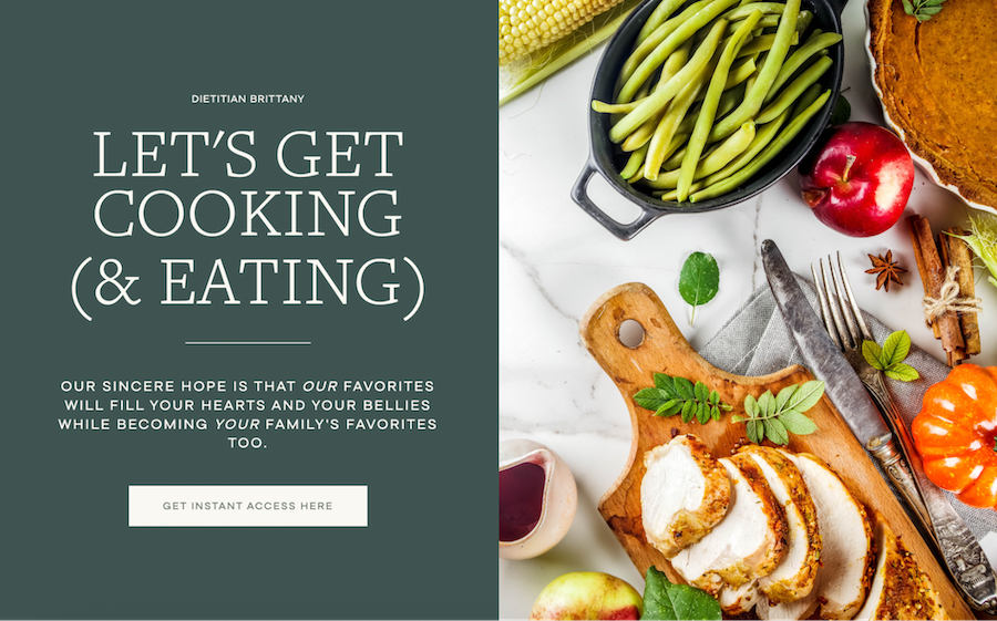
Checkout pages don’t need to be long-form or full of information to drive sales. See how Brittany—a dietician selling a collection of holiday recipes—crafted a straight and to-the-point page design that quickly drives visitors to download her recipe book. The gorgeous photography and bold headings are alluring, while CTA buttons prompt instantaneous sales.
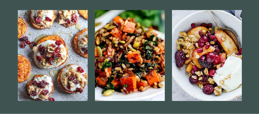
As a food-oriented brand, Brittany uses delicious-looking imagery to appeal to customers rather than copious amounts of on-page copy. While her checkout page is simple, it does a great job of driving customers to the payments page—which features her brand logo and a secure payments badge to build trust.
What we love about this design
- Stunning, appetizing imagery speaks louder than words
- Simplistic, action-oriented page blocks get visitors quickly clicking through to purchase
- All CTA buttons are large and prominent
- The brand logo and secure payments badge at the final payment eases potential hesitations and instills trust
6. The Yoga Underground’s training experience

The Yoga Underground is a Taṇhā Yoga Studio that offers a range of training, classes, events, and retreats. Their online yoga teacher training program is a big investment—both financially and time-wise. However, their checkout page presents a difficult offer to refuse. Every point in the page flow has been designed to inspire visitors to enroll in their training.
Off the bat, page visitors are greeted by a massive headline that presents the program with a link to purchase. It uses dazzling professional photography throughout the page to showcase yoga teachers in action—giving prospects a real-life visual of the role they could step into by taking this training.
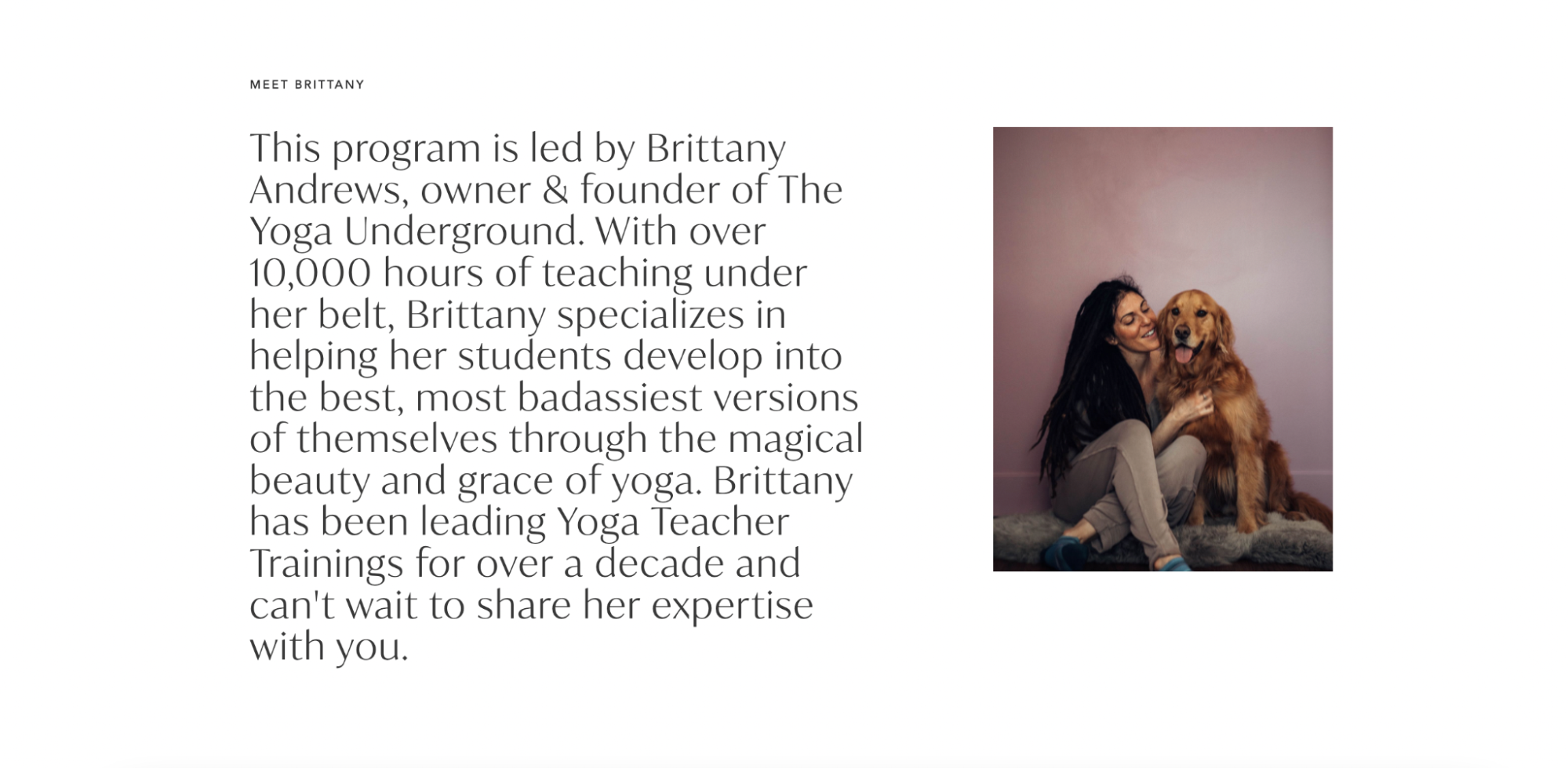
The leader, Brittany, is quickly introduced within the second page block. This establishes her as a yoga expert early on while fostering a more personalized connection to the program.
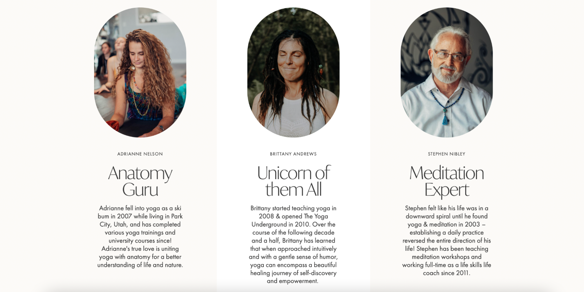
Additionally, the checkout page highlights each of the course instructors with a brief overview of their expertise areas. Together, these personal introductions increase the authority of the program while putting faces to the brand’s offering.
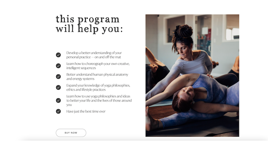
Throughout the page, they share information in digestible, listed formats—making it easy for page skimmers to quickly understand what the program includes and what it can help participants achieve.
What we love about this design
- It presents information in an easily digestible list-style format
- The range of on-page biographies makes the offering feel personalized and grounded in expertise
- Stunning photography not only compliments the page design—it also evokes emotions and inspiration
- The offer—plus CTAs—are echoed throughout the checkout page flow
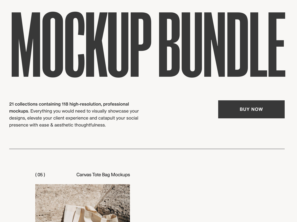
7. Rebecca Berrington’s mockup bundle

As a designer herself, Rebecca Berrington knows just how important showcasing portfolio work can be. That’s why she created a bundle of exceptional, professional mockups for anyone to visually showcase their designs or uplevel brand content.
Mockups are a highly visual product—so it makes perfect sense that Rebecca chose to create a hyper-visual checkout experience. Before she launches into mockup photography, she presents a brief intro to the bundled offer with a button to purchase at the top of the page.
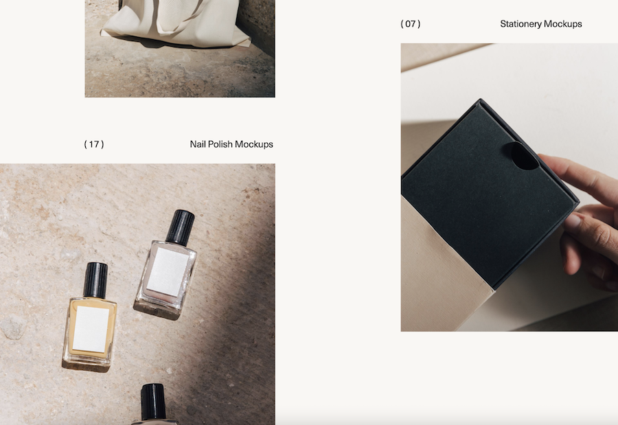
Next, she showcases a variety of the bundle’s gorgeous mockups—selecting a wide range of mockup products to suit every industry. Compelling statements like, “$10,000 of mockups for $299,” raise a tempting offer. She scatters visual mockup examples throughout the remainder of the page.

Rebecca makes a solid sales pitch by delving into undeniable reasons to act now and buy her bundle. She counters possible customer hesitations by cleverly outlining the benefits of her offering compared to alternative options.
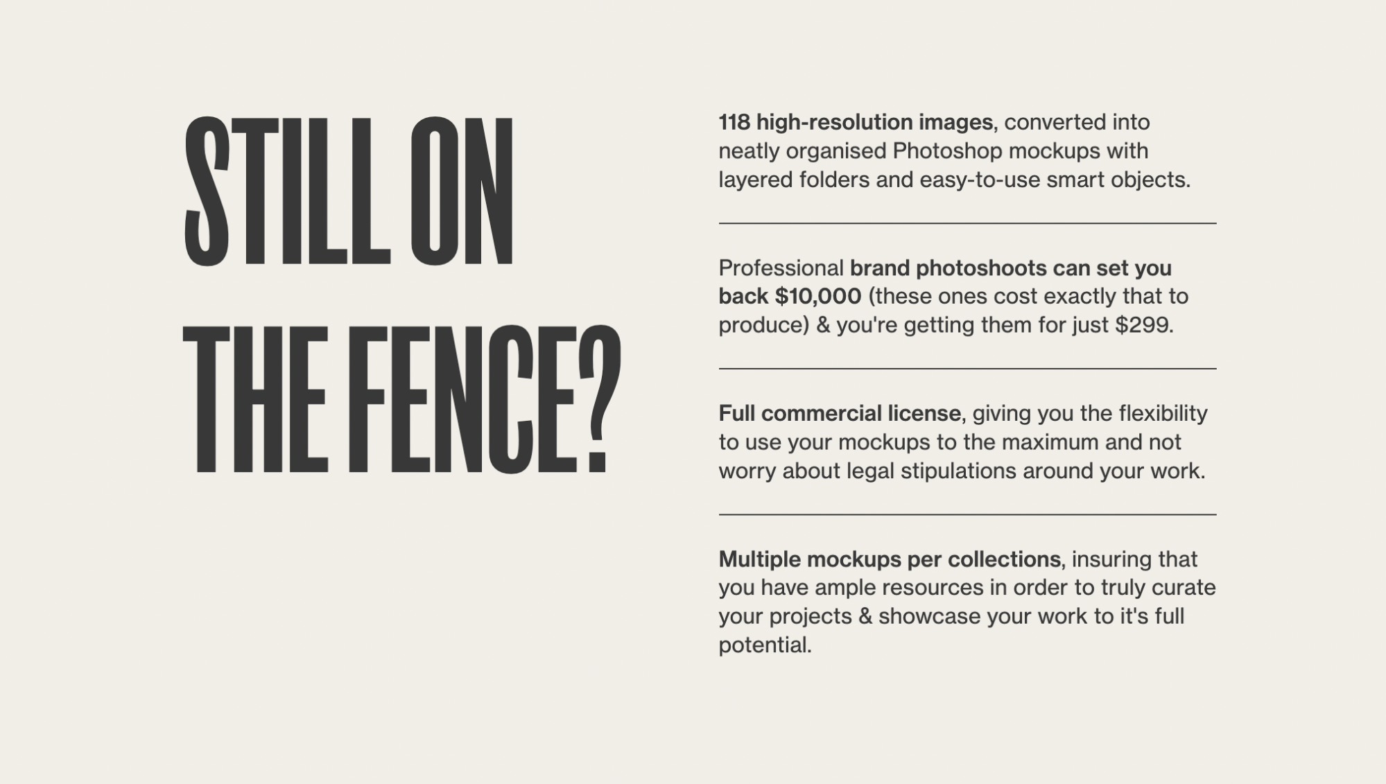
Once page visitors click through to payment, they see a customer testimonial and a limited-time free bonus offer to sweeten the deal and push them to proceed with their purchase. From the moment a visitor lands on Rebecca’s mockup bundle page, they’re guided through an exceptional checkout experience that’s bound to convert consistently.

What we love about this design
- It uses numerous stunning images to showcase the wide variety of mockups included in the bundle
- The checkout page draws clever comparisons to alternative options throughout the copy, making the bundled offer incredibly enticing
- The final purchase page is designed to drive quick sales plus boost customer loyalty with an irresistible freebie bonus
- CTAs are distinctly placed above the fold and in contrasted dark blocks throughout the page flow
8. Colleen’s Creative coaching experience
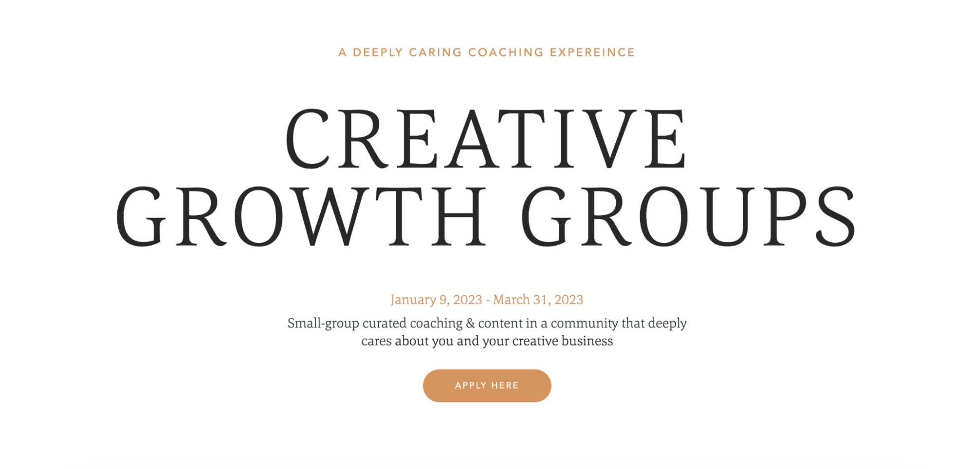
Colleen helps creative business owners thrive through community-building and coaching. She created a checkout page to sell access to her three-month coaching program. Her design leads with a striking headline followed by key program information and a CTA button—all of which lie above the fold on the page.
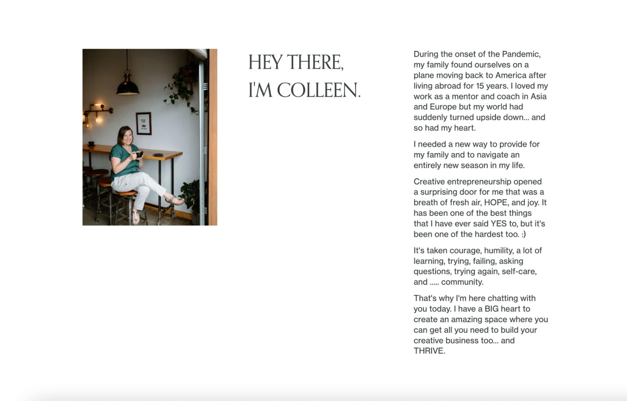
Then, she gives a brief yet candid introduction to her background and what led her into this field of work. As a coach, it’s important to give the audience insight into why you’re passionate and qualified to lead—something Colleen does an excellent job of.
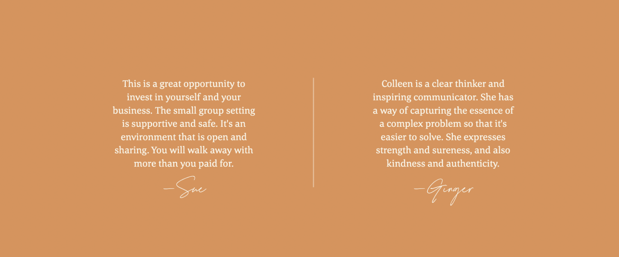
The uncluttered nature of this page’s design makes for an enjoyable on-page experience. Colleen provides confidence-boosting elements, like testimonials, to strongarm her offer. She manages to provide thorough membership details and enrollment information without flooding the page with text.

We can’t help but pay homage to the exceptional photography used, too. This page uses highly visual blocks to showcase Colleen’s aesthetic and create a consistent, on-brand checkout experience.
What we love about this design
- Gorgeous visuals and brand photography complement the offering and appeal to page visitors
- There’s a well-struck balance between decluttered page design and thorough information
- All of the most important pieces of information are above the fold
- Colleen’s candid bio shares her passion and qualifications for coaching
How to create exceptional checkout page designs
Wondering how you can create an outstanding checkout page for your business? With countless ways to approach checkout page design, it can feel like a challenging task to tackle. Unless you’re a designer or have ample knowledge of user experience (UX) principles, building a checkout page from scratch can be intimidating.
Luckily, design newbies and novices alike can create outstanding checkout page experiences with these design principles and tips from Flodesk’s design team.
Design tips and best practices for your checkout page—from Flodesk’s Design Director
There is a myriad of design principles that can help your checkout page stand out and drive more conversions. Just like many of the best practices used to design emails people love to get, you’ll want to maintain focus on how to capture users’ attention (and keep it) while establishing brand trust and identity.
Ready to get started? Flodesk’s Design Director, Claudia Aran, shares nine design tips and best practices to consider when building your checkout page.
Quick design tips
1. Identify your objective
2. Remember, less is more
3. Implement basic, yet key elements
4. Don’t underestimate the power of design
5. Build iconic designs with consistent, on-brand styles
6. Create contrast on the page
7. Inspire emotions with color
8. Build trust and authority with social proof
9. Try checkout templates
1. Identify your objective
A sales or checkout page follows a much more focused structure than a website—it’s designed to trigger action and support your business goals.
Before you start thinking about page style and design, it’s important to first identify the purpose of the page so all your design elements and decisions are driven by an overarching objective.
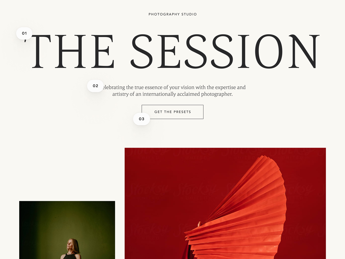
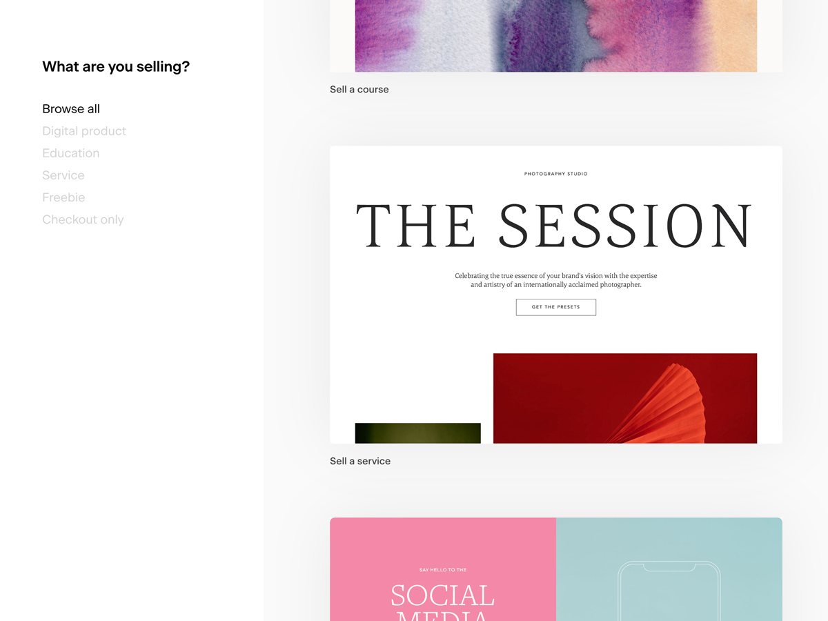
For example, the main goal of this checkout page is to sell new presets from The Session Photography Studio—which has clearly influenced the page title, subheading, and design elements.
2. Remember, less is more
Simplicity is key to great design. It’s common to add too many words or visuals to marketing communications in an effort to stand out—but the more you add, the more confusing your offer can become. Maintaining a focus on your key objective is essential when designing your checkout page. Make sure there are no on-page distractions that will cause visitors to navigate away from the page or leave the website altogether.
When there are too many options and choices to make, visitors are less likely to take action. That’s why design should be simplistic and clear, keeping a focus on a single intended action or offer so you can easily increase conversions.
3. Implement these three basic, yet key elements
To make your page design as clear and compelling as possible, you’ll first need to focus on the most basic elements of landing page design, which are:
- Place your offer above the fold. The best landing page structure is one that keeps all of the most important content above the fold (the section of the landing page that is immediately visible to visitors before scrolling).
- Insert eye-catching content at the top of the page, such as:
- Clear and straightforward headline
- Subheadline or short description that provides more information about the offer
- Prominent button with a direct CTA
- Include obvious calls to action. Create CTAs that convey exactly what you want people to do in no more than three words. Use buttons, colors, and fonts to make actions eye-catching and obvious.
- Use very few but clever words. Keep your copy to a minimum. Lengthy text is fine for giving people detailed information—but if you’re looking to drive immediate action, break text into bullet points and instill a sense of urgency in your copy.
Choose your words wisely. In his book Building a StoryBrand, Donald Miller says there are two critical mistakes brands often make when pitching their products and services:
- They fail to focus on the aspects of their offer that will help people survive and thrive
- They cause their customers to burn too many calories in an effort to understand their offer
Don’t make a customer work to make sense of your offer and determine if it’s right for them—use compelling messaging that clearly outlines how your brand will help customers thrive.
4. Don’t underestimate the power of design
Design is the face of your brand: the typeface, color, images, layout…all of these elements affect how you present your brand to the world and how it’s perceived. Plus, they play a key role in driving conversions and on-page interactions.
Stunning design, imagery, and typography will influence a visitor’s decision to take a desired action. A simple layout, legible text, and easy-to-understand imagery go a long way in encouraging visitors to make a purchase, engage with your content, or sign up for your newsletter. Prioritize good design throughout your sales funnel—especially at checkout.
5. Build iconic designs with consistent, on-brand elements
Whether you’re designing a checkout page or an email, cultivating a consistent brand look and feel can be influential to brand growth. Ensure you always use the same style—add your logo, use your brand typeface and colors, and establish your brand as an instantly recognizable and memorable one.
6. Create contrasting page elements
Draw attention to key sections of your checkout page by using contrasting elements to your advantage, such as variant font types, imagery, and colors.
For example, showcase varying levels of information by using different font sizes to depict page hierarchy. In this template (shown below) headings use large text, paragraphs feature normal-sized typography, and CTAs are styled with a small, unique font type.
7. Inspire emotions with color
When used wisely, color can portray its own design language—capable of communicating what words sometimes can’t. It’s important to consider which colors you should use and how you want people to feel when they visit your page.
We recommend sticking with two to three complementary colors per page and ensuring that no color hinders easy readability. Look for images that use a similar color palette to ensure a cohesive design and brand consistency.
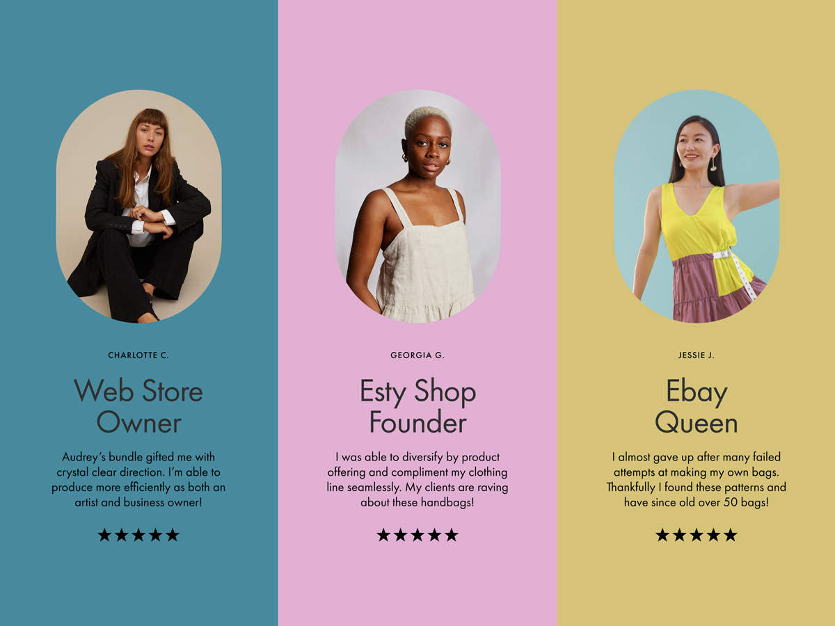
Move your page visitors from prospect to paying customer in your sales funnel by implementing trustworthy “aha!” elements to your page. By using social proof to pitch your offer, such as testimonials, statistics, or awards, you can easily gain authority while instilling customer confidence in your brand.
Social proof can help drive conversions when used right—but be cautious not to overload your page with them. Your goal should be to sound trustworthy without appearing desperate to make a sale.
9. Try checkout templates
Take the guesswork out of the design process with checkout page templates. Checkout templates are typically built using each of the core design principles listed above while offering a wide variety of style options to inspire your brand’s page.
Choose a beautiful, customizable template that suits your needs, then add your brand’s unique fonts, visuals, colors, and copy. Save hours and create stunning checkout pages that convert within a matter of minutes.
Build quick, beautifully designed checkout pages with Flodesk
Templates make it easy to create powerful checkout page designs that are intuitively built to drive purchases and move customers through the checkout process. Don’t waste hours fiddling with cumbersome tools to build a checkout page. Explore the range of sales funnel builders available and choose an option that offers pre-designed templates that can progress you toward your business goals.
If you’re looking to craft beautifully branded online experiences with a comprehensive sales funnel builder, look no further. Start selling and accepting payments online with Flodesk Checkout. With Flodesk, you can easily customize our templates with your brand colors, fonts, icons, and photography—no code required.
Design a sensational checkout page and start selling online in minutes. Pair it with Flodesk Email to create a powerful, holistic sales funnel experience that keeps customers engaged all year long—on your page and in their inbox.
Getting started is easy—you don’t even need a website. Try it for free.

Related Articles