15 Newsletter Layout Design Ideas to Keep Subscribers Clicking
Table of Contents Jump to:
Jump to:
Table of contents
If the average person receives around 121 emails per day, how do you ensure your email newsletter is worth remembering? It all starts with your email newsletter design.
When you launch an email newsletter, you’re providing more than well-designed content; you’re crafting a unique and memorable brand experience. To enhance this experience, you’ll need to simplify your newsletter layout and write high-value content.
Newsletter design separates the good from the great, helping your business stand out—even in overly saturated markets. If you want to make a splash with your email marketing, it’s best to get inspiration from other newsletter layout design ideas.
By minimizing distractions with a minimalist design, you’ll be able to create an email newsletter that guides readers through your content and makes a lasting impression. But first, let’s clearly define what an email newsletter is and why it’s beneficial to your business.
An email newsletter is a type of email that informs your audience on upcoming events, the latest news, and any new offers. Business owners often use eye-catching email newsletters to provide educational tips and drive sales.
Newsletters are often sent to subscribers on a consistent basis, no matter if it’s sent as a monthly roundup, quarterly review, or weekly digest. They’re meant to engage, grab attention and share relevant information with your audience.
Whether you begin with a unique concept or follow a tried-and-true email template, your future newsletters need to be anchored by a clear purpose.
Ask yourself:
- What are your top goals, and why are they important?
- What is the main message of your email newsletter?
- What have you liked (and disliked) about other email newsletters?
- What would you like others to say about your email newsletter?
As you craft a strategy for your email newsletter, let’s go over the main reasons why it’s important to optimize your email marketing efforts.
How often you send an email newsletter is completely up to you, but studies show that over 60% of consumers want to receive newsletters at least once a week. In comparison, over 85% of consumers expect to read a newsletter once a month.
If you wait for months to send an email to your audience, they may forget about your business. Sending a weekly or monthly newsletter allows you to stay top-of-mind, helping you build trust and lead more people to your website.
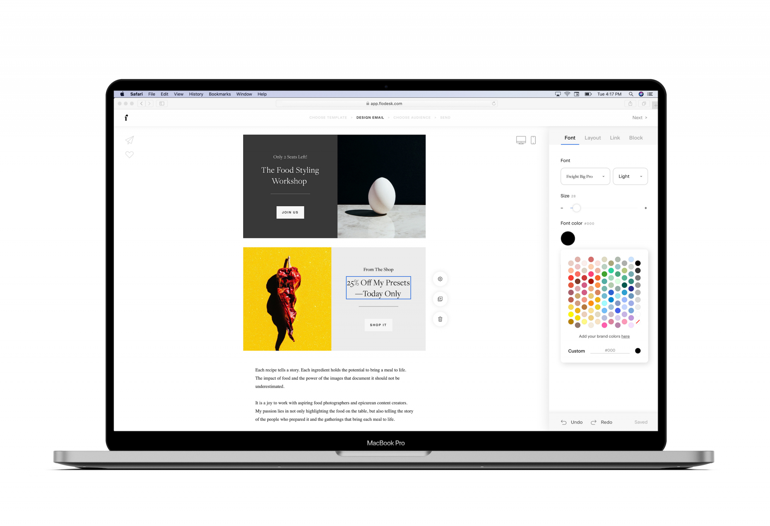
Design a beautiful email newsletter with Flodesk
Our simple drag-and-drop email marketing platform allows you to edit templates to suit your brand’s unique needs.
It’s difficult to market to a consumer who doesn’t know who you are. In order to build better brand awareness, use email marketing to position your business as the top choice in your industry.
Without an email newsletter, your featured content could get lost in a sea of noisy messages from other competitors. This often happens when business owners rely on social media, a place where ever-changing algorithms dictate who sees your content and when.
That’s why it’s best to inspire social media followers to become subscribers. You’ll have more opportunities to nurture your relationship with them for the long term, knowing your email content is consistently delivered to everyone on your list.
When you focus on nurturing relationships, it’ll pay off—literally! Email marketing has a greater ROI than other channels, generating $42 for every $1 spent.
To raise your conversions, start by writing an email newsletter that encourages your audience to click. The more people interact with your brand through email, the more likely they are to remember you, trust you, and ultimately buy from you.
By continually tracking your open rates and clickthrough rates, you’ll be able to see exactly how subscribers are interacting with your emails. What began as a click can turn into a sale, giving you the ability to increase your revenue.
Since consistency and memorable interaction leads to more sales, it’s clear why business owners prioritize their email marketing. Now, let’s talk about the elements you need to create a newsletter template you can repurpose and reuse.
Drive sales with personalized email marketing
Our automated email workflows give you the time to target your newsletters for the people who love them most.
If you’ve been wondering what goes into a great email newsletter design, we’ll break down exactly what you need to know, including how to write a newsletter. Instead of rushing into writing your email content, let’s consider what makes up your entire newsletter and any design elements that are completely necessary.
Email subject line
This is the first thing your subscribers will see. It’s what determines whether or not they’ll open your email. A subject line acts as the hook of your email, introducing what your email is about in a few words. It needs to be concise and written in an intriguing way.
To make sure your target audience pays attention to your subject lines, think about including an emoji. Emojis have been found to increase email newsletter open rates by as much as 56%, but only 6.9% of subject lines include an emoji. In other words, don’t let this be a missed opportunity if emojis fit your brand voice.
Once someone opens your email, they’ll be greeted by your header. Most businesses include their logo or their newsletter name in the header, but you can have even more fun with the design if you’d like.
It’s best to keep your newsletter header consistent in each email so people always know what to expect. This leads to stronger brand recognition and awareness. When you edit your header, be sure to include high-quality images or logo files so they look great on every device.
People want to consume highly valuable information, so put your most important stuff toward the top of your email newsletter. Your body content is the “meat” of your email newsletter, meaning it is where the key points of your message can be seen.
With a minimal design, your body content will stand out and entice subscribers to continue scrolling to read through your email. Depending on the goal of your email newsletter design, the body content found in your text boxes may be long or short and sweet.
For longer body content, break it up with interesting design elements and visual content so it doesn’t look like a wall of text. Also, don’t forget to add ample white space. Newsletter formatting is everything when it comes to creating an effective design!
Once readers scroll to the bottom of your email newsletter, they’ll see a footer. The footer acts as a secondary call-to-action with social links, allowing readers to learn more about your brand.
An email footer usually includes:
- Social media links or buttons with any necessary contact information
- Instagram feeds showing a preview of your own images
- Your business address as required by law, along with any legal disclaimers
- Unsubscribe link allowing others to unsubscribe from your list at any time
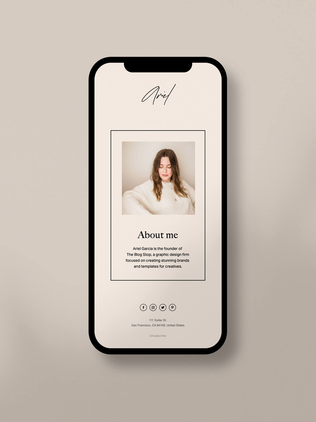
If you’re in search of more newsletter design ideas for your footer, think about adding a short bio about yourself or your business. That way, all subscribers will be aware of who you are, what you do and how you can help them.
Quick graphic design tips for better email marketing
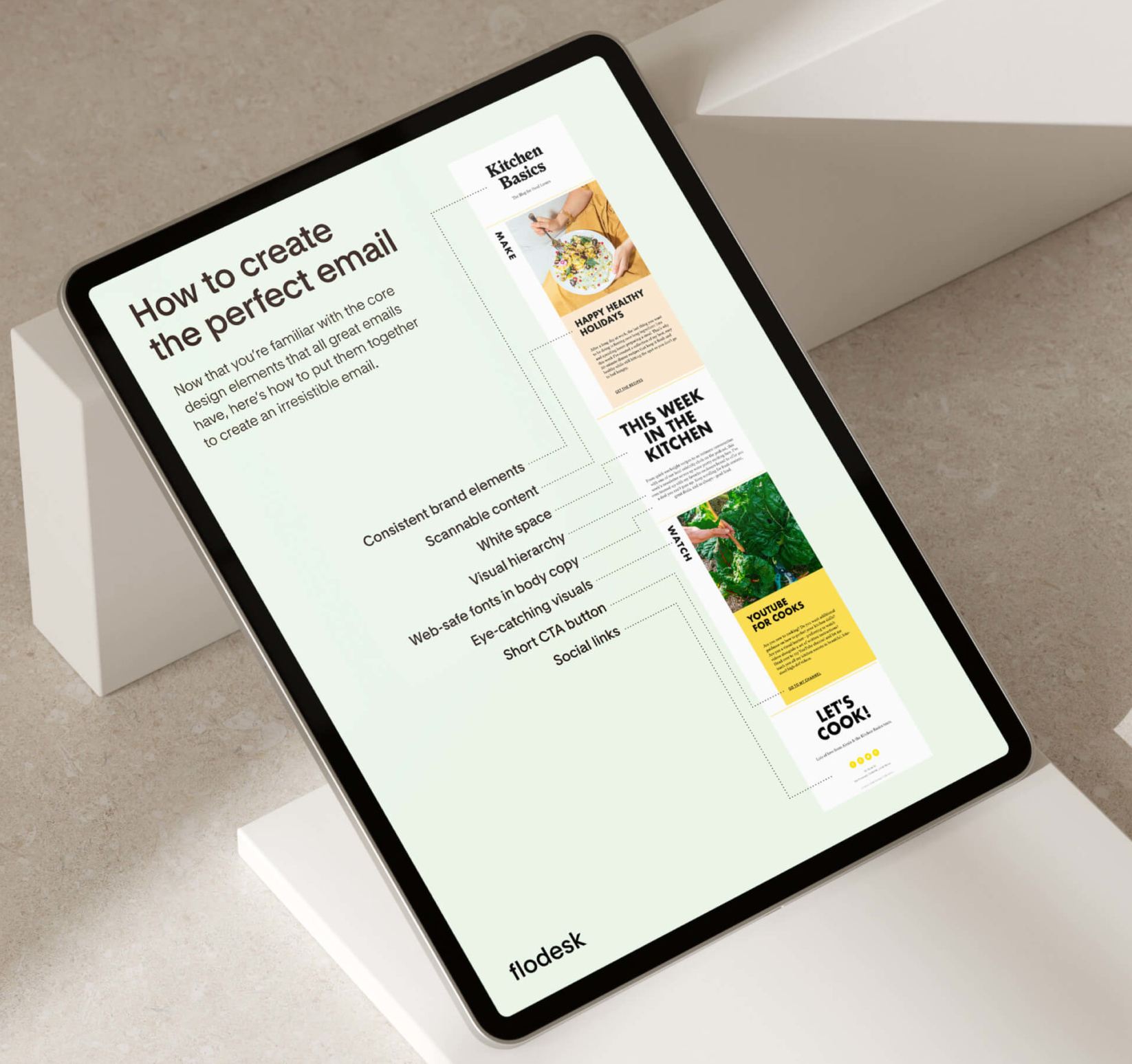
To elevate your email newsletter templates, begin by following proven design principles. When you understand what design elements are needed to engage and excite your audience, you’ll be able to incorporate more of them into your newsletter templates.
Your newsletter design must be consistent, intuitive, simplified and mobile-friendly. Mobile devices account for 60% of all email opens, so creating a responsive design that looks great and functions well on any device is crucial.
To improve your newsletter design and accomplish your email marketing goals, follow these design tips so you have a good example of what’s needed.
Include your company logo
Your logo is only one part of your larger brand identity, but it’s an essential design element to use when marketing your business. With a memorable logo that looks unlike anything else, you’ll have an easier time distinguishing your newsletter design from other competitors.
Following visual hierarchy guidelines, be sure to include your company logo toward the top of your newsletter template. The more your subscribers see the logo, the more likely they will be to remember your brand.
Customize your brand color palette
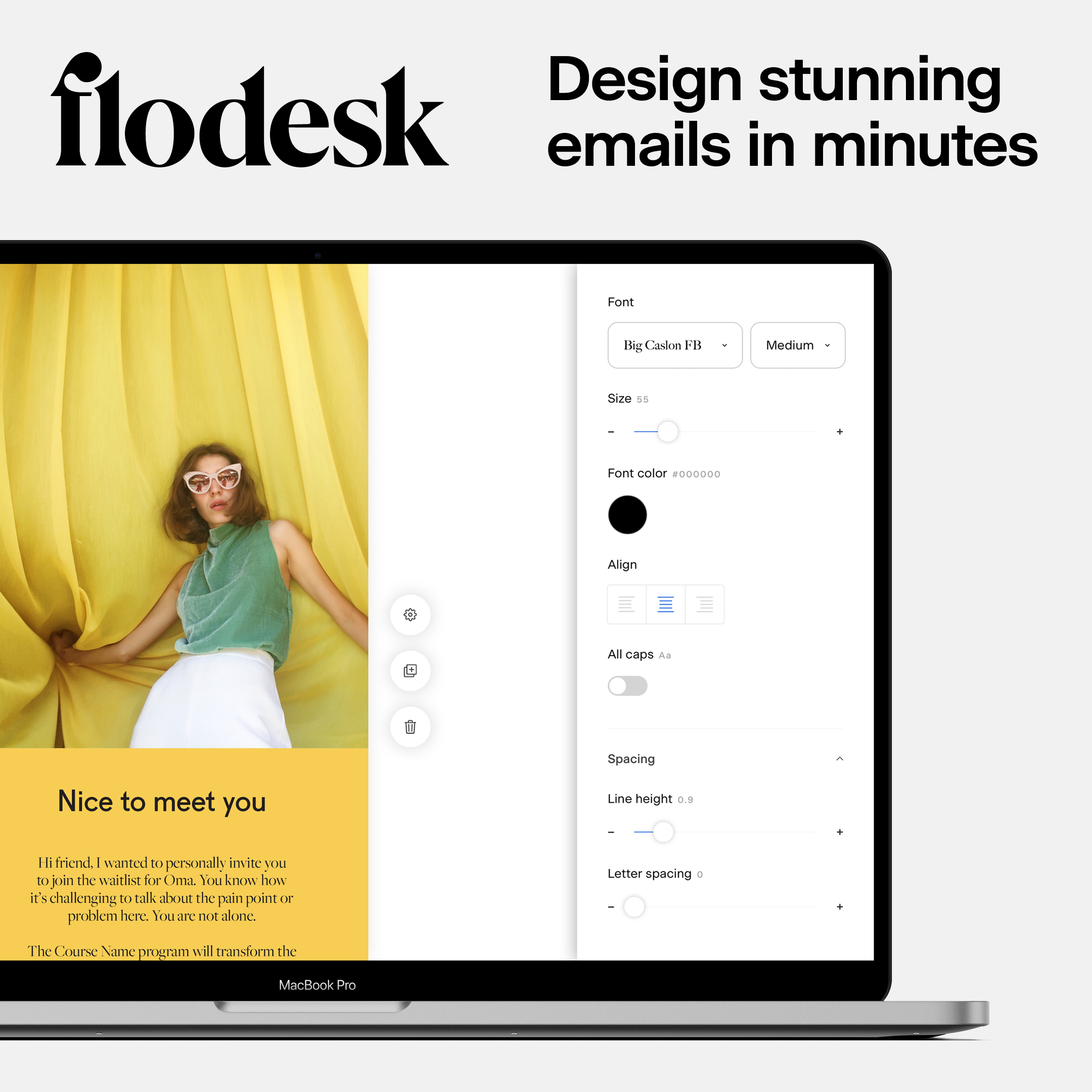
To ensure your email newsletter design stays on-brand, you’ll need to customize your design elements. This can include your fonts, logos and especially your brand color palette.
Colors evoke different emotions, helping you create a lasting connection with your readers. When you pay close attention to color theory and determine the mood (or vibe) of your brand, your newsletter designs will shine.
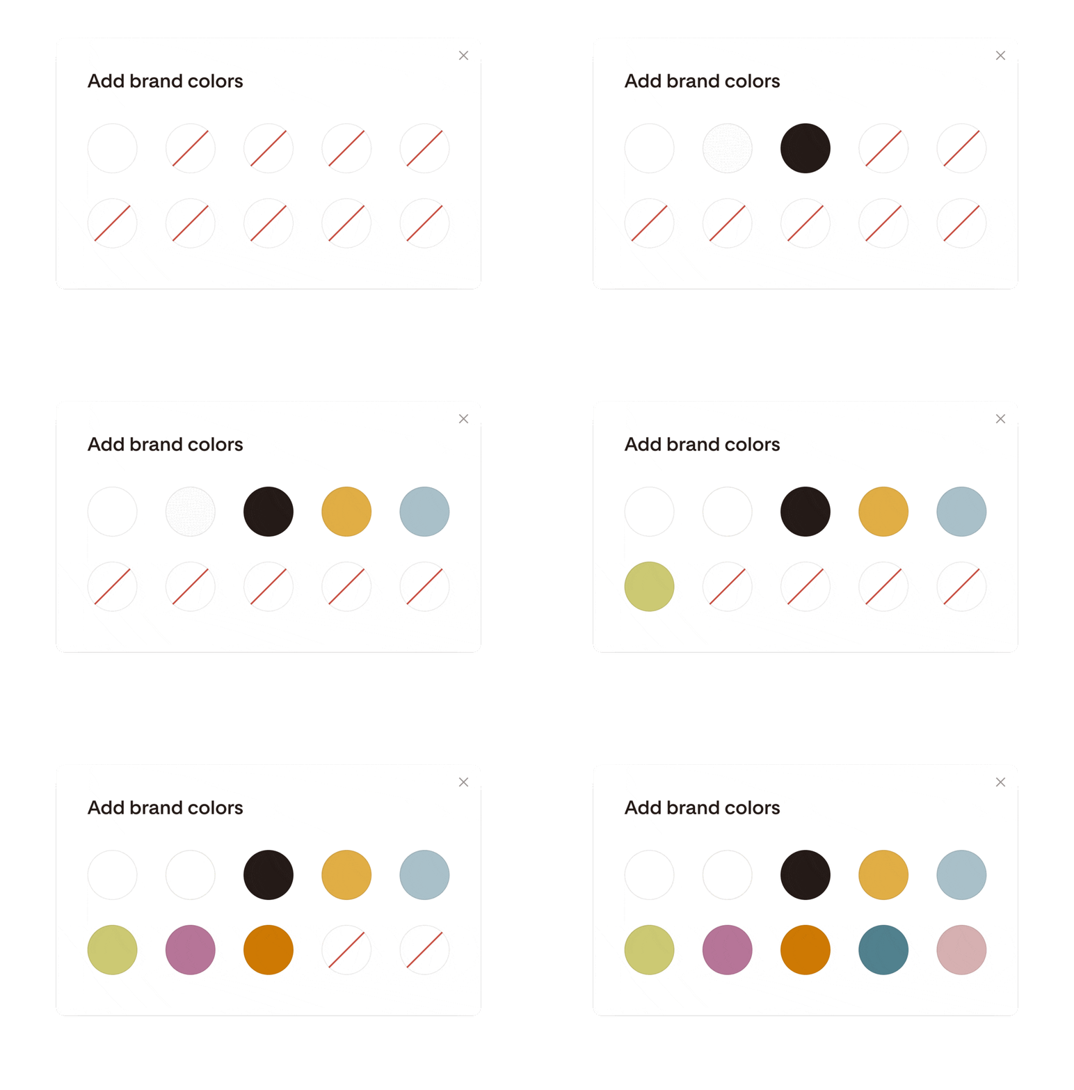
Inside Flodesk, you can set up to ten brand colors in the Branding tab, ensuring your colors give you a consistent and cohesive look in every email.
A call-to-action, or CTA, refers to the intended action you want your audience to take. It applies to your emails, website, social media and more.
If you fail to direct your subscribers on what to do next or where to go, they’ll be less likely to take any kind of action on your emails.
That’s why it’s important to include at least one call-to-action in your newsletter templates. In Flodesk, this can be done by adding a Layout with pre-made templates that already include CTA buttons or inputting your own button.
Common call to actions include:
- Join the waitlist
- Register for the event
- Read more
- Learn More
- Schedule a discovery call
- Reply to me
Be sure to include a link in your CTA button and test it before you send the email newsletter to your list.
Add interesting imagery
It’s hard to talk about newsletter design without mentioning photography. The quality of your visual content sets the tone for your newsletter. No matter if your subscribers skim your email or read every word, they’ll all see the same visuals.
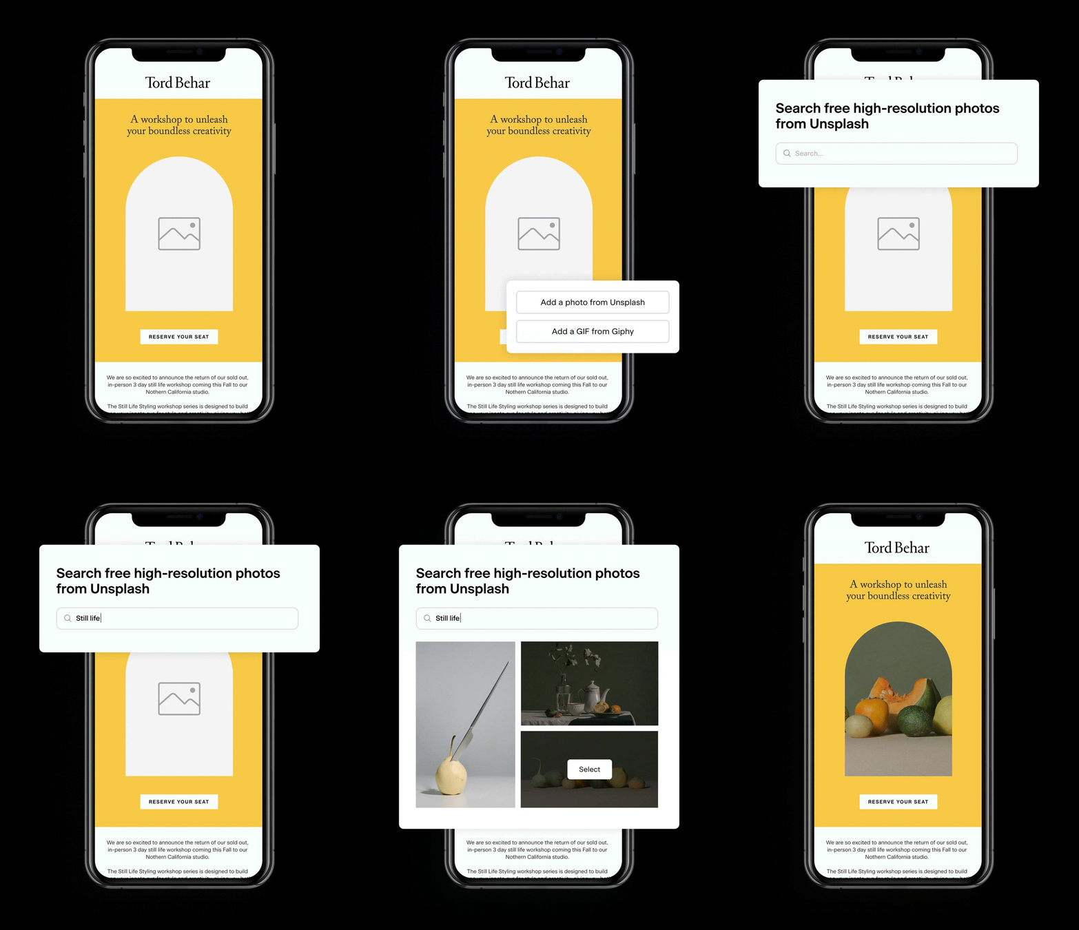
To create a stunning newsletter layout, you may want to add a product photo, brand imagery, professional headshot, graphic or your own photos. If you need more free stock photography options, Flodesk integrates with Unsplash so you can find the exact image you need right inside our platform.
Flodesk x Unsplash integration
To add an extra dash of fun and delight, include a GIF. Flodesk also integrates with GIPHY so your favorite pop culture references are well within reach.
End with a signature
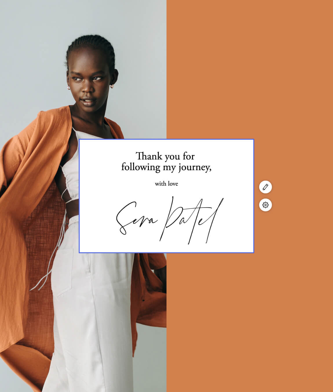
A signature will help your email feel like it was written by a friend. It humanizes your brand and signals the end of your newsletter content. While signatures are usually written in a script font, you can customize yours however you’d like inside Flodesk.
Here are a few signature sign-off messages we love:
- Warmly
- Until next time
- Chat soon
- With love
End your email with a bang
Create beautifully-designed emails with on-brand and unforgettable email signatures in Flodesk.
It’s important for your email newsletter to tell a visual story. To create a profound connection with your readers, begin by crafting a newsletter layout that’s memorable and noteworthy.
Inspired by professionally designed newsletter templates, you will love these 15 newsletter layout ideas. You’ll learn about the purpose of each newsletter template, what’s unique about the newsletter layout and when it might be a good fit for your business.
- Welcome email newsletter
- Sales welcome newsletter
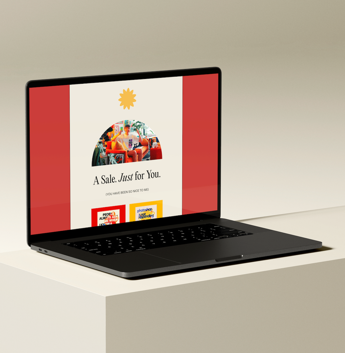
- Sale announcement newsletter
- Editorial newsletter
- Update newsletter
- Multi-part newsletter
- Roundup newsletter
- Dear subscriber newsletter
- Personal note newsletter
- Freebie delivery newsletter
- Engagement newsletter
- Re-engagement newsletter
- Reminder newsletter
- Thank you newsletter
- Inspiration newsletter
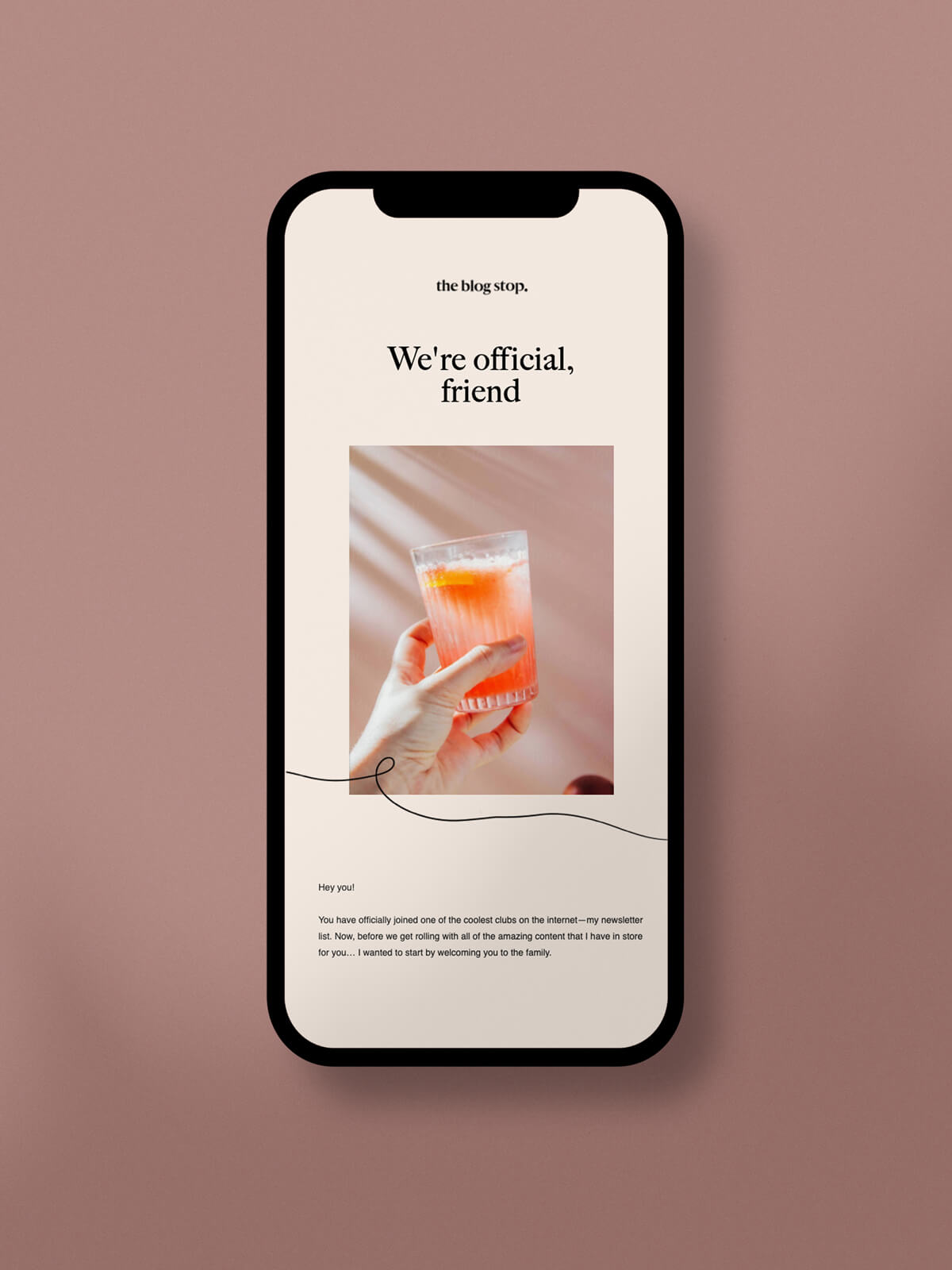
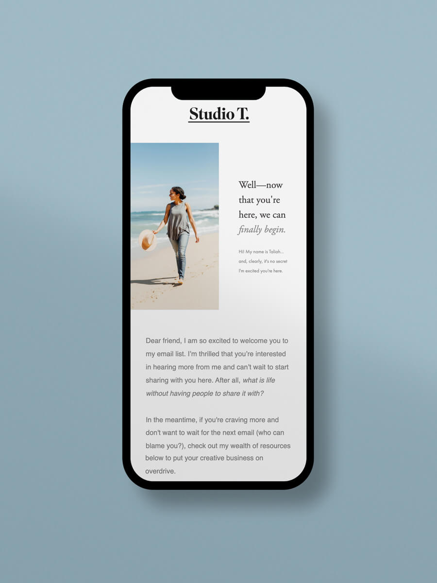
In this newsletter example, you’ll welcome new subscribers to your list in style and create an unforgettable first impression. This timely welcome note will remind them why they were so excited to join your list in the first place.
Use this newsletter template to:
- Share what they can expect from you in the future
- Start conversations with your audience by encouraging replies
- Explain who you are in a quick snapshot
Add a cheerful image that invites your audience to continue opening your emails. If you want to make an impact from the very beginning, use this eye-catching newsletter template.
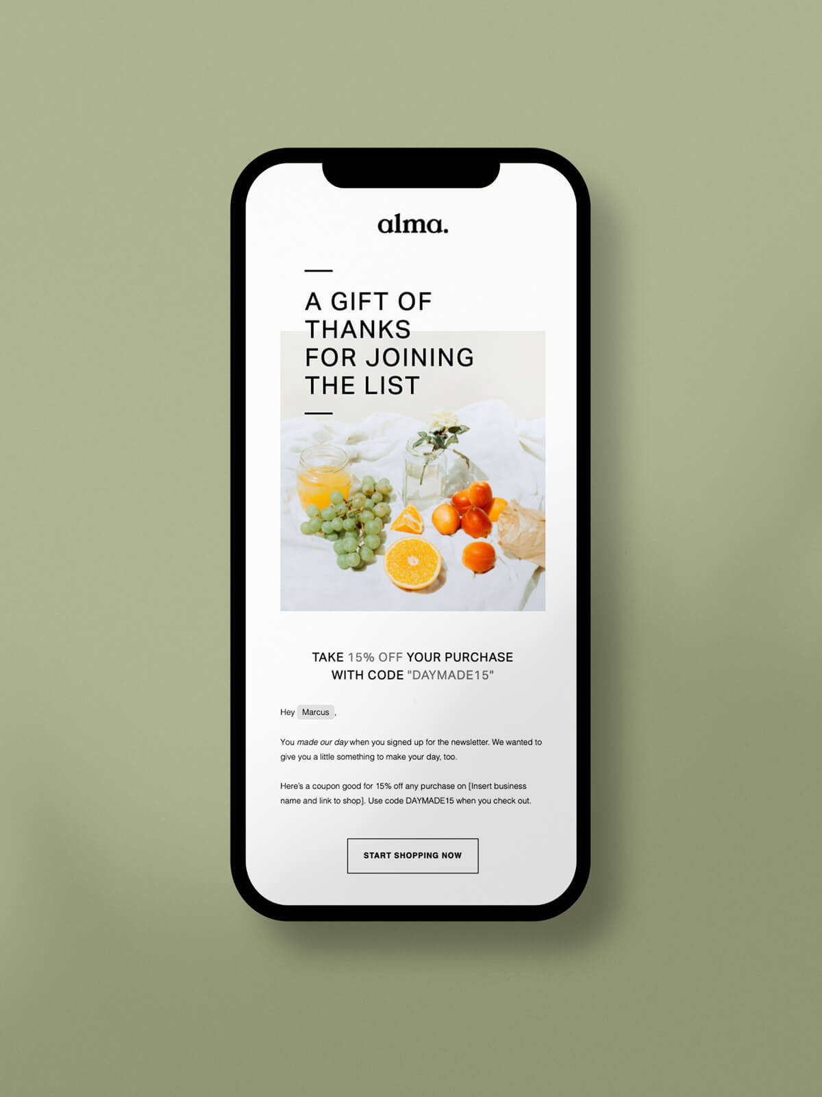
In this newsletter example, you’ll show just how excited you are for someone to join your list by extending a discount to your online shop. Think of it as a reward for becoming a new subscriber!
Use this newsletter template to:
- Welcome new subscribers to your email list
- Provide an exclusive discount
- Increase shopping cart conversions
After you capture your audience’s attention with a high-quality photo, make sure to highlight the discount code they can use on their first purchase. If you want to welcome subscribers into your list in a memorable way, this newsletter template is for you.
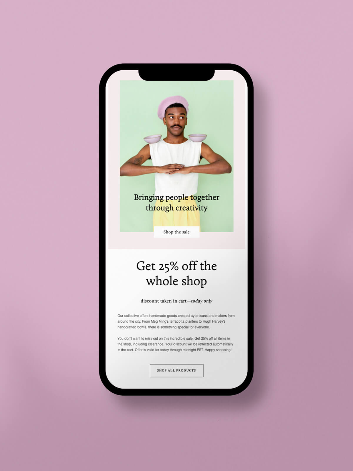
In this newsletter example, you’ll increase urgency and sell more products by using a limited time offer. When you clearly state what the offer is and how long it’s available, your audience will be even more interested in browsing through your online shop.
Use this newsletter template to:
- Promote your next product launch
- Convert more abandoned cart leads
- Re-engage cold subscribers
With a clear call to action, this newsletter design puts your offer front and center so your audience won’t miss it. If you want to send newsletters that are optimized for conversions, this creative newsletter template can help.
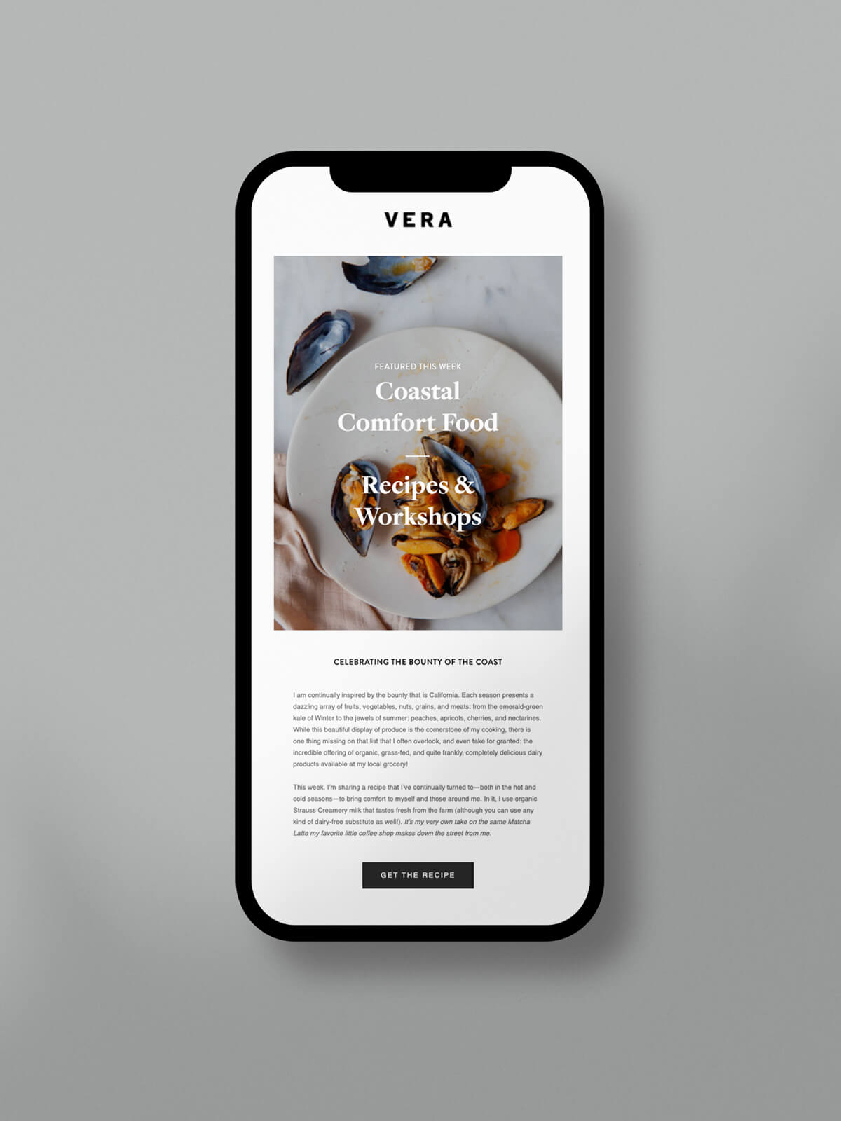
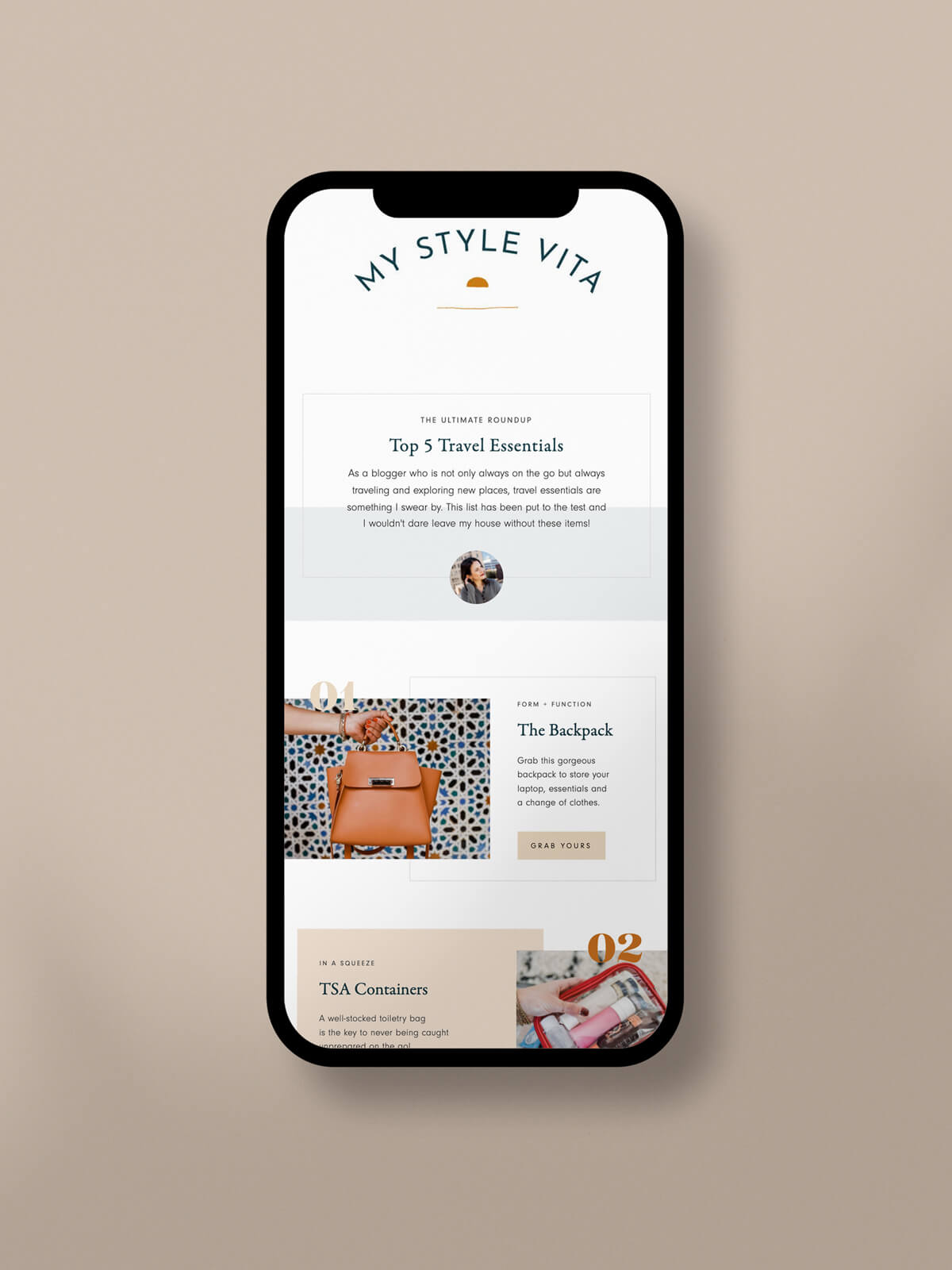
In this newsletter example, subscribers will be delighted to receive emails with an elevated editorial look. With a stunning newsletter layout inspired by the magazines we love to browse, this is a great example of how to visually format your newsletter in an optimal way.
Use this newsletter template to:
- Educate your audience
- Share your best tips and advice
- Create an internal newsletter with company news
The numbered sections and serif typography makes it easy for subscribers to skim content and stay engaged. If you want to display bite-sized information in a gorgeous way, you’ll love this newsletter template.
In this newsletter example, sharing the latest news about your brand is easier than ever before. An update newsletter gives a short explanation of what’s happening behind the scenes and how they can be a part of what your brand is doing.
Use this newsletter template to:
- Feature new content from your blog or podcast
- Personally invite others to attend your next event
- Get beta testers for a new product or service
Lifestyle and product photos really shine in this newsletter template with many opportunities to add custom graphics and other design elements. If you want to share multiple updates at one time, this newsletter template will help you do just that.
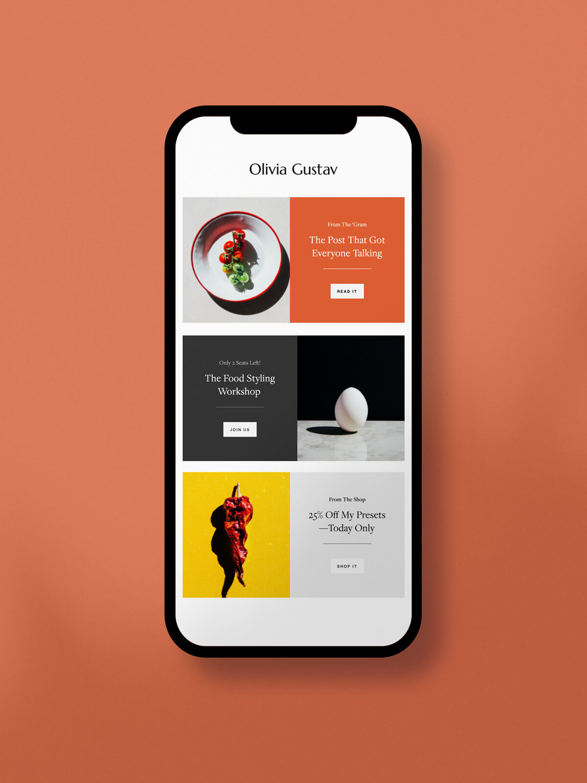
In this newsletter example, you’ll be able to thoughtfully engage with existing subscribers by offering a curated selection of resources. This newsletter design is a great example of how to include multiple CTAs without confusing or distracting your audience.
Use this newsletter template to:
- Highlight new products or events
- Share limited time offers
- Feature your latest blog post
The different colored blocks that separate the sections catch the reader’s eye and inspire them to click. If you want to give people the chance to explore your website or brand, this may be the newsletter template for you.
In this newsletter example, readers get exclusive access to your top recommendations and let them explore the things you love the most. By sharing your favorite things, you’ll better serve your audience while increasing your affiliate earning potential.
Use this newsletter template to:
- Share any products you’ve been loving lately
- Position yourself as an influencer or expert
- Highlight seasonal sales for holiday newsletters or school newsletters
To add more of your favorite things, simply add more items to the list by duplicating your Layout so you don’t have to reinvent the wheel. If you want to make more money on autopilot, a roundup newsletter template may help you get there.
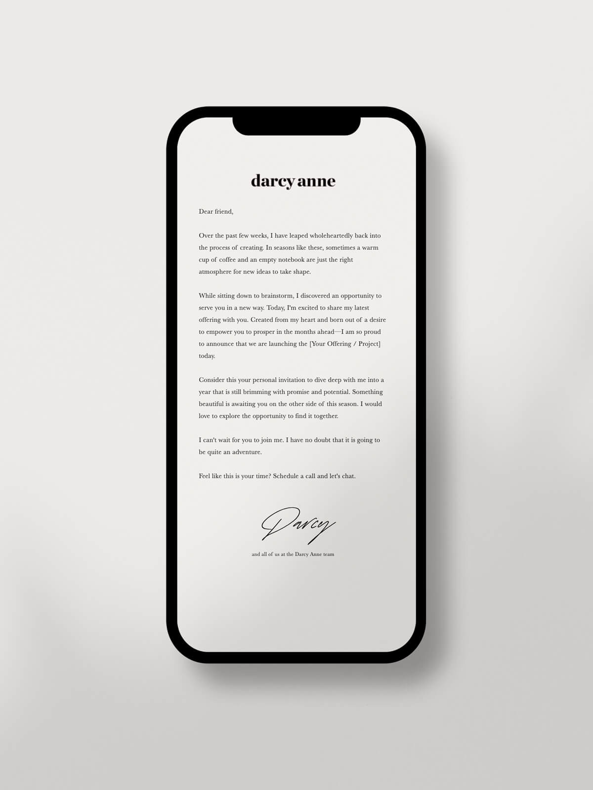
In this newsletter example, you’ll have ample room to share personal stories with impact. Written as a letter from a dear friend, you can use this newsletter type to deeply connect with your audience on a more personal level.
Use this newsletter template to:
- Lead with your own personal story
- Share a case study from a past client or customer
- Start from a blank canvas
Keep it simple with a plain-text template that encourages your audience to keep reading. If you want your newsletter to feel like a page from your journal, this simple newsletter template may fit your needs.
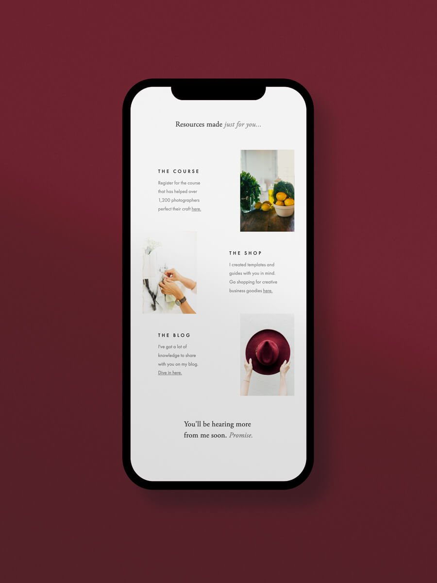
In this newsletter example, your story will take center stage as you focus on increasing email engagement. Curated with resources from your website, shop, or blog, this email will serve as a powerful introduction to your brand.
Use this newsletter template to:
- Share the inspiration behind your brand
- Increase brand loyalty and trust
- Build stronger relationships with prospective customers
Cropped imagery gives a preview of your resources without distracting from the text. If you want to re-introduce yourself to your email audience, this newsletter template will be your optimal choice.
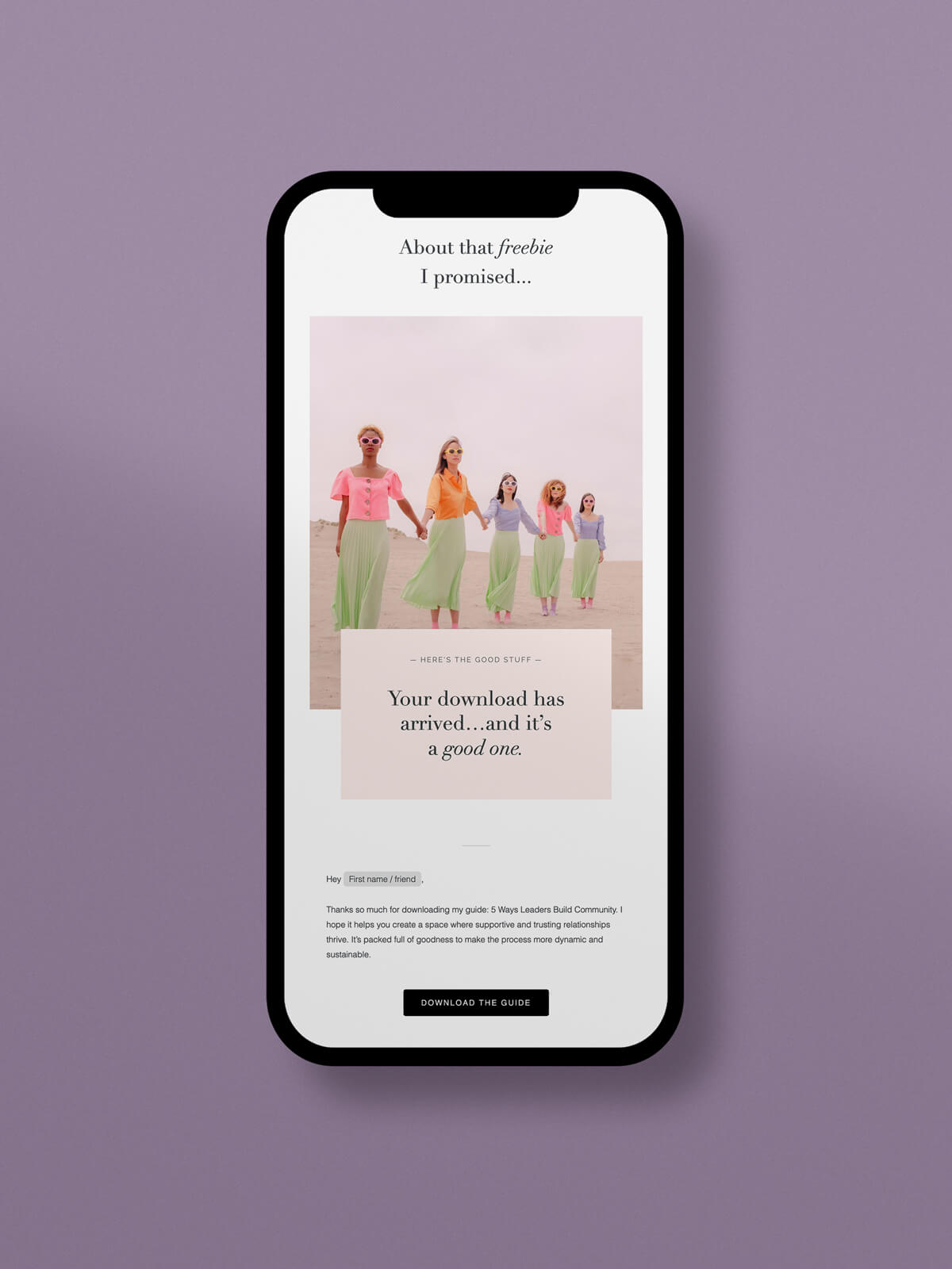
In this newsletter example, you’ll deliver value straight to your new subscriber’s inbox. No matter what type of freebie (or lead magnet) you create, you can reuse the same template to save time and keep everything consistent.
Use this newsletter template to:
- Deliver on your promise to send a freebie
- Surprise your audience with a freebie
- Introduce your brand and build trust from day one
Underneath your call-to-action button, start by setting expectations for when your audience can expect to hear from you and what topics you typically cover. If you want to automate your freebie delivery process, this newsletter template is your answer.
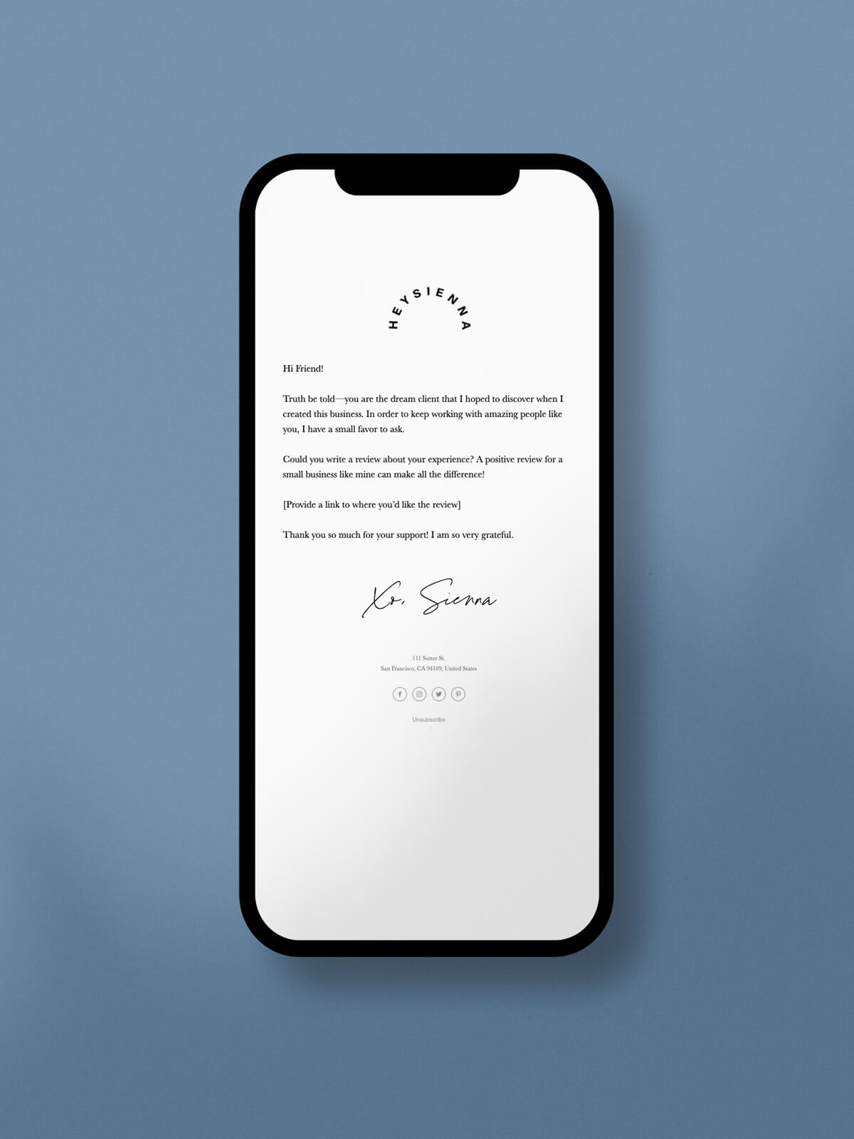
In this newsletter example, engaging with your audience won’t be a one-time event. Instead, you’ll be able to have a two-way conversation with readers, inviting them to give you feedback or reply to your message.
Use this newsletter template to:
- Encourage customers to review your business
- Nurture your connection with existing customers
- Tell customers what to do next
With a plain-text newsletter layout, your call to action should be simple and well-defined. If you want to send a follow-up email to new and current customers, be sure to use this minimal newsletter template.
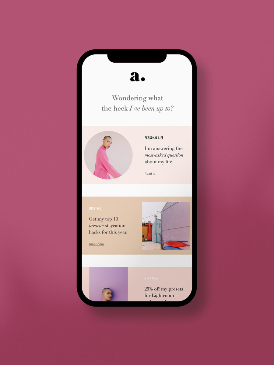
In this newsletter example, reconnecting with your audience is made easier. If a group of subscribers hasn’t opened your emails in a while, this may be the perfect email to encourage more interaction.
Use this newsletter template to:
- Increase engagement with cold subscribers
- Invite readers to connect through social media, your website and more
- Share what you’ve been up to lately
Unique color blocks naturally guide your reader’s eye, creating a user-friendly layout they can easily digest. If you want to re-engage readers to increase your email performance, this newsletter template gives you head start.
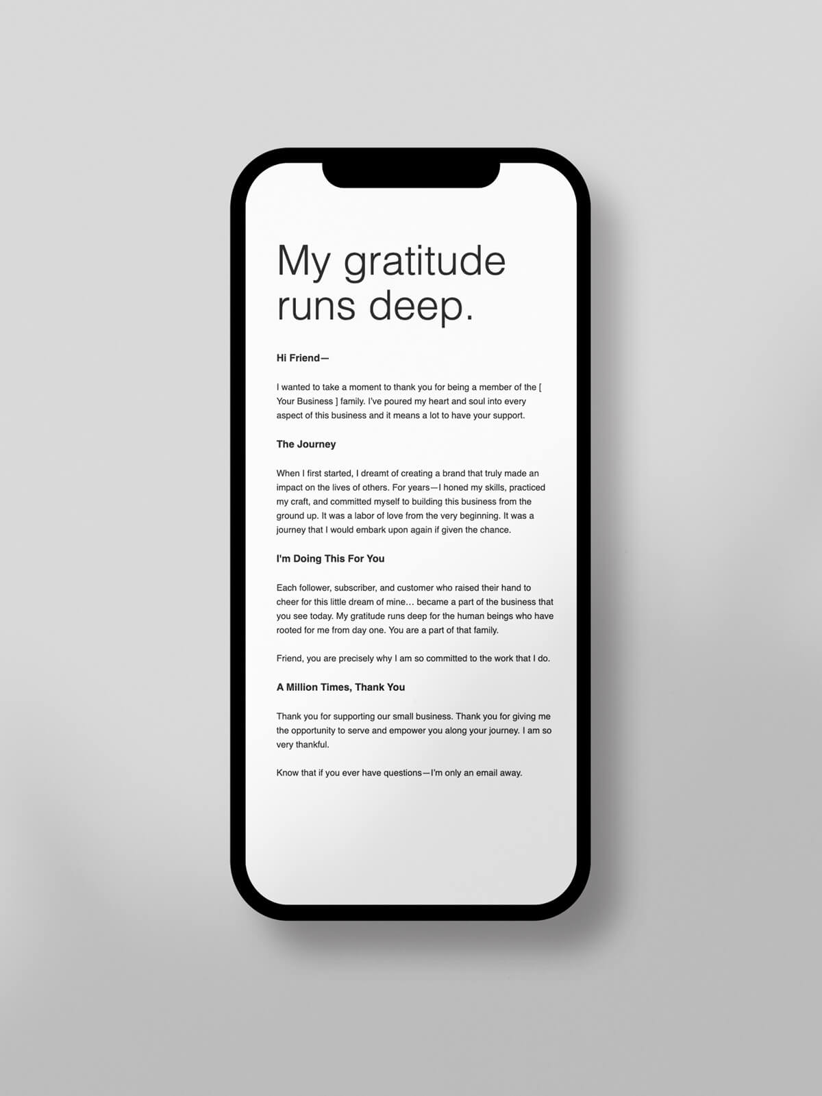
In this newsletter example, you’ll see how easy it is to add a personal note or reminder to any email. All you need to do is make this newsletter template your own. Be sure to add high-quality, personal content and speak from the heart.
Use this newsletter template to:
- Share important updates with new and existing subscribers
- Send a reminder or helpful hint
- Express gratitude to recent buyers
Who said plain-text emails couldn’t be visually stunning? If you want a simple newsletter template that can be easily edited for future newsletters, look no further.
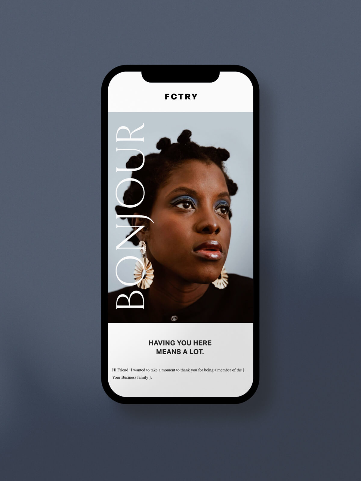
In this newsletter example, you’ll have an opportunity to express gratitude to your most loyal followers and brand advocates. This beautiful newsletter design is a great way to show and tell your audience just how much you appreciate their support.
Use this newsletter template to:
- Add a loyalty discount
- Give special access to your latest offer
- Surprise your audience with a freebie
With bold imagery and stylish typography, you’ll have everything you need to nurture the strong connection you’ve built with your audience. If you want to add a bit of flair to your thank you note, this newsletter template will be a fantastic fit.
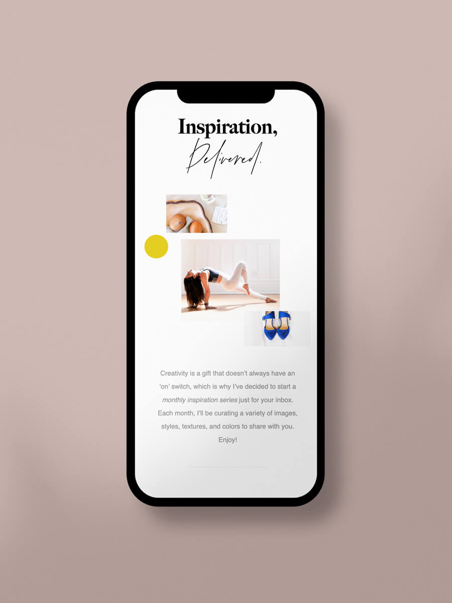
In this newsletter example, you’ll impress your audience by sharing a collection of inspiring imagery, fonts and colors. Inspired by moodboards, this template can be used by website designers, interior designers, fashion designers and artists who want to reveal the inspiration behind their work.
Use this newsletter template to:
- Give an exclusive look into your creative process
- Unveil your new rebrand
- Share more ideas with your audience
Designed with white space and visual hierarchy in mind, you’ll have plenty of design opportunities when customizing this newsletter layout. If you want to show off your stunning visuals, this beautiful newsletter template is sure to pique your audience’s interest.
Flodesk layouts
The highest performing newsletter designs are created with the end user in mind. If you want to create visually stunning newsletters without the hassle and headache of crafting custom designs, our Layouts will be your perfect solution.
With dozens of Layouts to choose from, you can create a completely unique email newsletter with a variety of content sections that naturally encourage interaction and conversion. You can choose from our library of email templates and send your first email in minutes when you sign up to a free trial.
