How to optimize your checkout experience for mobile
Table of Contents Jump to:
Jump to:
Table of contents
TLDR: Optimizing your e-commerce site for mobile checkout will take your business to the next level. Learn how to make the most of your site with these best practices and real-world examples.
Building a properly optimized mobile checkout flow is one of the most important aspects of creating a successful e-commerce digital marketing strategy. Has your website seen an increase in traffic without any uptick in sales? Your mobile checkout process could be to blame.
Creating a great mobile experience that reflects your brand can be a challenge, but it can also be the difference between securing a sale or losing out. If you’ve ever seen a social media ad on your phone, clicked through, and shopped for a bit before thinking, “I’ll have to check out on my computer later,” then you’ve experienced a bad mobile checkout flow.
You’re not alone either. According to Kibo, mobile phone users consistently have the highest abandoned cart rate (84% in the US for Q2 2022) when compared to desktop and tablet users (72% and 75%, respectively). So the question is, how can you use your mobile checkout process to overcome users’ tendency to abandon their carts?
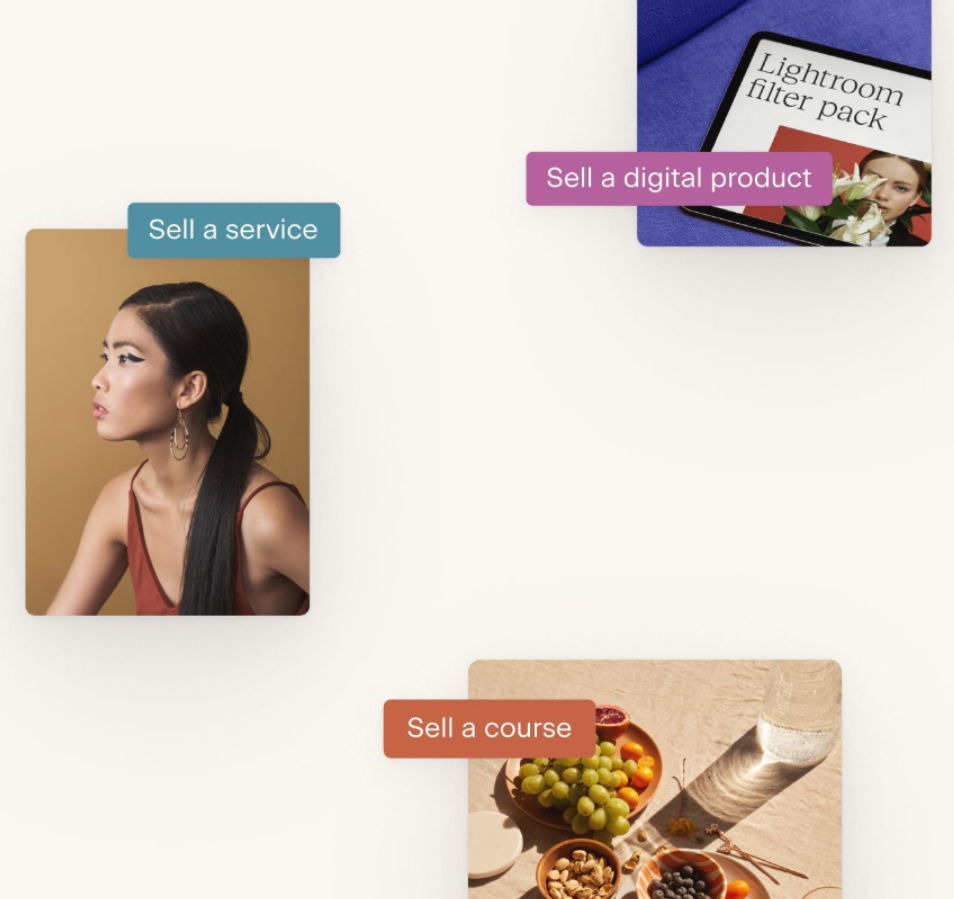
Creating mobile-optimized sales pages with Flodesk Checkout
Reduce friction and boost sales using Flodesk’s easy-to-use and beautiful checkout templates that are always optimized for conversion.
What is mobile checkout?
Mobile checkout refers to the process of completing a transaction using a smartphone. Whether the checkout process takes place on an internet browser or within dedicated mobile apps, the principles and best practices for mobile transactions remain the same.
There are many benefits to using mobile checkout in place of shopping at brick-and-mortar stores or even online shopping on a computer. Namely, shopping on a smartphone (if optimized properly) allows for an easy checkout experience with the added security and convenience of functionality like Apple Pay or Google Pay in the palm of your hand.
Shoppers have fallen in love with mobile checkout over the past few years and likely won’t be slowing down any time soon. According to Insider Intelligence, retail mobile commerce sales will more than double by 2025 to reach $728.28 billion and make up over 44% of all retail e-commerce sales in the US. Needless to say, there’s a lot of opportunity!
Why optimizing for mobile is important
Simply put, small business owners need to ensure their mobile checkout flow is optimized because e-commerce sales have shifted toward mobile users over the past several years. According to Statista, mobile devices have grown from accounting for 31% of all website traffic in Q1 2015 to nearly 59% in Q2 2022. Ultimately, as a business, you can’t win unless you’re in the game. It’s crucial to build an optimized mobile checkout flow to take full advantage of the opportunities presented by mobile checkout.
As mobile has moved to the forefront of online shopping, it’s become imperative that business owners of all sizes optimize their mobile checkout flow. Mobile shopping is growing into a larger share of e-commerce sales every year, and mobile shoppers have more apps, sales, and checkout options competing for their attention than ever. Research has found that 79% of smartphone users have made a purchase online using their mobile devices and that mobile devices account for nearly 73% of all e-commerce sales—despite that high cart abandonment rate.
Building a version of your checkout flow with a mobile user in mind lets you capitalize on the market shift toward mobile commerce. Creating a simple and intuitive checkout flow that can quickly process transactions will help you stand out against competitors, keep shoppers from abandoning their carts, and help you convert your mobile visitors into customers at a higher rate. It’s a win-win… win!
And if shoppers do drop off, these awesome abandoned cart email subject lines are sure to get your foot right back in the door!
Reasons mobile users abandon their carts
Before we break down how to optimize a mobile checkout flow, let’s discuss the most common hang-ups in a checkout flow or product page that might cause a mobile user to abandon their shopping cart.
- The website is too slow. One of the primary benefits of shopping on your smartphone is how quickly you can make a purchase. For most users, that’s completely out the window if the website they’re using to shop is slow to load on a mobile device. That friction is one of the leading causes of cart abandonment.
- High fees and shipping costs. Think you’ve found the perfect product at the perfect price only to be flabbergasted during the final stages of the buying process when you discover that the cost has now doubled with shipping, taxes, and fees? Not a great experience.
- Too many form fields. As brands continue to buff up their email subscriber lists by extracting additional contact info and adding more form fields, it can get complicated and lengthy. Convenience takes a hit.
- No guest checkout. Many users don’t mind creating an account to complete a purchase online. However, some customers find the lack of a “check out as a guest” option off-putting and would rather shop elsewhere than feel forced into subscribing to an email list.
- Researching other options. Another common reason users abandon their carts is to compare options. With instant access to countless product reviews and competing prices, customers want to know they’ve found the product they need and that they’ve found the best deal.
- Just looking. SaleCycle found that 34% of people abandon their shopping carts during mobile checkout because they were just browsing and had no intention of ever making a purchase. As frustrating as that may be, it was the most common reason they found for cart abandonment.
Fortunately, the first five of these cart abandonment issues can be addressed by optimizing your mobile checkout flow and improving the user experience. In fact, experts found that e-commerce sites can gain a 35.26% increase in conversion rate through better checkout page design. Let’s take a look at nine simple principles that will help guide your mobile-friendly checkout optimization.
9 Best practices for mobile-friendly checkout
No matter what kind of product you sell or your web design skill level, you can easily create optimized checkout options to guide customers quickly and easily through a purchase. The following tips and principles are a great starting point for creating a mobile checkout flow your users will love.
1. Streamline your checkout flow
First and foremost, it’s important to remember that many of the users who make it to your checkout page have already decided they want to buy your product. Don’t give them reasons to stop and reconsider. Every extra step or hitch in loading time during the checkout process is another opportunity for a customer to pause, sigh, and say “you know what, nevermind.”
Remove as much clutter and friction from the checkout process as possible so your customers who know what they want can quickly enter their credit card information to pay and be on their way.
2. Display the total price above the fold
Since unexpected costs and fees are a major contributor to cart abandonment during mobile checkout, transparently displaying the cost and fees for your product ahead of time can help your users stay informed and not feel so jarred by the final cost in their shopping carts.
“Above the fold” simply means that the price should be shown on your product and checkout pages without users needing to scroll down. Building this trust and credibility can help lead to higher conversion rates and ultimately, a better overall customer experience.
3. Clearly and concisely define your product
Clearly defining your product helps customers understand exactly what they’re purchasing and the value that your product or service provides. You want users to feel as secure and excited about what they’re buying as possible. This is especially important with first-time customers who may be seeing your store for the first time on mobile.
Product descriptions should be as thorough as possible to reduce the risk of miscommunication and to guide users through the final steps of their purchase. However, it’s important to remember that mobile shoppers are making their purchases on a small screen. Nobody enjoys scrolling through walls of text as they’re trying to shop. So your product descriptions need to be concise. Bullet points are great for delivering a lot of information in short order!
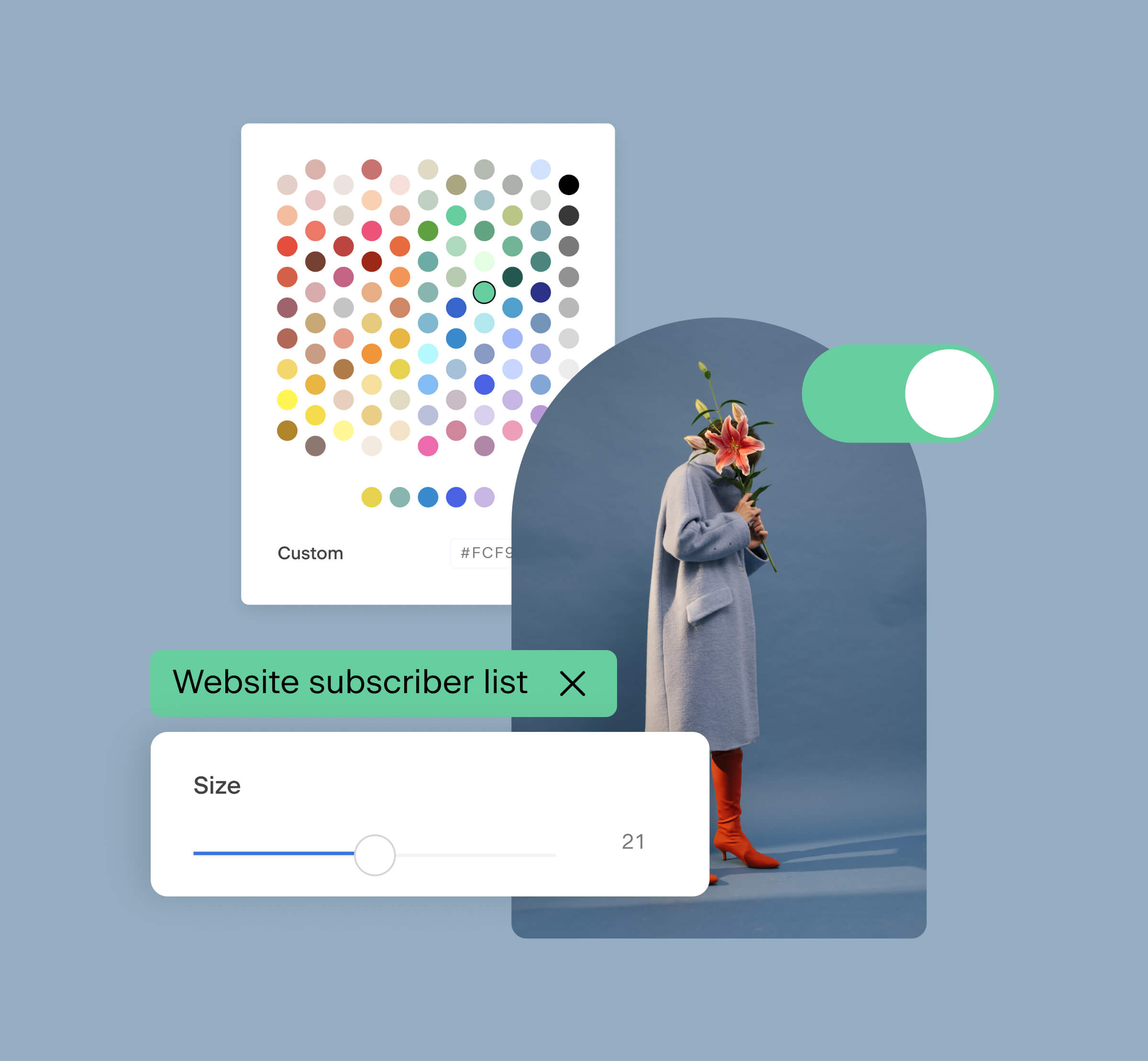
4. Simplify your form fields
Form fields are the text boxes where users fill in their information to complete a purchase. The mobile checkout flow is a great opportunity for you to capture first-party data about your customers and build ongoing relationships with them through products like Flodesk Email.
However, overcomplicating your checkout process with excessive questions and fields can add additional friction to the process that may cause customers to bounce. All online shopping requires some level of data entry from shoppers, so most people who make a purchase online are okay with providing obviously necessary information like email addresses, phone numbers, and credit card info. But truly consider whether the risk of additional questions on your checkout forms is worth the reward.
5. Eliminate pop-ups
While it may seem like a good idea, having excessive pop-ups as part of your checkout flow can be distracting for users and make the experience, especially on mobile, feel cluttered and slow.
Remember, not all of your mobile visitors will use the latest and greatest smartphones to do their shopping. While newer cell phones with more processing power and 5G networks might make zipping through a pop-up feel like a breeze, older and slower phones may get bogged down while trying to render a pop-up, adding unnecessary time to the checkout process. It’s best to avoid utilizing pop-ups on mobile to keep the experience streamlined.
6. Keep customers on the checkout page
The shortest distance between any two points is a straight line. As you’ve noticed in our tips so far, optimizing your mobile pages for high conversion is all about keeping your users on a straight path toward their shopping cart and entering their credit card information to pay. To that end, create product pages that make it effortless for users to find the information they need and make adjustments without leaving the checkout page.
A good example is when a clothing store lets you change the size of a t-shirt in your cart directly from the final confirmation page instead of having to double back and start the process over. This ease of use will keep users focused and more likely to complete their purchases.
A bit more of a practical step than a philosophical one, using large call-to-action (CTA) buttons on your checkout page instead of simple text hyperlinks will make your page more mobile-friendly. On a cell phone screen, it’s much easier to click a colorful button that says “BUY NOW” than it is to click a line of highlighted blue text.
Tools like Flodesk Checkout allow you to insert multiple CTAs onto your mobile pages that stay true to your brand. Flodesk Checkout also offers analytics that let you know if your page is converting or if you have room for improvement, allowing you to further optimize your mobile checkout UI.
Read next: 10 best checkout pages with actionable tips!
8. Allow for guest checkout
As tempting as it is to guide users to creating an account on your website, offering the option to checkout and pay as a guest is still imperative. This helps reduce the number of abandoned carts on mobile by, once again, removing friction from the process.
This is especially appealing for shoppers on mobile, who may be in a hurry or have limited time to complete their purchase. It also allows them to quickly buy an item without needing to remember login information or receive additional marketing emails they may not be interested in.
9. Accept multiple payment options
When it comes to mobile shopping, being able to accept a variety of credit card options is the name of the game. Limiting the payment and credit card options your online store can accept will muddle your checkout flow and is bound to filter out some potential buyers.
Building a mobile-friendly page with multiple checkout options is simple with tools like Flodesk Checkout. Flodesk Checkout features Stripe integration that lets you accept every major credit card like Visa, American Express, Discover, and Mastercard without the hassle of platform fees.
For each transaction completed on your Flodesk Checkout page, you will only be charged Stripe’s small processing fee and be able to offer the convenience and security of major credit card brands to your buyers.
One checkout page. Multiple ways to pay.
Create an enjoyable and seamless customer experience by accepting multiple payment options on your Flodesk Checkout page.
3 Examples of great mobile checkouts
Now that we’ve established some best practices for creating a mobile checkout flow, let’s take a look at real-world examples to get you inspired.
Each example was created using Flodesk Checkout, which makes creating stunning mobile experiences like these easy for any skill level. Flodesk Checkout offers a variety of beautiful templates that you can quickly customize to match your brand and fit your needs with no coding necessary. Let’s get into it!
1. Dietitian Brittany
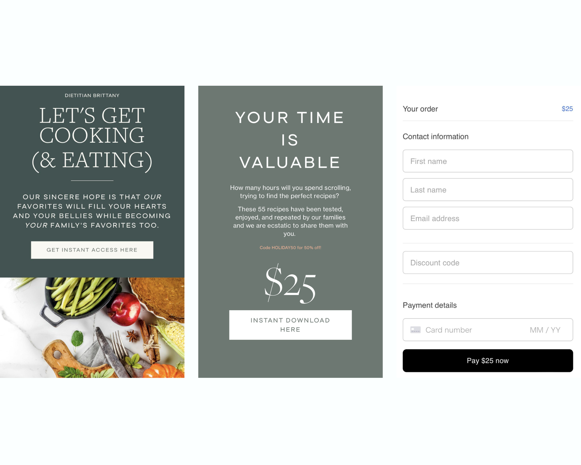
Dietitian Brittany is a dietitian and nutrition coach who helps women find healing from gut, hormone, and energy imbalances. In addition to her work as an influencer and coach, Brittany also offers a digital cookbook full of her favorite holiday recipes that she sells via a Flodesk Checkout page.
What it does right:
- Gorgeous, mobile responsive design
- Straightforward information about the product offering
- Offers a discount code further down the product page to convince unsure shoppers
- Multiple CTA buttons that emphasize instant access to product
- Only essential fields shown on the final checkout page
- Total price listed prominently above the fold
2. The Yoga Underground
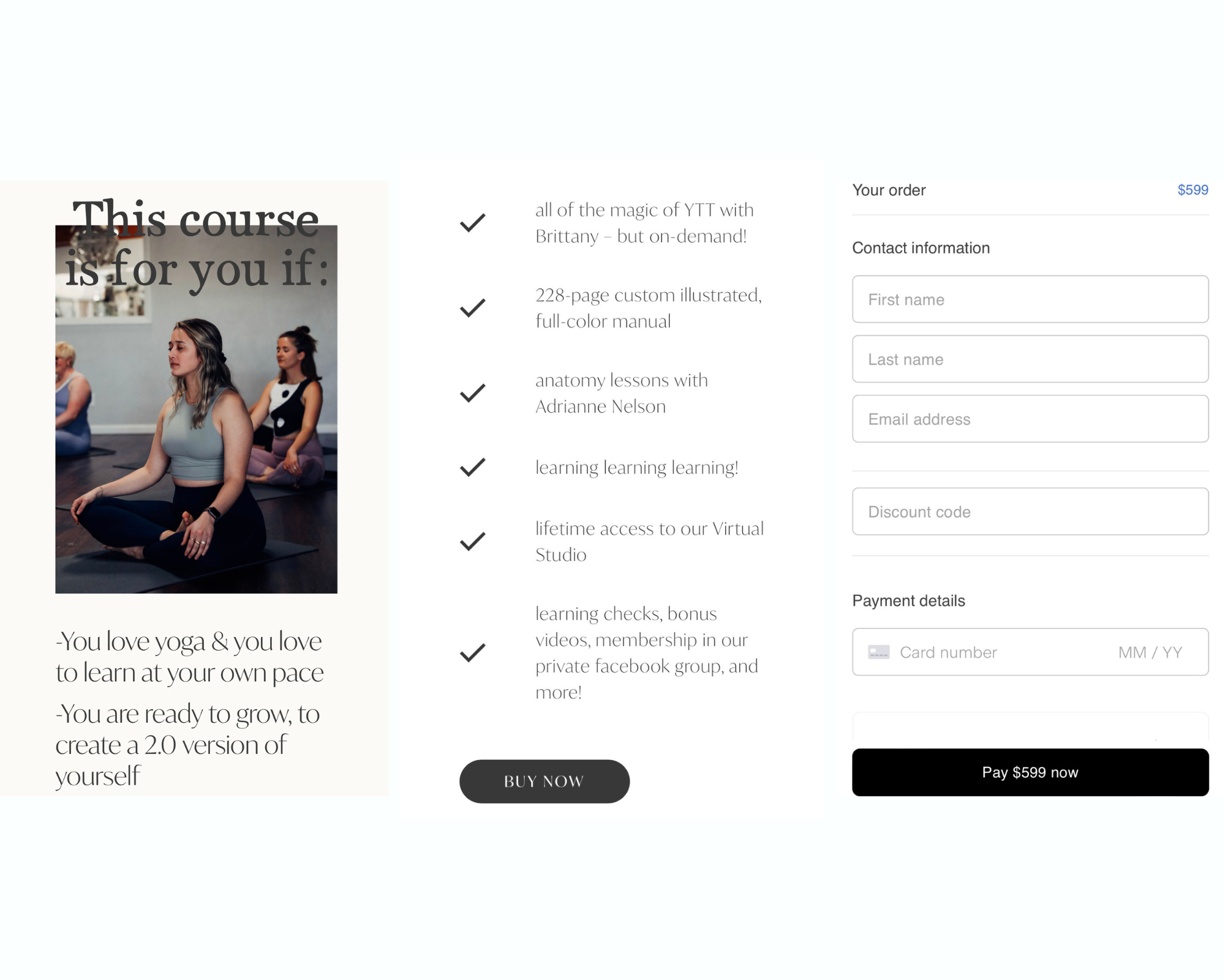
The Yoga Underground is a yoga studio based in Provo, Utah, that offers on-demand yoga courses online in addition to its in-person offerings. The Yoga Underground uses a Flodesk Checkout page to sell its virtual 200-hour Yoga Teacher Training (YTT) course nationwide.
What it does right:
- Thorough explanation of what’s included in the course
- Gorgeous photography that captures the spirit of the product
- Streamlined form to complete checkout
- Full pricing details listed above the fold
- Multiple CTAs throughout the page to guide the user toward a purchase
3. Creative Growth Groups
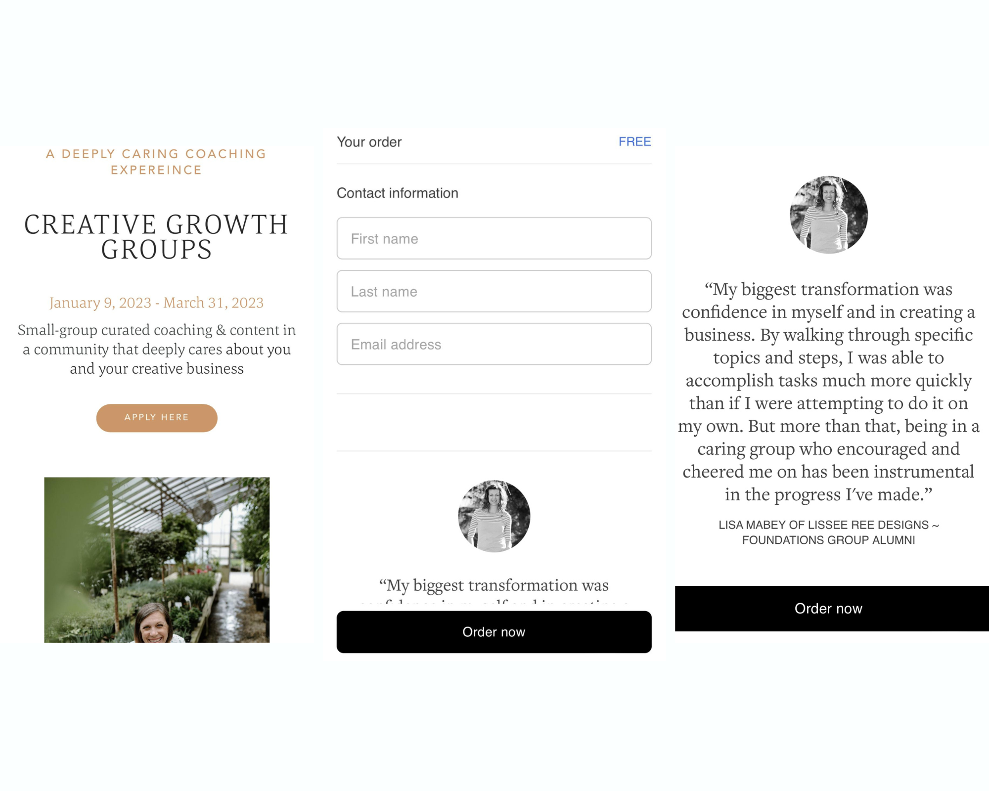
Creative Growth Groups is a small-group coaching initiative hosted by a woman named Colleen Annalea. Colleen uses Flodesk Checkout to gather applications for new members to join her group of mentees. Each member helps encourage the others with connection and accountability. Colleen’s ultimate goal is to help each member of her group elevate their business and marketing strategies.
What it does right:
- Thorough and concise product description above the fold
- More detailed information available lower on the page for shoppers who need further encouragement to sign up
- Multiple CTA buttons instead of links
- Only essential contact information is gathered on the checkout page, no purchase is necessary
- Testimonial on the final checkout page as a final appeal to curious applicants
Create high-converting checkout flows with Flodesk
Now that you’ve seen the beautiful simplicity of Flodesk Checkout in action, you’re ready to put our best practices in action for your own products and services. It’s never been easier to create a streamlined mobile checkout process that your users will love. You can get started today by trying Flodesk Checkout for free for 30 days and making the most out of the trend toward shopping on mobile.

Related Articles