17 Email Design Best Practices for Newsletter Marketing in 2025 (With Examples)
Table of Contents Jump to:
Jump to:
Table of contents
When it comes to getting your subscribers (or customers) to interact with your emails, a good email design can make all the difference.
Your subscribers receive tens of emails daily, so attention is a super scarce commodity. The average time spent reading a brand email is only 10 seconds. In order to stand out from the crowd, every aspect of your email needs to be right on the mark.
Good email design ensures that your subscribers not only open your email but also read your message and take your desired action. Everything from your subject line to your layout to your CTAs should be carefully crafted to grab and hold your readers’ attention.
In this article, we’ll share email design best practices to help you get it right.
Get unlimited email sends & subscribers with Flodesk
We’ll never increase pricing because your email list is growing
1. Use a trusted sender name
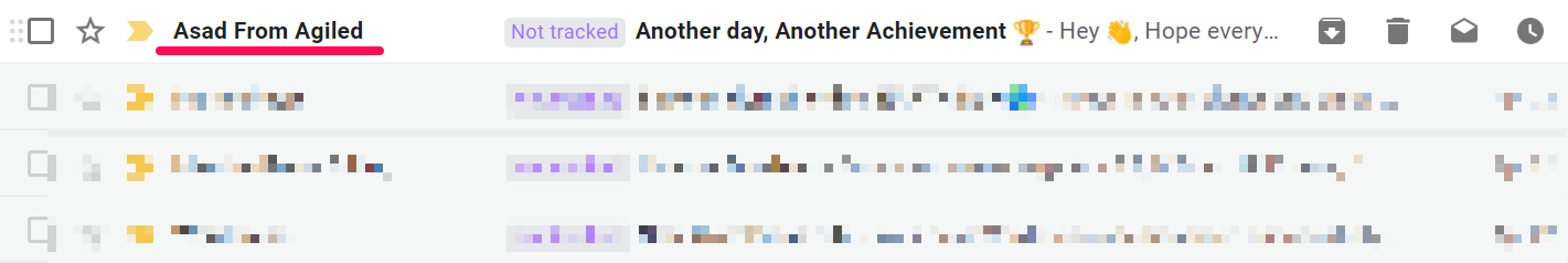
No one likes to receive emails from someone they don’t know. In fact, 42% of email recipients check the sender’s name before deciding to open an email, compared to 38% who check the subject line. So, it’s important that your sender name is instantly recognizable and helps subscribers remember your business. In the example above, Agiled includes both their staff name and business name. Notice how the email is marked as important by Gmail.
Tips and best practices for writing your sender name
- If you’re using a personal name, use “Staff from Business Name” instead of just the staff name.
- You can also use the name of your newsletter series if that will be more memorable to your subscribers.
- Be consistent with your sender name format, especially if your subscribers will receive emails from different employees or departments.
- Don’t use a no-reply address.
2. Create a compelling subject line
The first hurdle you must overcome is to get your subscribers to open your email. And it all starts with your subject line. 69% of email recipients report emails as spam based solely on the subject line. So, crafting a subject line that hits the mark is the first step in great email design.
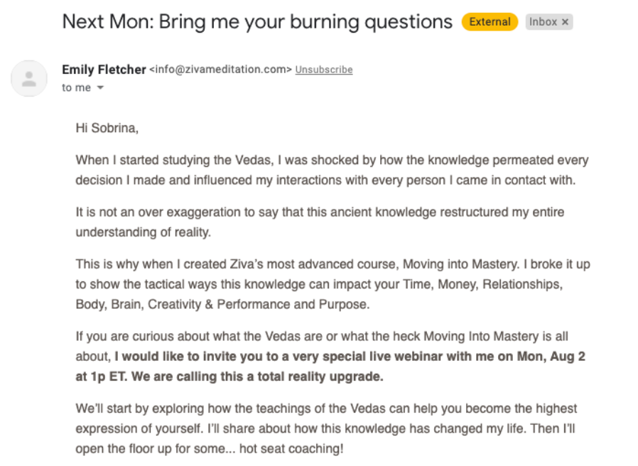
In the example above, Ziva Meditation uses the subject line “Next Mon: Bring me your burning questions” to invite subscribers to a live webinar. It includes a power word and speaks to the reader’s pain points.
Tips and best practices for crafting a great subject line
- Keep it short and to the point.
- Include power words.
- Make an offer.
- Pique the reader’s curiosity and interest with a question or teaser.
- Throw in an emoji or two, where appropriate.
3. Draft an irresistible preview text (or preheader)
A preheader is the preview text subscribers see when your email arrives in their inbox. Like subject lines, preheaders add valuable context and give your subscribers an idea of what to expect.
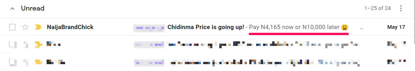
In the example above, NaijaBrandChick packs in the FOMO by highlighting the discount and original prices. Plus, she tosses in the “sad” emoji for extra effect.
Tips for crafting a great preview text
- Summarize your email as best as you can.
- Add more info about the subject line.
- Create urgency.
- Give your readers a strong reason that they should open the email.
4. Use an email template
Using an email template can save you time and greatly improve your email marketing workflow. Most email templates are designed with email best practices in mind. This means you can use them with confidence.
Tips/takeaways
- Choose responsive, well-designed templates, like those from the Flodesk library.
- Choose templates that fit your goal. For example, an ecommerce email template would not be helpful when you’re trying to promote a blog post.
- Plan your content first, then choose a template that best supports it.
- Be consistent—make sure your design choices are consistent across different types of emails.
For more tips on how to format your newsletter template, read How to Format a Newsletter That Subscribers Will Want to Read.
5. Optimize for mobile devices
Responsive email design is no longer optional. With almost 60% of all internet access occurring on mobile devices, mobile optimization is now a priority. In fact, 80% of recipients outright delete emails that are not optimized for mobile.
Author’s note: Flodesk offers several mobile-responsive templates that look great on any device. Or you could create your own template from scratch.
Tips for creating mobile-responsive emails
- Choose an email marketing software that supports responsive design—like Flodesk.
- Design for mobile first.
- Try the single-column layout
- Add alt text/descriptions to all images in case the email client fails to load your images.
- Use smaller image sizes.
6. Include an attention-grabbing header
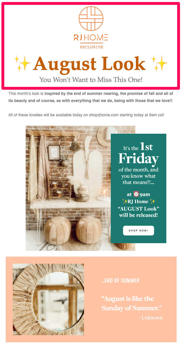
The header is the first thing your subscribers see after they open your email, and it sets the tone for the rest of the message. Done right, you can immediately grab your reader’s attention and get them interested in the rest of the content. Plus, a header forms part of your visual and brand identity.
RJ Home takes maximum advantage of its header by including its logo, a captivating headline and a subheading.
Tips for designing the perfect header
- Include your logo.
- Use a consistent header style across all marketing emails.
- Include a catchy headline.
- Share the most important information, such as your offer, in the headline and subheading.
7. Create a clear a visual hierarchy
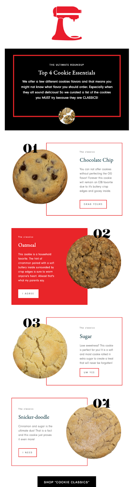
Visual hierarchy refers to the placement of text and visual elements in your email in order of importance. A distinct visual hierarchy helps your readers quickly understand your email by emphasizing what’s important and where to click.
In the example above, Everything Just Baked lays out its email content in a pleasing Z-pattern, which readers can easily follow.
Tips for building a clear visual hierarchy
- Choose a standard visual pattern—inverted pyramid, Z- or F-format.
- Choose the pattern that best serves your purposes. For example, the inverted pyramid works well for emails with one call to action button because you can direct the user’s attention to that button.
- Use colors and font sizes to highlight the most important elements. For example, your main headline should have the biggest font.
8. Use lots of white space
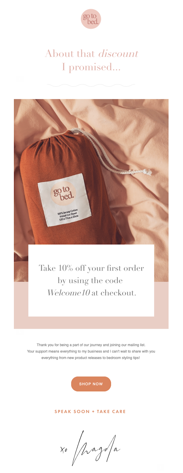
White space, also known as negative space, refers to the empty space around your email content. Why’s that important? White space affects how people read digital content and the legibility of text. It helps draw attention to important elements and creates a feeling of elegance.
In the example above from Go To Bed, notice how the extra space around the text and buttons gives the email an elegant, easy-to-read finish.
Tips on how to use white space
- Emphasize the most important elements.
- Make your text more legible by creating space in the places where readers will naturally pause.
- Remember that white space doesn’t have to be white—simply create negative space between design elements.
Get unlimited email sends & subscribers with Flodesk
We’ll never increase pricing because your email list is growing
9. Include relevant, eye-catching images
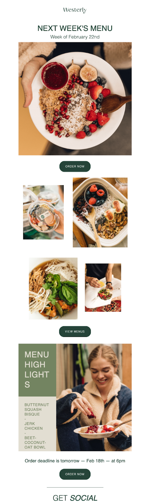
When it comes to email, visuals also win. Emails that include some sort of graphics have a higher open rate (27%) and click-through rate (4.5%) than text-based emails (20% and 3%).
In the example above, Westerly uses high-quality food images to capture the attention of their readers.
- Use a mix of stock and custom photos. Flodesk integrates with Unsplash so you can add high-quality stock images without missing a beat.
- Use smaller image sizes so your emails will open quickly.
- Use JPG, PNG, GIF or SVG formats. Not all email clients or web browsers support newer formats like WEBP, so use them cautiously.
- Use only relevant images—research shows that it’s best to keep the text-to-image ratio in emails at 4:1. Adding too many images could make your emails take longer to load or overwhelm readers.
- Optimize your images for different devices.
- Always include an alt tag for your images so subscribers can still understand your email if they fail to load.
- Don’t send image-only emails.
10. Use videos to boost engagement
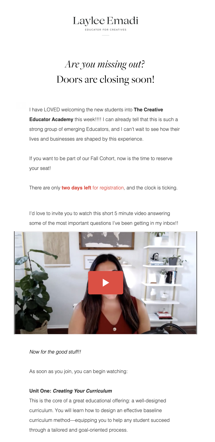
Videos are effective marketing tools—that’s why 86% of marketing professionals use them and 93% say it’s an important part of their marketing strategy. And it’s no different for email.
In this example, Laylee Emadi includes a video that answers some of the frequently asked customer questions. Notice how she states the length of the video upfront so readers know what to expect.
Tips/takeaways
- Use an animated thumbnail.
- If the video is the highlight of your email, include the word “video” in your subject line.
- Include video captions.
- Use videos to give an inside view of your business culture.
- Use the right video size and quality.
11. Use supported standard fonts
Your emails shouldn’t be a pain to read, and this comes down not only to your content layout but also your font choice. On average, readers take 86% longer to read decorative fonts than simpler ones.
So you also want to make sure you use supported fonts to ensure your text always appears the way you want it to. Supported fonts are system fonts, which are already installed on the subscriber’s computer, and web-safe fonts, which can adapt to any browser or device. Examples of standard fonts are Arial, Verdana, Helvetica, Tahoma and Georgia.
Flodesk offers a collection of web-safe fonts, ensuring that your emails display as intended on any device.
Tips for choosing the right fonts
- Go easy on the fonts. It’s best to use no more than two font styles per email.
- Use the right font size—your customers shouldn’t have to squint to read your email.
- Align text properly. Center alignment works best for short lines of text, meaning three lines or less. Once you have more than three lines, then left alignment is better.
- Avoid having a wall of text—keep paragraphs short and easy to read.
12. Tailor your email to your audience
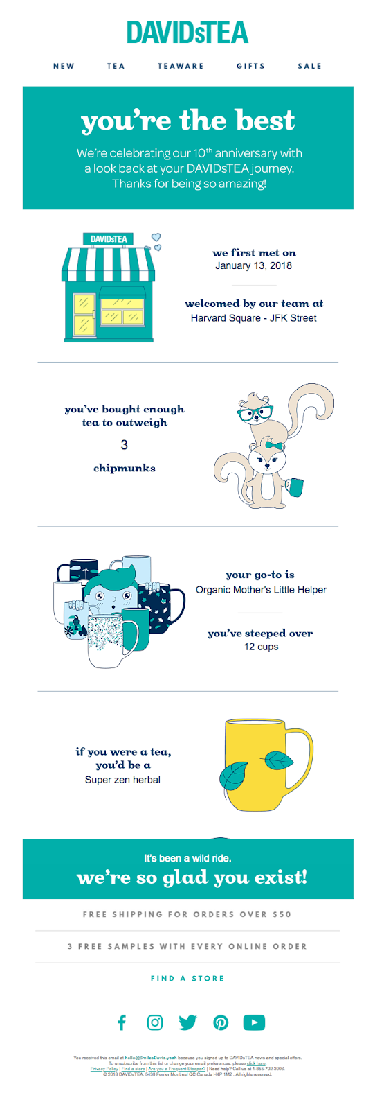
Here’s an interesting stat: Simply addressing email recipients by their names boosts open rates and increases click-through rates by up to 35%.
The above example from David’s Tea is a delight to read. The brand pulled in vital customer data in a thank you email for its 10th anniversary.
Tips for tailoring your email to fit your audience
- Always make sure your emails sound like they’re written by a real person—avoid corporate speak.
- Group your readers into segments. Email marketers who send segmented email marketing campaigns notice a 760% increase in revenue.
- Personalize your emails.
- Schedule emails to send in the recipient’s time zone—a feature that is often overlooked.
- Leverage behavior triggers—like when customers complete a purchase or click a link in your email—so you can send even more targeted content.
13. Use prominent CTAs
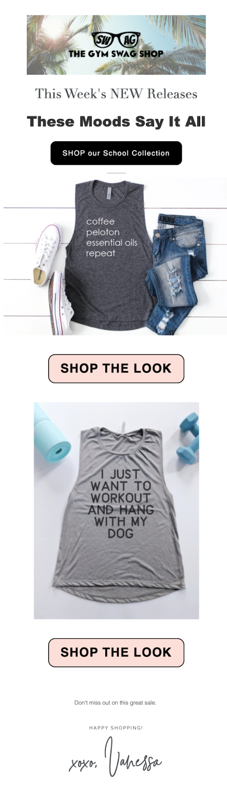
Emails with a single call-to-action can increase clicks by 371% and sales by 1617%. That’s huge!
The “Shop the Look” call-to-action button from The Gym Swag Shop is unmissable in the example above.
- Include first-person pronouns—say “Start my free trial” instead of “Start your free trial.”
- Keep it short.
- Ensure your button text is large and legible.
- Create urgency.
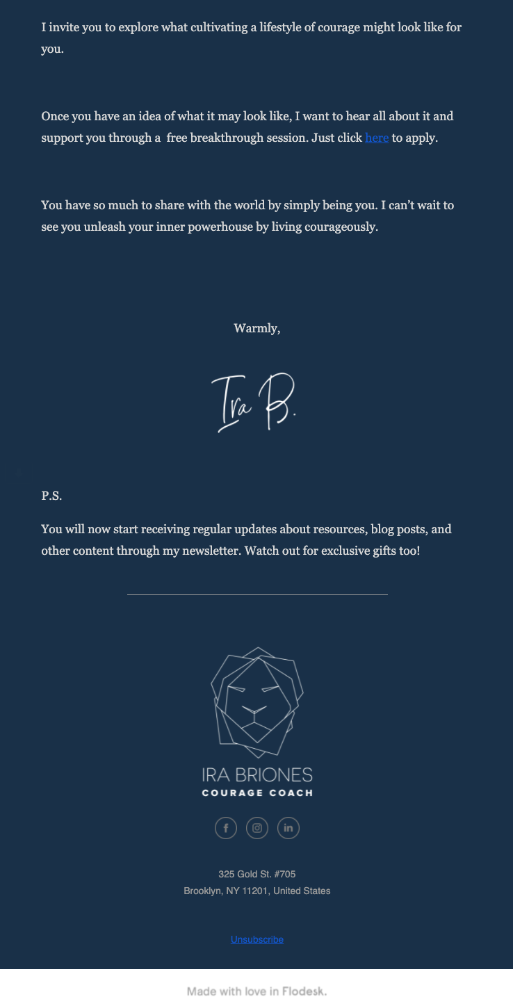
Your footer is an important piece of real estate in your email design. In addition to helping you wrap up your email nicely, it can contain helpful information that may not fit in the body of your email.
In the example above, Ira Briones uses an on-brand footer that includes the brand logo and links to their social media pages.
- Include legally required information—in most cases, this includes your address and an unsubscribe link. Some countries require that you include a link to your privacy policy or GDPR statement as well.
- Add a note to remind subscribers about why they are receiving your emails.
- Specify any terms and conditions that apply to your offer.
- Add your contact info and social media links.
15. Include an unsubscribe link
Unsubscribe links deserve special mention because they are required by law to protect readers from spam and to ensure users have control over their inboxes. While you can’t stop your readers from unsubscribing, what you can do is remember why people unsubscribe from emails and do your best to avoid those issues. The top 3 reasons why people choose to unsubscribe from an email list are receiving too many emails (59%), the information no longer being relevant (43%), or not recognizing the brand or remembering signing up (43%).
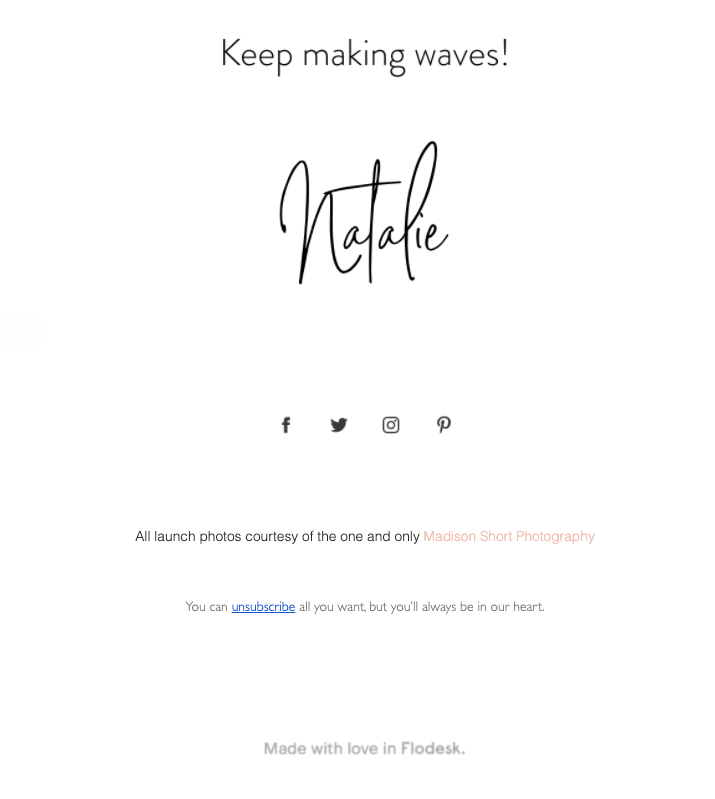
Natalie Franke’s unsubscribe email copy in the example above is a pleasure to read—and does not guilt-trip the reader or use snarky language. The unsubscribe link is also subtly highlighted so readers know exactly where to click.
Best practices for adding an unsubscribe link
- Make it easy for the reader to find—hiding your unsubscribe button can build distrust in your readers, and they could mark your email as spam.
- If you send multiple newsletters, offer readers an option to update their preferences so they can reduce the number or frequency of newsletters they receive instead of completely unsubscribing.
- Don’t require subscribers to log in to their accounts before they can unsubscribe.
- Don’t use negative or insulting language.
16. Maintain consistent branding
This is reason enough: Maintaining brand consistency across all channels can increase your revenue by as much as 23%. Inconsistent branding can have your readers second-guessing your emails and wondering if they’re authentic.
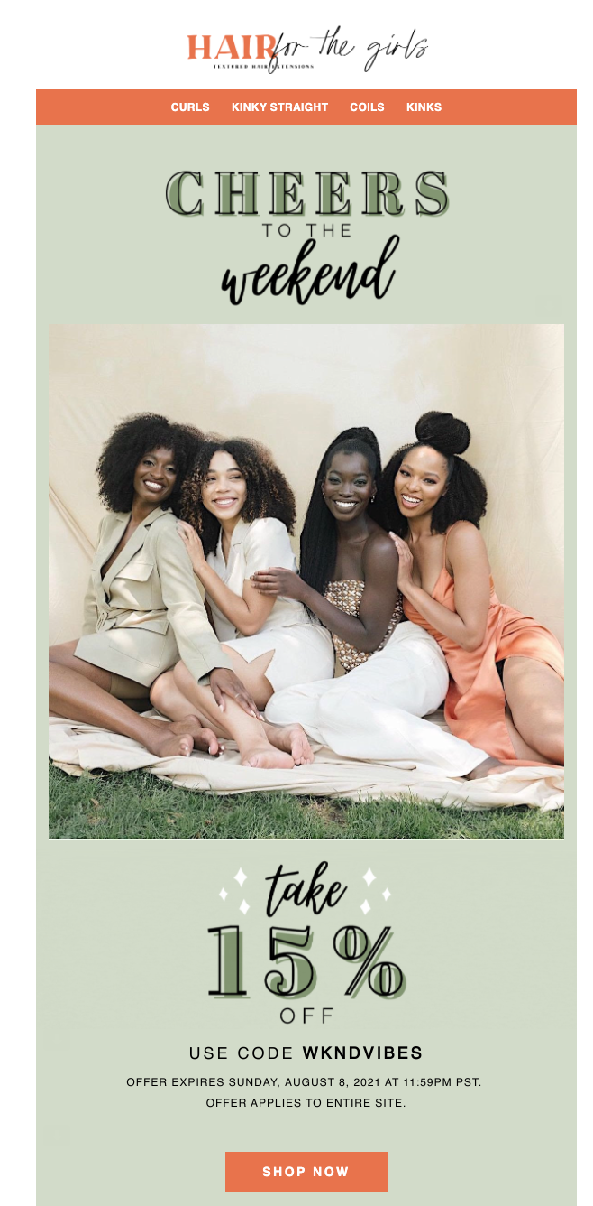
Hair for the Girls uses characteristic typography, colors and images of diverse models to always stay on-brand. Their emails are light-hearted, inspiring and full of good vibes.
Tips/takeaways
- Display your logo prominently in your header and/or footer.
- Use email templates so you can be consistent in your designs.
- Maintain a consistent tone of voice—goofy, formal, playful, etc.—from your email subject line to your email copy.
- Be consistent in your email frequency and timing. That is, deliver emails at the same time and at regular intervals—for example, every Thursday at 7 a.m.
- Maintain a consistent sender name and signature.
17. Test your emails before sending
Nothing beats testing your emails before sending them. A well-intentioned email could hit the wrong note with your audience because you misspelled an important word or added the wrong image. A/B-tested campaigns had 73% better open rates, 198% better click-through rates and almost 15% more sales than regular campaigns.
Tips for testing your email campaigns
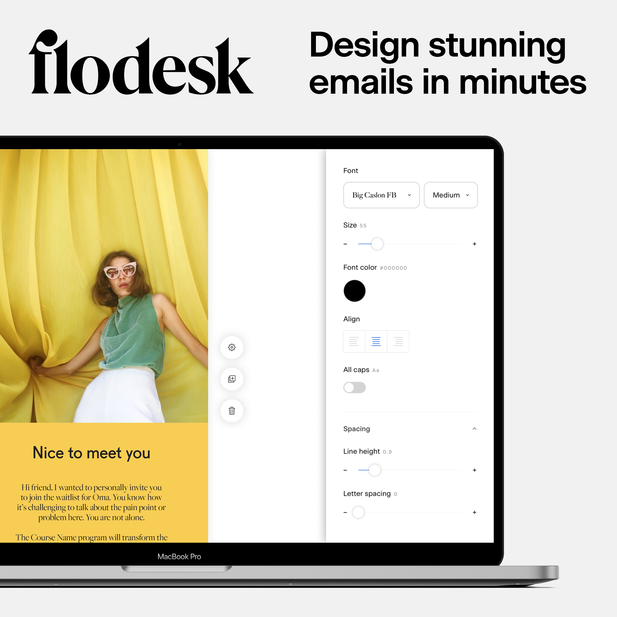
- Preview your emails as you design them to ensure everything looks great on different types of devices. For example, Flodesk makes it super easy to switch between mobile and desktop views in its email builder.
- Send yourself a test email. Check that your subject line, preheader, images and text all display correctly on both desktop and mobile. You should also view the test email using different email clients.
- Check that links and personalization tags are all working correctly—make sure there’s an actual name instead of a placeholder.
Get unlimited email sends & subscribers with Flodesk
We’ll never increase pricing because your email list is growing
Proper email design is important because it ensures your subscribers not only open your emails but also find the information they need quickly in order to take action.
Great email design starts with crafting an irresistible subject line and enticing preview text. Choose a consistent design and email layout, and write email copy that resonates with your target audience. Finally, include clear calls to action.
With Flodesk, you can choose from several professionally designed templates that instantly look great on any device. You can also create designs from scratch with Flodesk’s intuitive and powerful email builder, which includes all the features you need to create beautifully designed emails. Plus, you pay one price, no matter the size of your list.
Try Flodesk for free today.
Email design FAQs
1. What is email graphic design?
Email graphic design refers to the process of creating and customizing the visual elements that make up your email. Well-designed email graphics can help subscribers better understand your email, which helps increase clickthrough rates and conversions.
2. What makes a great email design?
A great email design is created with the reader in mind. It’s responsive and includes visual elements. It also uses a clean layout that helps the reader quickly figure out what the email’s about and what action they should take.
3. What should be included in an email design?
An email design should include a subject line, preview text, header, footer, call to action buttons, images, and text elements.

Related Articles
