How To Write An Effective Newsletter Introduction (With 10 Examples)
Table of Contents Jump to:
Jump to:
Table of contents
Nailing your email introduction is more important today than it’s ever been. Statista estimates that 319.6 billion emails will be sent per day in 2021. This means inboxes are a highly competitive space, with lots of brands vying for the same attention. So it’s absolutely critical to write a strong newsletter introduction. You’ve got to hook readers immediately and convince them to keep reading.
To help you, we’ve compiled some tips to write amazing newsletter intros along with real-life newsletter introduction examples.
If you’re still in the list-building phase of your email marketing campaign, check out 7 Newsletter Signup Form Examples to Grow Your Email List
1. Adopt a “no-fluff” mindset
To get your email subscriber’s attention you need a stunning newsletter header and your intro needs to get to the point right away. No small talk, no chit-chat, just the point.
Now, this doesn’t mean you should be brash or unconversational. It just means to think about your message from the reader’s perspective. A no-fluff mindset means removing anything that doesn’t add value to the reader or explain what they’ll get out of the full email.
For example, here’s an email introduction from Carol Tice at The Freelance Writers Den:
Hi [First name],
This week, we’ve got a podcast with Stefan Pallios, author of the new book The 50 Laws of Freelancing. He and Den admin Jennifer Roland talked about that book, his freelancing career, and how he manages such ambitious side projects alongside a full slate of clients.
Check it out in the Resource Library.
Carol gets right down to business, immediately describing the value in the current week’s email—a podcast interview with Stefan Pallos, author of the book, The 50 Laws of Freelancing. And she includes a clear CTA encouraging customers to click through to her website to listen to the podcast and check out the related blog post.
2. Make it a one-liner—with a strong punch
One-liners may seem simple on the surface, but they often make us laugh in spite of ourselves. And when every word counts, it’s hard to beat a one-liner in terms of efficiency when you write intros. You can make a connection, establish rapport and give existing customers the giggles all in one quick sentence. Of course, you’ll need to use them sparingly in your email campaigns and only when it’s relevant to your brand or product.
(To learn more about how to connect with your customers in emails, watch 3 Tips to Connect with Your Audience in Emails.)
For example, here’s a good one-liner that would be great as a recipe intro:
“Just burned 2,000 calories. That’s the last time I leave brownies in the oven while I nap.”
If your email newsletter happens to focus on baking and you’re sending brownie recipes, something like this would be a great way to grab your customers’ attention while staying relevant. One-liners are also a fantastic way to incorporate a visual into the newsletter.
Pack a punch with your first Flodesk newsletter
First impressions are everything in email marketing—make subscribers remember you with an unforgettable introduction email using Flodesk templates.
3. Ask an interesting question
Questions are useful in intros because they get the reader thinking, tempting them to continue reading. The trick, however, is to lead with an open or leading question as opposed to one with a specific yes/no answer.
For instance, if you ask: “Need quotes to refinance your mortgage?”
The reader is likely to think, “Nope.” And then just move on.
But if you say, “Will mortgage rates stay this low much longer?”
It’s likely to pique their interest. And they may click through to find out what you have to say.
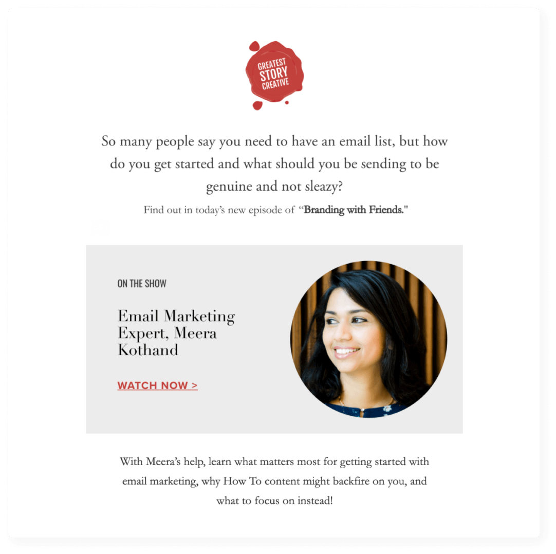
Here’s a good example of a newsletter intro that asks an interesting question from Annie Franceschi at The Greatest Story Creative:
In Annie’s email newsletter intro, she kicks things off with a question that’s likely on the mind of her potential customers (newbie email marketers)—“But how do you get started and what should you be sending to be genuine and not sleazy?”
Such a question gets the reader thinking and also succinctly communicates what they can expect from the rest of the newsletter. In fact, Annie follows the question immediately with a link to her new podcast episode discussing the topic in question.
A great statistic can tell the whole story quickly, eliminating the need for long-winded descriptions. Plus, the numbers themselves are visually eye-catching.
According to Mike Hamers, owner and founder of Lightspeed Commercial Arts, “Our brains are attracted to numbers because they automatically organize information into a logical order… like candy for your organizational mind.”
Statistics are effective anywhere you put them, whether in your intros, headlines or subject lines. For instance, LinkedIn ran A/B testing on headlines with and without statistics:
Headline A: 75% of B2B buyers rely more on content to make purchasing decisions than they did a year ago.
Headline B: B2B buyers rely more on content to make purchasing decisions than ever before.
And they found that statistics had a big impact on click-through rates. The headline with the statistic (Headline A) had a 37% higher click-through rate and 162% more impressions.
Statistics can also pique interest, similar to a question, enticing readers to find out more. This is where the uncommon part comes into play. If it’s a statistic that the reader has heard before, there’s nothing to motivate them to keep reading.
But if it’s new or uncommon, the reader is more likely to want to learn more—especially if it’s relevant. Statistics also lend authority to your newsletter since you’re introducing the reader to new, relevant information.
Take this example from CSP Kitchen’s email newsletter:
“Coffee With a Kick: 37% of Survey Respondents Add Alcohol to Coffee at Work”
CSP Kitchen leads with an eye-catching statistic that 37% of respondents add booze to their coffee at work. Given all we’ve shared about statistics, you can imagine how this is going to make a lot of readers want to find out more, just out of sheer curiosity.
5. Lead with a relevant image
Everyone knows the old saying, “a picture’s worth a thousand words.” And even though it’s a cliche, it’s true. You can communicate so much with a relevant image, leaving you to get down to business with your intro. Images are also a great way to make a personal connection with customers since images can evoke feelings more quickly than words.
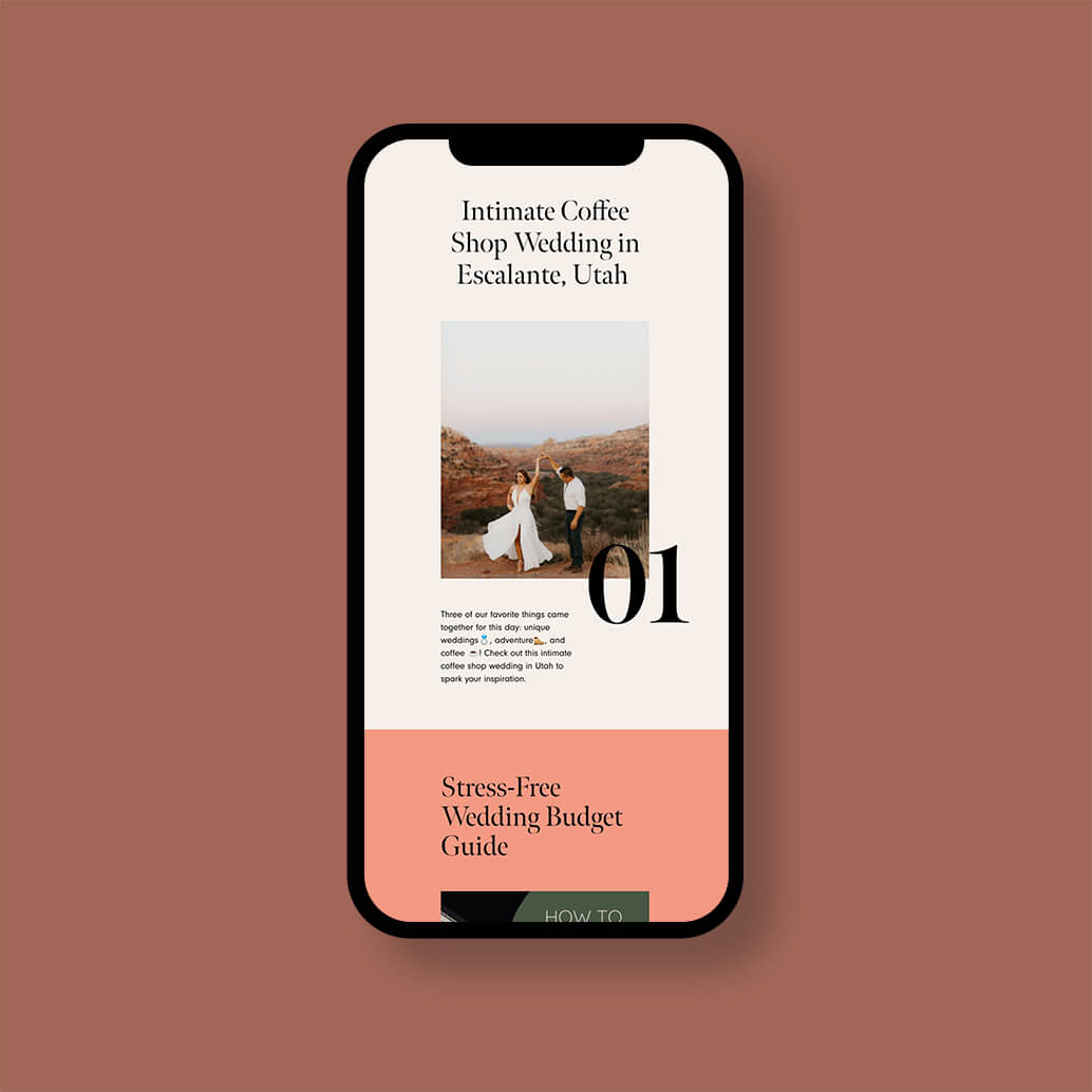
Here’s a good newsletter example that leads with a relevant image from ‘Cause We Can Events:
In this email newsletter from the folks over at ‘Cause We Can Events, things kick off with an image of a bride and groom with a stunning desert backdrop. If you’re in the wedding planning world (which their audience likely is) this picture is going to tug at your heartstrings pretty quickly.
Don’t limit your images. Think big.
Flodesk’s simple but elegant templates make your newsletters stand out with loud and proud images that capture your subscribers’ attention.
Sharing an unpopular opinion is a surefire way to get your readers’ attention and make them curious to know more. As Psychology Today explains, the drive to seek out information about our world is hardwired into us, through our dopamine-reward system:
“There is a body of research suggesting that dopamine incentivizes behavior more through wanting (…) than liking. In effect, the dopamine creates an itch that needs to be scratched.”
Unpopular opinions and bold statements can create an especially strong itch. However, you need to be careful to avoid a few common pitfalls—namely alienating your readers with the opinion itself or coming off as too “click-baity” by using irrelevant or overly shocking statements.
One of the best ways to avoid these problems is by sharing opinions that aren’t yours. Instead, you can share opinions held by others about something relevant to your audience. Then, the reader will be interested in the opinion enough to want to find out what’s behind it without being offended or annoyed.
Here’s a good example of a newsletter leading with a bold statement from Sarah Peck’s Startup Parent:
“Truth talk: the world of work was not made for working parents.”
This email newsletter starts out with a bang as Sarah drops some “truth” on her customers. The bold statement grabs attention and likely elicits a strong response from her readers (mostly professional women).
Read next: How to write a nonprofit newsletter!
7. Call out their common identity
Calling out a common identity is a good way to personalize an email. It immediately tells the reader you have something in common and makes a connection. Plus, it gives them a reason to consider what you have to say.
Here’s a good example of a newsletter intro that calls out a common identity from Sarah Turner:
“These are the top 10 books that EVERY copywriter MUST read. These books were crucial for my growth as a copywriter & an entrepreneur and I hope they’ll be just as important to you.”
Sarah’s email newsletter targets copywriters and entrepreneurs. As you can see, she calls out their common identity right away, immediately making a connection with her customers.
Let’s now look at even more examples of newsletter intros so you can draw inspiration from them.
These intro examples are some of the best we’ve seen, so we’re sharing them with you here:
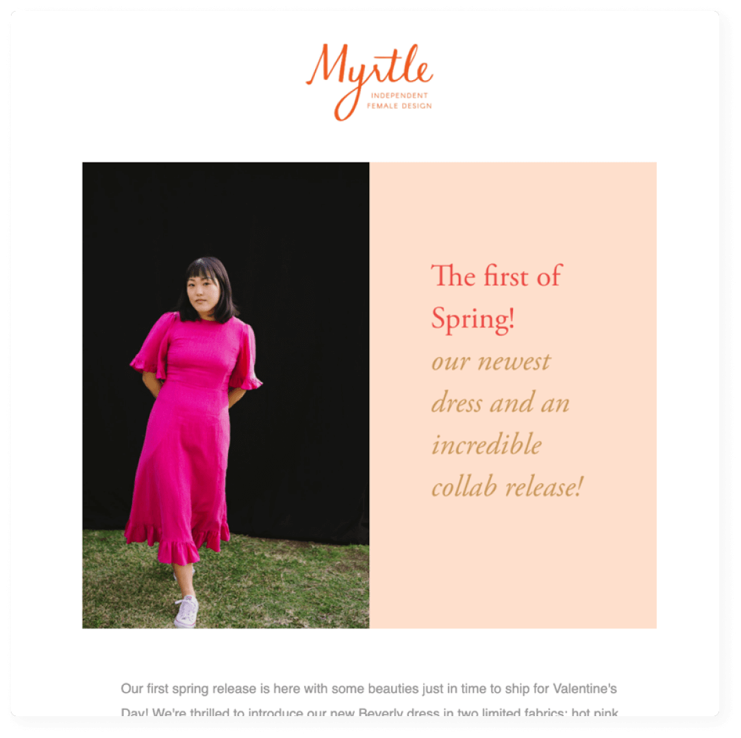
1. Myrtle’s irresistible sense of style
Founded in 2011 by Whitney Bickers and named after her great-great-grandmother, Myrtle is an online boutique featuring pieces by independent female designers.
This fashion newsletter introduction does a great job of capturing the sense of style inherent to Myrtle’s business. Leading with a crisp, relevant image and bold colors, the reader is immediately drawn into the email.
It’s also a great example of using enticing text, offering “the first of spring” which makes customers feel like they’re getting early access to something.
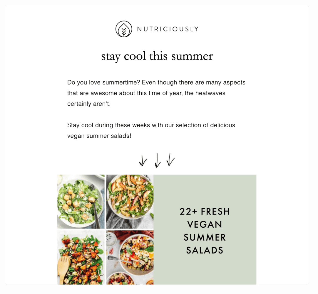
2. Nutriciously’s mouth-watering summer recipes
We love how this email newsletter introduction by Nutriciously gets right down to business. It has a bit of conversational banter at the top but the main image clearly shows the value to the reader right off the bat—22+ fresh vegan summer salad recipes.
The arrows are a nice touch too, drawing subscribers’ eyes to the main event and making the whole thing feel a bit personalized.
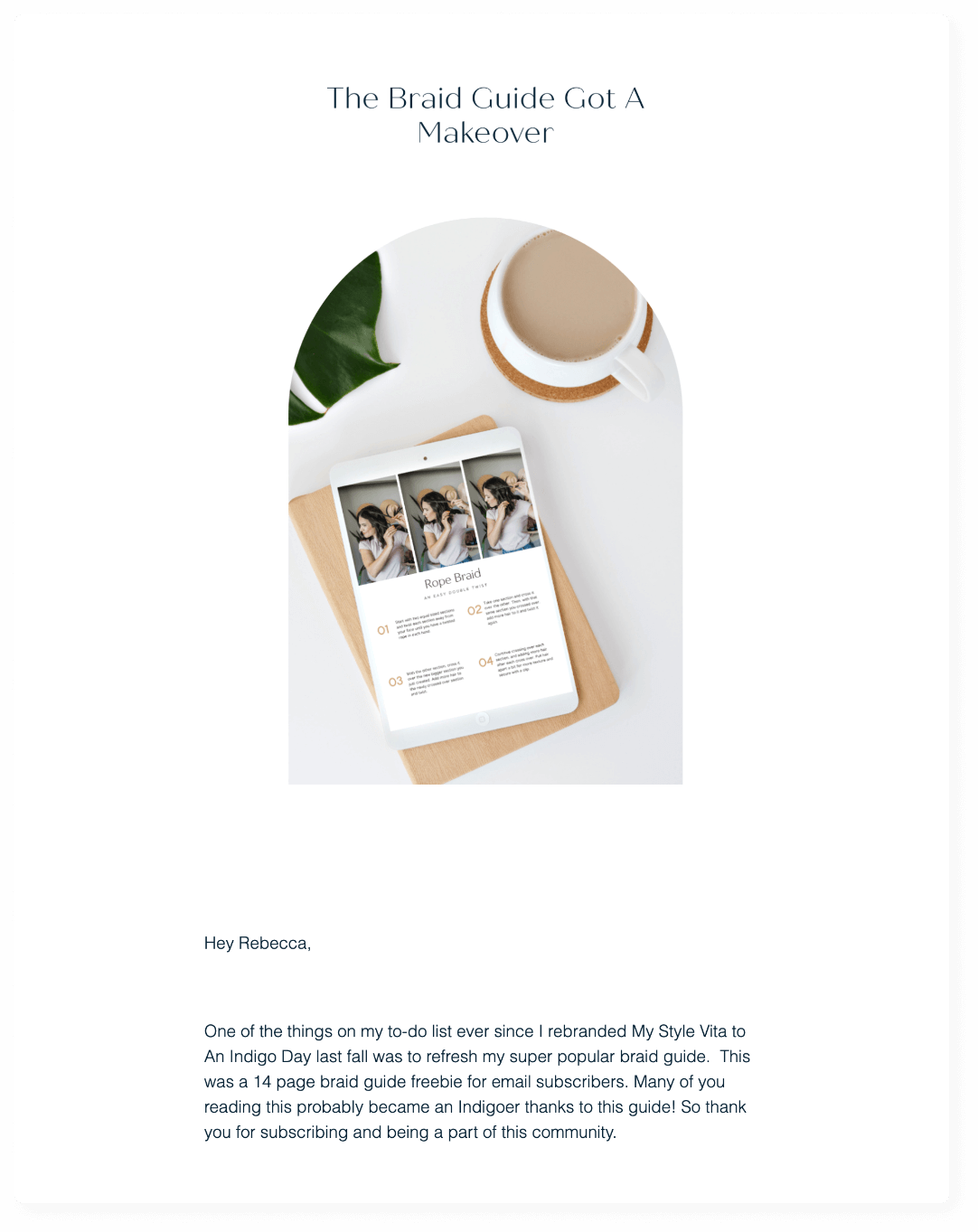
3. An Indigo Day’s chic freebie
Fans of Jessica Camerata’s fashion and lifestyle blog, An Indigo Day, will love her awesome newsletters as well. Jessica sends weekly digest emails to educate readers about her newest blog posts, including a personal note.
Plus, she shares loads of helpful information with her customers, including a monthly newsletter with 3 things inspiring her for the month ahead. And, every now and then, she shares a favorite product; a must-shop sale; or inside tips and tricks.
In this particular newsletter, Jessica is sharing a 14-page free guide with subscribers. We love how she features the actual guide as the image in her introduction.
It’s also great how the message is personalized with the subscriber’s first name. 82% of marketers report an increase in open rates using personalized emails vs non-personalized emails so this was a good move.
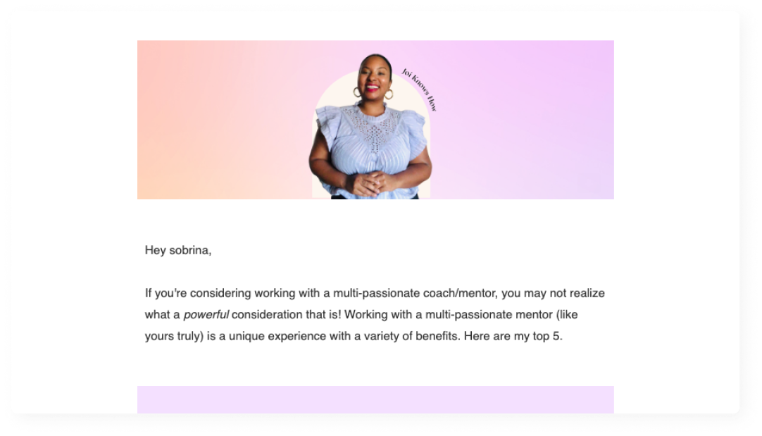
4. D’Ana Joi’s inviting photo and tone
We love this particular intro from multi-passionate coach D’Ana Joi because it leads with a great photo of herself (important because she’s selling coaching services) on a brightly colored backdrop. The photo is inviting and professional, gently nudging the potential customers to engage.
The intro is also personalized with the reader’s name and quickly gets to her value proposition—the top five benefits to working with a multi-passionate mentor.
Create vibrant and professional newsletters with Flodesk
Your customers deserve better than plain-text emails. Let them live life in full technicolour.
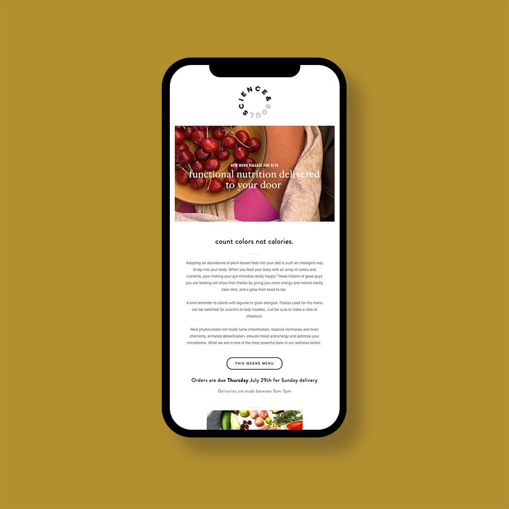
5. Science & Soul Nutrition’s relatable opening line
This email newsletter from Science & Soul Nutrition, a meal delivery service, hooks readers with an enticing statement—“Count colors not calories.”
It goes on to share about the benefits of plant-based food, suitable substitutions for customers with food allergies and a reminder to check out the current week’s menu, creating value and enticing readers to click through.
6. Wayfarer Design Studio’s aspirational intro
Abby over at Wayfarer Design Studio gives us another good example of a newsletter introduction. She leads by dangling something her customers likely aspire to—turning a $2.5K client into a $9K client.
And she follows the enticing headline immediately with a CTA button to watch the interview. For those who make it past that, Abby then personalizes the introduction using the subscriber’s name and explains a bit about the interview series and what the reader can expect.
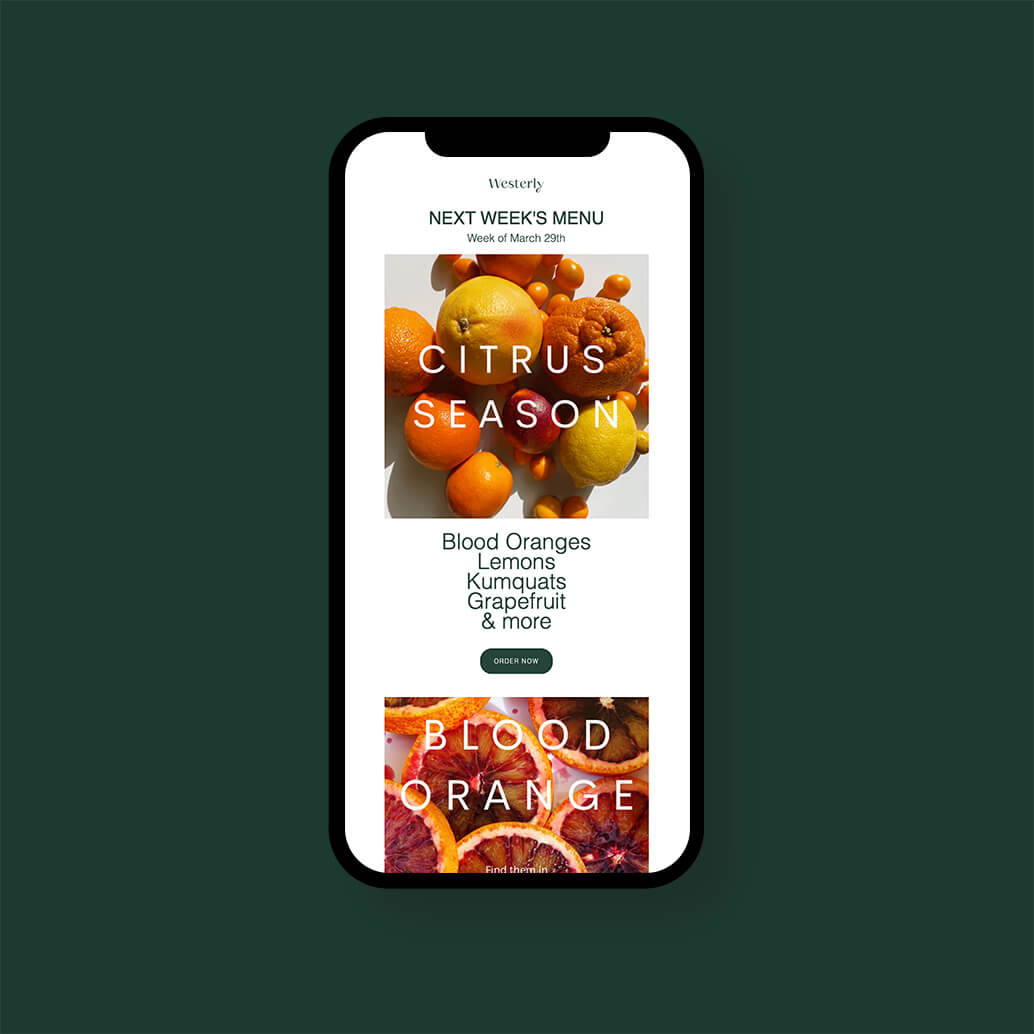
7. Westerly Kitchen’s well-designed layout
Westerly Kitchen is a meal delivery service in the greater Seattle area. They really know how to format a newsletter for their audience, as you can see in their email newsletter promoting the current week’s menu. Since people “eat with their eyes,” the bold visuals make a big impact with clear and concise copy describing the week’s dishes.
They also include a CTA button to “Order now” both above and below the fold for extra conversion.
Plus, their newsletter is optimized to look just as good on mobile devices as it does on desktop. According to a recent article in Forbes, mobile now accounts for 46% of all emails opened by consumers and professionals. While mobile responsiveness is an especially important feature when sending email newsletters, platforms like Flodesk make it easy with templates that are optimized to look great on any device, in any inbox.
Looking for the best software to design beautiful email templates like the one above? We have you covered – check out these top Mailchimp Alternatives
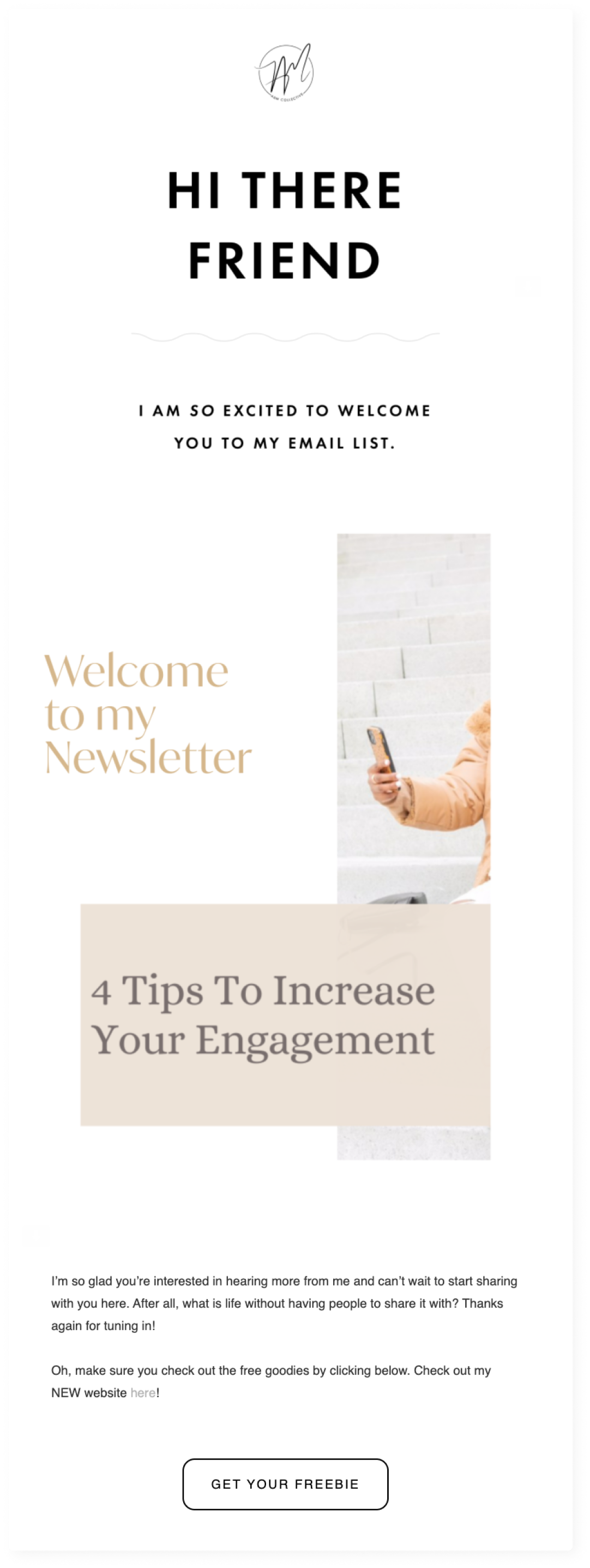
8. A&M Collective’s sharing expertise and value at the top
In this no-fluff email newsletter from social media strategist and blogger Antoinette Faltz-McQueen, the value is presented to the reader immediately—4 Tips To Increase Your Engagement.
For her audience of small business owners and coaches, these practical tips not only provide value but also demonstrate her expertise, potentially turning subscribers into clients.
We especially love how she includes a link to a freebie as her call-to-action, along with an invitation to check out her new website.
9. The Fearless Chase Collective’s understanding of their target audience
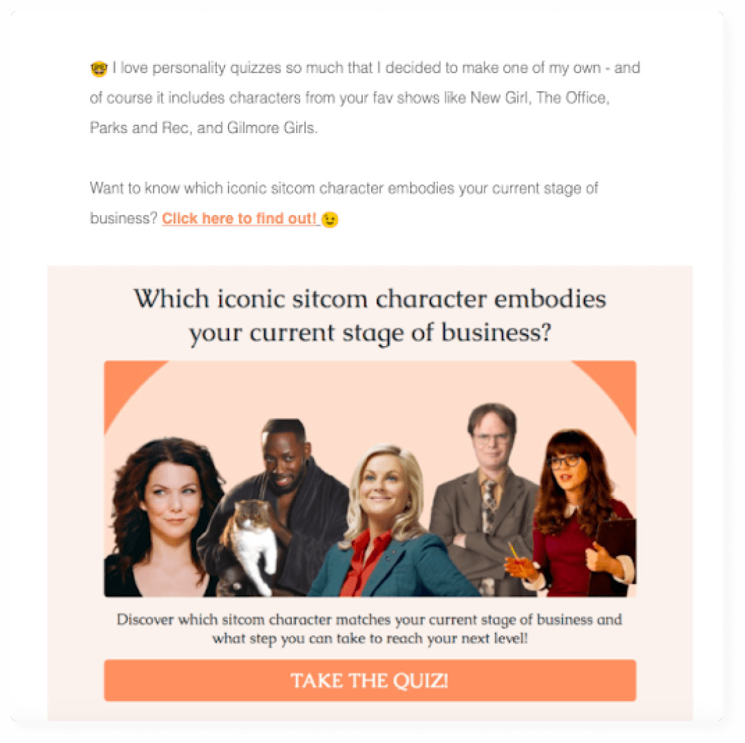
Madison Anaya knows her audience. And it shows in this quiz-based email newsletter from The Fearless Chase—the business education and community-focused membership platform you never knew you always needed.
According to Neil Patel, “Using quizzes in your marketing strategy is one of the most underrated marketing moves. (…) They are incredibly effective at generating leads, engaging your audience, and much more.”
Showing her marketing prowess, Madison made one of her own personality quizzes featuring sitcom characters from popular shows. This is one quiz you won’t find on Buzzfeed though as it tells users which iconic sitcom character embodies their current stage of business.
We also love how Madison’s intro (and all of her emails) are written in a unique and consistent brand voice. To learn how to craft your own, check out, “Brand Voice: What It Is, How to Develop Yours & Why It Matters.”
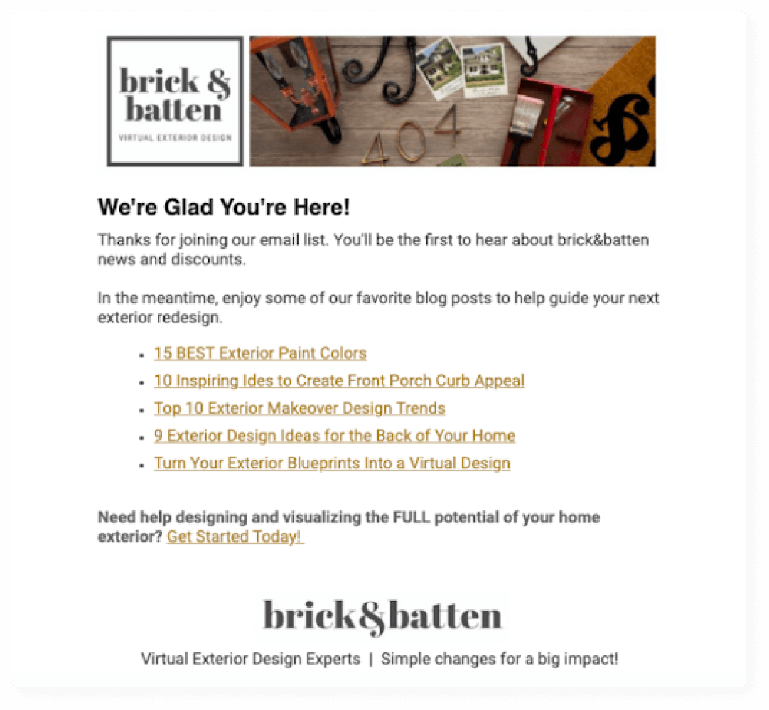
10. Brick & Batten’s value-packed welcome letter
We love this effective welcome email newsletter by Allison Vaccaro and Cassie McDowell of Brick & Batten, an exterior home design company. They lead with a simple but on-point message (We’re Glad You’re Here) which makes subscribers feel welcome.
Then they proceed to load up new subscribers with lots of valuable and relevant links, making it clear from the get-go that this is one newsletter that will be worth the reader’s time—especially since it mentions that subscribers will be the first to get deals or a discount code.
To learn more about writing effective welcome emails, read our post on the 11 Best Examples of Welcome Email Subject Lines (& Tips to Write Your Own).
A newsletter introduction should tell the reader what they’ll get out of reading the rest of the email or linked article. This should be of value to the reader and communicated without fluff and in a conversational tone.
Good newsletter introductions get right to the point, using techniques such as questions, statistics, images and one-liners to make a connection with the reader and get the main idea across quickly.
Once you’re done with your intro, check out, “How To Write A Newsletter (A Really, Really Good One), on Flodesk University to learn about writing the rest of your newsletter.
Let’s sum it up
If you’re wondering if all this effort is really worth it, especially with so much competition in the inbox, you’re not alone. But the answer is a resounding yes. Email marketing still has the highest ROI of any marketing channel, bringing in $42 for every dollar spent. So, now you can get to work on your email newsletter, knowing that your time is well invested.
If you want to learn how to make email marketing easy, why not read our post on 11 ConvertKit Alternatives for Your Email Marketing Strategy.
Flodesk: the simple & intuitive email marketing platform
You don’t have to learn code to create a beautiful email or create an introductory newsletter your subscribers love- that’s why we’re here!
