20 newsletter signup examples and tips to grow your list
Table of Contents Jump to:
Jump to:
Table of contents
Your email list is without a doubt one of your most prized marketing assets—it’s information you own that can’t be beaten down by algorithms. But to get your content in front of would-be subscribers, you have to first persuade them to sign up. That’s where newsletter signup forms come in.
The main challenge that marketers face is earning trust. When people trust a brand, they’re 2x more likely to share their email addresses. This means your signup form needs to send the right signals to overcome people’s fears and convince them that parting with their contact information is worth their while.
Here, we share some powerful, high-converting newsletter signup form examples. We’ll talk about what they’re doing right and give you tips so you can apply these ideas to your own newsletter signup forms.
A newsletter signup form is a form you use to capture subscribers’ email addresses. Your newsletter signup can be any kind of form—like a link in bio, full page, embedded inline, or popup—that you strategically place in front of your audience to build your subscriber list.
Flodesk form
Besides giving new subscribers access to all the fantastic content, incentives, and special offers your newsletter provides, newsletter signup forms are important for another reason—they ask your subscribers for permission to contact them in the first place. Anyone who completes your signup form is giving their express consent to receive email marketing from you.
Create a Signup Form in Minutes with Flodesk
We’ll be with you every step of the way with our guided tutorials and easily enhanced templates.
As a marketer, you can use various types of newsletter signup forms to capture email list information from visitors. Each form can support a different goal you might have for your online spaces, like engaging your audience on your website, your socials, and even on stand-alone landing pages.
Here’s a look at the different types of email signup forms:
- Popup: Get website visitors into your list. A popup form appears at a set time after a visitor first lands on your web page. You can also schedule newsletter popups to appear while a person scrolls, or when they show exit intent.
- Inline CTA: Encourage opt-ins on your website. Inline forms are embedded into web pages, footers, or sidebars. Inlines are displayed all the time, appear to be naturally built into the page, and are less disruptive to the browsing experience.
- Link in bio: Convert followers into subscribers. A link in bio, like a Flodesk Link in bio, lets you add a link to a landing page on your social media bio. This leads your followers to a beautifully designed page where you can capture email subscribers, display links, and engage with your audience.
- Landing page: Capture subscribers (no website necessary). Create a landing page form to promote anything you want. Direct your audience from your social profiles, paid ads, or other channels, and prompt them to join your list to learn more about your offerings.
These days, people are continually marketed to through many channels. People have become more protective of their data and there needs to be a strong incentive for people to share their email addresses.
So how can you make your newsletter signups as compelling and attractive as possible in order to encourage people to subscribe? We’re sharing our six top tips below.
1. Create a visually appealing form
While you might want your signup form to display specific information, it’s critical to optimize the design so it’s simple, clean, and visually engaging. Three good rules to focus on include:
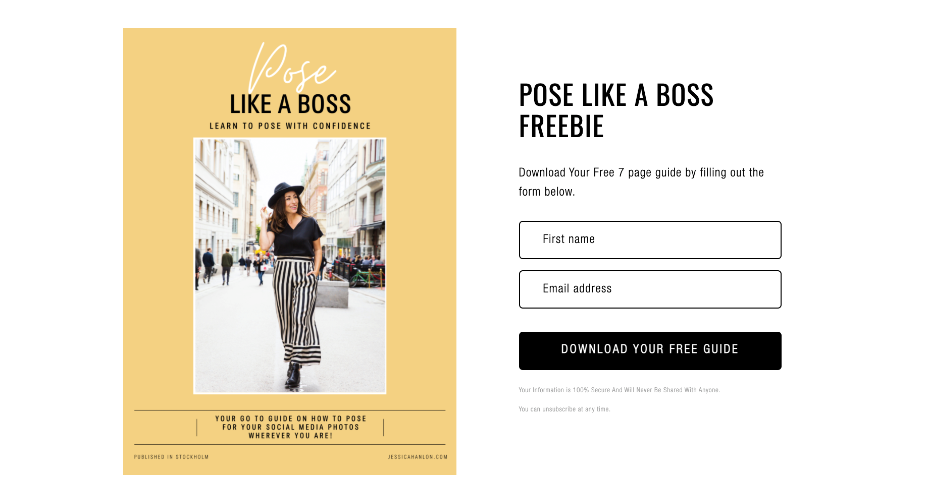
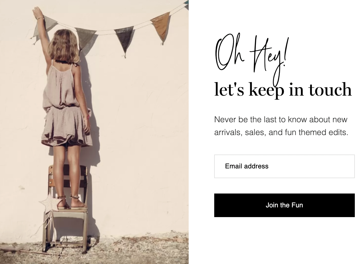
1. Simplicity: Design simplicity is a key driver in attracting and retaining customers. So use simple design elements that align with your brand.
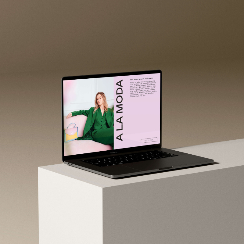
The form below by Jessica Hanlon is a great example of this. It uses a simple layout of an image and sign-up section, with an eye-catching color palette and bold font style.
jessica hanlon
2. White space: When you use white space in your design, you create visual breathing room for the eye to move between the various elements of your newsletter signup form.
This increases your content’s legibility and helps people understand what they’re looking at. A good use of white space can also draw attention to your call-to-action (CTA) button.
little whimsy
3. Relevant, high-quality images: People react quicker to images than text, so it’s important your image doesn’t distract from your signup button. Any pictures you use should reinforce the message your text is trying to get across.
2. Be clear on the benefits subscribers get from signing up
Potential subscribers aren’t likely to just give away their email if it’s not clear what they’ll get in return. So, highlight what’s in it for your audience when they sign up to your list. There are three ways to use your newsletter signup form to promote the benefit of subscribing:
- Provide an incentive or freebie: This is exclusive content that your audience will receive when they join your list. It could be a free ebook or checklist, or a discount code for their first purchase.
- Promote your newsletter’s value: Consider your audience’s goals or pain points—what relevant and useful information can you offer to address those? For example, say you sell toddlers’ art supplies—you might create content that shows how children build creativity or problem-solving skills through arts and crafts.
- Lessen people’s fears of subscribing: For example, include a short sentence at the bottom of your signup form reassuring your audience that you’ll never spam them or sell their contact information. You can also tell them how often they’ll receive emails from you.
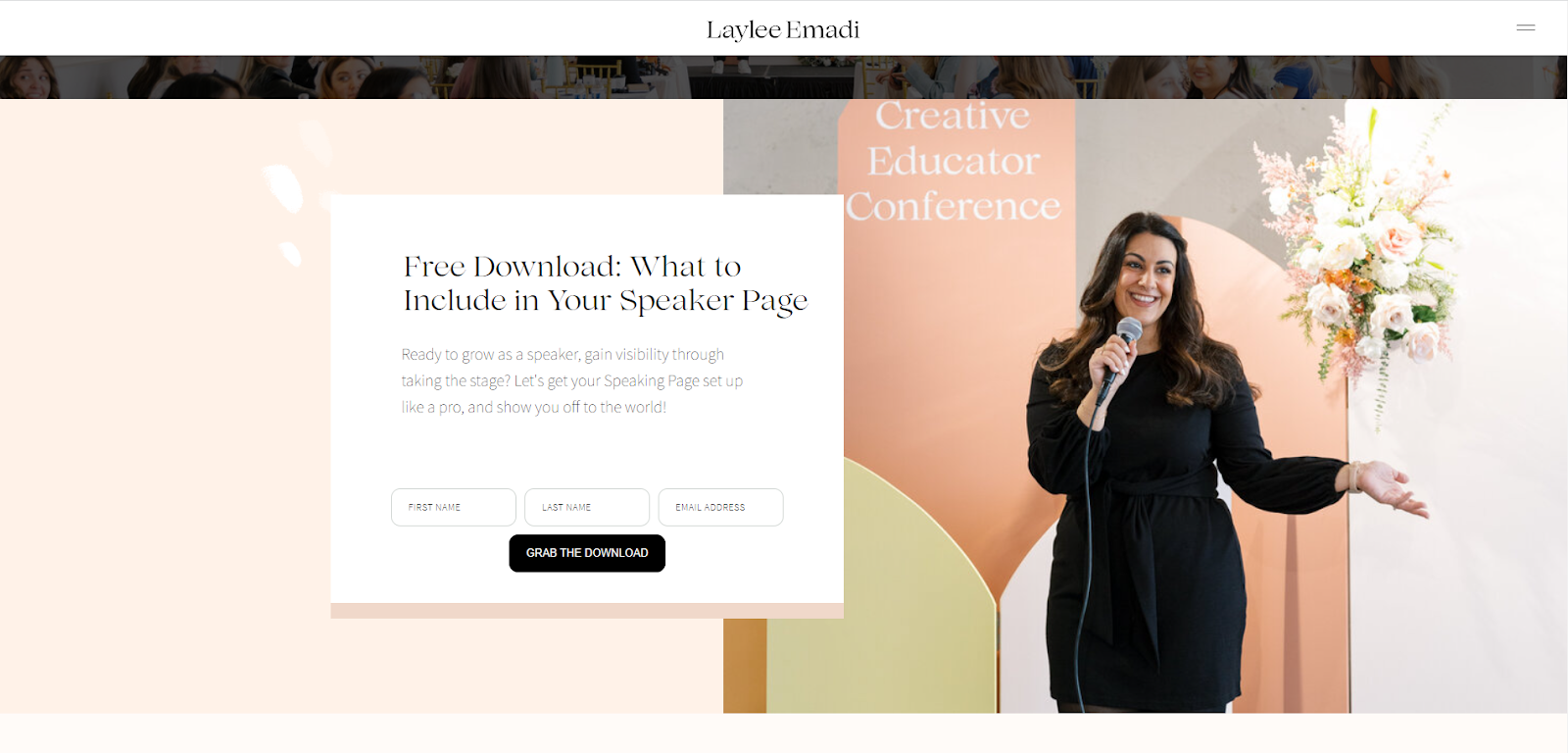
Flodesk member Laylee Emadi has addressed the first two points in her newsletter signup form. She outlines the incentive: gain visibility through taking the stage. And she notes the value for the subscriber: a free download to guide them through the process of setting up a professional speaker page.
People are more likely to take action when they see evidence that others have done so before them. Using social proof, like showing how many subscribers you already have, is a great way to encourage potential customers to come on board.
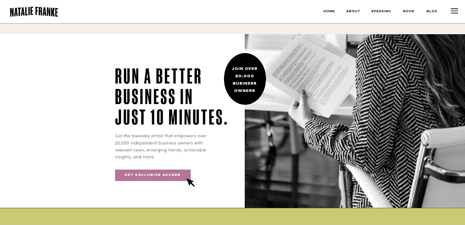
As you can see below, Natalie Franke’s newsletter signup page indicates that her newsletter already helps 20,000 business owners run better businesses. If her insights provide great value to that many people, they may well benefit the next entrepreneur too.
Adding professional certifications or sharing ratings like Google Reviews can also act as social proof. Why not feature a subscriber testimonial on your signup form so visitors can see the real value other people gain from your newsletter or freebie?
4. Get your timing right
Don’t be too quick to display your popup as soon as your audience hits your website. There’s a gap between when they land on your page and the moment you earn their trust. Instead of interrupting their journey of discovery, give potential customers a chance to explore your offering and appreciate the experience. Only then should you time your signup form to appear.
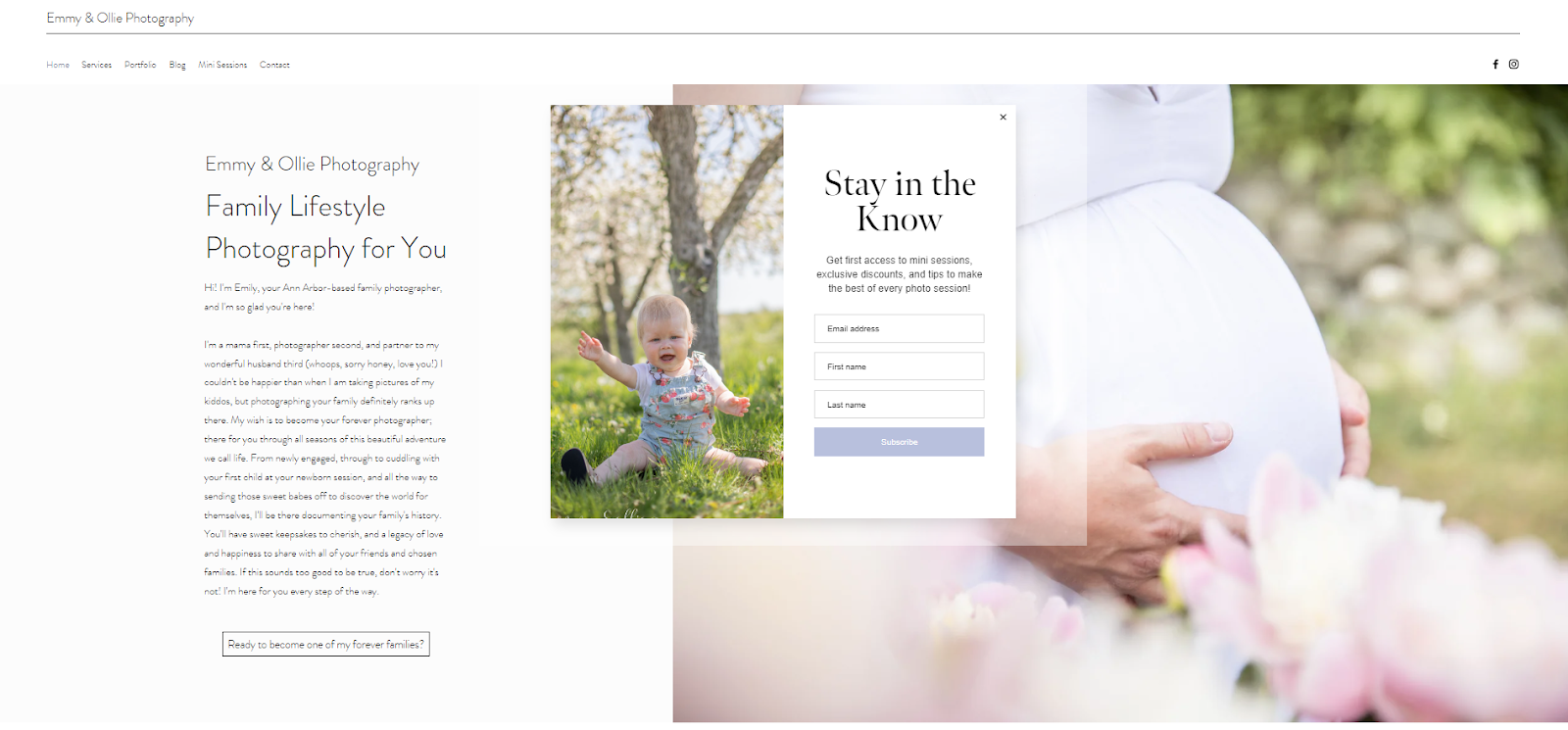
Emmy & Ollie Photography deliver their newsletter signup form around 10 seconds after arriving on the home page. It’s the perfect amount of time to scroll and “meet” the photographer before taking any next steps.
To figure out the perfect timing for your popup, dig into Google Analytics. Get a feel for how long people tend to spend on your site; you want to encourage signups before they leave. If the average time on page is around 20 seconds, engage visitors with an interesting, well-designed popup within that time frame.
To learn more about how to optimize your signup form on your website, read 5 High-Converting Places on Your Website to Add Your Opt-in Email Form.
Your CTA button should reinforce the end result of signing up to your email list. Avoid being generic. For example, “Send” or “Sign up to our newsletter” doesn’t inspire as much action as “Get the secrets.” And while “Subscribe to our newsletter” is okay to use, being more specific with your CTA, like Sage Family has done below, is even better.
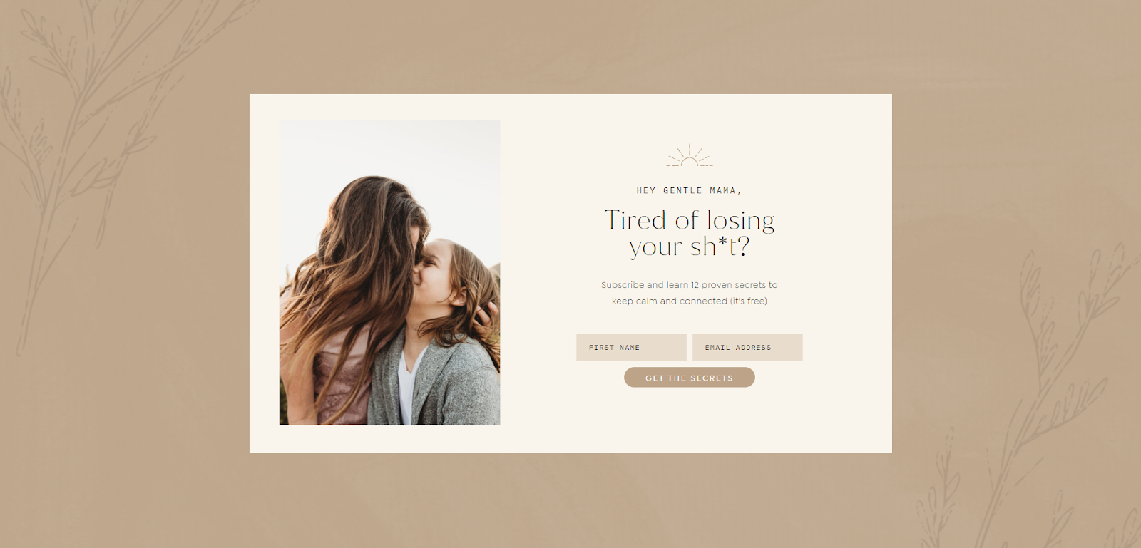
Take this opportunity to create a feeling of exclusivity. “Join the club” can be a good option—or remind visitors of the freebie they’ll have access to after subscribing, with a “Get your workbook” button. Make sure that your CTA button stands out from the rest of your email newsletter form by using an eye-catching color scheme or font.
6. Always confirm signup with a welcome email
After a person clicks subscribe, we recommend sending them a signup confirmation email to verify their request to join your list. This is called double opt-in—an extra layer of subscriber consent to ensure your list is full of engaged subscribers. Double opt-ins are an excellent tool to help:
- Stay compliant with your country’s email marketing and spam regulations
- Prevent spam or bots from joining your list
- Ensure your list is full of engaged, active subscribers who are genuinely excited to hear from you
You can create a post-opt-in that advises new subscribers to check their email, including spam folders, which will help ensure any new subscribers follow through.
Seventy-four percent of subscribers expect to receive a welcome email immediately after subscribing to an email list. So, the next email you send them should be your welcome email.
Ideally, your welcome email should be the start of an automated messaging sequence that introduces new subscribers to your brand, products, or services. It should immediately provide value so your audience can appreciate the benefit of signing up for your newsletter.
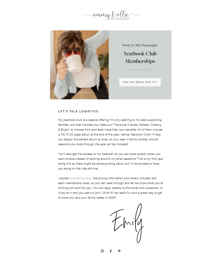
Emily, of Emmy & Ollie Photography, sends a welcome letter with details of her yearbook club—a new offering she’s promoting.
To learn more about designing an effective email sequence for new subscribers, read How to Write a Workflow Email Funnel.
Welcome new subscribers with style
We make it easy for you with elegant templates you can tailor to your brand and a simple drag-and-drop builder.
7. Allow your audience to self-segment with opt-in preferences
Segmenting your audience allows you to deliver more personalized communication that really resonates. You can create specific messaging based on interests, demographics, or location, for example. One of the really useful email opt-in best practices is to allow your audience to self-segment from the start by displaying opt-in preferences on your newsletter signup form.
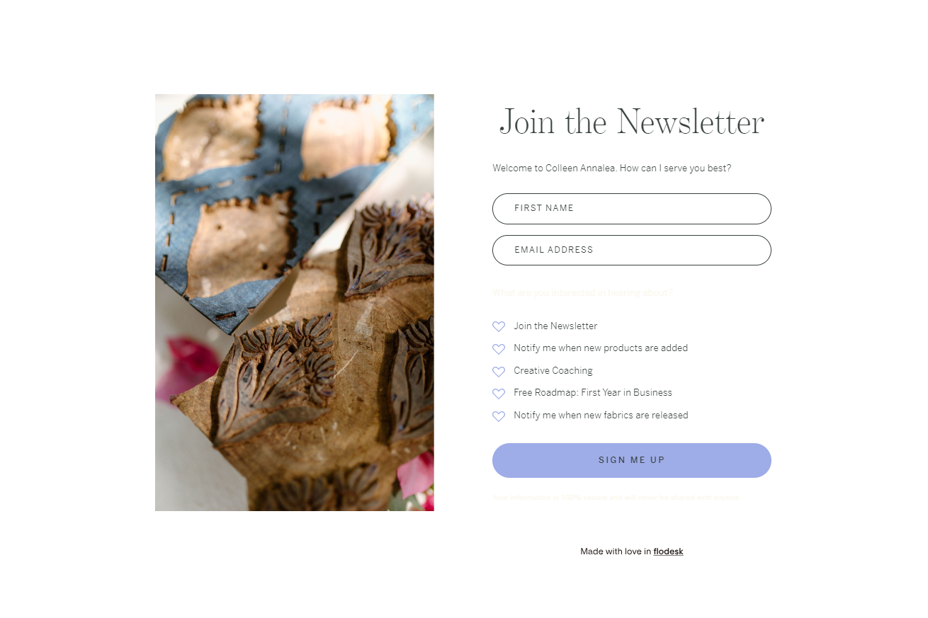
These preferences could be based on interest, as we see outlined in Colleen Annalea’s example below. She’s asked her audience what kinds of content they’re interested in receiving: like updates on her Creative Coaching space, or new releases from her fabric store.
Your website isn’t the only place to collect email newsletter signups—you can start growing your list right from the platforms where people hang out: social media. A Flodesk Link in bio is a custom link that sits prominently in your bio section. It leads to a stunning, on-brand form, where you can share your most enticing offers and convert your social followers into subscribers—all in one place.
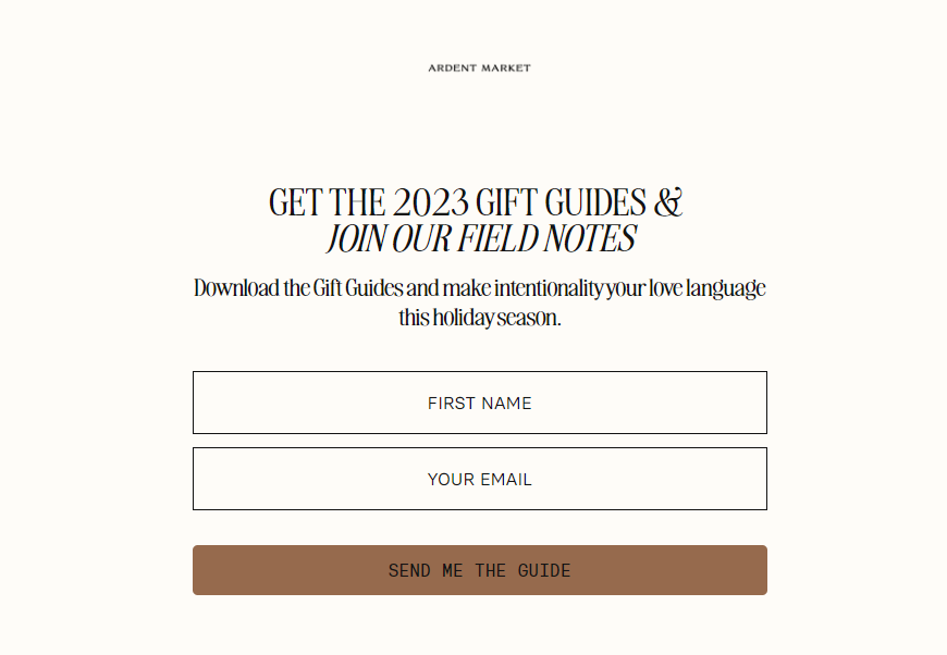
Ardent Market has used a Flodesk Link in bio to create a perfectly designed newsletter signup form for their social media. The form is clean, the messaging is enticing and targeted to their audience, and the CTA button is in a different color to draw attention.
A Flodesk Link in bio is completely free. Choose a professionally designed template, customize it to suit your brand, and then publish your Link in bio to grow your list on autopilot. Our tool lets you:
- Own your subscriber list: In a world of changing algorithms, an email list is a valuable marketing asset. Collect and segment your followers’ emails right from your social profiles, no website needed
- Elevate your brand: Add your logo, fonts, imagery, colors, and graphics, and customize your Flodesk handle
- Convert 40x better: Your Link in bio appears above the fold, helping you get eyes on your newsletter signup form and drive traffic to your top links
- Add personal touches: Include a heartfelt bio or handwritten signature to stand out from the masses
- Convert followers into customers: Subscribers are automatically added to your Flodesk account, giving you a centralized point to grow, nurture, and sell
- Adapt from your learnings: Track in real-time how many people visit your Link in bio, opt-in, and convert. Use these insights to grow your business
Still unsure? Check out other well-known link in bio tools in our writeup on the best Linktree alternatives before making up your mind.
Now that we’ve outlined what makes a great newsletter signup form, let’s look at a few real-world examples that put these tips into practice.
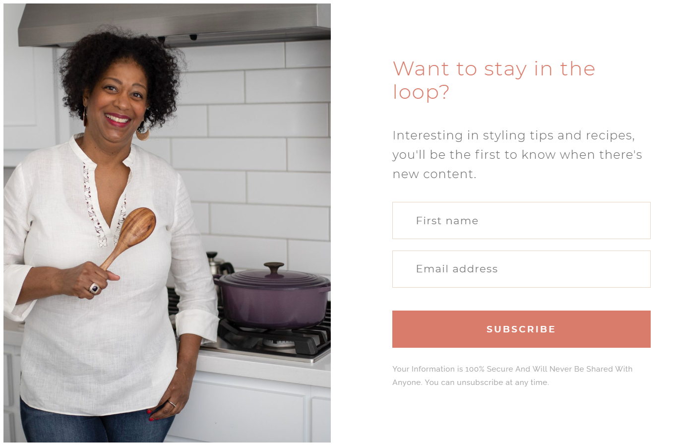
9. Cumber’s Corner
Cumber’s corner
Lifestyle blog, Cumber’s Corner, has a great signup form that embodies several of our tips. For starters, the form is simple with a relevant image and lots of white space.
Then, it makes it crystal clear what the offer is: styling tips and recipes. The message “Want to stay in the loop?” appeals to visitors’ fear of missing out. Cumber’s Corner also reassures visitors that their information is secure and won’t be shared.
Finally, adding a “First Name” field allows Cumber’s Corner to personalize their future emails.
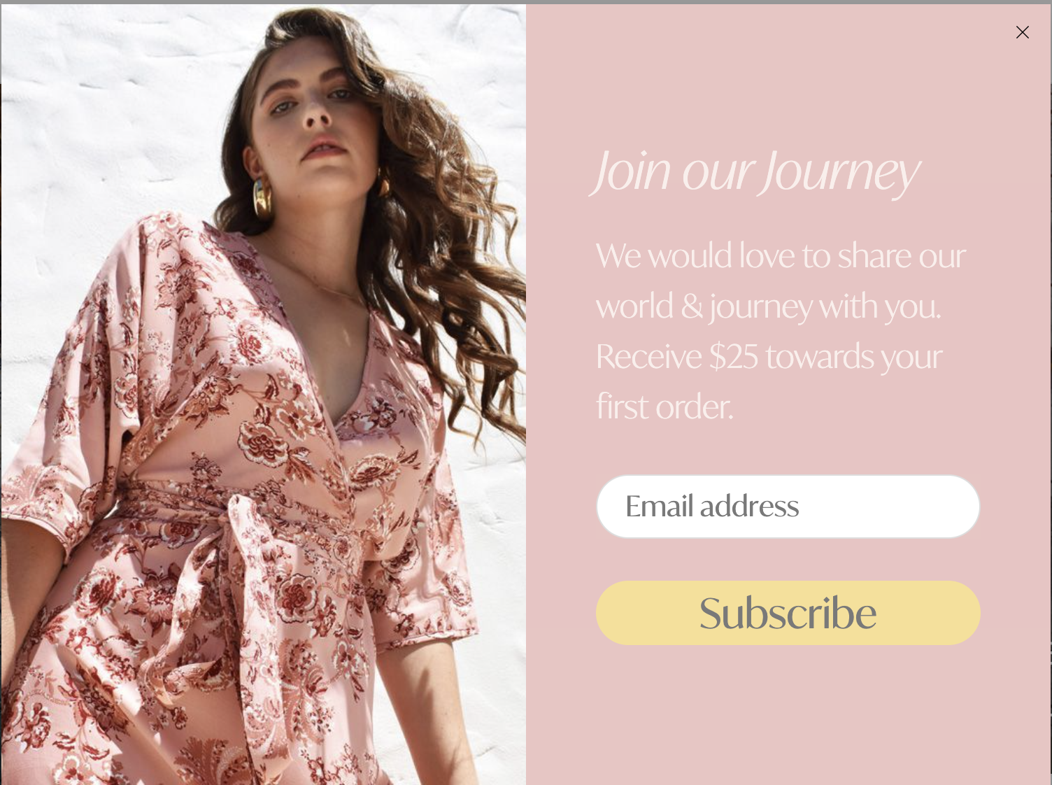
10. House of Lacuna
house of lacuna
Sustainable fashion company, House of Lacuna, displays an image of one of its clothing products on its email capture form, giving visitors an immediate sense of what the brand is all about. Anyone whose interest is piqued at this point will love the offer of $25 towards their first order.
The rest of the form is simple and clear, with nothing distracting from the offer. A prominent CTA button in a contrasting color and with a larger font guides the eye to focus on the action the company wants its audience to take—subscribe.
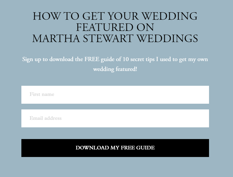
11. The Mrs. Book
the mrs. book
The simple newsletter signup form used by The Mrs. Book, an heirloom-quality bridal book company, reinforces its brand with an elegant color palette. In exchange for signing up, The Mrs. Book offers visitors a relevant freebie—the 10 secret tips the author used to get featured on Martha Stewart Weddings.
Offering this free guide is a fantastic way for The Mrs. Book to provide visitors with proof of their expertise. The thought of having a wedding that a celebrity like Martha Stewart would endorse is likely highly appealing to this audience. The CTA button reminds visitors that these expert tips are indeed free.
To learn more about how to successfully market your freebie, read How to Build an Email List: 5 Ways to Market Your Freebie.
12. Taylor Loren
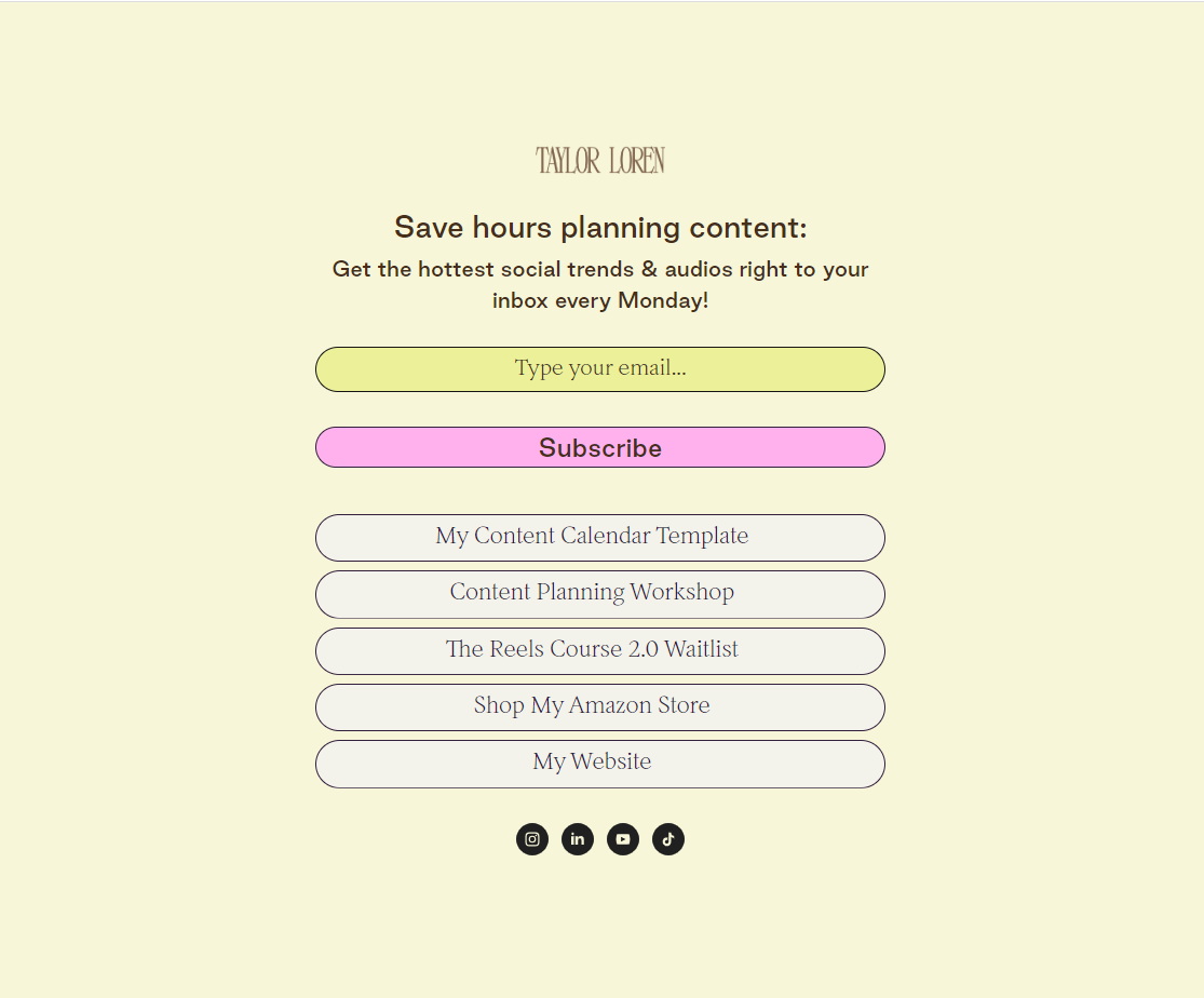
Taylor Loren uses her Flodesk Link in bio to not only capture email signups but also to show her audience links to her popular products and services.
Design-wise Taylor’s Link in bio matches her overall brand design perfectly. It’s got a retro feel that carries from her website to her social channels. Her messaging is persuasive too, “Save hours planning content.” Who doesn’t want some extra time on their hands to grow their business?
13. The Inspired Foundry
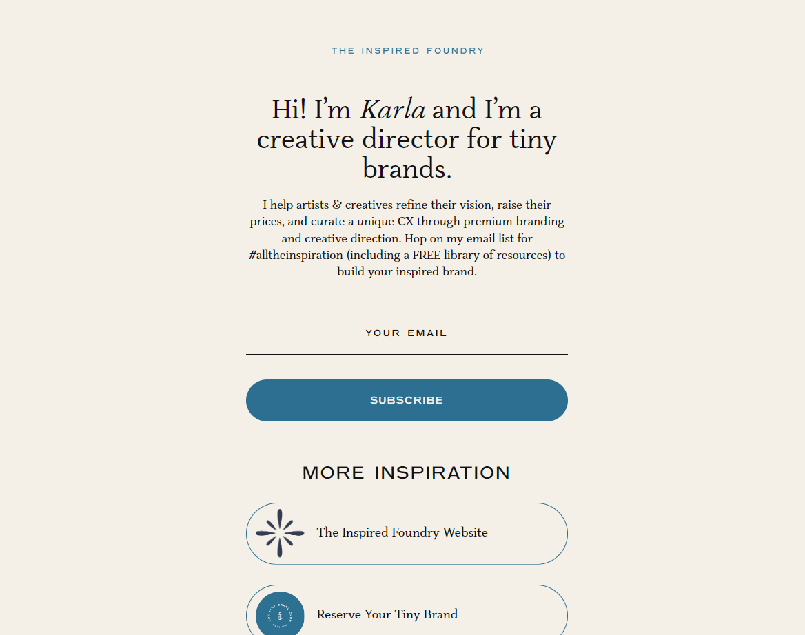
Another Flodesk Link in bio creator, Karla from The Inspired Foundry, has designed a thoughtful, simple, and inspiring newsletter signup form. She’s kept it to two colors and used them to ensure the eye goes straight to the “Subscribe” button.
Her messaging is all about being inspired, which is aptly on-brand. Her offer—creative direction and a library of free resources—is very enticing for small business owners who want to elevate their brand. You can also book time with Karla by clicking the “Reserve Your Tiny Brand” button in her Link in bio.
Turn followers into subscribers with a Flodesk Link in bio
Capture followers’ emails right from your social profiles to grow your list.
14. Nicole Bensen
nicole bensen
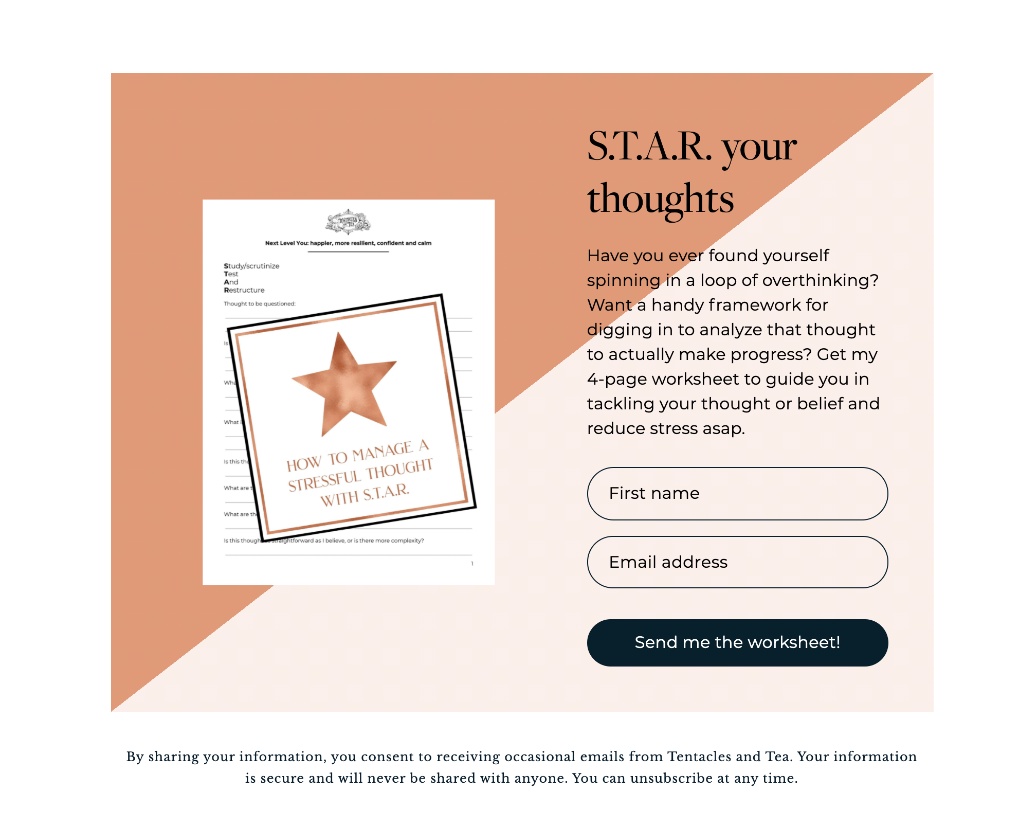
Nicole Bensen is a health and wellbeing enthusiast and positive psychology coach. Like The Mrs. Book, she offers subscribers a freebie to incentivize them to join her mailing list.
The text on her newsletter signup form helps connect her to her audience by describing a likely pain point—overthinking—and offers some immediate and tangible help in the form of a worksheet.
Nicole even calls out the exact benefit—reduced stress—that subscribers can hope to gain from joining up. And, her CTA button reinforces what’s going to happen after signup by using the text “Send me the worksheet!”
15. Rachel Rainbolt
Sage Family
Simple living mentor Rachel Rainbolt has a newsletter signup form with a large, bold headline to attract attention and draw in visitors to her offer.
Once she’s caught their interest, a written paragraph sums up the benefits of joining her mailing list. Then, Rachel takes it one step further by adding a testimonial from a happy subscriber—a great example of social proof.
16. Jessica Hawkes
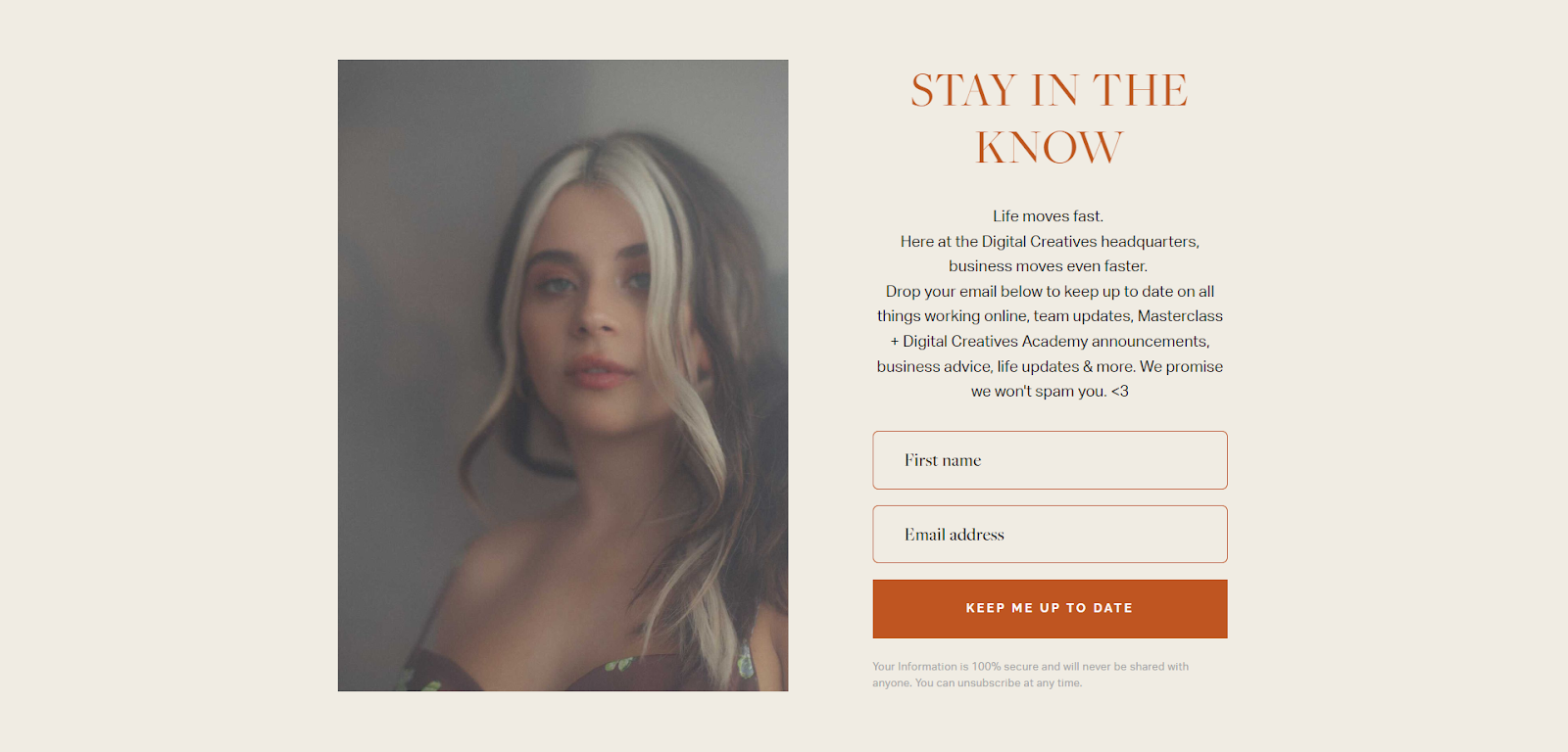
Founder and coach Jessica Hawks hosts an online academy and offers classes to digital creatives. She’s used a Flodesk Full Page Form to create her email newsletter signup page and connect with her audience. Much like the rest of her brand communications, Jess is the face of the business—and this form allows her audience to put a face to the brand.
The messaging is all about relationship building: “Stay in the know,” “Life moves fast,” “Keep me up to date,” “We promise we won’t spam you <3,” and “Your information is 100% secure.” All of these signal understanding of the audience, create connection, and earn trust.
17. Color & Chic
color & chic
Receiving too many emails is one of the leading reasons why people opt out of mailing lists. Color & Chic address this problem head-on. Their newsletter signup form outlines how often subscribers can expect to hear from them.
Not only does this tactic reassure new subscribers that Color & Chic won’t overwhelm their inboxes, but it also acts as a subconscious prompt to look out for new content on a weekly basis. In turn, their email newsletter is less likely to get lost in all the others.
18. Lilou Jewellery
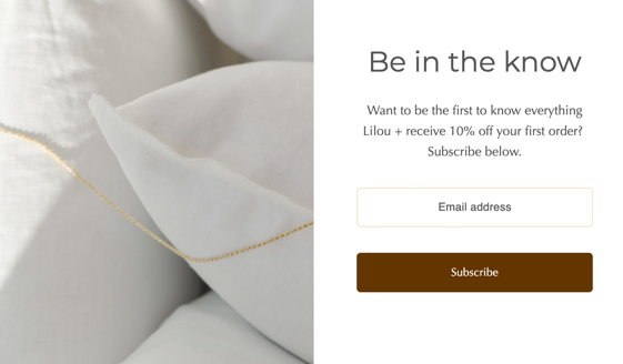
lilou jewellery
Lilou Jewellery’s simple popup form has a lot of white space. This draws attention to the subscribe button, which uses a contrasting color to stand out against the white background.
The signup copy is to the point and combines a dual offer of early access content and a discounted initial order. Using the title “Be in the know” reinforces the feeling of exclusivity and of getting something that others aren’t.
19. With Grace and Gold
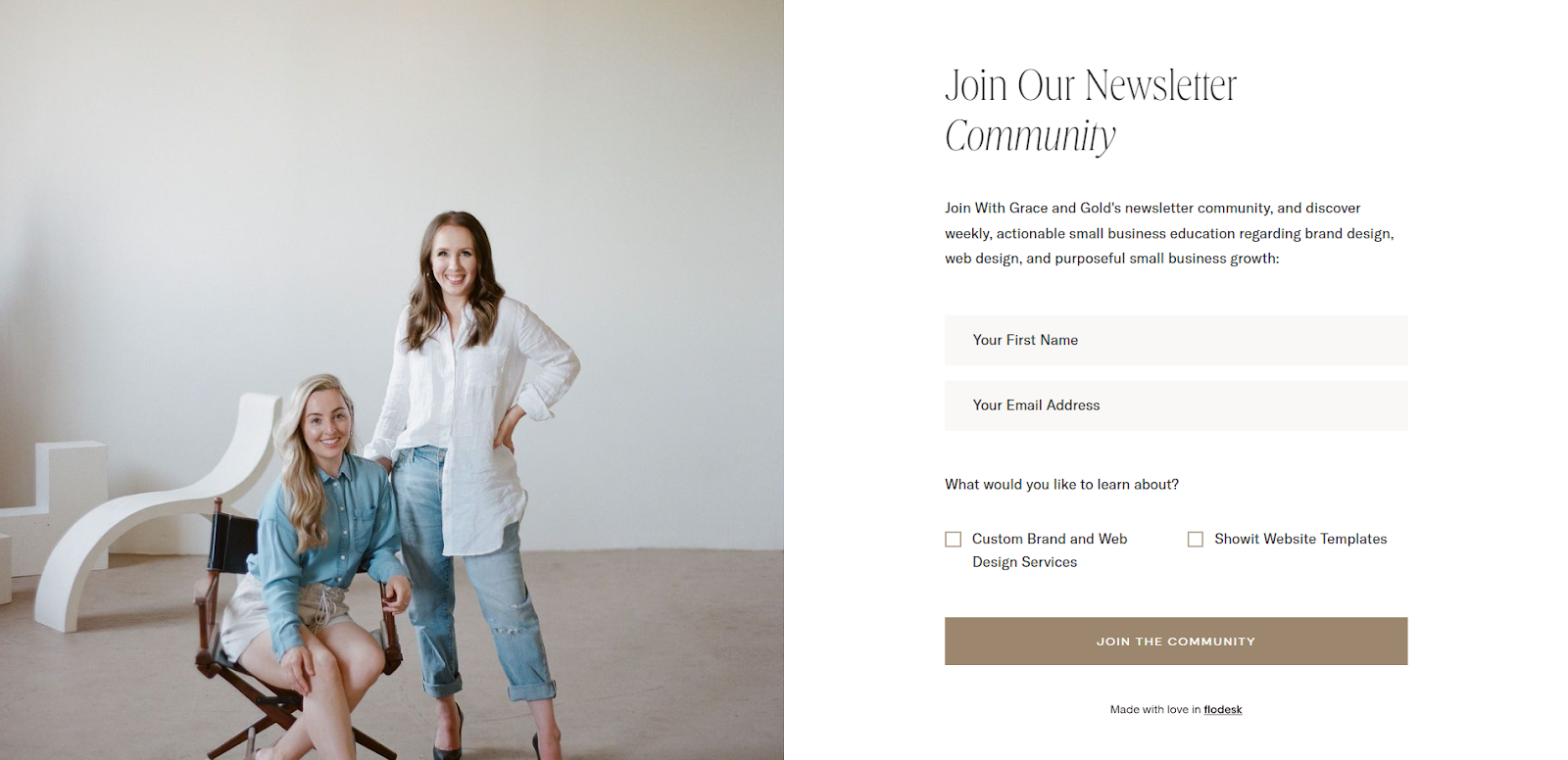
Flodesk member With Grace and Gold has made great use of their Full Page Form to capture email subscribers. The layout has lots of white space, an eye-catching image, and a prominent CTA button.
Grace and Gold emphasize joining a newsletter community and promise actionable tips for small business growth. They nail two fundamentals of an effective newsletter signup: the power of community and personalization. The form asks for a first name and what the person would like to learn about—meaning their subscribers can self-segment and receive hyper-relevant articles and personalized content.
20. Brooke Bakken & Co.

Brooke Bakken uses a Flodesk Link in bio for her newsletter signup form. She presents her social media followers with a strong value proposition: the ability to “Add an income stream while you sleep”—which is sure to grab their attention. The CTA button is in the same gold color as the header text, so it’s prominent on the page, and part of a cohesive design.
An image of Brooke adds a personal touch to the form, as does her handwritten signature at the bottom. She’s also written a heartfelt bio, which helps her connect with her audience.
Showcase the benefits of joining your email list
Collect subscribers with a simple, well-thought-out newsletter signup form that showcases the benefits of joining your list. Take inspiration from the examples we’ve shared and design your signup forms to create trust and a sense of connection with your audience. Master those points, and you’ll be on your way to growing your email list—and your business.
Start designing signup forms your visitors can’t resist. From stunning email templates to gorgeous forms, Flodesk makes it easy for you to build your list, engage your audience, and convert subscribers into customers. Create yours free.
Ready to grow your email list?
We’re ready to help you at no extra cost- no matter how many subscribers you get, our price stays the same.

Related Articles