How to Design An Email Newsletter Header: 6 Effective Tips & Examples
Table of Contents Jump to:
Jump to:
Table of contents
Most of us look at several email headers every day without even realizing it. After all, they’re the first thing you see when you click on a message in your inbox.
Email headers might seem simple, but they’re tricky to get right. Ideally, they should catch a reader’s attention and help them identify the company they’re receiving a message from without coming across as too busy, distracting or overwhelming.
Before you spend time trying to design the perfect email header, read this article. We’ve put together a useful guide that outlines our six top email header design tips to keep in mind during your development process. We’ve also included five great email header examples for you to use for inspiration, so keep reading and get those creative juices flowing.
Get unlimited email sends & subscribers with Flodesk
We’ll never increase pricing because your email list is growing
Email newsletter headers are fairly self-explanatory. Basically, they’re the images that you find at the top of most emails and newsletters. You might not have thought about it before, but you’ve probably looked at thousands of email headers throughout your life.
Email headers can include a variety of different elements, but at minimum they usually show a company’s logo or name and are consistent with their general branding. They often also include images, illustrations, and navigation menus.
Although many people don’t give email header design a lot of thought, they play an important role in email marketing, especially for small businesses. The email header is the first thing an email reader sets their eyes on and can contribute to everything from branding to marketing to highlighting your CTA.
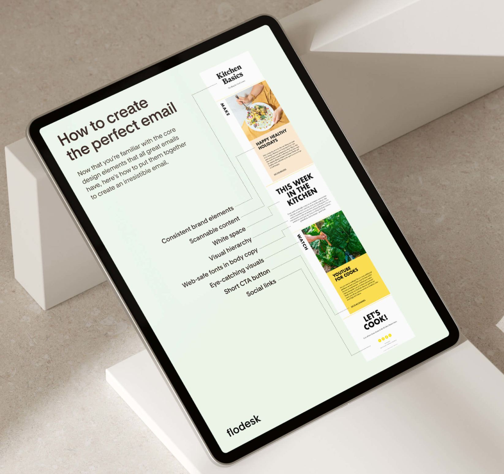
If you’re ready to get started with your own email newsletter header, keep the following six best practices in mind during your design process.
1. Don’t overdo it
When you’re just starting off with your newsletter formatting, it can be tempting to go overboard and include lots of information in your graphic. However, the best email headers are simple, elegant, on-brand and have lots of free space. The most important thing is that you put together something eye catching that makes readers want to keep scrolling down.
Think of it this way: your email header is the first thing a reader sees when they open your message. You don’t want them to get overwhelmed and hit delete (or worse, unsubscribe). Rather, you want to pique their interest and encourage them to read further.
2. Make sure it reflects your brand
When a subscriber opens one of your email campaigns, it’s important that they immediately recognize that it’s coming from you.
Many companies achieve this by including a recognizable company logo in their email header, but you can go even further. Basically, a great email header should embody all of a company’s key branding elements.
Email marketing is a big part of any company’s online presence (or at least, we at Flodesk think that it should be). It therefore only makes sense that your emails are yet another extension of your business’s brand and visual identity.
Ultimately, your email header design should be consistent with the fonts, colors, style, image types, and voice shown in your general branding.
3. Include your logo
As a general rule, your company logo should be located somewhere in your header — and in your newsletter footer, too. Above, you can see Flodesk’s logo, which sits on top of all the email messages that we send out.
If you want to go with a more minimalist style, you can make your logo your email header all by itself. Other companies integrate their logos into more elaborate email marketing graphics, or even include them in the center of a navigation menu.
Whatever you choose, make sure that your logo is prominent so readers associate what they’re reading with your brand right away.
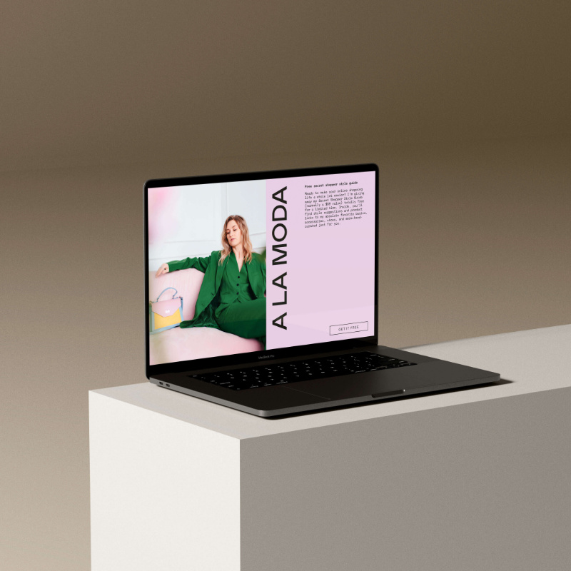
4. Integrate an eye catching image
To add some additional visual intrigue, many companies choose to integrate images into their email headers.
If you choose to add an image into your email header design, make sure to use your own images that truly represent your brand. Avoid using stock or generic images in a prominent place like your newsletter header. It’s just too likely that people will have seen them elsewhere on the internet, which will make your message come across as stale or unauthentic.
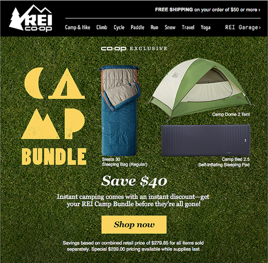
You’ll also have to design your email header so that your logo or company name is still easy to read, despite being paired with a photo. Outdoor brand REI does a good job of this above.
5. Create a few different versions
Unless your email header is next-level minimalist, you’ll probably have to change it up from time to time so that it matches the flow of your different email campaigns. In order to plan ahead, it’s a great idea to design a few different versions of your email header that you can switch out depending on your newsletter layout, design and needs.
This doesn’t have to be overly complicated. It can be as simple as creating a lighter version and a darker version of your email header. However, some companies go as far as creating header variations to showcase different logo versions, promotions or times of year.
6. Test it out
When in doubt, test it out! If you’ve designed several email headers but still aren’t sure which one you should use as your primary graphic, test them out with your subscribers and see what your analytics tell you. You’ll feel confident about what email header design aligns best with your audience and you’ll get an idea about the kinds of graphics you should make in the future.
An easy way to do this is by creating two different email headers and using them both for a specific period of time. For example, use each one for a month. Afterwards, you can compare analytical results over the two-month period and get an idea of which graphic made a great first impression.
Get unlimited email sends & subscribers with Flodesk
We’ll never increase pricing because your email list is growing
Examples of excellent email headers
Reading about design best practices is great, but looking at great design examples is even better. Keep reading to check out five fantastic newsletter header examples to help get you inspired.
Vester Design Creative Studio
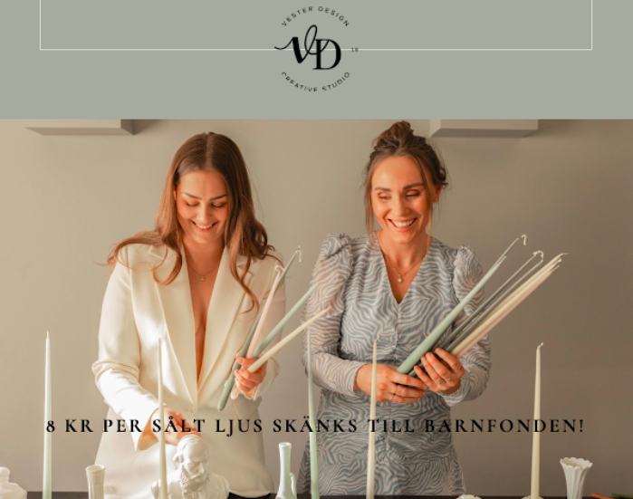
Vester Design is a Swedish event planning service based in Gävle, Sweden. We love their email header for a few key reasons:
First, they’ve included their unique logo and a very on-brand color palette. They’ve showcased their company’s branding in a very subtle and visually pleasing way. They’ve even gone as far as bringing the overall graphic together with a cohesive color scheme of cream and grey-blue.
The whole image comes off as elegant and subtle, yet striking at the same time. This would also be an easy graphic to create different versions of to showcase different design projects. They could simply select more of their own photos and change up the color palette, which would give all their email headers a unique, yet distinctive and cohesive, look.
Katie Lauren Graham
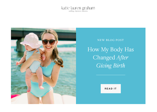
Katie Lauren Graham is a lifestyle blogger from the United States. Her email header is exactly what we’re talking about when we say that simplicity is the name of the game. She includes a minimal logo up top that showcases her brand name, and then highlights a recent blog post right below it.
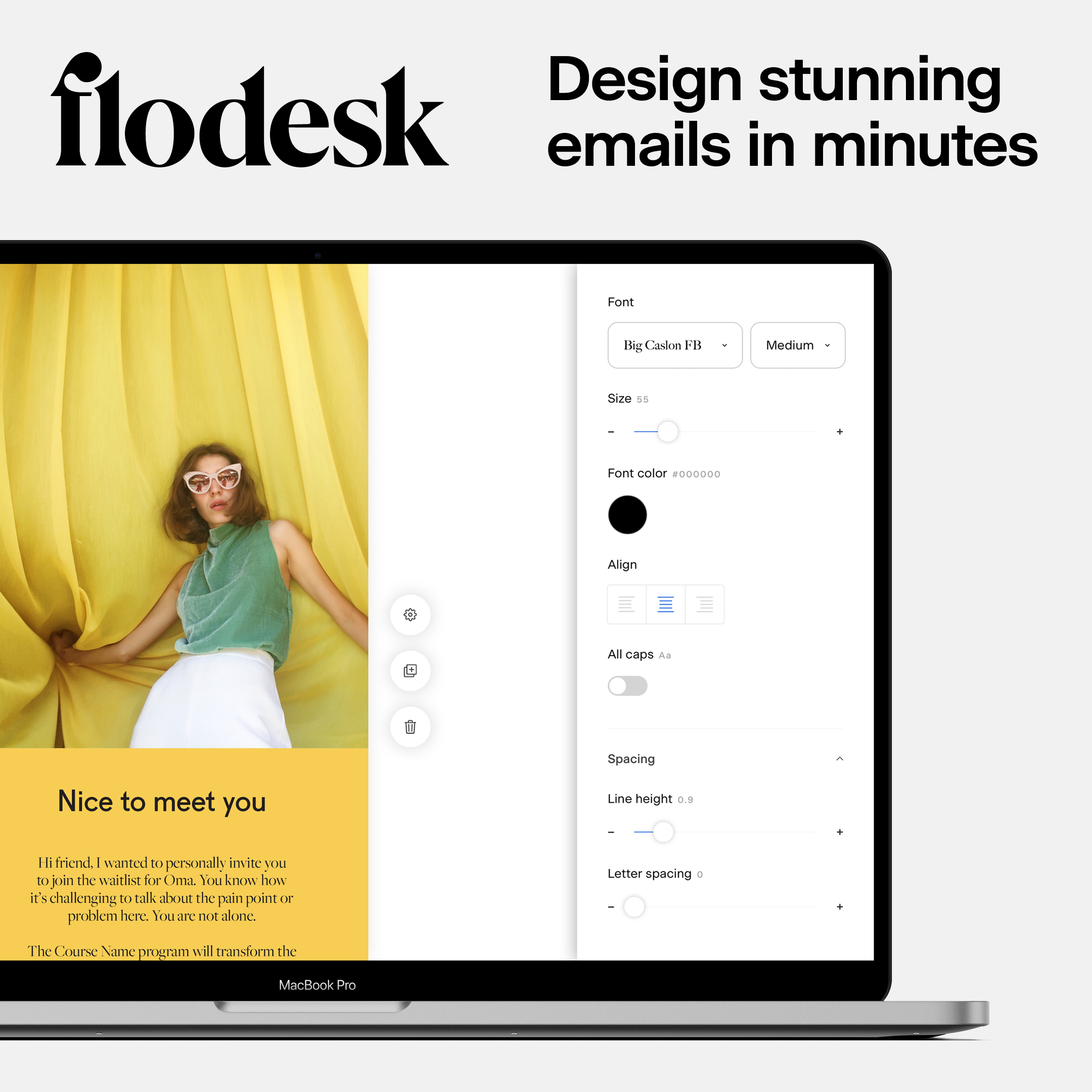
Katie’s graphic is a great example of how you can use Flodesk layouts to create some awesome graphics for your email headers. Our platform removes the need for any third-party design tools; you can create beautiful designs within Flodesk itself. This takes one step out of the design process and makes creating your own images a breeze.
Once you’ve signed up for your 30-day free trial, you can explore our email builder and check out all the different layout options that can help you create the perfect email header for your email marketing needs.
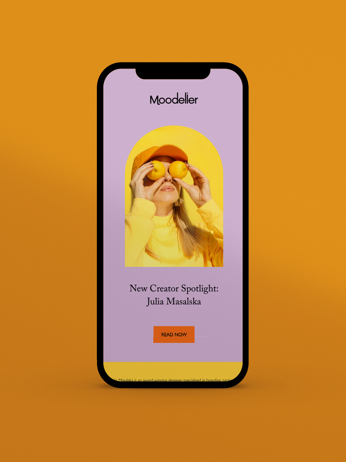
Joi Knows How

Joi Knows How is a multi-passionate creative who does everything from educating to public speaking to blogging to content creation and more.
We love Joi’s energy and think that her email header encapsulates it perfectly. It’s positive, motivating, and peaceful all at once. It’s also colorful without being over the top and makes great use of one of her own photos.
Since Joi as a person is a big part of her brand, we think it’s incredibly smart that she’s used her own smiling portrait in her newsletter header. It feels welcoming, personal and fun at the same time.
Parousia Press
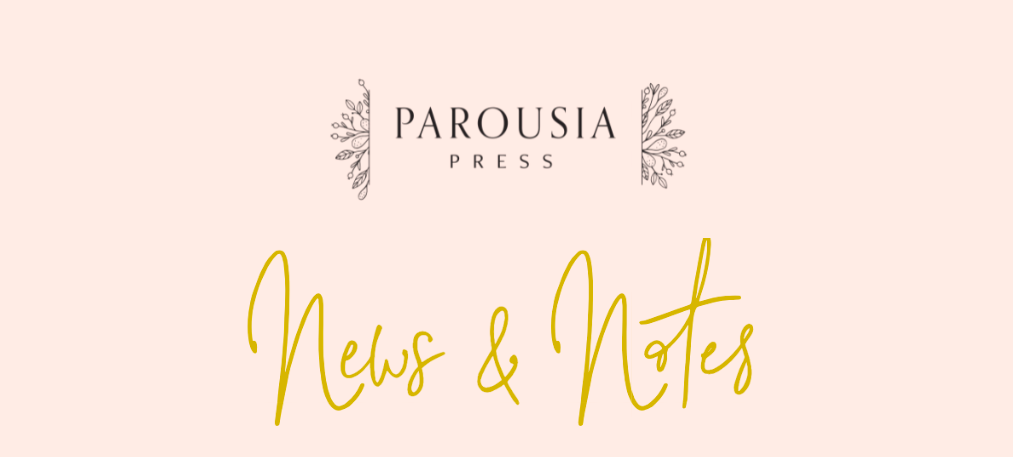
Parousia Press is an American company that specializes in Orthodox planners and agendas. Their newsletter header is a great example of how you can create a design that’s minimalist while still using some color.
The pale pink tone they use in their email header matches perfectly with their website and social media platform branding, making for a cohesive visual identity. Their logo is simple, elegant and easily recognizable.
We also like how this email header would easily lend itself to various different kinds of email design. In this example, you can see that they’ve extended their header by adding “news & notes” in cursive immediately below it. It’s convenient that this could easily be changed depending on the needs of different emails, such as a new product launch email.
Lilou Jewelry
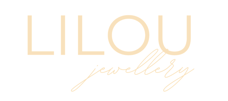
Lilou Jewellery simply uses their logo as their email header. As we mentioned in our email header design best practices section, simply using your logo in place of a header can be highly effective. It’s also convenient because it can easily be used with all kinds of different email templates and designs.
We like how Lilou Jewellery uses their logo because it’s minimalistic, yet still consistent with their brand. They’ve put their text in one of their signature colors, and their combination of cursive and bold fonts comes across as modern and sophisticated.

This kind of email header is also easy to customize according to your email marketing needs. As you can see above in this holiday newsletter example, they’ve changed the coloring to white and added a Santa hat for the holiday season, adding a festive touch while still being recognizable.
That’s it, you’re ready to take your email marketing content to the next level with a perfect email header. We hope that you found our tips useful and that our ideas and examples left you feeling creative and inspired.
If you remember to keep your email header elegant, on-brand, easy-to-customize and captivating, we’re sure that you’ll come up with something truly fantastic. Next up? Crafting your newsletter introduction!
Flodesk loves helping creative small to medium-sized businesses and entrepreneurs take their businesses to the next level with email marketing. Check out our 30-day free trial if you want to try your hand at creating email headers or whole campaigns yourself with our software.
You’ll be sending out your first Flodesk email in no time.

Related Articles