8 Emails, forms, and checkout pages to inspire you in 2024
Table of Contents Jump to:
Jump to:
Table of contents
TL;DR Take inspiration from our members’ beautiful Flodesk emails, forms, and checkouts. We’re rounding up some of the best and sharing what our members learned this year.
Watching you grow your list, your business, and your sales over the past year has been nothing short of incredible. You have taught us so much and continue to inspire us daily. You are the voices that guide our roadmap, our biggest cheerleaders, and the reason we launched Flodesk Checkout. And for all that, we are grateful for you and every member who helped Flodesk grow into what we are today.
You have inspired us for so long, and now it’s our turn. But we’re not doing it alone. Scan through some of our members’ best Flodesk emails, forms, and checkout pages and apply lessons they’ve learned to help move your business forward in the new year.
As always, we can’t wait to see what you’ll do next!
Flodesk for your business
Create stunning emails, beautifully simple forms, and high-converting checkout pages, effortlessly—all in Flodesk.
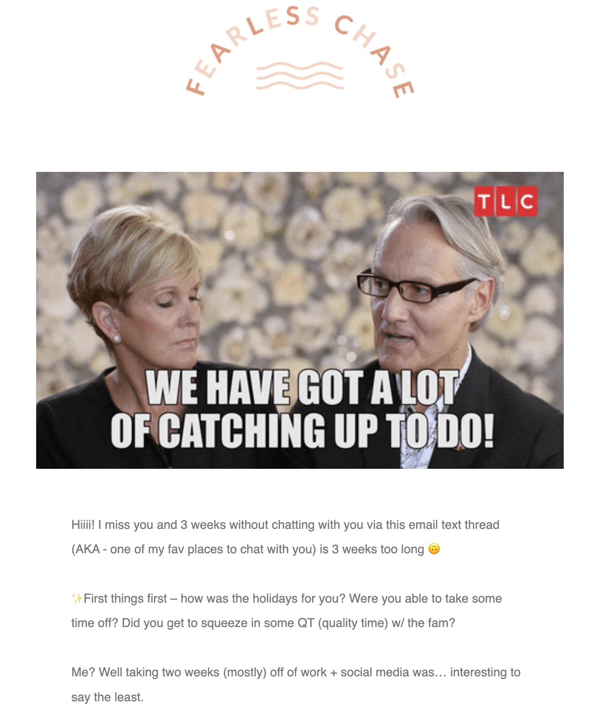
Grab your readers’ attention with a relatable GIF
Nothing screams relatability quite like a GIF. The one featured in this email is from a popular show the audience likely relates to, but it also ties in directly to the email. The GIF and personalization throughout this email bring it to life, quickly capture attention, and enticed us to read the whole thing.
This update email is from Mads, the creator behind her intentional living brand, The Fearless Chase. We get why this is her favorite! Want to see her entire email? Check it out.
Stay true to your roots
Mads’ shop, The Fearless Chase, features inspirational and cute trinkets, clothing, candles, and decor all centered around living with intention. She also runs a lighthearted podcast, discussing living a more conscious and deliberate life.
Despite having her life together now, Mads initially started The Fearless Chase as a way to get out of the cycle of doing what everyone told her to do. She chased her dreams and opened the shop as a reflection of herself and her style, and to inspire others to do what they want. Her shop is a dedication to romanticizing your life and surrounding yourself with beautiful things that represent the true you.
It all started with her journey of personal development when she went through her quarter-life crisis and realized something that completely changed the game for her: she needed to align with her values, not someone else’s. When she strayed, she looked up and noticed that she built a vision and dream for someone else.
Mads got back to her roots and, instead of morphing into what her friends, family, or other entrepreneurs told her to be, she pivoted her business to align with her passions. And so, The Fearless Chase was born.
Tell your story in a clever way
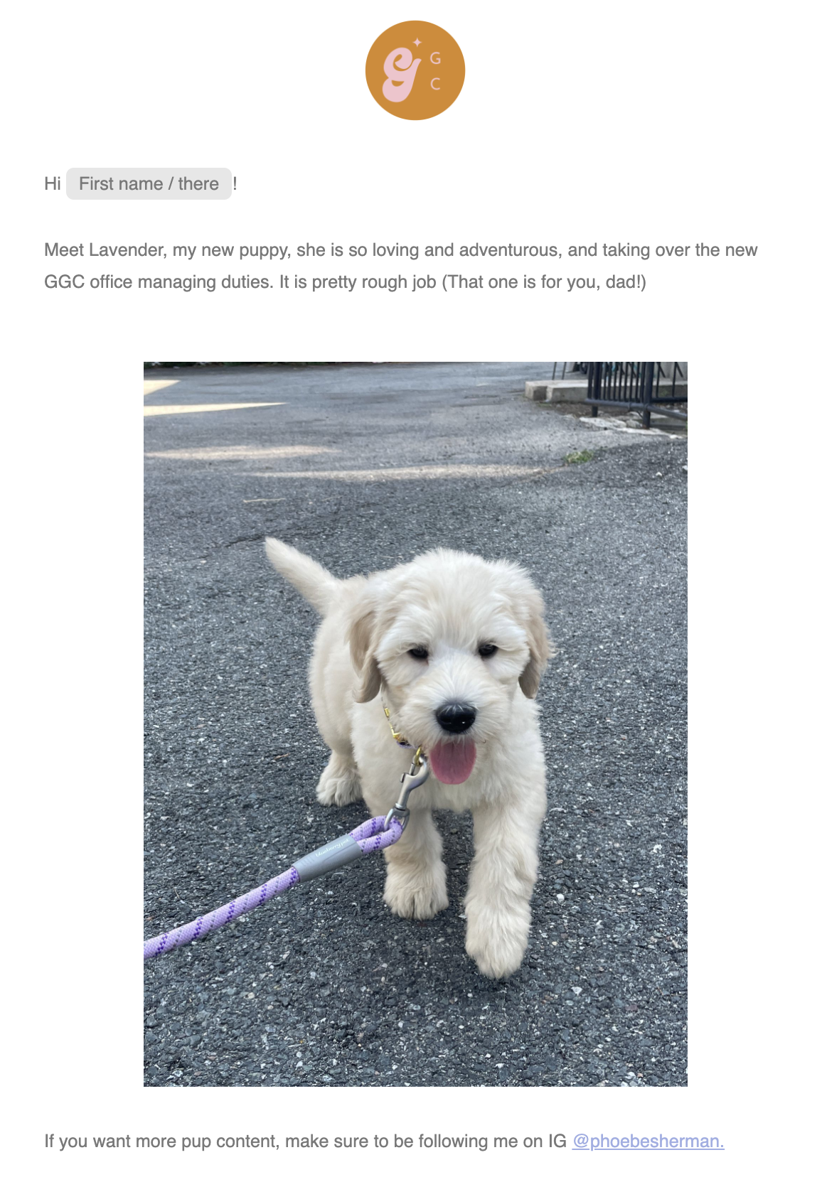
Who doesn’t love adorable photos of puppies or kittens? This email introduces Lavender, the Girl Gang Craft founder’s adorable new pup. But the image is more than just a cute puppy— it’s a clever way to tie into Girl Gang Craft’s course launch. Phoebe, the founder, asks you to help Lavender with an upcoming course by answering a few questions.
Well done! We love the simplicity and the creative way she made the email about her dog and the course launch. Scroll through the whole email to see how she did it!
Want to grow your business? Send more emails
Phoebe is the founder of Girl Gang Craft, a fem-forward community for creatives that hosts craft fairs, offers courses, and even hosts a podcast. They even have an amazing feminist clothing line that raises funds for social justice non-profits.
But Girl Gang Craft almost didn’t come to fruition. Phoebe created it by accident when she gathered 15 of her artist friends for a small craft fair. She couldn’t get enough of the energy in the room and chose to continue creating markets for artists to sell their work and collaborate. In August 2017, the “accidental” Girl Gang Craft came to be.
Ever since then, she’s focused on what matters most to her: leveling up her business. And she discovered that email is one of the most powerful ways to do so. Phoebe learned that emails are the best way to get paid, and has been reminding herself to “send more damn emails.” When someone subscribes to her list, they’ve told her they want to know more, so the more emails she sends, the more connection she can build with her audience (and more sales over time).
Align everything to your brand
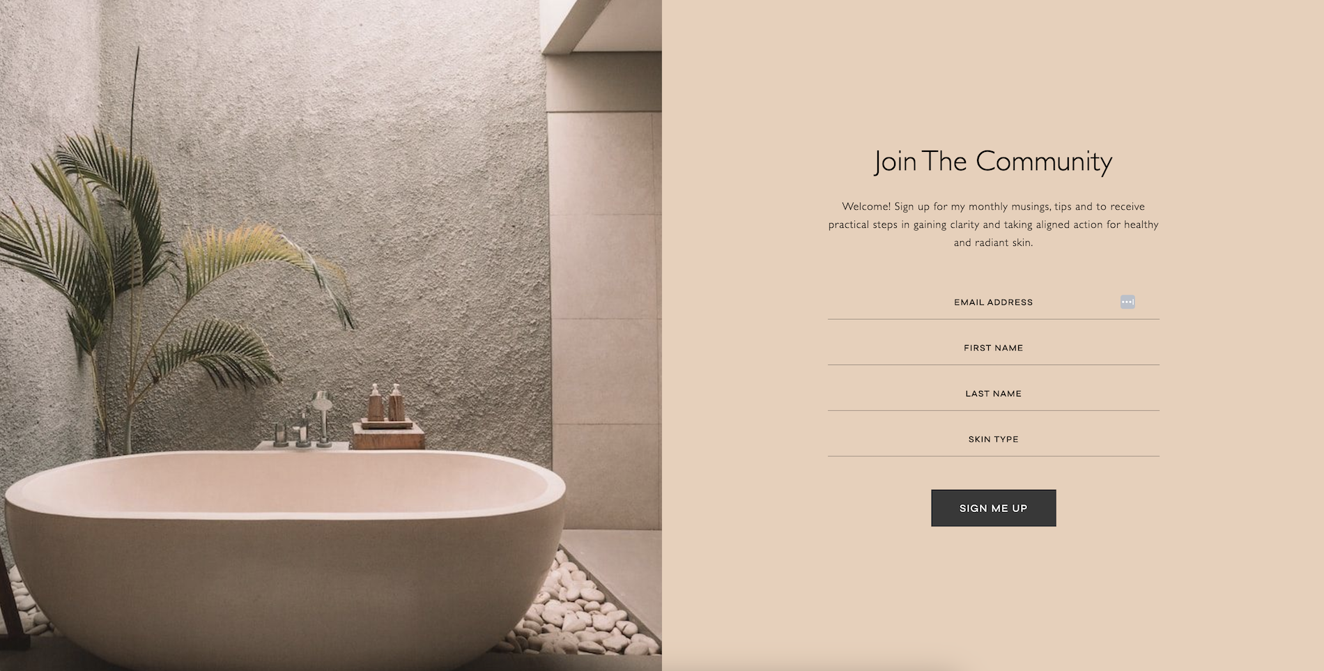
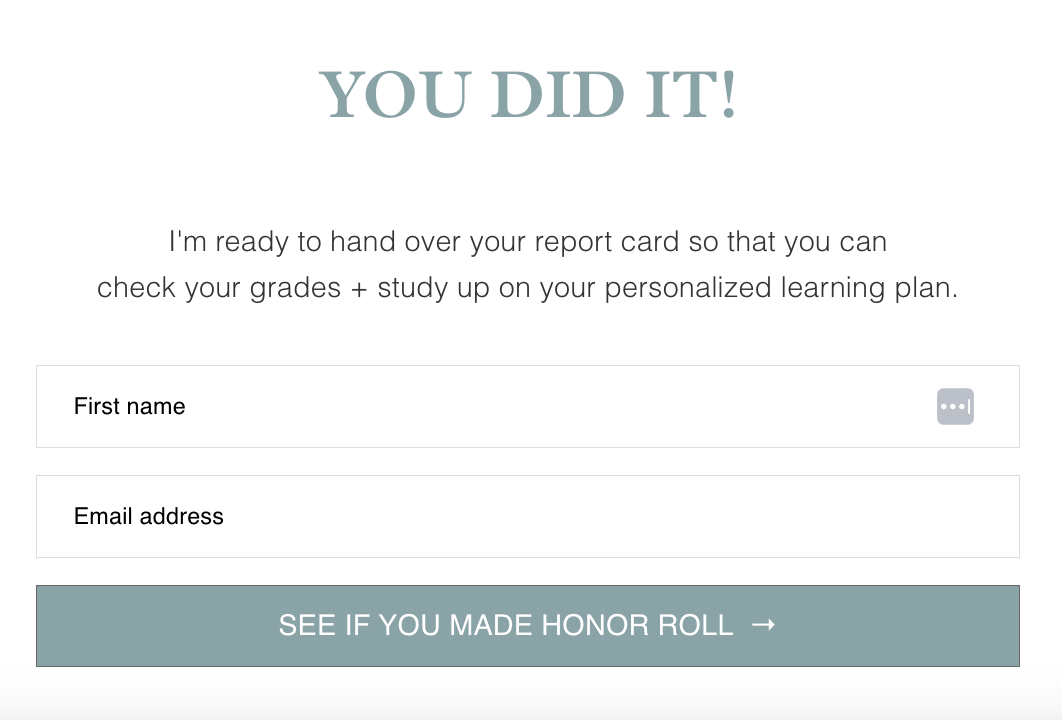
There’s something to be said about the soothing tones and spa-like feel of this beautiful Flodesk form. It aligns perfectly with the Minimal Beauty brand and keeps things simple. The form is so well branded, viewers might not realize they’re not on the brand’s website. And we can’t get enough of the highly-relevant form field asking about skin type. Every element on this form ties in beautifully with the Minimal Beauty brand.
And your business doesn’t need to be exciting to make for a beautiful branded email experience. Even lawyers, dentists and accountants can leverage branded aesthetics.
Build and execute a strategy
Jen is the holistic facialist and skin expert behind Minimal Beauty. Her authentic and holistic approach to skincare focuses on the basics and how lifestyle plays a role in our skin health and appearance. Jen curates your skincare, teaches foundations of skin health, and helps clients understand how the nervous system health reflects in our skin.
Jen is just about as passionate as we are about email marketing, but she learned that she needs to have a strong strategy in place to make the most of it. She has already started working on her strategy for next year, including content for lead magnets. She is even using the dynamic team of social media and email marketing to drive more traffic to her blog. Social media has become a marketing tool where she directs her audience to the blog to sign up for her email list.
Keep it simple
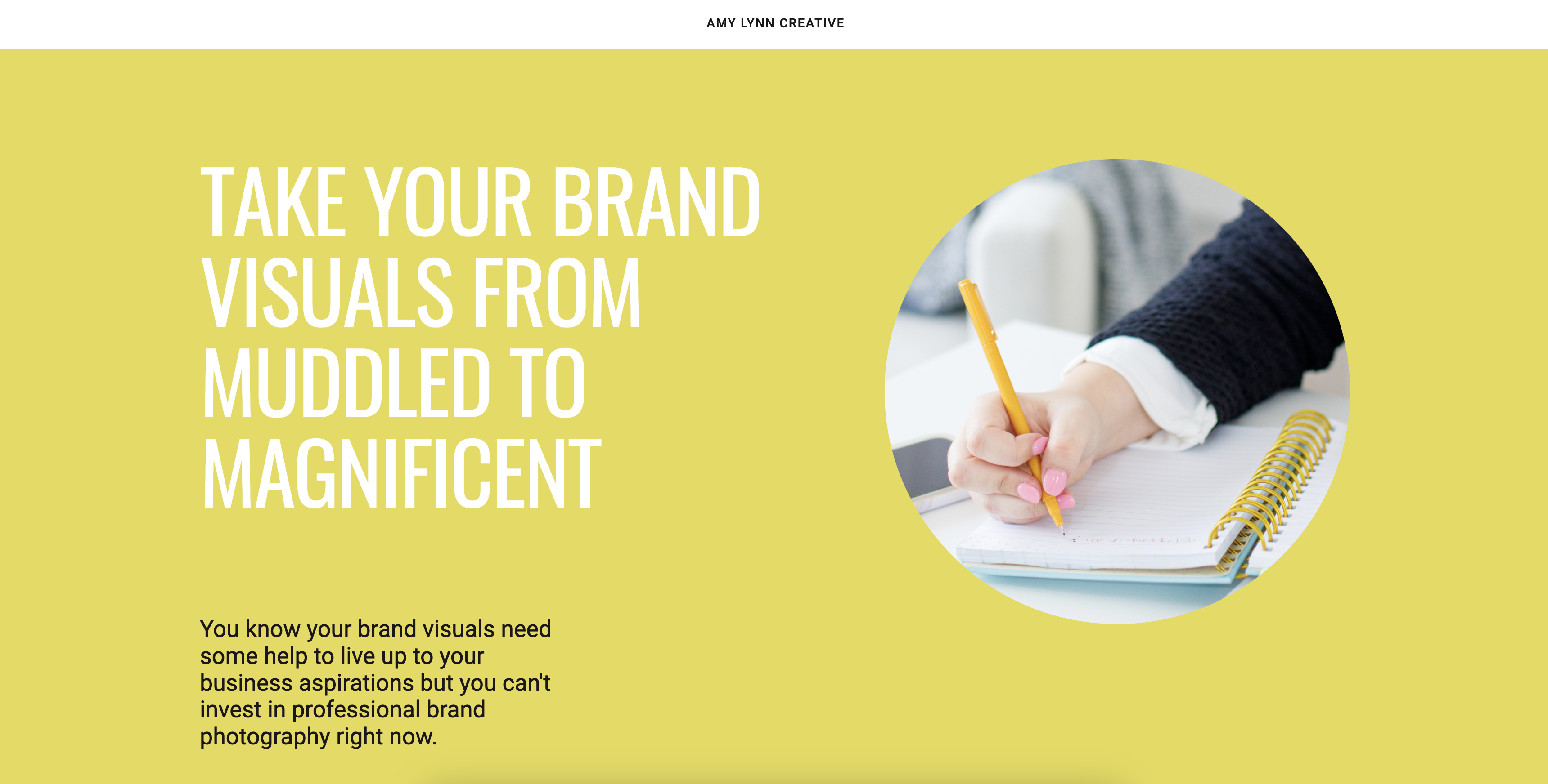
Amy Lynn Creative’s bold and bright checkout page does a wonderful job of matching her vibe, from the colors to the simplistic layout. It’s full of calls to action (CTAs) that optimize it for conversion and its simple format doesn’t distract from the main goal of getting visitors to buy her workbook.
Don’t be afraid to talk about your offerings
Meet Amy, founder and photographer of her namesake photography business, Amy Lynn Creative. Amy is a brand photographer for small business entrepreneurs, helping build detailed strategies to create a curated brand look and feel through imagery. Amy even offers clever tips, video tutorials, and a blog full of valuable content for her clients.
After talking with multiple clients who didn’t know about any services Amy offers outside of what they booked, a lightbulb went off in Amy’s head. She realized the fine line between talking about your services so much that it turns subscribers off and not mentioning them enough for your audience to be aware of everything you offer. She was doing the latter.
Amy was shocked but even more intrigued after receiving messages from potential clients asking if she offered specific services. She thought she had promoted her photography services well, but her subscribers and would-be clients were telling her otherwise. She realized that she should talk about her offerings more—much more than she thinks is necessary.
Get personal with your subscribers
The inbox is a private space that subscribers invite you into when they deem your content valuable enough to receive regularly. So, when someone brings you in, respect that by opening up, being personal, and sharing relevant and exciting content.
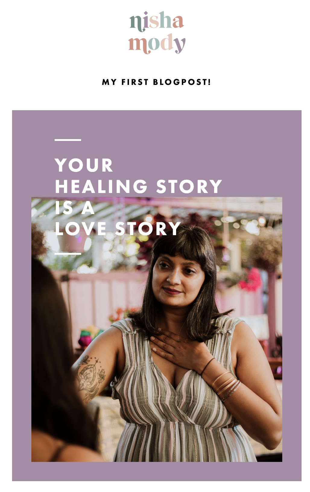
This welcome email is highly personal, with a heartfelt message and an option for subscribers to edit their preferences based on the content they want to receive from Nisha Mody. It is a true reflection of her brand, from the colors to the personalization throughout—everything comes together to showcase who she is.
Learn from your mistakes
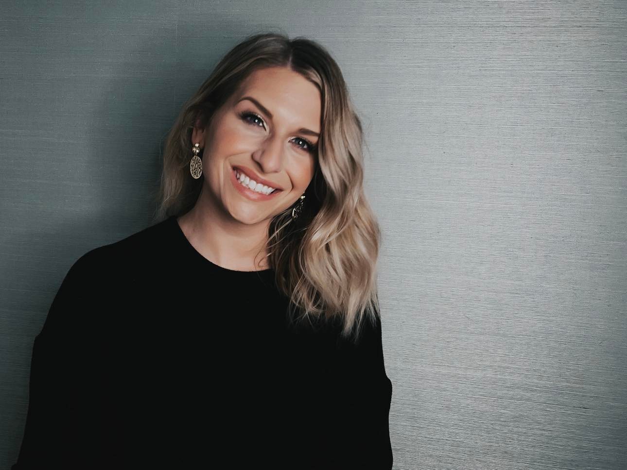
Nisha is a feminist healing coach, speaker, and blogger who helps people cope with their feelings, claim their agency, and relate to the world with care. This self-proclaimed healing hype girl helps her clients uncover how they’ve been conditioned, so they can heal themselves and their relationships.
She received an invite to attend a podcast after she mistakenly emailed her entire list (instead of a carefully curated segment), and quickly learned that mistakes can lead to great opportunities. They’re teaching moments at worst, and at best, they can turn negatives into positives, like going on a podcast!
Nisha quickly learned to laugh at the small mistakes—like spelling mishaps or emailing the wrong list. Building a business is hard, and we’re all sure to make mistakes, but Nisha embraces them as lessons learned and a gentle nudge to be more human.
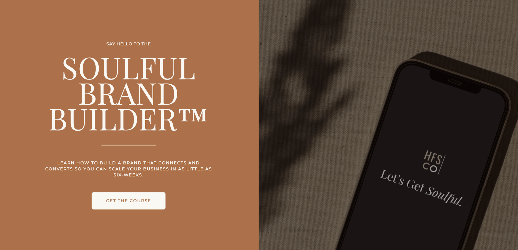
There’s a reason YouTube, Instagram reels, and other video streaming platforms are so popular: video content is engaging and more personal. This HFS Co. checkout page features an embedded video at the top, connecting visitors with the founder. The video also includes details about the course, so visitors don’t have to scroll if they’re in a rush.
Be authentic
Angie is the founder and CEO of HFS Co., a brand and web design studio dedicated to passionate business owners. While beautiful branding and design are paramount, HFS Co. believes you deserve more than that—you need a strategy-driven approach that prioritizes brand and business goals.
HFS Co. creates stunning branding and designs to communicate your message visually and connect with your audience. As the leader of a branding company, Angie understands the value of being authentic.
Authenticity creates conversation, and Angie has embraced being more open and real. She sparks conversations and connects with clients by being authentically Angie and sharing news about all the happenings in the studio. It’s never too late to show up as your true and best self.
Don’t skimp on details
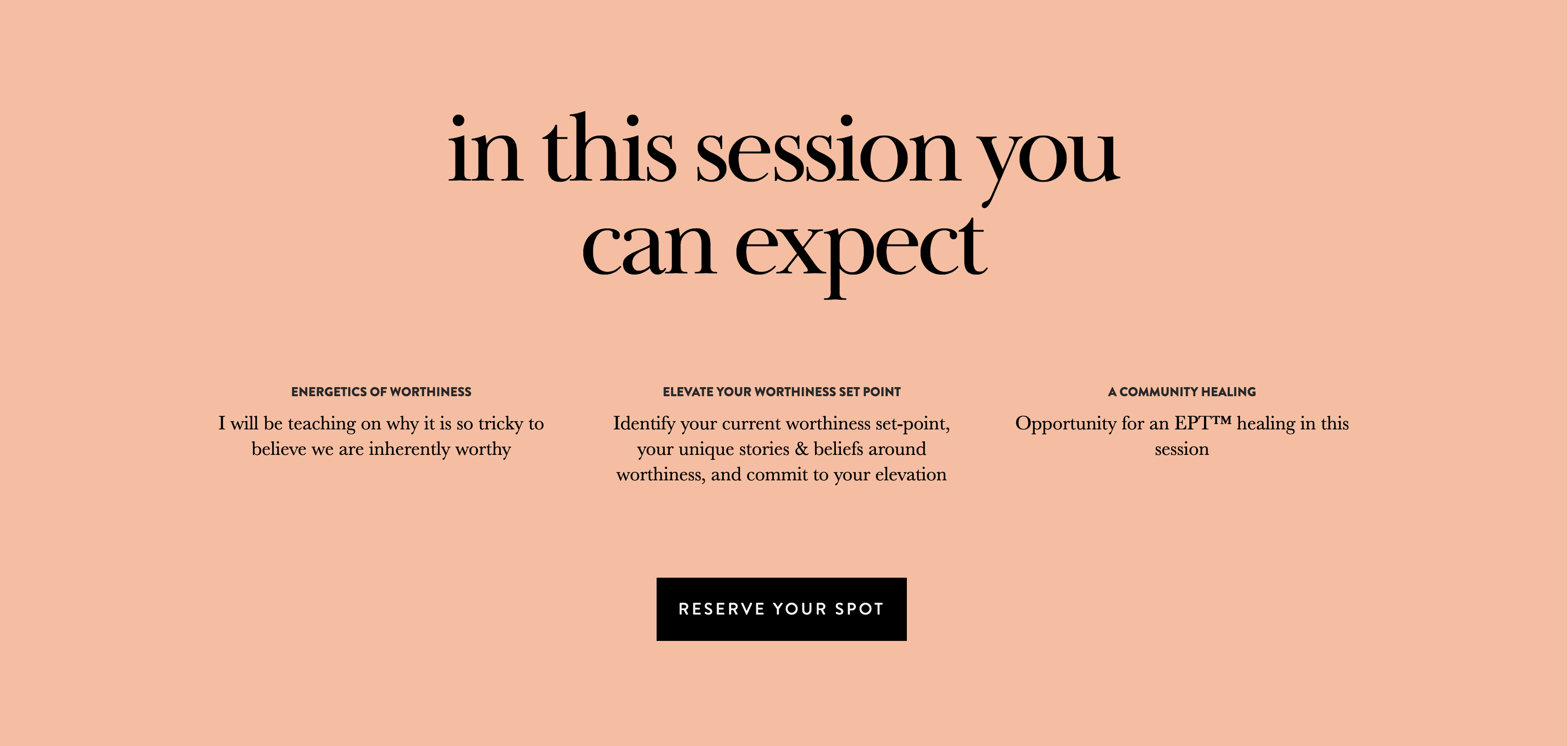
When someone visits your sales page, they want to know what they’re buying and all the details about your offering. This checkout page gives you all the details upfront: the date and time of the group session, what it is, and what you’ll get from it—all followed by a clear CTA.
If Beth of Earth & Ether piqued your interest and you don’t need more information, you can sign up without even having to scroll! It’s clear, concise, and full of the details visitors need to convert.
Trust yourself
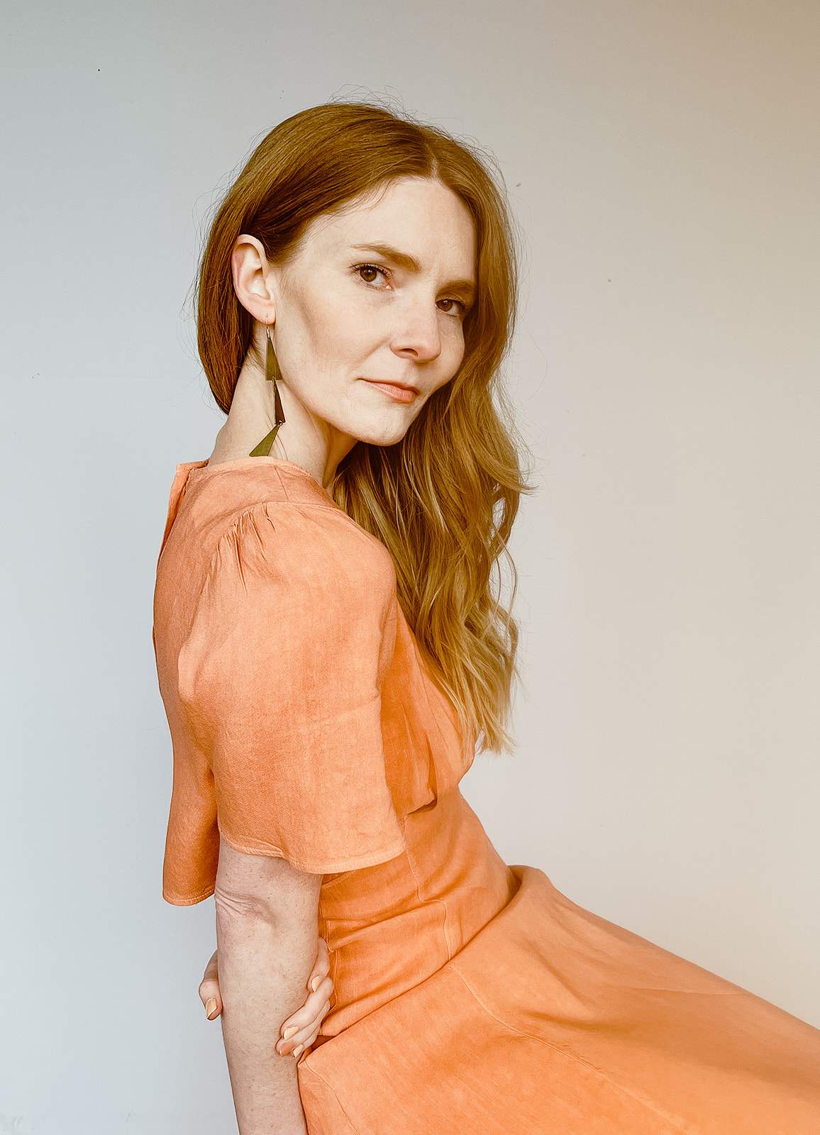
Beth from Earth & Ether is a healer focused on trauma reconciliation. She runs her own practice, helping clients heal through forgiveness. Whether it’s a one-on-one session or on a group retreat, Beth aids clients by identifying specific traumas, emotional blocks, generational patterns, or limiting beliefs that keep them stuck in a past or false version of themselves.
Beth was a bit overwhelmed with marketing and felt like she had to overcome a huge learning curve. Instead of letting the overwhelm overcome her, Beth chose to trust herself. She deepened her belief in herself and what she was doing. She stayed the course, believing everything would add up to get her the clients she wanted.
Beth knows she is the energy she brings to her work—whether it’s emails, her website, or a sales page.
Color outside the lines by getting creative
It can be hard to break out of the mold of doing things the way others do or how they expect us to. But once you do and start coming up with creative and new ways of doing things, it can pay off big time.
Erin from The Mom Life Handbook got creative with Flodesk, creating an in-line form to display on her quiz results page. She sends her audience a quiz and uses the opt-in form to collect their information. But after that, they’re automatically added to a segment that walks through a tailored workflow Erin set up in Flodesk.
This simple yet beautiful in-line form uses a creative CTA we love. But we are truly inspired by the entire process she set up around her form to create a personalized experience for her subscribers.
Create brand consistency across channels
Erin is a teacher turned entrepreneur who now spends her time as a mom and running The Mom Life Handbook. She teaches busy millennial moms how to reclaim their time by streamlining everyday life. Her digital courses and private consultations help overwhelmed moms use actionable strategies to uncomplicate life.
After deciding to hone her brand and focus on branding her newsletter, Erin saw her open and click rates triple. She realized the value of creating a newsletter that reflects your brand—from visuals to the brand voice to how you connect with your ideal customer.
But Erin took it a step further. She templated her newsletter, creating weekly features for exclusive content, highlighting long-form content, and incorporating product recommendations. It gets subscribers excited to read her newsletter, which has them coming for more every week.
Carry over your branding to your social channels, your website, and any assets you create to build a consistent and recognizable brand no matter where your audience finds you.
Ready for the new year?
As you have taught us over the past year, we hope the lessons learned shared here help you have an even better year next year. Our members continually remind us of what’s possible and inspire us with their stunning emails, forms, and checkout pages.
If any of these designs or tips spoke to you, we hope you’ll use them to grow your business, inspire new designs, or encourage you to dream bigger in the new year!
Flodesk for your business
Grow your list with powerful opt-in forms, wow subscribers with beautiful emails, and turn them into paying customers with high-converting sales pages.
