How to Use Email Marketing Graphics to Create Attention-Grabbing Emails
Table of Contents Jump to:
Jump to:
Table of contents
Stand-out email marketing graphics are one of the essential pillars of any excellent email campaign. They catch subscribers’ attention, breathe life into your body text, represent your brand, promote your call to action… and are notoriously tricky to get right.
Crafting the perfect email marketing graphic shouldn’t be that difficult, but there’s just so much to take into consideration. Even the best email marketers find themselves fussing over what image to select, what font size to choose, and what colors to integrate.
In order to help you on your path to creating the email marketing graphics of your dreams, we’ve put this handy article together. You’ll find out why email marketing graphics are so important, discover some valuable tips to keep in mind when designing them, check out some of our favorite examples, and learn about some of the best tools that can help you create your own.
Keep reading and get ready to design your best-ever email marketing graphics.
The importance of email marketing graphics for digital marketing strategy
Let’s just come out and say it, it’s hard to nail down just one reason why email marketing graphics are so important. Instead, we’ve outlined our top three:
Visual content is memorable
Put simply, images are more memorable than text.
People retain 80% of what they see, 20% of what they read, and 10% of what they hear. This often-quoted statistic holds a lot of weight when discussing email marketing graphics because of their impressive visual impact.
Basically, one of your subscribers might take a look at your email and only remember one thing about it… the graphic that they saw. If that’s the case, you definitely want to make sure that you’re including a high-quality graphic that’s stunning, impactful, and truly represents your brand.
And if you’re a photographer, visuals are even more important. Don’t worry, we’ve got email marketing for photographers tips, so you can build a beautiful, highly-visual email too.
Images communicate information quickly & clearly
Not only are email graphics more memorable than written content, but they’re also more effective at communicating information quickly and clearly. In fact, the human brain processes images as much as 60,000 times faster than text.
People receive so many emails nowadays that it’s important for yours to make an impression on the reader, and fast. Excellent email marketing graphics is just one tool at your disposal to make that happen. This is especially important when launching a new product that you want subscribers to remember and get excited about.
Imagine a situation where you’re looking at a series of email campaigns for only a few seconds each. When asked what information you can recall from each email, we’d be willing to bet that a large amount of what you remember would have something to do with the graphics you saw.
Graphics enrich your branding
Everything that your company presents to the public contributes to your company branding. That extends to email campaigns, social media platforms, websites, marketing materials, advertisements, logos… the works.
It’s only logical that in order to design an excellent email marketing graphic, it has to be consistent with your company and newsletter branding. Basically, you want someone to look at your graphic and easily associate it with your brand. This increases overall brand awareness and provides a unified experience for your customers.
Most importantly, email marketing graphics are yet another way you can build brand consistency and make your company more recognizable overall.
Learn more about email design best practices!
Get inspired with these 9 excellent email marketing graphic examples
If you’re ready to get started creating your very own email marketing graphics, check out the following nine examples. They all stand out in different ways and are sure to get your creative juices flowing.
1. Highlight items with a collage
Email marketing graphics present a great opportunity to showcase lots of different products at once. When putting together a collage, it works especially well if the photos you include are all of a cohesive style and size so the finished product doesn’t look too busy.
There are several different instances when a collage-style graphic would come in handy, for example, if you want to show off new arrivals in your store, new additions to a sale or simply different angles of a specific product.
Collages are also great space-savers in emails because they enable you to include a variety of visual content without overwhelming your general newsletter layout. Emails with large file sizes also have a higher chance of ending up in spam filters, so you’ll be able to avoid that pitfall as well.
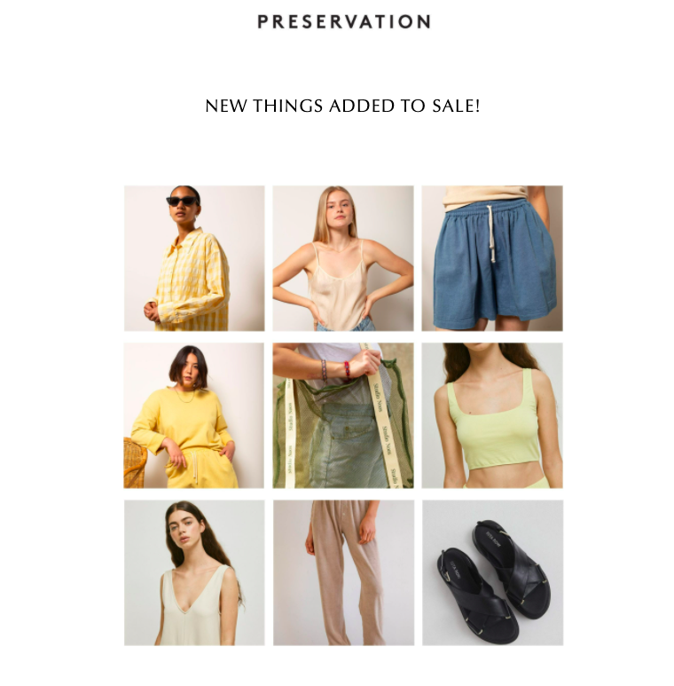
We love the collage that Shop Preservation included in their recent marketing email. It has a consistent color palette, is very on-brand, contains their own images, and makes use of a generous amount of white space. Overall, it adds visual interest without coming off as too much.
If elegant minimalism was a collage, this would be it.
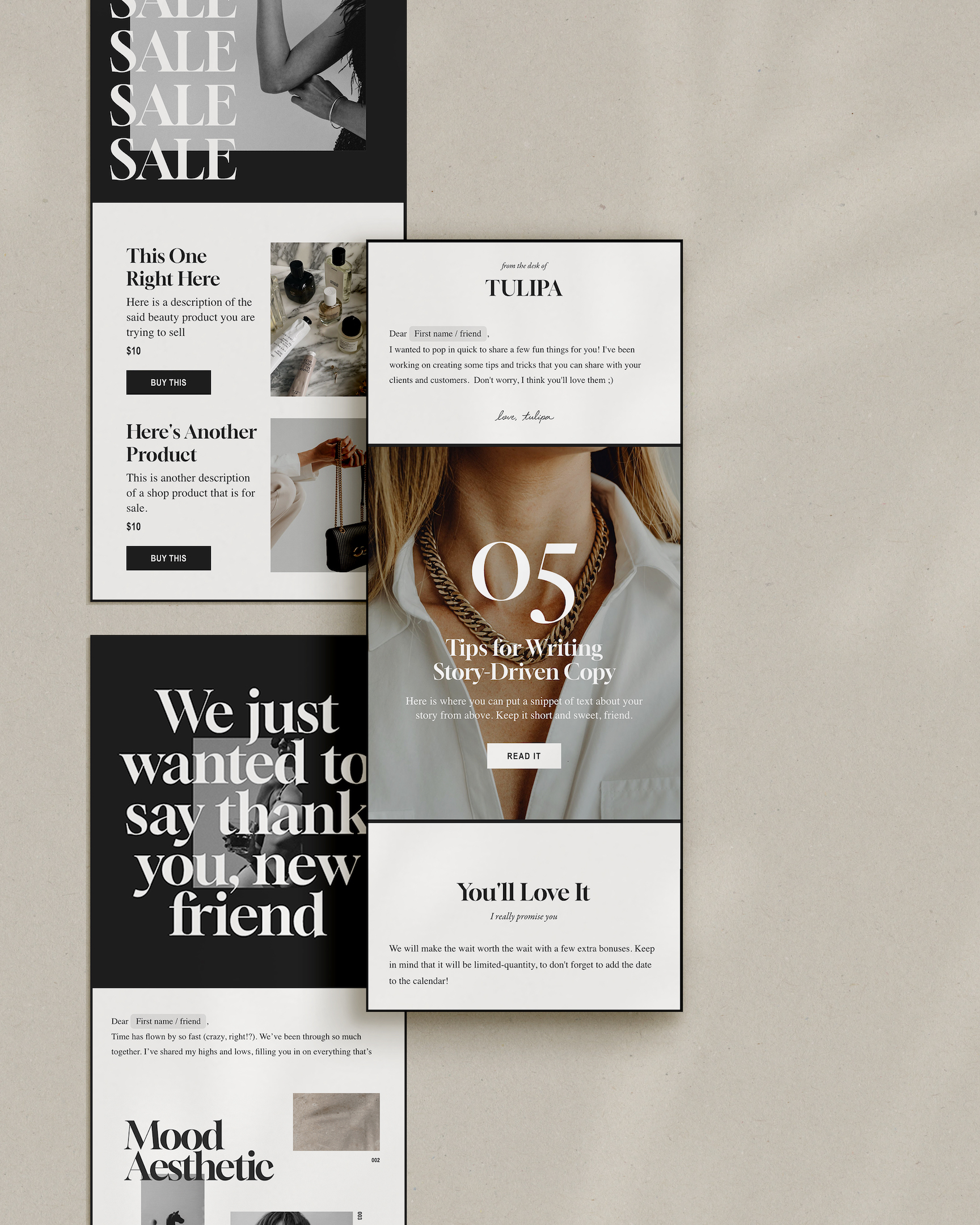
Want to create collages in your emails? With Flodesk’s proprietary Layout blocks, you can create custom graphics and design collages right within the email builder—no third-party design software needed. Once emails are sent, Layout blocks render in a special way to ensure they’ll look great on any device in any inbox.
Get unlimited email sends & subscribers with Flodesk
We’ll never increase pricing because your email list is growing
2. Appeal to your subscribers’ senses
Just looking at a picture can transport you elsewhere mentally. That’s one of the most powerful things about imagery.
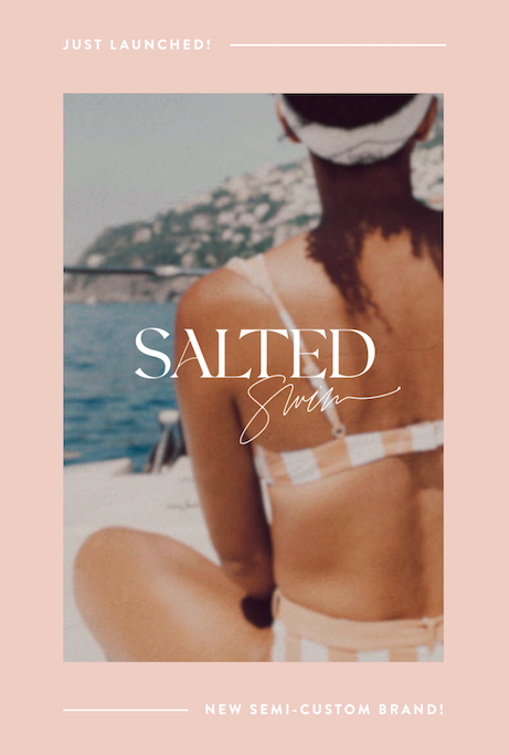
Take a look at the image above: a tanned woman in a bikini sitting on a boat looking out at the sea. A quick glance makes me feel like it’s summertime. I don’t know about you, but I can almost smell the sea air and feel the wind on my face.
Email graphics are incredibly useful because they allow businesses to connect with their customers’ senses. Describing a summery boat scene is one thing, but taking it in visually takes the experience to the next level.
This Saffron Avenue graphic is particularly captivating because they’ve appealed to their subscribers’ senses in a way that aligns with their brand. They’re selling swimwear, so it makes total sense that they’d want to put their potential customers in a summery mood and picture themselves wearing their bathing suits.
Of course, connecting with your subscribers’ senses can work in a variety of other contexts as well. For example, an outerwear brand would be best served by an email graphic in their fashion newsletters that shows a cozy winter scene and someone keeping warm in one of their coats.
3. Use captivating images
One of the most important parts of creating an email marketing graphic is image selection. Your image will make up a large part of the graphic and will have a big effect on how interesting it is to look at.
Ultimately, some images just stand out more than others. You’ll want to choose a picture that jumps out from the page, catches the viewer’s attention, and creates visual interest.
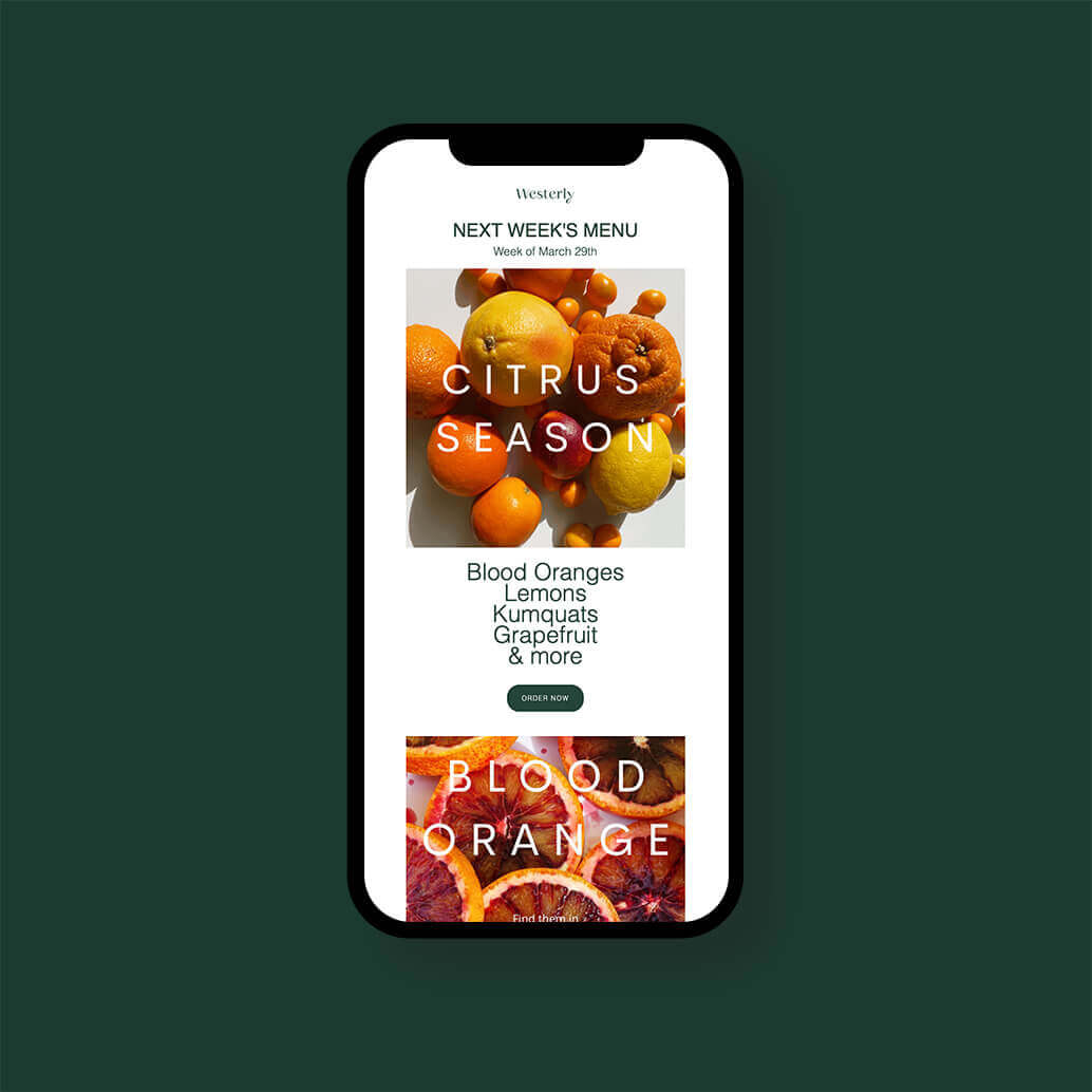
The two Westerly Kitchen examples above are eye-catching email graphics because of their engaging images. They’re high-quality, brightly colored, full of texture, and offer an unexpected perspective.
Even better, they also relate back to Westerly Kitchen’s business model because they’re showing the seasonal ingredients that are used in their meal delivery service’s recipes.
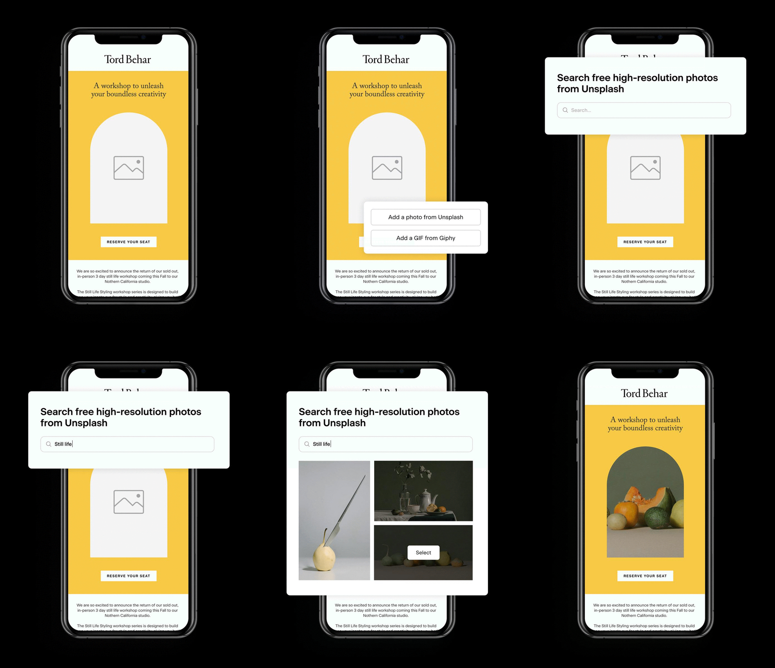
Get help choosing the right image with Flodesk’s Unsplash and Giphy integrations that allow you to browse, select and insert beautiful imagery and gifs within the email builder.
4. Be mindful of colors
The colors you choose for your email marketing graphics can have a big effect on how customers perceive them. Typically, bright colors come across as captivating, energetic, and optimistic. This leads to viewers having positive feelings when they look at your image. Stemming from this, marketing emails often opt for bright color schemes in their graphics for welcome emails or product emails.
On the contrary, companies often choose more neutral colors for their graphic design needs if they’re communicating more serious or somber information.
If you’re dreaming up a color scheme for your email graphics, it’s worthwhile to think about how email recipients might perceive it:
- Red: Passion, excitement & urgency
- Blue: Peace, security & reliability
- Green: Health, wealth, tranquility & nature
- Purple: Royalty, creativity, wisdom & respect
- Orange/Yellow: Cheer, optimism, enthusiasm & stress (when overused)
- Black: Authority, power, strength, stability & intensity
- Gray: Practicality, timelessness, solidarity, sadness (when overused)
- White: Purity, cleanliness, neutrality & safety
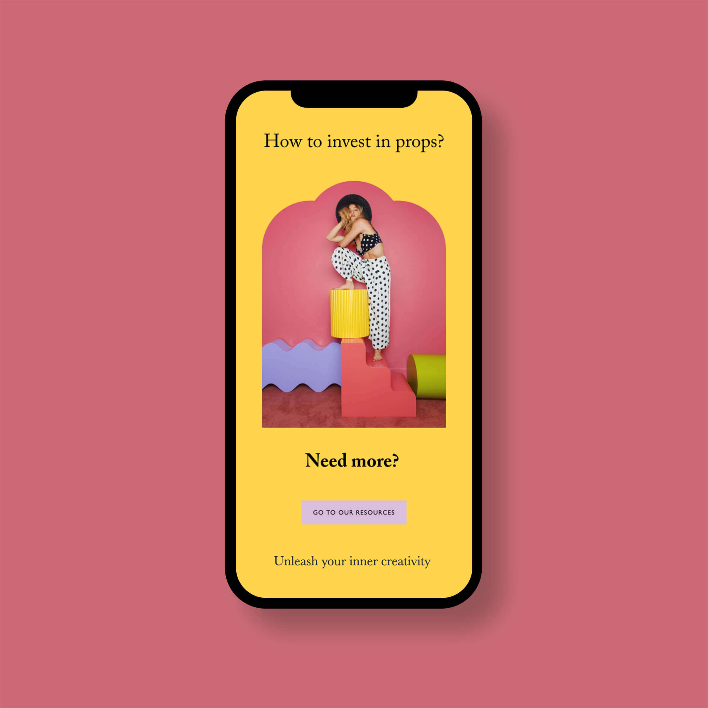
If you’re creating a graphic with bright colors, it’s also a good idea to choose colors from opposing sides of the color wheel. Moodelier is a great example of this because they’ve focused on yellow and purple in their email design. As you can see, the result is very pleasing to the eye.
Color is also a contributing factor to branding so it’s a good thing to keep in mind for your general marketing materials and digital marketing strategy. It’s even been shown that as many as 80% of customers believe that color is responsible for brand recognition.
5. Be different and memorable
When creating graphics for an email campaign, try to think of something that will stand out from the crowd. People receive so many emails nowadays (as many as 120 daily according to one study), so it’s extremely important to design something unique and memorable that will catch the reader’s eye.
Creating something different is easier said than done, but there are various ways to design something that’s specific to your brand. For example, consider using a quirky image, an unusual tagline or an unexpected pattern.
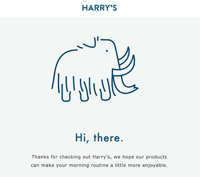
We love the Harry’s graphic pictured above because of how novel and unusual it is. The design is very minimal and uses a healthy amount of white space. The mammoth drawing isn’t overly complicated, but it’s cute and certainly isn’t something you see every day. It’s also consistent with their brand’s design elements as the same mammoth mascot appears in their other marketing materials.
Ultimately, if you see the same mammoth drawing in the future, you’d be likely to remember having seen it before and associate it with Harry’s.
As a final tip, if you want to create an email graphic that’s truly unique to your brand, it’s important that you use original images. If you use stock photography, you’ll run the risk of people seeing the same thing elsewhere.
6. Say exactly what you’re thinking
When you’re putting written content onto a graphic, you’ll need to keep things short and sweet. You won’t have much space to go on and on and your finished product will be most effective if you include as few words as possible on it.
This is especially important due to the ever-increasing usage of mobile devices. Almost half of emails are now opened on mobile phones, so it’s important for each email marketer to keep that in mind when creating graphics. Putting too many words on a graphic is never advisable and they’re even more difficult to process on smaller mobile device screens.
This Nuria Beauty graphic does a great job of getting straight to the point with their written content. They’ve provided four straightforward reasons as to why the reader should be exfoliating, and therefore consider using their product. We also like that they’ve highlighted the product image in their email graphic with a fun doodle. These kinds of design elements are very effective at drawing in a reader’s attention.
This is also a great example of an excellent email graphic for ecommerce newsletters because it would lead to a call to action seamlessly. As a general rule, your graphics should complement your copy and your central call to action.
7. Use bold text
When designing a perfect graphic for an email campaign, it’s important that it really jumps out at the viewer. The average person spends about 13 seconds looking at an email, so be sure those moments count and make an impact as quickly as possible.
This Fortnight Lingerie graphic does a great job of captivating their viewer in a couple of different ways. First of all, they’ve chosen a bold font in a large size so that their message can’t be missed. It’s also easily readable and stands out against their background image, which has a variety of different colors going on.
This graphic is also powerful because of the image they’ve chosen. Going back to our fifth point, it’s more important than ever to be unique and memorable in the email marketing world. Their image makes a strong impression as soon as you see it and it’s also not totally expected for a lingerie brand.
8. Be informative
When designed correctly, email marketing graphics present a unique opportunity to show off your products and educate your subscribers about them at the same time.
Even though it’s important to have a good balance between engaging copy and images in any digital marketing campaign, people typically don’t read the entire body of an email. In fact, they’re much more likely to skim it and stick to the images and headlines.
A good solution to this problem is by including key information on graphics, which typically hold people’s attention for longer. However, it’s important to do so carefully and make sure that you’re creating a graphic that’s actually readable (including on mobile devices) and doesn’t come off as too busy.
This Anián graphic does an excellent job of providing the reader with key information elegantly and concisely. They’re featuring one of their best-selling products and explaining some of its key attributes and selling points. This graphic works well because of its use of white space and clean, minimalist design.
9. Make sure your graphics are mobile responsive
As we’ve already mentioned in this article, mobile devices are increasingly important in the email marketing world. Whereas people previously preferred opening emails on their desktop computers, increasing numbers now end up reading them on their cellphones or tablets.
This trend makes it essential to create emails that are responsive and display properly no matter where your subscribers end up viewing them. The same goes for the graphics that you include.
It can be tricky to create your own templates and size your own images so that they look great on every device under the sun. Your best bet is to choose an email marketing software that does the hard work for you and makes sure that all your emails will be mobile responsive (hint hint, Flodesk).
We’re big fans of the graphic that James Street Co. created for one of their sales. It’s simple, elegant, and is sure to look great on any device.
4 tools for incredible email marketing graphics
There are lots of different tools out there that can help you make your email marketing graphic ideas a reality. Here are our four top picks, so take a browse and see which one would align best with your company’s needs.
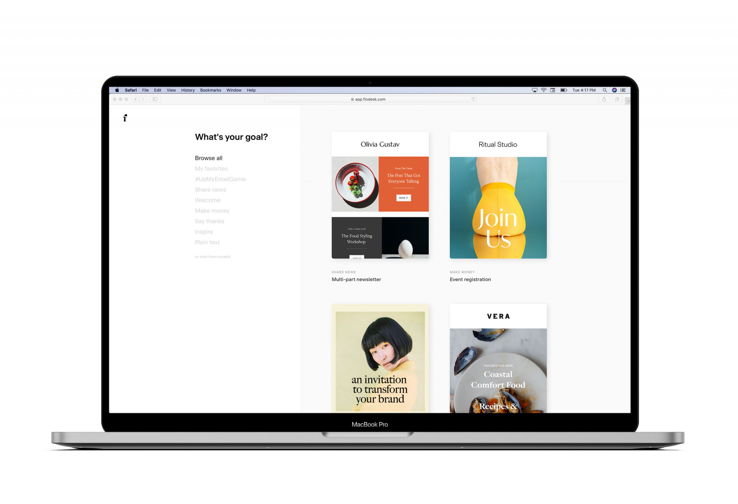
1. Flodesk
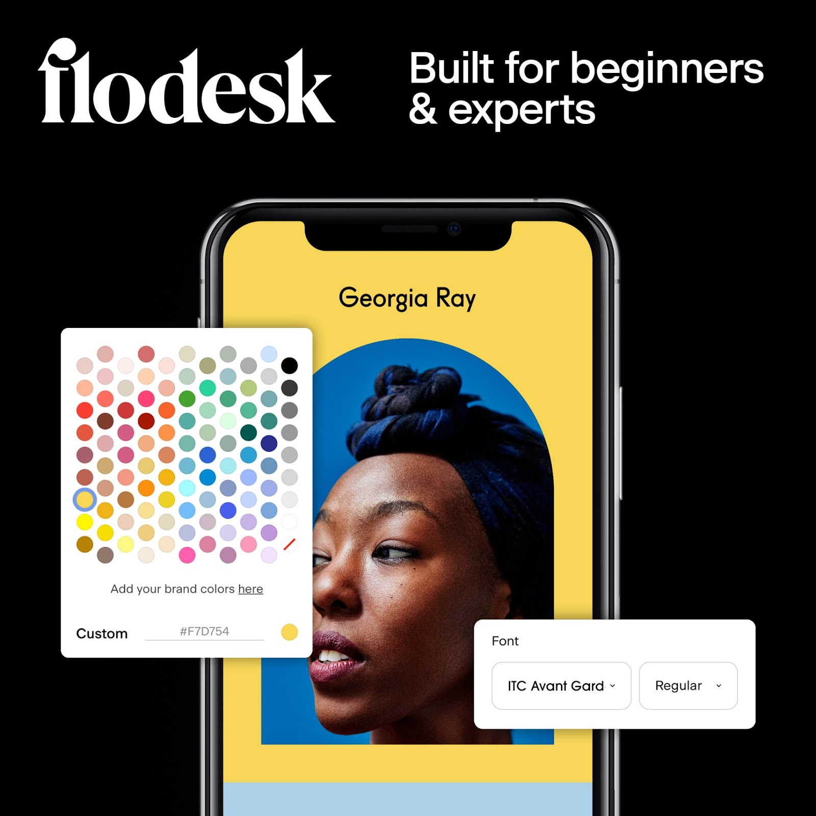
If you’re looking for an all-in-one solution that will tackle both your email marketing and email graphic needs, Flodesk is for you.
Flodesk is a relatively recent arrival into the email marketing game and it’s already the fastest growing platform out there. Designed specifically with entrepreneurs and small-to-medium-sized businesses in mind, they’re passionate about making it easy for anyone to create stunning email marketing content.
Equipped with gorgeous templates you won’t see anywhere else and an affordable flat rate of $38 per month, it only makes sense that they’re one of the most popular email marketing software out there.
One of the best things about Flodesk is the fact that they remove the need for any third-party design tools. Forget about having to design email graphics on platforms like Canva and then deal with downloading, uploading, and sizing them in your email campaigns. Flodesk enables users to create gorgeous built-in visuals without ever leaving the platform.
Get unlimited email sends & subscribers with Flodesk
We’ll never increase pricing because your email list is growing
Excellent design is one of Flodesk’s biggest values so you can rest assured that you’ll always be able to create graphics that are unique, modern, and totally on-brand.
Flodesk has a 30-day free trial if you want to try out the platform for yourself. Just click here to sign up with no strings attached.
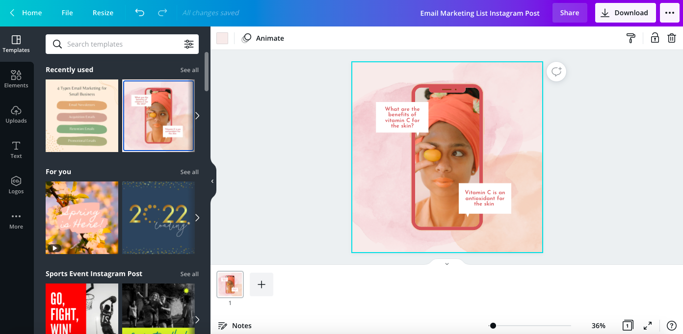
2. Canva
Canva is one of the most widely-used graphic design platforms on the market right now. More than just creating email graphics, their design tools allow users to create all kinds of visual content. Here are just a few examples:
- Social media posts
- Logos and icons
- Posters and flyers
- Infographics
- Charts, graphs & mind maps
- Business cards
- Greeting cards and invitations
- Reports
…the list goes on. Basically, if you need to design any kind of visual content, you can probably do it on Canva. Canva is also popular because it’s very beginner-friendly. You certainly don’t need designer experience in order to create some beautiful graphics on their platform.
Canva is particularly straightforward to use because they have an incredibly wide range of templates you can use to create any kind of visuals you can imagine.
Canva is also a free tool, at least when you get started. You can use their free plan for as long as you like, but it has a lot of limitations. Their pro plan allows you to access their full range of features and costs $12.99 monthly.
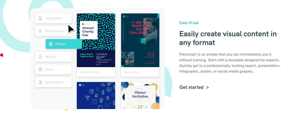
3. Piktochart
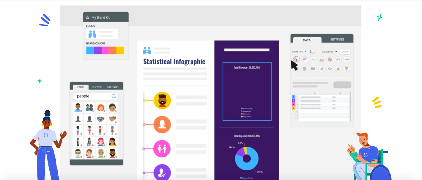
Piktochart is another online graphic design tool that’s designed with beginners in mind. Their platform makes it easy for anyone to create an account and put together stunning visual content with minimal time and effort.
Although Piktochart can certainly be used to create email marketing graphics and other digital marketing content, it’s more popular when it comes to designing reports, presentations, and other similar visuals. For instance, Piktochart gives users the ability to create many different kinds of charts and graphs, including:
- Line graphs
- Bar graphs
- Donut charts
- Pie charts
- Scatter plot charts
- Comparison charts
Like Canva, Piktochart also has a variety of templates intended for everything from infographics to posters to presentations to flyers to social media graphics.
If you’re interested in giving Piktochart a try, they’ve got a free forever plan you can take for a spin. It’s the perfect resource to help you get to know their platform better. If you like what you see, their pro plan starts at $24 per member per month.
4. Venngage
Venngage is another great graphic design tool that’s perfect for people of all skill levels. Similar to Piktochart, their platform can be used to create great email marketing graphics and images, but it is more widely used in the business world for things like presentations, infographics, and reports.
There are a few special things about Venngage. First of all, we like that they’ve designed their platform with tons of different professional contexts in mind. Just check out all the different industries that use Venngage:
- Marketing
- Human resources
- Training and development
- Operations
- IT and engineering
- Project management
- Sales
- Healthcare
- Finance
….pretty impressive, right? We also love that Venngage has a large variety of templates to help new users get started as well as an extensive library of virtual resources.
Venngage has a free plan that you can use to get going on your first few designs. If you’d like to take things a step further, their paid plans range between $16 and $39 per month depending on the specific features you’d like to use.
Create your own eye-catching email graphics
The world of email marketing graphics is wide, and we’ve only just dipped our toes in with this article. We hope that our insights, tips, examples, and tool suggestions have made you feel equipped to start creating your own email marketing graphics with confidence.
We might be biased, but Flodesk can help you create some seriously beautiful email marketing graphics. Excellent design is one of our core values and we’re passionate about helping small to medium-sized businesses take their success to the next level with our beginner-friendly, affordable, and powerful email platform.
Click here to give our 30-day free trial a try.
