10 Travel Newsletter Examples & Writing Tips
Table of Contents Jump to:
Jump to:
Table of contents
It’s estimated that between 8,000 and 20,000 planes are in the sky right now. Given that 50% of these planes are commercial people carriers able to take around 200 passengers, that’s between 800,000 and 2,000,000 people zooming overhead at all times.
Whether it’s discounted seats or guidance on road trips you’re offering, there’s a lot of people booking travel every single day.
A beautiful travel newsletter could turn those travelers into your travelers. Whatever you offer in the travel industry—be it experiences, retreats or route plans—it’s essential to reach your audience with relevant information, updates and offers.
We’ve put together this list of ten travel newsletters to show you how you can wow subscribers with sleek travel newsletters. Our examples are a collection from fellow entrepreneurs and small businesses that put their own twist on travel newsletters—much to their subscriber’s delight.
Here are the ten travel newsletters we’ll be talking about today:
- 7 Wayfinders
- Meera Lee Patel
- SUITCASE Magazine
- Much Better Adventure
- Judy
- Roadtrippers
- Dorsia
- Francisco Yoga
- Bright Nomad
- DialAFlight
They’ve put the work in so we don’t have to—plane and simple. Keep reading to find out more about how you can ensure only first-class emails are touching down in your subscribers’ inboxes.
Buckle up.
Get unlimited email sends & subscribers with Flodesk
We’ll never increase pricing because your email list is growing
If you operate in the travel industry but have yet to start sending out a newsletter, here’s why you should.
Engage your audience
The travel industry’s average email open rate is 16%. The average click through rate is 6%. With guaranteed deliveries and engaging content, you’re in a strong position to change that.
Creating engaging and relevant content to share with your audience is hugely beneficial to your overall business goals. If nurtured, it’s a consistent point of contact via which you can share any news, updates or offers you wish to communicate.
In fact, 81% of B2B marketers say their most used form of content marketing is email newsletters and 31% say it’s the best way to nurture leads. Email marketing creates space to share whatever you want with your audience, to keep them engaged and interested in your brand.
Increase website traffic
Sending out a travel newsletter is also a great way to direct traffic towards your webpage—or any other custom resource for that matter. Strategically created emails encourage readers to click through to your website and continue their search in a place that’s designed to convert.
However, it’s important not to overdo it. Too many emails with demanding calls to action (CTAs) will get you a one-way ticket to the spam folder.
Build trust in the industry
Building trust among customers and leads alike is key for ensuring business growth. Recommendations and positive word of mouth (WOM) are essential for smaller businesses looking to make waves, and beautiful emails and newsletters are a great way to make an impact.
Consistent delivery means recipients slowly begin to expect your travel newsletter as part of their weekly influx of emails. It’s what’s in those emails that ensures they begin to look out for it.
Use the opportunity to showcase an intimate side of the business—one that clients don’t typically get to see. This consistent, on-time delivery and exclusive access build up industry recognition and trust in your brand.
A great travel newsletter includes personalized fields, user-generated content, clear CTAs and is optimized for mobile. The precise content and layout really depend on your brand and product, and what you’re looking to achieve with your email.
Newsletters, like any other part of your business, are unique to your product and vision. A travel newsletter should be an extension of your brand—you want it to be instantly recognized by your subscribers. Here are some tips on where to start.
For more, check out our post on what to include in a newsletter!
Personalize your emails
Email personalization is a quick and simple way to increase your newsletter engagement. In fact, 82% of marketers reported an increase in open rates when sending out personalized emails. It’s a bit of a no-brainer, really.
Personalization doesn’t just mean Dear {FirstName}, however. There are ample ways to personalize your newsletter, such as:
- Dynamic content: is email content that changes based on the subscribers’ data and preferences.
- Triggered messages: are sent automatically based on pre-established conditions met by a subscribers’ actions or behaviors in your email workflows.
- Send-times: play an important part in newsletter open rates so ensuring your emails are time-zone adjusted is essential.
Include user-generated content
User-generated content (UGC) can be anything from photos of clients enjoying your product or service to reviews of their experience with your travel organization. Including it in your emails is a way to showcase genuine appreciation for what you’re providing—from one client to another.
There are many ways in which you can collect user-generated content. A great place to start is online and in social hashtags—yes, we’re suggesting you google yourself. Users often take to social media to share their travel experiences and recommendations, so see what your clients are saying and sharing.
Alternatively, you could encourage UGC by asking individuals to send photos of them interacting with your product or experience. A competition or giveaway that requires users to send their UGC in is a great way to do this.
UGC also does wonders for your reputation. When it comes to securing new clients, 84% of consumers say they trust peer recommendations and reviews over other sources of advertisement. Showing your audience how others are enjoying your products or services is key to creating a great travel newsletter.
Optimize for mobile
Mobile clients account for 41.6% of email opens so it’s super important to optimize your content for mobile devices. Responsive email templates make this a lot easier so make sure you’re using one for your travel newsletter. Here are a couple of other points to consider when optimizing for emails on mobile:
- Subject line and preview text: you’ve got substantially less space to say what you want to say. A good character count to aim for is about 30 characters.
- Break up text: don’t overdo it on the copy front as a smaller screen can make your email look crowded. Make blank space your friend.
Clear CTAs
Finally, clearly directing your subscribers to action is key in meeting your email newsletter goals. Every email is sent out with an intention; whether that’s getting clicks on an affiliate marketing link or updating your subscribers on a sale.
Whatever your goal is when sending out a newsletter, make sure your CTAs help you reach them. CTA buttons attract 28% more clicks than hyperlinks. But, don’t overdo it—your subscribers will be overwhelmed by choice and end up picking none.
Here are a couple of things to consider when designing and placing your CTA button:
- Size: catch the reader’s eye in a way hyperlinks can’t
- Design: make it stand out by adding gradients, shadows and other effects
- White space: allows for readers to spot your CTA with no distractions
- Color: color doesn’t just help a CTA to pop, color psychology can play a key role in evoking an emotion and reaction from a subscriber
Read more: How to monetize a newsletter
Now that we’ve looked at why you need a travel newsletter and how best to go about it, we’re ready to dive into our favorite examples to inspire your own.
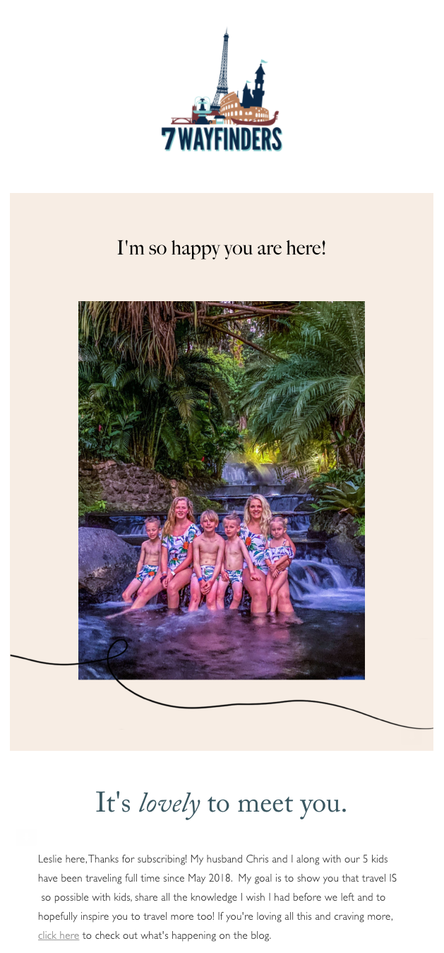
1. 7 Wayfinders—driving web traffic
This family of seven travel the world and share their experiences doing so. Leslie and Chris use the newsletter to share the good and the bad of their journey, as well as provide some top tips on how others can take the leap.
Why does it work?
Their travel newsletter is focused on inviting people in to discover more about the experience and how they can also manage traveling with kids. This travel newsletter isn’t trying to sell anything—it’s instead encouraging subscribers to take a look at their latest blog post. Their goal is to drive web traffic and engagement.
The newsletter follows their family-orientated brand and engages subscribers with personal, new blog posts and supporting content from the get-go. The simple and sleek template allows them the space to get their message across seamlessly.
2. Meera Lee Patel—nurturing community
Meera Lee Patel is an artist and author who creates work to inspire and encourage people on their journey of self-exploration. While Meera Lee doesn’t center her offerings around travel, this email is a great example of a travel newsletter looking to invite participants on an exciting journey.
Why does it work?
The intent of a newsletter impacts the chosen template and this travel newsletter is no different. It’s more copy-heavy as there’s more to communicate. Meera Lee has also added an element of exclusivity to their travel newsletter. The travel offering—in this case a holistic retreat—has been shared with subscribers first.
This is a great example of how a travel newsletter can be used to nurture an existing community.
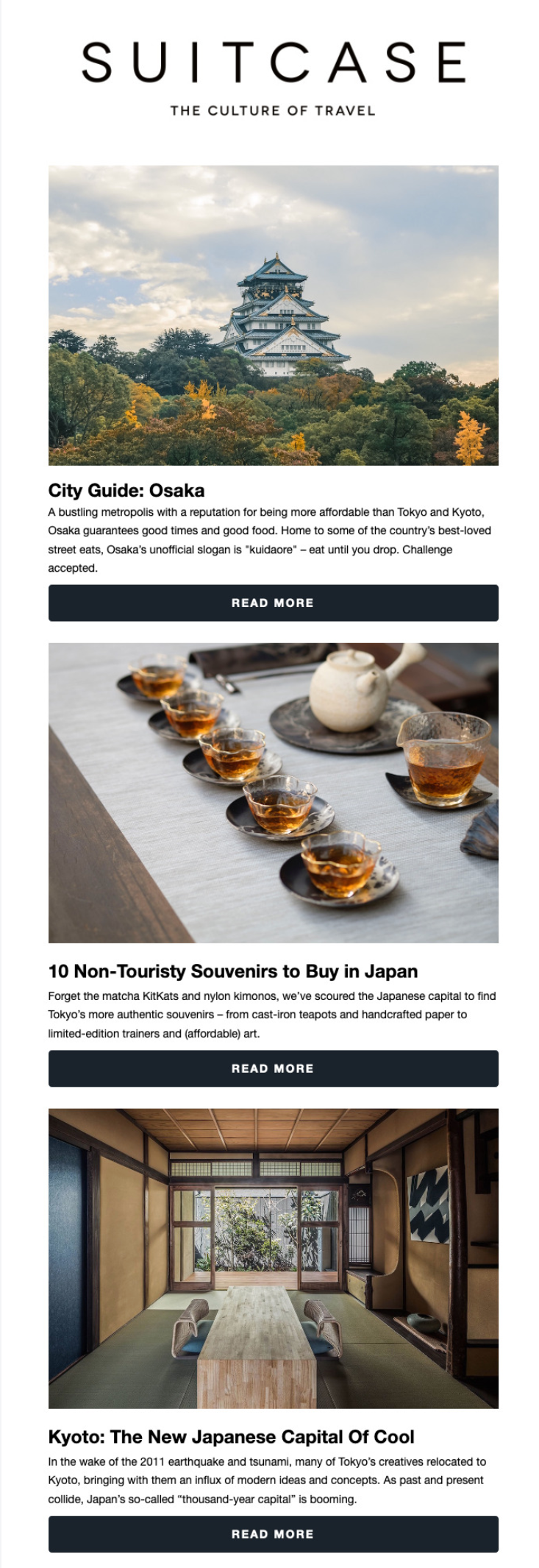
SUITCASE Magazine is another travel newsletter delivering high-quality emails to its subscribers. The simple template makes space for the location images it’s presenting—in this case, Osaka, Japan.
Why does it work?
Promoting an experience or trip is very visual—people want to know where they’re headed and what they’d see. In general, emails that include some sort of graphic have a higher open rate and CTR than their text-oriented counterparts.
A couple of lines of copy support the images, and clear CTA buttons guide users to the next step: heading to the next stage of the funnel and reading more.
Get unlimited email sends & subscribers with Flodesk
We’ll never increase pricing because your email list is growing
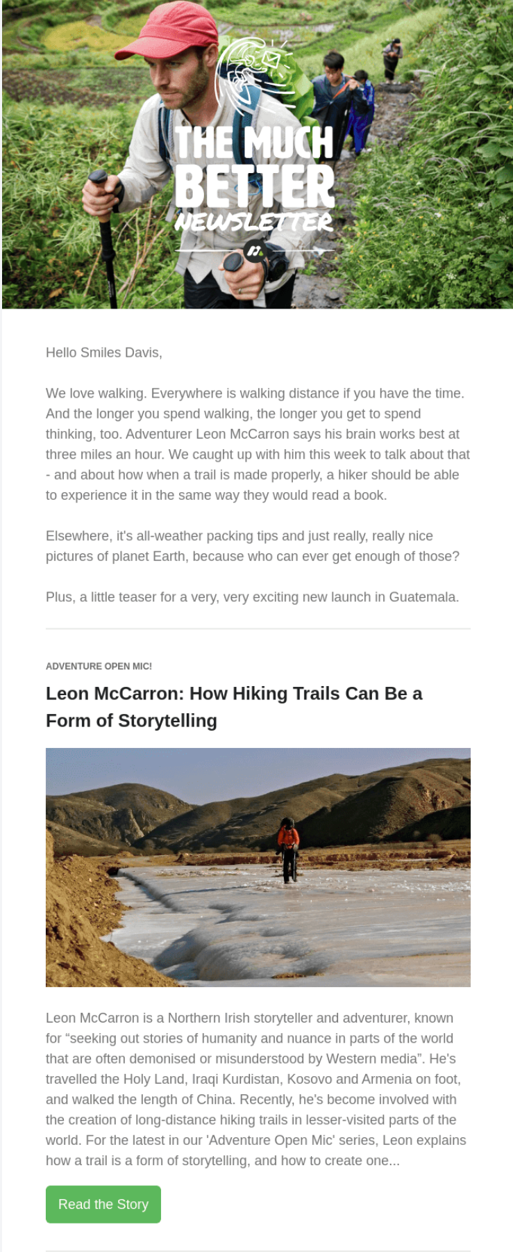
4. Much Better Adventure—ample user-generated content
Much Better Adventure delivers exciting travel and adventure news and relevant information in its travel newsletter. It’s about sharing experiences with subscribers and inspiring them to embark on their own journeys for their next vacation. This newsletter is full of breathtaking images and access to new blog posts about the locations on display.
Why does it work?
Traveling is about breathtaking experiences. That’s why UGC is so beneficial here. Including personal travel pictures show users there’s a real person behind the newsletter, and that it’s real experiences being shared within.
Taking the leap is a lot easier when you can see others just like you doing the same. Having UGC at the heart of this travel newsletter is letting people do just that.
5. Judy—adding instant value
Judy is a company helping people prepare for disasters and emergencies. Whilst they’re not necessarily a travel company, lots of their offerings revolve around traveling safely. This travel newsletter is packed with value for subscribers and promises even more in the full guide.
Why does it work?
The eye-catching graphic and bold copy sit beautifully in any inbox and the inclusion of the six top travel tips in a snowstorm is a smart move. By including these helpful tips, subscribers are able to get something for nothing. They’ve simply opened the email and been presented with value.
White space and bright color contrast nicely to create an enjoyable reading experience. The high-quality, valuable content almost feels like an added bonus.
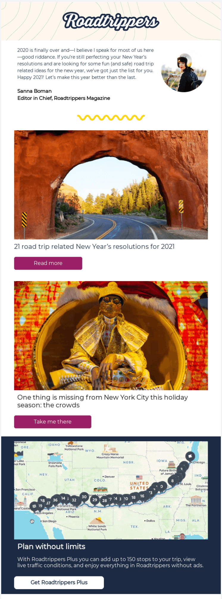
6. Roadtrippers—a familiar face
Roadtrippers is a route planning tool used by many to plan car trips and experiences across the US, Canada, UK and Israel. Its travel newsletter is one of the few to open with a note from a familiar face instead of just an image.
Why does it work?
Presenting a face and name people can trust at the beginning of every newsletter creates a sense of security in the brand. It gives you the chance to build a deeper connection with your subscribers—one they’ll look out for in their inboxes.
This trust is essential for Roadtrippers. The software takes people from A to B but it needs to ensure it does it safely and securely.
More importantly, users and subscribers need to perceive it as a safe and secure service. If you don’t trust the software leading you 2,000 miles across the continental U.S, you’ll likely abandon ship.
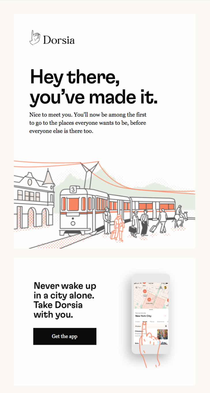
7. Dorsia—an automated email
Dorsia creates travel itineraries for cities across North America, Europe and Hong Kong. They find activities across your city of choice and curate itineraries depending on the type of stay you’re looking for.
An organization that sends personalized content to its users relies on automation and personalization in its email marketing. Their travel newsletters look different depending on where you’re heading or have been.
Why does it work?
This welcome email is just the start, but it does a great job of saying hello. Dorsia focuses on a visual approach to email marketing and uses the welcome email as an opportunity to push the app.
A glance at their website will also confirm their branding is consistent throughout its communications. Illustrations and the newsletter header are simple and travel orientated and overall great visuals by which users remember the brand.
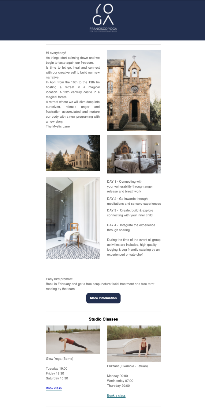
8. Francisco Yoga—a travel experience
Francisco Yoga’s recent travel newsletter focuses on an upcoming experience for subscribers to take part in. A newsletter like this one calls for ample picture space as well as sufficient space to explain the offering.
Why does it work?
This travel newsletter template meets both of the above criteria and creates space for recognizable branding, in this case, the logo. Subscribers know who it’s from instantly, and the template shows them what it’s about at a glance.
They’re likely to have heard about this opportunity via other channels but it’s important to further communicate the experience and its offerings for subscribers.
9. Bright Nomad—a travel update
Bright Nomad shares the experiences of Tal Bright, owner, as she adventures around the world. It’s a personal travel newsletter that intends to inform and entertain people. It’s a community update of how things are going.
Why does it work?
This template places buttons to other social channels at the very top of the template. This ensures subscribers know they’re there without having to look for them and encourages people to look further into Tal’s adventurous lifestyle.
People are inquisitive and curious and nosey. That works for your business. Encourage them to scroll through your travel content, it’s there for a reason.
10. DialAFlight—optimized for mobile
The final travel newsletter example on our list is from DialAFLight, which specializes in travel booking and management. This travel newsletter is to update subscribers on current travel regulations and the latest news.
It’s an essential send-out for this organization that gets to the point straight away. Subscribers know exactly what to expect from the get go.
Why does it work?
The template is ideal for sharing updates and the airplane window-style images nicely suit the industry and brand. The lack of buttons here—if they’re able to communicate everything in the newsletter—is a win. Readers aren’t tempted to click away before receiving the full update—smart.
This is also a great example of an email that’s been optimized for mobile. The template—that separates the content into blocks—breaks down easily to ensure a great viewing experience on mobile.
Have a look at these top Mailchimp alternatives to find the best tool for designing beautiful, mobile-friendly newsletters.
Let’s sum it up
With our top tips and examples, you’re sure to be creating quality travel newsletters in no time. Just remember: your template depends on what you’re looking to achieve. Don’t just pick the prettiest.
When it comes to creating amazing travel newsletters, focus on what makes them great. Personalization, UGC, mobile-friendly templates and clear CTAs will all help you on your way to creating engaging travel newsletters people can’t help but click.
Consider what you want to achieve with your newsletter as this will inform your other decisions—like template and copy, personal note vs. no personal note, copy-heavy vs. picture-heavy. The list goes on.
We’re certain these examples and tips will get you ready for your travel newsletter take-off. If you’re interested in both effective and beautiful, try Flodesk and begin creating purposeful, affordable emails, to help take your business, and subscribers, to new heights.

