Rebranding Flodesk: a return to our roots
Table of Contents Jump to:
Jump to:
Table of contents
A great rebranding is less about remaking your identity and more about becoming closer to who you already are.
That’s why the following isn’t a breathless exposé about how we decided to go in a new direction or remake Flodesk as something new; rather, it’s the story of how we got back to who we were in the first place.
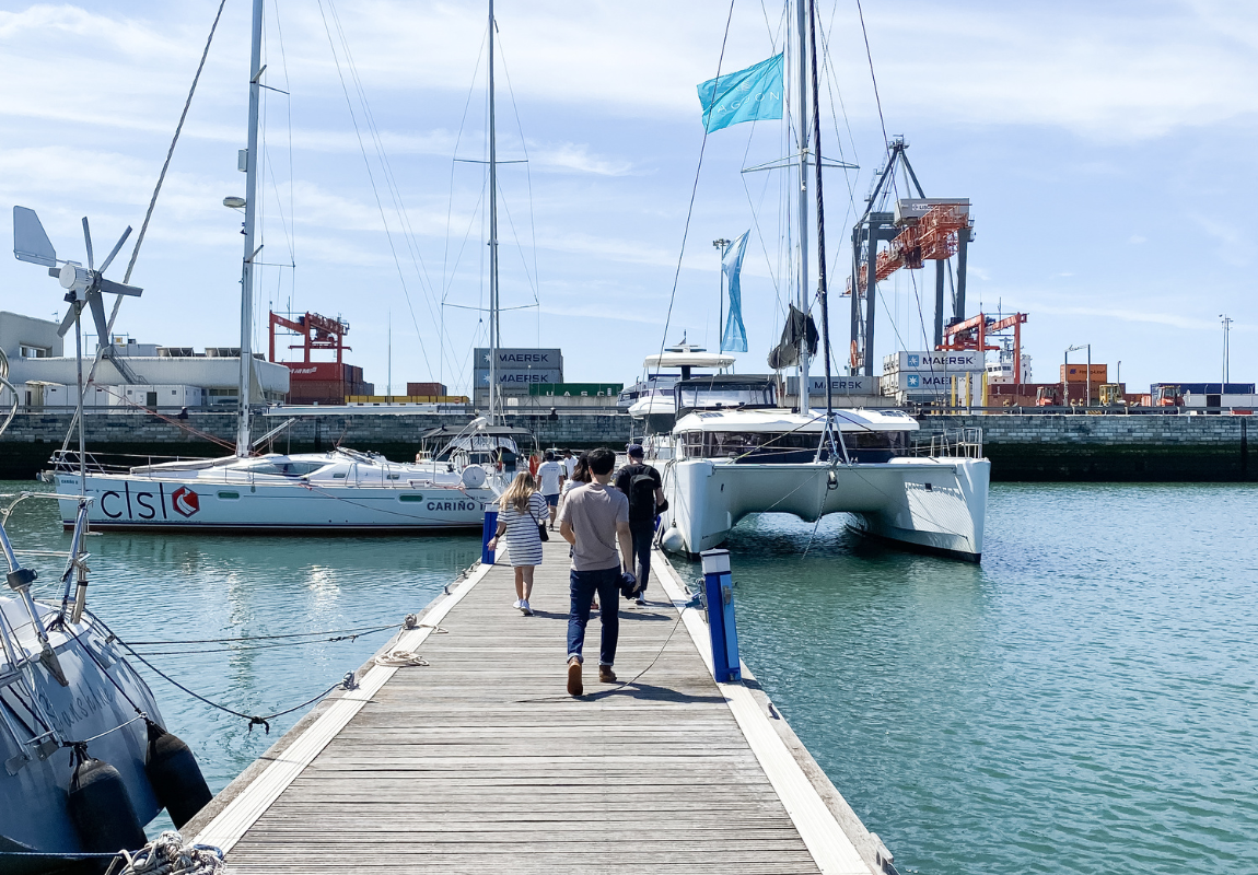
When I brought up the idea of a brand refresh to the Flodesk leadership team in the Summer of 2022, it was a casual conversation on a sailboat in Lisbon about how, from a brand perspective, we had drifted from the original vision of Flodesk—and we needed to do something about it. I wanted to go forward by reflecting back; refreshing our identity based on the concepts and vision that brought us early success.
Our early vision
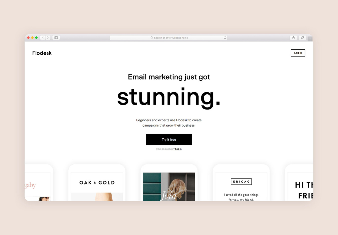
We launched in 2019 with a tiny team, no funding, and no PR launch. We had a product that was still firmly in beta, missing many of our competitors’ features. The only expression of our “visual identity” was a simple landing page my co-founder Martha and I had designed in Photoshop sitting on the shag carpet of her San Francisco apartment.
Original Flodesk website, 2019
But even though Flodesk was only a very beta SaaS product and a basic landing page at that time, there was a brand vision—a solid conceptual foundation of five pillars—guiding our early decisions.
Radical minimalism
This idea continues to guide our every decision. Don’t ask, “What can we add?” but instead, “What can we remove?”
Richard Neutra
One of Flodesk’s initial inspirations was the midcentury architect Richard Neutra, who believed minimal, clean design didn’t just look beautiful—it could actually improve your health. We asked: what would it look like to apply this same idea to software?
Ritual yoga
In the very early days, Martha and I frequented a yoga studio in San Francisco that talked about creating rituals in your life. We asked ourselves: how could we make the software experience a ritual rather than a habit?
SFMoMa
We also often visited SFMoMa. These visits inspired the idea that our brand—and product—should be a blank gallery where our members’ creations hang, taking the spotlight. We are the minimal container, not the artwork.
Aesthetics of the small business community
The creative small business community has a look. It’s light and bright, visual, and organic, with many serifs and personal touches in the brands. We tailored our original templates, design vision, and brand to reflect the people we serve.
The brand project: balancing community, function, and flow
I felt strongly that if we were going to spend the time, money, and effort to refresh our visual identity (and have it last for many years to come), the new brand needed to be rooted in these five original pillars.
I also knew that we couldn’t do this alone. We needed an outside firm to help us sharpen and articulate who we are at our core, then express it in an original and rigorous visual system.
There was only one partner for this project: DIA Studio. The firm’s founder, Mitch Paone, was a longtime friend of mine who has since become a bit of a celebrity in the tech branding space. I remembered the lively conversations we used to have about design, typography, history, and branding over the years—and I was so excited when he and the talented team at DIA agreed to take on our project.
Collaborating with DIA in Geneva
What makes DIA stand out as a top modern branding firm is how they apply rich historical design foundations into a dynamic and screen-based world—exactly what Flodesk needed. Instead of the usual PDF of colors, type sizes and a logo, DIA delivers a full suite of custom toolkits and templates utilizing After Effects and Figma, and complex typographic guidelines that our internal design team can easily activate—and really work to maintain consistency in a modern digital brand. On top of that, they’re also just super talented, awesome human beings.
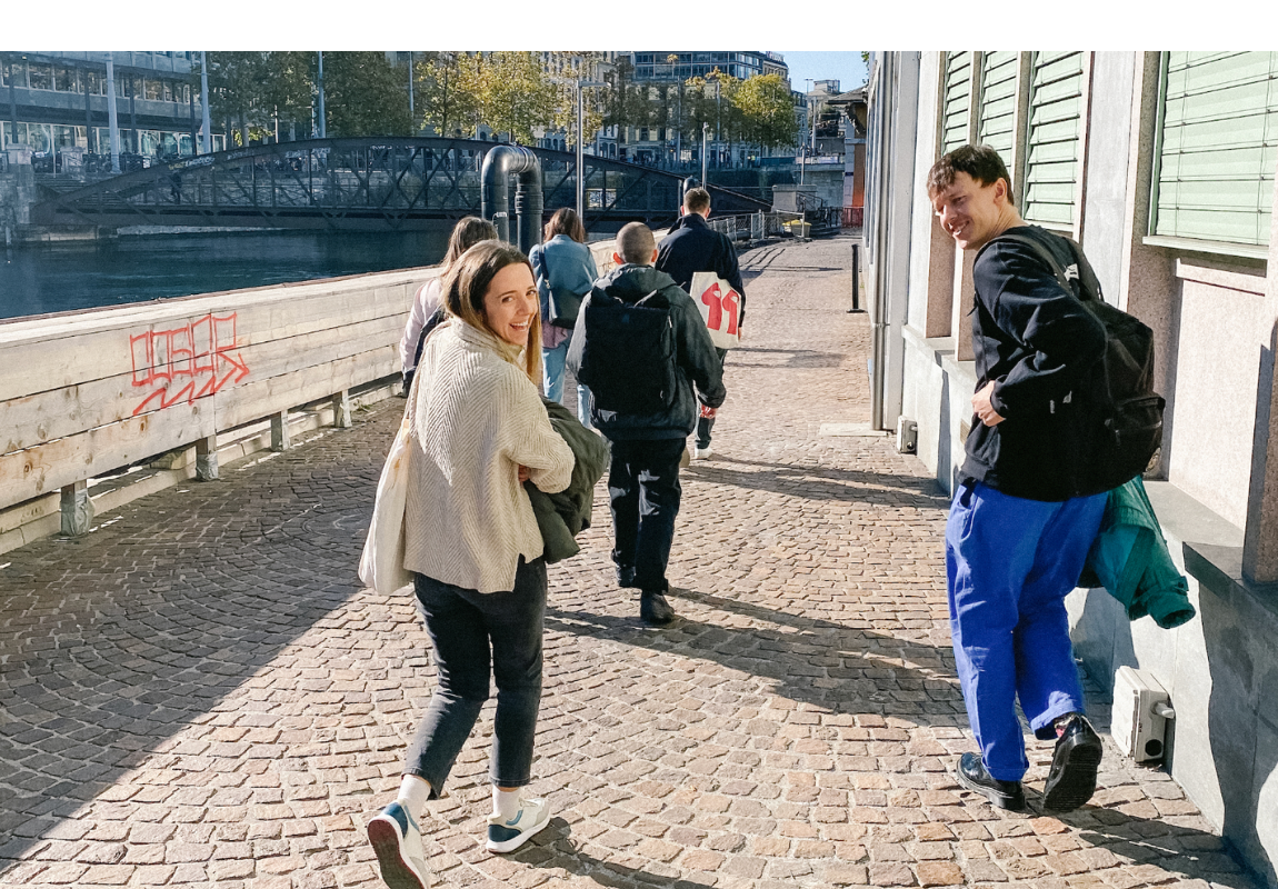
Our small team collaborated with their small team for over a year. The project took us through countless iterations, conversations, and a trip to Geneva.
Flodesk and DIA in Geneva
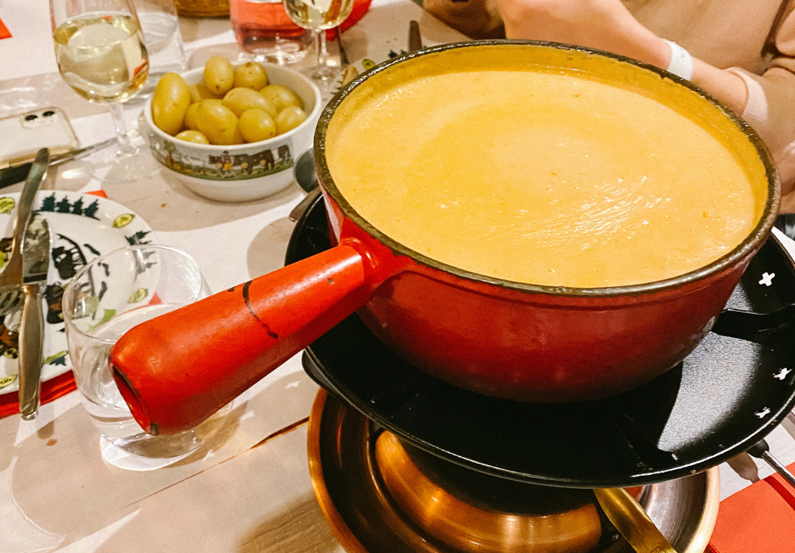
We had real Swiss fondue (a meal I’ll never forget) and stellar hot chocolate.
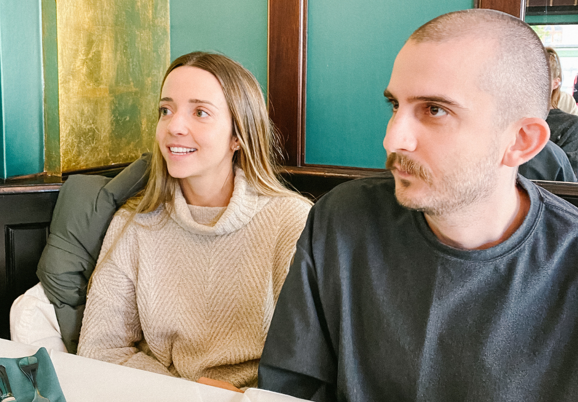
Claudia Aran and Hayk Ananyan
And best of all, we got to work with renowned font foundry Optimo on custom typography for Flodesk.
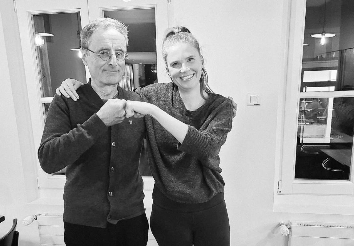
We were fortunate enough to have Optimo’s François Rappo—a legend in the type design world—agree to personally take on our project. Yes, I fangirled a little—but I also taught him how to fist-bump.
Rebecca Shostak and François Rappo
The original commission included only one typeface, but the team at Optimo was so enthusiastic about how Flodesk Sans had turned out that they volunteered to customize one of their signature serifs so that the two fit perfectly together. In the end, Optimo created not just one but two custom typefaces just for us: Flodesk Sans and Flodesk Serif.
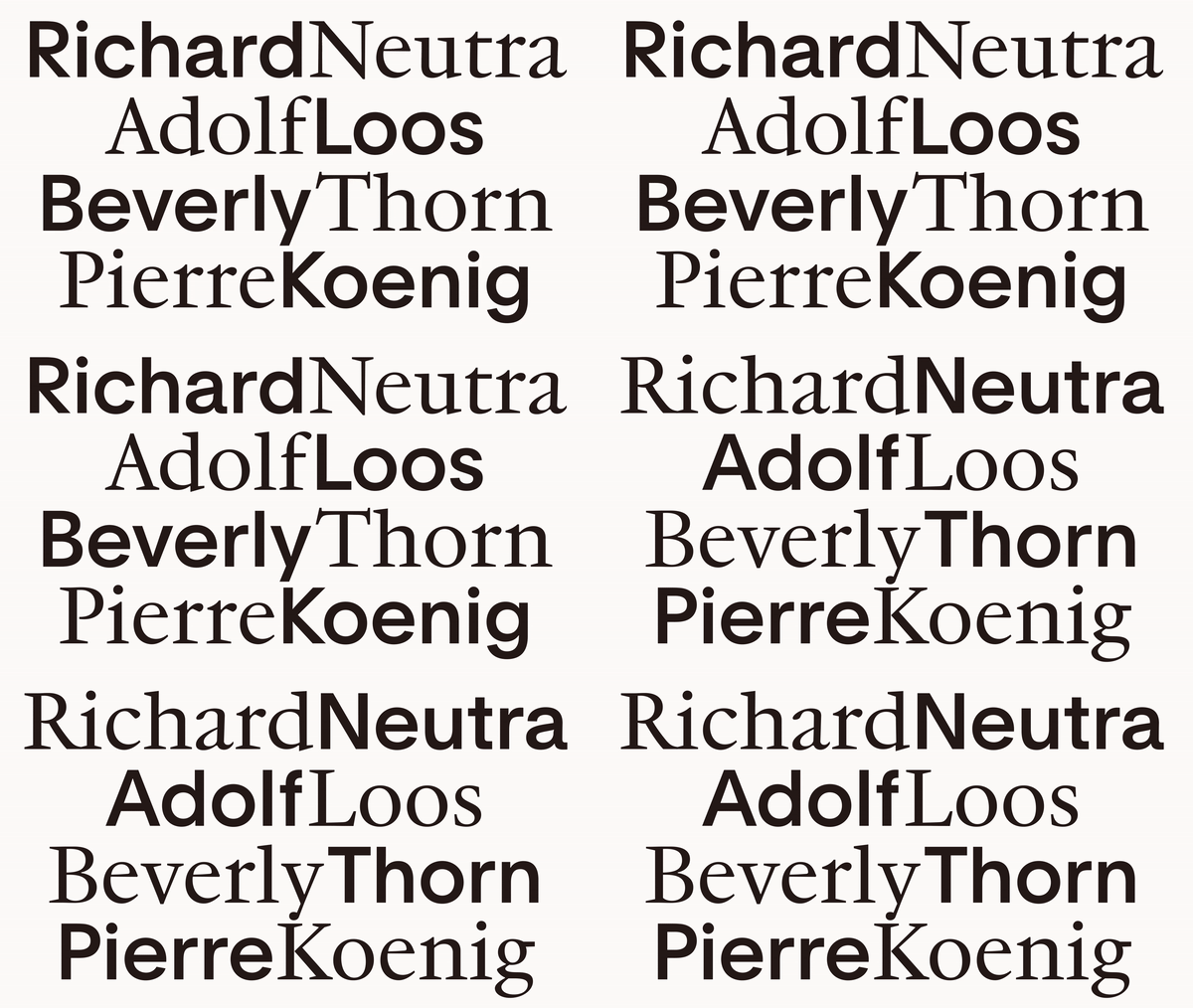
Flodesk Sans & Flodesk Serif
Flodesk Sans represents the minimalist, rational, design-driven functionality that Flodesk is known for. Invigorated by our brief based on historical references rather than the typical “make a font that looks like this other tech company we want to copy,” François reached deep into his drawer of type specimen booklets spanning back a hundred years to bring us a highly functional grotesque that performs beautifully at both large and small, UI-sized scale.
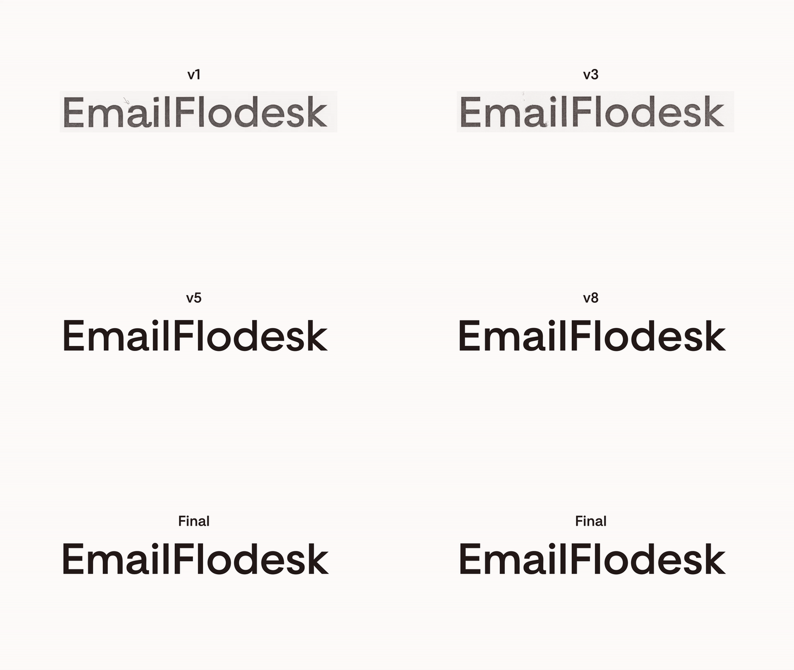
Flodesk Sans Evolution
Mitch Paone writes, “[ Flodesk Sans ] taps into the antique feel of late 19th-century grotesques combined with geometric forms closely related to Richard Neutra’s architectural work. The result is something that feels contemporary while evoking its historical roots. The typeface functions seamlessly in all settings, from tiny product UI to large-scale branded collateral, without losing its aesthetic quality.”
Flodesk Serif was François’s updated twist on Optimo’s JJannon, providing an ideal pairing with its sans-serif counterpart. Flodesk Serif represents the authenticity of the Flodesk member base, offsetting the Swiss rigor of the sans, resulting in a softer, more human touch.
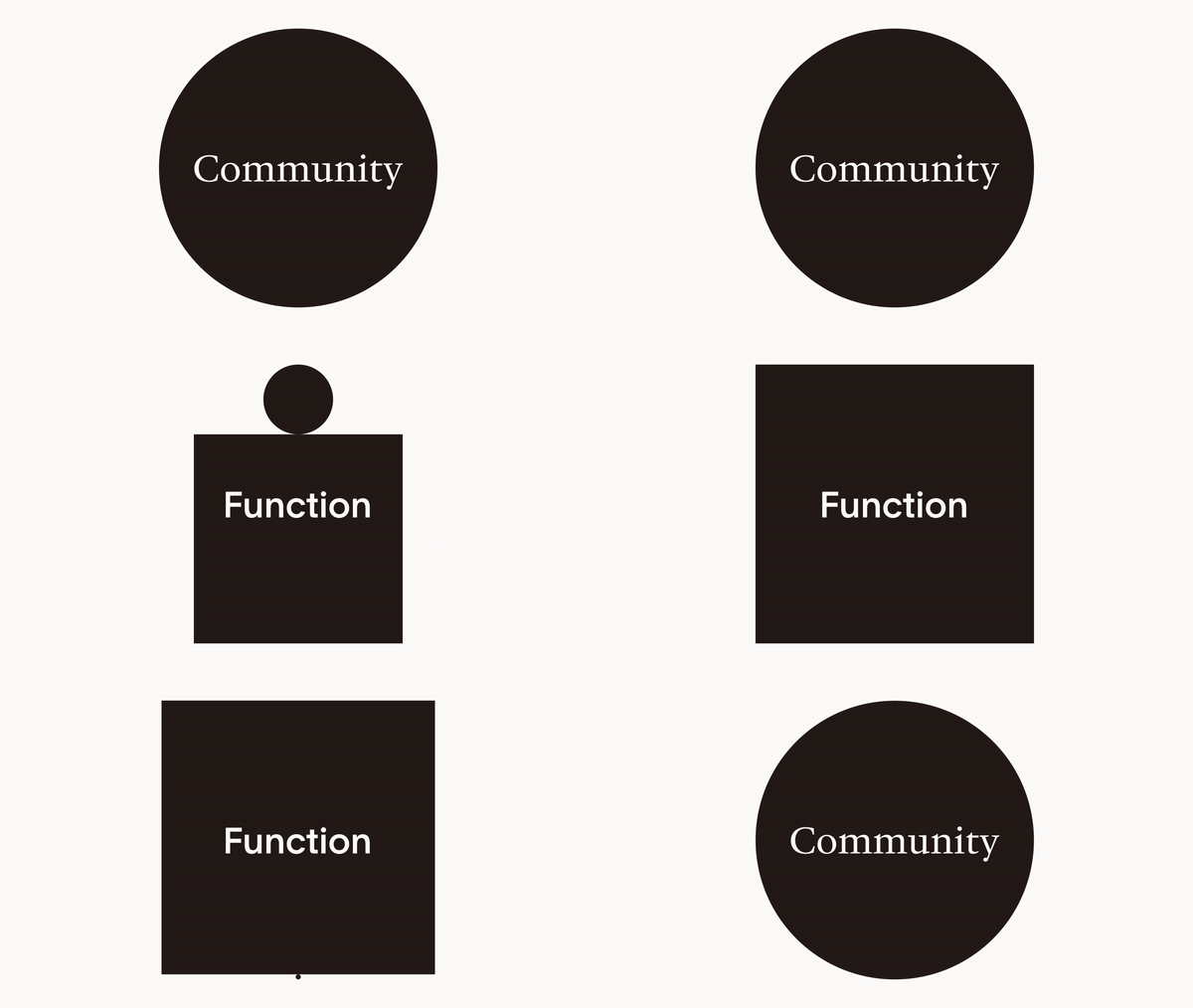
Together, Flodesk Sans and Flodesk Serif form the conceptual foundation of the visual identity, representing the duality of Flodesk: function and community. Or, as I often describe it: the high-design world meets the warmth and humanity of our members.
What I love the most about the typefaces is that you don’t have to be a typography expert to appreciate their rigor and personality. Even self-proclaimed “non-designers” have a positive reaction to the pairing. They truly speak to everyone—which should be the hallmark of any great font.
The end result: a refreshed identity rooted in the spirit of our values
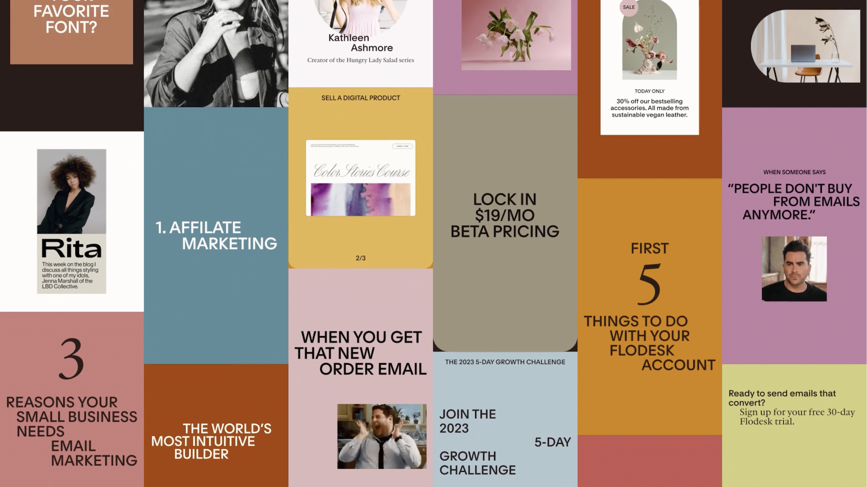
Once the typefaces were complete, DIA developed a complex motion system, typography guidelines, color palette, shape library, and template set to make the brand not just a nice design—but an entire world. A feeling.
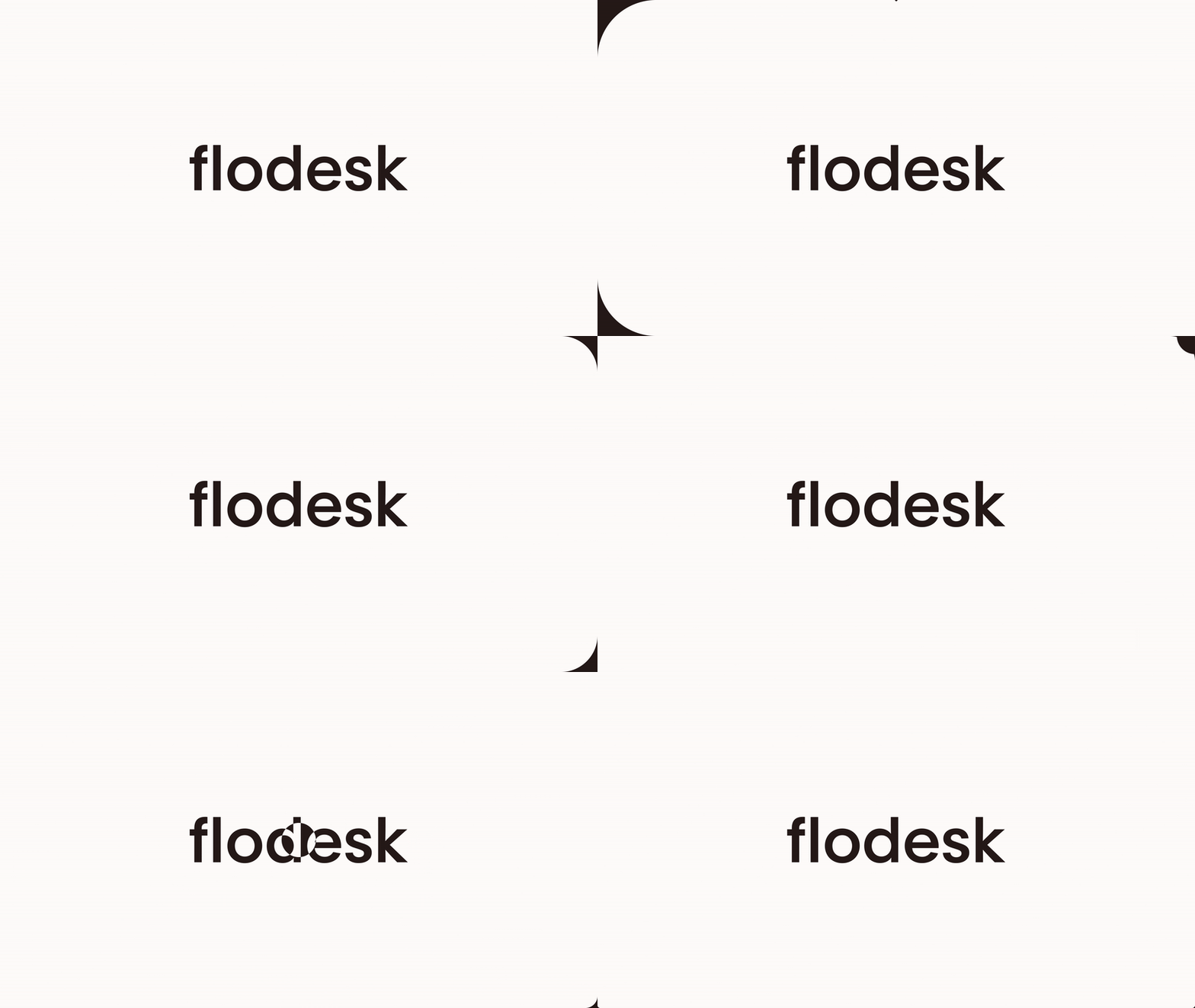
Our living logo, which shimmers on hover between the two typefaces, is a subtle nod to our original brand pillars, where high-design philosophy meets the warmth of the small business community.
The new identity embraces the original pillars of the Flodesk brand brilliantly. The radical minimalism shines through. As everyone else shouts at the top of their lungs for attention in this noisy digital world, we hope to stand out by whispering.
On a personal level, browsing all the new brand assets together brings me back to the “early days” of Flodesk. In it, I see those visits to SFMoMa, the hot yoga classes, my husband’s Richard Neutra coffee table book, and a quiet nod to so many of the brands I’ve come to fall in love with from the small business community.
I truly believe the new identity captures the essence of who we were and who we are while providing a rigorous foundation for who we want to become in the years ahead.
For a visual walkthrough of the new identity, visit our brand page.
