How to Design an Impactful Newsletter Footer: Tips & Examples
Table of Contents Jump to:
Jump to:
Table of contents
As a small business owner, building a good relationship with your clients is key to your success. So, when you’re crafting an email or newsletter, you probably pay more attention to the content rather than what comes at the end of it: the newsletter footer.
Email newsletters are an essential part of marketing your business. In fact, 81% of small business owners rely on a weekly or monthly newsletter to find customers, and email marketing gets you nearly five times more buyers than social media.
A newsletter footer is the bottom-most portion of an email newsletter and contains contact information, social media handles and subscriber preferences. It is an indispensable element for well-thought-out newsletters and can act as an effective lead magnet—allowing you to gather customer data, like contact email addresses, in exchange for a free trial, a limited-time offer, or an ebook.
Let’s dig deeper into why well-designed ecommerce newsletter footers are integral to emails.
Get unlimited email sends & subscribers with Flodesk
We’ll never increase pricing because your email list is growing
A newsletter footer is important because it tells your reader how to contact you, connect with you across different platforms, and informs them of new offers and deals.
Footers also hold value because they are constant across all your email newsletters. While newsletters often target just one topic per issue, your footer can include a universal message in every email, such as your company motto or perhaps a new service you are offering. And, when they are designed keeping the brand identity in mind (through formats, fonts, or colors), they can become fairly memorable, which means they make it easy for your audience to remember your business.
In this article, we will look at the key elements of designing effective footers as well as some newsletter footer best practices and examples.
Your newsletter footer doesn’t need to be another rocket science project; here are the key elements it should have:
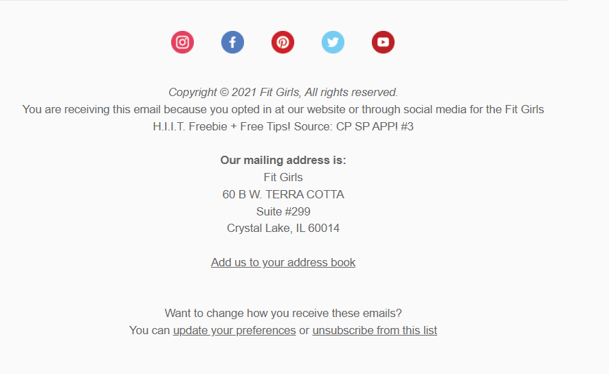
Remind subscribers where/how they joined your list
Reminding people where they signed up is a great way to remind them of the value you bring. It assures your subscribers that they are a part of something bigger—whether it is an online community, a mailing list, a social media platform, or an online course.
For example, Anna Victoria of Fit Body reminds her community that they signed up through her social media channel as they reach the end of the email, encouraging them to revisit these social links.
Not sure what to say? Here are a few statements you can use to remind people of your brand or community:
- “You are a part of our [Instagram] community of [wonderful women building their fitness business], and we think about how we can help you every time we send out these emails.”
- “You are a member of our exclusive email list, giving you access to our best offers before they become available to the rest of the world.”
- “We love that you signed up for our newsletters through our website, so we make sure to respond by adding value (not spam) to your inbox.”
Add an unsubscribe option
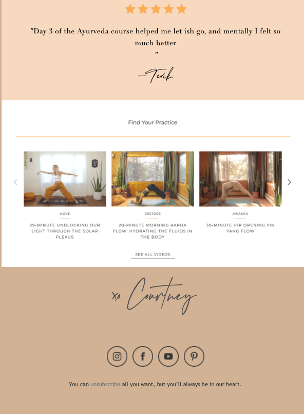
An unsubscribe option is an essential part of your newsletter footer because it allows people to opt-out without having to contact the company directly. It makes people feel in charge while establishing trust with your brand. (Not to mention that including an unsubscribe link in your marketing emails is legally required.)
In her newsletter footer, Courtney of Coincide gives people the option to unsubscribe but tells them they will always be in her heart. Her unsubscribe button is perfectly aligned with her yoga and Ayurveda brand, which focuses on a message of flexibility and kindness.
Here are some more ways you can introduce your unsubscribe link:
- Let them know they can rejoin any time.
“We’d be sad to see you go, but you can unsubscribe if you must. If you change your mind, you can jump right back in at any time through our social media channels or website.”
- Add an emotional send-off, like Courtney did above.
“We understand if you need to unsubscribe, but you’ll always be part of our journey.”
- Get creative.
“As life gets busy, you may need to unsubscribe for now. We’ll be here when you decide to come back. :)”
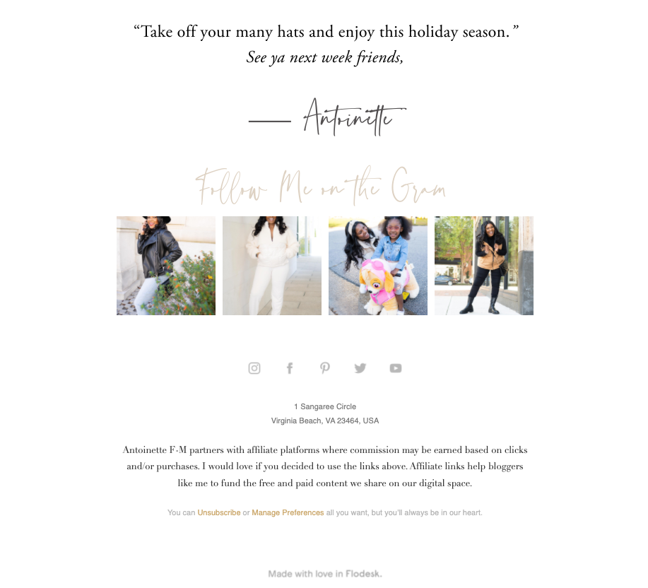
Social media is a lifeline for many businesses—especially ones that operate entirely online. Getting your audience to connect with your Instagram, Facebook, LinkedIn or Twitter accounts can give them an insight into your products, processes and ideas. This, in turn, builds a community that is both connected and engaged.
To follow the best practices for newsletter footers, have your social media icons in a prominent location in your footer. For example, Antoinette FM includes her social media icons as well as a few of the latest pictures from her Instagram in her email footer, adding a little color as well as her clothes to the design.
There are many ways you can make your social media presence stand out:
- If you use audio-visual platforms like Instagram or TikTok, it might be interesting to turn a short video into a GIF and place it in the email footer to entertain your readers.
- If your customers are on LinkedIn, consider including a link to your business’s LinkedIn page with the newsletter topic as a discussion in the comments.
- If you tweet regularly, a snapshot of a popular tweet or a popular person’s reply to a tweet from your brand will help grab your reader’s attention.
Let subscribers manage their preferences
To ensure that your subscribers don’t unsubscribe when all they want to do is reduce the frequency they receive your email newsletters, it is important to have a “manage preferences” link in the email footer design. This allows a customer to reduce how often they receive the newsletters or opt to receive only a certain type, such as ones that include product discounts or introduce a service offering.
To encourage people to opt in for your newsletters, read 5 Converting Places on Your Website you Can add your Opt-In Email Forms for tips on how to do it organically.
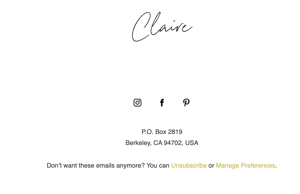
Unsubscribe or “manage preferences” links do not need to take up too much space. Claire from Harper the Label sums it up succinctly in her great email footer design.
Flodesk allows your subscribers to personalize the content of your newsletter throughout your subscriber relationship by letting them opt in and out of content instead of unsubscribing from your entire list. They just click “manage preferences” in the footer of any email to manage their email relationship with you.
Include address/contact information
A crucial purpose of the email footer is to make it easy for a subscriber to contact you. The address field for the footer should include details such as your complete physical address, phone number, email address and any additional ways your subscribers can reach you.
Keep your communication direct by adding a popup reply email to the email address.
To learn how to communicate more effectively in your emails, read How To Write Email Copy That Gets More Opens, Clicks and Sales.
So, now you know what a newsletter footer should contain. But how do you make it stand out? This section highlights the steps you can take to create an effective newsletter footer, peppered with sample screenshots from actual businesses.
Step 1: Select your template
Add a specialized footer block to your email newsletter or use one provided by Flodesk.
It is important to select a newsletter layout that represents your business through its design choices of font, color and spacing.
Make sure you optimize your selected footer design for mobile devices and tablets, as well as desktop computers.
For all parts of a newsletter—footer included—you want to keep accessibility in mind so that all of your subscribers can easily read your messages. To learn more about this, read How to Design Accessible Emails.
Get unlimited email sends & subscribers with Flodesk
We’ll never increase pricing because your email list is growing
Step 2: Write your content
While it is important to convey relevant and important information in the footer, it is equally essential to keep it free of fluff. Make sure your footer includes contact information, preferences and your social media handles, while being easy to skim.
A few tips on execution:
- Use readable fonts
- Do not change your footer information or format too often
- Refrain from adding too much information
Step 3: Organize your elements in order
Arrange your information in a sequential manner and use different font sizes and colors to maintain the hierarchy. For example, this footer from Greatest Story Creative maintains a very clear order, with social media tags (in company colors) followed by the address in a smaller greyed-out font and an unsubscribe link at the very bottom.
These are some of the best practices to keep in mind when creating your newsletter footer — and we’ve included examples you can draw inspiration from:
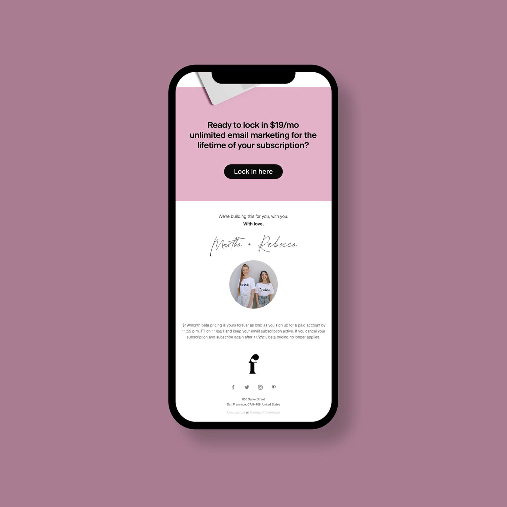
1. Lead with a “launching soon” offer
Joelle Elizabeth uses her email footer to build anticipation around an upcoming offer. She has made it the last message her readers are left with before closing the email, thus ensuring that it stays in their heads.
2. Add a time-bound CTA
The reader of your newsletter might intend to sign up for your personal training sessions, buy your road map or visit your website link, but they might forget by the time they reach the end of the newsletter. Use your email signature or footer to restate your offer and remind them of a reduced price offer as you sign off as Katie Lauren Graham does in the email footer example below.
3. End with a quote
“I love quotations because it is a joy to find thoughts one might have, beautifully expressed with much authority by someone recognized wiser than oneself.” — Marlene Dietrich, American actress and singer
Exactly as Marlene Dietrich said, quotes are a way to channel someone else’s authority, research and understanding to suit your purpose while giving them due credit. Including a quote can help you inspire people to take action and has the potential to become a valuable part of a good newsletter design and strategy.
When choosing a quote for your email footer, there are several approaches you may consider using:
- Inspire them: When people feel inspired, they are the most likely to act. Choose an empowering message related to the services you offer.
“The only person you are destined to become is the person you decide to be.”– Ralph Waldo Emerson.
- Confirm their beliefs: These types of quotes make people feel understood and accepted. Choose a quote that helps your subscribers see the best in themselves.
“Put all excuses aside and remember this: You are capable.” – Zig Ziglar
- Appeal to their emotions: Hope, fear, anger and joy are all powerful drivers for action. Find a quote that taps into those emotions.
“Your current body is the only body that can take you to your new body—so be kind to it.”– Elaine Moran
4. Use a quirky signature
Add an element of personal style to your footer by including a stylized signature—whether it is a quirky heart dotting your “i,” a calligraphy-inspired stroke under your name or a portrait your toddler made of you. This works especially well if a big part of your brand is your personality.
The more your email design brings out your brand’s personality, the better. Jules of Om & The City does this well with her eccentric email signature.
5. Keep it conversational
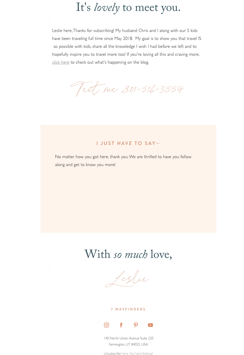
For small and medium business newsletters, personal data, honesty and storytelling go a long way in building a connection with your community. Sharing your intention behind starting the newsletter, an important life story that inspired a campaign or a fun anecdote to make the reader grin a little can go a long way in harboring relationships and retaining subscribers.
For example, Leslie from 7 Wayfinders shares her story in her email newsletter:
Now that you know how to create the perfect newsletter footer, find out how to design a newsletter header next!
Leave your subscribers on a high note
One of the most important elements to include in your newsletter, your footer is a great tool for summarising valuable offers, reminding your readers of your social media presence, directing them to your website or simply bringing a smile to their faces.
If you put in the effort to craft a newsletter footer that will draw the attention of your readers, you will see rewards in the form of fewer unsubscribes, higher open rates, and greater engagement on your social media.
As your business grows, newsletters—especially ones with impactful newsletter footer designs—can create a lot of value for your members; generate trustworthy metrics like click-through rates or open rates; and give you direction on how to scale your business. If you’re looking for a complete guide on writing an email newsletter for your business, you can read How to Write a Newsletter (a Really, Really Good One) from Flodesk University.
