How to write a new website announcement email (+ Examples)
Table of Contents Jump to:
Jump to:
Table of contents
Can you imagine a blockbuster movie hitting theaters without any trailers? Launching your new website without announcing it is essentially the same misguided act.
A perfectly-executed website launch will create a wealth of intrigue about and desire for what you’re selling, just like that tantalizing movie trailer. But if you don’t get the word out and build anticipation, you’ll be waving an easily avoidable goodbye to your own “opening weekend.”
Analogies aside, your hard work isn’t over just because your new website is almost ready to go. You need to generate excitement for your site launch, and since emails tend to reach about 85% of your contact list (a massive increase over the reach of an average social media post), we firmly believe that new website announcement emails are an absolutely essential part of a successful website launch.
In this post, we’ll show you exactly:
- Why you should tell people about your new website launch,
- How to write an engaging announcement email, step-by-step, and
- What a terrific example (or five) looks like.
Get unlimited email sends & subscribers with Flodesk
We’ll never increase pricing because your email list is growing
Why should you tell people about your new website launch?
Can you remember the last time anything new hit the market without building up a buzz first? “Coming soon” is a well-known phrase for a good reason!
You have to generate hype for what you’re putting out there before you put it out there. And an email campaign is a perfect way to do exactly that. It will help you:
- Build the momentum you need for a scorchingly successful launch day.
- Re-engage your existing subscribers by drawing their attention to your exciting updates.
- Generate maximum returns for any advertising or promotions you’re running.
- Build your brand identity and audience rapport.
- Create a desirable sense of exclusivity through using a “soft launch” (a.k.a. giving select people advanced access in exchange for their valued feedback).
How do you write an exciting new website announcement email?
The million-dollar question. You know how important a new website announcement email is, but how do you create one?
Better yet, how do you create a successful one that builds excitement and attracts website visitors as soon as your new site launches? Good news: we’re going to walk you through the steps that will help you write your own unforgettable website launch email.
Step 1: Build your email list
Without an email list, your website announcement is missing its deserving audience.
Thankfully, we’ve already covered how to build your email list in detail. Check out our in-depth articles on how to build an email list and lead generation tactics for everything you need to know on the subject.
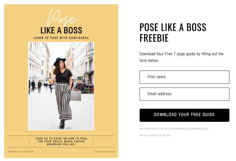
We strongly advise taking this step as early as you can—you want to be gathering emails long before your launch date. Consider creating a “coming soon” landing page that includes a super simple sign-up form or some gated content, as you can see in the example below from Jessica Hanlon. And while you’re at it, dip into other avenues for raising awareness, such as social media.
Building your list should also help you improve your understanding of who you’ll be sending your announcement email(s) to and how best to talk to them—especially if you use form builders with subscriber preferences that help you tailor your message.
Pro tip: Document your daily process on social media—it’s a great way to generate interest and can help you gather subscribers to your mailing list.
Step 2: Plan your announcements carefully
Before you write anything, consider your email campaign carefully. Structure what you want to say and the best method for delivering it.
Remember the teaser trailer analogy? Your goal here is to build excitement and anticipation, not to give the whole game away. Building intrigue the right way will help your pre-launch generate enormous success.
Of course, it’s impossible to appeal to everyone, so the more you know about your email subscribers, the better. If you know why they subscribed, you can be super precise with what you announce and how you announce it.
Pro tip: Separate out the core elements of your message and create a different announcement email for each. Say one thing really well per email instead of saying five things only kind of well.
Check out our favorite teaser email campaign examples for inspiration!
Step 3: Have a clear announcement purpose
Avoid rushing to reach out to your subscribers with an impulsive email that misses the mark. Instead, take the time to make sure you’re sharing why you’re reaching out to them.
Today, you’re excited to share a sneak video preview of a new area of your site, because you know it’s something they’ll find valuable.
Three days from now, you’re excited to share a selection of products you’ll be featuring in your store, because you believe your recipient is interested in them.
Every email has its own purpose.
Pro tip: For every email you’re planning, put yourself in the recipient’s shoes and ask yourself, “what’s in it for me?” If the answer isn’t crystal clear, maybe it’s time to rethink the email.
Step 4: Tap into your readers’ emotions
A wise man once said: “If you want me to laugh, you must laugh first. If you want me to weep, you must weep first.”
People are emotional decision-makers, and you’d do well to remember that. It’s why you can be given all the facts and still say, “It sounds great… but it just doesn’t feel right.”
You can improve the efficiency of your email marketing by up to 70% if you hit on the right emotional triggers.
The trick is to harness your own excitement and channel it into your email so your readers can feel a shared emotional connection to your announcement.
Pro tip: Get comfortable with freely expressing your emotions in the most genuine way possible. This will help you authentically convey that emotion through your writing.
Step 5: Use visuals to create excitement
The human race has been visual for far longer than we’ve been literary. It’s why images and video often outperform written content—our brains are literally built for visual information.
This makes visual marketing an extremely powerful tool, producing 650% higher engagement than text-only content. This is a huge opportunity.
You can use this to your advantage by sharing things like beautiful product imagery or some visual media to showcase the benefits for recipients—you’ll notice images are used to great effect in the examples later in this post. Share imagery that connects with the reader and you’ll keep their attention even after a new distraction arises.
Pro tip: Don’t underestimate emojis—they’re simple and effective ways to spice up your written content with visuals and get the best of both written and visual worlds.
Step 6: Cover all your bases
No matter what the focus is for any particular announcement email, there are some core features that you should always include. Use this list as a checklist to make sure that your announcement includes all the necessary beats to get your subscriber excited:
- Don’t bury the lead. In other words, make the value of the email immediately clear to your reader—the “what’s in it for me?” question from Step 3 will help with this.
- Include the essentials. Make a list of the key points you want to convey and prioritize them based on what your recipient cares about most. Use this list to ensure your email doesn’t leave out anything important.
- Focus on their interests. Do this by replacing words like “I” or “we” with “you” or “your” whenever possible. You’ll end up reworking many sentences, but this will help you show readers why they should care about your announcement.
- Stand out from the crowd. From your email subject line to your footer, make your email memorable. 5x as many people read the headline as the body copy, so take your time and make sure you hook people’s interest.
- Show your personality. People buy from people, so keep your emails relatable and conversational—it will help your email subscribers remember you and should encourage them to engage further.
- Don’t oversell yourself. Try to find a balance between sharing your excitement and the benefits to your subscribers without being pushy.
- Include a call-to-action (CTA). Chances are you want the reader to do something after reading your email, whether it’s visiting your new website or signing up for more updates. Whatever the goal, give your recipient a clear and easy way to act.
Step 7: Proofread your announcement
Before you send anything, perform the essential editing steps for any piece of writing:
- Give yourself some distance from what you’ve written. Even ten minutes away can refresh your perspective.
- Check the length of your subject line—it should be less than 50 characters. Anything longer than that might get cut off, especially on mobile phones. It should also read like an attention-grabbing headline.
- Scan your email for trigger words that might send your email straight to the dreaded spam folder. If you find any, get rid of them, stat!
- Put yourself in the reader’s shoes as you read your email. Do you feel compelled to open, read and take action? If not, edit until you feel differently, and consider other influence tactics like creating urgency via limited-time offers.
- Read your email aloud. This helps you ensure your writing flows naturally and has no awkward phrasings or errors that might trip readers up.
- Ask yourself if an eight-year-old would understand your email. This is a great way to make sure you’re communicating clearly.
- Use a tool like Grammarly or spell check to ensure your email has no off-putting typos.
- Ask someone who’s not involved in your business to review the email. They can help ensure that you haven’t used any confusing jargon and have stayed focused on what’s in it for your reader.
Step 8: Send a test email
Before you send your announcement email out to your full list of subscribers, it’s important to test how it’s going to look when it arrives in someone’s inbox.
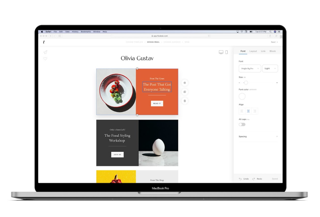
Even if you’re using something as easy as Flodesk’s intuitive drag-and-drop email builder, you’ll want to send a test email to make sure everything comes out as you planned. Be sure to check out how your test email looks on mobile and desktop.
Pro tip: Even if you’ve sent 1000 emails and know your platform inside and out, don’t skip this step. You can always spare the time needed for this final review.
Get unlimited email sends & subscribers with Flodesk
We’ll never increase pricing because your email list is growing
Step 9: Maintain momentum
Don’t just stop after you’ve sent your announcement email. If you play your cards right, your first announcement email is the beginning (or revival) of a beautiful relationship with your subscribers.
After you send that first email, cycle back to Step 2. Review, draft and send multiple announcement emails, focusing each one on a different and exciting aspect of your new website launch to get your readers excited:
- Showcase products or services they can look forward to.
- Offer them pre-order or launch-day discounts.
- Invite them to exclusive launch events.
- Encourage them to spread the word in return for a chance to win a grand prize.
- Create a newsletter that readers can subscribe to, or release a regular blog that keeps them engaged up to and beyond your now hotly-anticipated launch.
5 examples of incredible new website launch announcement emails
Are you ready to see what a great example looks like? This selection of email examples will help spark some ideas and get you started with your own new site announcement.
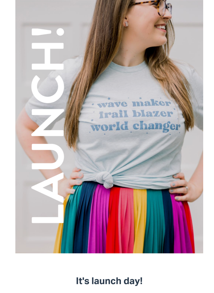
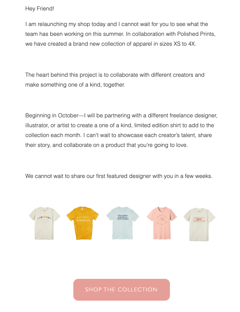
1. Natalie Franke’s shop launch email
Why it’s great:
- Natalie Franke’s email conveys a friendly and welcoming personality.
- It’s an example of how you can get creative with the types of new website announcement emails you send.
- The email has a clear purpose and uses relevant CTAs to guide readers to the new website shop.
- The benefits are clear before you ever read a word of the email body—it’s written right on her shirt!
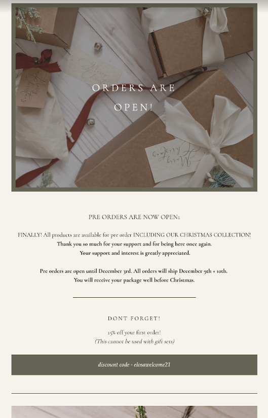
2. Elosa’s pre-orders now open email
Why it’s great:
- Elosa’s message is crystal clear: you can finally place your orders!
- The text is simple, but you can really feel the excitement behind it.
- It’s short, sweet and to the point—fluff-free writing that doesn’t get in its own way is always the most effective.
- The 15% discount is an excellent way to encourage readers to take action.
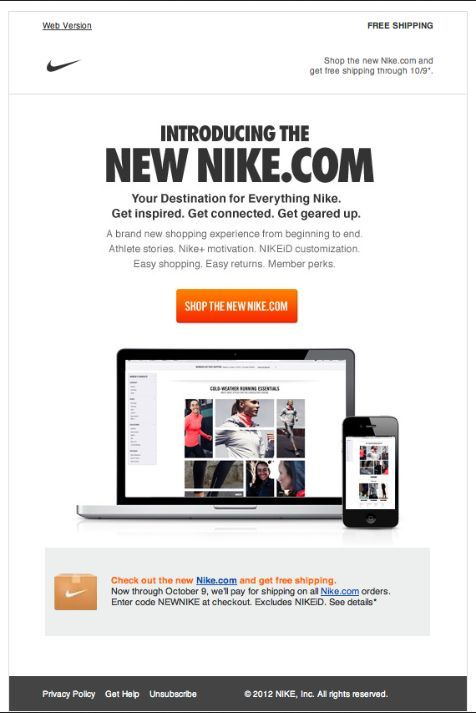
3. Nike’s new website email
Why it’s great:
- Nike’s email shows that whether you’re a startup or a household name, new website announcement emails are essential.
- It hits you with a bunch of simple, easy-to-spot benefits.
- The visuals draw you into the new site experience before you even read a word.
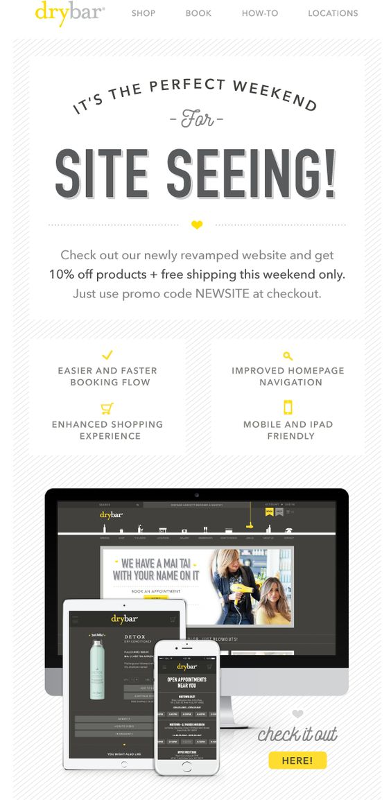
4. Drybar’s updated website email
Why it’s great:
- Drybar’s email demonstrates the perfect use of clever copy—a beautiful headline that’s relevant, creative, memorable and easy to understand.
- It gets straight to business and comes at you with the big-time temptation of 10% discounts and free shipping.
- The space is artfully used—this email shows how you don’t need a lot of words to say a lot (another great way to achieve this is with bullet points).
- It’s a perfect example of focusing solely on what’s in it for the reader.
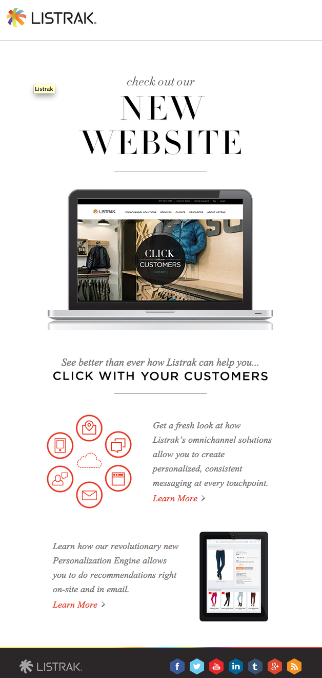
5. Listrak’s new website email
Why it’s great:
- Listrak’s visuals have a smooth flow that effortlessly guides your eye from top to bottom.
- They’ve used language that cleverly (but not too cleverly!) speaks to the reader.
- The benefits are extremely clear and found at every level—from headline to images and carefully-worded body copy.
Get unlimited email sends & subscribers with Flodesk
We’ll never increase pricing because your email list is growing
Create a new website launch email that gets subscribers excited
Finishing your shiny new website is a challenge in and of itself, whether you’re creating a new one from scratch or performing a much-needed revamp. But you’ll be in for an even tougher go of things if you don’t plan out a new website announcement email campaign to support the launch.
Email marketing software like Flodesk makes creating and sending a new website announcement email the easiest part of your launch. Their intuitive workflows and dynamic features like subscriber preferences, advanced personalization and mobile image display customization will help you speak directly to your subscribers and provide them with the information they care about most.
When you want to create appealing emails that grab attention and are as beautiful as they are easy to create, Flodesk has you covered.
