10 Fabulous Fashion Newsletter Examples & DIY Tips
Table of Contents Jump to:
Jump to:
Table of contents
What do high heels and email marketing have in common?
They’ll both keep you on your toes.
Fashion and emails aren’t typically spoken about together, but here you’ll find just that. It may not seem like the most natural match, but here are two reasons you’ll definitely want to stay tuned:
- Fashion is the largest B2C eCommerce market segment
- Email generates a 4,200% return on investment
Combining the two—when done right—can do wonders for your marketing strategy and fashion business. In this article, we’re looking to help you do just that.
First, we’ll dive into some fabulous fashion newsletter examples from brands delivering quality content to their subscribers. We’ll wrap things up with some trending best practices from the examples you can utilize to create your brand emails. These will help you start strong and deliver value from the get-go.
Stay on your toes; this one’s a good one.
Stay on-trend with Flodesk
Our simple & elegant email marketing platform puts your designs at the front of the catwalk.
Ready to talk the talk? Here are ten fabulous fashion newsletter examples that we love seeing land in our inbox.
1. An Indigo Day
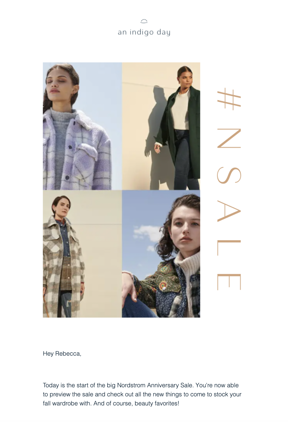
This Atlanta-based fashion and lifestyle blog grabs the eye with high-quality images and a beautiful color palette from the offset. It’s a great newsletter example for any fashion brand and it’s even more impactful when viewed on mobile devices.
An Indigo Day also remains true to its branding throughout the email. This helps remind customers who they are—super important in any industry, but especially fashion.
2. White Buffalo
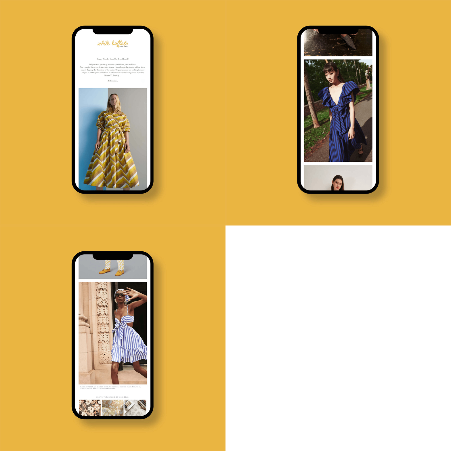
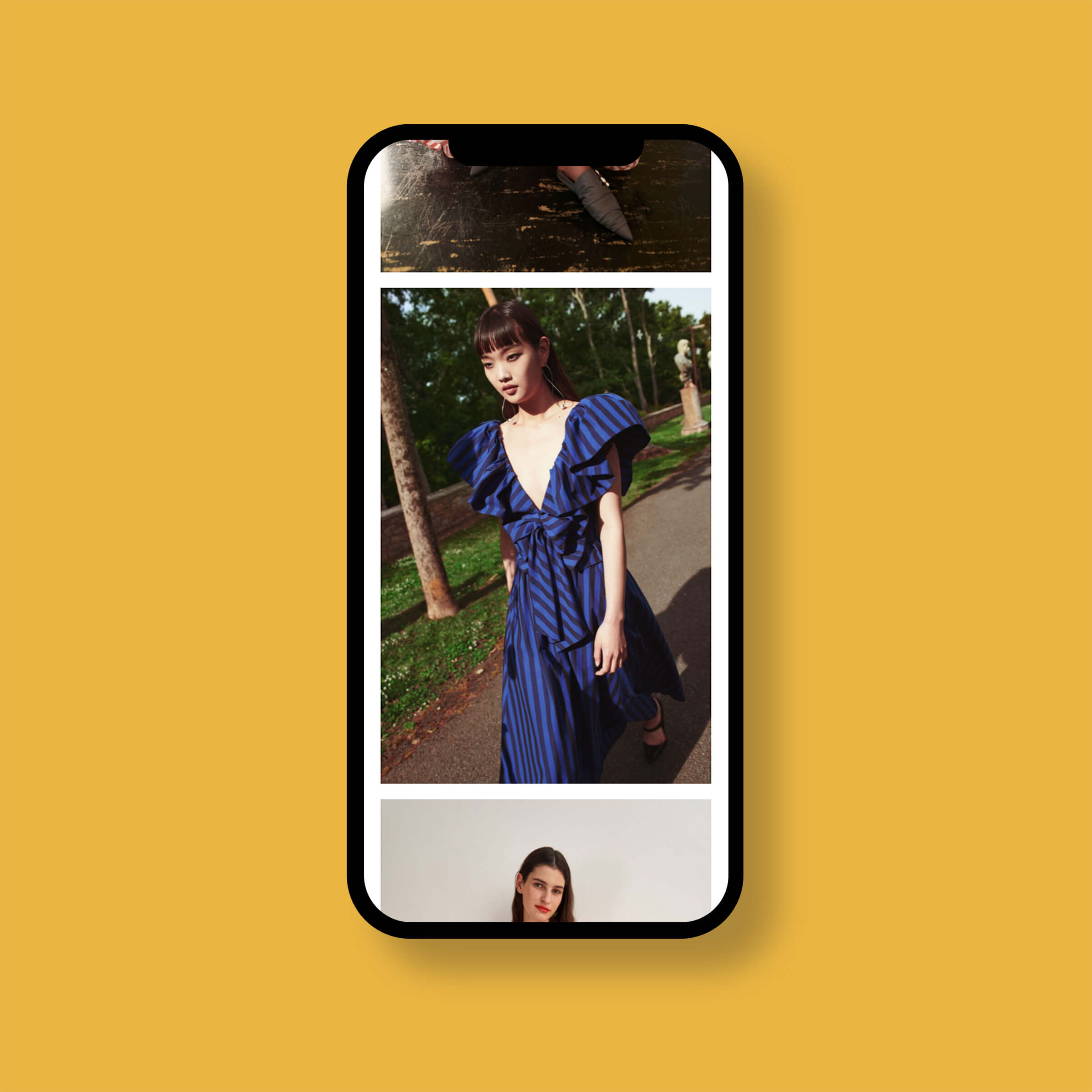
White Buffalo really understood the brief when it came to delivering vibrant emails with minimal copy. It’s straight to the point and utilizes the space available to showcase its products with minimal descriptions. It gives us Pinterest board vibes that we want to follow in a heartbeat.
This luxury fashion retailer has opted for a highly visual template—and it’s working wonders for them. A short introduction makes way for ample images of styling ideas and a good amount of white space to give the eye a break between looks.
Find out more about welcoming readers in How to Write an Effective Newsletter Introduction (With 10 Examples)
3. Antoinette F-M
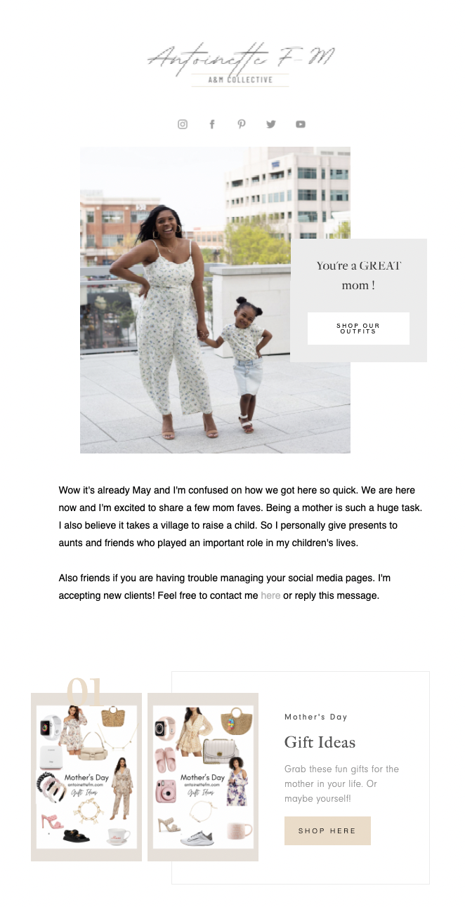
This email from A&M Collective invites subscribers to check out the online shop at the very start of their email. It’s placed directly in front of a picture of the looks available—enabling the reader to put two and two together at a glance.
Further down, they also showcase other fashion items available to purchase from the store. It makes the list for fashion newsletter examples for putting the right content alongside easy-to-click buttons in all the right places.
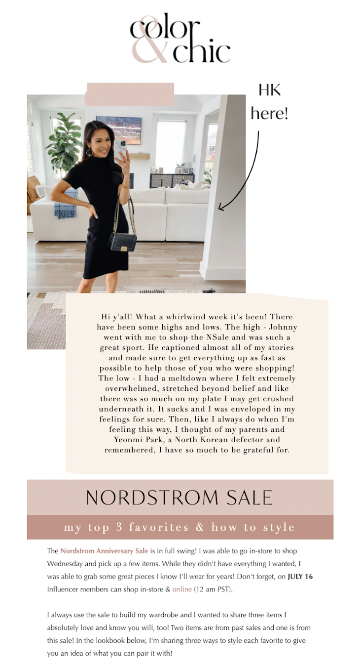
4. Color and Chic
This fashion, beauty and lifestyle newsletter example remains consistent with their branding throughout. The spaces used for text stand out from the rest and the color scheme is kind on the eye.
There’s lots of information in the same email, but the template makes space for that. The template you decide to use really depends on what you’re looking to share with your subscribers.
This fashion email lets customers know about a sale and delivers the latest news and updates. It’s a fashion email that supports your other newsletter goals.
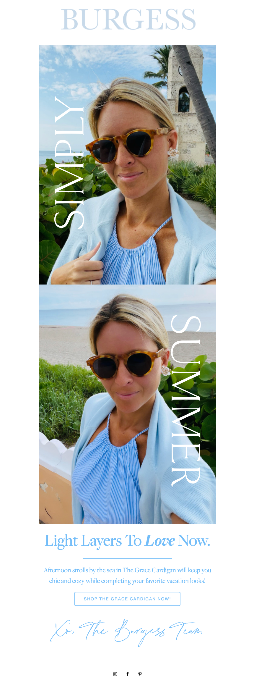
5. Burgess Sweaters
Burgess Sweaters display minimal text in their newsletters and instead showcase their products as worn by the founder and owner. This approach makes for an interesting newsletter example that gives the brand personality and history.
Having a familiar face in your fashion newsletter can strengthen customer relationships and contribute to the so-sought-after consistent branding of fashion emails. People prefer brands they can relate to, and people relate to people.
The template allows for beautiful images that capture attention from the second they land in your inbox. The minimal text keeps things short and simple, and the button pushes subscribers towards the online store.
To learn more about driving conversions from email marketing, check out our post on 5 High-Converting Places on Your Website to Add Your Opt-in Email Form.
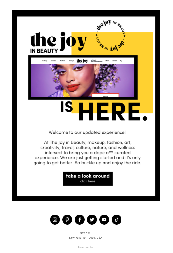
6. The Joy in Beauty
The Joy in Beauty uses vibrant color on a simple template—and it works a treat. The fashion email template includes one image, but that’s all it needs.
It’s different from what usually lands in your inbox and it demands you pay attention—in this case, to the elevated experience.
Find your colours with Flodesk
Our intuitive templates and colour pallettes tailored to your brand make email design easy.
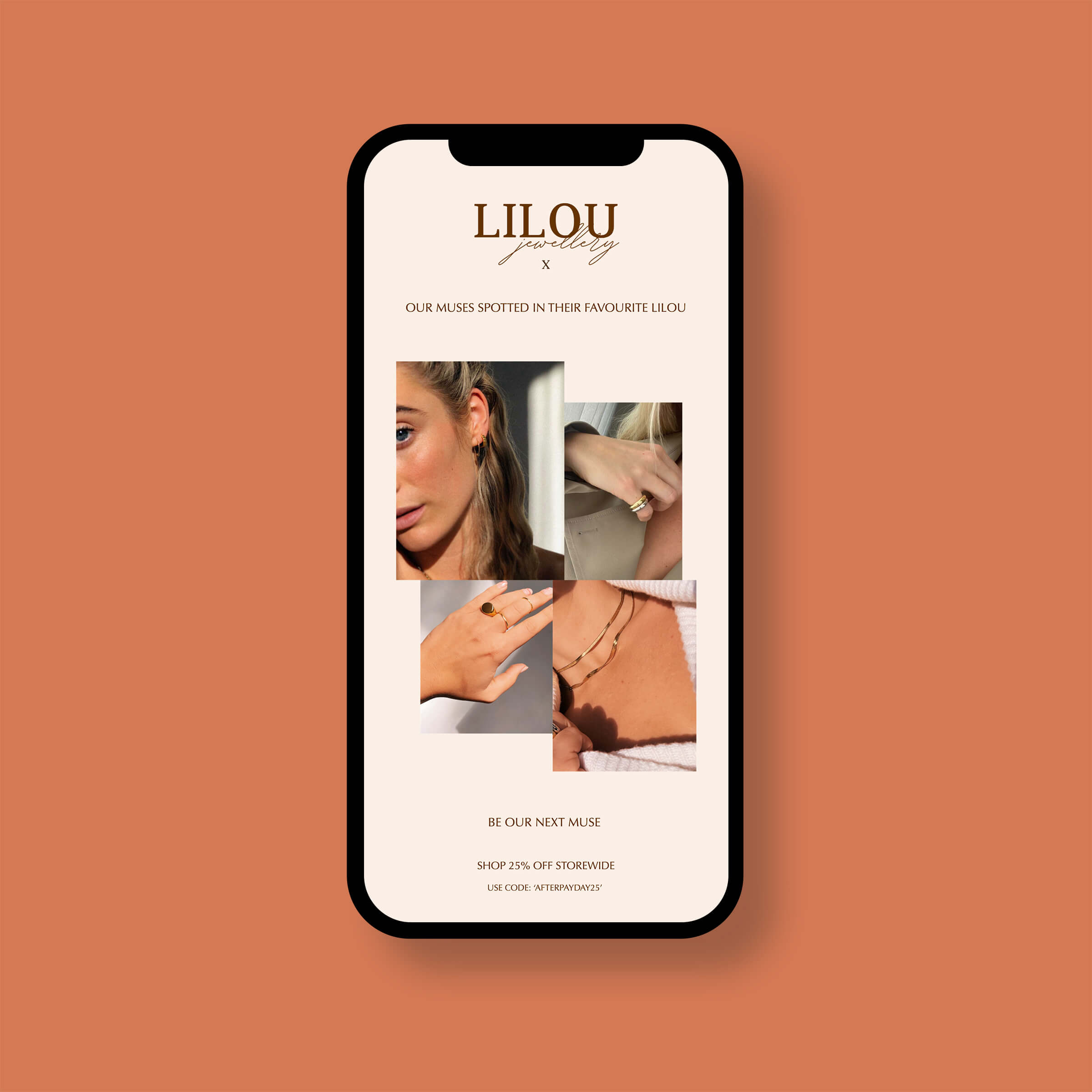
7. Lilou Jewellery
Lilou Jewellery uses this template to share its sale and discount code — a great way to monetize a newsletter. If it’s in the subject line, subscribers are going to look out for it. The template makes space to showcase the jewelry, share the discount code and send customers in the right direction.
It’s a great example of utilizing subject lines and giving people exactly what they came for. For example, with “25% off store-wide” in your subject line, don’t nestle the discount code deep in email content —deliver it upfront and keep your subscribers happy.
8. Myrtle
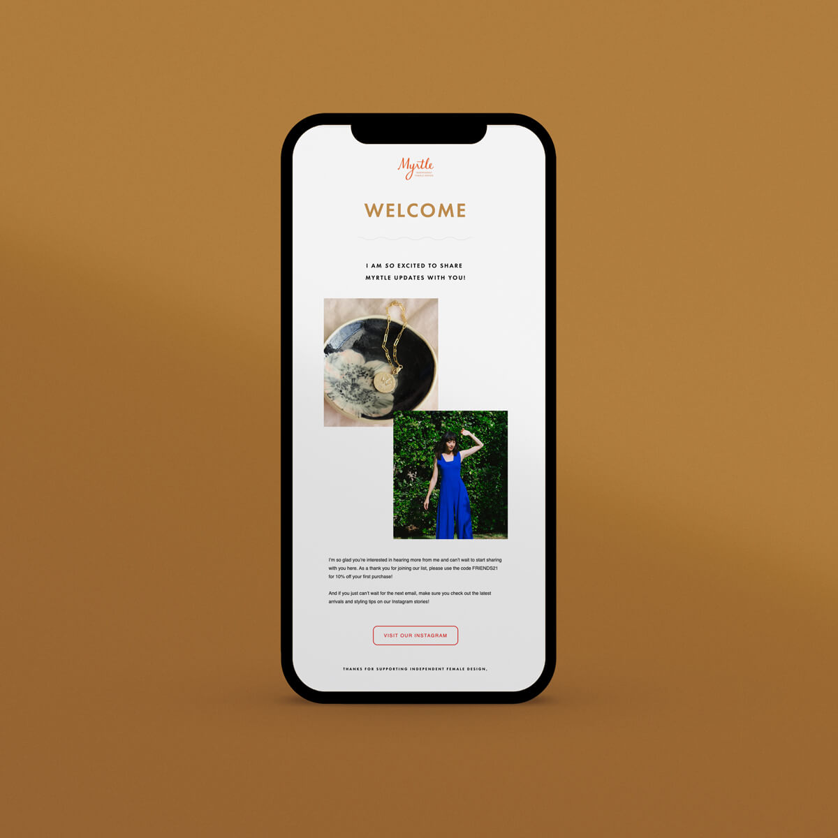
This is how Myrtle used one of Flodesk’s welcome email templates to greet new customers. A welcome email is a great way to start building customer relationships. It’s also a great opportunity to point new subscribers towards your other content channels, like your website blog or social media pages.
To find out more about how email marketing software can help you send effective emails, check out our post on 11 Sendinblue Alternatives to Shake Up Your Email Marketing.
9. Natalie Franke
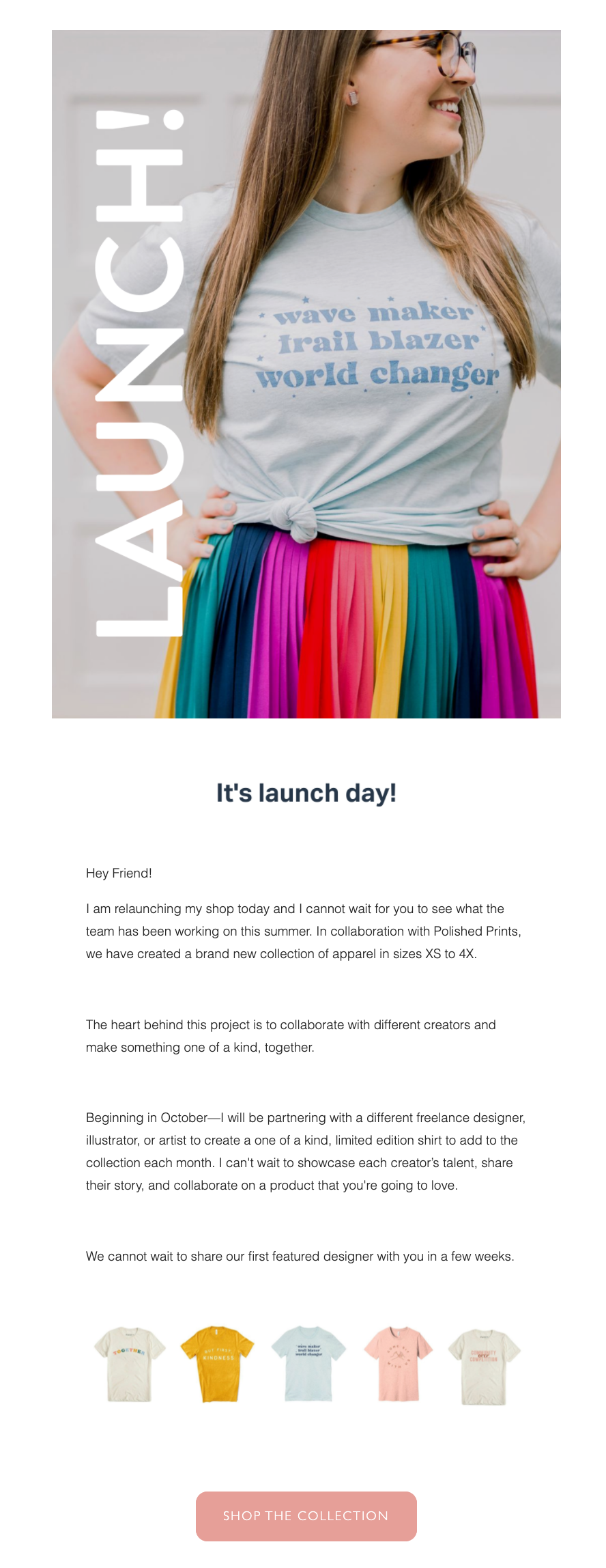
Fashion newsletters can be used by smaller businesses and entrepreneurs as a way to create the same inbox impact as bigger brands.
It’s an effective way to connect with your subscribers and point them towards any landing page or sales they could benefit from. For example, Natalie’s newsletter does a fantastic job of informing subscribers of a new t-shirt line. It’s colorful and vibrant while also containing all the copy necessary to share the news.
Buttons stand out and entice the reader while the images encourage them to look a little closer. It’s a powerful and polished way to deliver exciting news without following the same guidelines used by corporations for years.
10. Roots
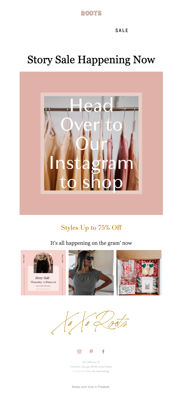
Roots are the final brand on our list to be showcasing their products in a fashion newsletter. Their chosen template provides ample space for images and minimal copy. We’re also fans of using emojis in subject lines when the context is right: a pop of color to someone’s inbox can be great for grabbing attention.
The email feels like exclusive access to the upcoming sale. It’s giving subscribers a heads up before the fun starts—and it does it simply and quickly.
We’re impressed by the ten fashion brands above, and we hope they’ve inspired you to want more from your emails. Let’s take a look at where to start when it comes to creating your own fashion newsletter.
Ready to start sending out your own fashion newsletters? Have a look at our favorite newsletter signup form examples to grow your email list
Fashion newsletters’ core elements are no different from any other newsletter type—you need a thumb-stopping subject line, high-quality images and irresistible CTA buttons. But, how can you elevate your email marketing newsletter design? Let’s explore four best practices we’ve noticed from the above example brands.
1. Showcase your creativity
It’s never a bad idea to stand out. It’s an especially good idea to stand out in the fashion industry. Statista is predicting 376+ billion emails pinging across the globe by 2025. So, making sure yours stands out from the crowd is an absolute must if you want to compete in this potentially highly-rewarding space.
Fun fonts, colors and images are often a go-to. You can also level this strategy up with the copy you use in your fashion newsletter. From your subject line to your last hurrah and farewell, keep your copy creative and unique to your brand voice.
Showcase your creativity and entice subscribers with action shots of the fashion tips and items you’re sharing with them. You can also choose to personalize your emails for added impact—this is certainly best practice from our newsletter examples.
Take a look at how Flodesk can help with personalization by reading updates on the three new ways to hyper-personalize your email marketing with Flodesk Forms.
2. Show up and be consistent
Our second tip for smashing your fashion newsletter goals is consistency. You want your subscribers to recognize your emails as soon as they land in their inboxes. Create a recognizable fashion newsletter and send it out on a regular cadence.
Email marketing is not just about keeping the delivery consistent, though. It’s also super important to make sure all the details line up within your newsletter. Don’t go switching things up every week without keeping the bare-bones structure the same; we are creatures of habit.
This applies to aspects like footers and headers—maybe consider a banner—the general theme of your newsletter, and the format.
This works in your favor as you’ll already know the gaps in your newsletter you need to fill in. It works in your subscribers’ favor as they return to an experience they recognize and are comfortable with every time.
Send consistent emails with Flodesk
Automating your email workflows in Flodesk makes it easy to focus on the finer details.
3. Optimize for mobile
Third on our list of learnings for optimizing your fashion newsletter is ensuring your emails look great on mobile devices. This is really important—81% of people now use their smartphones to check their emails regularly, and email marketing strategies need to accommodate this. Your first impression takes up about 5 to 6 inches of space—use it wisely.
There are also other, more technical steps you can take to optimize your emails for mobile. We recommend you:
- Use a responsive template to ensure your email looks great on desktop and mobile. Flodesk can definitely help you with this, try it out for free here.
- Keep your subject line short and sweet—41 to 70 characters depending on which email service your subscribers open your emails with. Any longer than this and you’ll likely be cut off by the physical limitations of a 3-inch-wide screen.
- Use readable fonts—minimum 13pt—to avoid anything being too small to read. Also, consider how your copy will look on different colored backgrounds and brightness levels—super important with mobile ‘dark modes’ becoming more common each day/update.
- Include buttons in your email marketing to nudge readers towards where you want them to go—if that’s a blog post, great. Maybe for sales campaigns, it’s a landing page for a new item. Potentially you want to link them to social media? Whatever it is, buttons can do wonders for your click-through rate and ultimately help you sell more.
- Integrate AMP landing pages: make sure people click through to mobile accelerated pages; these are mobile-centric landing pages optimized for load speed. This ensures your audience is receiving the best version of your newsletter as quickly as possible and minimizes the chance of content not loading properly.
4. Segment your audience
Finally, we encourage you to segment your audience when it comes to fashion newsletters, or any email campaign, automated campaigns or cart abandonment emails for that matter. Segmentation is key.
Segmentation is the best way to show people the products they’re interested in—a win-win situation and a recurring trend from our newsletter examples.
There are many ways you can choose to segment your mailing lists. Here are six favorites we’ve seen in fashion newsletter examples:
- Location: segment your audience depending on where they live in the world. This helps when sharing seasonal offers and clothing. It’s also great info to have when delivering your newsletter with the best chance of a high open rate. It might be prime time for you, but not many people open their emails at 4am.
- Age: segment your audience based on their age. This allows you to share better offers and opportunities relevant to different age groups and life events they may be going through. For example, ASOS is great at doing this with targeted emails for students.
- Triggered events: fashion brands have a wealth of information from their website visitors’ actions. Perhaps someone was halfway through a checkout process; perhaps they clicked on social proof for a product or clicked on a shoe finder tool you have on-site. Segmented campaigns depending on website events are hyper-personal, lead to more conversions, and can inform upsell sections in your newsletter strategy.
- Active vs. inactive: segment your list based on activity. This gives you the chance to engage subscribers that have been showing less interest in your newsletters. Killer subject lines are crucial for this segment—and a cheeky discount never hurt anyone.
- Past purchases: segment your audience based on what it is they come to you for. This makes sending out purchase recommendations and accessories in your newsletter so much easier—you already know what they’re pairing it with!
- Amount spent: segment your audience by how much they tend to spend on your products. This is a fantastic way to figure out who in your audience is looking for more expensive items and who is looking for more affordable items. It can inform future content and ensure that content gets the views it deserves.
Remember, just because you have this information, it doesn’t mean you always have to use it. Sometimes you’ll want to segment your audience and others you won’t—this is up to you.
All of these methods end at the same destination: deliver the right product and content to the right person.
To learn more about segmenting and delivering the content your audience actually wants, check out 3 New Ways to Hyper-Personalize Your Email Marketing with Flodesk Forms.
Wrapping Up
Your newsletter is a key tool in your digital marketing strategy, so maximizing its effectiveness is essential. Research your audience, understand what they want from your fashion newsletter, then give it to them in bite-sized, onbrand pieces.
Memorable emails are impactful and beautiful. Cost-effective emails are also hard to create from scratch—or at least they used to be. Try Flodesk free for a month and start delivering emails people love to get. Stay on your toes—heels or not—and we hope to see you on this list in 2022.
For help creating and delivering attention-grabbing and impactful emails, try Flodesk free.
