10 Email Optimization Strategies for Big Wins in Your Next Campaign
Table of Contents Jump to:
Jump to:
Table of contents
Email optimization means taking steps to improve the performance of your email marketing campaigns—with the ultimate goal of reaching more customers with the same amount of emails. For example, if you optimize an email by personalizing the subject line, you can boost open rates by 22%. If you segment your audience, you can increase revenue by 760%. And the benefits go on. Optimized email campaigns can yield higher open rates, click-through rates, and conversion rates compared to non-optimized campaigns. They can also reduce bounce rates and ensure your emails make it to the inbox in the first place.
So, we’re going to take a look at ten examples of optimized emails and then cover a few tips and best practices to get you started.
Get unlimited email sends & subscribers with Flodesk
We’ll never increase pricing because your email list is growing
10 effective email optimization examples
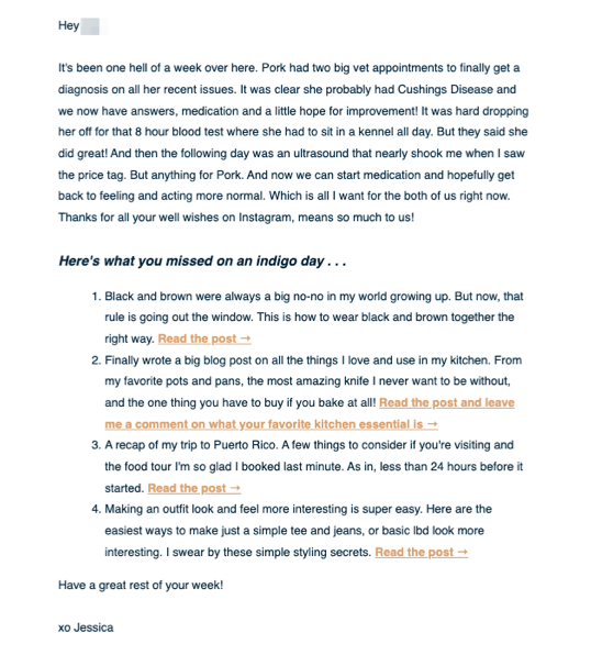
In this section, we’re going to cover ten real-life examples of optimized emails and why they’re effective. Let’s start with this email from Jessica over at An Indigo Day.
1. Weekly update example from An Indigo Day
Optimized features:
- The greeting is personalized with the recipient’s first name.
- The content is personal and engaging (who can resist a good dog story?!) and includes links to several relevant blog articles.
- The sender name from An Indigo Day is a “real person” (Jessica) instead of a generic company name like XYZ, Inc.
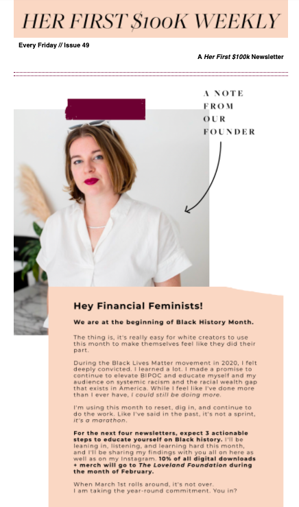
Optimized features:
- The subject line (Should you and your partner join accounts?) grabs attention by asking a question that’s relevant to Her First 100k’s audience.
- The personal, on-brand image at the top of the email grabs attention as soon as the email is opened, encouraging users to read the full newsletter.
- The design of the email uses white space and bold colors to draw the eye and keep users engaged.
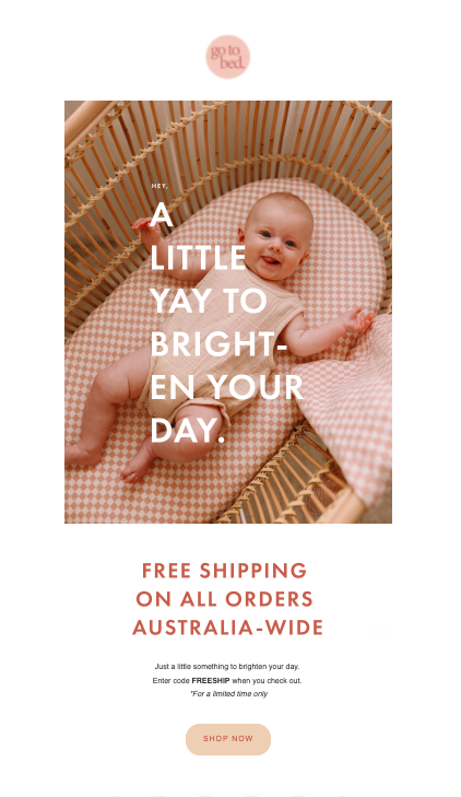
3. Discount code example from Go To Bed
Optimized features:
- The graphic featuring a smiling baby is ideal for capturing the attention of Go To Bed’s target audience of parents.
- The limited-time discount code entices users to click through the email.
- A single, clear CTA lets readers know exactly what they’re supposed to do (Shop now!)
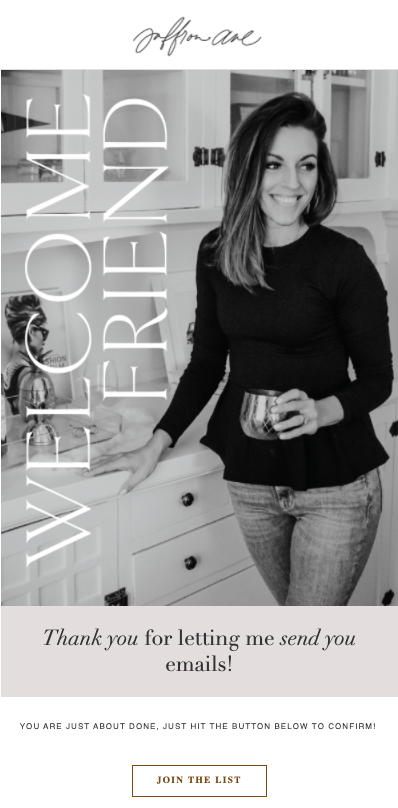
4. Double opt-in example from Saffron Avenue
Optimized features:
- The stunning design in this double opt-in email from Saffron Avenue encourages readers to complete the process by giving them a taste of what’s to come.
- The personal “thank you” message makes a connection with the recipient.
- Clear, concise copy tells the reader exactly what to do.
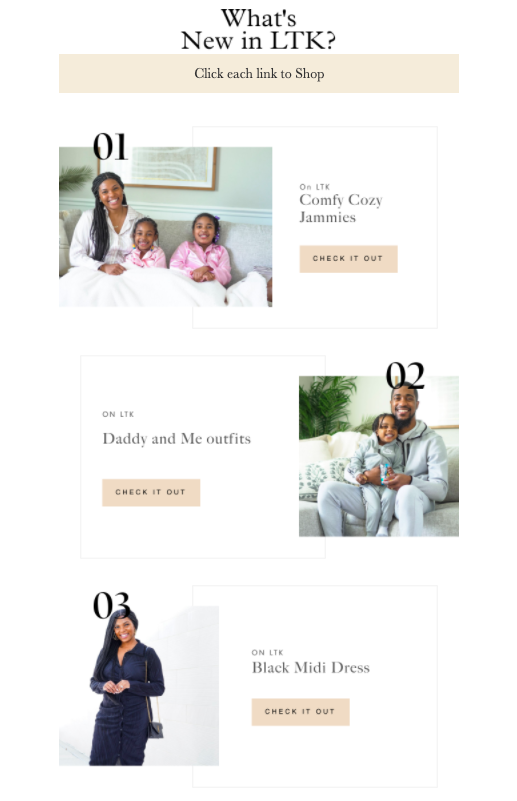
5. Product round-up example from A&M Collective
Optimized features:
- The images are personal and inviting, drawing readers into this product email from Antoinette at A&M Collective.
- The staggered block design displays multiple products in an easy-to-digest format.
- Each product has a dedicated CTA button to take the reader directly to the right place on the website.
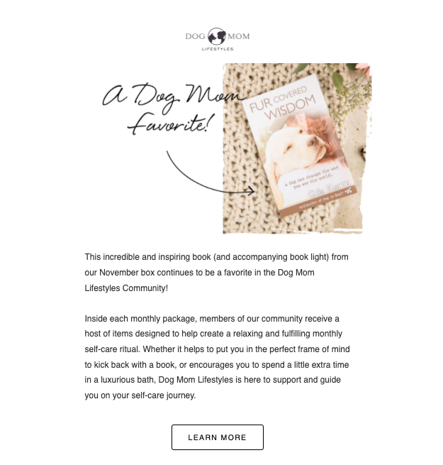
6. Favorite product example from Dog Mom Lifestyles
Optimized features:
- Sharing a “favorite” product like in this email from Dog Mom Lifestyles is a good way to add perceived value for your readers.
- The image of the product along with the arrow and script captures readers attention as soon as the email is opened.
- The email sprinkles in a bit of social proof by saying that the book is a favorite within the Dog Mom Lifestyles community.
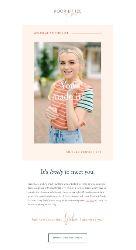
7. Free download example from Poor Little It Girl
Optimized features:
- This email from Poor Little It Girl uses white space between each section of the email to create a good user experience.
- The subtle nod towards exclusivity (Welcome to the list! You made it!) is great for boosting engagement. In fact, subject lines with a sense of urgency or exclusivity have a 22% higher open rate.
- Value is added in the form of a free download, which is easy for the reader to access using the clear CTA button.
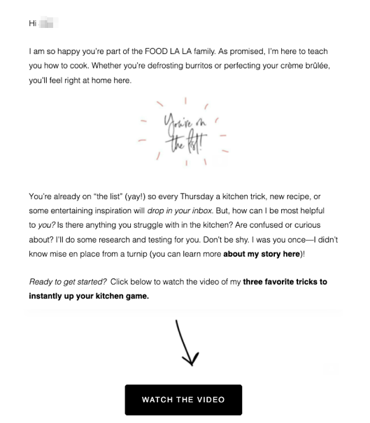
8. Welcome email example from Food La La
Optimized features:
- The copy of this onboarding email tells users exactly what types of emails they can expect to receive from Food La La, reducing the likelihood of future emails being sent to the spam folder.
- The text is broken up with a fun, on-brand image—just enough to give a visual break without distracting from the message.
- There’s a clear CTA button at the bottom of the email to keep the engagement going.
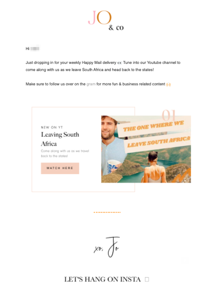
9. YouTube video example from Jo & Co.
Optimized features:
- This email from Jo & Co. encourages readers to follow them on social media by adding prominent calls-to-action.
- Including video in your email is a great way to boost engagement and click-through rates. In fact, a video thumbnail can improve subscriber engagement by almost 41%.
- Adding a personal signature like Jo’s can help make a connection with the reader, making them more likely to open your next email.
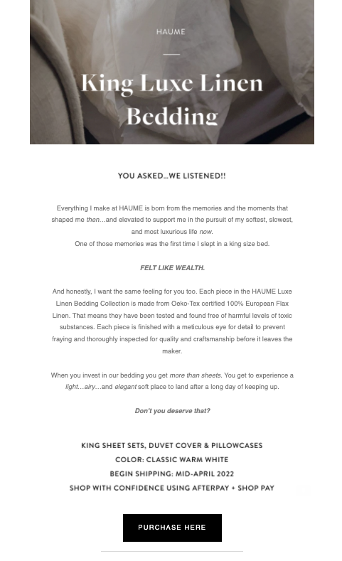
10. New product launch email example from Haume
Optimized features:
- Including the image of Haume’s new product at the top of the email captures interest right away.
- The phrase, “You asked…we listened,” sparks curiosity and encourages recipients to keep reading.
- The wording on the CTA button tells readers exactly what will happen when they click the button.
Get unlimited email sends & subscribers with Flodesk
We’ll never increase pricing because your email list is growing
4 email optimization tips and best practices
Now that you have a better idea of what optimized email campaigns look like, here are a few tips and best practices for your email marketing strategy.
1. Focus on improving email deliverability
Email deliverability refers to how many of your emails reach the coveted inbox—a critical component of email optimization. If your emails don’t reach your subscriber’s inbox, the game is over before it’s begun. Here are some things you can do:
- If you’re sending emails from a new email account, warm up your IP address by gradually increasing the number of emails you send over time to improve your reputation and deliverability.
- Check your emails for anything that looks or acts like spam. This can include using too many special characters or emojis in the subject line, writing in ALL CAPS, using “spammy” words in the subject line or the email itself, broken links, and more.
- Periodically remove inactive subscribers to improve your sender reputation. (But send them a win-back email first! Check out 6 Compelling Win Back Customer Template Ideas to get some ideas).
2. Monitor your metrics
Staying on top of your email marketing metrics alerts you to when specific areas need attention. Here are some metrics to keep an eye on and what you can do to improve them:
- Your open rate tells you how many people are opening your emails. You can improve it by optimizing your subject lines, sender name, and preheader text.
- Your click-through rate tells you how many people are clicking through your emails. Make sure it’s easy for customers to take action by testing out your email on multiple devices.
- Also, optimize your copywriting and link placement. You can run A/B testing to perfect things like the ideal anchor text, location of links in the body of the email, and the number of times you include a link.
3. Only send relevant content that provides value
Your subscribers are busy. If your content isn’t relevant or valuable, they’re not going to click through your email—no matter how well you’ve optimized everything else. So, it’s important to be choosy and only send emails that matter. Here are a few tips on how to execute this:
- Group your subscribers into segments based on their interests, preferences, or lifecycle stage. Then send content that’s relevant to each segment.
- Create automated workflows to make sure people are receiving your emails at the right moment.
- Inspire readers to take action by providing something of value like a discount code, a free download, or a sneak peek.
Want to write emails that bring customers closer to your business? Read 11 Email Marketing Lead Generation Tactics Your Subscribers Will Love.
4. Use pre-designed templates to create a good user experience
The design and flow of your emails directly impacts the user experience, which in turn affects engagement rates. Fortunately, you don’t have to be a designer to create well-designed emails—you just need good templates.
If you’re using Flodesk, you’re in luck: we have an extensive template library for you to choose from, and each template can be customized for your brand! (Check out this template customization tutorial on how to do it).
Beyond templates, here are some of our top tips for designing engaging emails:
- Use concise, relevant content, so people are excited to see your email come through—knowing that you’ll provide value.
- We recommend putting a 20 to 40-pixel spacer between each block in your email. This adds a light and airy feel to your design. Then, make sure to check that your spacers are consistently placed between all blocks to avoid that icky “broken HTML” look.
- Use clear, short wording in your CTAs—something widely proven to significantly increase your click rate. For example, a button that says “Buy now” is going to convert much better than one that says “Click here to buy it now.”
- Before sending your email to your list, send out a test to make sure everything looks great on both desktop and mobile devices. If you’re a Flodesk user, just click on that little paper plane in the top left corner of the Flodesk Email Builder to send a test email to your account.
Conclusion
Hopefully, you’re feeling ready to tackle email optimization now! And remember, if it’s beautiful, cost-effective emails you’re after, look no further than Flodesk—the email marketing platform that helps small business owners design beautiful emails in a flash.
Our intuitive drag-and-drop email builder allows you to optimize emails quickly while the unparalleled email and form template gallery helps elevate your brand.
Plus, Flodesk’s proprietary layout blocks truly set the platform apart from the competition. Layouts help you create custom graphics, design collages and sign off every email with a specialized script font signature right within the email builder—no third-party design software needed. Once emails are sent, Layout blocks render in a special way to ensure they’ll look great on any device. If that sounds good to you, why not try a free trial?
Email optimization FAQs
What’s an email marketing optimization strategy?
An email marketing optimization strategy is a tactic used to improve the performance of your email campaign. Common strategies include optimizing the subject line, using a personal sender name, and segmenting subscribers.
What is an optimized email?
An optimized email is one that has been improved or designed in such a way as to improve its chances of being delivered, opened, and clicked through. Common strategies include optimizing subject lines, including a single call to action, using actionable language, and sending targeted emails to specific groups.
What’s an email marketing campaign?
An email marketing campaign is a planned set of email messages that are sent over a period of time. An email campaign typically has a specific purpose or goal like getting customers to make a purchase on your website or sign up for an event.
