The ultimate guide to Flodesk Checkout
Table of Contents Jump to:
Jump to:
Table of contents
TL;DR: Check out Flodesk Checkout! It’s how small businesses sell and accept payments online for digital downloads, courses, and services.
I spent weeks ideating my ebook, carefully planning every word, spending hours in Canva, and redesigning it over and over. So, after a month or two, when I was ready to release it, I gathered the social proof (testimonials) necessary to promote my ebook and writing services to the clients who need them most.
I was thrilled—this was it. I was going to put it out there and hope for the best. I even designed a string of stunning emails in Flodesk to encourage sales.
And then it hit me. All that time spent branding my ebook, my emails—and I hadn’t even thought about how to sell and distribute it. Where would I even start? After a few hours of research, I found many—too many—possible solutions. But they all required connecting (and paying for) multiple tools.
I had a beautiful website and a beautiful product. But I couldn’t find a checkout service that matched. I wasn’t going to purchase a membership to an unattractive ecommerce website. Researching integrations and figuring out how to piecemeal everything together was low on my list of to-dos.
And if I patched different tools and platforms together, my subscribers would convert on an unbranded, unexciting page that would not match the rest of the experience. It was beyond frustrating.
I created my ebook to make money, not spend all my profits on various tools and integrations. And why should I have to pay for an ecomm platform that doesn’t let me brand the experience to its full potential? I was about to pull my hair out, throw my hands in the air, and give up. So. Much. Stress.
Thankfully, this all happened when the Flodesk team was frustrated, too (I work here, I know), so we did something about it. We listened to your feedback and are excited to introduce a fully-branded sales experience. Meet Flodesk Checkout.
I spent an ungodly amount of time making my ebook perfect. I slammed my laptop shut in anger after researching where to sell my ebook, how to get everything set up and integrate it with my website, and how I could deliver the ebook.
Is it too much to ask that customers have a beautiful, seamless experience, from a captivating sales page to a quick checkout process to instant access to their purchase? I didn’t think so, which is why I very carefully (and intentionally) chose Flodesk Checkout.
Flodesk’s templates made it easy to design and customize to my brand, but it was more than just the surface things. Flodesk Checkout let me customize the delivery. Instead of dealing with extra tools, integrations, or another site, I deliver my ebook my way.
Flodesk Checkout also works seamlessly with Flodesk Email, so I could add subscribers into segments, tailor my outreach, and nurture them through consistent outreach. Oh, and it’s all in my brand colors and fonts so that consistent experience I love doesn’t get broken by a clunky checkout experience. It’s everything I need, all in one platform.
And now, I’m here to walk you through how you can use it to grow your business (and your bank account).
Read next: Checkout page design examples & best practices!
What’s Flodesk Checkout?
Flodesk Checkout is the easiest way to sell online. You don’t need a website or complicated setup with extra tools. And the best part? You can customize it to match the look and feel of your brand and emails like you do with Flodesk Email.
Whether you’re launching a new course, selling digital products, or offering services, you’ve come to the right place. So, what are you waiting for? Let’s dive in!
Before we explore the ins and outs of Flodesk Checkout, here’s a quick roundup of everything you need to know:
- Flodesk Checkout allows you to sell digital products, courses, and services online—no need for cumbersome tools or setups.
- You work hard for your money, and we want you to keep it. That’s why you’ll only pay a 3% Stripe fee + $0.30 on every transaction. No Flodesk fees or taking a cut.
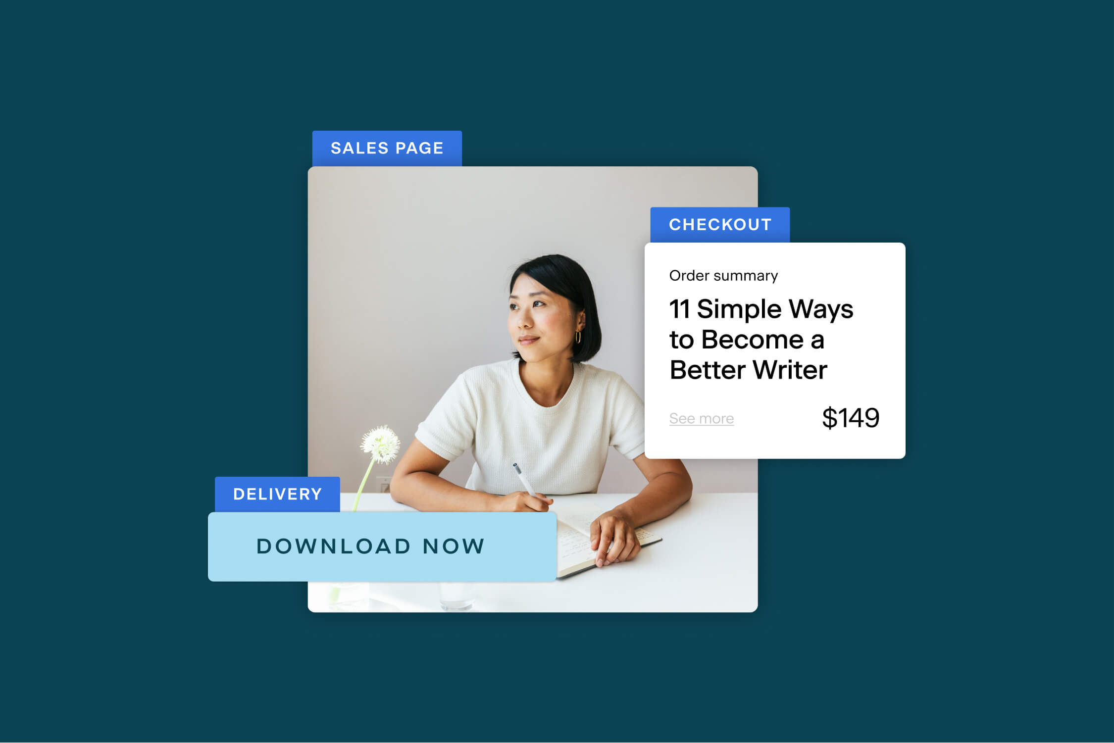
- You can build a checkout-only page or create an entire sales experience, from attention-grabbing sales pages to a simple way to pay online to a delivery page that delights your customers.
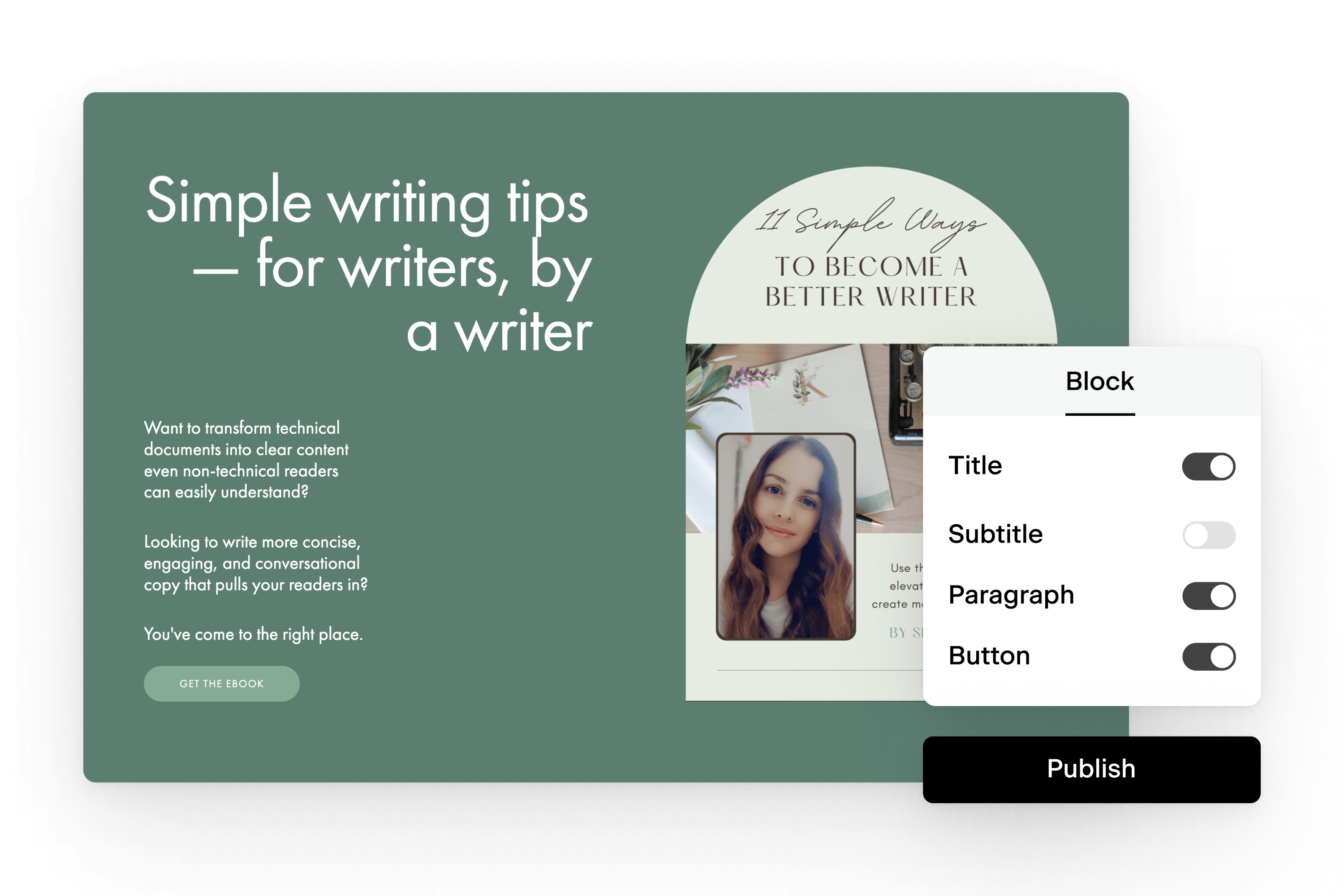
- Flodesk Checkout uses the same intuitive builder as Flodesk Email, so you can focus on selling your products and services, not complicated design.
- You can get a complete walkthrough of Flodesk Checkout in our Help Center.
Flodesk Checkout is where small businesses do business. Selling courses, digital products, and services online (and accepting payment) has never been easier. Like Flodesk Email, you can choose from several checkout templates and customize every block, swap out layouts, delete sections, and more. We’ve optimized the layouts for conversion, so if you want to keep everything as is and only add your brand colors, fonts, and logo, you can do that too.
And because we know that some members have websites and just want a way for customers to check out while others need a full sales experience, you can choose to have a checkout page only or a sales, checkout, and delivery page.
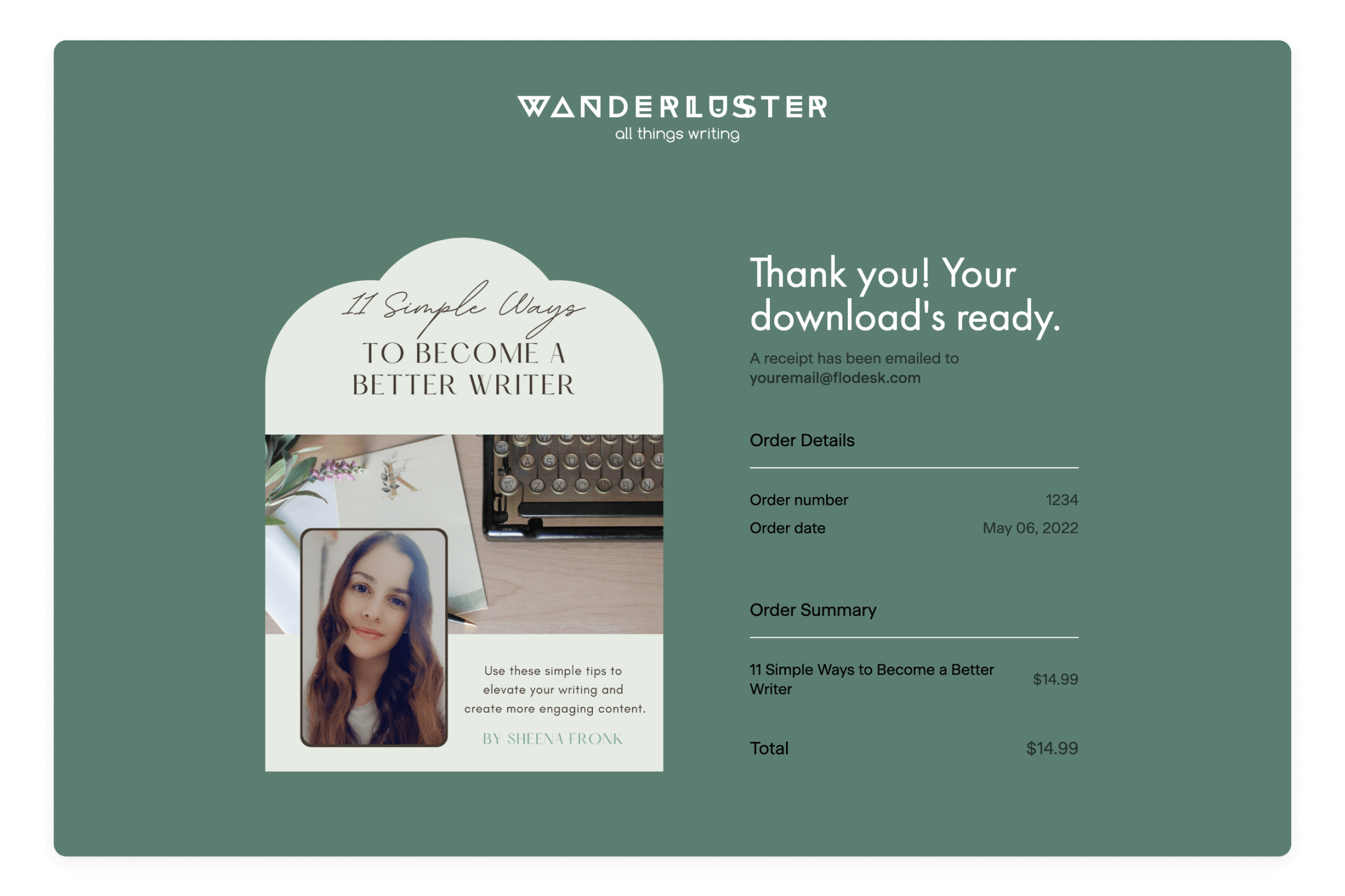
What I did: As a writer, words are everything, but that doesn’t mean I skimp on design. I rebranded my all things writing business—wanderluster co.—to be more reflective of me and my aesthetic. So when I designed my checkout page, I chose the “Sell a digital product” template and kept the bones, but changed everything else to be on-brand, so whether you were on my website or my checkout page, you knew it was all from wanderluster co.
Need some inspiration? Check out my checkout (see what I did there?)!
Now that the creative juices are flowing, let’s start with the sales page.
Sales pages built for conversion
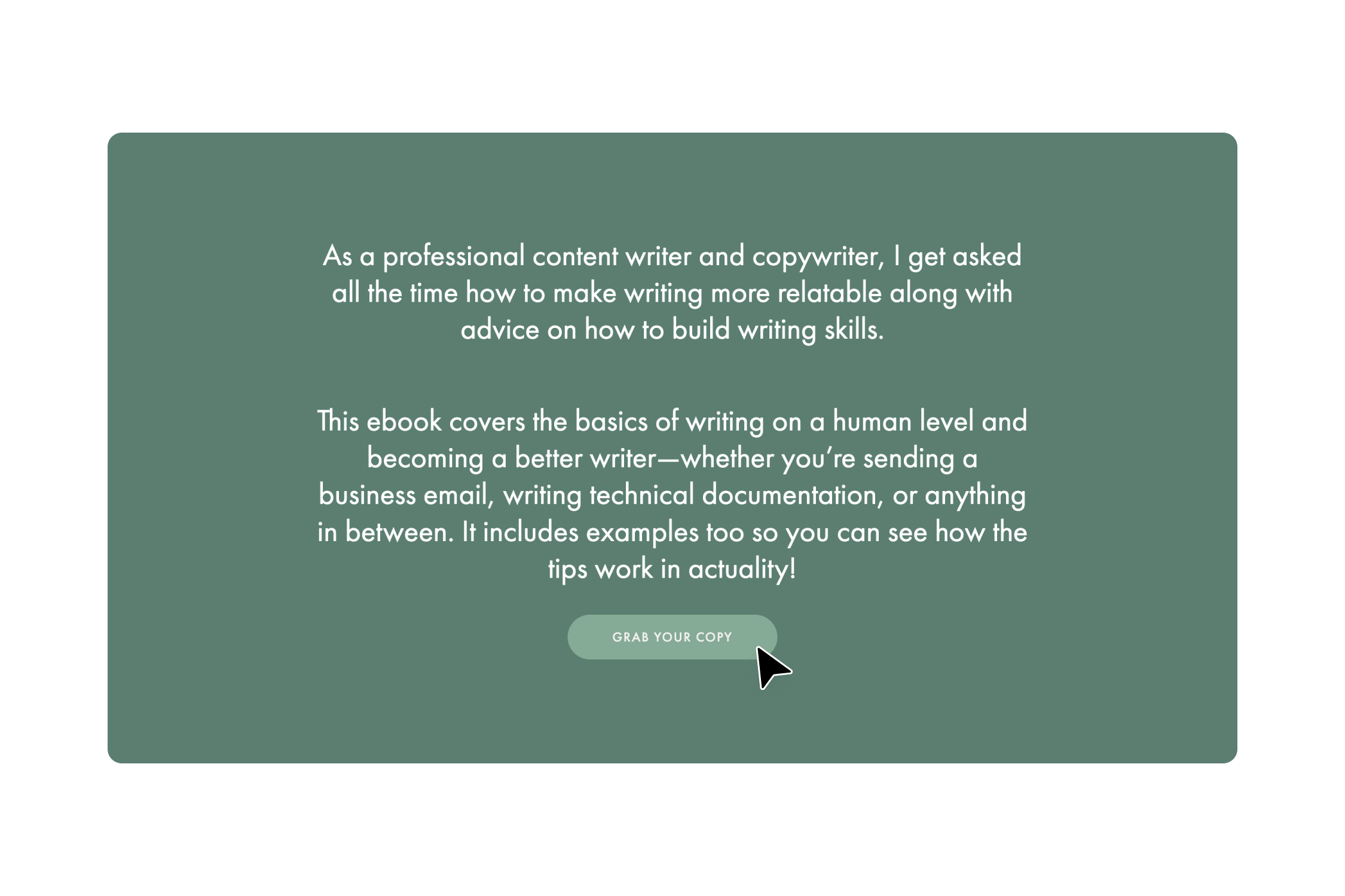
Once I put the finishing touches on my ebook, I breathed a huge sigh of relief and got excited about designing my sales page. After all, I already did all the hard work. Flodesk has stunning templates, so I chose my favorite, customized it, and wrote the irresistible copy that has visitors clicking that CTA button over and over.
I know, sales copy is hard. I’m a writer, and it’s tough for me. But you can do it! I spent a lot of time writing, rewriting, editing, and finalizing my copy until it was just right. If you’re struggling, though, here’s what I suggest:
- Take some time to think through why your visitors need what you’re selling and everything they have to gain by purchasing your digital products or services.
- Remember, your sales page is your chance to make a great first impression with compelling copy and beautiful design. Take the time to think through how the design and copy work together.
- Don’t worry if it’s not perfect for your first iteration—you can always go back and edit it at any time.
Pro tip: Keep the focus on the benefits and your customers. No one likes being sold to, but everyone loves to buy. Let this guide you and watch the sales roll in.
A simple checkout for them. An opportunity for you.
Sure, checkout pages are gorgeous, but I’m here to make money (and create valuable, engaging, and inspiring content and courses for my clients and customers). So, when customers visit my website or checkout page and tell me they want to buy from me, I keep it simple.
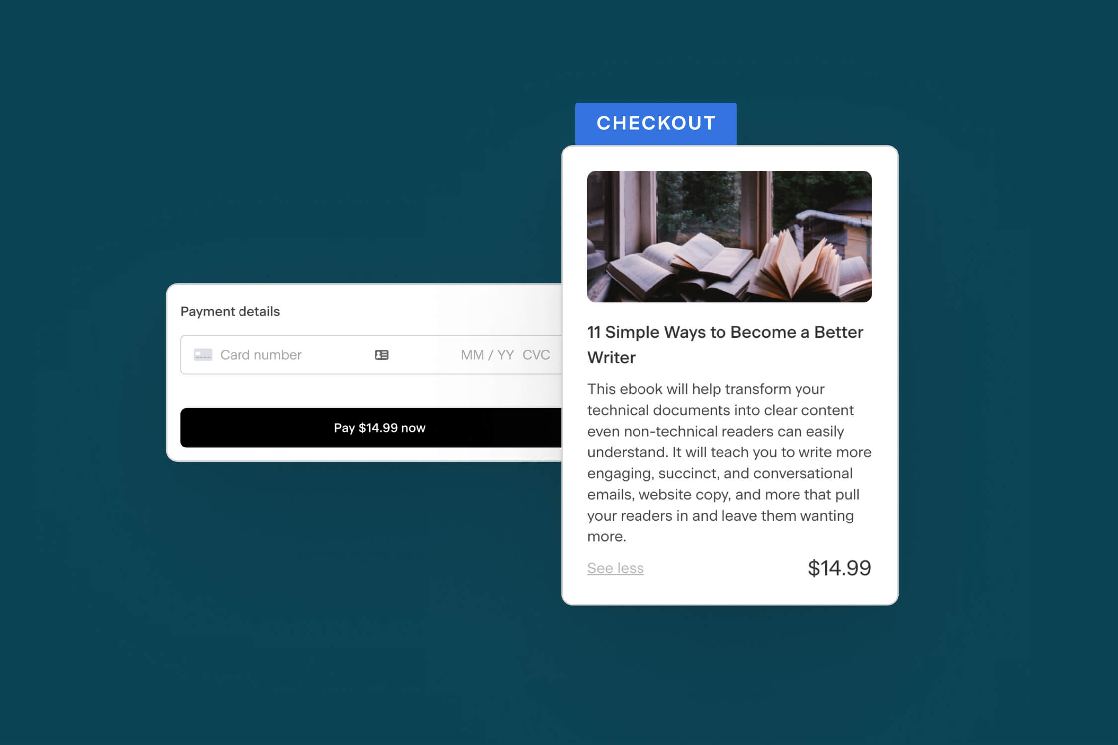
Flodesk built the checkout page to be frictionless, so when a visitor clicks that “Get the ebook” or “Download your copy” button, they only have to take one additional step to purchase. Did you know you can use your checkout page to grow your list and your bank account? Here’s how:
- Sell to visitors and then turn them into subscribers. It lets customers input their credit card information to pay for digital goods and services. But I’m not just thinking about the now. I’ve got big goals, and part of that is future sales, too. I opted to add a checkbox where my customers can opt-in to my list and receive offers down the road (to become repeat customers!).
- Do you have the perfect upsell to pair with their purchase? We thought so! Add your upsell to the checkout page to give your customers even more value and yourself more money in the bank. That’s what we call a win-win. Trust me, when I finish building my upsell, it will be on my checkout page too!
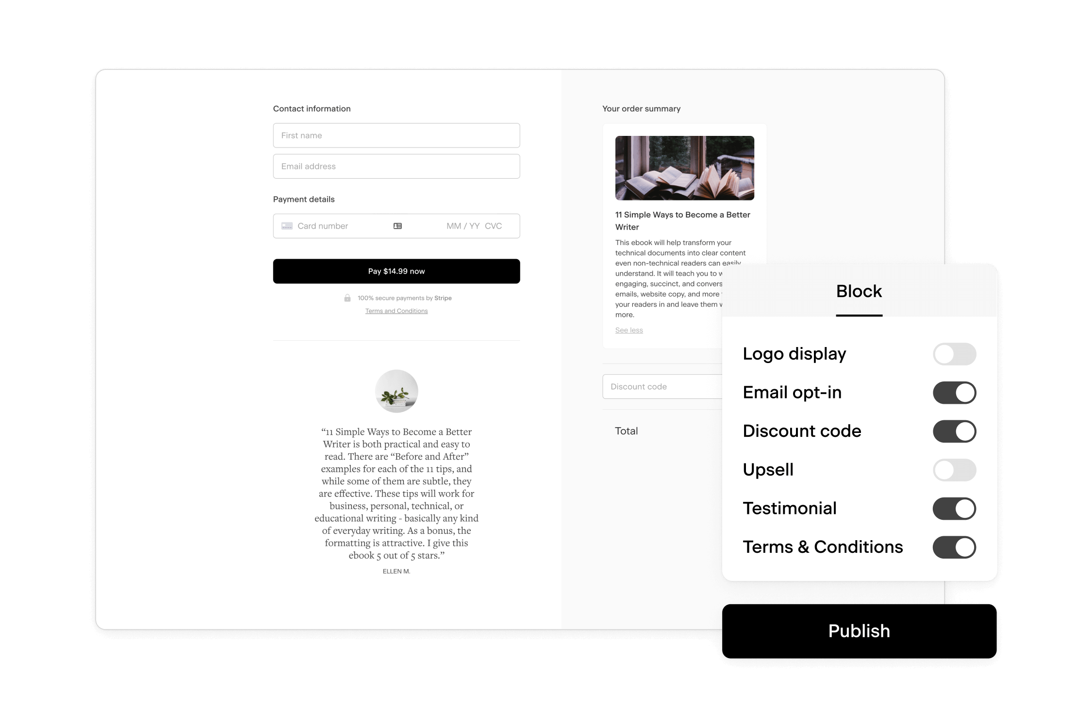
Your checkout page can be as minimalistic or full as you like. With customizable features like testimonials, upsells, email opt-ins, and discount codes, your checkout page can truly be everything you want and nothing more.
What I did: I am by no means a designer, but I love pretty things, so when I built my checkout experience, I focused on sales copy and a design that felt comfortable, relaxed, and not overwhelming. I don’t have a lot of images or different elements, but that’s how I like it. But if you want all the bells and whistles, Flodesk delivers there too.
You can get a thorough overview of each element in the Help Center, but here are a few I think you’ll love:
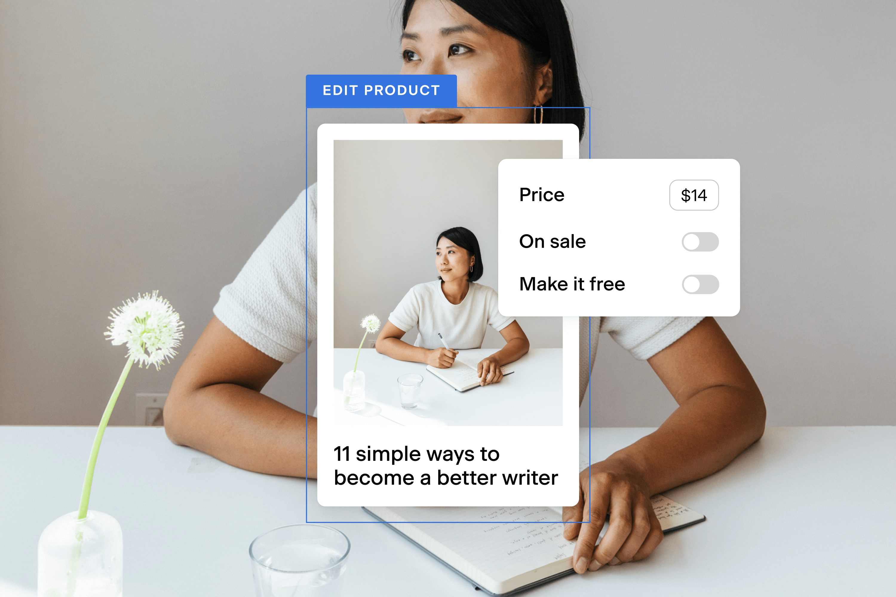
- Product. Change the photo, add a description, adjust the price, make it free, or mark your digital product or service on sale—it’s up to you!
- Upsell. Create a high-value upsell and customize it the same way you customize the Product tab.
- Contact. Remember how I talked about allowing your visitors to subscribe to your list? Do that here and add subscribers to different segments too! I’ve created different welcome sequences based on people who join my list by purchasing my ebook or otherwise.
- Testimonial. Who loves your offerings most? Share their words in the Testimonials tab to build trust and credibility. I hate bragging about myself, but I love when other people do, so I’ve got testimonials all over my website and on my checkout page, too.
- Discounts. Who doesn’t love a good discount? Whether you want to offer a discount immediately after launch or reward loyalty, you can create multiple custom discount codes here and leverage crossed-out pricing to get them to “Buy now!”
Pro tip: Enable the opt-in field so you can nurture customers over time and give them a reason to keep coming back. Reward loyalty by offering your existing subscribers a discount code for your latest offering.
Give them the goods!
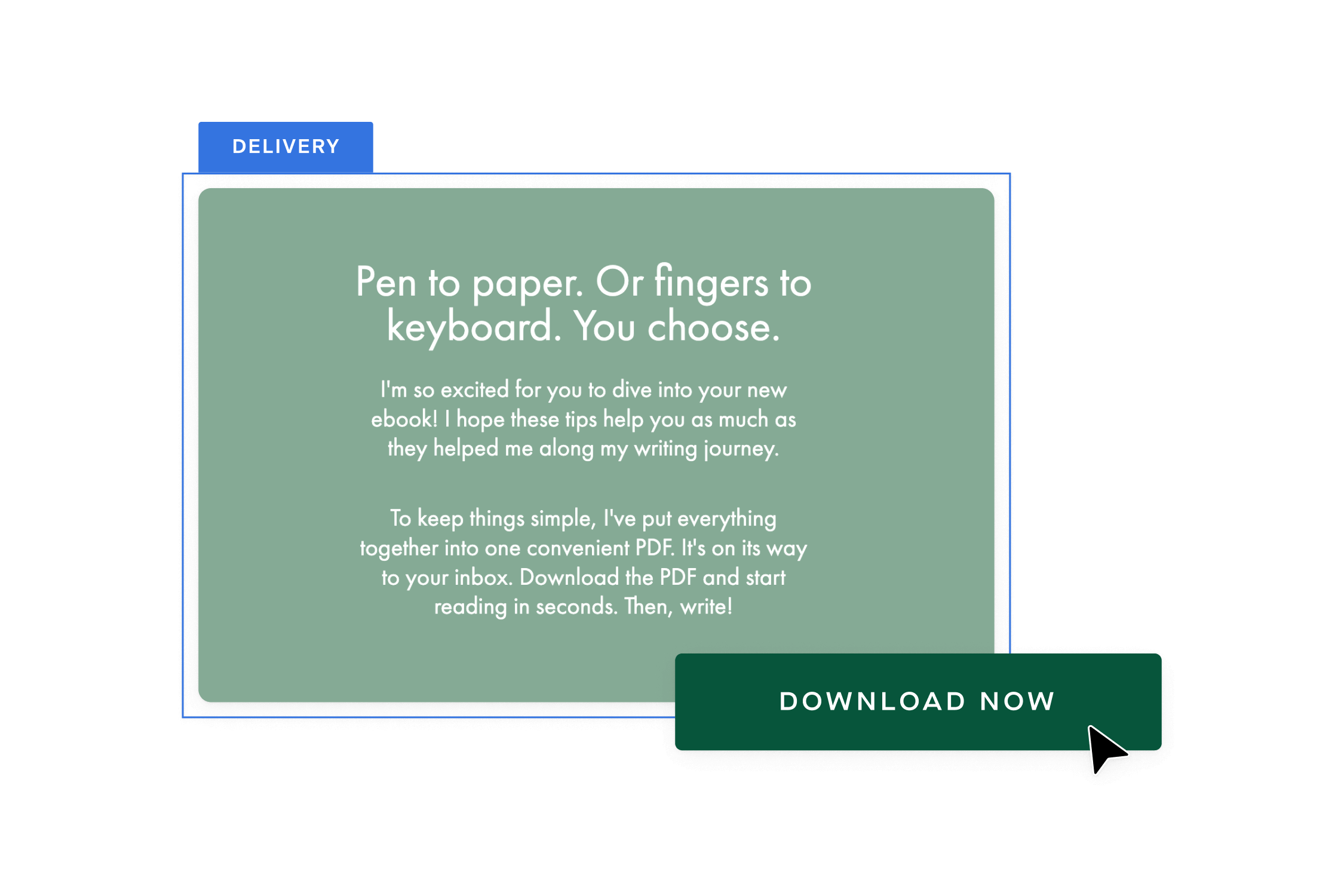
Your delivery page is how you grant your customers access to your offering. Are you a graphic designer who needs to meet with customers before you begin the design work? Link to your scheduling page (like Calendly) and allow customers to schedule time with you to go over the details.
Do you have an ebook for download? Me too! I auto-send an email with the attached ebook, so I can fully customize their experience, but you can link to a Dropbox or Google Drive account where they can access it. It’s completely up to you.
Did your course launch recently? You can link to your videos or downloadable PDFs or instruct customers to look out for an email with registration info to access your course on another platform.
And don’t worry about receipts—Flodesk will automatically send a receipt email to your customers.
Like with your sales and checkout pages, you can tailor blocks, remove sections, and choose what you want to show to customers. You can even add your logo to reinforce your brand. From start to finish, you’ve created a beautifully branded experience your customers will love. All that’s left is to publish your checkout.
What I did: I adore my clients and especially love the ones who purchase my products. I express gratitude on my delivery page and get them excited to download my ebook and start writing. Of course, I’m excited I made a sale, but I genuinely care for my customers and want them to get value from it, so I do my best to hype them up.
Pro tip: Express gratitude to your customers and end on a high note.
Connect Stripe and publish
You are so close to making your first sale. There’s nothing more exciting than getting that first notification that someone purchased from you! Hit the Publish button and then connect your account to Stripe so you can collect payments from your Flodesk Checkout sales.
After you get set up and verified in Stripe, you’ll have to publish your checkout page again.
And just like that, you’ve made your first (or next) sale. Congratulations! It’s a big deal, so feel free to celebrate. I texted every member of my immediate family and best friends when I made my first sale. I also shared it with my boss. I couldn’t contain my joy, and you don’t have to either. Celebrate that win!
Build, sell, repeat with Flodesk Checkout
Selling can be simple with Flodesk Checkout. Whether you’re launching a course, selling digital products, or offering services, Flodesk Checkout helps you build mobile-responsive and high-converting sales, checkout, and delivery pages that your customers love.
I am already working on more products to add to more and more checkouts. It’s too simple, too beautiful, and too high-converting not to.
So, who’s ready? Let’s make sale after sale!
