How to format a newsletter | 8 top tips
Table of Contents Jump to:
Jump to:
Table of contents
So, you know that you want to create an email newsletter for your business, but have no idea how to format it.
Surprisingly, this is a pretty common situation. Email marketers spend a lot of time thinking about what goes into their newsletters, like writing a newsletter, but they often feel stumped when it comes to their formatting and design.
Imagine you’ve spent hours crafting the perfect newsletter content. You’ve identified the problem your reader is looking to overcome using your tool, and have put together handy resources from your blog that will guide them in making the most of your technology. But you didn’t optimize your newsletter for mobile. It’s so unreadable that the majority of your readers—who check their email from their phones—don’t make it past your introduction.
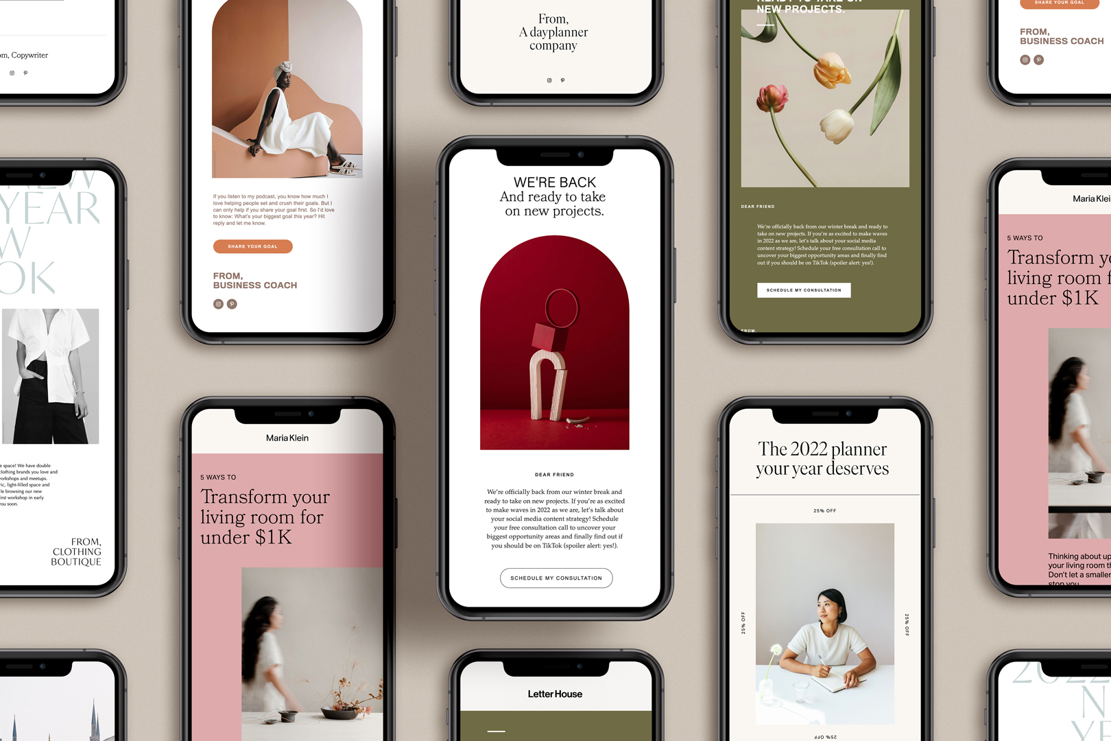
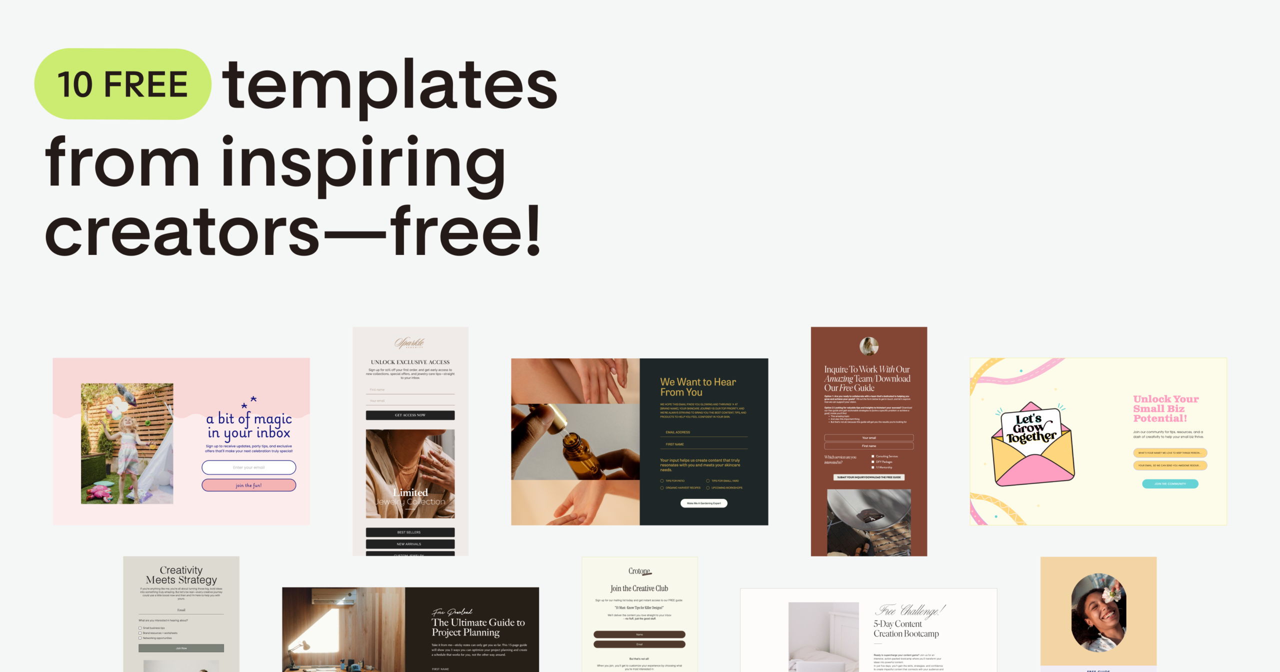
The easiest way to get your newsletter formatting perfect every time is by using a template like the gorgeous ones we have at Flodesk. However, there are also simple steps and best practices you can follow to make an email design from scratch.
Keep reading for a breakdown of what they are below. If you’re already feeling confident about your email newsletter formatting and are craving some design inspiration, you can check out our curated list of excellent email newsletter examples.
Newsletter formatting is an essential part of your email marketing strategy. Not only does it ensure your emails are consistently designed and professional, it sets you up to create targeted email campaigns that your audience is actually interested in.
An optimized newsletter format ensures your email:
- Is readable and clear
- Is professional and consistent
- Looks great across email providers
- Is optimized for mobile devices
- Factors in audience preferences
- Uses a newsletter template relevant to your niche
Discover tips and examples to craft winning email optimization strategies.
Building beautifully formatted newsletters is easier than you might think. Here are eight practical tips to design emails people love to get:
- Prioritize the mobile device
- Include a beautifully branded header and a footer
- Design with your target audience in mind
- Emphasize the most important parts of your design
- Find a balance between images and text
- Use fonts strategically
- Opt for a tidy newsletter design with lots of white space
- Use an email newsletter template
If you want more in-depth information about newsletter design, dive into our article about newsletter layout design ideas.
Brilliant emails. As easy as it gets.
Elevate your newsletters with Flodesk’s beautifully designed templates, custom fonts, branded graphics, and full creative freedom.
1. Prioritize the mobile device
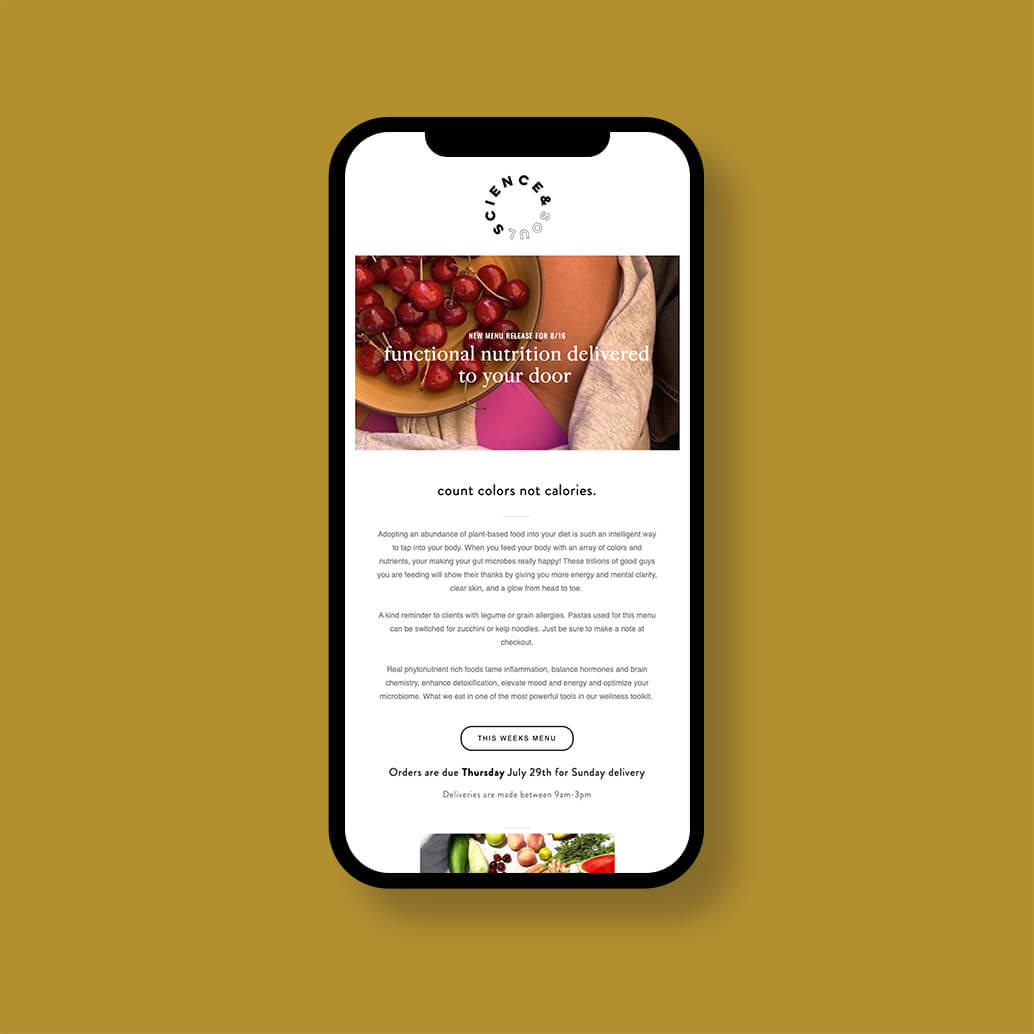
Mobile devices are one of the most important factors to keep in mind when formatting your newsletter. Most people check their emails on their phones every day—making mobile optimization increasingly essential.
In fact, a Super Office study estimated that as many as 81% of all emails were opened and read on mobile devices as of 2020.
If your email newsletter format isn’t mobile-friendly, it doesn’t matter how beautiful it is. As soon as interested readers open your email and see how poor the mobile reading experience is, they’ll delete it right away.
All marketing emails should begin with a header and end with a footer. These are useful design elements that give you the chance to showcase your logo, company name, branding, color palette, and fonts—ensuring your newsletter is easily identifiable.
They also frame your emails, help provide a cohesive visual experience, and are opportunities to catch your reader’s eye.
If you’re looking for more specific advice on designing your email header, take a look at our guide on email newsletter headers.
While there are a few common best practices, what makes a perfectly formatted email newsletter is somewhat subjective. In order to determine what newsletter formatting will resonate best with your customers, it’s important to reflect on who your target audience is.
Ask yourself questions like:
- What is the typical age group of my customers? Are they older, or younger?
- What kind of feedback have I received about previous email campaigns? Has any come up multiple times?
- Has anyone complained about my email newsletter formatting in the past?
The answers to these questions will help inform the kind of targeted email format you should go with. For instance, younger demographics tend to have more patience for different kinds of media (like images, videos, and GIFs) and a busier overall look.
On the other hand, the best newsletter format for older demographics might be more minimalist and easy-to-read.
4. Emphasize the most important parts of your design
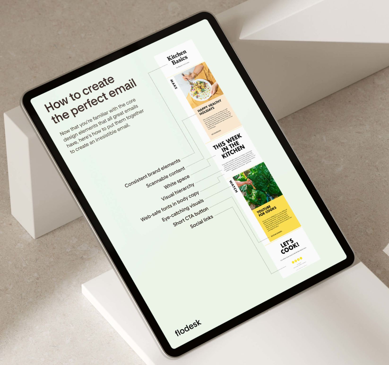
Visual hierarchy is a design strategy that arranges visual elements to show their importance. For example, if an element is larger, brighter, or higher up on a screen, it’s more likely to grab attention.
Use visual hierarchy when designing your newsletter template. This helps viewers digest the information they’re seeing.
Here are some basic principles of visual hierarchy:
- Large elements attract more attention than small elements. If you want to emphasize or focus on something in your design, make it bigger.
- Bright colors or stark color contrasts catch the eye more than more muted and subtle palettes.
- Don’t limit yourself to one font size. Different font sizes show the reader what’s important, and bring order and information hierarchy to your newsletter.
- Use negative space to focus on a specific element. Negative space, also known as white space, creates a clean look and directs the eye to whatever’s found within it.
- To create a cohesive design, repeat certain elements—like fonts, colors, or shapes.
Design emails people love to get with Flodesk
Get started with gorgeous, highly customizable email templates that make your brand shine through across devices.
5. Find a balance between images and text
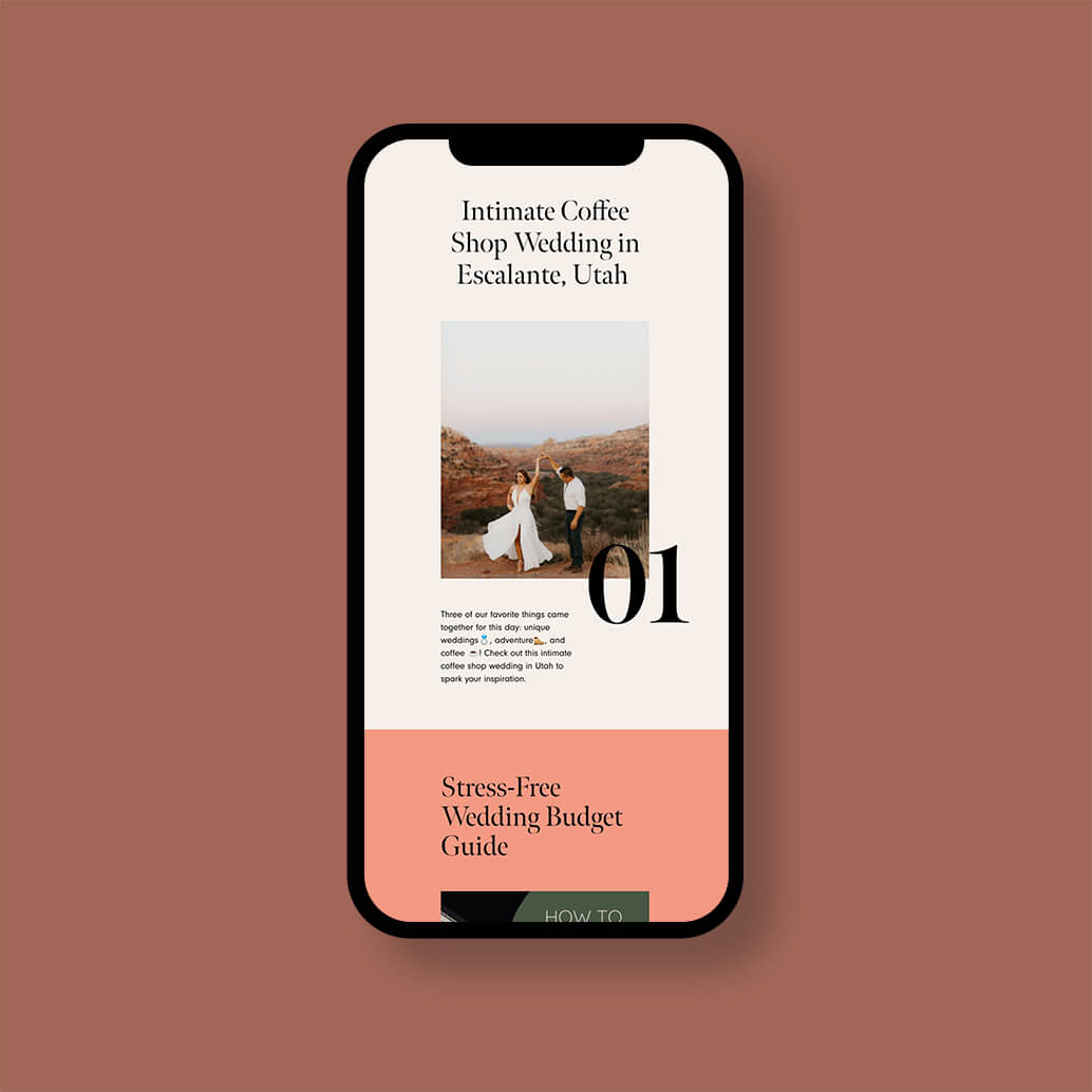
A perfect email template needs an equal mix of images and text. Even though email marketers often talk about how vital images are for easy readability, you can’t rely on them alone.
Your email newsletter should ideally be about 50% images and 50% text. Dedicate the text portion to your message’s most important information, keep it concise, and be mindful of font size.
The images you choose to include should be high quality, consistent with your brand, and reflect what you’re talking about in the newsletter copy.
6. Use fonts strategically
Even though there are tons of custom font options nowadays, be careful where (and when) you use them. Custom fonts ensure your headers and subheaders are beautifully designed. They’re also ideal for adding in an email signature that feels ultra personal—but they shouldn’t be used in the body of your newsletter.
For an ideal newsletter format, use standard or email-friendly fonts for the body text. These are neutral and easy to read, ensuring your messages are accessible and easily readable for all audiences.
It’s also important to consider that different email providers like Gmail and Outlook display fonts differently. If you use a custom font, they might display something else altogether. So, it’s best to use one of the following standard fonts for the body of your newsletter:
- Arial
- Georgia
- Helvetica
- Lucida
- Tahoma
- Times
- Trebuchet
- Verdana
We recommend using no more than two different fonts per newsletter template.
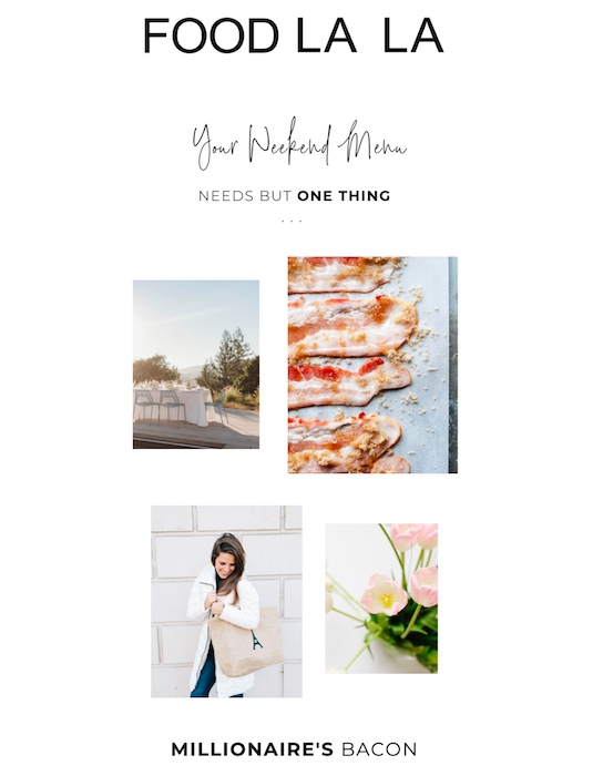
Less is more. As a best practice, opt for a tidy, minimalist email design that uses lots of white space. Take a look at this newsletter example from Food La La.
Think carefully about whether you want to use vibrant background images or background colors in your design.
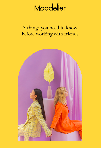
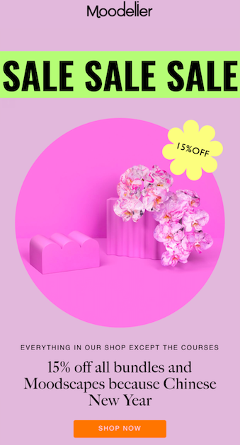
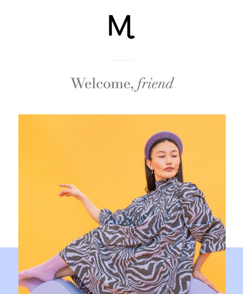
These can definitely attract attention, but make sure your newsletter is still easy-to-read and doesn’t appear too busy. This Moodelier newsletter format uses bold colors effectively without overwhelming the email’s design.
In terms of general advice for the best newsletter format, you shouldn’t use more than a few different colors in a single newsletter. And be mindful of how colors complement each other by referencing a color wheel.
If you really want to ensure you’re sending beautifully formatted newsletters—without putting in too much time or effort—use an email marketing software that offers gorgeous, customizable email templates.
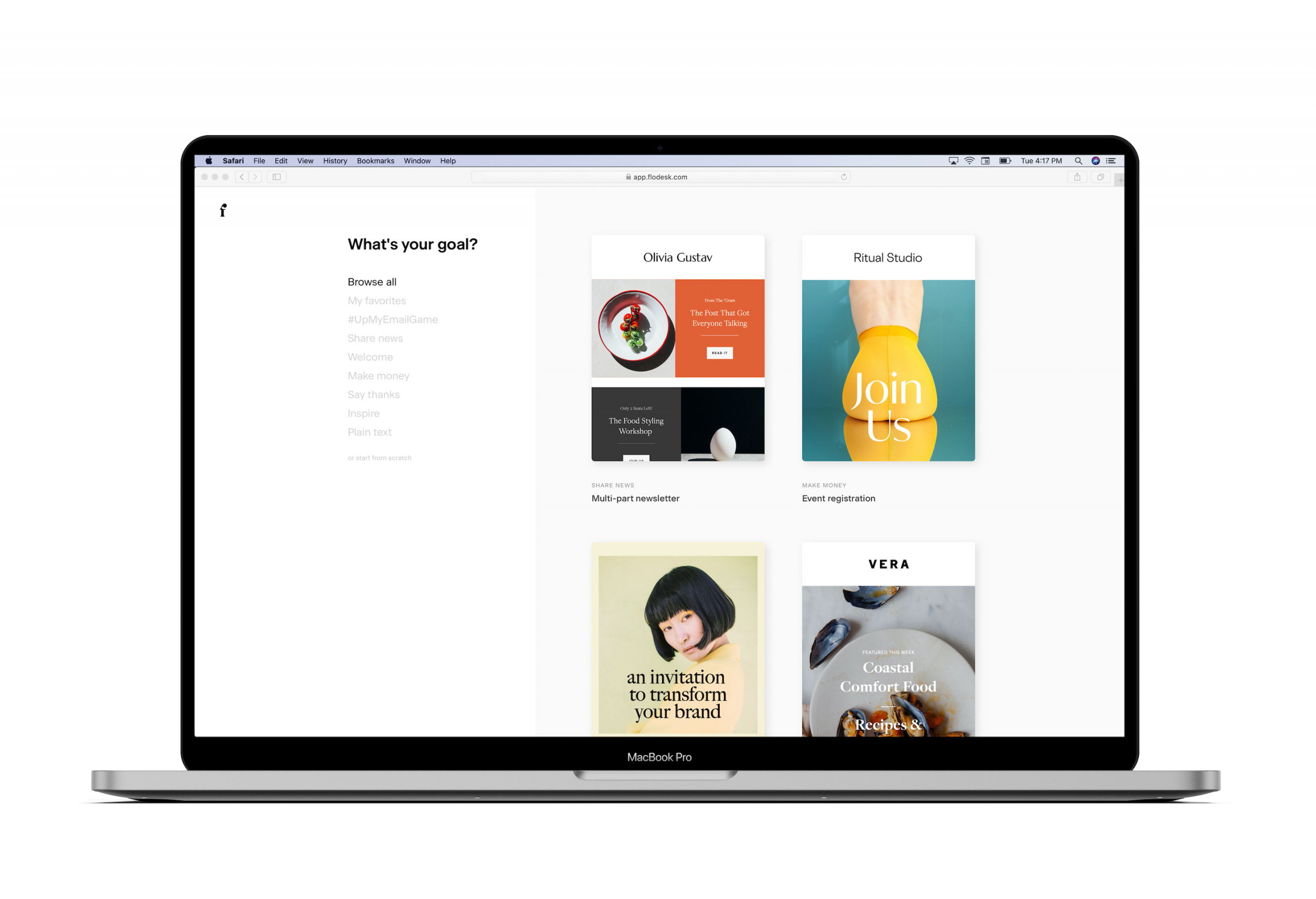
Flodesk’s library of templates for every goal helps businesses design stunning emails that people love to get. The intuitive drag-and-drop builder makes it easy for beginners and experts alike to create custom, on-brand designs in mere minutes.
Design emails people love to get
Ensure your newsletter content looks great across devices with Flodesk’s stunning, customizable templates. So easy.
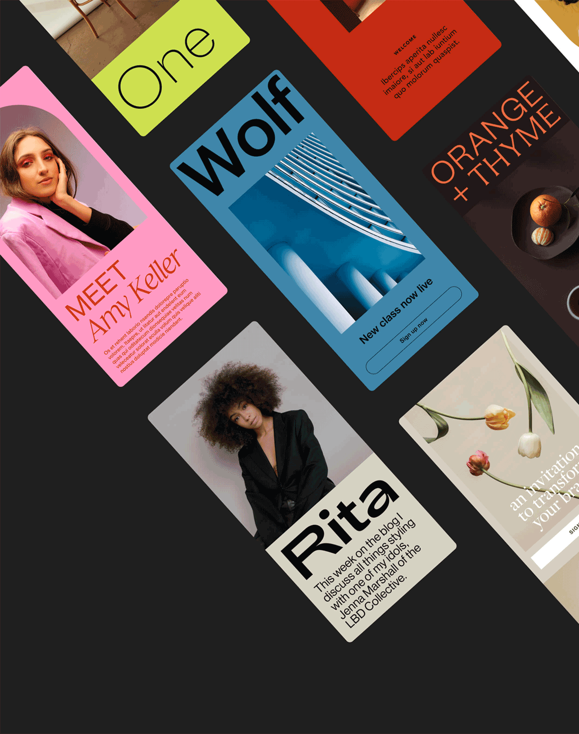
Different kinds of email newsletters call for slightly different formatting and layout. Here’s a breakdown of the most popular kinds of newsletters.
Ecommerce
If you’re sending out an ecommerce or typical email marketing newsletter, you’ll generally want to narrow the focus on one specific product or deal.
Be sure to announce it with an eye-catching headline right at the top of your email (under your header) before the reader scrolls down.
The best examples of ecommerce newsletter email marketing also:
- Convey urgency to drive sales
- Include high-quality photos that showcase the product they’re featuring and add visual appeal
- Choose their own images and show their products in different contexts
- Reinforce their email’s focus in their subject line
- Use a consistent color palette
Nonprofit
If you work for a nonprofit or charitable organization, you might be searching for the perfect monthly newsletter template.
Many nonprofits send out monthly newsletters outlining all their most important information and updates for their donors. Here are a few of our top formatting tips for nonprofit newsletters:
- Go with a minimal, sophisticated design and color palette so your nonprofit newsletter looks professional
- Make an impact with powerful, welcoming subject lines and headers that attract readers’ attention
- Highlight important links with buttons (but not more than a couple in each newsletter)
- Draw your reader into your email with subheaders that create a visual hierarchy and break text into digestible chunks for a better reading experience
Blogger
As a blogger, you’re usually the most important element of your brand. Your reader should feel like they’re receiving a personal message from you, so look for opportunities to add heartfelt touches to your newsletter format, like brand photos and a scripted signature.
Here are a few more formatting tips:
- Keep your email design consistent with your blog design
- Choose visuals that have performed well on your social media pages or website
- Use buttons for further engagement and link back to your website
- Make your email introduction, headers, and subheaders friendly and approachable
For tips on how to grow your blogging business through email, read our article on how to monetize your newsletter.
Now that you know exactly how to format a newsletter that your subscribers will love, it’s time to start designing. Flodesk offers a library full of gorgeous, customizable email newsletter templates that will help you perfectly format your emails on repeat. Choose your favorite template (or start from scratch) and make it yours. Brilliant email newsletters are just a click away. Try Flodesk free for 30 days—no credit card required.
