12 Abandoned cart email examples that lead to conversions
Table of Contents Jump to:
Jump to:
Table of contents
Abandoned carts are every merchant’s nightmare. Imagine having a shopper browse your site, find items they like and then just walk away. This happens a lot—the average cart abandonment rate is a whopping 69.82%. Ouch.
This is partly due to typical customer behavior—some are window shopping, comparing prices, or saving items on their wishlist.
In fact, Baymard’s latest study found that 47.8% of online shoppers in the US abandon carts because they were just browsing.
But when you remove these casual browsers from the picture, you can uncover legitimate reasons shoppers abandon carts—issues you can mitigate. Once you identify what’s causing visitors to leave their shopping cart, you can send them an abandoned cart email encouraging them to return and complete their purchase. Here’s how.
Plans built to grow with you. Pricing that puts you first.
See why Flodesk is the world’s most-loved email marketing platform.
Why invest in abandoned cart emails?
More conversions mean more revenue. But don’t waste your time chasing customers with low or no intention of buying first.
Instead, look at missed opportunities like abandoned carts. By adding items to their cart, these shoppers have expressed an interest in your products or services and are more likely to make a purchase from you.
Here are three other reasons investing in abandoned cart emails is a smart idea:
- Well-timed and multi-step abandoned cart emails can recover sales and improve campaign performance by as much as 30%
- Since cart recovery emails are targeted emails, they can help you improve both your customer experience and retention rates
- You can find out why visitors abandoned their carts by asking them what went wrong. Then, you can use that information to improve your checkout process or provide content that will prevent lost sales in the future
The ideal abandoned cart email sequence
How can you implement abandoned cart emails effectively and recover lost sales? An ideal abandoned cart email sequence will be timely and personalized to each potential buyer.
For example, your abandoned cart email sequence should clearly specify what products or services the visitor was considering purchasing.
You should deliver a series of emails (we recommend three). Sending multiple emails is a more effective abandoned cart email strategy than a standalone cart reminder, as it increases touchpoints for conversions.
You should carefully time out your sequence—ensuring you remain top of mind without spamming your customers. Here’s how.
- Your first email should go out almost immediately—within an hour of cart abandonment—and prompt customers to complete their purchase
- Send the second email after 24 hours and offer exclusive and time-bound offers customers won’t want to miss
- The third and final email can be sent 48 hours later. This is a good opportunity to offer greater discounts and other value propositions, like free shipping, to incentivize quick purchases
With Flodesk, you can quickly design beautiful emails and set up automated workflows that help you automatically send follow-up emails and make money while you sleep. So easy.
Now, let’s review a few abandoned cart email examples to inspire yours.
and Checkout page examples & best practices to reduce cart abandonment.
12 best abandoned cart email examples to win back customers
Ranging from gentle cart reminders to full-blown psychology hacks, these email examples will help you understand what works and why so you can design the perfect abandoned cart email strategy.
1. The “forget something?” email
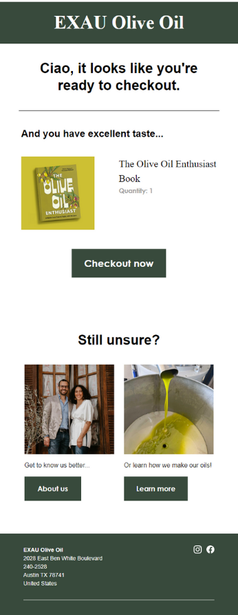
The standard “you left an item in your cart” email can work like a charm. Take this example from EXAU Olive Oil, a high-quality olive oil brand that uses a standard abandoned cart email template to remind shoppers about their incomplete purchases.
Why this works:
Online shoppers can get easily distracted. A knock on the door, a social media notification, or shopping around can result in them forgetting the items in their cart faster than you can say “shopping cart abandonment.”
EXAU Olive Oil’s email hits all the right notes:
- It has a clear and direct subject line: “Where are you going?!”
- The email shows off the product(s) left behind
- There’s no fluff—only short, concise copy
They emphasize the quality of their products with “And you have excellent taste…”
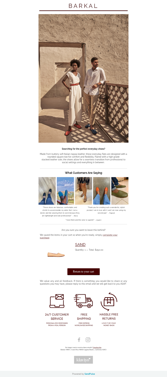
Barkal, a modern take on traditional Sudanese shoes, sends shoppers this email when they abandon their cart:
Why this works:
First-time shoppers tend to be skeptical of sites they haven’t shopped on before. In fact, 19% of shoppers Baymard surveyed said they abandoned their cart because they didn’t trust the site with their credit card information.
Social proof helps foster trust and ease shoppers’ worries. By including customer reviews and testimonials, you can lower that barrier. Some other reasons this email works:
- The subject line is helpful, not sales-driven
- The copy highlights reasons to buy
- The review features the customer’s names and user-generated content, which makes it more authentic
3. The “free shipping + returns” email
Here’s how Manitobah Mukluks, an indigenous-owned company that makes winter boots, brings back customers.
Why this works:
Extra costs—like shipping, taxes, and fees—drive 49% of US consumers to abandon their carts. The same survey found that 11% abandoned their purchases due to an unsatisfactory returns policy.
Manitobah solves both of these issues by highlighting its free shipping and returns policy in the preheader and copy. They also:
- Provide social proof with average customer ratings
- Show their commitment to transparency by sharing HQ and warranty information
- Deliver a clean, aesthetic design that’s consistent with the brand
4. The “FOMO” email
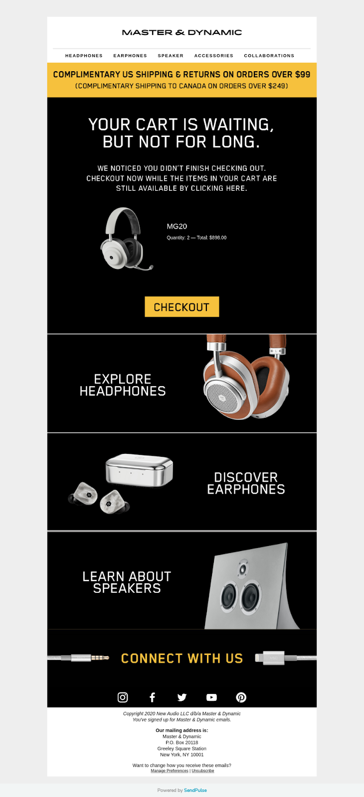
FOMO, or fear of missing out, can be a powerful motivator. Master & Dynamic, a premium audio brand, taps into FOMO with their abandoned cart emails.
Why this works:
FOMO can make visitors hyper-aware of missed opportunities, prompting a purchase.
Master & Dynamic’s email evokes that emotion in several ways:
- The subject line “Your cart is waiting, but not for long” grabs attention
- The email heading doubles down on this key messaging
- The copy invokes urgency through phrases like “while items are still available”
You can leverage the FOMO factor in your subject lines, too. Explore 64 abandoned cart subject lines to increase open rates and draw people back.
5. The “FAQ” email
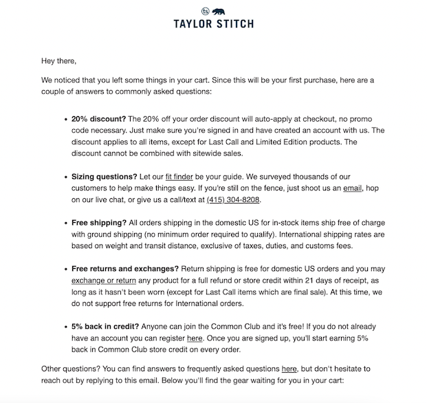
There are numerous reasons why you may lose a customer, one of which may be a lack of crucial information on your checkout page. This abandoned cart email example shows how you can address common questions and clarify any customer doubts.
Why this works:
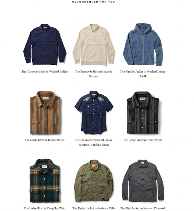
There’s a lot to consider when making an online purchase, especially when it comes to clothing sizes. Taylor Stitch addresses the questions and concerns their shoppers may have—like details around returns, shipping, discounts, sizing, and a link to answers for other frequently asked questions. This helps retailers build trust and customer loyalty.
Some other reasons why this cart recovery email works:
- The subject line addresses potential customers’ indecisiveness
- Recipients can explore the answers at will instead of being overwhelmed
- The CTAs are short, clear, and actionable
6. The “talk to us” email
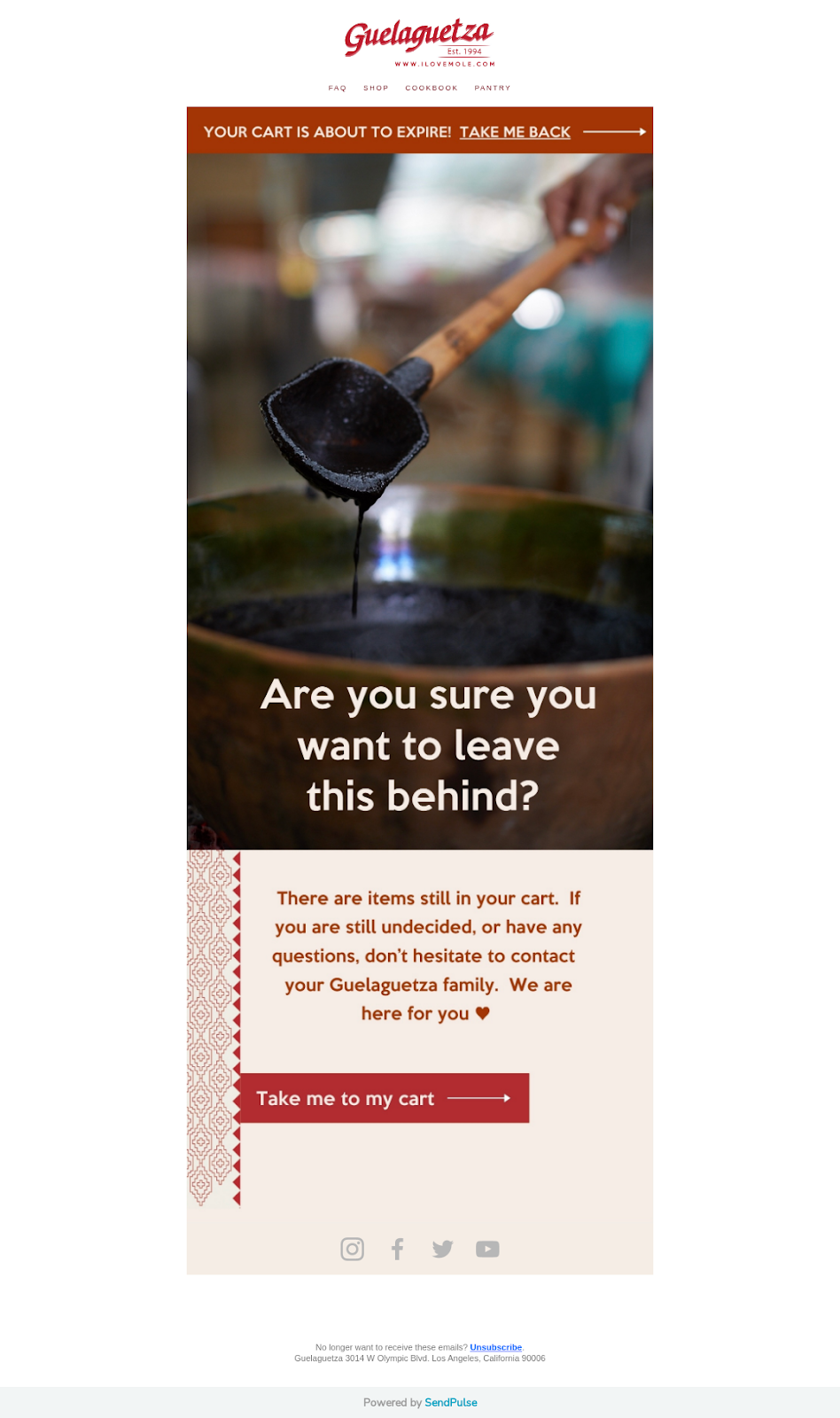
Guelaguetza, an immigrant-owned Oaxacan cuisine restaurant that sells its mole and Michelada mix online, sends shoppers this email when they abandon their cart.
Why this works:
Some people abandon carts due to a lack of customer support and uncertainty about the product. That’s why Guelaguetza offers customer service and personalized responses from a real person.
This is a valuable alternative to other common approaches to customer support, like chatbots. Userlike’s 2021 study found that almost 40% of people complained about bots not being able to understand their requests, and 60% said that bots couldn’t resolve their issue.
Guelaguetza’s email also uses other effective tactics, such as:
- Invoking urgency with “your cart is about to expire”
- Using short and to the point email copy
- Featuring actionable CTAs like “Take me back” and “Take me to my cart”
7. The “discount” email
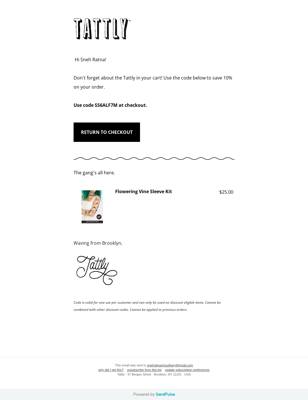
A well-timed discount email can encourage more visitors to convert to customers. Tattly, a temporary tattoo sticker brand, uses an abandoned cart email template to offer a 10% discount to customers that return to checkout.
Why this works:
A reported 92% of US consumers use coupon codes for shopping. And codes can tip the scales in favor of making a purchase.
Tattly also boots the effectiveness of their abandoned cart email with these elements:
- The subject line invokes FOMO
- The discount terms and conditions are clearly mentioned
- The copy is clean and concise
8. The “USP” email
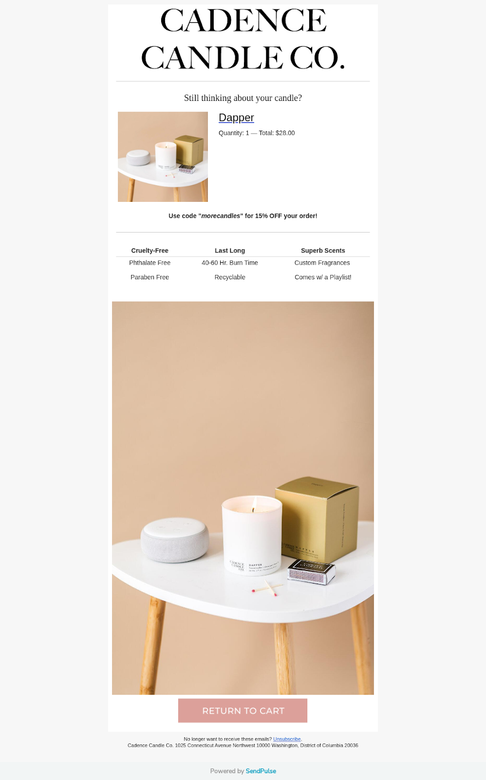
Cadence Candle Co., a candle brand, shares why someone should choose their products in this simple abandoned cart email.
Why this works:
Your unique selling proposition (USP) is what differentiates you from your competitors, and it’s often the reason why customers choose you over other products.
Cadence is cruelty-free, paraben-free, phthalate-free, and recyclable—qualities that matter to consumers. Plus, the brand offers custom fragrances.
By sharing all the different ways Cadence is a better and unique product, cart abandoners are more inclined to return to the store.
A few other effective key elements in this email:
- They offer a 15% discount on the order
- The copy captures all the reasons to buy
- Visuals go beyond the product and showcase a lifestyle
9. The “benefits” email
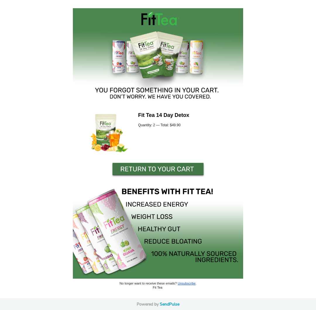
FitTea, a detox tea company, reminds customers of the benefits they promise.
Why this works:
Customers buy a product because they have a problem to solve or a need to be met. With this email, FitTea outlines guaranteed product benefits. By putting customers’ needs first, the brand increases its chances of conversion.
Fit Tea gets straight to the point in this email but they’ve made sure to include a few effective touches:
- The email shows off the different product flavors
- The CTA “Return to your cart” inspires immediate action
10. The “our picks” email
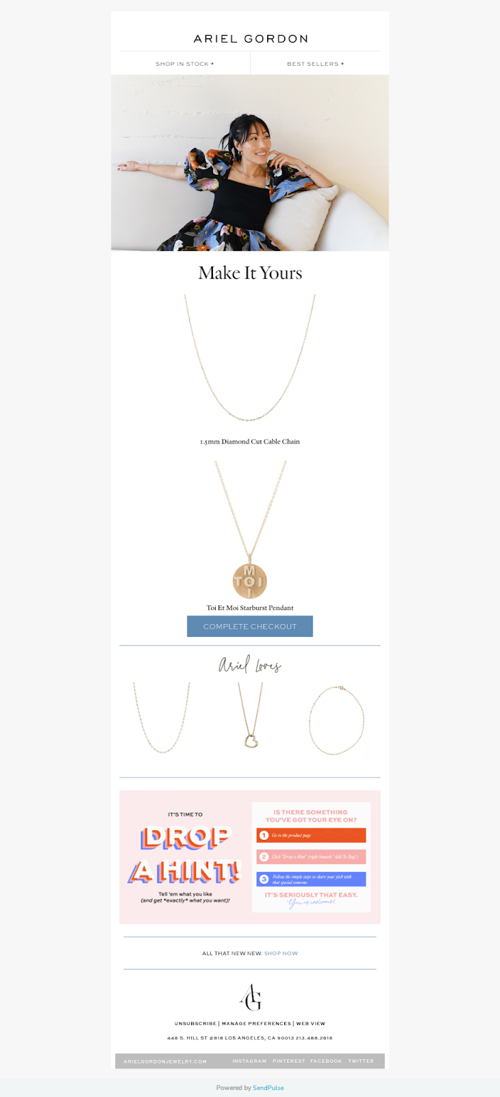
Ariel Gordon Jewelry (AGJ), a woman-owned jewelry brand, sends out favorite products with their cart reminder.
Why this works:
You may think that an abundance of choices is what we all want, but in reality, less can be more. When we get overwhelmed by the number of options easily available to us, it can be harder to make a decision.
So if customers routinely add products to their cart but can’t seem to decide, product recommendations may help them commit.
With the “Ariel Loves” section, AGJ makes it easier for customers to make a purchase by recommending specific products. The email also does a great job of:
- Matching the email design with their website’s look and feel
- Including multiple, clear CTAs
11. The “pay later” email
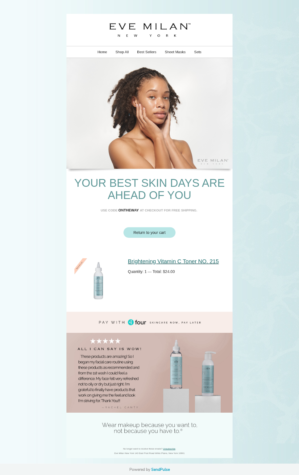
Eve Milan, a skincare brand, offers a pay later option to customers who may want to delay paying for their order.
Why this works:
This offer helps the 9% of people surveyed by Baymard who abandon their carts because there aren’t enough payment options. It’s also convenient for customers who want a low-commitment and budget-focused alternative to credit cards.
A reported 1 in 3 US workers run out of money before payday. Offering your audience the option to shop now and pay later can help customers shop while remaining in budget.
Additionally, Eve Milan:
- Help customers instantly relate to the product with visuals
- Offers social proof through a customer review system
- Includes a discount code for free shipping
12. The “free sample” email
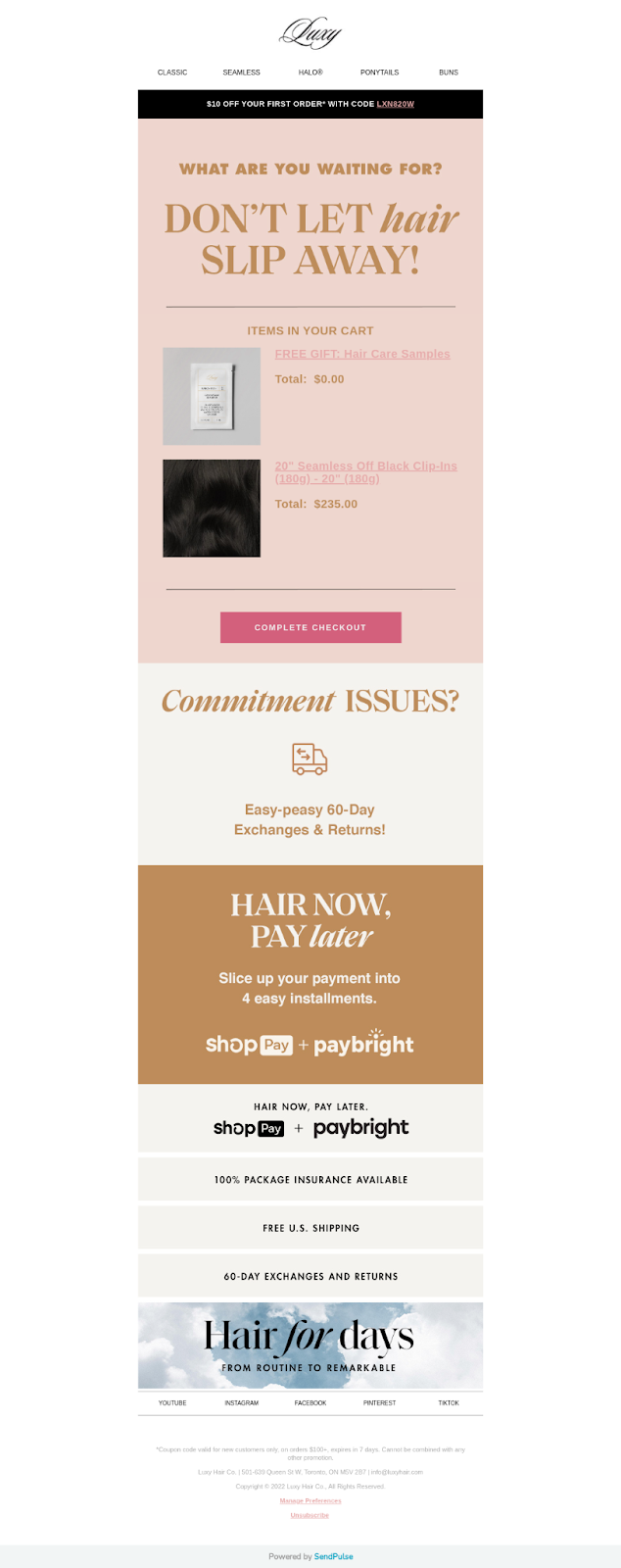
Luxy Hair, a hair extensions brand, offers a free sample to customers in their cart recovery email.
Why this works:
This approach works for two reasons: It helps new retailers build trust and invokes the law of reciprocity, compelling recipients to “return the favor” with a purchase.
Luxy Hair’s email also works by including enticing elements such as:
- A sense of urgency by adding “don’t let hair slip away”
- A discount code for $10 off
- 60-day exchange and returns
- A buy now, pay later option
- 100% package insurance
- Free US shipping
Start sending emails people love to get
Flodesk’s affordable, transparent pricing puts small business owners first—always.
Abandoned cart email strategy: 5 best practices for an online store
You can see from the examples above that there are numerous ways to create effective abandoned cart emails. You can mix and match your strategy, combine approaches, and run A/B tests to better understand what works for your audience.
But when you’re designing an abandoned cart email, make sure to include these six key components:
1. Follow up more than once
One reminder is rarely enough to bring customers back. We recommend sending three emails to address various concerns potential shoppers may have.
For example, Fit Tea sends four emails to shopping cart abandoners.
Remember: timing is everything. Follow-ups shouldn’t spam people’s inboxes—you need to balance your email frequency to stay top of mind without annoying your customers. Here are some general follow-up guidelines to follow.
- Your first email should be helpful, not sales-driven, and should go out almost immediately
- Your second email should leverage FOMO and hint at expiring discounts or limited availability
- The third and final email is a good opportunity to offer extra value like increased discounts
2. Craft an enticing subject line
The primary goal of any email marketing campaign is to get recipients to open your emails. If your subject lines blend in with the masses, your chances of getting opens and engagement aren’t great.
Here are a few keywords that have been found to increase the chance of someone opening your email:
- X% off purchase
- Free
- X% off cart
- Still thinking about it?
And as you can see from these examples, most brands stick to these best practices.
P.S. Don’t forget about your pre-header. If you don’t set one, copy from your email gets pulled which can get truncated like this email below:
You may also want to test adding emojis and using brand-related subject lines. For instance, the subject line for a hair-care brand could read “Your luscious locks await. Cart expires in 48 hours…⌛”
For added inspiration, read How to Write Good Abandoned Cart Email Subject Lines.
3. Show off the abandoned products and recommendations
Window shoppers may have trouble remembering your products, so make sure you include high-quality, enticing product photos.
Or better yet, go a step further and offer some helpful product recommendations. Potential customers will likely appreciate the help and may be tempted to add-on recommended items to their cart.
When designing your abandoned cart email, you can also include pictures of your products in use by people so that shoppers can get a sense of how products might look or function.
4. Use clear and actionable CTAs
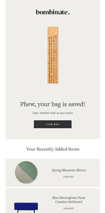
The best abandoned cart emails have a clear agenda: get customers to return to the checkout. Make it easy for them to do so by including multiple clear and actionable call-to-action buttons. Take a look at this example from Bombinate, a lifestyle brand:
- There are multiple CTAs, like “View Bag” and “View Cart”
- The CTAs are placed strategically—in the header section and below each product
Purchase flows aren’t linear. It’s unusual for customers to hear about you, visit your site, and then immediately make a purchase. They may come across you on Instagram, visit your site, forget about you, watch a TikTok, come back to your site, abandon the cart, wait for a discount, get distracted—and finally make a purchase.
Since there are multiple channels involved, you may need to think beyond email. Buyers are used to interacting with direct-to-consumer and ecommerce brands on social media. In fact, according to Instagram, 90% of users follow a brand on the site.
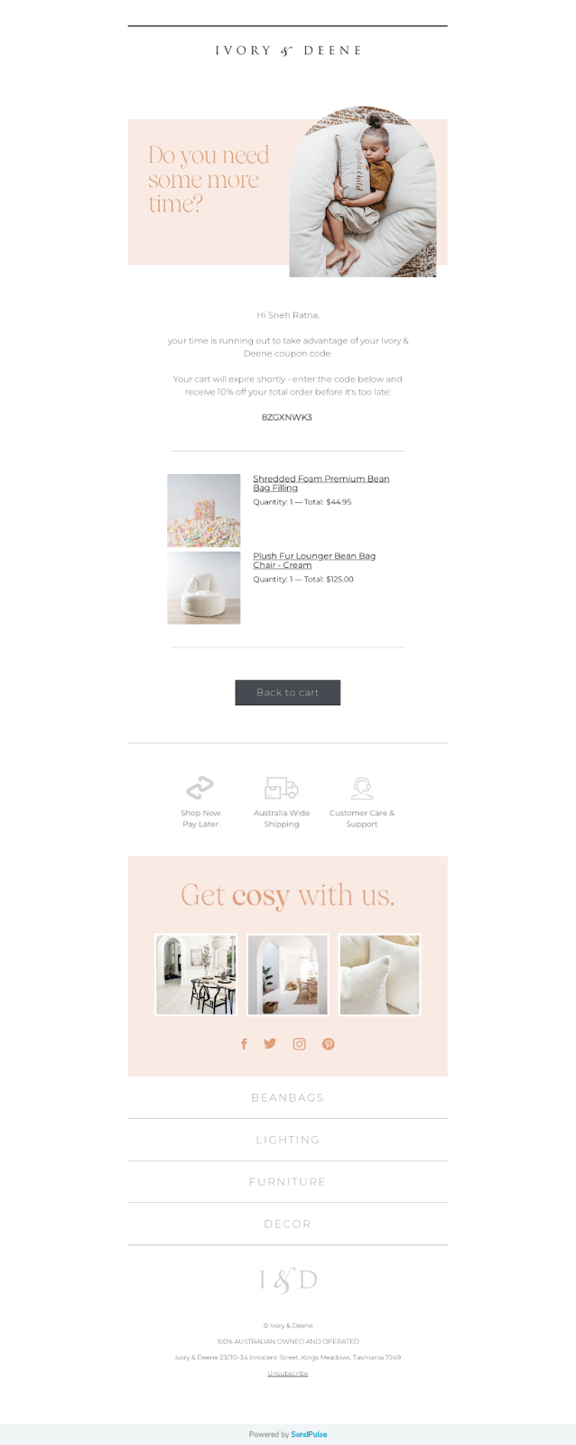
Most—if not all—brands give subscribers the option to follow them on social media through their emails. Here’s an example from Ivory & Deene, a home decor brand:
- The brand offers multiple channels
- Some channels are better suited than others (like Pinterest, where shoppers save their home decor inspiration)
- If your focus is Gen Z, make sure to share your TikTok handle
6. Avoid antagonizing customers
Don’t follow up incessantly or contact customers without their permission.
All you’ll likely gain from these practices are angry prospective customers—which no brand wants. In fact, dissatisfied consumers tell twice as many people about their negative experiences than satisfied customers do according to a 2020 National Customer Rage Study.
So, while you’re trying to persuade customers to come back to their abandoned carts and make a purchase, make sure you’re not antagonizing them with your tactics
Send emails people love to get
Flodesk’s affordable, transparent pricing puts small business owners first—always.
Design an unmissable cart abandonment email
Cart abandonment emails can bring customers back and help you recover lost sales. When designing your recovery cart email, try:
- Creating a multi-step email sequence to increase touchpoints for conversions
- Crafting unique, snappy subject lines that will boost open rates
- Using stunning visuals to show off the product
- Having multiple clear and actionable CTA buttons
- Pushing cart abandoners to engage with you on social media
And cart recovery email builders like Flodesk can help you do just that.
Flodesk is the fastest-growing email marketing platform on the market, helping small business owners design emails people love to get. From stunning email templates to immersive forms, Flodesk makes it easy for beginners and experts to build their email lists, engage their audiences, and convert subscribers into customers—all without a website. Try Flodesk free, no credit card necessary.
Abandoned cart email FAQs
What should I write in an abandoned cart email?
If you’re taking a direct approach, let customers know what they’re missing out on and create a sense of urgency by offering a limited-time discount code to get them to “buy now.”
For multi-step abandoned cart email sequences, use each email to build excitement around your products. Regardless of what strategy you choose to use, make sure your content feels helpful—not sales-driven.
How do abandoned cart emails work?
Abandoned cart emails are sent to customers who leave their purchase without completing the checkout process. These emails can be triggered automatically to bring customers back or find out why they abandoned their cart in the first place.
Is it legal to send abandoned cart emails?
As long as shoppers sign up with their email on your site, you can send them an abandoned shopping cart email since these are considered transactional emails. However, be wary of using their information for other email campaigns unless you receive their express consent.
