Take your newsletter from meh to marvelous: 6 Things to include in your next email newsletter
Table of Contents Jump to:
Jump to:
Table of contents
TL;DR: Want to create a newsletter people can’t wait to read? Include these six elements to create an email your audience loves to get!
What makes a newsletter great? Is it the beautiful photos, the storytelling, the personalization—or maybe it’s a combination of everything? No one element makes a newsletter exceptional, but when you bring together powerful copy, irresistible design and other impactful elements, you can create an engaging newsletter your readers can’t wait to read once it hits their inboxes.
Let’s explore ways to elevate your email newsletter!
We all have different goals for our newsletters, whether it’s driving traffic to our blogs or encouraging course registrations. No matter your goal, there are a few basic things you can add to your newsletter to not only help you achieve your goals but take it from standard to standOUT. Start with:
- Personalization
- A focus on your audience
- Compelling copy
- Captivating imagery
- Calls to action (CTAs) and links
- Social media links
Using your subscribers’ first names in your subject line or the body of your email is a great way to personalize your outreach, but it’s not the only way. Did you know you can show your subscribers you’ve tailored your newsletter specifically for them by:
- Segmenting based on their actions. Did your subscriber purchase your latest course, download your freebie and register for your upcoming webinar? Show them some love by adding them to your customer loyalty segment.
Ex: Thanks for purchasing [course name]! I know you’re going to love it. As a little thank you for all your support, I’m granting you early access to my new ebook (for free). Enjoy! - Segmenting based on their stated preferences. Send subscribers a preferences email early on to gauge their interest in specific content. Once you know what they want to receive, you can easily make it feel like each newsletter was made just for them. For example, if they set their preferences as wanting to receive monthly roundup emails and exclude your weekly travel blog newsletter, you can add them to your “once a month” segment to ensure they only receive the content they want.
Ex: Hi [first name]!
Do you ever get lost in a daydream about packing a bag, heading to the airport and telling the agent to book you a flight to anywhere? Me too! That’s why I booked my flight to Europe and visited six countries in a month. Check out the roundup of my favorite spots from last month!
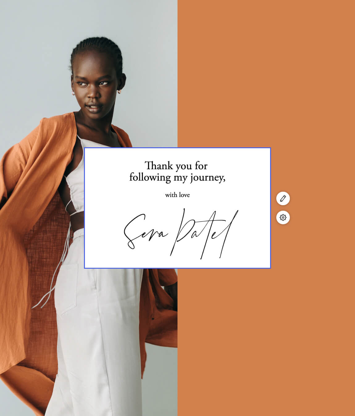
Pro tip: Sign off your email using your name instead of your company name. Flodesk has beautiful fonts that look like you hand-wrote it, giving subscribers that nostalgic feeling of receiving a hand-written letter.
- Setting clear expectations on your lead magnet or freebie. If you plan to send your subscribers emails promoting your services or products, be upfront about it. If you intend to educate readers with weekly tips, let them know! For example, if you send subscribers weekly tips to build their businesses, you could say something like this on your lead magnet:
Get tips on building your business delivered straight to your inbox every week. You’ll also be the first to know when I release a new course to power your small business.
It lets your subscribers know they’ll receive something every week, that it’s educational and that they can expect occasional sales emails when you release new courses. - Feature your subscribers/members! Is there any better feeling than someone recognizing you or your accomplishments? Okay, maybe, but it’s still a pretty good feeling. Highlight your subscribers/members or give them a shout-out to personalize even further. You can request submissions and get them excited about being featured in your newsletter.
What I do: I always address my readers by their first names, but I also set very clear expectations from the get-go. I make it clear that the sole purpose of my newsletter is to drive traffic to my blog. I let subscribers know that I will be sending a monthly newsletter with totally random blogs—no selling my services, just encouraging them to read and share my content.
2. How do I shift the focus to my audience?
If you’re as passionate about your business as we are about ours, chances are you want to share it with the world. It’s so easy to talk about what we do, what we offer, why our businesses are special and why our customers love us. But there’s a fine line between providing our subscribers with value and overselling ourselves.
We’ve got some tips to help you balance selling with educating, engaging and building trust with your audience:
- Find a balance between sales/promotions and educational content. Your newsletter should be about 90% educational and 10% promotional. While your subscribers may love your products, courses or services, they probably don’t want to hear about them all the time.
Ex: You sell handmade, all-natural soaps. You structure your email to include:- A blog post highlighting the unique benefits of the natural ingredients you use in your soaps
- A section about scents that are proven to relax people
- A CTA with a discount code for your newly-released soap featuring the relaxing scent you mentioned earlier
- Focus on being relevant and providing value. Yes, you want to balance educational content with sales content, but make sure the educational content is relevant to your audience. Consider how it will benefit them.
Ex: Your subscribers opted-in to your emails to receive helpful information on using social media to grow their businesses. Sending them content about how to become a TikTok influencer would benefit them, but content focused on using paid ads outside of social media might not be relevant.
- Ask them what they want. Asking subscribers what they want from you not only builds trust but also puts them in control. This is a great strategy to ensure your subscribers are fully engaged and getting the most value from your newsletters. Think about it—what do you do when you get sick of the emails a business sends you? You probably mark it as spam or click “Unsubscribe.”
By giving subscribers a say in the content they receive, you’re giving them a reason to stay.
Ex: Do you love hearing about our latest releases, learning about the benefits of our unique ingredients or reading about all things soap on the blog? Let us know what you want to hear most!
A. Product releases, please!
B. Send me to the blog
C. Educate me!
**The key here is adding them to specific segments once you identify their preferences and delivering on the promise to only send them the content they asked for!
3. How do I create compelling copy?
Have you ever re-read the same page—or worse, the same paragraph—multiple times because it’s so unengaging that you can’t focus on truly reading and understanding it? This happens to me all the time, and it’s always because the writer doesn’t do enough to draw me in.
Writers typically have conquered the art of engaging readers from the get-go, but you don’t have to be a writer to have a successful newsletter. These five tips will instantly make your newsletter more engaging.
- Keep it concise. We get dozens of marketing, personal and work emails a day that simply managing our inboxes can be quite the feat. So, if a subscriber takes the time to open your newsletter, respect their time by keeping it brief. If you have a lot to share, consider sending more frequent, very brief newsletters. Quick emails are much more digestible.
- Be authentic. Own your unique brand and voice and stay consistent. Just because a popular brand in the same space is using phrases like, “Hey babe” or “Later, girl!” doesn’t mean you have to. Stay true to you to build trust and make your brand instantly recognizable—in and out of the inbox.
- Focus on the reader. Read the section above for more on this. But the overarching message is that your readers don’t want to be sold to every time they open your newsletter. Find balance.
- Be clear. Your newsletter should flow well and sound nice, but don’t get caught up in using flowery language that lacks clarity.
Do you want your readers to sign up for your social media course? “Sign up for my social media course to learn how TikTok can take your business from $0 to $10k/mo. in less than a month!” is clear and concise.
While the below sounds nice, it’s wordy and the connection to the course isn’t as clear or upfront.
“Beach vacations, working on your own schedule, afternoon naps. These are all part of my day-to-day now that I have used TikTok to grow my business to a full-time gig. You can create this life for yourself too! Join my course.” - Write how you speak. Business-speak and jargon can be isolating, but these words are also just not engaging. Write casually, similar to how you speak, to make it feel like you’re having a conversation with your subscribers. We don’t recommend using slang or writing literally how you speak, but a casual, friendly tone is always a great way to engage your audience.
When I read about the first apartment I ever rented, I wasn’t overly impressed but decided it was worth touring. It was only 450 square feet, but when I walked in, I was immediately stunned by the design and how beautiful it all was. It told the story the listing simply couldn’t do with words. And that is the power of good design.
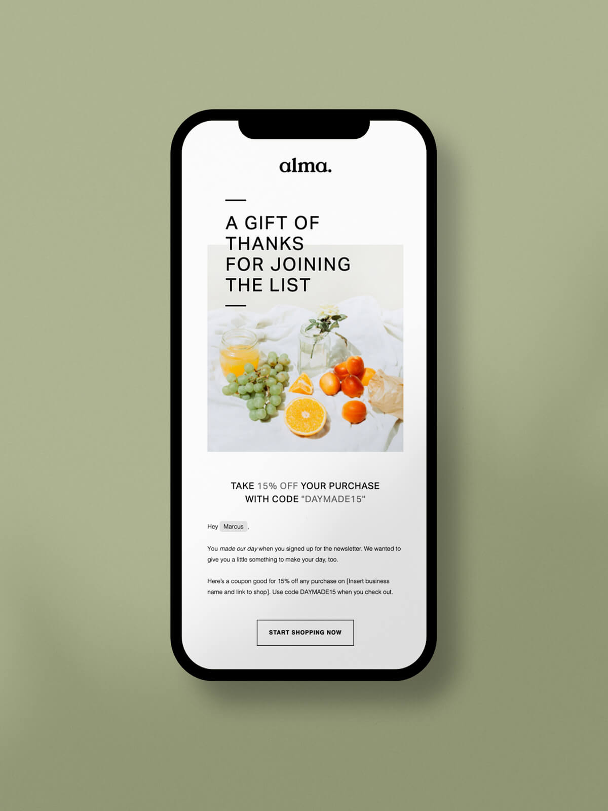
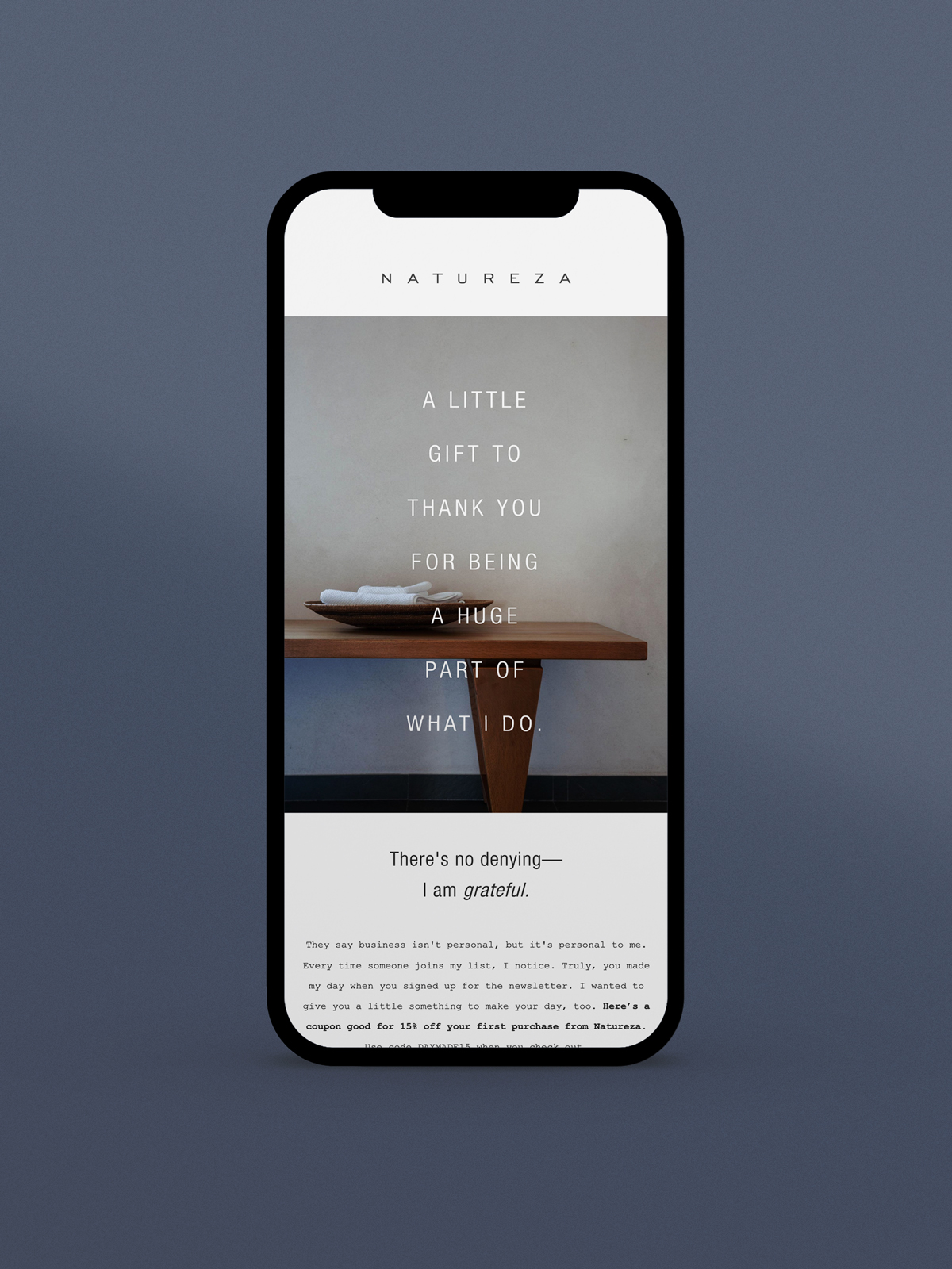
Good design and captivating images should add to your newsletter, helping to tell the full story. Here are a few ideas on how to use images in your newsletter:
- Give your name a face by adding a headshot to your signature
- Add an image of your products so your audience knows what they’re getting
- Add your Instagram feed to your newsletter to give subscribers a peek into your life or behind-the-scenes content
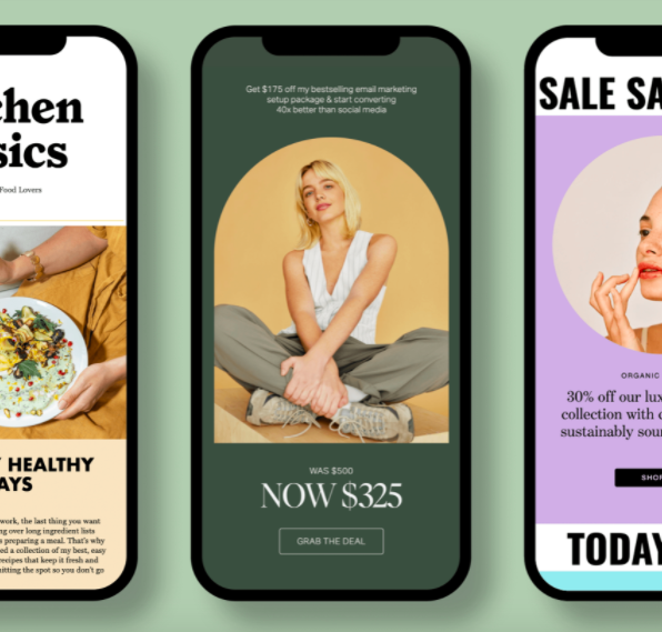
- Highlight a sale or promotion using a bright or bold graphic
- Use lifestyle imagery to show the life your subscribers could have if they purchased your course or product
- When you link to a blog, use the blog header image to add visual interest
- Save room for white space so your newsletter looks less cluttered, especially on mobile
And a few specific examples:
- Your $0 to $25k course allows people to live the life they want by helping them make a sustainable income working for themselves. Share images of people traveling, cooking or working in a coffee shop as this highlights the freedom that comes from working for yourself.
- Use a few strategically placed photos from your latest photography session to show off your skills.
- Your health and nutrition blog is known for delicious yet healthy recipes. Share your Instagram feed to show the latest recipe photos in your newsletter.
Pro tip: Use professional photos from free stock photo sites like Unsplash.
What I do: I pair my blog header images with a quick blurb about the blog and a CTA directing my subscribers to read more on the blog itself. The photos make it clear what the blog is about and the blurb entices them to read more.
5. Should I use links and CTAs?
Conversions look different for everyone. For me, it’s getting readers to my blog. For you, it may be webinar registrations, product sales or someone booking a consultation with you. Regardless, your subscribers can’t convert if you don’t give them a way to do so. But how many links or CTAs is too many?
Science proves that when we have too many options, we avoid making a choice altogether. So, it’s best to have one main CTA (like booking a photography session) that is more prominent than the rest of your CTAs or links. You may have other pieces of content you want them to see, but if the goal is to book that photography session, use a CTA button, and make it obvious.
Ex: You are a luxury group travel agent who wants subscribers to book a consultation with you. You’ve shared two blog posts in your newsletter, a little bit about you and a CTA directing them to your scheduling link.
To ensure they get to the main CTA, you can make it a button and arrange it at the top of your email. Your “Read more” CTAs for the blog posts can be links that aren’t as forward-facing and you can position the blogs lower in the newsletter. And for your about me section, use a simple linked phrase like, “Get to know me” that doesn’t draw too much attention but allows them to take action if they want.
Like peanut butter and jelly or grilled cheese and tomato soup, some things are just better together—like email marketing and social media. Newsletters are a great way to encourage your subscribers to connect with you on other platforms, like social media or your blog. Let’s dive into some ways you can incorporate social media into your newsletter.
- Footer icons. You can link over a dozen social accounts in Flodesk, so if you want to take your relationship with your subscribers to Instagram, Facebook or even LinkedIn, you can! This lets subscribers get to know you more personally, and if they want to refer business your way, they can easily send your LinkedIn profile or website link to a friend.
LinkedIn is my highest-converting channel for clients, so I always link it to my emails. I also connected my Instagram account for subscribers to view all the educational content I post there. - Instagram feed. Are you a highly visual brand? Why not share all your scroll-stopping images with subscribers? Flodesk lets you share your Instagram feed to your emails, so subscribers will always see your three most recent photos without having to leave the email. I love this for showing subscribers behind-the-scenes videos and product photos and offering a peek into life outside the business.
Ex: Want to see the process behind my handmade soaps? Get behind-the-scenes content on my IG page!
It’s so easy to overcomplicate or overthink things when it comes to business. But if there’s one area where you can feel good about keeping things simple, it’s your email newsletter. Simply use the six elements above in your newsletters and start building! You might be surprised how quickly you can create a beautiful and compelling newsletter.
We can’t wait to see what you create! We’re sure it will be marvelous.
