In this article, we'll show you 10 email examples for Email Confirmation that have been sent to customers in the past from different companies. Seeing these examples can help you understand what works best and inspire you to create your own effective and visually appealing confirmation emails.
A good Email Confirmation email is clear and concise, providing essential information such as order details or account activation steps. It should also include a friendly tone and a visually appealing design to enhance the user experience.
Let's jump into it and explore 10 email examples of good Email Confirmation emails!

Catch's email confirmation email is a prime example of effective design, featuring a clean and straightforward layout that focuses on the primary action—verifying the user's email address. The minimalist design, clear branding, and prominent call-to-action ensure that users can quickly and easily complete the verification process, enhancing the overall user experience.
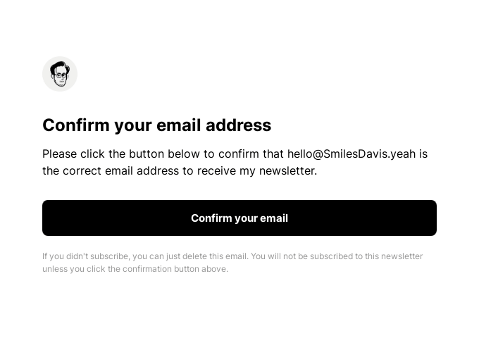
Notionway's email confirmation email is a great example of simplicity and user empowerment. With a clear subject line, a prominent call-to-action, and a clean, minimalistic design, it ensures users can quickly confirm their email and start engaging with the platform without any distractions.

Tome's email confirmation email is a perfect blend of simplicity and user empowerment. With a clear subject line, a prominent call-to-action, and a clean, minimalistic design, it ensures users can quickly confirm their email and start engaging with the platform without any distractions.
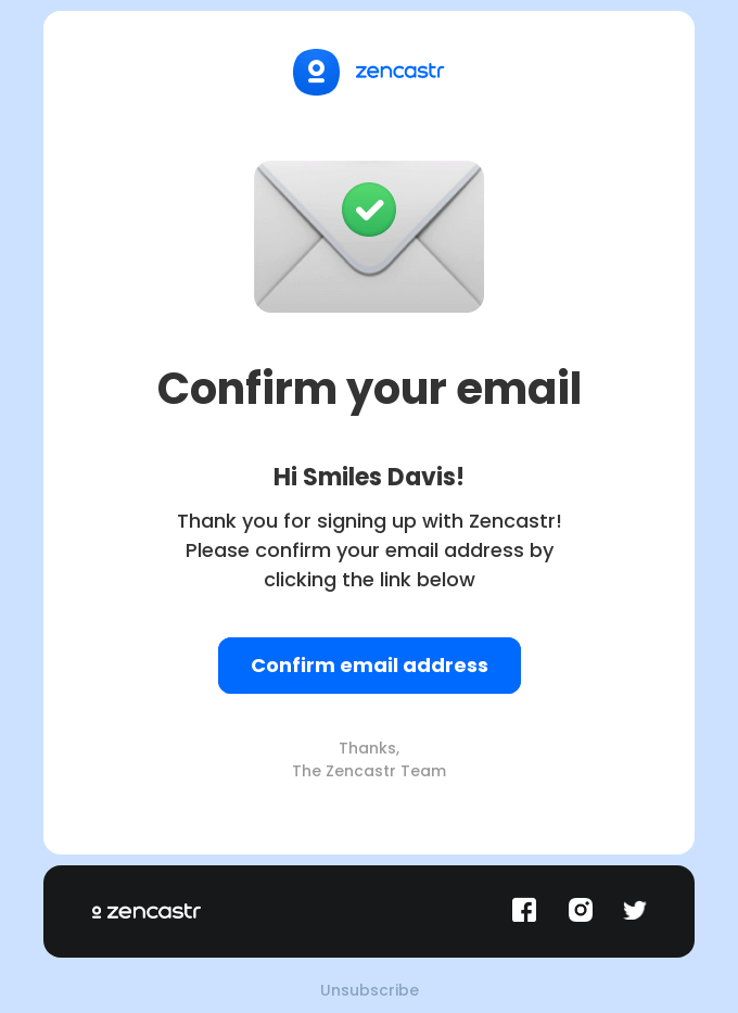
Zencastr is a platform for recording high-quality audio and video podcasts remotely, enabling podcasters and content creators to capture studio-quality sound over the internet. The email confirmation from Zencastr stands out due to its clear subject line, straightforward call-to-action, and clean, modern design, ensuring users can quickly verify their email and start using the platform without any distractions.

DeviantArt is an online community where artists, illustrators, photographers, and art enthusiasts can share, showcase, and discuss their creative works. The email confirmation from DeviantArt excels in simplicity and user empowerment, featuring a direct subject line, a clear call-to-action, and a clean design that guides users effortlessly through the email verification process, ensuring they can quickly start engaging with the platform.
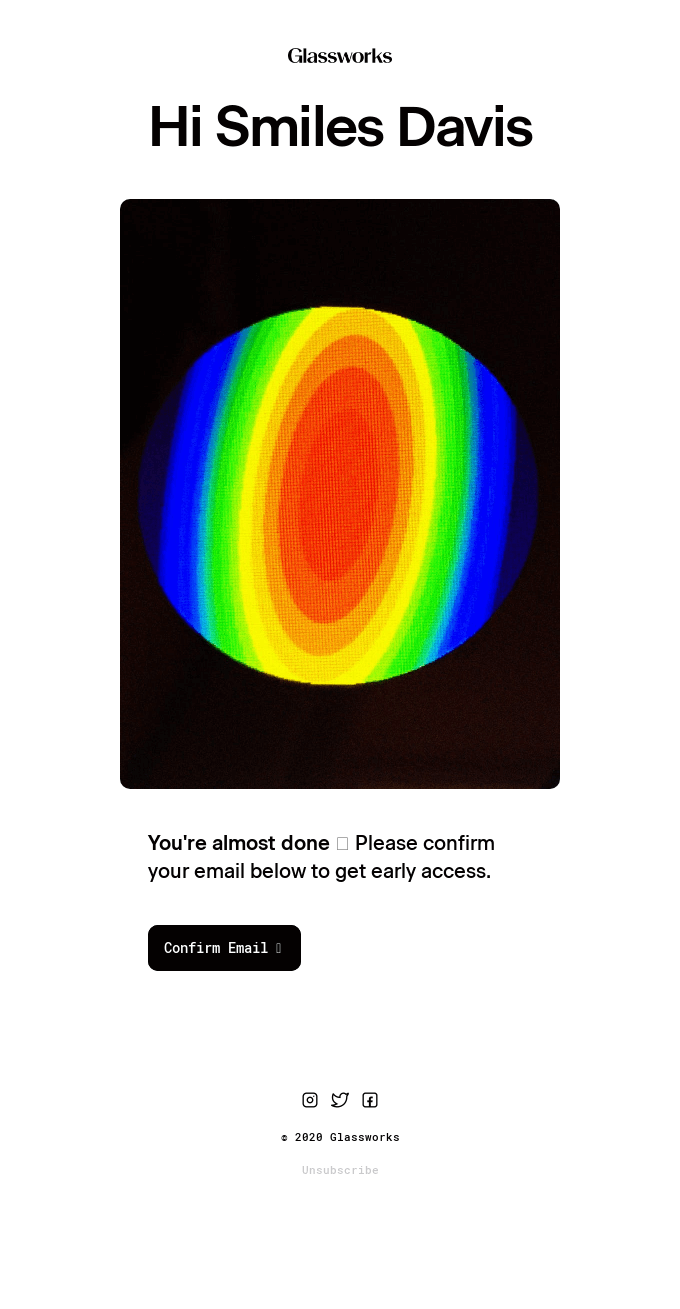
Glassworks' email confirmation email is a prime example of simplicity and user empowerment. With a clear subject line, a prominent call-to-action, and a clean, minimalistic design, it ensures users can quickly confirm their email and start engaging with the platform without any distractions.

Wix is a platform that allows users to create websites easily, offering tools for web design, hosting, and online business management. The email confirmation from Wix is effective due to its clear subject line, prominent call-to-action, and clean, minimalistic design, ensuring users can quickly confirm their email and start engaging with the platform without any distractions.
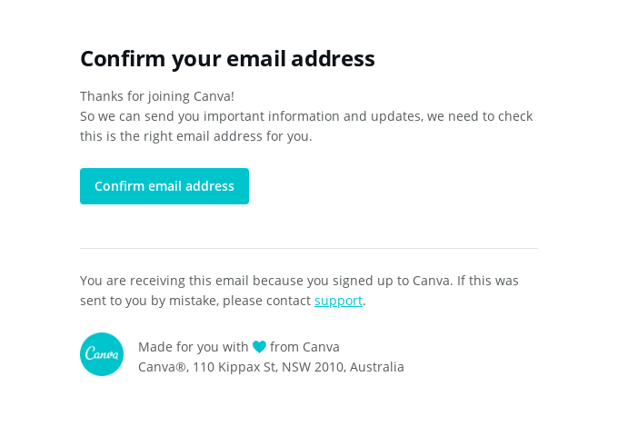
Canva is a popular online graphic design platform that allows users to create a wide range of visual content using an easy-to-use drag-and-drop interface. Canva's email confirmation is a good example because it features a clear subject line, a prominent call-to-action, and a clean, minimalistic design, ensuring users can quickly confirm their email and start engaging with the platform without any distractions.

Shopify is a leading e-commerce platform that enables individuals and businesses to create their own online stores and sell products. The "Confirm your email address" email from Shopify stands out with its minimalist design, clear branding, and prominent call-to-action, ensuring users can quickly and easily complete the verification process, enhancing the overall user experience.

Lunch Money is a digital service that emphasizes user authentication and security, requiring users to confirm their email addresses. The email confirmation from Lunch Money excels with its clean, minimalist design, clear call-to-action, and prominent branding, ensuring users can quickly and easily complete the verification process, enhancing the overall user experience.
With Flodesk, you can effortlessly create visually stunning and highly effective email confirmation emails. Our intuitive drag-and-drop interface empowers you to design clean, minimalistic emails that enhance user experience and ensure quick, seamless verification.
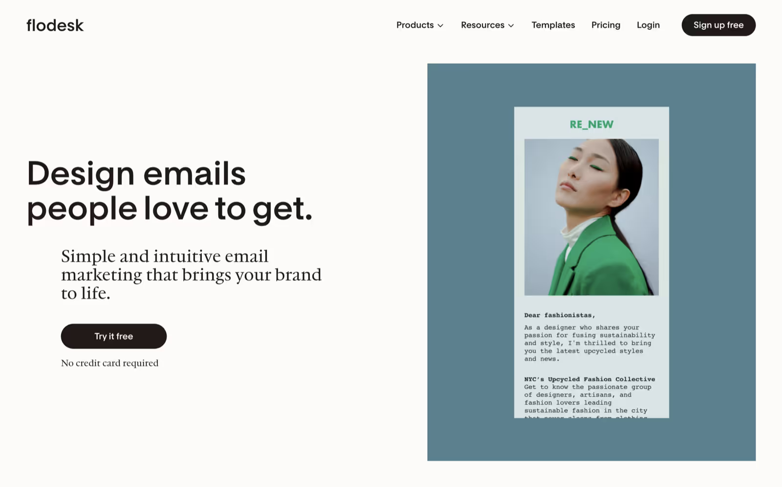
Flodesk's intuitive drag-and-drop interface makes it easy to create visually stunning and highly effective email confirmation emails. With no need for coding or design skills, you can effortlessly design clean, minimalistic emails that enhance user experience and ensure quick, seamless verification.
Flodesk offers the most user-friendly email marketing tools for small businesses, helping you grow and monetize your email list with ease. With no need for coding or design skills, you can create, send, and automate emails that captivate your audience and drive revenue. Trusted by over 100,000 businesses, Flodesk helps both beginners and experts send beautiful, high-converting emails in a radically simple way. With the world’s most intuitive email builder, powerful automations, and beautiful forms, Flodesk provides everything you need for effective email marketing—without the complexity.
In conclusion, creating effective email confirmation emails is crucial for enhancing user experience and ensuring seamless verification. Sign up for Flodesk today to start designing your own beautiful, high-converting emails. Get started with Flodesk.
image-code-yes